Comments (10)
 sgoudham
commented on June 7, 2024
4
sgoudham
commented on June 7, 2024
4
Hello! Finally getting around to revisiting this.
As per recommendations suggested on discord, I've updated the comments to be overlay2 and increased the contrast on the selection highlight.
What do people think about this for the next release? (Excluded Frappe, Macchiato since they're basically the same as Mocha in the screenshots below)
Mocha


Latte


from jetbrains.
sgoudham
commented on June 7, 2024
1
Thanks for raising this.
While I agree that VSCode has better highlights for this. There's a small tradeoff being made here:
- VS selection highlights only actually select the text and don't highlight the cursor line behind it, making it easier to select a lighter colour
- I don't believe comments are well highlighted/readable with the lighter colour.
Having messed with the colours, I've found that it's really hard to make the selection background highlight look good for normal code and comments :/
I'd be super happy if someone could mess around with it enough to make it look good for both
from jetbrains.
sgoudham
commented on June 7, 2024
1
I have also discovered an additional issue inside dialogs.
ToggleSite.tsxin theToinput field is highlighted/selected. Honestly, I cannot distinguish the selection from the background even upon close inspection.
(macOS WebStorm 2022.3.1, Catpuccin 2.0.7 Macchiato variant)
Hmmm, this is quite weird. I don't think there are any different highlights for these dialogs but I could be wrong. I'll try to look into it when I have time! Running pretty low on that right now 😅
from jetbrains.
 kkrypt0nn
commented on June 7, 2024
1
kkrypt0nn
commented on June 7, 2024
1
Looking amazing to me :D
from jetbrains.
sgoudham
commented on June 7, 2024
1
Great! I'll close this as the new changes are implemented with the release of 2.1.0
I'd imagine it'll be reviewed and released to the marketplace from W.B Monday 3rd April!
from jetbrains.
kkrypt0nn
commented on June 7, 2024
1
@sgoudham To me it looked already nice before, following the suggestion of changing the color used makes it stand out even better, looking awesome to me ✨
from jetbrains.
 BButner
commented on June 7, 2024
BButner
commented on June 7, 2024
Thanks for raising this.
While I agree that VSCode has better highlights for this. There's a small tradeoff being made here:
- VS selection highlights only actually select the text and don't highlight the cursor line behind it, making it easier to select a lighter colour
- I don't believe comments are well highlighted/readable with the lighter colour.
Having messed with the colours, I've found that it's really hard to make the selection background highlight look good for normal code and comments :/
I'd be super happy if someone could mess around with it enough to make it look good for both
Too be fair, using the VSCode theme as a reference... The highlighting there has the same issue with the comments, they almost disappear:

I think the tradeoff would be worth it. Personally, I'd rather have a higher contrast highlight color and not be able to read comments while I'm doing so.
If you're fine with this tradeoff/if enough people thumbs up here, I'm happy to PR this to match the color that VSCode uses.
from jetbrains.
 pohy
commented on June 7, 2024
pohy
commented on June 7, 2024
I have also discovered an additional issue inside dialogs.
ToggleSite.tsx in the To input field is highlighted/selected. Honestly, I cannot distinguish the selection from the background even upon close inspection.
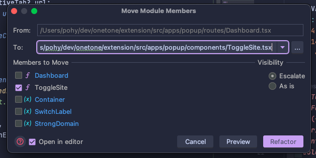
(macOS WebStorm 2022.3.1, Catpuccin 2.0.7 Macchiato variant)
from jetbrains.
sgoudham
commented on June 7, 2024
Thanks for raising this.
While I agree that VSCode has better highlights for this. There's a small tradeoff being made here:
- VS selection highlights only actually select the text and don't highlight the cursor line behind it, making it easier to select a lighter colour
- I don't believe comments are well highlighted/readable with the lighter colour.
Having messed with the colours, I've found that it's really hard to make the selection background highlight look good for normal code and comments :/
I'd be super happy if someone could mess around with it enough to make it look good for bothToo be fair, using the VSCode theme as a reference... The highlighting there has the same issue with the comments, they almost disappear:
I think the tradeoff would be worth it. Personally, I'd rather have a higher contrast highlight color and not be able to read comments while I'm doing so.
If you're fine with this tradeoff/if enough people thumbs up here, I'm happy to PR this to match the color that VSCode uses.
Funnily enough, the highlights were the same as VSCode in the earlier releases and then an issue (#24) was raised about comments not being visible ahaha!
from jetbrains.
sgoudham
commented on June 7, 2024
Re-opening this as I incorrectly read the suggestion to be overlay2 instead of overlay0. Our NeoVim & VsCode ports use that at the minute so I would like to match them and keep the legibility on the selection highlight.
It was pointed out to me that using overlay2 does not make the comments stand out on their own enough, which I do agree with looking back at it.
How do people feel about the following screenshots? We are using overlay0 for comments now and I've tried to tweak the selection highlights. @kkrypt0nn @BButner
Mocha


Latte


I like it as it's a middle ground between the old comments and the new ones proposed above. If it's fine, I'll make a 2.1.1 release "fixing" this.
from jetbrains.
Related Issues (20)
- 3.0.0 and 3.0.1 broke Catppuccin Latte HOT 2
- code area is white after update HOT 2
- Darcula theme being applied instead of Dark/New UI theme HOT 6
- Connection colors in Database plugin or DataGrip
- Unable to see selection in UI text fields HOT 4
- Keywords in ruby comments are highlighted HOT 2
- Make Java Interfaces a different Color HOT 1
- Editor field now white when "Mocha" is enabled after updating to 3.2.2 HOT 2
- Fix text colors in main toolbar HOT 7
- Accessibilty: Change unused variable color HOT 3
- 2024.1+ Support
- Pastel colors are missing in some places HOT 2
- Latte theme: Very low contrast of highlighted search terms in the Search Everywhere window HOT 2
- Latte: Contrast for VCS changed files is really low HOT 2
- Variance from Neovim version HOT 3
- White background with Goland HOT 1
- New terminal background is unstyled HOT 3
- Parameter Info panel: improve contrast of current argument HOT 6
- Increase whitespace contract
- Missing color for the current branch in git log HOT 1
Recommend Projects
-
 React
React
A declarative, efficient, and flexible JavaScript library for building user interfaces.
-
Vue.js
🖖 Vue.js is a progressive, incrementally-adoptable JavaScript framework for building UI on the web.
-
 Typescript
TypeScript is a superset of JavaScript that compiles to clean JavaScript output.
-
TensorFlow
An Open Source Machine Learning Framework for Everyone
-
Django
The Web framework for perfectionists with deadlines.
-
 Laravel
A PHP framework for web artisans
-
D3
Bring data to life with SVG, Canvas and HTML. 📊📈🎉
-
Recommend Topics
-
javascript
JavaScript (JS) is a lightweight interpreted programming language with first-class functions.
-
web
Some thing interesting about web. New door for the world.
-
server
A server is a program made to process requests and deliver data to clients.
-
Machine learning
Machine learning is a way of modeling and interpreting data that allows a piece of software to respond intelligently.
-
Visualization
Some thing interesting about visualization, use data art
-
Game
Some thing interesting about game, make everyone happy.
Recommend Org
-
Facebook
We are working to build community through open source technology. NB: members must have two-factor auth.
-
Microsoft
Open source projects and samples from Microsoft.
-
Google
Google ❤️ Open Source for everyone.
-
Alibaba
Alibaba Open Source for everyone
-
D3
Data-Driven Documents codes.
-
Tencent
China tencent open source team.
from jetbrains.