According to sas.com, Data visualization is the presentation of data in a pictorial or graphical format. It enables decision makers to see analytics presented visually, so they can grasp difficult concepts or identify new patterns.
With interactive visualization, you can take the concept a step further by using technology to drill down into charts and graphs for more detail, interactively changing what data you see and how it’s processed.
The article attached here explains the History of DataViz, The Current Trend of DataViz, How it's Used and How it works
SearchBusiness explains Data Visualization as it relates to Data Science. In their Definition, Data Visualization is the practice of translating information into a visual context, such as a map or graph, to make data easier for the human brain to understand and pull insights from. The main goal of data visualization is to make it easier to identify patterns, trends and outliers in large data sets. The term is often used interchangeably with others, including information graphics, information visualization and statistical graphics.
They provide examples of Visualizations, some use cases in Business and importance. Read in details here.
How Data Vis is used by the business incl. potential linkages to interesting sample visualizations.
Data Visualization is a very important skill to have for any ML practitioner. It is a tool to communicate with stakeholders your findings and what the data entails. For example,
Data Visualization helps uncover insights from our data. It is done before feature selection and engineering. It is to be carried out after Business Understanding and Data gathering. The output of a Data Visualization task can be a dashboard illustrating insights or a report in form of a slide deck communicating what the data entails. Data Visualization helps Data Scientist/Analyst etc build intuition about the results of the model.
As stated by Jason Brownlee (PhD), Data Visualization is an important skill in applied statistics and machine learning. Statistics does indeed focus on quantitative descriptions and estimations of data. Data visualization provides an important suite of tools for gaining a qualitative understanding. This can be helpful when exploring and getting to know a dataset and can help with identifying patterns, corrupt data, outliers, and much more. With a little domain knowledge, data visualizations can be used to express and demonstrate key relationships in plots and charts that are more visceral to yourself and stakeholders than measures of association or significance.
It is very important Machine Learning Engineer, Data Scientist, Analyst etc understand in detail what Data Visualization is all about, how to complete a data visualization task for any kind of dataset, how to present insights, findings and make better judgement using Data Visualization.
Visualization helps you to see "what's happening in your data"
Visualization can help you decide which analysis to use
Visualization is what the business probably speaks
Pictures they say is lounder than words. Almost everybody has seen one or two meme images. Without saying anything you are already making inference from the picture. That is an example of Data Visualization. Now making good charts is not enough but making quality (clear, precise, neat) chart is very important. The essence is that, it must communicate something that can drive actions.
The use and mastery of visualization tools. An expert should know how to use Viz tools like Tableau/Power BI etc to turn Business question into actionable insights
Understanding and being able to use libraries like seaborn, matplotlib etc to derive insights from data is good. Going a step further like designing an interactive dashboard, building an automatically updating dashboard is IMO an expert-like kind of thing.
- Matplotlib: a base visualization python library that makes data come to life. Simple and easy to learn and use
- Seaborn: a high-level python visualization library based on matplotlib. It offers additional charts and beautiful colors
- Plotly: provides graphing libraries for Python, R, MATLAB, Perl, Julia, Arduino, and REST. For python, plotly express (a module in plotly) is most popular for its high end nature, and plotly graph-objects (another module in plotly) for its vast features and customisation capabilities. Closely related, is plotly dash - a python framework well known for delivering excellent visualisation apps and dashboards. The winning point for plotly is the fact that it produces interactive chats, something you cannot easily achieve with matplotlib and seaborn.
- Bokeh is an interactive visualization library for modern web browsers. It provides elegant, concise construction of versatile graphics, and affords high-performance interactivity over large or streaming datasets. Bokeh can help anyone who would like to quickly and easily make interactive plots, dashboards, and data applications. See a live notebook here to practice with Bokeh
- d3.js: a JavaScript library for producing dynamic, interactive data visualizations in web browsers.
- Power BI :: Power BI is a Data Visualization and Business Intelligence tool that converts data from different data sources to interactive dashboards and BI reports. Power BI suite provides multiple software, connector, and services - Power BI desktop, Power BI service based on Saas, and mobile Power BI apps available for different platforms. These set of services are used by business users to consume data and build BI reports. This tutorial covers all the important concepts in Power BI and provides a foundational understanding on how to use Power BI.
- Tableau :: Tableau is a Business Intelligence tool for visually analyzing the data. Users can create and distribute an interactive and shareable dashboard, which depict the trends, variations, and density of the data in the form of graphs and charts. Tableau can connect to files, relational and Big Data sources to acquire and process data. The software allows data blending and real-time collaboration, which makes it very unique. It is used by businesses, academic researchers, and many government organizations for visual data analysis. It is also positioned as a leader Business Intelligence and Analytics Platform in Gartner Magic Quadrant.
- Altair: a statistical visualization library for Python
- Uni-variate Analysis
- Bi-variate Analysis
- Multi-variate Analysis
- Model Visualization*
The article here explains the different kinds of chart to explore data and provides some examples
- Uni-variate Analysis
Univariate analysis explores each variable in a data set, separately. It looks at the range of values, as well as the central tendency of the values. It describes the pattern of response to the variable. It describes each variable on its own. Descriptive statistics describe and summarize data. Univariate descriptive statistics describe individual variables. learn about uni-variate analysis here
In the article, a walkthrough of how to complete the univariate analysis part of a data visualization process is explained using the hello world dataset of machine learningiris dataset.
- Bi-variate Analysis
According to wikipedia, Bivariate analysis is one of the simplest forms of quantitative analysis. It involves the analysis of two variables, for the purpose of determining the empirical relationship between them. Bivariate analysis can be helpful in testing simple hypotheses of association. The notebook attached here is a kaggle notebook that explains the art of bivariate analysis and also provides various question to solidy the understaning of what has been taught in the notebook. Do well to complete the tasks.
- Multi-variate Analysis
Multivariate (Multidimensional) Visualization. □ Visualization of datasets that have more than three variables. In this article, Dipanjan Sarkar (GDE) explains the art of effective viz for multi-dimensional data. The Art of Effective Visualization of Multi-dimensional Data
- Model Visualization
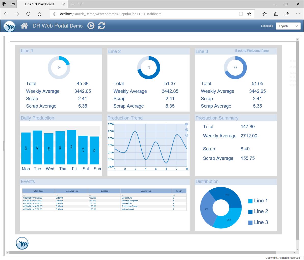
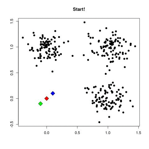
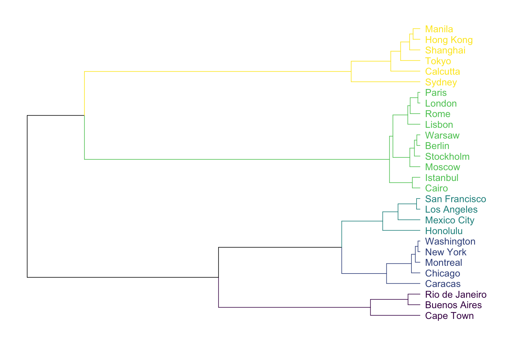
Here we have charts like
- Clustering: The most common algorithm used is k-means. k-Means starts by choosing k random centers which you can set yourself. Then, all data points are assigned to the closest center based on their Euclidean distance. Next, new centers are calculated and the data points are updated (see gif below). This process continuous until clusters do not change between iterations.
- Dendograms: A dendrogram is a network structure. It is constituted of a root node that gives birth to several nodes connected by edges or branches. The last nodes of the hierarchy are called leaves.
- Heatmaps: A heatmap is a two-dimensional graphical representation of data where the individual values that are contained in a matrix are represented as colors.
- DBSCAN: (Density Based Spatial Clustering Application of Noise) which clusters data points if they are sufficiently dense. It identifies clusters and expands them by scanning neighborhoods.
-
Beginner
Beginner possess skills to use
- Matplotlib and Seaborn to build charts that communicate insights
- Plotly library to create interactive visualizations
- Present charts as a slide deck
-
Experts
Experts can use more complex tools and derive more hidden insights. Experts can
- Use Tableau/Power BI to create dashboards that automatically update as new data comes in
- Create Web App using streamlit/Plotly-Dash or D3.js to present Data Viz project
- Create attractive and interactive plots that tells useful story about the data
This section contains links that explains how various chart relate to analysis, how to interpret the charts and when to use what chart
- A step-by-step guide to Data Visualizations in Python
- Data Visualization with Python
- Exploring Data with python from scratch
- Kaggle Notebooks: Detailed exploratory data analysis with python
- Visual data analysis in Python
- Step by Step Guide to learn Tableau


