
Reworked version of the most commonly used controls, plus some new special controls and extra functionality.


Repository wiki: https://github.com/devpelux/fullcontrols/wiki
|
FullControls |
Here is an overview of all the features of the package.
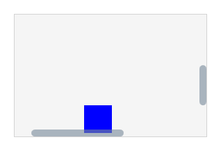
Adds collapsing and expanding functionality to another element.
For example you can specify a Grid as collapsible Child, so the content of this Grid can be expanded or collapsed.
The collapsible works with Width and Height, so expanding means "go from zero to full size", and collapsing means "go from full size to zero".
Is possible to collapse only width, only height, or both.

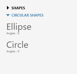
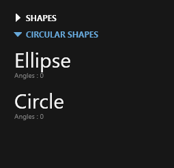
Is a control that contains a stacked list of items.
Each item can be expanded or collapsed to reveal the content associated with that item.
This is a control that can be used within an Accordion.
It can contain everything on its Content property.
It has an header and contains a Collapsible, to make the content collapsible by clicking the header.
This is a control that can be used within an Accordion.
It works as an items control, so can be used to display multiple items inside.
It has an header and contains a Collapsible, to make the content collapsible by clicking the header.
Similar to the normal Grid, but this draws a grid with bordered cells.

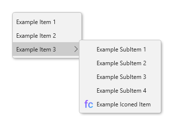
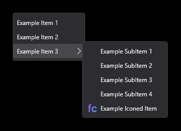
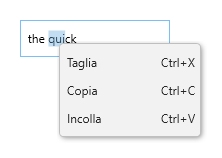
Reworked version of the classic ContextMenu with more customizations.
For example you can change the color of the shadow or display a scroll viewer if needed.
However, it was created primarily for handling some inherited properties of FlatMenuItem.
This control was created only for handling some inherited properties of FlatMenuItem.
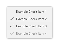
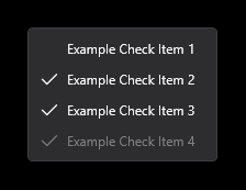
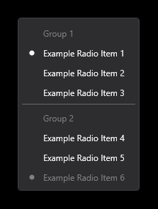
Extended version of the MenuItem with more features and customizations.
It contains also a "radio-checking" feature to make checkable items mutually exclusive.
Reworked version of the Separator with more customizations.
This is a blank menu item: is made to add a blank space (without any separator line) between the items.
This is an unclickable menu item that works only as SubmenuItem, it can be used to add an item that works as a title for a group of items.

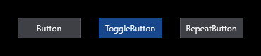
Extended version of the classic button with more customizations.
Extended version of the classic repeat button with more customizations.
Extended version of the classic toggle button with more customizations and features.

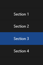
Button with the behaviour of a radio button.
It can be used, for example, to switch between different section of an application.

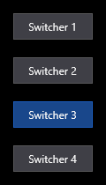
With multiple switchers you can easily do a navigation drawer menu.
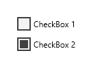
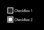
Extended version of the classic checkbox with more customizations.
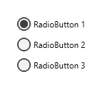
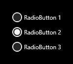
Extended version of the classic radiobutton with more customizations.
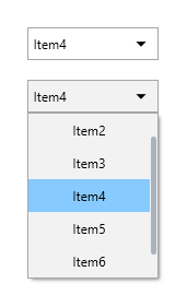
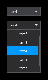
Extended version of the classic combobox with more customizations and features.
Extended version of the classic combobox item with more customizations and features.
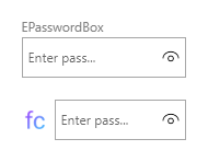
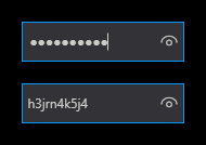
Extended version of the standard password box with more features and customizations.
Is possible to add a label (or icon) and display an hint, add a button to show the password when pressed and copy the password.
It maintains the same security of the original password box.


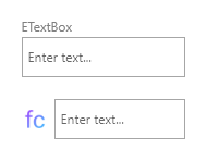
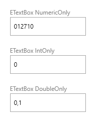
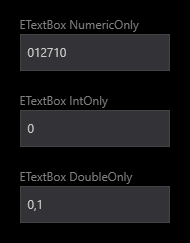
Extended version of the standard text box with more features and customizations.
Is possible to add a label (or icon) and display an hint, add a button to copy the text, choose if the textbox can contain only number, doubles…


Reworked version of the classic scrollbar adapted to be semi-transparent and colored.


This is a scroll viewer that uses the GlassScrollBars and with some new functionality, as draw the scrollbars inside the scroll viewer.
Incapsulates a Window to be displayed as dialog and, in the end, return an object as result.
It can be used to create custom messageboxes.
A fully customizable titlebar used in custom windows.


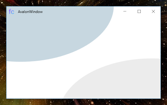
Extended version of the classic window with possibility to customize the titlebar, fuse the titlebar with the content of the window, better handling of close, minimize, etc...
Extended version of the classic window with the same features of AvalonWindow, but with support for round angles and custom shadow. (This window can only be minimized, is not resizable or maximizable)

Extended version of the classic window with the same features of FlexWindow but resizable. (This uses AllowsTransparency=True)
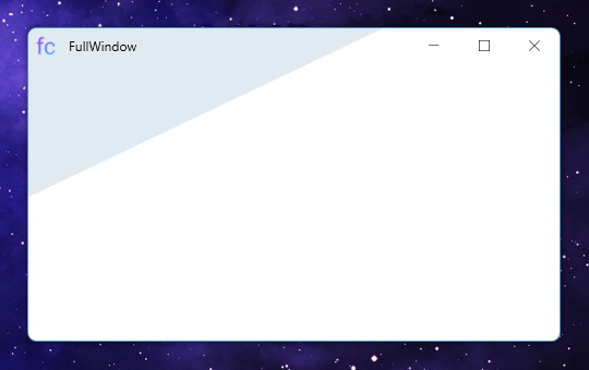
FullWindow requires AllowsTransparency set to True to be fully customizable, and using AllowsTransparency may drastically reduce the performances of the window.
In most cases, if you don't need to resize the window, or if you don't need round angles, you can use FlexWindow or AvalonWindow respectively, that achieve the same goals without using AllowsTransparency.
Copyright (C) 2020-2021 devpelux (Salvatore Peluso)
Licensed under MIT license.

 React
React
 Typescript
 Django
 Laravel
 Facebook
 Microsoft
 Google
 Alibaba
 D3
D3
 Tencent