

Draw a leader line in your web page.
Document and Examples https://anseki.github.io/leader-line/
<div id="start">start</div>
<div id="end">end</div>
// Add new leader line from `start` to `end` (HTML/SVG element, basically).
new LeaderLine(
document.getElementById('start'),
document.getElementById('end')
);
It supports options to customize.

Basically, it can indicate HTML/SVG element such as <div>, <button>, <ul>, <td>, <circle>, <text>, etc.

It can indicate a part of an element also instead of the element.


Also, it can indicate an element of another library.
For example, the following uses LeaderLine with D3.js. Move the mouse on the list.

Load LeaderLine into your web page.
<script src="leader-line.min.js"></script>Pass two HTML/SVG elements to LeaderLine constructor. Then a leader line is drawn between those elements.
new LeaderLine(
  document.getElementById('element-1'),
  document.getElementById('element-2')
);
Any element that has bounding-box is accepted. For example, <div>, <button>, <ul>, <td>, <circle>, <text>, and also, elements in another window (i.e. <iframe>). (See start and end option.)
And, the constructor accepts options.
var startElement = document.getElementById('element-1'),
  endElement = document.getElementById('element-2');

// New leader line has red color and size 8.
new LeaderLine(startElement, endElement, {color: 'red', size: 8});
Also, the options can be accessed via properties of the instance (readable and writable).
var line = new LeaderLine(startElement, endElement);
line.color = 'red'; // Change the color to red.
line.size++; // Up size.
console.log(line.size); // Output current size.
You can change the style of the leader line via color, size, outlineColor, and more options.
new LeaderLine(startElement, endElement, {
  color: '#fff',
  outline: true,
  endPlugOutline: true,
  endPlugSize: 1.5
});
You can add effects to the leader line via some options.
new LeaderLine(element1, element2, {
  startPlugColor: '#1a6be0',
  endPlugColor: '#1efdaa',
  gradient: true
});
new LeaderLine(element2, element3, {dash: {animation: true}});
new LeaderLine(element4, element5, {dropShadow: true});
new LeaderLine(element5, element6, {dash: true});
You can change symbols that are shown at the end of the leader line via startPlug and endPlug options.
new LeaderLine(startElement, endElement, {
  startPlug: 'square',
  endPlug: 'hand'
});
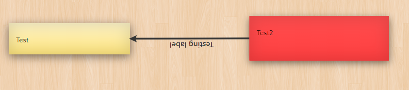
You can indicate a point or area of an element instead of the element via pointAnchor or areaAnchor attachment. You can indicate a point or area of the document also.
You can specify additional labels via startLabel, middleLabel and endLabel options. Also, captionLabel and pathLabel attachments can be specified as labels.
new LeaderLine(
  startElement1,
  LeaderLine.pointAnchor(endElement, {
    x: 60,
    y: 20
  }),
  {endLabel: LeaderLine.pathLabel('This is additional label')}
);

new LeaderLine(
  startElement2,
  LeaderLine.areaAnchor(endElement, {
    x: 80,
    y: 60,
    width: 50,
    height: 80,
  }),
  {endLabel: 'This is additional label'}
);
You can show and hide the leader line with effects by show and hide methods.
mouseHoverAnchor attachment allows it to implement showing and hiding with mouse moving, easily.
new LeaderLine(LeaderLine.mouseHoverAnchor(startElement), endElement);
For more details, refer to the following.
line = new LeaderLine(options)Or
line = new LeaderLine(start, end[, options])The options argument is an Object that can have properties as options. hide option also can be contained.
The start and end arguments are shortcuts to options.start and options.end. The following two codes work same.
new LeaderLine({start: element1, end: element2});
new LeaderLine({start: element3, end: element4, color: 'red'});
new LeaderLine(element1, element2);
new LeaderLine(element3, element4, {color: 'red'});The instance has properties that have the same name as each option to get or set those values (other than hide option).
var line = new LeaderLine(startElement, endElement);

upButton.addEventListener('click', function() {
  if (line.size < 20) { line.size++; }
}, false);

downButton.addEventListener('click', function() {
  if (line.size > 4) { line.size--; }
}, false);
If you want to set multiple options after it was constructed, using setOptions method instead of the properties may give better performance.
When you will do something about HTML document regardless of the LeaderLine, you typically do that after the HTML document is ready (i.e. the HTML document has been loaded and parsed by web browser).
For example:
// Wait for HTML document to get ready
window.addEventListener('load', function() { // NOT `DOMContentLoaded`
  // Do something about HTML document
  var line = new LeaderLine(
    document.getElementById('start'),
    document.getElementById('end')
  );
});
If you don't wait for HTML document to be ready, you might not be able to get a target element yet, or problems with incomplete layout may occur. Also, you should do so asynchronous like the above for the performance because synchronous code blocks parsing HTML.
Only the constructor accepts hide option. That is, the instance doesn't have hide property. (Note that the instance has hide method.)
If true is specified, the leader line is not shown, it is shown by show method.
This is used to hide it without using hide method, it is not shown at all until show method is called.
// The leader line is never shown until the button is clicked.
var line = new LeaderLine(startElement, endElement, {hide: true});
button.addEventListener('click', function() { line.show(); });self = line.setOptions(options)Set one or more options.
The options argument is an Object that can have properties as options.
Since this method updates a view only once after it sets all specified options, it may give better performance than setting options via the properties when multiple options are set to the instance that already exists.
self = line.show([showEffectName[, animOptions]])self = line.hide([showEffectName[, animOptions]])Show or hide the leader line.
var line = new LeaderLine(startElement, endElement, {hide: true});
showButton.addEventListener('click', function() { line.show(); }, false);
hideButton.addEventListener('click', function() { line.hide(); }, false);Type: string
Default: Value that was specified last time, or fade at first time
One of the following keywords as effect:
nonefade
DefaultanimOptions:{duration: 300, timing: 'linear'}draw
DefaultanimOptions:{duration: 500, timing: [0.58, 0, 0.42, 1]}
Type: Object
Default: See above
An Object that can have properties as Animation Options.
self = line.position()Re-position the leader line with current position and size of the elements as start or end option.
By default, the position of each leader line is fixed automatically when the window that loads LeaderLine was resized. You should call position method if your web page moved or resized the elements without resizing the window. For example, animation, a box that was scrolled or <iframe> that was resized.
scrollableBox.addEventListener('scroll', AnimEvent.add(function() {
  line.position();
}), false);
(The code above uses AnimEvent for a better performance.)
If you want to disable the fixing the position automatically, set LeaderLine.positionByWindowResize to false.
line.remove()Remove the leader line from the web page. It can't be used anymore.
The following options are specified by constructor or setOptions method. And also, those are accessed via each property of instance.
Type: HTML/SVG element or Attachment
The leader line is drawn from the start element to the end element.
line.end = document.getElementById('end-element');Any element that has bounding-box is accepted. For example, <div>, <button>, <ul>, <td>, <circle>, <text>, and also, elements in another window (i.e. <iframe>).
Note: if you want to handle elements in another window regardless of LeaderLine, you should understand about security.
Or you can specify an attachment instead of HTML/SVG element to indicate something.
Type: string
Default: 'coral'
A color (see Color Value) of the leader line.
line.color = 'rgba(30, 130, 250, 0.5)';Type: number
Default: 4
The width of the leader line, in pixels.
line.size = 20;Type: string
Default: 'fluid'
One of the following keywords to indicate how to draw the line:
straightarcfluidmagnetgrid

Type: string
Default: 'auto'
The string to indicate which side of the element the leader line connects. It can be 'top', 'right', 'bottom', 'left' or 'auto'.
line.setOptions({startSocket: 'bottom', endSocket: 'top'});If 'auto' (default) is specified, the closest side is chosen automatically.
Type: number, Array or string
Default: 'auto'
The force of gravity at a socket.
If a number is specified, the leader line is pulled in the direction of the socket. The number is pull strength.
line.startSocketGravity = 400;If an Array that is coordinates [x, y] is specified, the leader line is pulled in the direction of the coordinates. The distance between the coordinates and [0, 0] is pull strength.
For example, if [50, -100] is specified, it is pulled in the direction of the rightward and upward (The strength in the Y axis direction is larger than the X axis direction). If [-50, 0] is specified, it is pulled in the direction of the leftward (no strength in the Y axis direction).
For example, parabola:
line.setOptions({
  startSocketGravity: [192, -172],
  endSocketGravity: [-192, -172]
});
If 'auto' (default) is specified, it is adjusted to gravity suitable for current path option automatically.
Type: string
Default: startPlug: 'behind' | endPlug: 'arrow1'
One of the following keywords to indicate type of plug (symbol that is shown at the end of the leader line):
disc
outlineMax:4square
outlineMax:4arrow1
outlineMax:1.5arrow2
outlineMax:1.75arrow3
outlineMax:2.5hand
startPlugOutline/endPlugOutlineoption is ignored
startPlugColor/endPlugColoroption is ignoredcrosshair
startPlugOutline/endPlugOutlineoption is ignoredbehind
startPlugOutline/endPlugOutlineoption is ignored
startPlugColor/endPlugColoroption is ignored

Type: string
Default: 'auto'
Each option for when a plug that accepts this option is specified for startPlug/endPlug option.
A color (see Color Value) of a plug.
It is painted separately from the line (i.e. Those don't overlap each other). Therefore one of color and startPlugColor/endPlugColor or both options can have an alpha channel.
lineA.setOptions({ // element-1, element-2
  color: 'rgba(30, 130, 250, 0.5)', // translucent
  startPlugColor: 'rgb(241, 76, 129)',
  endPlugColor: 'rgba(241, 76, 129, 0.5)' // translucent
});

lineB.setOptions({ // element-3, element-4
  color: 'rgb(30, 130, 250)',
  startPlugColor: 'rgb(241, 76, 129)',
  endPlugColor: 'rgba(241, 76, 129, 0.5)' // translucent
});
If 'auto' (default) is specified, a value of color option is set synchronously (i.e. it is changed when color was changed).
Type: number
Default: 1
Each option for when a value other than behind is specified for startPlug/endPlug option.
A multiplying factor of the size of a plug.
The plugs are resized synchronously, with the following options that contain size:
Plug Size: size * [default-plug-scale] * [startPlugSize or endPlugSize]
new LeaderLine(element1, element2, {
  startPlug: 'arrow1',
  size: 4,
  startPlugSize: 1,
  endPlugSize: 2
});

new LeaderLine(element3, element4, {
  startPlug: 'arrow1',
  size: 8,
  startPlugSize: 1,
  endPlugSize: 2
});Type: boolean
Default: false
If true is specified, an outline of the leader line is enabled.
line.outline = true;Type: string
Default: 'indianred'
An option for when true is specified for outline option.
A color (see Color Value) of an outline of the leader line.
It is painted separately from inside of the line (i.e. Those don't overlap each other). Therefore one of color and outlineColor or both options can have an alpha channel.
lineA.setOptions({ // element-1, element-2
  color: 'rgb(248, 205, 30)',
  outlineColor: 'rgb(30, 130, 250)'
});

lineB.setOptions({ // element-3, element-4
  color: 'rgba(248, 205, 30, 0.5)', // translucent
  outlineColor: 'rgba(30, 130, 250, 0.5)' // translucent
});

lineC.setOptions({ // element-5, element-6
  color: 'rgba(248, 205, 30, 0.5)', // translucent
  outlineColor: 'rgb(30, 130, 250)'
});

lineD.setOptions({ // element-7, element-8
  color: 'rgb(248, 205, 30)',
  outlineColor: 'rgba(30, 130, 250, 0.5)' // translucent
});Type: number
Default: 0.25
An option for when true is specified for outline option.
A multiplying factor of the size of an outline of the leader line, it is greater than 0 and is less than or equal to 0.48.
The outline is resized synchronously, with the following options that contain size:
Outline Size: size * outlineSize
lineA.setOptions({ // element-1, element-2
  size: 12,
  outlineSize: 0.4
});

lineB.setOptions({ // element-3, element-4
  size: 24,
  outlineSize: 0.08
});Type: boolean
Default: false
Each option for when a plug that accepts this option is specified for startPlug/endPlug option.
If true is specified, an outline of the plug is enabled.
line.endPlugOutline = true;Type: string
Default: 'auto'
Each option for when true is specified for startPlugOutline/endPlugOutline option.
A color (see Color Value) of an outline of the plug.
It is painted separately from inside of the plug (i.e. Those don't overlap each other). Therefore one of startPlugColor/endPlugColor and startPlugOutlineColor/endPlugOutlineColor or both options can have an alpha channel.
lineA.setOptions({ // element-1, element-2
  startPlugColor: 'rgb(248, 205, 30)',
  startPlugOutlineColor: 'rgb(30, 130, 250)',
  endPlugColor: 'rgba(248, 205, 30, 0.5)', // translucent
  endPlugOutlineColor: 'rgb(30, 130, 250)'
});

lineB.setOptions({ // element-3, element-4
  startPlugColor: 'rgb(248, 205, 30)',
  startPlugOutlineColor: 'rgba(30, 130, 250, 0.5)', // translucent
  endPlugColor: 'rgba(248, 205, 30, 0.5)', // translucent
  endPlugOutlineColor: 'rgba(30, 130, 250, 0.5)' // translucent
});
If 'auto' (default) is specified, a value of outlineColor option is set synchronously (i.e. it is changed when outlineColor was changed).
Type: number
Default: 1
Each option for when true is specified for startPlugOutline/endPlugOutline option.
A multiplying factor of the size of an outline of the plug, it is greater than or equal to 1 and is less than or equal to outlineMax that is shown in startPlug/endPlug option.
The outline is resized synchronously, with the following options that contain size:
Plug Outline Size: size * [default-plug-scale] * [startPlugSize or endPlugSize] * [default-plug-outline-scale] * [startPlugOutlineSize or endPlugOutlineSize]
lineA.setOptions({ // element-1, element-2
  size: 4,
  startPlugSize: 1.5,
  startPlugOutlineSize: 2.5,
  endPlugSize: 3,
  endPlugOutlineSize: 1
});

lineB.setOptions({ // element-3, element-4
  size: 10,
  startPlugSize: 1.5,
  startPlugOutlineSize: 1,
  endPlugSize: 3,
  endPlugOutlineSize: 2.5
});Type: string or Attachment
Default: ''
An additional label that is shown on the leader line.
new LeaderLine(startElement, endElement, {
  startLabel: 'START',
  middleLabel: 'MIDDLE',
  endLabel: 'END'
});
Or you can specify an attachment instead of a string.
Type: boolean or Object
Default: false
Enable the effect with specified Object that can have properties as the following options.
Or true to enable it with all default options.
new LeaderLine(startElement, endElement, {dash: true});Type: number or string
Default: 'auto'
The size of parts of the dashed line, in pixels.
len is length of drawn lines, gap is gap between drawn lines.
If 'auto' (default) is specified, the following each value is set synchronously (i.e. it is changed when size was changed).
len: size * 2
gap: size
new LeaderLine(element1, element2, {
  dash: {len: 4, gap: 24}
});

new LeaderLine(element3, element4, {
  size: 8,
  dash: true // len: 16, gap: 8
});Type: boolean or Object
Default: false
An Object that can have properties as Animation Options to animate the effect.
Or true to animate it with the following default options.
Default Animation Options: {duration: 1000, timing: 'linear'}
new LeaderLine(startElement, endElement, {dash: {animation: true}});Type: boolean or Object
Default: false
Enable the effect with specified Object that can have properties as the following options.
Or true to enable it with all default options.
new LeaderLine(startElement, endElement, {startPlugColor: '#a6f41d', gradient: true});Type: string
Default: 'auto'
The start color (see Color Value) and end color of the gradient.
If 'auto' (default) is specified, each value of startPlugColor and endPlugColor is set synchronously (i.e. it is changed when startPlugColor/endPlugColor was changed).
lineA.setOptions({ // element-1, element-2
  gradient: {
    startColor: '#2e17c3',
    endColor: '#1df3f9'
  }
});

lineB.setOptions({ // element-3, element-4
  gradient: {
    startColor: 'rgba(17, 148, 51, 0.1)',
    endColor: 'rgb(17, 148, 51)'
  }
});
Since the gradient is made from only two colors, it might be not beautiful.
Type: boolean or Object
Default: false
Enable the effect with specified Object that can have properties as the following options.
Or true to enable it with all default options.
new LeaderLine(startElement, endElement, {dropShadow: true});Type: number
Default: dx: 2 | dy: 4
The offset X and offset Y of the drop shadow, in pixels.
line.setOptions({
  color: '#f7f5ee',
  dropShadow: {dx: 0, dy: 3}
});Type: number
Default: 3
The standard deviation for the blur operation in the drop shadow.
line.setOptions({
  dropShadow: {
    dx: 6,
    dy: 8,
    blur: 0.2
  }
});Type: string
Default: '#000'
A color (see Color Value) of the drop shadow.
An alpha channel can be contained but opacity option should be used instead.
new LeaderLine(startElement, endElement, {dropShadow: {color: 'blue', dx: 0, dy: 0}});Type: number
Default: 0.8
A number ranging from 0 to 1 to indicate the transparency of the drop shadow.
Attachments are passed to the leader line via some options, and those make that option have special behavior.
You can get new attachment instance by individual static methods of LeaderLine (not instance methods).
For example, LeaderLine.pointAnchor method makes new pointAnchor attachment instance. It is attached to the leader line via start or end option of the leader line.
The following code passes a new pointAnchor attachment instance to LeaderLine constructor, via second argument as end option.
new LeaderLine(startElement, LeaderLine.pointAnchor(endElement));In the case of the plan to use the attachment afterward.
var attachment = LeaderLine.pointAnchor(endElement);

function attach() {
  line.end = attachment;
}attachment = LeaderLine.pointAnchor(options)Or
attachment = LeaderLine.pointAnchor(element[, options])An attachment that is specified instead of an element for the start or end option of the leader line, for indicating a point instead of the element.
new LeaderLine(startElement, LeaderLine.pointAnchor(endElement));The options argument is an Object that can have properties as options that are described later.
The element argument is shortcut to options.element. The following two codes work same.
attachment1 = LeaderLine.pointAnchor({element: element1});
attachment2 = LeaderLine.pointAnchor({element: element2, x: 16, y: 32});
attachment1 = LeaderLine.pointAnchor(element1);
attachment2 = LeaderLine.pointAnchor(element2, {x: 16, y: 32});This attachment can be shared between multiple leader lines.
// A new attachment instance is shared between `line1` and `line2`.
line1.end = line2.end = LeaderLine.pointAnchor(endElement);line1.end = LeaderLine.pointAnchor(endElement);
function share() {
// The `line1`'s attachment instance is shared with `line2`.
line2.end = line1.end;
}After the attachment was attached by start or end option of the leader line, when something else is specified for that option, the leader line is detached from the attachment. When the last leader line is detached, the attachment is removed from the web page automatically, and it can't be used anymore.
Type: HTML/SVG element
An element that is a base of the point. See x and y options.
You can specify a <body> element also. That is, you can make the leader line indicate anywhere in the document.
Type: number or string
Default: '50%'
The X and Y coordinates of the point, in pixels, relative to the top-left corner of the specified element for element option.
Each value can be a percentage of the element's width or height. For example, {x: '50%', y: '50%'} (default) indicates the center of the element, {x: '100%', y: 0} indicates the top-right corner.
And also, each value can be a negative value or a value over the element's width or height, it indicates the outside of the element.
new LeaderLine(element1, LeaderLine.pointAnchor(element3, {x: 10, y: 30}));
new LeaderLine(element2, LeaderLine.pointAnchor(element3, {x: '100%', y: 0}));attachment = LeaderLine.areaAnchor(options)Or
attachment = LeaderLine.areaAnchor(element[, shape][, options])An attachment that is specified instead of an element for the start or end option of the leader line, for indicating an area instead of the element.
new LeaderLine(startElement, LeaderLine.areaAnchor(endElement));The options argument is an Object that can have properties as options that are described later.
The element and shape arguments are shortcuts to options.element and options.shape. The following two codes work same.
attachment1 = LeaderLine.areaAnchor({element: element1});
attachment2 = LeaderLine.areaAnchor({element: element2, color: 'red'});
attachment3 = LeaderLine.areaAnchor({element: element3, shape: 'circle'});
attachment4 = LeaderLine.areaAnchor({element: element4, shape: 'circle', color: 'red'});
attachment1 = LeaderLine.areaAnchor(element1);
attachment2 = LeaderLine.areaAnchor(element2, {color: 'red'});
attachment3 = LeaderLine.areaAnchor(element3, 'circle');
attachment4 = LeaderLine.areaAnchor(element4, 'circle', {color: 'red'});This attachment can be shared between multiple leader lines. See pointAnchor attachment for the sharing and the life cycle.
Type: HTML/SVG element
An element that is a base of the area. See x, y, width and height options.
You can specify a <body> element also. That is, any area in the document can be indicated.
Type: string
Default: 'rect'
One of the following keywords to indicate the shape of the area:
rectcirclepolygon

Type: number or string
Default: '-5%'
An option for when rect or circle is specified for shape option.
The X and Y coordinates for the top-left corner of the area, in pixels, relative to the top-left corner of the specified element for element option.
Each value can be a percentage of the element's width or height. For example, {x: '50%', y: '50%'} indicates the center of the element, {x: '100%', y: 0} indicates the top-right corner.
And also, each value can be a negative value or a value over the element's width or height, it indicates the outside of the element.
Type: number or string
Default: '110%'
An option for when rect or circle is specified for shape option.
The width and height of the area, in pixels.
Each value can be a percentage of the element's width or height. For example, {x: '50%', y: 0, width: '50%', height: '100%'} indicates the right half of the element.
And also, each value can be a value over the element's width or height.
Type: number
Default: 0
An option for when rect is specified for shape option.
The radius to round corners of the area, in pixels.
new LeaderLine(startElement,
  LeaderLine.areaAnchor(endElement,
{x: '20%', y: '20%', width: '60%', height: '60%', radius: 10}));Type: Array
An option for when polygon is specified for shape option.
An Array that contains three or more points of the polygon. Each item that is a point is an Array that contains the X and Y coordinates for the point. That is, it is Array that contains Array, like [[x1, y1], [x2, y2], ...].
The X and Y coordinates are handled as same as x and y options.
new LeaderLine(startElement,
  LeaderLine.areaAnchor(endElement,
{shape: 'polygon', points: [[10, 15], ['90%', '70%'], [10, '80%']]}));Type: string
Default: color of current first attached leader line (synchronously)
A color (see Color Value) of the border of the area.
By default, a value of color option of the first leader line in current attached leader lines is set synchronously (i.e. it is changed when color of the leader line was changed).
Type: string
Default: ''
A fill-color (see Color Value) of the area.
If it is not specified (default), the area is not painted. It is better than specifying 'rgba(0, 0, 0, 0)'.
new LeaderLine(startElement,
  LeaderLine.areaAnchor(endElement,
{x: 14, y: 20, width: 42, height: 60, radius: 10, fillColor: '#f8cd1e'}));Type: number
Default: size of current first attached leader line (synchronously)
The width of the border of the area, in pixels.
If 0 is specified, the border is not drawn.
new LeaderLine(startElement,
  LeaderLine.areaAnchor(endElement,
    {shape: 'polygon', points: [[10, 15], [63, 70], [10, 80]],
fillColor: '#f8cd1e', size: 0}));Type: boolean or Object
Default: false
Enable "dashed line" effect to the border of the area with specified Object that can have properties as the following options.
Or true to enable it with all default options.
new LeaderLine(startElement,
  LeaderLine.areaAnchor(endElement,
{x: 14, y: 20, width: 42, height: 60, radius: 8, dash: true}));Type: number
Default: len: size * 2 (synchronously) | gap: size (synchronously)
The size of parts of the dashed line, in pixels.
len is length of drawn lines, gap is gap between drawn lines.
attachment = LeaderLine.mouseHoverAnchor(options)Or
attachment = LeaderLine.mouseHoverAnchor(element[, showEffectName][, options])An attachment that is specified instead of an element for the start or end option of the leader line, for showing and hiding the leader line by the mouse hovering.
This is a convenient way to call show method when a mouse enters the element, and call hide method when a mouse leaves the element. Also, a small icon and some style are added to the element.
And also, it includes a polyfill for mouseenter and mouseleave events that are not supported by some web browsers.
new LeaderLine(LeaderLine.mouseHoverAnchor(startElement), endElement);This is an attachment to provide a convenient way to do the behavior above. If you want more style or more custom behavior, you will use show/hide methods and your CSS code instead of this attachment.
The options argument is an Object that can have properties as options that are described later.
The element and showEffectName arguments are shortcuts to options.element and options.showEffectName. The following two codes work same.
attachment1 = LeaderLine.mouseHoverAnchor({element: element1});
attachment2 = LeaderLine.mouseHoverAnchor({element: element2, style: {color: 'red'}});
attachment3 = LeaderLine.mouseHoverAnchor({element: element3, showEffectName: 'draw'});
attachment4 = LeaderLine.mouseHoverAnchor(
  {element: element4, showEffectName: 'draw', style: {color: 'red'}});
attachment1 = LeaderLine.mouseHoverAnchor(element1);
attachment2 = LeaderLine.mouseHoverAnchor(element2, {style: {color: 'red'}});
attachment3 = LeaderLine.mouseHoverAnchor(element3, 'draw');
attachment4 = LeaderLine.mouseHoverAnchor(element4, 'draw', {style: {color: 'red'}});This attachment can be shared between multiple leader lines. See pointAnchor attachment for the sharing and the life cycle.
Type: HTML element
An element that is a trigger for showing and hiding the leader line.
Type: string
Default: Value that was specified last time, or fade at first time
A value that is passed to show/hide methods as its showEffectName argument.
new LeaderLine(LeaderLine.mouseHoverAnchor(startElement, 'draw'), endElement);Type: Object
Default: See showEffectName of show/hide methods
A value that is passed to show/hide methods as its animOptions argument.
Type: Object
Default: undefined
An Object that has additional style properties for the element.
You can specify null as a property to disable adding the style property. Note that it doesn't disable the style property. For example, if {backgroundColor: null} is specified, the attachment doesn't change current backgroundColor style property of the element.
Type: Object
Default: undefined
This works same to style option except that these style properties are added when a mouse enters the element.
Type: function
Default: undefined
A function that is called after show/hide method, with an event argument.
attachment = LeaderLine.captionLabel(options)Or
attachment = LeaderLine.captionLabel(text[, options])An attachment that is specified instead of a string for the startLabel, middleLabel or endLabel option of the leader line, for showing a custom label on the leader line.
new LeaderLine(startElement, endElement, {
  startLabel: LeaderLine.captionLabel('START'),
  middleLabel: LeaderLine.captionLabel('MIDDLE'),
  endLabel: LeaderLine.captionLabel('END')
});
The options argument is an Object that can have properties as options that are described later.
The text argument is shortcut to options.text. The following two codes work same.
attachment1 = LeaderLine.captionLabel({text: 'LABEL-1'});
attachment2 = LeaderLine.captionLabel({text: 'LABEL-2', color: 'red'});
attachment1 = LeaderLine.captionLabel('LABEL-1');
attachment2 = LeaderLine.captionLabel('LABEL-2', {color: 'red'});This attachment can not be shared between multiple leader lines.
When the attachment that was already attached is attached to another leader line, then, the former leader line is detached automatically. That is, the attachment moves from the leader line to another leader line.
// A new attachment instance is attached to `line1`.
line1.endLabel = LeaderLine.captionLabel('LABEL-1');

// The attachment is attached to `line2`, then, `line1` is detached.
line2.endLabel = line1.endLabel;
Also, it can move between labels of the same leader line.
// The attachment is moved from `endLabel` to `startLabel`.
line1.startLabel = line1.endLabel;
When the leader line is detached from the attachment and any leader line is not attached, the attachment is removed from the web page automatically, and it can't be used anymore.
Type: string
A string that is shown as a label.
Type: Array
Default: Calculated suitable position
By default, a captionLabel attachment that is attached as startLabel is positioned near the socket (i.e. connecting point) that is decided by startSocket option of the leader line. In like manner, attached one as endLabel is positioned near the socket that is decided by endSocket option. Those are calculated with the size of the leader line, the font size of the label, etc.
If an Array that is [x, y] in pixels is specified for offset option, the attachment is positioned at the specified coordinates relative to the decided socket.
new LeaderLine(startElement, endElement, {
  startLabel: LeaderLine.captionLabel('START', {color: 'blue', offset: [-20, 0]})
});Type: number
Default: 0
By default, a captionLabel attachment that is attached as middleLabel is positioned at the middle point of the path of the leader line.
If a length in pixels is specified for lineOffset option, the attachment is positioned at the offset point from the middle point of the path. The length is distance along the path, a negative value makes it become close to the element as start option.
Type: string
Default: color of current attached leader line (synchronously)
A color (see Color Value) of the text.
By default, a value of color option of the current attached leader line is set synchronously (i.e. it is changed when color of the leader line was changed).
Type: string
Default: '#fff'
A color (see Color Value) of an outline of the text.
The outline makes the text avoid seeming to blend with a background.
If '' is specified, the outline is not drawn. It is better than specifying 'rgba(0, 0, 0, 0)'.
You can specify the following CSS properties also:
fontFamilyfontStylefontVariantfontWeightfontStretchfontSizefontSizeAdjustkerningletterSpacingwordSpacingtextDecoration
Note that some properties might not be supported by some web browsers, LeaderLine doesn't care for those.
attachment = LeaderLine.pathLabel(options)Or
attachment = LeaderLine.pathLabel(text[, options])An attachment that is specified instead of a string for the startLabel, middleLabel or endLabel option of the leader line, for showing a label along the path of the leader line.
new LeaderLine(startElement, endElement, {
  startLabel: LeaderLine.pathLabel('START'),
  middleLabel: LeaderLine.pathLabel('MIDDLE'),
  endLabel: LeaderLine.pathLabel('END')
});
The options argument is an Object that can have properties as options that are described later.
The text argument is shortcut to options.text. The following two codes work same.
attachment1 = LeaderLine.pathLabel({text: 'LABEL-1'});
attachment2 = LeaderLine.pathLabel({text: 'LABEL-2', color: 'red'});
attachment1 = LeaderLine.pathLabel('LABEL-1');
attachment2 = LeaderLine.pathLabel('LABEL-2', {color: 'red'});This attachment can not be shared between multiple leader lines. See captionLabel attachment for the sharing and the life cycle.
Note that the characters are put along the path of the leader line from the start element toward the end element even if the path curves sharply or it is drawn toward the left. If you have to avoid those cases for important text, use captionLabel instead.
Type: string
A string that is shown as a label.
Type: number
Default: 0
By default, a pathLabel attachment that is attached as startLabel is positioned near the element as start option. In like manner, attached one as endLabel is positioned near the element as end option. And attached one as middleLabel is positioned at the middle point of the path of the leader line.
If a length in pixels is specified for lineOffset option, the attachment is positioned at the offset point from the position above. The length is distance along the path, a negative value makes it become close to the element as start option.
Type: string
Default: color of current attached leader line (synchronously)
A color (see Color Value) of the text.
By default, a value of color option of the current attached leader line is set synchronously (i.e. it is changed when color of the leader line was changed).
Type: string
Default: '#fff'
A color (see Color Value) of an outline of the text.
The outline makes the text avoid seeming to blend with a background.
If '' is specified, the outline is not drawn. It is better than specifying 'rgba(0, 0, 0, 0)'.
See the option of captionLabel.
Type: number
A number determining how long (milliseconds) the animation will run.
new LeaderLine(
  LeaderLine.mouseHoverAnchor(startElement, 'draw', {
    animOptions: {
      duration: 3000
    }
  }),
  endElement
);Type: Array or string
An Array that is [x1, y1, x2, y2] as a "timing function" that indicates how to change the speed. It works same as that of CSS animation.
new LeaderLine(
  LeaderLine.mouseHoverAnchor(startElement, 'draw', {
    animOptions: {
      duration: 3000,
      timing: [0.5, 0, 1, 0.42]
    }
  }),
  endElement
);
You can specify one of the following keywords also. These values mean keywords for common timing functions.
easelinearease-inease-outease-in-out
CSS color notations are accepted. A value might contain an alpha channel that specifies the transparency.
For example, hsl(200, 70%, 58%), rgba(73, 172, 223, 0.5), #49acdf, skyblue, etc. Some web browsers support hwb(), device-cmyk() and gray() also.
Thanks for images: Brain & Storm, Michael Gaida, CGvector


 React
React
 Typescript
 Django
 Laravel
 Facebook
 Microsoft
 Google
 Alibaba
 D3
D3
 Tencent