


A pure JavaScript version of the <Slider> component for react-native and react-native-web. This can be a direct replacement for the Slider component from react-native/@react-native-community. Ideas and contributions are very welcome.
Try it out live on Expo Snack.
yarn add @miblanchard/react-native-slideror
npm i --save @miblanchard/react-native-sliderVersion 1.x.x only supports React Native >= 0.59.0
| React Native version(s) | Supporting react-native-slider version(s) |
|---|---|
| v0.59.0+ | v1.x.x |
import React from 'react';
import {Slider} from '@miblanchard/react-native-slider';
import {AppRegistry, StyleSheet, View, Text} from 'react-native';

class SliderExample extends React.Component {
    state = {
        value: 0.2,
    };

    render() {
        return (
            <View style={styles.container}>
                <Slider
                    value={this.state.value}
                    onValueChange={value => this.setState({value})}
                />
                <Text>Value: {this.state.value}</Text>
            </View>
        );
    }
}

const styles = StyleSheet.create({
    container: {
        flex: 1,
        marginLeft: 10,
        marginRight: 10,
        alignItems: 'stretch',
        justifyContent: 'center',
    },
});

AppRegistry.registerComponent('SliderExample', () => SliderExample);| Prop | Type | Optional | Default | Description |
|---|---|---|---|---|
| animateTransitions | bool | Yes | false | Set to true if you want to use the default 'spring' animation |
| animationConfig | object | Yes | undefined | Used to configure the animation parameters. These are the same parameters in the Animated library. |
| animationType | string | Yes | 'spring | 'timing' | Set to 'spring' or 'timing' to use one of those two types of animations with the default animation properties. |
| containerStyle | style | Yes | The style applied to the container view around everything | |
| debugTouchArea | bool | Yes | false | Set this to true to visually see the thumb touch rect in green. |
| disabled | bool | Yes | false | If true the user won't be able to move the slider |
| maximumTrackTintColor | string | Yes | '#b3b3b3' | The color used for the track to the right of the button |
| maximumValue | number | Yes | 1 | Initial maximum value of the slider |
| minimumTrackTintColor | string | Yes | '#3f3f3f' | The color used for the track to the left of the button |
| minimumValue | number | Yes | 0 | Initial minimum value of the slider |
| onSlidingComplete | function | Yes | Callback called when the user finishes changing the value (e.g. when the slider is released) | |
| onSlidingStart | function | Yes | Callback called when the user starts changing the value (e.g. when the slider is pressed) | |
| onValueChange | function | Yes | Callback continuously called while the user is dragging the slider | |
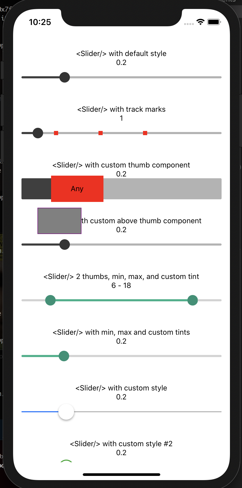
| renderAboveThumbComponent | function | Yes | null | Function which returns a custom Component of your liking to be rendered above the thumb and pass as props index of a thumb starting from 0 and its current value. |
| renderBelowThumbComponent | function | Yes | null | Function which returns a custom Component of your liking to be rendered below the thumb and pass as props index of a thumb starting from 0 and its current value. |
| renderThumbComponent | function | Yes | null | Function which returns a custom Component of your liking to be rendered within the thumb. |
| renderTrackMarkComponent | function | Yes | null | Function which returns a custom Component of your liking to be rendered on top of the slider truck at the values provided by trackMarks property. It accepts an index of a mark from trackMarks array the method is being executed for. |
| step | number | Yes | 0 | Step value of the slider. The value should be between 0 and maximumValue - minimumValue) |
| thumbImage | source | Yes | Sets an image for the thumb. | |
| thumbStyle | style | Yes | The style applied to the thumb | |
| thumbTintColor | string | Yes | '#343434' | The color used for the thumb |
| thumbTouchSize | object | Yes | {width: 40, height: 40} |
The size of the touch area that allows moving the thumb. The touch area has the same center as the visible thumb. This allows to have a visually small thumb while still allowing the user to move it easily. |
| trackClickable | bool | Yes | false | If true the user will be able to click anywhere on the track to set the value to that position. |
| trackMarks | Array | Yes | The value should be an array of numbers between minimumValue and maximumValue. In order to render a mark on top of the slider track at provided numbers renderTrackMarkComponent property should also be provided. |
|
| trackRightPadding | number | Yes | The padding that extends the track after the maximumValue (if not specified it will use the width of the thumb component) | |
| trackStyle | style | Yes | The style applied to the track | |
| minimumTrackStyle | style | Yes | The style applied to the track left of the thumb | |
| maximumTrackStyle | style | Yes | The style applied to the track right of the thumb | |
| value | number or Array | Yes | 0 | Initial value of the slider. The value should be a number or array of numbers between minimumValue and maximumValue, which default to 0 and 1 respectively. Default value is 0. This is not a controlled component, e.g. if you don't update the value, the component won't be reset to its inital value. |


![dependabot-preview[bot] avatar](https://avatars.githubusercontent.com/in/2141?v=4 "dependabot-preview[bot]")
![dependabot[bot] avatar](https://avatars.githubusercontent.com/in/29110?v=4 "dependabot[bot]")


 React
React
 Typescript
 Django
 Laravel
 Facebook
 Microsoft
 Google
 Alibaba
 D3
D3
 Tencent