I will merge pull requests but I don't have the time to actively support this now; sorry for any inconvenience.


Simple multiselect dropdown plugin for Angular 2.
The module relies on ngx-bootstrap for dropdown functionality.
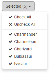
Icon fonts can be interchanged, by default ng2-dropdown-multiselect uses input[type="checkbox"].
To include in your project install via NPM with:
npm install --save ng2-dropdown-multiselect
You will then need to include the module to your app.module.ts:
import { DropdownMultiselectModule } from 'ng2-dropdown-multiselect';

// ...

@NgModule({
    imports: [
        DropdownMultiselectModule
    ]
})
// ...
Finally, include the component in your component HTML as per the next section.
Once the module is installed, you will need to add HTML markup to include the dropdown in a component. The minimum requirement is an [(ngModel)] attribute
<dropdown-multiselect
    [(ngModel)]="dropdownModel">
</dropdown-multiselect>
The [(ngModel)] attribute expects an array of objects to represent the dropdown options, this array should include the following properties:
| Property | Type | Required | Description |
|---|---|---|---|
| id | any |
Yes | A unique key for this option. |
| label | string |
Yes | A user friendly description. |
| selected | boolean |
No | Whether the option is selected by default. |
| color | string |
No | A hex color value, if provided a color tile will appear to the left of the label |
To aid in development, ng2-dropdown-multiselect exposes a TypeScript interface for the object properties, this can be referenced as a type in your component by importing it:
import { IDropdownItem } from 'ng2-dropdown-multiselect';Which can then be used as the type of the model object:
public dropdownModel: IDropdownItem[];

ngOnInit() {
    this.dropdownModel = [
        {
            id: 1,
            label: 'Today',
            selected: false, // optional
            color: '#336699' // optional
        }
        // ...
    ];
}
You can then reference the component's model property in the [(ngModel)] attribute:
<dropdown-multiselect
    [(ngModel)]="dropdownModel">
</dropdown-multiselect>
It is possible to configure ng2-dropdown-multiselect by providing a configuration object to
the [dropdownConfig] attribute (see the next section for more details on this object):
<dropdown-multiselect
    [(ngModel)]="dropdownModel"
    [dropdownConfig]="dropdownOptions">
</dropdown-multiselect>ng2-dropdown-multiselect exposes an interface to provide an indication of valid configuration properties,
this can be references as a type for your configuration object by importing it:
import { IMultiselectConfig } from 'ng2-dropdown-multiselect';Which can then be used as the configuration object type in your component:
public dropdownConfiguration: IMultiselectConfig;Current list of configuration options, types and default values
| Property | Type | Default | Description |
|---|---|---|---|
| defaultButtonText | string |
'Selected' | Displayed when the maxInline threshold is exceeded or 0 options are selected. |
| allSelected | boolean |
false | Select all options when the component is rendered. |
| maxInline | number |
3 | The max number of selected options that will display in the button. |
| showCheckAll | boolean |
false | Display a 'Check All' option at the top of the dropdown. |
| showUncheckAll | boolean |
false | Display a 'Uncheck All' option at the top of the dropdown. |
| buttonClasses | string[] |
['btn', 'btn-default'] | Array of classes added to the control button. |
| checkClasses | string[] |
[ ] | Array of classes added to the of checked options and "Check All" - will hide input[type="checkbox"]. |
| uncheckClasses | string[] |
[ ] | Array of classes added to the of "Uncheck All". |
| scrollingHeight | number |
200 | Height at which the dropdown will start to scroll. |
ngx-bootstrap has removed the option to close on outside click for the time being, therefore as a temporary measure I have added [autoClose] as an extra attribute on the dropdown, default to false which will then only close on button close. Hopefully the guys over at ngx-bootstrap will fix this sooner rather than later as this is less-than-ideal for a dropdown multiselect.


 React
React
 Typescript
 Django
 Laravel
 Facebook
 Microsoft
 Google
 Alibaba
 D3
D3
 Tencent