Giter VIP home page Giter VIP logo

bit-frontend's Introduction

Bit Frontend

Our project is built on create-react-app and utilizes functional components with the help of React Hooks to handle the "lifecycle" of each component. We use Redux to handle our complex state management and styled-components for styling our components. All our designs are prototyped in our Figma

Guidelines for Creating Components

// overview

General Process

  1. Visually, all components are first prototyped on Figma. Here's the link
  2. Then we implement it in our project, on the particular view it should appear on. If it's a new view, you can create a page for it, linking it through the App component and use that area as your workspace.

Styling

In order to create responsive styling in our application, we use ems and percents for everything from container sizes to fonts instead of px. We created global media queries that vary font-sizes so that by using ems, every device will have a similar user experience. This doesn't extend to mobile devices, however, but right now our focus is desktop and tablet users.

Structure

Imports: should be at the top of the file

styled-components: declarations should come next, generally placed in the order that they are used.

Components:

  • all styled-components declarations should be outside the component, before the component's declaration.
  • all props for the component should be destructured inline in the component parameters. This is to create a visible interface for each components.
  • In the body of the component, variables should generally come, then Hooks, then functions, and then the rendering return.
  • If the component is connected to the Redux store, the mapStateToProps and mapDispatchToProps` functions should come next.
  • If there are multiple components in a file, then the above points, including styled-components will still apply, so that each component will have its own section in the file.

Helpful Notes

Try to reuse components as much as possible. The shared components folder is under src/components/shared/. The low folder indicates that the component a very low-level, meaning it can be reused without much discretion. The high folder indicates that a component is a lot more specific, but still reusable, and tends to combine many low components. The containers folder indicates that the component is used as a wrapper or container for many other components.

Work in Progress

Documentation is a work in progress right now and much more will be created so that new contributors will have a more streamlined process in contributing to our project.

bit-frontend's People

Contributors

bitprojdev avatar bryanwong8 avatar lazyplatypus avatar lohnguyen avatar poroia avatar tomstepp avatar

Stargazers

 avatar  avatar  avatar  avatar  avatar  avatar  avatar  avatar  avatar  avatar  avatar  avatar

Watchers

 avatar  avatar  avatar  avatar  avatar

bit-frontend's Issues

Create [ModuleSummary] component

Create a module summary component that will be on the Explore and Module pages.

  • For now, don't worry about its function, though it will be connected to an API eventually.
  • use AvatarGroup for the avatars. It's located under src/components/shared/high. Regarding the number of contributors, it can be made static for now but in the future, when the component is connected to our API, the AvatarGroup may need a little modification to account for the number of contributors. Since we don't have the API data right now, you can bypass that, but it's on the roadmap. See an example usage for AvatarGroup under src/components/Student/Dashboard/Journey/Floating.js.

image
The component is under the Explore and Module pages under Student View on the Figma.

For now, place this component under src/components/shared/high

This component can be directly created in the World component. This component can be accessed through src/components/World/World.js. As shown in App.js, this component/view can be accessed by typing in the url: /world/:id where :id is equal to any number

Convert Frontend to adopt new Modular backend system

  • fetch FetchUserData, FetchTeacherData, FetchStudentData with user id, student id, teacher id
  • convert login
  • put FetchUserData info in Redux state "account"
  • convert all previously userData in studentData info into userData

Implement Infinite Scrolling for [Module] Component

Is your feature request related to a problem? Please describe.
Need to load activities from modules dynamically since everything is static right now.

Describe the solution you'd like
For all the modules in the module page, grab all of their activities and as the user scrolls down, the activities should be dynamically loaded. Each of the loaded activities should look like the Figma design below.

Figma Design
Screen Shot 2020-04-30 at 3 38 37 PM
Reference: Student View -> Module Page

Component Details

  • Adjust the component in src/components/Explore/FeaturedDisplay.js to make the activity have the option to have a header or without the header. This is to display the activities under the FeaturedActivity to have headers
  • Adjust the logic in src/components/Explore/FeaturedDisplay.js to display many activities with infinite scrolling
  • Test infinite scrolling with an array of JSON objects that contain the data needed to display an activity

Adjust Grading View

  • Display the correct answer for Multiple Choice Checkpoints
  • Adjust the image quality for image checkpoints

Screen Shot 2020-04-19 at 3 17 32 PM

- Fix the markdown renderer for Short Answer Checkpoints. There are weird "///" in the short answer

Screen Shot 2020-04-19 at 3 15 46 PM

Add ActionCard and ActivityList Component to the [Module] Component

Is your feature request related to a problem? Please describe.
Integrate the action card component and ActivityList to the right side bar of the Module Component.

Describe the solution you'd like

  • Add the ActionCard and ActivityList Component to the right sidebar of the Module Component.
  • Test that when the activity is clicked in the ActivityList, make sure that it leads to the learning view

Figma Design
Screen Shot 2020-04-30 at 4 33 23 PM

Component Details

  • You can find the ActionCard in src/components/shared/high/ActionCard.js
  • You can find the ActivityList in src/components/Student/Module/ActivityList.js
  • Integrate the ActionCard and ActivityList in RightSidebar.js in src/components/Explore/RightSidebar.js

Create [PageHeader] component

This component will act as a header for the Explore, World, and Module pages and would need to be created to properly adjust to each page.
It is in progress/finished by Daniel Kim on Slack. If you would like to work on this, please contact him.

  • You would probably need to utilize the AvatarGroup under src/components/shared/high to create the avatars. See an example usage under src/components/Student/Dashboard/Journey/Floating.js. This component requires names for the AvatarGroup which may not have been built yet. See #19.
  • Use the reusable button from src/components/shared/low for the action button.
  • For the Last Commit part next to the star, consider using IconLine under src/components/shared/low

image
The component is under the Explore, World, and Module pages under Student View on the Figma.

For now, place this component under src/components/shared/high

This component can be directly created in the Activity component, which is under src/components/Activity/Activity. As shown in App.js, this component/view can be accessed by typing in the url: /activities/:id where :id is equal to any number

Adjust [FeaturedDisplay] Component

Is your feature request related to a problem? Please describe.
FeaturedDisplay component needs to be adjusted to look more like the design on Figma.

Describe the solution you'd like

  • There needs to be more padding for the title and summary of the FeaturedDisplay.
  • The authors need to be place before the summary of the activity
  • The authors name must be place next to the images
  • Decrease the spacing between author images
  • Add dummy data and lightning icon for the last commit date

Figma Design
Screen Shot 2020-04-30 at 4 21 54 PM

Component Details

  • Adjust the FeaturedDisplay Component in src/components/Explore/FeaturedDisplay.js

Modify [AvatarGroup] to display Names

Right now, AvatarGroup (src/components/shared/high/AvatarGroup) takes in a collection of children that get recomposed and cloned to have proper spacing and size specified by AvatarGroup. We may need to add another capability to the component where an array of objects with names are passed to the AvatarGroup which then gets mapped out onto the child clone and write names to the side.

  • See an example usage of AvatarGroup under src/components/Student/Dashboard/Journey/Floating.js.

Need to be added:

  • names: array, an array of names that will be mapped onto the Avatar children's name prop
  • showNames: boolean, decides whether or not to show names onto the rightside of the component, uses names prop

image
This can be seen under the Explore Page on the Middle component (also known as FeaturedContent) on the Figma

Create [ActivitySummary] component

Create an [ActivitySummary] component that will give a summary on a particular Activity.

-This will eventually be connected to our API but for now, we'll focus on building out the visual aspects.

  • You would probably need to utilize the AvatarGroup under src/components/shared/high to create the avatars. See an example usage under src/components/Student/Dashboard/Journey/Floating.js. This component requires names for the AvatarGroup which may not have been built yet. See #19.

image
The component is under the Explore, World, and Module pages under Student View on the Figma.

For now, place this component under src/components/shared/high

Create [FeaturedActivity] component

Create a component that will be used as a "featured" content for a particular page. This will need to accept dynamic props like title, description, authors, and will likely eventually need to be connected to our API, but the API part is not part of this issue.

  • For this component, apart from the props, it will likely utilize the AvatarGroup under src/components/shared/high to create the avatars. See an example usage under src/components/Student/Dashboard/Journey/Floating.js. This component requires names for the AvatarGroup which may not have been built yet. See #19.
  • For the Last Commit part next to the star, consider using IconLine under src/components/shared/low.

image
The component is under the Explore, World, Activity, and Module pages under Student View on the Figma.

For now, place this component under src/components/shared/high

This component can be directly created in the World component. This component can be accessed through src/components/World/World.js. As shown in App.js, this component/view can be accessed by typing in the url: /world/:id where :id is equal to any number

Make Reusable Action Cards

Make Reusable Action Cards that can display different content based on Passed Props using Styled Components

  • Screenshot at Apr 12 23-49-05

  • Screenshot at Apr 12 23-51-36

Render Activities in Blog Format.

LIst out all Activity Steps into one single unified page making sure to convert key checkpoints into a readable format.

In addition, get props for Prereqs, Objectives, and Authors.

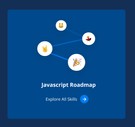
Create [RoadMap] component

Create a reusable roadmap component

The emojis will be a svg, so it's mainly creating the header and action button.

image
The exact component can be found under Figma/Student View/Explore Page and Figma/Student View/Module Page. Accordingly, it would probably need an invert prop to account for the two modes in each of the specified views on Figma.

In order to retrieve the SVG, refer to the project README about extracting SVGs from Figma

For now, place this component under src/components/shared/high

This component can be directly created in the Module component (which already has content at the moment, but will need to be eventually reimplemented like in the Figma under Module Page, so ignore the other content for now and create this component below it). This component can be accessed through src/components/Module/Module.js. As shown in App.js, this component/view can be accessed by typing in the url: /modules/:id where :id is equal to any number

Fix up the [Sidebar] Component

Several instances of a [Sidebar] component exist throughout the project: one in Learn, one in Explore, and one in Teacher. We need to combine them and create several variants. It would be best to start from the one in the Teacher View, as the look-and-feel of it is what we want to pursue.

image

This picture is under Explore Page Module Page World Page and Activity View under the Student View in Figma.

If you would like to work on this, please contact Bryan Wong on Slack to give yourself a role of the teacher by getting your account a teacherId.

Notes: This would be more difficult as it involves knowing more features of the project and modifying multiple parts of the project while still keeping it intact.

For now, place this component under src/components/shared/high

This component can be directly created in the Module component (which already has content at the moment, but will need to be eventually reimplemented like in the Figma under Module Page, so ignore the other content for now and create this component below it). This component can be accessed through src/components/Module/Module.js. As shown in App.js, this component/view can be accessed by typing in the url: /modules/:id where :id is equal to any number

Modify [ChooseProject] for UX improvements

Currently, [ChooseProject] (/src/components/Student/Dashboard/ChooseProject.js) is split up into two states, a menu selection and details selection. This new change will improve the UX (and also UI).

  • To tackle this, generally pull from what is already existing and combine it to the new UI.
  • The sidebar will be a little harder and should be borrowed from #14 .

image
This is under Choose Project under the Figma Tab Student View.

To be able to work on this, you need have access to a classroom which you can join through the homepage using the code : juJLr. From then on, the Pick a Project button will lead you to the current ChooseProject.

Connect [PageHeader] Component with backend

Is your feature request related to a problem? Please describe.
The PageHeader now needs to connect to the backend so we can start working with dynamic data.

Describe the solution you'd like
Call the backend to get data for ModuleProgress.

Figma Design
Screen Shot 2020-05-01 at 6 12 32 PM

Component Details

  • Need to call /modules/<int:module_id>/progress to get the module data like title. This is call should be called in src/components/Explore/Explore.js so then the appropriate data can be passed as props to the header component.
  • For now display the first ModuleProgress that the Student has.
  • You can see how API calls are made in one of the files in src/services. API call should be made in src/services/ExploreService.js

Figure out Logic for Explore Page

Logic to dynamically fetch card content (authors, title, desc, etc) for the Explore Page.

Filter tutorials loaded by Sidebar selection. (React.js loads React.js tutorials)

Recommend Projects

  • React photo React

    A declarative, efficient, and flexible JavaScript library for building user interfaces.

  • Vue.js photo Vue.js

    ๐Ÿ–– Vue.js is a progressive, incrementally-adoptable JavaScript framework for building UI on the web.

  • Typescript photo Typescript

    TypeScript is a superset of JavaScript that compiles to clean JavaScript output.

  • TensorFlow photo TensorFlow

    An Open Source Machine Learning Framework for Everyone

  • Django photo Django

    The Web framework for perfectionists with deadlines.

  • D3 photo D3

    Bring data to life with SVG, Canvas and HTML. ๐Ÿ“Š๐Ÿ“ˆ๐ŸŽ‰

Recommend Topics

  • javascript

    JavaScript (JS) is a lightweight interpreted programming language with first-class functions.

  • web

    Some thing interesting about web. New door for the world.

  • server

    A server is a program made to process requests and deliver data to clients.

  • Machine learning

    Machine learning is a way of modeling and interpreting data that allows a piece of software to respond intelligently.

  • Game

    Some thing interesting about game, make everyone happy.

Recommend Org

  • Facebook photo Facebook

    We are working to build community through open source technology. NB: members must have two-factor auth.

  • Microsoft photo Microsoft

    Open source projects and samples from Microsoft.

  • Google photo Google

    Google โค๏ธ Open Source for everyone.

  • D3 photo D3

    Data-Driven Documents codes.