In this repository, I'll explore the use of clustering to learn the features of bike share time series data, which I had obtained and cleaned.
The goal of this project is for me to learn about some unsupservised learning techniques on real data sets. The Bike Share Toronto data set contains individual trips taken between 291 stations on record, including trip dates/times and departure/arrival stations. This allows us to calculate the total number of bikes arriving and leaving a station during any hour on record.
Some questions to think about based on the data:
- What are the prominent features of the groups of stations within each cluster?
- Given the setting of the analysis, what is a rigorous way to score the clustered results? We are not testing the classification of new data, but on how "well-defined" the clusters are based on some measure (i.e. silhouette coefficient).
- We can see if clustering on the feature vectors imply some sort of clustering in spatial coordinates of the stations.
An ideal measure of station usage as a function of time, would be the fraction of availability, calculated as the number of available bikes at a station divided by the total capacity of the station.
While this information is live and available (TBD), it has not been mined and extracted for analysis (TBD).
Instead, I'll define a proxy for usage based on available data.
< traffic >(hr) = (< num_arrival >(hr) - < num_departure >(hr)) / capacity
where hr = [0,1,..23]. The above formula denotes the average amount of "traffic", defined as the difference in the total number of bikes at the station during each hour, averaged over the number of days on record (averaging is denoted by angular brackets <...>).
With the k-means clustering algorithm, while labelled data is unnecessary, we have to provide beforehand the number of clusters we want to the data to be segmented into.
On n_clusters = 3, the centroid for each cluster, which is a time series representative of the cluster are shown in the following plot:
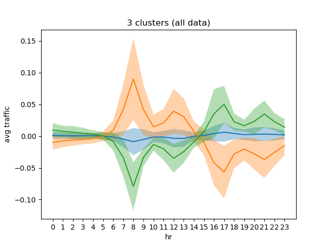
We can see some interesting features: the largest cluster (comprises > 60% of the stations) are characterized by low traffic behaviour. The other two centroids show opposite "rush hour" behaviours, They distinguish groups of stations which have:
- Peaks during morning rush/noon, troughs during evening rush/nighttime.
- Troughs during morning rush/noon and peaks during evening rush/nighttime.
While the above plot has nice interpretation, I try to see if the cluster memberships are well-classified, depending on the number of clusters chosen for k-means. To do this, I computed the silhouette coefficient averaged over all data points, as a function of the number of clusters.
The silhouette coefficient for a point is a value in [-1, 1] that measures (based on Euclidean distance) how well separated the point is to other clusters. It is depends on its intra-cluster distances to all other points within its cluster, and inter-cluster distances to points in other clusters. Silhouette coefficients (as these values are referred to as) near 1 indicate that the sample is far away from the neighboring clusters. A value of 0 indicates that the sample is on or very close to the decision boundary between two neighboring clusters and negative values indicate that those samples might have been assigned to the wrong cluster 1.
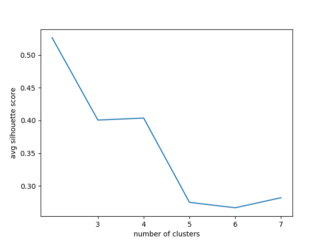
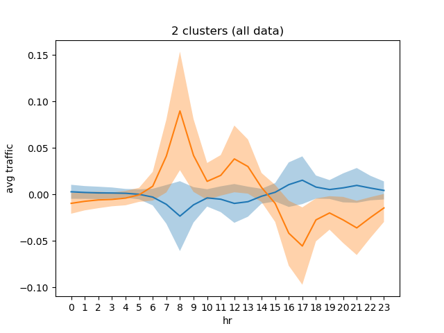
From the plot, we see that n_clusters >= 5 score poorer. while n_clusters = 2 scores the best, we have to analyze further to see if the cluster members are well-represented by this scoring method (TBD). Below are some plots for these cluster sizes:
I am weary of this result since the n_clusters = 3 plot shows that the "rush hour" clusters are roughly the same in magnitude in their means and fluctuations. So, while forcing one of them to be clustered with the low-usage cluster results in a higher scoring, the scoring method is Euclidean distance-based just like the clustering method so some bias can be introduced...
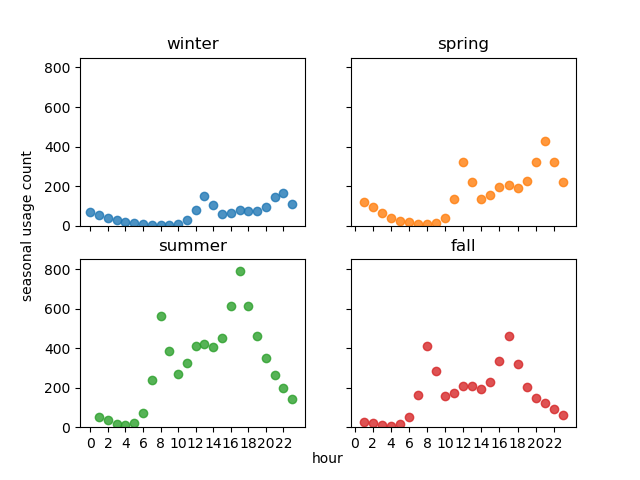
The aggregating the total number of trips per hour, conditioned on the season, we can see something interesting: that in the Summer+Fall seasons peak bike usages occur at morning/evening rush hours, while in the Winter+Spring seasons the peak usages occur at noon/nighttime.
Based on the above observation, I tried clustering again the Winter+Spring and Summer+Fall subsets of data. We can indeed separate the the rush hour and nighttime usage behaviours:

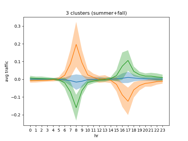
Silhouette scoring from above rules out n_clusters >= 5. Again, n_clusters = 2 gives the best scoring. The scoring for 3 to 4 clusters however ranges from ~ 0.44-0.5.
Extra plots not shown here are collected in the figures folder.
- Further analyze the quality of cluster assignments (bootstrapping?) and scoring metric (TBD).
- The main insight of this analysis shows that difference in seasonal usage accounts for a change in behaviour of the traffic in heavily-used bike share stations.
- By using the full time series (rather than taking averages), the feature vectors will encode the seasonal differences. This can allow us to see if some stations change their behaviours (from rush hour peak traffic to nighttime peak traffic) depending on the time of the year. Of course, this means that the feature vector will be much higher dimension...
- Does clustering in temporal behaviour translate to clustering in space? i.e. stations that are belong in the same clusters are also located close to each other in the city.


