Giter VIP home page Giter VIP logo

storybook-addon-pseudo-states's Introduction

Storybook Pseudo States

Toggle CSS pseudo states for your components in Storybook.

Published on npm Tested with Chromatic

Introduction

This addon attempts to "force" your components' pseudo states. It rewrites all document stylesheets to add a class name selector to any rules that target a pseudo-class (:hover, :focus, etc.). The tool then allows you to toggle these class names on the story container (#root) or any other root element you want (via the rootSelector param). Additionally, you can set the pseudo property on your story parameters to set a default value for each pseudo class. This makes it possible to test such states with Chromatic.

Limitations

Because this addon rewrites your stylesheets rather than toggle the actual browser behavior like DevTools does, it won't render any of the default user agent (browser) styles. Unfortunately there's no JavaScript API to toggle real pseudo states without using a browser extension.

Getting Started

This addon requires Storybook 6.1 or later. Install the latest with npx sb upgrade --prerelease

First, install the addon:

npm i -D storybook-addon-pseudo-states

Then, add "storybook-addon-pseudo-states" to the addons array in your .storybook/main.js:

module.exports = {
  addons: ["storybook-addon-pseudo-states"],
}

Setting default story states

You can have your stories automatically use a specific set of pseudo states, by setting the pseudo property on parameters:

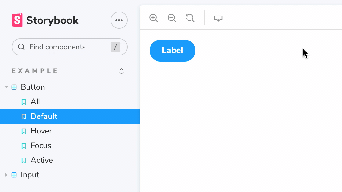
export const Hover = () => <Button>Label</Button>
Hover.parameters = { pseudo: { hover: true } }

This is what enables snapshot testing your pseudo states in Chromatic.

Targeting specific elements

If you don't want to force or toggle pseudo styles to all elements that use them, but rather only enable them on specific elements, you can set a string or array value instead of a boolean:

export const Buttons = () => (
  <>
    <Button id="one">Hover</Button>
    <Button id="two">Hover focus</Button>
    <Button id="three">Hover focus active</Button>
  </>
)
Buttons.parameters = {
  pseudo: {
    hover: ["#one", "#two", "#three"],
    focus: ["#two", "#three"],
    active: "#three",
  },
}

This accepts a single CSS selector (string), or an array of CSS selectors on which to enable that pseudo style.

Overriding the default root element

By default, we use #storybook-root (or #root before Storybook 7) element as the root element for all pseudo classes. If you need to render elements outside Storybook's root element, you can set parameters.pseudo.rootSelector to override it. This is convenient for portals, dialogs, tooltips, etc.

For example, consider a Dialog component that inject itself to the document's body node:

export const DialogButton = () => (
  <Dialog>
    <Button>Hover</Button>
  </Dialog>
)

DialogButton.parameters = {
  pseudo: { hover: true, rootSelector: "body" },
}

storybook-addon-pseudo-states's People

Contributors

chromatic-support avatar dmaulick-cb avatar dsueltenfuss avatar filipw01 avatar ghengeveld avatar ilanus avatar jonathankolnik avatar jpzwarte avatar jreinhold avatar jrolfs avatar kasperpeulen avatar m-akinc avatar sag1v avatar shaunevening avatar tobi-or-not-tobi avatar valentinpalkovic avatar wegry avatar yasnbouz avatar

Stargazers

 avatar  avatar  avatar  avatar  avatar  avatar  avatar  avatar  avatar  avatar  avatar  avatar  avatar  avatar  avatar  avatar  avatar  avatar  avatar  avatar  avatar  avatar  avatar  avatar  avatar  avatar  avatar  avatar  avatar  avatar  avatar  avatar  avatar  avatar  avatar  avatar  avatar  avatar  avatar  avatar  avatar  avatar  avatar  avatar  avatar  avatar  avatar  avatar  avatar  avatar  avatar  avatar  avatar  avatar  avatar  avatar  avatar  avatar  avatar  avatar  avatar  avatar  avatar  avatar  avatar  avatar  avatar  avatar  avatar  avatar  avatar  avatar  avatar  avatar  avatar  avatar  avatar  avatar  avatar  avatar

Watchers

 avatar  avatar  avatar  avatar  avatar  avatar  avatar  avatar  avatar  avatar

storybook-addon-pseudo-states's Issues

Use the new Framework API

Opening this issue so we can address the upcoming changes on how addons are built/updated for the upcoming 7.0 release. If anyone is interested in making the changes required and continuing to support and maintain the addon, let us know so that we're aware and help/guide the community moving forward. To help with this process, we've built an abridged guide here, and should any questions or issues, please reach out to us in the prerelease channel in our Discord Server.

Selecting specific element also applies pseudostate to all its descendants

Because of this rewrite logic if .pseudo-* class is applied to a specific element it triggers all descendants' pseudostate
https://github.com/chromaui/storybook-addon-pseudo-states/blob/main/src/rewriteStyleSheet.test.js#L26-L30

when: parameters = { pseudo: { hover: '.someSelector' } } or parameters = { pseudo: { hover: ['.someSelector', 'div'] } }

Current state:
a:hover -> a:hover, a.pseudo-hover, .pseudo-hover a

Proposed change:
a:hover -> a:hover, a.pseudo-hover

when: parameters = { pseudo: { hover: true } }

no changes - a:hover -> a:hover, a.pseudo-hover, .pseudo-hover a

Several pseudo selectors inside ::slotted() not working

We're using this plugin to preview various states of our (lit based) web components. It works awesome, however we encountered a couple of CSS selectors that are causing the following error:

999.3e99130f.iframe.bundle.js:2 DOMException: Failed to execute 'insertRule' on 'CSSStyleSheet': Failed to parse the rule '::slotted(:hover:not(:active)), :host(.pseudo-hover.pseudo-active) ::slotted(:not()) { box-shadow: var(--oryx-elevation-1) var(--oryx-elevation-color); }'.
    at rewriteStyleSheets (https://***/999.3e99130f.iframe.bundle.js:2:2443621)
    at https://***/999.3e99130f.iframe.bundle.js:2:2444564 null

The various (valid) selectors that cause this behaviour are:
(adding all of them, but it's a common pattern)

::slotted(:hover:not(:active)) { ... }

::slotted(:is(button, a):active) { .. }

::slotted(:is(button, a):focus-within:focus-visible:not(:active)) { ... }

:host([outline]) ::slotted(:is(button, a):not(:active)) { ... }

:host([outline]) ::slotted(:is(button, a):active) { ... }

:host([outline]) ::slotted(:is(button, a):focus-within:focus-visible:not(:active)) { ... }

:host([type='secondary']) ::slotted(:is(button, a):focus-within:focus-visible:not(:active)) { ... }

We could unblock ourselves by changing the selectors, using specific elements.

 ::slotted(button:hover:not(button:active)),
  ::slotted(a:hover:not(a:active)) { ... }

Even the star selector (*:hover) or leaving out a specific element (:hover) wasn't enough. We not like to changes our selectors and are worried about future component development.

Any change you can support those selectors?

Cannot find module '@storybook/manager-api'

Hi.

Trying to install storybook-addon-pseudo-states to our Storybook v6.5.16

npm i -D storybook-addon-pseudo-states

Added 'storybook-addon-pseudo-states' to the addons array in our .storybook/main.js

Storybook builds but the button is not available in the toolbar, no states styles are created when setting the parameters in the story.

I am getting the following error in my console:

vendors-node_modules_etchteam_storybook-addon-status_register_js-node_modules_storybook_addon-3f5fbe.manager.bundle.js:129599
Uncaught Error: Cannot find module '@storybook/manager-api'
    at webpackMissingModule (vendors-node_modules_etchteam_storybook-addon-status_register_js-node_modules_storybook_addon-3f5fbe.manager.bundle.js:129599:96)
    at ./node_modules/storybook-addon-pseudo-states/dist/manager.js (vendors-node_modules_etchteam_storybook-addon-status_register_js-node_modules_storybook_addon-3f5fbe.manager.bundle.js:129599:193)
    at __webpack_require__ (runtime~main.manager.bundle.js:23:42)
    at __webpack_exec__ (main.manager.bundle.js:69:48)
    at main.manager.bundle.js:70:1162
    at __webpack_require__.O (runtime~main.manager.bundle.js:60:23)
    at main.manager.bundle.js:71:56
    at webpackJsonpCallback (runtime~main.manager.bundle.js:319:39)
    at main.manager.bundle.js:1:91

Am I missing something?

storybook-addon-pseudo-states doesn't work correctly

Hello! The dropdown icon appears but when I click on some list item like ':active' nothing happens.

this is how my package.json looks like

  "devDependencies": {
    "@storybook/addon-essentials": "^7.0.17",
    "@storybook/addon-interactions": "^7.0.17",
    "@storybook/addon-links": "^7.0.17",
    "@storybook/blocks": "^7.0.17",
    "@storybook/nextjs": "^7.0.17",
    "@storybook/react": "^7.0.17",
    "@storybook/testing-library": "^0.0.14-next.2",
    "storybook": "^7.0.17",
    "storybook-addon-pseudo-states": "^2.0.1",
  }

this is main.ts

const config: StorybookConfig = {
stories: ['../src//*.mdx', '../src//*.stories.@(js|jsx|ts|tsx)'],
addons: [
'@storybook/addon-links',
'@storybook/addon-essentials',
'@storybook/addon-interactions',
"storybook-addon-pseudo-states"
]
}
export default config

Breaking Chakra on storybook 7 build

If you install this plugin with the @next to support storybook 7, the components that rely on chakra stop rendering correctly after build-storybook.

I've created a reproduction repo
https://github.com/wladiston/chakra-sb7-bug-repro

Just execute storybook dev mod and build + preview to see the differences. If you comment the line that adds storybook-addon-pseudo-states on main.ts you will git it built correctly.

[Feature request] Target only specific elements with the hover-state

Hey!

Great plugin, already wrote tons of stories that finally need to have their pseudo states checked :)

One feature idea I had was being able to target just a specific element rather than activating the pseudo-state on all elements.

A good example for this would be a Select or a List.

[ List item 1 ]
[ List item 2 ]
[ List item 3 ]
[ List item 4 ]

If I want to check that an element has the correct hover state, I kinda just want to activate it on one item.

I'm not sure how that'd look in an implementation, but I think we might need to be able to get our hands on the WithPseudoState and wrap it around specific components, i.e.

<WithPseudoState state="hover" target="[data-testid=3]">
  <List
    items={[
      { id: 1, label: 'Item 1' },
      { id: 2, label: 'Item 2' },
      { id: 3, label: 'Item 3' },
      { id: 4, label: 'Item 4' },
    ]}
  />
</WithPseudoState>

I've completely made this up but maybe something along those lines could work?

Thanks a lot!

pseudo-state rules passed to a scss media query mixin do not appear to be added to the DOM

:hover definitions defined in scss and passed through to a media query mixin via@include and @content do not appear to be added to the DOM.

I am using:

โ”œโ”€โ”€ @storybook/[email protected]
โ”œโ”€โ”€ [email protected]

The storybook bits work great, thank you. The pseudo-class class is added where I want it, but the related CSS definition is not added to the DOM.

Works:

.component:hover {
    background-color: purple;
}

Does not work:

@include medium {
    .component:hover {
        background-color: purple;
    }
}

Where mixins have been previously defined:

@mixin medium {
  @include breakpoint(777px) {
    @content;
  }
}

@mixin breakpoint($breakpoint) {
  @media (min-width: #{$breakpoint}) {
    @content;
  }
}

I'm not sure if this has to do with the rules being inside a mixin, a media query, or what.

[Feat request] Support different root element

Currently the lib decide about what is the root element to use for the query see this line.

The issue with this approach, is that sometimes the elements we want to query are rendered outside of this "root" element, E.g: Modals, popovers and portals in general that are attached to the document.body.

I don't see any way to work around this issue with the current implementation, so I'm suggesting an additional API that will allow consumers to pass a root element:

For example:

pseudo: {
  root: document.body, // <- new API
  hover: '.my-tooltip'
}

This can be done in the applyParameter function, we just need to take in account the root parameter and have a fallback to whatever we have today in case the consumer didn't pass it.

  const {root = rootElement, ...parameters} = parameter // <- get the root param with a fallback and also filter it out from the rest of the parameters (i.e states).

  Object.entries(parameters || {}).forEach(_ref => {
    let [state, value] = _ref;

    if (typeof value === "boolean") {
      // default API - applying pseudo class to root element.
      add(root, value && state);
    } else if (typeof value === "string") {
        // explicit selectors API - applying pseudo class to a specific element
        root.querySelectorAll(value).forEach(el => add(el, state));

    } else if (Array.isArray(value)) {
      // explicit selectors API - we have an array (of strings) recursively handle each one
      value.forEach(sel => root.querySelectorAll(sel).forEach(el => add(el, state)));
    }
  });

@ghengeveld WDYT?

DOMException: Failed to execute 'insertRule'

I have run into this issue when adding this plugin for storybook.

DOMException: Failed to execute 'insertRule' on 'CSSStyleSheet': Failed to parse the rule '.btn-primary:hover:not(:active):not(:disabled):not(.disabled), .pseudo-hover.pseudo-active .btn-primary:not():not(:disabled):not(.disabled) { background-color: rgb(74, 143, 33); border-color: rgb(67, 118, 43); }'.
at rewriteStyleSheets (http://localhost:6006/vendors-node_modules_storybook_addon-actions_dist_esm_preset_addArgs_js-generated-config-entr-fcfaa8.iframe.bundle.js:45960:21)
    at Object.<anonymous> (http://localhost:6006/vendors-node_modules_storybook_addon-actions_dist_esm_preset_addArgs_js-generated-config-entr-fcfaa8.iframe.bundle.js:45994:10)
    at http://localhost:6006/vendors-node_modules_storybook_addon-actions_dist_esm_preset_addArgs_js-generated-config-entr-fcfaa8.iframe.bundle.js:5199:14
    at Array.forEach (<anonymous>)
    at Channel.handleEvent (http://localhost:6006/vendors-node_modules_storybook_addon-actions_dist_esm_preset_addArgs_js-generated-config-entr-fcfaa8.iframe.bundle.js:5198:19)
    at handler (http://localhost:6006/vendors-node_modules_storybook_addon-actions_dist_esm_preset_addArgs_js-generated-config-entr-fcfaa8.iframe.bundle.js:5124:16)
    at Channel.emit (http://localhost:6006/vendors-node_modules_storybook_addon-actions_dist_esm_preset_addArgs_js-generated-config-entr-fcfaa8.iframe.bundle.js:5131:9)
    at http://localhost:6006/vendors-node_modules_storybook_addon-actions_dist_esm_preset_addArgs_js-generated-config-entr-fcfaa8.iframe.bundle.js:8503:43
    at _callee12$ (http://localhost:6006/vendors-node_modules_storybook_addon-actions_dist_esm_preset_addArgs_js-generated-config-entr-fcfaa8.iframe.bundle.js:8390:38)
    at tryCatch (http://localhost:6006/vendors-node_modules_storybook_addon-actions_dist_esm_preset_addArgs_js-generated-config-entr-fcfaa8.iframe.bundle.js:44486:40)

Looks like plugin, maby doesn't know how to read .scss file styles?

Optional chaining error in 1.15.2

Hi!

There seems to be a bug introduced in 1.15.2 where optional chaining has been used. This creates the following error:

ERROR in ./node_modules/storybook-addon-pseudo-states/dist/esm/withPseudoState.js 91:17
Module parse failed: Unexpected token (91:17)
You may need an appropriate loader to handle this file type, currently no loaders are configured to process this file. See https://webpack.js.org/concepts#loaders
| const rewriteStyleSheets = shadowRoot => {
|   let styleSheets = shadowRoot ? shadowRoot.styleSheets : document.styleSheets;
>   if (shadowRoot?.adoptedStyleSheets?.length) styleSheets = shadowRoot.adoptedStyleSheets;
|   Array.from(styleSheets).forEach(sheet => rewriteStyleSheet(sheet, shadowRoot, shadowHosts));
| };

Node version: v14.19.3
Plugin version: 1.15.2
Webpack version: 4.46.0
Storybook version: 6.5.14

Would it be possible to compile the optional chaining via babel in the generated module code?

Pseudo classes are generated when pseudo is excluded

When a pseudo selector is used in an exclusion, i.e. :not(:hover), it should not be used to generate a pseudo state class.

We've seen this in various rules:

:not(:hover) { ... }
foo > bar :not(:hover) { ... }
foo > bar :not(item:hover) { ... }

The regex to match those pseudo's should be improved to avoid the excluded pseudo's.

Provide a way to opt out of the auto-applied decorator

TL;DR: parameters.pseudos = false could be used to make the withPseudoState simply return the wrapped story


This addon globally applies the withPseudoState decorator. But, because of its usage of hooks (I think?), calling that decorator can cause problems in some contexts. In my case, it throws an error (see below) when called inside of the beforeScreenshot function of storyshots-puppeteer's imageSnapshot, but I'm guessing any usage outside of the Storybook preview context might be a problem.

Error: Storybook preview hooks can only be called inside decorators and story functions.

I've worked around this issue for now by manually applying the decorator instead of registering the addon, e.g.:

import { withPseudoState } from 'storybook-addon-pseudo-states/dist/withPseudoState'

export default {
  decorators: [withPseudoState],
}

But it'd be a much nicer API to register the addon and disable it (effectively, as Storybook doesn't allow you to truly disable/remove a decorator) for the edge cases where it causes problems.

Happy to try my hand at a PR if you agree.

DOMException: Failed to execute 'insertRule' on webkit rules

Was trying out this plugin so I'm on version 1.15.1 but getting the following errors. "@storybook/react": "^6.5.9",
DOMException: Failed to execute 'insertRule' on 'CSSStyleSheet': Failed to parse the rule 'body ::-webkit-scrollbar-thumb:hover, body ::-webkit-scrollbar-thumb.pseudo-hover, .pseudo-hover body ::-webkit-scrollbar-thumb { background: rgba(128, 135, 139, 0.8); }'.

DOMException: Failed to execute 'insertRule' on 'CSSStyleSheet': Failed to parse the rule '.custom-range::-webkit-slider-thumb:active, .custom-range::-webkit-slider-thumb.pseudo-active, .pseudo-active .custom-range::-webkit-slider-thumb { background-color: rgb(255, 230, 224); }'.

image
image

[ CRITICAL ]: Using the addon freezes the app

When having this addon on my storybook, the whole app would freeze and go unresponsive upon entering only a couple of characters in a controls field.

Any interaction with other addons would eventually, break the app.

No errors ever output in the console, so it was hard to trace it back to this dependency.

I hope this can prevent trouble for some people.

[Request] Support for Docs page

Hi! Wonderful work here.

I've noticed a recent merge of a PR that ostensibly adds support for docs page, but cannot tell if I's facing a bug, or I've misunderstood that PR. Looking at the code for the PR, and the code as-is in preset/manager.js:

    match: ({ viewMode }) => viewMode === "story",

It looks as though it's still conditionally rendering only in the "Canvas" tab - no?

I'd like to either see its continued presence in the "global" toolbar area no matter the current viewMode, or, see the button in each canvas block in the docs page in addition to existing behavior otherwise.

Regarding the latter suggestion: I'd tried really hard to find API or documentation about configuring or changing the toolbar for the primary story canvas in the docs page, and have had no luck. Would love to know if you guys know any better there.

In any case thanks again! <3

More sophisticated rule rewriting is needed

Exact error received:

withPseudoState.js:178 DOMException: Failed to execute 'insertRule' on 'CSSStyleSheet':
Failed to parse the rule '.MuiButtonGroup-root > :focus, .pseudo-focus .MuiButtonGroup-root >  { z-index: 2; }'

Input selector:

.MuiButtonGroup-root > :focus { ... }

Actual output selector:

.MuiButtonGroup-root > :focus, .pseudo-focus .MuiButtonGroup-root >  { ... }

Expected output selector (proposed):

.MuiButtonGroup-root > :focus, .pseudo-focus .MuiButtonGroup-root > * { ... }

Possibly related to #9.

CORS warnings

Can't access cssRules, most likely due to CORS restrictions https://use.typekit.net/zkq0zzv.css

Anyway to detect this and prevent "spamming" the console?

Generating pseudo states without opening Canvas

We found pseudo states generation very convenient for displaying various states in the Docs by applying them to the appropriate containers. It seems that classes are only generated and available for Docs after visiting any Canvas at least once. Would it be possible for pseudo states to be generated on Storybook load so that they are available in the Docs immediately?

Thank you!

I just submitted two issues, but I don't want those to overshadow that I really appreciate this addon. To capture pseudo states, I was previously defining a function in a story's parameters that would run inside of storyshots-puppeteer, just before the snapshot was taken. Using this addon is so much simpler, easier to understand, and a much better experience overall.

๐Ÿ™Œ

Pseudo classes incorrectly generated for group selectors with one pseudo match

Pseudo state classes generated by storybook-addon-pseudo-states failed to generate pseudo classes for the following:

.thumb:hover,
.thumb.active {
  opacity: 100%;
  border-color: white;
} 

The reason for this is that the :hover indicates that a pseudo class must be generated, however the 2nd selector is used similarly. This results in invalid CSS, hence the following error is thrown at the client:

withPseudoState.js:212 DOMException: Failed to execute 'insertRule' on 'CSSStyleSheet': Failed to parse the rule '.thumb:hover, :host(.pseudo-hover) .thumb, .thumb.active, :host() .thumb.active { opacity: 1; border-color: white; }'.

The problem, as shown in the error is that an incorrect CSS is generated for the 2nd selector in the group, which gets an incorrect :host() prefix.

Not working with Lit for component states

Hi,
We are trying to create some stories for our components states like hover but no luck.
Here you can look at our other issue before using this addon.

Code:

export const SingleButtonTemplate = (args) => html`<bl-button
    variant=${ifDefined(args.variant)}
    kind=${ifDefined(args.kind)}
    href=${ifDefined(args.href)}
    target=${ifDefined(args.target)}
    size=${ifDefined(args.size)}
    icon="${ifDefined(args.icon)}"
    label="${ifDefined(args.label)}"
    ?disabled=${args.disabled}
    style=${ifDefined(args.styles ? styleMap(args.styles) : undefined)}
      >${unsafeHTML(args.content)}</bl-button>`

export const Template = (args) => html`
${SingleButtonTemplate({content: 'Primary Button', ...args})}
${SingleButtonTemplate({variant: 'secondary', content: 'Secondary Button', ...args})}
${SingleButtonTemplate({variant: 'success', content: 'Success Button', ...args})}
${SingleButtonTemplate({variant: 'danger', content: 'Danger Button', ...args})}`;

export const states = {
  pseudo: {
    hover: "bl-button"
  }
}

<Canvas isColumn>
  <Story name="Primary Buttons Hover" args={{ content: 'Save', icon: 'info' }} parameters={states}>
    {ButtonTypesTemplate.bind({})}
  </Story>
  <Story name="Secondary Buttons Hover" args={{ variant: 'secondary', content: 'Save', icon: 'info' }} parameters={states}>
    {ButtonTypesTemplate.bind({})}
  </Story>
  <Story name="Success Buttons Hover" args={{ variant: 'success', content: 'Save', icon: 'info' }} parameters={states}>
    {ButtonTypesTemplate.bind({})}
  </Story>
  <Story name="Danger Buttons Hover" args={{ variant: 'danger', content: 'Save', icon: 'info' }} parameters={states}>
    {ButtonTypesTemplate.bind({})}
  </Story>
</Canvas>

It will not work well in Chromatic. Here you can see that our first button has no pseudo-class or Chromatic took a screenshot of this story like that. However, if you react to those stories in the storybook, everything seems fine. Unless, if you open canvas and go back to docs again (maybe twice), it will not work. Additionally, after you open canvas and use the left menu and reach the hover story, it will work for only that story.

I am using Chrome (Version 104.0.5112.101)

PS: If there is no parameter, simply returning StoryFn() may be considered as a performance improvement.

Thanks in advance

Incorrectly rewrites classnames with :state in name

In CSS, classnames may have colons (:). Tailwind CSS uses a state followed by a colon to express a utility class that only applies when that state is active (see https://tailwindcss.com/docs/hover-focus-and-other-states). An example could be: hover:border-red. This would apply the style for border-red only when the element is hovered.

The example (hover:border-red) would have the following generated CSS (by Tailwind):

.hover:border-red:hover {border: red;}

This is rewritten by the addon to:

.hover:border-red:hover, .hover:border-red.pseudo-hover, .pseudo-hover .hover:border-red {border: red;}

This rewrite is correct. However, when you combine two states, for example focus:hover:border-red. The translation is incorrect.

The example class translates to the following generated CSS (by Tailwind):

.focus:hover:border-red:hover:focus {border: red;}

The addon rewrites this to:

.focus:hover:border-red:hover:focus, .focus.pseudo-hover:border-red.pseudo-hover.pseudo-focus, .pseudo-hover.pseudo-hover.pseudo-focus .focus:border-red {border:red;}

Which is incorrect. The first :hover is also replaced by pseudo-hover.

The correct output would be:

.focus:hover:border-red:hover:focus, .focus:hover:border-red.pseudo-hover.pseudo-focus, .pseudo-hover.pseudo-focus .focus:hover:border-red {border:red;}

In short; when classnames have a colon followed by a state name in them, they are incorrectly replaced with the pseudo-states.

Interaction with UI crashes after installing this plugin

Whenever I interact with story with internal state, I'm landing on a crash screen like this.

image

It seems like this issue is only surfacing when I'm interacting with stories with internal state.
Other stories are working fine.

Storybook 6.5 peerDependencies react 18.1.0

With the new 6.5.x Storybook release and your package as dependency will break the 'npm install'.
Due the addons with ' || ^18.0.0' in it comes react '18.1.0' but your plugin dont accept that.

"react": "^16.8.0 || ^17.0.0",

    "react": "^16.8.0 || ^17.0.0",
    "react-dom": "^16.8.0 || ^17.0.0"

https://github.com/storybookjs/storybook/blob/4b849f9bcd1d76bd6a016d50f7f1cb8f7809ed31/lib/addons/package.json#L55

    "react": "^16.8.0 || ^17.0.0 || ^18.0.0",
    "react-dom": "^16.8.0 || ^17.0.0 || ^18.0.0"

or maybe i'm wrong :D

cheers

newRules contain errors, host not removed or modified

Our vanilla web components have a css like this

:host(:active) #person{
   border: 1px solid red;
}

when a pseudo state is set, the new rule contains an empty host(), which results in a insertRule fail.
See:

Failed to execute 'insertRule' on 'CSSStyleSheet': Failed to parse the rule ':host(:active) #person, :host(.pseudo-active) :host() #person

[Feature Request]: Activate several pseudo states

Hi,

Another feature I think could be hugely beneficial would be being able to activate several pseudo-states. This would be especially useful when having to save the amount of screenshots you take.

The way I could see this working is like this:

const Template = (args) => (
  <>
    <h1>Buttons: {args.pseudo}</h1>
    
    <Button>Default Button</Button>
    <ButtonText>Text Button</ButtonText>
    <ButtonOutline>Text Button</ButtonOutline>
   </>
)

Template.args = { pseudo: ['idle', 'hover', 'focus', 'active'] } 

Then the plugin could loop over the given states and render it like this:

<>
  <Template pseudo="idle" />
  <Template pseudo="hover" />
  <Template pseudo="focus" />
  <Template pseudo="active" />
</> 

That would be great because I could save myself the time writing loads of stories activating different states.

Let me know what you think!

Media queries mess up stylesheet override

Version v2.0.0-next.0

Because index is not incremented here, media queries just go to the next rule. This leads to a situation where

@media only screen and (max-width: 790px) {
    .test {
    	background-color: green;
	}
}

.test {
    background-color: blue;
}

.test:hover {
    background-color: red;
}

.test2:hover {
	background-color: white;
}

is rewritten to

@media only screen and (max-width: 790px) {
    .test {
    	background-color: green;
	}
}

.test:hover, .pseudo-hover.test, .pseudo-hover .test {
    background-color: red;
}

.test2:hover, .pseudo-hover.test2, .pseudo-hover .test2 {
	background-color: white;
}

.test2:hover {
	background-color: white;
}

I will open a PR fixing soon

Doesn't work with stencil web component

  • Stencil does as many things asynchronous as it can; This requires use of setTimeout instead of requestAnimationFrame at https://github.com/chromaui/storybook-addon-pseudo-states/blob/main/src/withPseudoState.js#L118 ; that gives stencil time to initialise
  • Still unclear to me, but it never reaches if (shadowRoot) shadowHosts.add(shadowRoot.host); for my web component
  • It seems to throw an exception on the sheet.insertRule(newRule, index); line; newRule = ":host(:active), :host(.pseudo-active) :host(), :host(:focus), :host(.pseudo-focus) :host() { outline: currentcolor none medium; }", index = 4, "An invalid or illegal string was specified"; the original cssText = ":host(:active), :host(:focus) { outline: currentcolor none medium; }"

Fail to parse className from SVG elements

Describe the bug
Doesnt work with components containing SVG elements (may be already in issues but not detected as SVG problem)

To Reproduce
Steps to reproduce the behavior:

  1. init storybook (webpack5 version), add storybook-addon-pseudo-states addon (version storybook-addon-pseudo-states": "1.1.0-canary.8.ee5c388.0)
  2. compose any component with SVG element inside (missing classNames attribute)
  3. run storybook

Expected behavior
Render preview

Current behavior
Render fails while trying to split className value, this attr doesnt exists on SVG elements

Desktop (please complete the following information):

  • OS: OS-X, gitlab CI

I have edit dist code, apply try-catch on critical line to print error and element, as you can see its only svg and its childs. I cant reach the code from next version, if you cant find it in your source code:

`

  tagSelectors.add("(?<![.#])\\b".concat(element.tagName, "\\b"));
  if (element.id) idSelectors.add("#".concat(element.id));
  try {
        var _iterator3 = _createForOfIteratorHelper(element.className.split(/\s+/)),
            _step3;
  } catch (e) {
    console.log(e, element);
  }
  try {
    for (_iterator3.s(); !(_step3 = _iterator3.n()).done;) {
      var classname = _step3.value;
      if (classname) classSelectors.add("\\.".concat(classname));
    }
  } catch (err) {
    _iterator3.e(err);
  } finally {
    _iterator3.f();
  }

`

image

Lack of documentation

Hi, thanks for this great addon!

It would be very handy if the documentation would be more complete. I had to go into the source files to discover that focusVisible, visited and focusWithin also existed.

Hover behavior persists until component is remounted.

Describe the bug
The hover behavior is still shown (while viewing the stories at issue on the canvas) even after switching between stories for a single React (v18.0.2) component. The issue resolves itself once the component is remounted.

To Reproduce
If you alternate between the two stories (Default and Hovered) to view their canvases, you'll see that the hover behavior persists until the components are remounted. And if you remount the component with the pseudo hover state enabled, the hover behavior disappears.

Stories:

// HeaderNavigation.stories.tsx

import {
  ComponentMeta,
  ComponentStory
} from '@storybook/react';
import { HeaderNavigation } from 'modules';
import { withRouter } from 'storybook-addon-react-router-v6';


export default {
  title: 'modules/layer00/HeaderNavigation',
  component: HeaderNavigation.FC,
  decorators: [withRouter],
  parameters: {
    layout: 'fullscreen',
    reactRouter: {
      routePath: '/'
    },
  },
} as ComponentMeta<typeof HeaderNavigation.FC>;

const Template: ComponentStory<typeof HeaderNavigation.FC> = () => <HeaderNavigation.FC />;

export const Default = Template.bind({});

export const Hovered = Template.bind({});
Hovered.parameters = {
  pseudo: {
    hover: "#linkAboutUs"
  }
}

HeaderNavigation implementation:

// HeaderNavigation.tsx

import {
  FC as ReactFC,
  startTransition,
  useCallback
} from 'react';

import { useNavigate } from 'react-router-dom';

import styles from './HeaderNavigation.module.css';
import { topBarLogo } from 'assets/images/svg';


export const FC: ReactFC = () => {
  const navigate = useNavigate();


  const goTo = useCallback((path: string) => {
    startTransition(() => {
      navigate(path);
    });
  }, [navigate]);


  return (
    <header className={styles.header}>

      <div className={styles.headerItems}>

        <img className={styles.itemsLogo} src={topBarLogo} alt="" />

        <nav className={styles.itemsNavlinks}>
          <div onClick={() => goTo('/services')}>
            Services
          </div>

          <div
            id="linkAboutUs"
            onClick={() => goTo('/aboutus')}>
            About Us
          </div>

          <div onClick={() => goTo('/')}>
            Industries
          </div>

          <div onClick={() => goTo('/')}>
            Work
          </div>

          <div onClick={() => goTo('/')}>
            Contact us
          </div>
        </nav>

        <button className={styles.itemsButton}>
          START A PROJECT
        </button>

      </div>

    </header>
  );
};

System

Environment Info:

  System:
    OS: macOS 12.4
    CPU: (10) arm64 Apple M1 Pro
  Binaries:
    Node: 16.13.2 - /usr/local/bin/node
    npm: 8.13.2 - /opt/homebrew/bin/npm
  Browsers:
    Chrome: 104.0.5112.101
    Safari: 15.5
  npmPackages:
    @storybook/addon-actions: ^6.5.9 => 6.5.9
    @storybook/addon-essentials: ^6.5.9 => 6.5.9
    @storybook/addon-interactions: ^6.5.9 => 6.5.9
    @storybook/addon-links: ^6.5.9 => 6.5.9
    @storybook/builder-webpack5: ^6.5.9 => 6.5.9
    @storybook/jest: ^0.0.10 => 0.0.10
    @storybook/manager-webpack5: ^6.5.9 => 6.5.9
    @storybook/node-logger: ^6.5.9 => 6.5.9
    @storybook/preset-create-react-app: ^4.1.2 => 4.1.2
    @storybook/react: ^6.5.9 => 6.5.9
    @storybook/testing-library: ^0.0.13 => 0.0.13
    ```

Recommend Projects

  • React photo React

    A declarative, efficient, and flexible JavaScript library for building user interfaces.

  • Vue.js photo Vue.js

    ๐Ÿ–– Vue.js is a progressive, incrementally-adoptable JavaScript framework for building UI on the web.

  • Typescript photo Typescript

    TypeScript is a superset of JavaScript that compiles to clean JavaScript output.

  • TensorFlow photo TensorFlow

    An Open Source Machine Learning Framework for Everyone

  • Django photo Django

    The Web framework for perfectionists with deadlines.

  • D3 photo D3

    Bring data to life with SVG, Canvas and HTML. ๐Ÿ“Š๐Ÿ“ˆ๐ŸŽ‰

Recommend Topics

  • javascript

    JavaScript (JS) is a lightweight interpreted programming language with first-class functions.

  • web

    Some thing interesting about web. New door for the world.

  • server

    A server is a program made to process requests and deliver data to clients.

  • Machine learning

    Machine learning is a way of modeling and interpreting data that allows a piece of software to respond intelligently.

  • Game

    Some thing interesting about game, make everyone happy.

Recommend Org

  • Facebook photo Facebook

    We are working to build community through open source technology. NB: members must have two-factor auth.

  • Microsoft photo Microsoft

    Open source projects and samples from Microsoft.

  • Google photo Google

    Google โค๏ธ Open Source for everyone.

  • D3 photo D3

    Data-Driven Documents codes.