The Planets
The remit of the assignment is to write a custom JavaScript, HTML and CSS code to create a front-end web application consisting of one or more HTML pages with significant interactive functionality that produces relevant responses dependant on users' actions.
User Experience
The aim of this website was to provide the user with knowledge pertaining to the planets of our solar system and their relationship with one another. In doing so, I wanted to convey a basic description of all planets as well as use intermediate level planetary data to elaborate on lesser known knowledge, whilst providing a visual representation of the scale of our solar system.
I wanted the website to have a minimalist landscape that provided clear and vivid direction as to the options available to the user. In addition, a dark theme representing the blackness of space was used whilst colours that closely matched the actual colour of each of the planets were used when presenting the data.
The key, interactive element of the website (The dashboard) was the main focus and provides the user with the ability to isolate individual planets within graphs from a dropdown menu. In addition, the user has the ability to click on a section within a graph to isolate those elements in the other graphs.
Each planet also has its own page providing a brief background of the planet as well as an image so that the user can explore the fundamentals of each planet before delving deeper into the data-sets analysed on the dashboard.
The wireframe used for this project can be accessed in the wireframe folder of the GitHub repository (Link below).
Features
- Home
- I wanted the homepage to provide a striking image of the solar system, identifying each of the planets in order, and offer a clear and simple navigation option to enter the rest of the site and explore the information contained within.
- As the screen size changes the image used rotates 90° clockwise so as to ensure the image is still portrayed appropriately and the aim of the image is not lost at smaller resolutions.
- The Dashboard
- A brief heading, providing an overview of the dashboard was provided. I wanted it to be short and to the point allowing the user to explore the data as soon as possible. Just below the header a dropdown menu is presented to the user allowing them to explore a single planet within the graphs displayed.
- A black background is used to convey the blackness of space and provide a sharp contrast against the graphs provided.
- Navbar and footer both have black backgrounds to remain consistent with the theme of the website, however, they offer muted options until the elements are hovered upon. The active page is displayed in white in the navbar to allow the user to identify what page they are currently on. The navbar and footer remain the same regardless of the page the user is viewing. The navbar also remains fixed to allow the user access to all parts of the site at any time.
- Where colour is used to represent data in the graphs, I have tried to link it with colours of the solar system. The pie charts are orange & golden, representing the sun, whilst each of the data-sets pertaining to a particular planet are represented by a colour that closely resembles the colour of that planet. Although these colours are quite muted and less distinct, they fell in-line with how I wanted the website to look.
- The graph elements (Axis, labels, etc), as well as the descriptive text are white to offer a sharp contrast against the black background.
- Graph types are grouped and sized accordingly to appropriately convey the information contained within.
- As screen size becomes smaller, font size and weight reduce, the positioning of each of the graphs changes to allow for a better user experience when using handheld devices, and the navbar and footer adjust to reduce their content and become more aesthetic whilst not losing any of their functionality.
- Planet Biographies
- I wanted the focus of each of the biographical pages to be the image of the planet.
- As a result, an opaque text box was used to contain the information so as to not detract too much from the background image.
- The navbar and the footer are present just as they were on the dashboard and respond in exactly the same way.
- I didn’t want the user to have to scroll on these pages so all the information is contained within the viewing window. There is no need for the user to look for any information as it is all presented immediately. This is also true at smaller screen sizes as the font size and weight adjusts and the background image of the planets re-sizes to match the screen size.
Existing Features
- Navbar - Links to specific sections of the webpage change colour when hovered (Colour and speed consistent in all site hover elements) and clicking on 'The Planets' will return to homepage. At small screen sizes, navbar menu collapses, and when accessed, will automatically collapse when links is clicked. Hover elements are removed at smaller screen sizes due to the touch screen nature of devices.
- Background - The background of 'homepage' change at smaller screen sizes as original picture was not suitable and was therefore rotated 90° clockwise to achieve the same desired effect. Also, the backgrounds of each of the planet biographies adjusts accordingly to fit the viewing screen size.
- Homepage – The ‘Enter’ button, when hovered, changes shade of green and the pointer changes to a finger to indicate the user needs to press the button in order to access the data contained within.
- Dashboard – There is a dropdown menu to allow the user to isolate a specific planet and display only the data pertaining to that planet in each of the graphs. In addition, if a graph is clicked, the elements contained within the clicked portion will display on each of the other graphs. In order to return the graphs to normal, the clicked portion must be deselected. The graphs display differently depending on screen size and all adjust to ensure the relevant data is visible.
- Footer - Each footer sub-heading acts as an anchor to each page of the website. These elements also change colour when hovered on at larger screen sizes. As the screen size reduces the font-size adjusts accordingly for both the sub-headings and text. At small screen sizes, the text is removed and the sub-headings are stacked centrally so as to take up minimal space. The social media links also change colour at larger screen sizes when hovered and redirect the user to NASA's specific pages.
Features Left to Implement
- An X axis label needs adding to the row charts to indicate the units represented. Currently, this is added to the title of the graph.
- When hovering on plots on the scatter plots, a description of the data pertaining to that planet is displayed in a brief summary. This feature needs expanding upon in other graphs.
- In the row charts, the label for ‘Uranus’ needs its colour changing to add greater contrast between that and the colour used to represent the data.
- The number of ticks used in the Y axis on the scatter plots need adjusting to provide a better visual effect.
- At smaller screen sizes, the names of planets in the X axis on the bar chart need to be altered to prevent overlapping.
- The font of the dropdown menu needs to be changed to match the rest of the website.
- Graphs need to be brought in-line with one another on the same row even when the heading above it has a number of lines differing from those adjacent to it.
- The position and size of the pie charts within their divs need to be modified at various screen sizes to centre and vary viewing sizes.
Technologies Used
- jQuery
- The project uses jQuery to simplify DOM manipulation.
- Google Fonts
- The project uses Google Fonts as a source of text fonts.
- Bootstrap CDN
- The project uses Bootstrap CDN to help with website structure and visual elements.
- HTML5
- The project uses HTML5 to add content and structure to the website.
- CSS3
- The project uses CSS to add style to the HTML5 elements.
- JavaScript
- The project uses JavaScript to enable interactivity on the website.
- D3
- The project uses D3 to enable visualisation of the data-set and allow data interaction.
Testing
Throughout the development of the webpage, there was continuous testing and evaluation to ascertain whether the website functioned as planned.
The website was developed, as previously indicated, with minimalism in mind whilst drawing on the elements of space and its vastness.
The 'inspect' tool in Google Chrome was the primary testing apparatus for the website when investigating the functionality and usability of the site at various screen resolutions. Whilst developing all sections of the website I continually reverted back to this tool to ensure the product matched my expectations which then informed me as to whether further modifications were required.
In addition to 'inspect' in Google Chrome, I frequented W3C's HTML validation service as well as W3C's CSS validation service to ensure my code fulfilled the necessary criteria and remove any errors.
Scenarios I was concerned with whilst developing and testing my website have already been indicated in the features part of this READMe file.
Whilst working on the project I ran into a number of bugs that I feel have been resolved to my satisfaction. These bugs included:
- The use of a navbar burger icon at large sizes.
- Ensuring background images for both the homepage and video sections were appropriate for smaller screen sizes.
However, the bugs that I feel still need improving have been addressed in the Features left to implement section of this READMe file.
Deployment
The site was deployed using GitHub and utilises a single branch. Throughout the development process, at each key phase, I committed the updated files to GitHub so as to back up my work and also allow me to refer back to previous versions of my work.
The deployed site mirrors the site preview throughout the testing process. Rendering, functionality, sizes, and interactive elements were displayed as expected when used on an iPhone X & 11, Samsung S10, and iPad.
Deployed site URL: https://benm4ckenzie.github.io/assignment-two/
GitHub repository URL: https://github.com/benm4ckenzie/assignment-two/
Credits
Code
- Stack Overflow was heavily utilised in modifying both HTML5 and CSS code to attain the desired results.
- w3schools was used for researching HTML5, CSS3 and JavaScript components of the website.
Content
- The planetary dataset used for the interactive element of the website was copied from NASA.
Media
- The photo used for the 'Homepage' of the website was obtained from Zastavki.
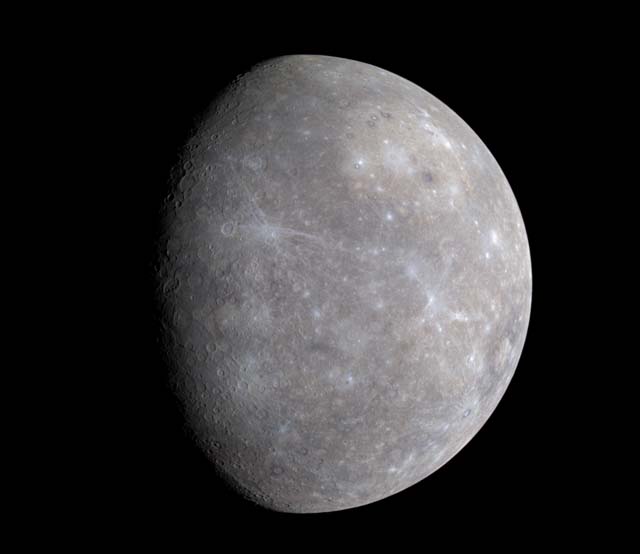
- The photo used for the 'Mercury' page of the website was obtained from Cloud Front.
- The photo used for the 'Venus' page of the website was obtained from Business Insider.
- The photo used for the 'Earth' page of the website was obtained from Solstation.
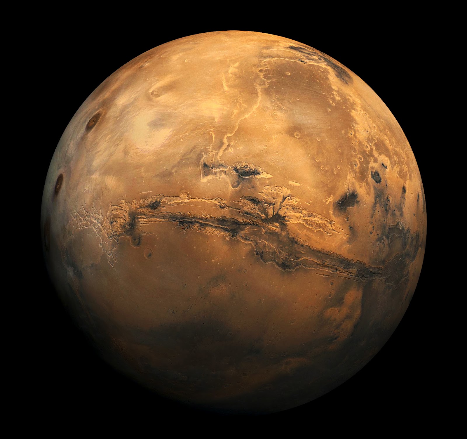
- The photo used for the 'Mars' page of the website was obtained from Blogspot.
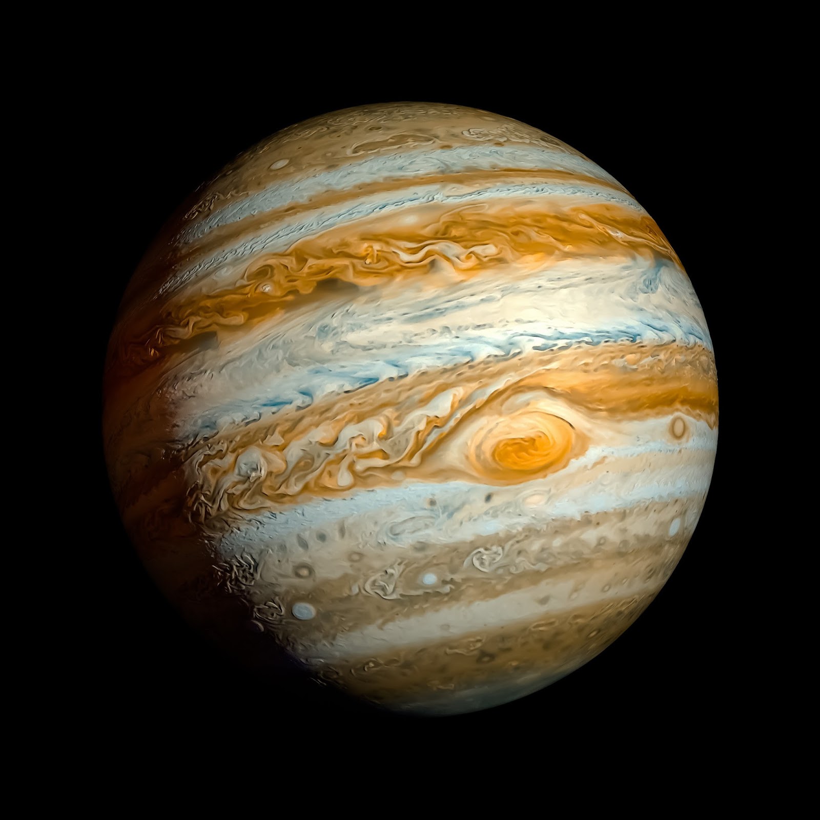
- The photo used for the 'Jupiter' page of the website was obtained from Blogspot.
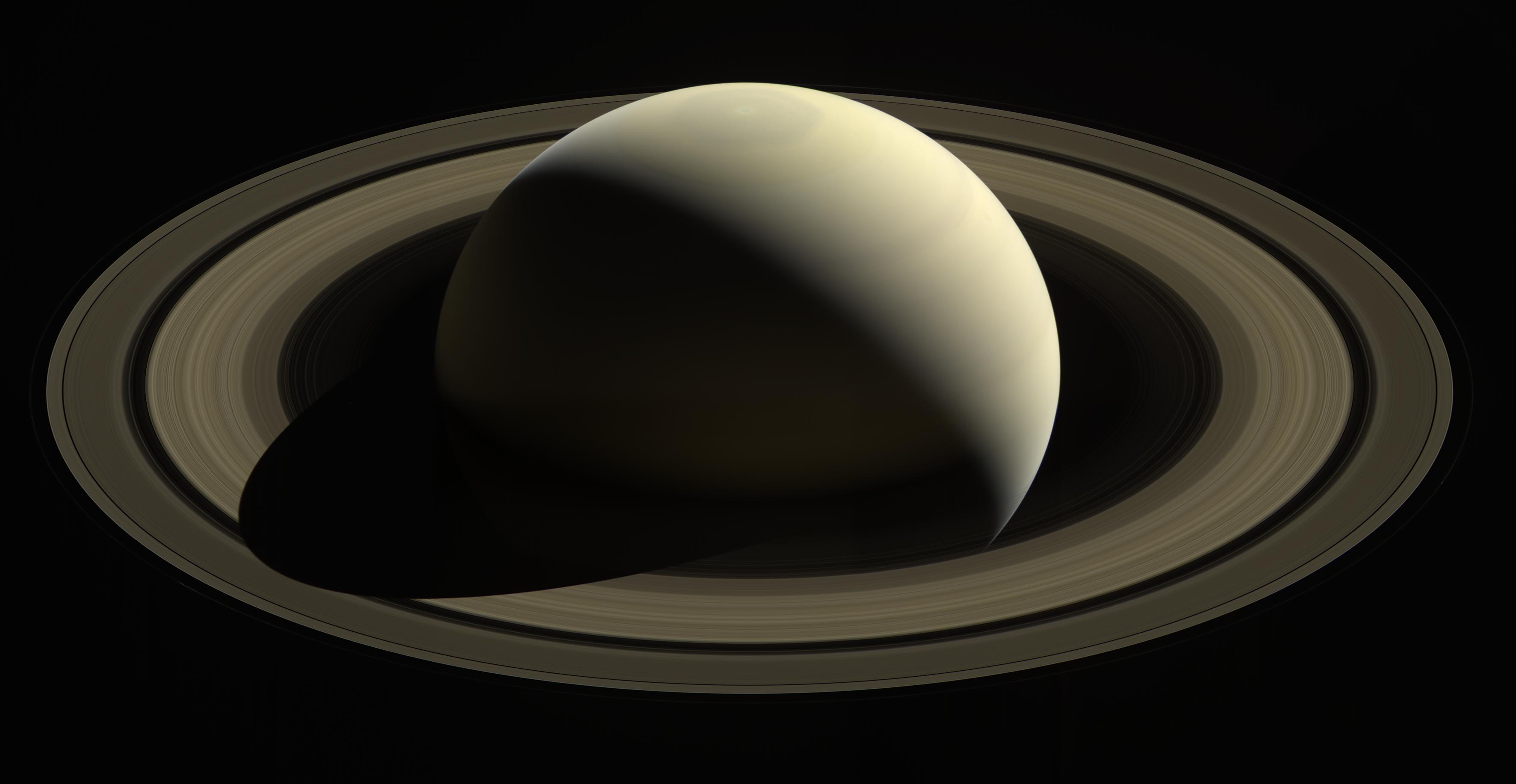
- The photo used for the 'Saturn' page of the website was obtained from European Space Agency.
- The photo used for the 'Uranus' page of the website was obtained from Wikimedia.
- The photo used for the 'Neptune' page of the website was obtained from Lovecraftian Science.
Acknowledgements
- I received inspiration for this project from my keen interest in all things space. I am an avid reader of Apollo and NASA history as well as being an amateur astronomer.

 React
React
 Typescript
 Django
 Laravel
 Facebook
 Microsoft
 Google
 Alibaba
 D3
D3
 Tencent