A Dashboard of Ice and Fire
Milestone Project 2: Interactive Frontend Development
This is a single-page website that offers illustrated information on the HBO television series 'Game of Thrones.'
The page uses the D3.js library in conjunction with the DC.js and crossfilter.js libraries in order to display interconnected and dynamic graphs. The site contains the following types of graphs: bar charts, row charts, pie charts, and scatter plots.
In addition, the site uses jQuery to hide and display parts of the website. This gives the site a multi-page look despite being single page.
The current deployed version can be accessed at: https://synnea.github.io/GoT-Dashboard/.
UX
The website's target audience are casual fans of the Game of Thrones TV series and it offers a condensed look at several key statistics on the series, split into three topics: general information, death statistics nd IMDB ratings. The unpredictability and brutality of the series' deaths are part of what made the show so popular, so the probablity is high that death-related statistics will be interesting to a large number of fans. Finally, a lot of people were unhappy with the final season of the show, and the IMDB rating section gives further information on the situation.
For aesthetic reasons, the website features a 'fake' multi-page layout. Upon visiting the website, the 'see the stats' button shivers into view. Intuitively, it becomes the first click of the user, leading to the dashboard.
The dashboard offers short cuts to different sections of the website in the form of buttons. The user will then be led to the relevant section via smooth scrolling.
For ease of navigation, the top section also contains a clickable arrow that transports the user to the beginning of the general information section, as well as a 'back to top' arrow at the bottom of the page.
User Stories
The following user stories were used to design the website:
- I know nothing about the series Game of Thrones, but want to find out some basic information.
- I am a casual fan of the series, and want to learn more about it in a visually pleasing, easily digestible manner.
- I have not seen the series yet, but I am considering to watch it.
- As a casual fan disappointed in the series finale, I want to find out if my sentiment is shared among critics and other fans.
Wireframes
Handdrawn wireframes were created to plan the project. The following wireframes date back to the beginning of the project.


A commented .pdf file is also available on my Github repository.
The finished project differs quite a bit from the wireframes. For one thing, the names of the links, which at inception stage still were named after series references were made more general and user-friendly. Also, the three dashboards were combined to one, but are still accessible separately via the shortcut buttons. Additionally, a 'redraw graphs' function was added to the navbar later, as it became clear that this was the most user-friendly way to reset graphs.
Additionally, a color palette was created early on, using the colors found in the background image as the basic point of reference. The palette was created using https://coolors.co/.

Features
Current Features
Feature 1 - jQuery hide function
Upon loading, jQuery hides the dashboard. Clicking on either the prominently places 'see the stats' button or clicking on the 'dashboard' link in the navbar unhides the link.
Feature 2 - CSS animations
The website features several CSS animations. The 'see the stats' button shivers into view using http://animista.net/.
Feature 3 - Smooth scrolling
A smooth, animated scrolling feature was implemented using jQuery.
Feature 3 - Navigation Arrows
The navigation arrows in the dashboard were found on codepen and freefrontend. Sources can be found in the 'Credits' section of this Readme.md.
Feature 4 - Fixed navbar with redraw function
The navbar is fixed and offers a prominently placed redraw button, preceded by an intuitive icon.
Feature 5 - Footer
A simple footer with a link to the original dataset on kaggle. Also contains a copyright notice and a link to my GitHub page.
Feature 6 - Graphs
The heart of the website is, of course, the graphs. In total, the dashboard features 11 graphs of 4 different types, split into 3 categories. All graphs except for the scatterplot are interconnected, and selecting a specific season will give information on it throughout the entire dashboard. This interconnectivity was achieved using the crossfilter.js library in conjunction with DC.js.
Feature 7 - Tutorial
Upon opening the dashboard via the main button, a 5-step tutorial plays that guides the user through the dashboard.
Features Left to Implement
Additional page with character information
Given the time, I would like to add an additional page with information on the characters appearing in the show.
Inclusion of an API
The books on which Game of Thrones are based have an API. I would like to include the API in some form. At present, the project is only really relevant to show fans. The inclusion of the API and book information, though, would also make it interesting to readers.
Technologies Used
Programming Languages
HTML5 - The project uses HTML5 to build the structure of the content.
CSS3 - The project uses CSS3 to style the content.
JavaScript - The project uses JavaScript for interactive elements as well as the graphs.
Framework
Bootstrap - The project uses Bootstrap, a CSS3 and JavaScript framework, to simplify and empower the CSS3.
Libraries
jQuery.js, version 3.4.1 - The project uses jQuery.js, a JavaScript library used for event handling.
D3.js, version 3.5.17 - The project uses D3.js, a JavaScript library for manipulating documents, to bind data to the DOM.
DC.js, version 2.1.8 - The project uses DC.js, a JavaScript charting library, to create the graphs in the dashboard section.
crossfilter.js, version 1.3.12 - The project uses crossfilter.js, a JavaScript library, used to filter data and allow for easy interconnectivity.
queue.js, version 1.0.7 - The project uses queue.js, a JavaScript library, used to handle asynchronous tasks.
reductio.js, version 0.6.3 - The project uses reductio.js, a helper library for crossfilter.js, used to simplify custom reduce functions.
intro.js, version 2.9.3 - The project uses intro.js, a tutorial library.
Other
Font Awesome - The project uses Font Awesome, free icons for improved UI.
Animista - The project uses Animista, free CSS animations used to improve intuitive UX.
Google Fonts - The project uses Google Fonts for its typography.
Testing
Responsiveness Testing
The responsiveness of the website was tested on Responsinator.
At this stage, the positioning of the footer and background image was tested on the following devices:
- iPhone eXpensive portrait
- iPhone eXpensive landscape
- Android portrait
- Android landscape
- iPhone 6-8 portrait
- iPhone 6-8 landscape
- iPhone 6-8 Plump landscape
- iPhone 6-8 Plump landscape
- iPad portrait
- iPad landscape
While the landing page is fully responsive, the dashboard is not, and does not display properly on mobile devices. This is in line with the requirements of the project, which is in line with the project requirements, which state, "Please note that if you are building a data dashboard, only your chart containers are expected to be responsive. Charts using D3.js are not responsive as they are designed for desktop or large-screen viewing."
Code Testing
The HTML was validated using the HTML Validator.
Initially, 16 issues were found. Many of the errors related to using too many hyphens for commenting, so I fixed that.
At the time of deployment, only two issues remain. One advised me to use a h2-6 element in my sections. I chose not to change it because instead of headings, the images serve as headings.
Further, the test advised me to use a role with an anchor element in the navbar. However, adding the role of "link" was then judged unnecessary by the same validator. Thus, I chose to ignore it.
The CSS was validated using the CSS Validator. In total, 3 issues were found. All were corrected and none remain for the deployed version.
User Story Testing
Here are the results for the user story tests:
Story 1
- I know nothing about the series Game of Thrones, but want to find out some basic information.
- Solution: Upon opening the website, the prominent 'see the stats' button leads the user to the dashboard. The tutorial pops up to explain what the dashboard is all about. The user clicks on the arrow to begin reading the information.
Story 2
- I am a casual fan of the series, and want to learn more about it in a visually pleasing, easily digestible manner.
- Solution: upon opening the website, the prominent 'see the stats' button leads the user to the dashboard. The tutorial gives an overview of what kind of information is available on the website. The casual fan can then click on on one of three buttons to skip to the section he or she is most interested in.
Story 3
- I have not seen the series yet, but I am considering to watch it.
- Solution: upon opening the website, the prominent 'see the stats' button leads the user to the dashboard. The tutorial gives an overview of what kind of information is available on the website. To someone who is considering to watch the series, they will want to start with general information. He or she will thus click on the downward pointing arrow button to begin reading.
Story 4
- As a casual fan disappointed in the series finale, I want to find out if my sentiment is shared among critics and other fans.
- Solution: upon opening the website, the prominent 'see the stats' button leads the user to the dashboard. The tutorial gives an overview of what kind of information is available on the website. As a fan disappointed in the finale, the IMDB ratings section is most relevant. He or she will thus click on the 'skip to stats on IMDB ratings' section.
Known Bugs
A few bugs remain:
-
The first step of the tutorial sometimes displays across the db-logo div and sometimes to the bottom left. Since both positions look fine, I chose to leave the bug as-is.
-
The pie charts will display 'Season Percentages' and 'Percentages' respectively. This is actually a bug because the show_slice_percent function is still displayed when the pie chart is activated through another chart via crossfilter. When the input is undefined or not a percentages, the function is still active and return something. Returning "Percentages" at least makes the bug look like it might have been an intentional design choice.
Deployment
This project was developed locally using VS Code. A repository was created on github and named 'GoT-Dashboard.' Regular commits were made and pushed to my Github repository.
Very early on, I hosted the website on Github Pages. It was then regularly updated with my commits.
To initially deploy the project on Github Pages, the following steps were taken:
- Log into Github
- Select the repository synnea/GoT-Dashboard.
- Select the 'Settings' tab, which is the last tab in the top row.
- Use Cmd + F to open up a search window. Type in "GitHub Pages" and scroll automatically to the relevant section.
- Under Source, click the drop-down menu labelled None and select the master branch.
- Upon selecting the master branch, t the page refreshes automatically. The website is now deployed.
Content
The data in the dashboard is based on this dataset sourced from Kaggle.
Data Manipulation
Prior to working on the graphs, the kaggle dataset was edited in several significant ways:
-
Data on season 8 was manually added, with information sources from the internet (.e.g the IMDB rating from imdb.com, the episode titles from wikipedia). This was done to offer a more comprehensive website that includes the newest, most relevant information.
-
To make the data easier to work with, the .csv file from kaggle.com was converted to a json file.
-
To simplify the graph building, several columns were renamed (e.g. "Original Air Date" was changed simply to "airdate").
Credits
Content Source
Many thanks go to Code Institute student Dave Laffan, whose remove_blanks function, taken from his github repository here here and edited slightly.
The print_filter helper function was taken from here.
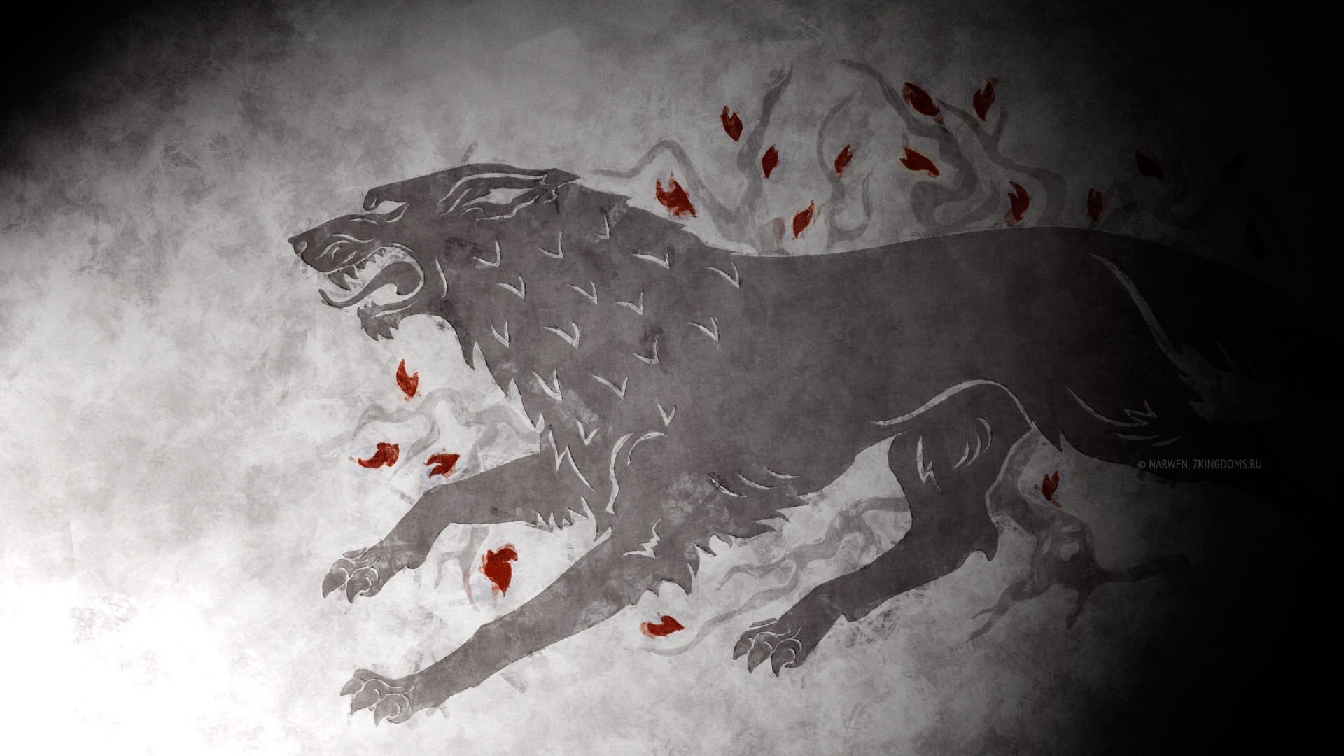
The source for the background image used on the landing page can be found here.
Several images were created using the game of thrones font on fontmeme.com.
The downward pointing arrow animation was taken from here.
The back to top arrow was found here.
Bugs
Displaying data in the graphs rounded to two decimals was a challenge at first. This Stack Overflow thread solved the problem.
Inspiration & Acknowledgements
Chris Quinn's Exoplanets project serves as an inspiration to use the jQuery hide method.
Many thanks also to Tim Nelson, whose advice on the Code Institute Slack channel was invaluable!

