
This project has been created for my Milestone Project 2 for the Full Stack Development Diploma at The Code Institute. The purpose of the project is to create an interactive front end using HTML, CSS and Javascript.
Gwent Triathlon Club is a fictional triathlon club based in Gwent, Wales. The purpose of the website is to allow website users to learn more about the Gwent triathlon club, to derive answers about the club and attract new members to join the club. The user will interact with the website through a Google maps API to view their training locations; selecting buttons to determine their club membership fee; playing a triathlon quiz and by completing and submitting a joining form that it will send to a fictional club secretary.
My deployed project can be viewed live here
- To create a website that provides the information needed for the website users to learn about the Gwent triathlon club and that attracts new members.
- To create a website that provides a quick and simple way for new members to join the Gwent triathlon club.
- To make a website that uses Javascript to allow the website users to interact with the website.
- To design a website that is both visually appealing and easy to navigate for the wide range of potential users.
- To create a website that provides a good user experience on mobile, tablet and desktop devices.
- I am a local triathlete, I want to know what membership price I would have to pay if I was to join the Gwent Triathlon Club.
- I am the club secretary at Gwent Triathlon Club, I want a simple way for new members to contact me so that I can invite them along to a free trial session.
- I am the manager of a leisure centre in Gwent, I want to know where the local triathlon club currently train and find their contact details, so that I can invite them to rent my sports facilities like the swimming pool and running track.
- I am the chair of Gwent Triathlon Club, I want a website that highlights what we do and the benefits of joining us, so that I attract new members to the club.
- I am a local person who wants to start duathlon, I want to know if I can join the club without being expected to join in swim training and if the club is suitable for beginners, so that I can decide if I want to join.
- I am a person who is new to sport and fitness, I want to know what triathlon is and what it involves, so that I can decide if I want to give it a go.
Having created the user stories so that I knew who I was designing my website for, I then followed the user centred design process to create a website that would answer the above user stories.
-
Strategy Plane:
-
When addressing the strategy plane, I focused on who the GTC website users were likely to be and the objectives the website needed to meet to attract these users. I kept in mind the question: Why is the GTC website so special?
- Reason for the website’s existence – To serve the triathlon community of the county of Gwent in South Wales.
- Culture of the audience – Triathlon community (including the single disciplines and multisport variations of swimming, cycling and running) and the wider fitness community.
- User demographic – the club is open to all ages and abilities of triathletes including children, paratriathletes and senior members. The website branding therefore needs to appeal visually to all ages and genders. It must also be able to navigated easily as the users could have a wide range of computer competency levels.
-
I researched current triathlon websites (specifically Malvern, Evo & Manchester) to gather information on what these websites offer their users; the pros and cons that I liked as a user of their website and to identify the features and information they provided. This gave me ideas of how to address my user’s needs but also how I could further improve my user’s experience to add value to the GTC website.
-
-
Scope Plane:
-
When addressing the structure plane, I focused on the journey the website would take the users on. I kept in mind the question: What is an intuitive way to go navigate the content and features?
- How to get there? I knew that my website should include a navbar with tabs to enable users to easily navigate through the website content. There would also be buttons linked to specific parts of the website such as the ‘sign up’ form to allow users to quickly and easily access the main features.
- How will they move through the website? I decided to have 5 pages to the website: Home page (welcome and intro to the club), Training (with training locations featuring the map), Membership (featuring the membership packages and benefits of joining GTC), Triathlon (featuring a quiz to learn about/test knowledge of the sport) and Join (featuring the sign-up form, contact info and Frequently Asked Questions (FAQs)). By using this order, the user first learns about the club, can see the locations (to see if they are near to the user and if they meet the users needs), then learns about the membership benefits and pricing, then moves onto testing their knowledge/learning more about triathlon (e.g. to see if it is for them) and then once they have the above information, the user can make a fully informed decision about joining which takes them to the final page with the sign up form, FAQs to address any questions they may have and contact info in case they have further questions.
-
-
Structure Plane:
-
When addressing the structure plane, I focused on the journey the website would take the users on. I kept in mind the question: What is an intuitive way to go navigate the content and features?
- How to get there? I knew that my website should include a navbar with tabs to enable users to easily navigate through the website content. There would also be buttons linked to specific parts of the website such as the ‘sign up’ form to allow users to quickly and easily access the main features.
- How will they move through the website? I decided to have 5 pages to the website: Home page (welcome and intro to the club), Training (with training locations featuring the map), Membership (featuring the membership packages and benefits of joining GTC), Triathlon (featuring a quiz to learn about/test knowledge of the sport) and Join (featuring the sign-up form, contact info and Frequently Asked Questions (FAQs)). By using this order, the user first learns about the club, can see the locations (to see if they are near to the user and if they meet the users needs), then learns about the membership benefits and pricing, then moves onto testing their knowledge/learning more about triathlon (e.g. to see if it is for them) and the once they have the above information the user can make a fully informed decision about joining which takes them to the final page with the sign up form, FAQs to address any questions they may have and contact info in case they have further questions.
-
-
Skeleton Plane:
-
When addressing the skeleton plane, I focused on the keeping the layout design of the website familiar to the users by using a standard layout the users would be use to seeing. I kept in mind the question: What conventions will the user be familiar with?
- How to style the page? I knew that my website pages should be consistent in style and that they should use a standard page layout. I chose to use features the user would expect to see including: a navbar at the top of the page, a hero image, a callout message, a main body with titles and sub-titles and a footer at the bottom of the page.
-
-
Surface Plane:
-
When addressing the surface plane, I focused on the website branding and details like the colour, fonts and images. I kept in mind the question: What will be appeal to my users?
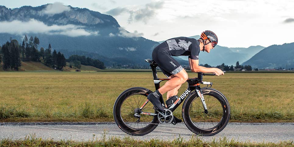
- Hero images – relevant to triathlon to appeal to the target user groups.
- Colour scheme – I chose to use the colours of green, white and red as these are the colours of the Welsh flag and Gwent Triathlon Club is a South and East Wales based tri club, so will appeal to the intended website audience. The colours are also gender neutral to have greater appeal. I choose the specific green (#00AD36), white (#FFFFFF) and red (#D30731) hex colours as these are the hex colours used on the Welsh flag.
- Map marker colours – I chose to have a different map marker colour for the swim, bike and run locations respectively to make it obvious to the user what training was at what location.
- Icons – I chose to use font awesome icons across the pages where it could aid the user’s understanding and for greater visual appeal.
- Logo – I chose to add font awesome swim, bike and run icons to improve the visual and make it easily understandable on first glance that the website is for triathletes as the logo is one of the first features the user will see upon accessing the website. I also chose to position the logo in the top left hand corner of the website (within the navbar) as this is a convention of websites that users have to come to expect.
- Navbar active tab - I chose to have the active tab a different colour to the other navbar tabs so that it was obvious to the user as to which page they were currently on. I also chose to make the active tab a duller colour and the other tabs a bright white colour, so that the user's eye was drawn to the other tabs to encourage them to click them and explore the website further.
- Callout message - to make it obvious to the user what the page is about.
- Join Us buttons - I chose to add 'Join Us' buttons in the callout message of each page as a quick way to allow the users to reach the sign-up form to increase the simplicity of joining and increase the amount of traffic to this part of the website.
-
Before I started coding my project, I created wireframes using Balsamiq. I created wireframes for mobile, tablet and desktop devices to decide the layout at different screen sizes. I also used the user stories to add more detail to the website to provide a better user experience. A pdf copy of my wireframes can be found under wireframes in the assets folder or accessed here Code-Institute-MSP2-wireframes.pdf
Wireframes for mobile devices


Wireframes for tablet devices


Wireframes for desktop devices


The project has five separate pages: Home page (index.html), Training (training.html), Membership (membership.html), Triathlon (triathlon.html) and Join (join.html). Features consistent across the five pages include:
-
Navbar
- The navbar has the logo in the top left-hand side which when clicked returns the user to the home page. On the right-hand side are five navigation tabs linking to each of the four pages. The green (#0007c00) fits with the brand colours and provides a good contrast for the light-coloured text and logo. The logo is white (#ffffff) to fit with the brand colours. The navigation tabs are white in colour except the active page that changes to pale red (#ec7676) to provide visual feedback to the user to let them know which page they are on. The navbar collapses to a toggle button on mobile devices for an improved user experience on smaller screen sizes.
-
Hero image, callout message and ‘join us’ button
- Each page has a hero image (although the image is different for each page), the image is the same size across all pages. Within the hero image is a callout message (again the message is different for each page to fit with the page content) that includes a ‘Join Us’ button that links directly to the sign-up form. The positioning of the callout message is the same on every page and deliberately positioned to catch the user’s eye.
-
Title
- Each page starts with a simple title under the hero image, that explains the purpose of that page.
-
Footer
- The footer is the same red (#b71c1c) across all pages to provide consistency in design and fit with the brand colours. It includes social media links and copyright information which are coloured white to fit with the brand colours. The footer is the normal place that a user would look for this information. The social media links open a new tab, when clicked by the user, to take them to the corresponding website.
-
Background colour styling
- The background colour for the main body of text on each page is consist across all pages. A white background with black text for the first section and then either a light red (#ec7676) or a light green (#59b460) with white text. The light red and light green keep with the brand colours but provide some added visual appeal.
Features on the seperate pages include:
-
Home Page
- Includes information to introduce the user to the club and what they are about.
- Includes buttons that link to other pages in the website to encourage the user to explore the website further.
-
Training page
- Includes an interactive map where the user can explore the training locations the club uses for swimming, cycling and running. Each map marker is colour coded to match eaither swim, bike or run with a simple key to explain this to the user. This allows the user to see if they're locations near them for the triathlon discpline they want, at a quick glance. If the user clicks on a map marker, then the name of the training location appears.
- Includes the locations for swim, bike and run. The headings are colour-coded to match the map marker colours form the map above it to keep consistency in the user experience. The location names also match those in the map marker info windows, again for consistency. The locations are grouped into the triathlon discipline they provide (swim, bike or run) and then further grouped into the type of training (e.g. swim is grouped into river swims, sea swims etc.). This grouping allows the user to quickly and easily get the information that they are after. A font awesome icon relevant to each discipline above the corresponding group, adds visual appeal and further aids the user to quickly find information.
-
Membership page
- Includes a section on the benefits of club membership with added font awesome tick icons to improve visual appeal and emphasis the long list of benefits to the user.
- Includes a section on the membership packages available. Instead of the user having to navigate say a table with pricing info, the process has been simplified so that the user just clicks on the button on the package that matches their need. Just 5 options keep this a simple process. The user gets clear feedback on which package they are about to select as the cursor changes to a pointer (as per convention, so the user would expect this to happen) and the button text changes colour as the user hovers over it to further emphasis the otpion that is about to be selected. When the user selects a package by clicking the corresponding button, a modal with pricing and any other information (like eligibility criteria) appears. The modal provides a simple and clear message that is easy for the user to understand.
-
Triathlon page
- Includes a simple introduction to the quiz, explaining to the user the number of questions, number of correct answers per question and how to get their score.
- Includes an interactive quiz with 10 questions on triathlon that provides a fun way to test their current level of knowledge and to help them learn more about the sport. Consistency in the style, layout, colours and number of potential answers keeps the quiz simple for the user to understand. The user has visual feedback about which answer option they are about to select as the cursor changes to a pointer (like convention and in keeping with the buttons on previous page) and the background colour and text changes colour as the user hovers over it. As a user selects an answer, the other possible answers are hidden this keeps the display clean. When the user selects an option, if it is correct then it colours green or colours red if incorrect, this provides instant visual feedback to the user.
- Includes a submit and try again button that are in keeping with the brand colours but styled differently to the buttons of the quiz answers to make it obvious to the user that the user is at the end of the quiz. When the user hovers over either, they change to a cursor pointer and change background colour and text colour, keeping consistency with what the user has already experinced through the quiz.
- Includes a results section that shows the user the number of questions they got correct and the total number of questions, that is only revealed when the user clicks on the 'Get my score' button.
- Includes a 'try again' button that refreshes the quiz and takes the user back up to the top of the page, so that the user can have another go.
-
Join page
- Includes an interactive sign-up form. The form is simple in design to be quick and simple for the user to complete. Placeholder text aids the user's understanding of what is required. Validation ensures that the user has inputed information into the fields before they can submit the form.
- The 'submit form' button is styled to stand out from the form background but in keeping with the brand colours used on the website. Keeping consistency, the cursor changes to a pointer and the background colour changes when the user hovers over the button to provide visual feedback that they are about to submit the form. Once the user has clicked the 'submit form' button it keeps a dull green colour to provide visual feedback that the form has been submitted.
- Once the form has been submitted, an email is sent to my email inbox containing the information inputted in the form. Also an auto-reply email is sent to the user to confirm that the club has successfully received their form and explaining the next steps. This provides a quick, simple and easy sign up process for the user.
- A note below the form informs the user to check their inbox for a confirmation email that their form has been successfully received by the club. It also provides alternative contact information if something was to go wrong with the form.
- Includes a Frequently Asked Questions (FAQs) section to provide useful information about the club. Certain answers provide links the the relevant parts of the website to aid the user in finding the information they are after.
- Includes contact details if the user has any further questions or any other business they want to discuss with the club. When the user clicks the email or Facebook link then a seperate window opens to the corresponding website. This provides simplicity for the user but is also convention and what the user would expect.
- Includes an interactive sign-up form. The form is simple in design to be quick and simple for the user to complete. Placeholder text aids the user's understanding of what is required. Validation ensures that the user has inputed information into the fields before they can submit the form.
- The text content of the website was improved and added to as the project progressed.
- Added swim, bike, run font awesome icons to logo.
- Changed colours from Welsh flag hex colours green (#00AD36), white (#FFFFFF) and red (#D30731) to green (0007c00), white (#ffffff) and red (#b71c1c). The darker shades of green and red gave better readability and looked less ‘garish’ on the page, whilst keeping with the flag colour theme. I changed the footer red (#b71c1c). I changed the strong background colour for lighter versions of the green (#59b460) and red (#ec7676) so it was easier on the user’s eye and improved readability.
- Changed navbar active tab from Welsh flag red (#D30731) to lighter (#b71c1c) to keep consistency with the other colours used on the website.
- Added an overlay to the hero image to help the callout message stand out to the user more clearly. This will help to catch their eye and make them more likely to press the ‘Join Us’ button. Changed the ‘Join Us’ buttons to white to stand out better against the hero image background.
- Removed background colour of main text on Home page as this page didn’t have multiple sections of information that needed to be separated unlike the other pages and therefore keeping a white background made it cleaner, easier to read and more visually attractive.
- Added map key to aid the user in understanding what the different map marker colours mean. A map key is also convention and what the user would expect to see.
- Changed the font awesome icons on Training Locations section from map marker to swim, bike & run icons to suit the text better and improve the visual appeal.
- Changed the formatting on tablet devices to be the same as on mobile devices for Training Locations information on Training page and also for Member Benefits and Membership package option sections on Membership page. It looked to squished when done as per wireframe design. This improves the user experience and makes the website look more professional.
- Changed the quiz answer options from radio buttons to buttons. This matched the style of other buttons used on the website further adding to the consistency in design for an enhanced user experience.
- Added results section to display the user’s score when the ‘get my score’ button is clicked.
- Added ‘try again’ button to quiz to refresh the quiz and return the user to the top of the page in one simple step.
- Changed the form input fields as feedback from potential users of the website highlighted that some users would be uncomfortable submitting information like their age. In changing the input fields, I simplified the form so it is easier to understand, less time consuming to complete and less invasive in the questions asked. A text box asking for a bit of information about the user means the form now gives the user the option to include as much or little information as they are happy to provide, whilst getting the basic information required. It also gives the user the option to add any questions they may have without having to look for contact information and submit a separate email. This minimises the amount of user effort and eases the admin load for the club secretary.
- Fixed navbar position so it in accessible at all times to the user, no matter where on the page they are for ease of navigating the website.
- Changed some of the hero images to better quality images.
- I created the pricing information that appears when the user selects a membership package button by using a Javascript alert. Tutor feedback made me decide to change this code to a modal instead as I was made aware that some people will have 'pop-up blockers' installed on their browser and many people find pop-ups annoying. In changing this code I decided that rather than having a seperate model for each button, I would have one modal and change the text displayed depending on the membership package button option selected by the user.
- In the future I could add greater interactive and visual content to improve the user experience like including videos from past club training sessions or introducing the key club members to give the user a virtual experience of the club.
- For a real-life triathlon club, it may be useful to include a link to a secure payment process that allows the user to sign up to the club and make their membership payments.
- In the future a feature that allowed club members to book onto training sessions with an interactive club training calendar would be useful as well as a member’s log-in area where they could see what sessions or races, they have booked to attend.
- HTML5
- used for the .html pages
- CSS
- used to style the html pages.
- Javascript
- used to make my website interactive.
- jQuery javascript library
- used for my javascript code denoted by $ prefix on membership.js, quiz.js and sticky-navbar.js.
- Bootstrapv5
- used for the grid layout to make the website responsive and to style appropriately for different screen sizes, to improve the user experience. I also used the bootstrap templates for the navbar (including the toggle button feature) and the buttons. I also used the Bootstrap template for the Javascript code to create the sticky navbar on desktop devices.
- Google Fonts
- used to style the headings and main text across all pages.
- Font Awesome
- used for the social media icons in the footer across all pages; for the swim, bike & run icons in the logo; on Training Locations page and on Membership page.
- Google Maps API
- used to create the map of Gwent and map markers for highlighting the locations used by GTC for swim, bike & run training on the Training page.
- EmailJS
- used to integrate email into my project through emailing the submitted join up form to me and by returning an auto-reply email to the user on successful receipt on the form.
- ColorTool
- used to decide the shades of greens and reds used for all the website. I also used the accessibility feature to find that exact hex code of colours that provided good readability for the user.
- Balsamiq
- used to create my wireframes
- W3C Markup Validation Service
- used to check the validity of my html code for all .html pages.
- W3C CSS Validation Service
- used to check the validity of my css code for style.css file.
- JSHint
- used to check the validity of my javascript code for all .js files.
- Am I responsive
- used to check the responsiveness of my design on different screen sizes and for creating the first image in this README file.
- Paint 3D
- used to crop the screenshots of images added to this README.md file and testing.md file.
- Google Chrom Lighthouse
- used to generate Lighthouse reports on the performance of all my web pages once the project was deployed.
The testing that I undertook on my project is detailed in the testing.md file.
I created my project using GitHub and deployed my project using the GitHub pages hosting platform.
-
To deploy my wesbite I completed the following steps:
- Open GitHub.
- Select my project repository called KimLHill/Kimberley_Hill_MSP2.
- Clicked the 'settings' tab in my project respository.
- Scrolled down to the 'GitHub Pages' section.
- I changed the source to 'Branch: master' then clicked the 'save' button.
- This deployed my website which can be viewed here.
To run my project locally you can clone the project.
-
To clone my project, complete the following steps:
-
Open GitHub.
-
Select my project repository called KimLHill/Kimberley_Hill_MSP2.
-
Click on the green ‘Code’ button.
-
Click the clipboard icon next to the url to copy the url link.
-
Open Git Bash.
-
Change the current working directory to the location where you want the cloned directory.
-
Type git clone, and then paste the url link you copied in step 4.
-
Press enter to create your local clone.
Alternative methods of cloning my project can be found here
-
To make a copy of my project to your GitHub account, you can fork a copy of my project.
-
To fork a copy of my project, complete the following steps:
-
Log in to your GitHub account (or create a new account).
-
Search for my repository called KimLHill/Kimberley_Hill_MSP2.
-
In the far right-hand corner of the screen at the top of the repository, click the ‘fork’ button next to the fork icon.
Further information about forking a repository can be found here.
-
- The website is for a fictional triathlon club, the content is fictional and was created by myself.
- I got the code to initialise the Google map from the Google API website.
- I used this post to get the details of the different colour map marker urls.
- I used code from the EmailJS documentation to add the necessary scripts, add my serviceID and templateID for my email functionality.
- I used EmailJS email templates to create the template for both emailing the submitted form to my email and for the auto-reply email sent to the user upon successful submission.
- I used this post for the code for changing the navbar toggler.
- I used this post for the code to make my map zoom responsive for different screen sizes.
- I used this post to get the comment to resolve the JSHint warnings cause by esversion: 6.
- I used this website to get the hex colours of the Welsh flag.
- Code Institute mentor Seun Owonikoko whose feedback throughout the project influenced my website design, content and features.
- Miranda (Github user mkthewlis) and Gregory (Github user gregory4321) whose milestone 2 projects were provided to me be mentor Seun as a good example of what I should be aiming to achieve in my own project and therefore provided me with inspiration for my own project.
- I watched this tutorial to understand how to implement custom map markers and combine it with info windows.
- I used this pdf file for inspiration for my triathlon quiz questions and answers.
- I watched this video to learn how to link to a specific part on a different html.page.
- w3schools Modal Box tutorial used to learn how to write the html and javascript code for creating modals for membership package option buttons.
- I watched this Code Institute tutorial to implment my EmailJS functionality.
- My triathlete friends who viewed my website as potential users and provided feedback on the content.
The images used on the website are from the following sources:
-
Home Page:
-
Training Page:
-
Membership Page
-
Triathlon Page
-
Join Page
The images used on the wireframes that weren't used for the website, are from the following sources:
-
Wireframe Home Page
-
Wireframe Training Page
-
Wireframe Membership Page
Tablet outline used for creating my tablet wireframes.

