This project focuses on the website development for the video game called "Dying Light". The website was built with the intention of introducing the game, Dying Light to users. The website is designed to be intuitive and easy to navigate. It is targeted towards users interested to find out more about the game with the eventual goal to purchase it. The website aims to advertise the game in an appealing and positive manner which would drive sales. Additionally, it provides users with all the essential information they need to know about the game.
A live demo of the website can be found here: https://soycat999.github.io/milestone-project-dying-light/
| User Stories | Description | Features to implement |
|---|---|---|
| 1 | User would like to see the latest game trailer. | To include the video game trailer on the website. |
| 2 | User would like to know more about the game. | To include an about section that gives more information about the game. |
| 3 | User would like to see the various gameplay features in the game. | To include more information on the gameplay features in the game. |
| 4 | User would like to purchase the game. | To include a buy now section that leads them to the official purchase page. |
| 5 | User would like to purchase the game in either console or pc. | To include a buy now section that leads them to the official purchase page of both console (PS4/XBOX) and PC (STEAM). |
| 6 | User would like to subscribe to the latest news and updates about the game. | To include a section in the buy now page that lets them enter their email and "subscribe". |
-
Homepage - The homepage has a short, muted, autoplay video that features the gameplay. Below that, there is a short description of the game. There is also a logo on the top right-hand side of the website and a collapsable navigation bar on the right-hand side of the website.
-
About Game - The about section includes more information about the game. There is a short description about the game, its features and there is also a gallery of images.
-
Buy Now - The buy now page includes links to the official PC and Console purchase pages. There is also a parallax image in the background and a sticky social media bar on the side of the page.
View wireframes for both desktop and mobile here: https://docs.google.com/document/d/1EXbarzoNlgPHfAAtar7pMNcObNwsNRzCSKVN2oFSOc8/edit?usp=sharing
-
Homepage The muted, autoplay video gives users a peek into the gameplay. Additionally, the short introduction of the game gives users a little more detail about the game. The logo on the top-left hand corner also lets users know that they have come to the right website. Additionally, it makes the website more credible. There is a collapsable navigation bar on the top-right hand corner of the homepage. This was placed to give users an easier access to navigate the different pages easily and quickly.
-
About Bootstrap features like cards were used to explain the various features of the gameplay. Another Bootstrap feature that was used in the about page was the carousel images, to showcase the screenshots taken from the game. The image under the Expansion Pack section is a link to the official video game page, which gives more information.
-
Buy Now In the buy now page, users can visit the official social media sites to learn more about the game and connect with the game community. Apart from that they will be able to purchase the game in the platform of their choice. At the bottom of the page, users will be able to input their email address and subscribe to the latest news and updates.
In the future, I would like to include more information about the expansion packs and the season pass so as to give users more of a choice when it comes to what they want to buy.
In the about page, I would like to have more images and information about the different characters in the game. I also think including a buy now button will increase and drive sales.
I would also like to include more interactive elements in the buy now page that would achieve the end goal of persuading users to buy the game. These interactive elements could be in the form of image hover overlay, an animated buy now button, etc.
###Limitation There is also a subscription form at the bottom of the page, although clicking on the submit button will not navigate away from the website. (There is no Javascript). This would be a feature to implement in the future.
(i) The color scheme of orange and black reflects the main theme of the overall game and hence why it is consistently used throughout the website. I also believe that the colour scheme will appeal to users. (ii) The font looks fun and appeals to gamers. It also reflects the game and the gameplay. (iii) A scrollable parallax image was included in the buy now page to give the webpage more depth. I also believe the juxtaposition of the image and the subscription form will enable and encourage users to buy and subscribe to the game. An active subscription is equally important as a purchase as it measures the individual's interest level and allows developers to push more news and updates to their email so as to attain the goal of a purchase if the user has not already bought the game.
- HTML (link to the documentation: https://devdocs.io/html/) HTML was used to structure the content of the website.
- CSS (link to the documentation: https://devdocs.io/css/) CSS was used to style the website.
- Bootstrap (link to the documentation: https://getbootstrap.com)
- Javascript — for the navigation bar. (link to the documentation: https://devdocs.io/jsdoc/)
(i) Mobile Responsiveness
This site was tested across multiple devices multiple mobile devices (iPhone 4, 5, 7: Chrome and Safari, iPad, Samsung Galaxy) to ensure compatibility and responsiveness.)
Website tested on mobile and on laptop mode : https://drive.google.com/drive/folders/1-eJxjByE_b5XR4rv-MGpQLcyzqR0ku33?usp=sharing
(ii) Browser Compatability
This site was tested across multiple devices multiple mobile devices (iPhone 4, 5, 7: Chrome and Safari, iPad, Samsung Galaxy) to ensure compatibility and responsiveness.)
(iii) Additionally, parallax scrolling has been turned off for phones, as soon as the breakpoint hits min-device-width: 300px.
(iv) Under the subscription section, users will get a prompt in red if their email has not been entered in the correct format.
(v) Test Cases
| Test Case(s) | Description | Outcome |
|---|---|---|
| 1 | When user clicks on home link on the top-right navigation bar, the website redirects to the home page. | Pass |
| 2 | When user clicks on about link on the top-right navigation bar, the website redirects to the about page. | Pass |
| 3 | When user clicks on home link on the top-right navigation bar, the website redirects to the buy now page. | Pass |
| 4 | User should see 3 buttons at the top corner of the navigation bar. | Pass |
| 5 | When user clicks on the linkable image under the Expansion Pack section in the about page, he/she will be directed to the official page which gives the user more information. | Pass |
| 6 | When user clicks on the linkable platforms (Steam, PS4, Xbox) in the buy now page, he/she will be directed to the official purchase page for each of the different platforms. | Pass |
| 7 | When user enters their email address in the wrong format, they will be prompted in red to re-type their email address. | Pass |
| 8 | All links in the website will open in a new tab using 'target="_blank"' | Pass |
No bugs found.
Homepage video (Owned by IGN's channel) Source: https://www.youtube.com/watch?v=9IM3YE0BZuo&t=16s
Homepage logo Source: https://dyinglightgame.com/10in12/img/logo_dyinglight.png
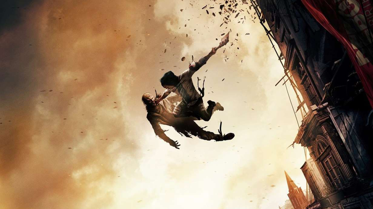
About page header picture Source: https://media.comicbook.com/2019/05/dying-light-1172647.jpeg Website: https://comicbook.com/
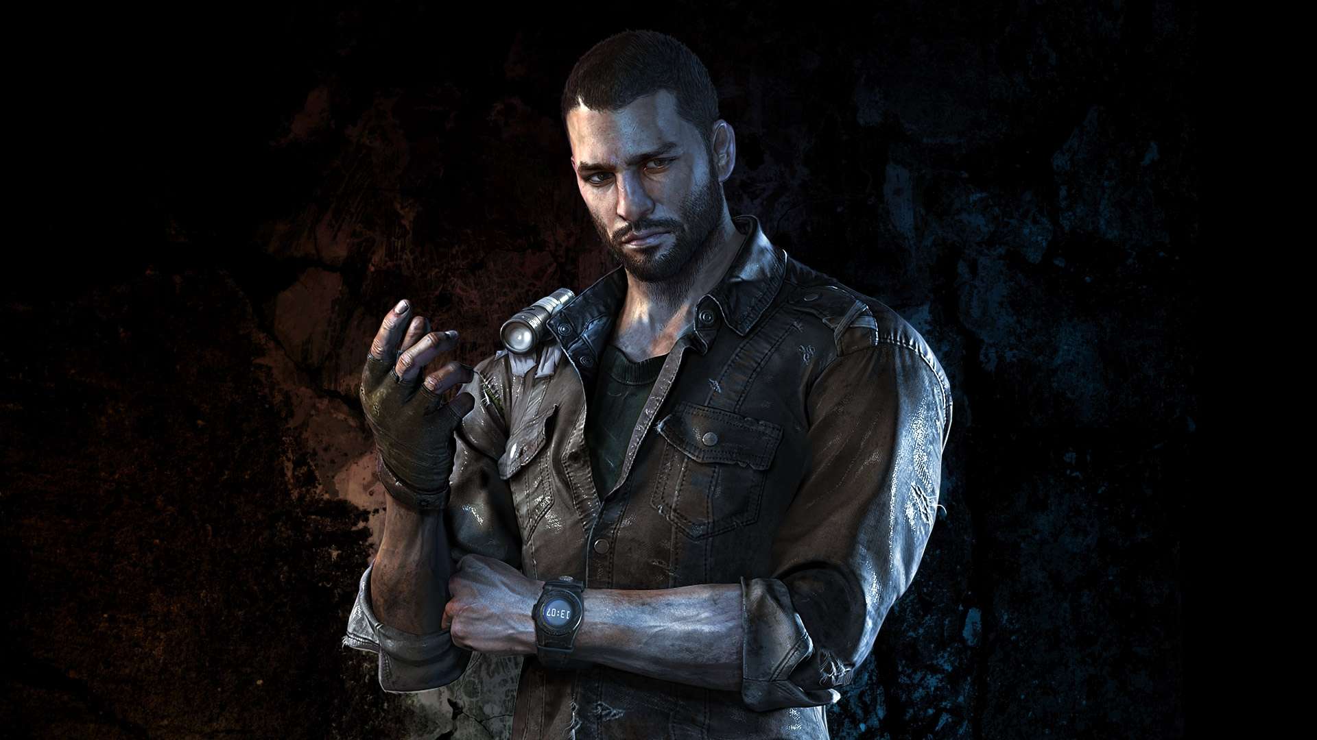
Picture for the gameplay section Source: https://vignette.wikia.nocookie.net/dyinglight/images/9/92/DL_Kyle_Crane.jpg/revision/latest?cb=20150224125550&path-prefix=pl Website: https://dyinglight.fandom.com/pl/wiki/Kyle_Crane
Expansion Pack image: Source: https://hb.imgix.net/dc7375193c4e0ab556a935ecbd288d52fd8a8666.jpg?auto=compress,format&fit=crop&h=353&w=616&s=88cbf97c9366bd4a0d49128763748348
Parallax image Source: https://mp1st.com/wp-content/uploads/2019/09/Dying-Light-2-Post-Launch-Support.jpg Website: https://mp1st.com
Footer rating: Source: https://www.esrb.org/wp-content/uploads/2019/04/Mature.svg
All other photos were taken from the game via screenshots and screen recordings. All rights go to Techland, the game developer and Warner Bros. Interactive Entertainment, the publisher.
W3Schools:
- Used an overlay for the navigation bar from W3Schools: https://www.w3schools.com/howto/tryit.asp?filename=tryhow_js_overlay
- Used a sticky social bar from W3Schools: https://www.w3schools.com/howto/howto_css_sticky_social_bar.asp
- Used parallax image from W3Schools: https://www.w3schools.com/howto/howto_css_parallax.asp
Bootstrap features:
- Used cards for the about page of the website : https://getbootstrap.com/docs/4.3/components/card/
- Used carousel for the about page of the website: https://getbootstrap.com/docs/4.3/components/carousel/
- Used form for the subscription section in the buy now page: https://getbootstrap.com/docs/4.3/components/forms/#overview
Fonts:

