This is a website where you can find information about two holiday homes that are rented out by the Lichtenberg family and are located in the vicinity of Winterswijk in the Netherlands. Winterswijk is a beautiful area full of nature and where many activities can be undertaken.
On this website it is possible to view information and pictures of the holiday homes and to get in contact to make a reservation.
The purpose of this website is to bring the holiday homes to the public's attention and thus rent out the property more often and thereby earn more.
-
As a First Time Visitor, I want to be able to navigate the website well and find content easily.
-
As a First Time Visitor, I want to see pictures of the houses to determine if the ambiance suits me.
-
As a First Time Visitor, I want information about the features and the prices of the holiday homes. With this information I can make a decision about the suitability.
-
As a Returning Visitor, I want information about how to make a reservation.
-
As a Returning Visitor, I want information on how to get in contact to ask any questions i might have.
-
As a Frequent User, I want to be able to see if there are new homes and / or changes available.
-
As a Frequent User, I want to be able to see if there are attractive discounts in a certain period.
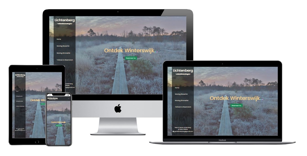
The website has a minimalist character, so that the user can quickly and clearly find good information about the holiday homes. Visually, the site has been made as much as possible according to the latest trends, so that the website distinguishes itself from the more standard websites of the competition. All this in a way that suits my current skills.
- The main colours used are black and several types of pastel yellow.
- The Poppins font is the main font used. Sans Serif is the fallback font.
- The website is calm and visually appealing. There is a nice natural background from the area and there are some nice photos with the properties of the holiday homes.
The website consists of one page and has four sections.
- Responsive on all device sizes.
- Opaque-overlay; to create a nice background effect.
- Navbar (upper navigation); with a collapsing hamburger menu for smartphone and tablet.
- Navigation menu left; for desktop.
- Callout; to get people's attention.
- Carousel; stylish way to display images.
- Form; get in contact.
- Modal; stylish an compact way of displaying information.
- Bootstrap v5.0; for basic structure, styling and responsiveness.
- Font Awesome; for the icons.
- Google Fonts; for the fonts.
- Git; for version control.
- GitHub; for storing the project.
- Balsamiq; for the wireframes.
- PicResize; for resizing the images.
- TinyPNG; for resizing the images.
- Techsini; for the Mockup.
The W3C Markup Validator and W3C CSS Validator Services were used to validate the website to ensure there were no syntax errors.
-
As a First Time Visitor, I want to be able to navigate the website well and find content easily.
- On the tablet and smartphone, the navbar provides easy access to the different sections on the website.
- On the desktop, the side menu clearly shows the different sections of the website. Here you can easily navigate.
- It is easy to see which section you are on due to the large headlines.
- Since the content is on one page, you can easily scroll through the page.
-
As a First Time Visitor, I want to see pictures of the houses to determine if the ambiance suits me.
- The carousel allows you to view the pictures quickly and easily.
- The varied pictures give you a good idea of the ambiance.
-
As a First Time Visitor, I want information about the features and the prices of the holiday homes. With this information I can make a decision about the suitability.
- The features of the houses are shown below the pictures on the tablet and smartphone, so that you can quickly see what is meant. They are next to it on the desktop.
- The use of color on the black background makes the features stand out well.
- By using the modal you can quickly and clearly see the prices. Scrolling is not necessary.
-
As a Returning Visitor, I want information about how to make a reservation.
- The reservation form is designed to make it easy to contact and make a reservation. It is clear to see what has to be entered in the input fields.
- On the home page, below the callout, there is a button to go directly to the reservation form.
-
As a Returning Visitor, I want information on how to get in contact to ask any questions i might have.
- The contact details at the bottom of the reservation form are clearly visible on the tablet and smartphone. That's where you would expect them. You have to scroll to the bottom of the page.
- On the desktop there is also a section at the bottom of the side menu with the contact details. They always remain visible, no matter which section you are in on the website.
-
As a Frequent User, I want to be able to see if there are new homes and / or changes available.
- The structure of the site, which the visitor is already familiar with, makes it easy to see whether a new home has been added. This would also be visible in the menu.
- The same applies to changes to the existing homes. It is easy to see if features have been changed or added.
-
As a Frequent User, I want to be able to see if there are attractive discounts in a certain period.
- The button "actuele tarieven" opens a modal where frequent users can quickly and easily check whether certain discounts apply. The user is now used to the website layout and knows where to find this button.
- The website has been tested on multiple browsers; Mozilla Firefox, Google Chrome, Microsoft Edge and Safari.
- The website has been tested on multiple devices; desktops, tablets and smartphones.
- The website has been extensively tested on the site http://www.responsinator.com/, suggested by my mentor.
- It has been properly tested whether all links function.
The website was deployed to GitHub Pages using the following steps:
- Log in to GitHub and locate the GitHub Repository
- At the top of the Repository (not top of page), locate the "Settings" Button on the menu.
- Scroll down the Settings page until you locate the "GitHub Pages" Section.
- Under "Source", click the dropdown called "None" and select "Branch: Master".
- Click on the "Save" Button.
- Scroll back down through the page to locate the now published site link in the "GitHub Pages" section.
- Log in to GitHub and locate the GitHub Repository
- Under the repository name, click the "Code" Button.
- To clone the repository using HTTPS, under "Clone HTTPS", copy the link.
- Open Git Bash
- Change the current working directory to the location where you want the cloned directory to be made.
- Type
git clone, and then paste the URL you copied in Step 3.
- Background; settings from Whiskey drop excercise in the Code Institute diploma program and https://getbootstrap.com/docs/5.0/getting-started/introduction/.
- Opaque-overlay; settings from Whiskey drop excercise in the Code Institute diploma program and https://getbootstrap.com/docs/5.0/getting-started/introduction/.
- Navbar (Upper navigation). The basic code is from https://getbootstrap.com/docs/5.0/examples/. I have edited the code.
- Navigation menu left. The basic code is from https://getbootstrap.com/docs/5.0/getting-started/introduction/. I have edited the code.
- Carousel; the basic code is from https://getbootstrap.com/docs/5.0/examples/. I have edited the code.
- Form; The basic code is from https://getbootstrap.com/docs/5.0/getting-started/introduction/. I have edited the code.
- Modal; the basic code is from https://getbootstrap.com/docs/5.0/examples/. I have edited the code.
- All content was written by the lichtberg family and the developer.
- Background image from Eric Lichtenberg
- Opaque overlay image (light-mesh.png) from https://www.transparenttextures.com/
- Pictures homes from Eric Lichtenberg
- My Mentor; for getting me started and his helpful feedback.


 React
React
 Typescript
 Django
 Laravel
 Facebook
 Microsoft
 Google
 Alibaba
 D3
D3
 Tencent