Milestone_1_ThirdEyeBlind_Site
By: Mike Webber
User Centric Frontend Development Milestone Project
Demo
A live demo of the finished project can be found here.
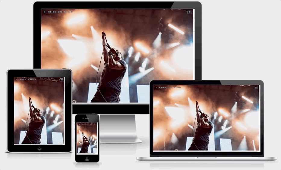 "Desktop Demo")
UX
When first navigating to the site, I actually found a really great photo to bless the 'landing page'. The image shows us warm lighting and a touch of cool blue hues, which is a sort of narrative on the bands song content. Warm and cold lyrics, and engaging guitar riffs. The lights on the stage finding the lead singer in the middle of romance, disappointment, and hope. I believe this initial contact with the page creates a great first impression. This is visually appealling content. The only written information on the landing page is on the Navbar, which is the small square logo of the band, followed by the band name itself. The font used is Open Sans, which is said by to be "a humanist sans-serif typeface. It features wide apertures on many letters. It is said to be highly legible on screen and at small sizes. As of July 2018 it is the second most served font on Google Fonts."-Wikipedia (https://en.wikipedia.org/wiki/Open_Sans). The space on the page of the project isn't crowded and gives us only the elements that are important to a clean delivery of content. The hover effect on the the buttons is subtle.
UI
The landing page is clean and straightforward in content delivery. Giving us a picture of the lead singer, a navbar with the title of the band name and a dropdown menu with navigable links to the rest of the single-page app. All of the pages interactions are mapped by links in the navbar. The footer gives us external links to explore more of what the band has to offer, if a user wishes to venture.
Wireframes
The initial wireframes were loosely conceptualized with room for improvement once the project was underway. These were done in Balsamiq 3 and are available to view in the repo as well (file titled 'Wireframe.bmpr') as some notebook photos taken during the design of the project when I was working with my mentor (denoted as the jpg images in the repository, IMG_1220.jpg, IMG_1221.jpg, and IMG_1222.jpg).
User Stories:
- As a longtime fan of Third Eye Blind, I can navigate to this site and listen to their entire playlist on spotify or watch some of their music videos (downsized presentation for brevity - they have a lot of videos).
- As a new fan of Third Eye Blind, I can go to this site to find all their music and listen to it.
- As a concert goer who wants to see Third Eye Blind live, I can come to this site to view upcoming tour date times and locations, as well as purchase tickets from external sites.
- As someone who wants to host the band at an event, I can fill out the form at the bottom of the page and someone will contact me about that event in the future.
- As a developer, I want to showcase my skills to date utilizing HTML5, CSS3, Bootstrap and other libraries to make a website dedicated to one of my favorite bands.
Design:
I wanted the site to be minimal in appearance, yet definitive in it's delivery of pertinent content about the band, Third Eye Blind. When loading the page, we are immediately greeted by a hero image of the lead singer bathed in a nice ambience of light at one of their concerts. This will tell you that if you didn't already know, Third Eye Blind is a band. Then you scroll the page and learn more about their music.
Color Scheme:
The main colors used in the project are Black (#000) and White (#FFF), grey, as well as North Carolina Blue or Baby Blue (#87ceeb). I didn't want to overwhelm anyone with a complicated and unecessary color scheme selection so I kept it simple. I thought the #87ceeb color went well with the lyrics of the band which often are "daydreamy" and "hopeful", so I used sky blue.
Features
The first thing we see when we navigate to the page is a hero image of the lead singer. The second section is a tour date list and ways to purchase tickets. The third part of the project is where you can listen to music by the band or watch a music video. The next section is an Image Gallery. The section after that is a booking form you can use to book the band for an event. And in the footer there are more ways to follow the band or listen to more of their music on other web services.
Features left to implement:
I would like to somehow include more music videos on the site, but for the sake of brevity, I selected videos "throughout" the career of the band, providing an oversight of their music.
I didn't really think about this until the end of the project, but would like to implement a tagline at the bottom of the 'landing-page' that explains a little bit about Third Eye Blind.
I would also like to implement a 'stop-scrolling-while-video-plays' function for when a user clicks one of the videos in the carousel to play. The carousel keeps scrolling otherwise.
Technologies used
HTML 5
CSS3
Javascript
Fancybox https://fancyapps.com/fancybox/3/docs/
Bootstrap 4.3.1 https://getbootstrap.com/
Font Awesome https://fontawesome.com/
Deployment
Instructions on how I deployed my project to github pages (a free hosting feature of github to launch projects) can be found here and here.
You can download and edit the file locally by going to the repository found at https://github.com/mick3/Milestone_1_ThirdEyeBlind_Site and clicking 'clone or download' (a green button on the page) and then pasting the link into your code editor with 'git clone' before it. So it would look like (without quotes) 'git clone https://github.com/mick3/Milestone_1_ThirdEyeBlind_Site.git'.
Media
image used for jumbotron landing-page background found at: https://substreammagazine.com/2019/07/third-eye-blind-summer-gods-tour-photo/. It is named "Third_Eye_Blind_glory.jpg" and downsized as "3eb_downsized.jpg". took an image from https://www.paradiso.nl/nl/programma/third-eye-blind/62618/ to use on the "booking-area" section of the page. Named it "Stephan_Jenkins.jpg"
All images in Image Gallery were downsized at http://www.onlineimageresize.com/. Images used for the Image gallery were resized to be small for thumbnail viewing with the fancybox app, and all file names of the resize are named "onlineimageresize_com_" followed by the original file name. For example, the thumbnail for "acoustic.jpg" is named "onlineimageresize_com_acoustic.jpg" after running it through the downsize web app aforementioned.
1."acoustic.jpg" taken from https://trilliumfamily.org/advocacy-platform/look-keep-oregon-well-with-third-eye-blind-in-the-skype-live-studio-photos-video/
2."screamer_tour.jpg" taken from https://loudwire.com/third-eye-blind-fall-2019-tour/
3."band_bw.jpg" taken from https://www.billboard.com/articles/news/7834041/third-eye-blind-summer-gods-EP-album-tour-interview
4."band_bw_dopamine.jpg" taken from https://crypticrock.com/third-eye-blind-dopamine-album-review/.
5."sj_hand.jpg" taken from https://www.rollingstone.com/music/music-features/third-eye-blind-frontman-on-the-desperation-behind-hit-debut-250843/.
- "3eb_back.jpg" taken from https://www.impconcerts.com/event/1820799-third-eye-blind-jimmy-eat-columbia/.
7."group_hug.jpg" taken from https://spectrumculture.com/2019/06/20/concert-review-third-eye-blind-jimmy-eat-world/
8."acoustic_2.jpg" taken from https://splice-mediagroup.com/jimmy-eat-world-along-with-third-eye-blind-light-up-freedom-hill/2019.
9."3eblogo.png" used in the navbar was taken from the Third Eye Blind Facebook group site.
10."favicon.io" was originally an image of the bands upcoming album "Screamer". It was taken from a photo gallery on https://www.thirdeyeblind.com/ and turned into a small favicon image used in the tab of the browser. It was processed using https://www.favicongenerator.com/.
Used https://wpshout.com/quick-guides/create-text-outline-css/ to create a black outline border on the navbar title "Third Eye Blind" and the navbar dropdown, to create separation from the background upon landing and scrolling the page for viewability with the light blue color used.
I utilized a third party library for the image gallery on the page. This is called "Fancybox" and can be seen from visiting: http://fancyapps.com/fancybox/3/docs/#introduction .
Used this demo to display more than one item in the carousel at a time on large screens. Must utilize media queries to sort out smaller screens though. https://medium.com/wdstack/bootstrap-4-custom-carousel-94a537364fde
Testing
Deleted "background-attachment: fixed" in my css for both background images. They were showing up on my iphone as 'zoomed in' and pixelated. So I deleted that, and reloaded the page on my iphone 6 and it rendered correctly without the effect upon scrolling it had before.
As I worked through the project, I primarily tested the site on mobile by using my own iPhone 6s (Safari 13). This helped me immensely and helped to cover some of the smallest screen sizes needed to be accounted for in my project.
Browsers I tested the site on include: Chrome Version 76.0.3809.100 (Official Build) (64-bit), Firefox Quantum 69.0.1 (64-bit), Safari Version 13.0.1 (14608.2.11.1.11) and Opera Version:63.0.3368.94. I was unable to test on Microsoft versions of browsers (Edge, IE) because I don't own any Microsoft products. But in hind sight, I could have gone to Best Buy to test on their sample models.
Using the 'booking form', in order to submit it, you need to fill out each of the fields. If you miss a field, there is a warning asking you to fill out said field in the form. The exception is the optional comments field which does not need to be filled out.
All tour date ticket links work and open in a new page in your default browser. This was accomplished in html by using target="_blank" for the link.
The CSS was run through the AutoPrefixer Online at https://autoprefixer.github.io/ to add functionality across web browsers where needed.
Personal feedback from Mobile users:
I posted my page to Facebook and got feedback on various mobile devices (9) and potential problems.
- Alex Kowalkowski's first comment was to ask if I work for the band. His feedback was to tell me to focus on Wordpress and he didn't complain about anything about the site but said he used an iPhone 10.
- Meghan Mcpherson said "Looks great! I didn't have any issues with the site and I'm on an iPhone (X Max)."
- John Montross said "I found it easy to use and browse and I use Android (Samsung J3)".
- Marie Goheen replied to John's comment and said "same on iPhone 7".
- Courtney Leach said she used a Galaxy S7, and said "Looks good, but when I scrolled to the bottom there was an icon over the submit button". And "this is personal preference but I didn't like having all the pages to scroll through when I went to the page. I prefer a homepage and then going to each page for that info." I replied to her and made her aware that the point of the single-page app is to be concise and that the dropdown menu is used to navigate to each section.
- Heather Saunders said "I'm on the Moto One Zoom and when I scrolled back up to the top from the bottom there is a large blank area above the tour dates". This is actually a bug I've been dealing with in the project. Sometimes the Hero image on the landing page has to reload. I'm not sure if it's because a bigger file or what.
- Megan VanHoose said "I'm on an iPhone XR and it looks great. Scrolls well, easy to navigate."
- Jacoby Routley said "Galaxy Note 10 worked good for me".
- Cassandra Salsa said "Moto 4, Android. Mostly works good, the tickets stuff didn't quite fit the page for me." (I made this section have an "x-scroll" feature because it's a little wide on mobile devices and also told her that in feedback).
I also used Chrome Devtools throughout the project and utilized all the simulations of devices to ensure it was mobile, tablet, and desktop friendly (covering most screen sizes). Simulated devices include Galaxy S5, Pixel 2, Pixel 2 XL, iPhone 5 / SE, iPhone 6/7/8, iPhone 6/7/8 plus, iPhone X, iPad, and iPad Pro.
Bugs/Fixes:
Collapsible navbar dropdown code found here: https://stackoverflow.com/questions/42401606/how-to-hide-collapsible-bootstrap-4-navbar-on-click Since I created a single-page app, the default navbar wasn't enough. The default navbar expects when you are clicking to go to a different segment of the page, that you'll be reloading the entire site and navigating elsewhere. For a single-page app, additional code was needed.
I received help from Anthony O'Brien, a channel lead for "User Centric Front-End": he let me use some javascript for the main dropdown menu to collapse after clicking on one of the menu elements, since the entire project is a singe-page HTML project. The default dropdown menu wasn't sufficient for use with a single-page element because it only disappears because we are navigating to a different page and it is reloading an entire page (when using a multi-page project). I have a single-page web app, so after you click the dropdown, it navigates to a different page section, and also collapses with the javascript implementation.
Acknowledgements
I received inspiration for a more "modern" look and "minimal" look by looking at the highest graded Milestone project submitted by Haley Schafer. I also liked the presentation of her README.md file and asked her where she found a site to demo the responsiveness of my website by using http://ami.responsivedesign.is/ and then a gif generator to capture the screen demo and post it in this README.md file.
This is for educational use.


 React
React
 Typescript
 Django
 Laravel
 Facebook
 Microsoft
 Google
 Alibaba
 D3
D3
 Tencent