This website is to help improve on an already existing website for a shop that is local where I live. For the sake of copyright names have been changed and text reworded. The purpose of this is to help advertise the business more effectively with improved visuals, better organisation of information and finally a simpler less cramped interface for users to navigate the site.
The reason I feel it is necessary to make this project is the original site is strangely broken with uneven negative space between containers, along with uneven positioned images. These are a few of the issues I found and wish to improve upon. My overall aim is to design and make a website with the idea of better itself financially and socially. Giving it a platform to better communicate with their consumers where they have full control. As well as a pleasant environment for customers to visit and wish to return to.
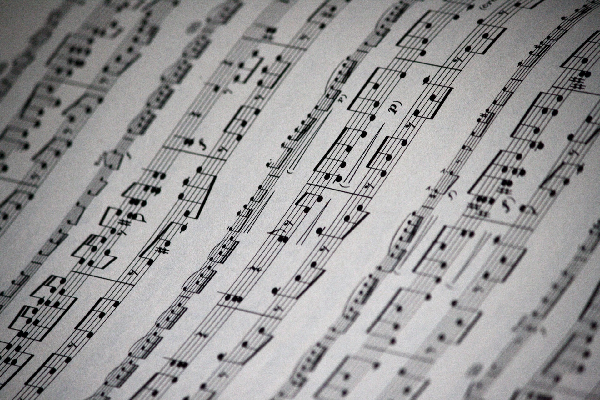
To achieve greater user experience I have improved on the coloration of the site opting for burgundy and ivory themes. This is not only to be gone with the original coloration of black, white and yellow; which did not blend well and help to separate the content in a way that doesn't flow with the page; it was chosen to give the feel of a classical instrument and a piece of sheet music. This is to link the design to the product.
The navigation section of every page's core concept was designed to stick out from the rest of the page being easy to find and understand. When a user hovers the cursor over one of the buttons it fades into a lighter for two reasons. The first being to let the user know which button they are on, giving the user feedback on their actions. Making the website responsive to their actions. The second being the maroon used is very dark so to help the fade stand out against the background it becomes lighter to make it easier to see. This also brightens up the page making it more appealing.
On the original web page it has a carousel displaying off centred images without context. To improve on this aspect I used images covering the entire width of the slide this helps to show off various products the business sells in a cinematic way drawing the eye of the consumer. This is ideal as the slides show information on how the business operates. Displaying it an appealing way catching the attention of the user.
At the bottom of index.html is an embedded view of the business as of Google Maps, this allows users to see almost first hand how the business looks and types of products that they sell. It is also good for locating the business in person. This is something the original site seemed very dedicated to as it also used an embedded Google Maps view point in a well appealing way, as well as with addresses used widely across pages, being included in header and footers along with giving physical directions to the business. I feel this information presented in this way is not the ideal way of doing this. As those who are not local would not understead the directions or need them in some cases, and those that are local would be aware of business considering its location to other well known businesses. This is way I opted to go for a large map that users can use to look around the area to understand where it is along with zooming out to gather directions.
For the information provided on rental.html I didn't want to present it a mundane way where it was just text on a page separated by headings. Because of this the page includes alternating visuals and information on either side. This is to keep the user interested in the website, enjoying their experience. The images used are of bands, concerts and an orchestra the reason for this is the business sells all the instruments involved in all three of these instances. This helps users to relate to the content. Whether they wish to be a pop star or a classical performer. When the screen size is of the size of small tablet or phone the alternation stops and instead goes down in rows presenting the information above the images to keep the core concept the page was given.
Contact.html is very plain and simple, being given a transparent background with the input fields for the user's email and the message they wish to send. To make it more appealing for the user a classical background was added to help brighten up the page as well as break away from the usual colours of the website. The purpose of the transparent background on the contact form itself is to allow the colour to shine through and help the two separate pieces appear as one. The contact form no longer has a message field. This is because when the user filled out the form and pressed "Send!" the user's default emailing app would open with all input fields as the message. This didn't look professional so has become a very simple and easy to use "Why not email us!" button which fills in the address field with the business' email address. Allowing the user to input the text as an email and send their message that way.
- Customer, I want to use the website to find a guitar that I wish to purchase. Loading up the webpage there is no clear tab for buying instruments. I scroll down on the "home" page and click on the "latest products" to find they do not lead anyway. I was unable to buy a product on this website.
From this I can see that customers have no clear way of purchasing items using the website. To combat this issue I will add links to the "latest products" section allowing the customer to see the product's information and buy it.
- Customer, I want to scope out the new website to see if it deserves my interest. Loaded up "home" page and was impressed by the professional presentation. Continued to the "rentals" page and enjoyed the splash of colour involved alongside the information provided. Lastly went to the "contact" page and was overwhelmed by the out of character presentation revealed by the rest of the site. Having too much colour, rather than being eye catching, it demands attention and is "too in your face". Overall enjoyed most of the website but suggested a more subtle contact image.
In light of this criticism the background image for contact.html will be changed to a musical score to stay within the classical theme of the website. Helping it better suit the over experience of the website.
- Customer, I wish to visit the business in person so am using the website to find the address. After loading the "home" page I looked for a while to discover that the address was at the bottom of the page. Which was easy to see from the contrasting colour of the title but I struggled to read the actual address as it blends into the red.
Now that it is known that the address text is hard to read it will change to the same as the address to provide a better contrast of colours to allow the user to read the text easily.
- Customer, I have visited the website to send a message using the "contact us" page. After loading up the "home" page and progressing onto the "contact us" page I am disappointed with the default button that is used with the form. This is very out of theme with the rest of the web pages. However, the button does work sending me to my email with the recipient field already filled in.
After looking into the comment it is true that a very basic button has been used for the sake of simplicity. The issue with this is as the comment says it breaks the flow of the already established styling conventions. To combat this a styled button will be used in the place of the default styling.
- Customer, viewing the mobile view of the webpage I want to check out the latest products section of the website and see the product's information page. Loading the "home" page the latest the products section is easy to navigate to. The section is easy to find but the images themselves don't appear to link to any other pages, as well as the images "seem to fall off the page".
The images do not have links to the products information pages as this is a feature to be implemented in the future. But it is true the images appear to fall off the page of the mobile view. Some padding tweaks will be made to tighten up the images making them feel firmly on the page.
- In an isolated incident on an iOS device the carousel flickered between the first and last image after clicking the "next" button it is unknown why this happens, as the code is taken from Bootstrap and works well majority of the time I do not want to tamper with it in the event the code's functionality is affected even more.
- Navigation - Allows the user to access the other pages of the website. The current page's button is disabled making it impossible to keep reloading the same page. as screen size changes so does the arrangement of the buttons going from a row of 3 to on top of this other.
- Carousel - Displays 3 images with various information. The navigation buttons allow the user to go back to a specific slide by using either the left and right arrows or the buttons at the bottom of the slides.
- Latest Products - This panel shows the latest products that the business is selling. This panel is displayed on most of the pages allowing easy access by the user to latest deals. These will be updated as the business acquires new merchandise. The code is designed in a way that these are easy to locate and alter as needs be.
- About Us - Shows a summarised history and workings of the business. Shorted to just 6 paragraphs to keep the information concise and not allow it to overwhelm the user or the page.
- Google Map - Lets the user see the shop "personally". Allowing them to look into the layout and what the shop offers. The map also be used to help locate the business allowing users to visit the shop.
- Rentals - The information displayed here is shown in 2 columns and 3 rows alternating the images and information. This helps add colour to the usual theme of the website. This helps to draw the user's eye and present the information in a fun way keeping their attention for longer. Rather than showing text on a screen which would make reading the information seem like a chore.
- Contact Form - The form itself is very simple having only an email field and a message field, as well as being given a black transparent background. To help make the form stand out a colourful background has been used. The purpose of the form is to allow users to email the business either with queries, compliments or complaints. All of these can be used to improve the business, as well as to develop a healthy customer business relationship.
- Footer - Placed at the bottom on the page it helps to section off the end of the content for the page to end. The same burgundy has been chosen to match the theme of the page. Within is the address to help users visit the business in person, along with social media links to see the latest updates between the platforms.
- Latest Product Information Pages - These pages will have a full scale image of the product, followed by the history and details of the product. Underneath these columns will be the price and an add to basket button.
- Basket - This feature will hold all of the products that the user wants to buy. Other than listing all of the products it will show the prices and total price of all the products. After all this there will be an option to buy along with payment methods.
- Products Page - This page would list all of the products categorised appropriately to make it easier for users to find the specific product they desire.
- Product Pages - Similar to the latest products page these will house the information the user will need to decide whether or not to buy the product.
- Search Bar - The advantage that this feature will bring is that users will be able to simply type the product that they desire and be sent straight to it. Where the products page is a library of products the search bar is a chauffeur.
- HTML5
- The project uses HTML5 for the purpose of adding content and structure to web pages.
- CSS3
- This project uses CSS3 to style and position the content provided by HTML5.
- JQuery
- The use of JQuery was to help in manipulation of DOM, clearing up time which was better focused on other aspects of the project.
- Github
- Github was used as a hosting platform, as well as a backup for all the project's files.
- Gitpod
- Gitpod provided ready to codecdev environment for the project to begin and come into fruition.
- Bootstrap
- The external library provided by Bootstrap was used to save time on styling, rather than making entirely bespoke CSS3.
- Google Fonts
- This was used to embed more type faces into the project, helping to use specific fonts rather than a rigid selection.
- Google Maps
- Google Maps was used to embed a map and first person perspective of the business.
- Font Awesome 6
- This allowed me to add icons that acted the same as text, allowing for easy styling.
- Hover.css v2
- This allows for easy to embed hover css styles, specifically I used the fade effect for the navigation buttons.
- Lucidchart
- The purpose of Lucidchart within the project was to make clean and easy to understand wireframes.
- View Product:
- Go to "Home" page
- Scroll down to "latest products" to verify the images have displayed properly
- Images have appear in a row with the same styling (success)
- Appears carousel images have not display properly for an iOS device
The latest products appeared correctly but the user found another issue during testing that on an iOS (phone) device the carousel final image violin.jpg did display on that device. This led to further testing.
- Carousel Functionally
- Load "Home" page.
- Scroll down to the carousel.
- Check auto scrolling works as expected.
- Carousel images scroll right every few seconds this is expected functionality.
- Click the right button.
- Images scroll right.
- Click the left button.
- Images scroll left.
- Test 1, 2, 3 buttons
- Buttons 1, 2, 3 do not appear to have any functionality.
After looking into the code it appears the code was not embedded correctly, after following the instructions the code has been embedded correctly and the functionality of the carousel has works as expected.
- Carousel Image Display on different platforms:
- Load the website again on iOS phone device to ensure the problem persisted.
- It does. Load website on iOS tablet device to see if the problem is an isolated issue or persisted throughout iOS devices
- It does. Load website on PC and test sizing of web page to ensure that isn't the reason why the bug was present.
- This wasn't the case. Load the website on an Android to see if the problem was a phone or tablet issue.
- The problem wasn't present within an Android device. So it was decided this was an incompatibility with iOS devices in general.
- Went through code to see if the file type was the source of the issue. All the images were jpegs.
- To solve the issue a similar picture was chosen and tested in the same way to ensure the problem was no longer present.
This was quite an unusual bug as it only persisted on iOS devices, and all of the file types were the same. However, it was an easy fix and the carousel now works on all platforms.
- Ensure Social Links Load Correctly
The icons for "Social Links" have been taken from Font Awesome the test is to ensure the embedding process has been implemented correctly.
- Load all pages and ensure the "Social Links" appear at the bottom of all pages.
- The "Footer" has been implemented successfully along with the "Address" and "Social" sections.
- All social links appear correctly except the ebay icon.
- The link appears to work correctly, opening at the correct destination.
This test was unsuccessful as the ebay icon did not appear. After researching it appears that an old link was embedded within the website causing the newer to not appear.
- Occurs When Swapping Between Desktop and Phone Display Mode Within Developer Tools While swapping between desktop and phone display modes in Google developer tools a strange margin on the right appears, it is unknown why this happens. However, during standard use of the website this will not occur and therefore will not be issued to the standard user so no time or resources will be spent to solve the problem.
To host the website I made use of Github as a hosting platform. To accomplish I had to link Github to Gitpod this is quite a simple process having me add Gitpod as a browser extension to my browser of choice. From there I had created a repository then I can proceed to open it with Gitpod and begin to develop the code. After enough code has been written I can then host the website from the settings options scrolling to the Github pages section choosing to host off of the master branch. This will then provide me a link to access the website from. The project has no differences between the development and deployed versions, this is so it is easy to update and maintain in the future as both are carbon copies of each other. Therefore do not contain different configuration files and run on the master branch provided by Github pages.
In order to run the code locally you will need Github and the Gitpod browser extension from there you will need to access Github repositories and open it within Gitpod using the added options from the extension.
- All text used within this project was taken from https://www.stamfordmusicshop.co.uk
- All images used are images found within Google Images, all of which are labeled for commercial reuse.
- e-guitar.jpg - https://medium.com/giglue/top-20-musical-instruments-you-can-easily-play-693f603a2bcf
- guitar.jpg - https://guitarsquid.com/best-classical-guitars-under-1000/
- violin.jpg - https://www.piqsels.com/en/public-domain-photo-sbrfv
- contact-banner.webp - https://serenademagazine.com/wp-content/uploads/2017/03/music-sheet-1327003_1920.jpg
- products-e-guitar.jpg - https://commons.wikimedia.org/wiki/File:Maton_electric_guitar_(1960s).jpg
- products-guitar.jpg - https://www.peakpx.com/439381/epiphone-spruce-top-acoustic-guitar-with-gray-capo
- products-keyboard.jpg - https://www.flickr.com/photos/30478819@N08/31659976968
- products-violin.jpg - https://commons.wikimedia.org/wiki/File:German,_maple_Violin.JPG
- rental-band.jpg - https://www.wallpaperflare.com/band-in-rainbow-smoke-people-watching-music-band-during-nighttime-wallpaper-zhjwn
- rental-concert.jpg - https://www.publicdomainpictures.net/en/view-image.php?image=64321&picture=concert-with-purple-lights
- rental-orchestra.jpg - https://www.usafe.af.mil/News/Article-Display/Article/1993570/usafe-band-unites-us-ukrainian-armed-forces-through-music/
Throughout the project I was inspired by a handful of sources to help shape the finished product. These included:-
- Currys for the layout of the latest products section of index.html.
- Food Station with their use of embedded Google Maps showing the location of the business, along with the style.
- Stamford Music Shop for the idea of the first person perspective Google Map. As well as the inspiration to make an improved version of their website.
- Apple (specifically the airpods pro page) for introducing me to a much more interesting way to present information. I used this for the information contained within rental.html.
- CodeInstitute For both the social links and contact form. The code for these sections were bespoke but the design concepts were taken from the lessons provided for Whiskey Drop, as well as the Resume websites respectively.


 React
React
 Typescript
 Django
 Laravel
 Facebook
 Microsoft
 Google
 Alibaba
 D3
D3
 Tencent
.jpg)