The users of the site are people who want to learn more about the experiences of other people regarding flying into space, they want to learn more about the Moon and/or Mars. Furthermore, site visitors are able to request more information or book a flight into space. The company wants to create more bookings by sharing the experiences of other people, providing more information about the two destinations and to make it easy to book a flight or request more information regarding a departure from several locations in the world.
- As a visiting user I want to easily find and read the experiences of other people so that I get an idea of the quality of the service.
- As a visiting user to the website I want to quickly learn more about the Moon and Mars so that I can decide if and which one I want to visit.
- As a visiting user to the website I want to be able to navigate directly to the book a flight area so that I don't waste time searching for it.
- there is a pdf version added in the project itself and can be found at the wireframes folder.
- each page will include the Space✈M logo which always links back to the homepage when clicked on and it is a representation of the company. Also, the navbar with three links for users to change pages by clicking on each specific link: Home - Background information - Book a flight.
- both are responsive to the screensizes Ipad and Iphone5.
- each page will show the footer with the company address so users know where the company resides.
- will include four social links which allows users to follow updates, come into contact with each other and share experiences.
- they are responsive to smaller screensizes like an Ipad and an Iphone5.
- will have a header and footer.
- additionally a body with three sections, each will have their own header.
- in the first section there will be two quotes with a video link in the middle for users to think about space and earth in a funny and philosophical way.
- in the second section there will be two reviews with a green round button to redirect directly to the green book a flight page.
- in the third section we show the three departure locations on earth.
- responsive to Ipad and Iphone5.
- will have a header and footer.
- the body has three sections with each their own header as well.
- the first section includes two video links, one about the Moon and one about Mars, to inform the users about the two possible destinations with again in the middle the green round button to link directly to the book a flight page.
- the second section is used to provide additional information about the flights in a structured way by using a table which shares dates, duration, departure location and destination. As well as a green round button to redirect directly to the green book a flight page.
- in the third section we show the three departure locations on earth.
- responsive to Ipad and Iphone5.
- will have a header and footer.
- the body will have two sections.
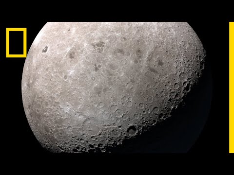
- the first section shows an image of the Moon and of Mars including the price for each flight.
- the second section includes a form with required information and submit button to either request more information or to book a flight.
- responsive to Ipad and Iphone5.
- using ARIA attributes to create accessibility for screen readers.
-
#021f4b blue -
#4c3b71 purple -
#115268 green -
#fafafa white -
#676767 grey
- the color-scheme inspiration came from the following image.
- HTML: was used to create the basic skeleton of the project
- CSS: was used for styling the pages to make it more attractive for users to visit.
- Bootstrap: the project uses Bootstrap 4.0 to be responsive to screen size and it provides a certain basic structure which saves time.
- FontAwesome: all the icons I used on my website are from here.
- GoogleFonts: by browsing Google fonts I chose the space mono 400 regular for content and the 700 bold for headers and the menu in general.
- DevTools: was used for the positioning of features and content while also used during adaptations regarding responsiveness.
- Fixed header
- Drop-down menu
- Visually improved buttons
- Table adjustments
-
Desktop: my own screen turns out to be 1366x768 and I started with this screen once I was able to view it in a browser. All the links, buttons and videos worked the way they should.
-
Ipad: I used DevTools to adjust it to the Ipad size. I tested all the links, buttons and videos. They worked.
-
Mobile: the Iphone5 was the basis for adjusting the website to mobile size. At first I hid quote two and review two, but in the end the view allowed for all. Also here everything worked as expected.
-
Chrome: this is the browser I normally use and have used during this project. For the most time I did not have access to the browser view, but via DevTools at the end I was able to see how to adjust for an Ipad screen and mobile (Iphone5) screen. All the links, buttons and videos work.
-
Firefox: for now I only pasted the link in the browser and it showed that the links, videos as well as the buttons were working in the same way.
-
Edge: I tested the links, videos and buttons and they were all working similarly when I pasted the url in this browser.
-
As a visiting user I want to easily find and read the experiences of other people so that I get an idea of the quality of the service.
- Home: on this page we see a header with a logo that links to the homepage. Then a navbar that links to all three pages. The first section header with two quotes and a video. Then another section header with two reviews and a round button with a link to the booking page. Below that a section header with three departure locations. Finally, a footer with the address of the company and four social links.
- As a visiting user, when I visit the homepage, I can see the section header and read the reviews below from people who already experienced a flight in an instant on the homepage.
-
As a visiting user to the website I want to quickly learn more about the Moon and Mars so that I can decide if and which one I want to visit.
- Background information: on this page we see the same header and footer. Besides that there is a section header with two informative videos and another round button with a link to the booking page. Below that section header with a table that contains more information regarding the dates, departures, travel time and destination. Below that a section header with three departure locations and at the bottom the footer again with the address of the company and four social links.
- As a visiting user you can learn more about the Moon and Mars by clicking on background information in the navbar which leads to the background information page where you can watch both videos.
-
As a visiting user to the website I want to be able to navigate directly to the book a flight area so that I don't waste time searching for it.
- Book a flight: on this page we have the same header and footer. At the top there is a section header with images of the Moon and Mars including the prices per destination. Below that a header as a question with a form where you can either request more information or leave your info if you want to book a flight. Name, email and the specific request are required. There is a submit button as well.
- As a visiting user you are one click away from booking on each page via the green book now button or via the booking a flight link in the navbar, as you have seen on the homepage and background information page. When you click on the green button you are directed to the final book a flight page. The same result when you click on the book a flight link in the navbar on any page. Directed to the last page, book a flight, you can fill out the form.
- The logo link should direct to the homepage when being clicked on which it does.
- All the lines/boxes of the form should be filled out since they are required. If not a message should appear to fill out a certain line/box which it does. Once you fill out all the lines before you click on 'I want to fly into space' these warnings should not appear which indeed they do not, as expected.
- The social links should open in another browser tab once you click on any of the four. All four social links open, as expected, in another browser tab.
- HTML: was checked and passed the W3C validator with no issues.
- CSS: was checked and passed the Jigsaw validator with no issues.
- Please note that I removed my alt text at the images and videos since they came up as errors in the above validators.
-
At the homepage for some time I could not get all three features of the first section aligned next to each other. Despite trying first by changing margins and/or padding without DevTools. I realized that the second section did place three similar features next to each other. I compared the code just to realize that the only thing that I needed to change were some end divs! They were not placed correctly around the code so I corrected that.
-
At some point I decided to check my social links and they did not work eventhough I followed a CI tutorial doing this. I did not understand why, looked online and then found a website where they mentioned that you should use the absolute URL. I adapted the links and after that they worked!
-
Responsiveness; here I still have so much to learn and I think this is what took a lot of time and I am still not satisfied with the results. At the same time I learned a lot playing with the box model. I believe I missed my deadline mainly due to this part (combined with the fact that I was stressed with time anyway). I was proud of creating this neat website (first ever!) with Bootstrap on my own desktop view. Then came responsiveness.. First I started to use both the grid system and the media queries which completely messed up my good looking website. I should have read 2.6 of LO2 more closely. I decided I should go for media queries this time and perhaps later the grid system. Since Bootstrap is mobile first design but my own design was desktop first, mainly made with looking at the preview in gitpod and later luckily looking at it via my own browser, I was confused. I started with min-width, but later realized that even though I used Bootstrap, which is mobile first, my design had been desktop first. So I changed it to max-width. Then to pick the breakpoints. The idea was to make it fit all the screen sizes on DevTools, but I could not make it due to time. I decided to focus on desktop, Ipad and Mobile (Iphone5) which already created many changes and sometimes challenges for each size. At the final moments there were still always little things to adjust that would not change due to? Although I have to say it always gives a great feeling when I resolve one of my issues and learn more about how it all works.
This website was deployed to GitHub pages from the GitHub repository by following these steps:
- Login into GitHub.
- From all the repositories on the screen, select TheExplorationofaLifetime.
- From the menu items click on Settings.
- Scroll down to the GitHub Pages part.
- Under Source click on the drop-down menu and select Master Branch instead of None.
- While selecting Master Branch, the page is automatically refreshed and is now deployed.
- Scroll back down to the GitHub Pages part and get the link to the deployed website.
At the moment of submitting this project the Development Branch and the Master Branch are identical.
To clone this project in Gitpod you have to:
- Have a GitHub account. Create one here.
- Use the Chrome Browser.
Then:
- Install the Gitpod Browser Extension for Chrome.
- Then, restart the browser.
- Log into Gitpod with your gitpod account.
- Go to the Project GitHub repository.
- Click on the green Gitpod button.
- A new gitpod workspace will be created from the code in GitHub where you can work locally.
If you want to work on the project code within a local IDE:
- Follow this link to the Project GitHub repository.
- Click on the Code button next to the green Gitpod button.
- Choose the Clone option with HTTPs.
- Copy the clone URL for the repository.
- Open the terminal in your local IDE.
- Change the current working directory to the location where you want the cloned directory to be made.
- Type 'git clone', then paste the URL copied at step 4.
- The quotes came from the following site.
- The departure locations used in my website came from this site.
- In order to get the Youtube Video Thumbnail Image I used the following site.
- The Moon and Mars images had to be converted from webp to jpg so I used this site.
- The reviews, address and pricing were written by me.
-
The images used in this site came from this source.
-
The video's used in this site came from Youtube:


- The pull-right that I used on the navbar came from this site.
- The code for the table was taken from Bootstrap.
- The resizing of the images so that they are equal.
- The basic code for the form was taken from a CI tutorial.
- The (submit) button code came from a CI tutorial and was adjusted.
- Regarding media queries, I have looked at CI tutorials and online as mentioned in the bug fixing section.
- In the end, most of the basic structures came from CI tutorials. I especially looked again at the miniprojects.
- I would like to thank my mentor for guiding me through the steps and staying optimistic about being able to finish before the deadline even though I am a complete beginner who was stressed with time.
- Thanks to tutor support I was was able to view my project in my own browser at the end by fixing my open ports issue. This helped me to work a lot easier and gave me a much better overview.
- Thanks to student support for having a look at my surgery at the end of last year and the possibility regarding an extra time request.

