JuliaMono is a monospaced typeface designed for programming in text editing environments that require a wide range of specialist and technical Unicode characters.

Visit https://juliamono.netlify.app to find out more.
repository for JuliaMono, a monospaced font with reasonable Unicode support.
Home Page: https://juliamono.netlify.app/
License: SIL Open Font License 1.1
JuliaMono is a monospaced typeface designed for programming in text editing environments that require a wide range of specialist and technical Unicode characters.
Visit https://juliamono.netlify.app to find out more.


To reproduce, write >--> in a terminal with ligatures enabled. The last > becomes invisible and actually every character after that becomes invisible as well. Could this be a bug in the ligature rendering? I am using the latest v0.011 and this doesn't happen with any other font.
For example, in my tmux status line:

v.s. Fira Code

Great work BTW 🎉
Here is how the following looks with Consolas font in VScode:

and here is with JuliaMono:

the Greek characters have unequal spacing, some appear more or less caligraphic, especially κ, while the vertical height is unequal, see for example difference with ζ, ξ which should have same bottom and top.
Is this intentional? (ps: I see that capital Φ still has problems, cc @jagot )
Extracting a comment from #27, because I believe it to be a valid suggestion that could be discussed separately:
I think the only complaint I have is that
`looks slightly "heavier" than'(seems to be slightly wider at the top?):
Besides being objectively wider, the fact that it's a diagonal stroke makes it not pixel-aligned, which adds to its heavier appearance. I do like the larger backticks (with a height matching that of ' and "), but I'd prefer if they weren't so top-heavy.
Here's a screenshot showing what I see (VSCode, 13" macbook, JuliaMono 0.017):

As shown in the screenshot, the "ring" of the capital Phi Φ seems to rest on the baseline:

This feels wrong to me, being half Greek. This is more in line with what I expect, i.e. that the vertical line ends on the baseline (taken from Wiki):
In Estonian the letter õ is commonly used and at the moment the character has a bit too wide tilde for the base or it's too close to the base. For both õ and Õ. I might be oblivious about other languages and fonts, maybe Portugese fonts do use it like that. I've included some images to show, what looks to me, a more appropriate size and height for the tilde.


When dropping these fonts into the Fonts folder on Windows 10 I get a message that they are not valid font files.
The file browser identifies them as OpenType font file
Happy to run any tests if you make any changes.
in certain sizes. I'm not sure whether it's an issue with VSCode/Atom, but these don't look right:
pr, 10:

a:

The font looks great on the website (and/or on Linux) though, so I suspect there's a problem with the otfs on Windows.
I'm not sure if this is an explicit design decision, but the way the number sign is rendered seems a little off to me:

I admit that among the letters with descenders, on the right, it doesn't look off, but among uppercase letters and numbers, it seems like a noticeable drop.
For contrast, here's Roboto Mono:

And here's Fira Code:

IMO aligning the base of the # character to the baseline, as these two do, works well in both contexts. Maybe JuliaMono could adopt that style as well?
It looks like the normal large and the small backticks for multiple backticks are aligned along a too high baseline above. It's very subtle, but " and ' seem to be aligned just a smidgen lower. This has the effect that ``` after a doctest, for example, looks a bit too close to the text above:

Would you consider adding a stylistic set (if that's the appropriate mechanism, that is) to disable the bigger single backtick:

I know this is a bit of a request, but just putting it out there in the spirit of: "Be Greedy"
Until julia-mono my faverite coding font was Input
Which is a proportional font for coding.
Even if not for coding, having a proportional font is nice to use for other times.
The <- ligature can be confusing for Julia code, since in Julia, <- is not an operator. This is because it misleadingly makes1<-2 look like 1 <- 2, where it actually parses as 1 < -2. Since this font is advertised as being explicitely designed for Julia, would it make sense to disable that ligature by default?
please look at the picture.
Left v0.010 ... Right v0.011
https://0x0.st/iExn.png
6 line less is a big change.don't you think?
OS: Linux
Terminal: rxvt-unicode
Editor: Neovim
Font: JuliaMono Medium,Size 10
Probably effects other characters as well. Unrelated to font size:

The APL programming language uses a set of mostly non-ASCII characters for built-in functionality. Here is an example APL keymap. Julia Mono supports all the characters (hooray!) even in NARS2000 (keymap), the most demanding APL I know of. The glyphs generally look okay, but there are some issues with specific glyphs and a lot of glyphs that are much smaller or lighter than a typical character. Historically (though a very long time ago), many of these glyphs were produced by overstriking—typing two characters on top of each other. In most cases the issues could be fixed by replacing a glyph with a combination of existing ones, like ⌽ with | and ○.
⌶ is just the wrong character. It renders as a delete key symbol when it should be "I-beam", usually a stripped-down small-caps I.⌽ is a very unusual rendering; I would expect to see the bar extend past the circle just like a lowercase phi, but maybe more precisely geometrical.⍲ has its tilde cut off; it should have a full tilde like U+2371 ⍱.⍫ is extremely small.⍞ in "quote quad" the quote is almost as big as the quad, making it difficult to recognize. If you're not going to expand the box, the quote should probably be cut off.⍷ is inconsistent with U+220A ∊ (which is very small), although this is something I've seen in other fonts as well.Since they're not always obvious, here's a table of commonly recognized APL overstrikes. There are also characters with an underscore or box that Julia Mono does seem to use overstrikes for. I would say the circle (U+25CB ○) and quad (U+2395 ⎕) should be heavier and the quad larger to match other APL characters better.
   |~∘⋆\-¨

○  ⌽ ⌾⍟⍉⊖⍥
¨   ⍨⍤⍣
∆  ⍋
∇  ⍒⍫
∧   ⍲
∨   ⍱
0   ⍬
⊥    ⍎
⊤    ⍕
∩    ⍝
,        ⍪

Pipeline operator has excess vertical padding
This is so cool! And perfect for Pluto :)
The file size is too high (1200kB for two font weights vs the current 20 kB for Roboto Mono latin+greek), but the high number of glyphs is too cool to consider changing it.
But I thought of a way to make it work: Pluto could initially load with a version of JuliaMono that only includes latin (with browser default monospace for other glyphs), and then swap over to full JuliaMono once it is loaded. Do you think that this is a good idea?
I noticed that the latin subset of JuliaMono is similar to Roboto Mono, but there are differences. Would it be possible to extract the latin subset from JuliaMono?
Couldn't but noticed that tildes and accents are incomplete with taller upper case letters: ñÑ áÁ (at least on the Windows Terminal)


It looks like all the fonts are loaded twice - from the same URL, but in separate requests (the response headers are different).

Technically, the two dots should overhang towards the 'a'. Personally, I enjoy it as is.

(One may add something like the following to startup.jl to further enjoy juliamono.)
using REPL

function myrepl(repl)

    repl.interface = REPL.setup_interface(repl)

    repl.interface.modes[1].prompt = "julϊ̇a> "

    return

end

atreplinit(myrepl)
You probably thought about it and being "mono" spaced . . .
Currently, I find that \Psi and \psi in JuliaMono look a little too similar for my taste. It's not a big deal when they're right next to eachother and you can cross reference them, but I worry that I'd mistake the lowercase for uppercase or vise versa if I only saw one of them in isolation.
E.g. here is Julia mono

and here is Droid Sans which I think did and excellent job with their \psi.

Using emacs and Konsole in Manjaro Linux / KDE Plasma. The monitor is a BenQ GW2765HT 27.0" 2560x1440 Monitor.
Roboto
When raising an issue, check that you're using the latest version, and if appropriate could you add information about your operating system, hardware in use (mainly the ppi of your monitor , software/editor, pixel size, etc. Thanks!

Julia Mono

I also compared some other fonts. Visually the hypen seem to me to sit too 'low' and should be bumped up slightly higher. This is especially evident in the 3--32 text.
Can we use stylistic alternatives to have a second set of ligatures?
I would just like a small gap, rather than no gap for them.
I think 1 full pixel, rather than just a little bit of shading, would be all i want.
![]()
I had to zoom so far in to see that there was infact some shading between the characters

I really love this font ❤️ and it seems to be intentionally designed, but I don't like the design of the fractions.

I can't visually recognize the center character of the figure above as a fraction. In particular, the numerators other than 1 and 2 are hard to recognize because they do not have a horizontal line element at the bottom.
I also don't see the rationale for fitting a glyph between the baseline and ascender line. It feels like it unnecessarily reduces the size of the figures. (Edit: As I commented below, if this is a ligature issue, I can understand why it would be of such a size and position, but that does not change the claim.) I would prefer to follow the position and size of superscript and subscript numbers.
I know that OpenType has features for styling fractions (frac/afrc). However, I suggest changing the "default" glyph design.
In version 0.017, the dot of U+013F LATIN CAPITAL LETTER L WITH MIDDLE DOT and U+0140 LATIN SMALL LETTER L WITH MIDDLE DOT is above the letter. It should be to the right. Also, the dots should be the same size as U+00B7 MIDDLE DOT.

So as from v0.003 I've started adding TrueType hints, which I was hoping not to have to do - in about 20 year's time it shouldn't be needed at all, but as of now it appears to be useful for improving rendering at lower resolutions...
I'm hoping this just improves clarity in all environments with no drawbacks, but please tell me about any regressions.
In case you're wondering what this involves: you have to persuade the relevant pixels on the screen grid to change color since there's not enough resolution to show the real shapes.

I expect this to take some time... :)
Maybe it's a taste thing, but I personally prefer φ for phi (as does the standard VS Code font, not sure what it is) since it is easier to distinguish with Φ Phi (and also I find it kind of prettier than ϕ)
Currently in JuliaMono:
| Tab completion | Character |
|---|---|
| \phi | ϕ |
| \varphi | φ |
| \Phi | Φ |
Could it be possible? 😅:
| ab completion | Character |
|---|---|
| \phi | φ |
| \varphi | ϕ |
| \Phi | Φ |
I get the following rendering on linux (tried x emacs and terminal so far):

The cap appears to be levitating a bit.
If there is an uppercase letter in front of a backtick, the backtick gets smaller than usual:

I'm guessing this was not intentional, but I also don't really understand why that would happen.
Might just be personal preference, but I do think :: would benefit from a ligature putting the two colons just a tad closer and maybe making them the tiniest bit smaller. I think currently, the fact that the space between the two colons is larger than the space after the preceding and before the following character looks a bit odd when looked at closely. FWIW, FiraCode also has this ligature, and I think it makes Julia code a bit more readable.
When using Beamer in LaTeX, things like <5-> is quite often typed.
JuliaMono would render them by combining ->, which is what I don't want in this situation.
Is there a way to optionally disable it if there is not space between -> (or some other criteria)?
First of all: thanks so much for this contribution! I think your typeface is fantastic, clean and readable but still with character - near perfect actually. But to my eyes there are two minor inconsistencies among the standard latin letters that stick out a tiny bit.
Lower case f: the filial of the ascender is quite flat where I would expect it to be more curved. Compare with the upper filial of the a, s, c and r which all curve downwards a bit, or the foot of the t or l which curve similarly upwards. Would it be possible to just mirror the bottom of the t and call it a day?
Lower case r: this one is tricky. I think I see what you were going for by combining the slight leftward angular serif of the stem (similar to the i, j, l) with more of a curve to the right (see point 1 above). But the end result looks a bit out of place, as if a cursive glyph was dropped in among the rest. See how the three r's stick out in "Argumenterror" your screenshot below. On the other hand, your r also contributes to the typeface character so I'm a bit on the fence about it. Maybe just tone down the "cursiveness" a tiny bit?
https://juliamono.netlify.app/assets/emacs-example.png
This is all highly opinionated of course. But If you see my point here but still want to keep your original designs, would you consider providing alternate glyphs for the f and r?
In version 0.016, U+02A7 LATIN SMALL LETTER TESH DIGRAPH looks like a ligature of ⟨tf⟩ instead of a ligature of ⟨tʃ⟩.

In version 0.016, U+240E SYMBOL FOR SHIFT OUT looks like “SS”. It should look like “SO”.
After downloading the font and installing correctly, The fonts don't seem to be working correctly on my vs code editor. Current setting.json:
   "terminal.integrated.fontSize": 14,
   "editor.fontFamily": "JuliaMono-Regular",
    "terminal.integrated.fontFamily": "Consolas",
    "editor.fontLigatures": "'ss01', 'ss02', 'ss03', 'ss04', 'ss05', 'ss06', 'zero', 'ss07'",
    "editor.suggest.showInterfaces": false,
    "julia.execution.resultType": "both",
    "editor.fontSize": 16
But editor keep displaying this:

Ordinarily, I would be expect the font style and ligature to display nicely like in the screenshot in https://juliamono.netlify.app/
Not sure why mine isn't working and what I'm missing
Thanks for your interest in this experiment!
Wouldn't it be great if your code ran perfectly on everybody's machine, no matter what? I wish... 😃 So, I'm interested in seeing how different this font 'code' runs on various machines. So, if you have a spare minute, you could upload a picture of JuliaMono-Regular running on your setup.
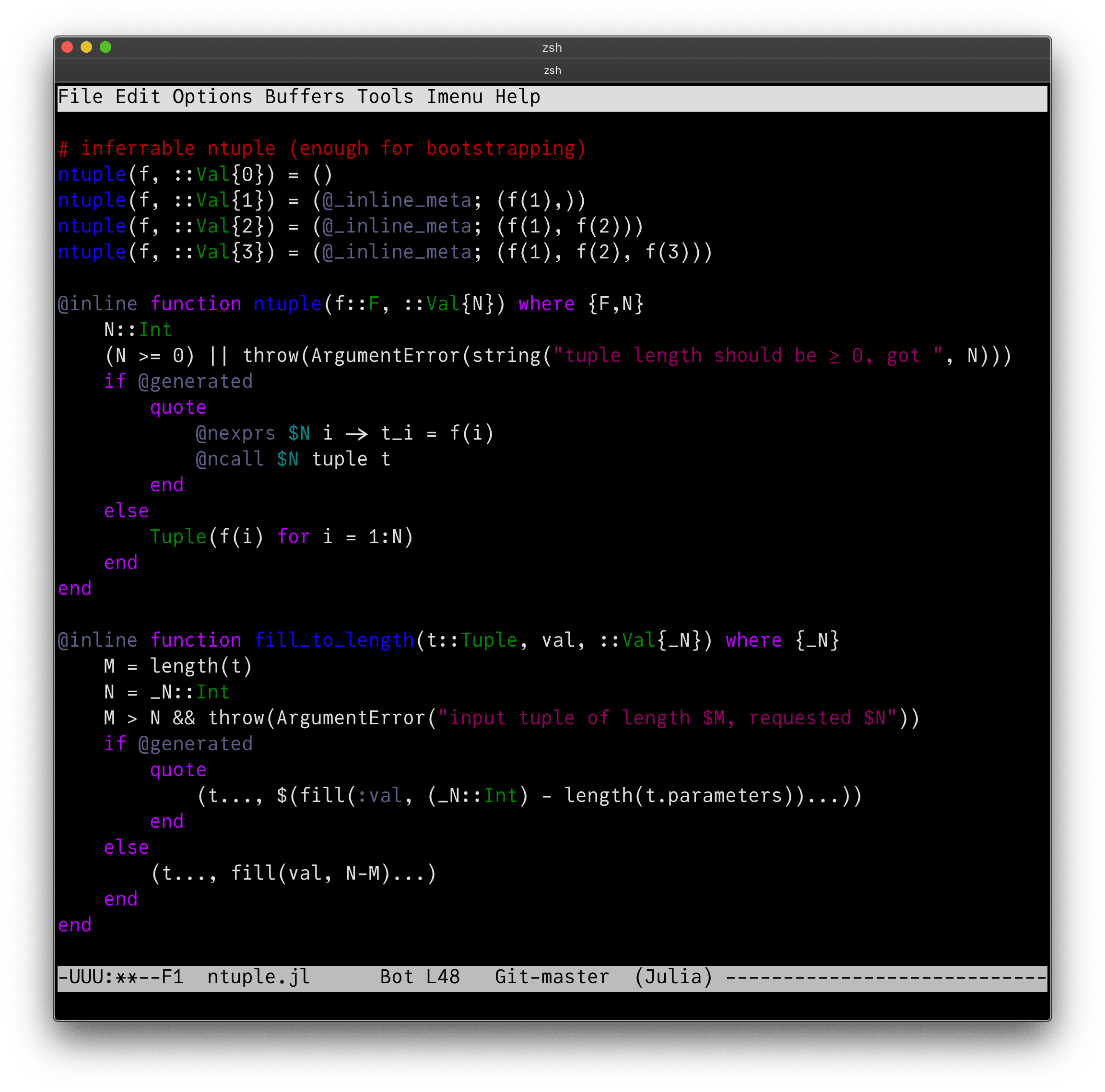
I suggest opening up a file such as /julia/base/ntuple.jl for editing in your usual favourite coding environment, and post it with a few details about how old your machine is, which OS, monitor resolution, and so on. I might be able to gather from these where best to spend time trying to improve it.
iMac (Retina 5K, 27-inch, 2017):

Thanks!
A few letters for these unicode groups are inconsistent:
frak: A, N
bfrak: Q
scr: (B), M, N, R
bscr: H, K, M, N, R, T, V, Y
All characters tested:

julia> for (name,st) in pairs(Tofrak.styles)
           println(name)
           foreach(print, st.(['A':'Z'; 'a':'z'; '0':'9']))
           println()
       end
bb
𝔸𝔹ℂ𝔻𝔼𝔽𝔾ℍ𝕀𝕁𝕂𝕃𝕄ℕ𝕆ℙℚℝ𝕊𝕋𝕌𝕍𝕎𝕏𝕐ℤ𝕒𝕓𝕔𝕕𝕖𝕗𝕘𝕙𝕚𝕛𝕜𝕝𝕞𝕟𝕠𝕡𝕢𝕣𝕤𝕥𝕦𝕧𝕨𝕩𝕪𝕫𝟘𝟙𝟚𝟛𝟜𝟝𝟞𝟟𝟠𝟡
b
𝐀𝐁𝐂𝐃𝐄𝐅𝐆𝐇𝐈𝐉𝐊𝐋𝐌𝐍𝐎𝐏𝐐𝐑𝐒𝐓𝐔𝐕𝐖𝐗𝐘𝐙𝐚𝐛𝐜𝐝𝐞𝐟𝐠𝐡𝐢𝐣𝐤𝐥𝐦𝐧𝐨𝐩𝐪𝐫𝐬𝐭𝐮𝐯𝐰𝐱𝐲𝐳𝟎𝟏𝟐𝟑𝟒𝟓𝟔𝟕𝟖𝟗
sans
𝖠𝖡𝖢𝖣𝖤𝖥𝖦𝖧𝖨𝖩𝖪𝖫𝖬𝖭𝖮𝖯𝖰𝖱𝖲𝖳𝖴𝖵𝖶𝖷𝖸𝖹𝖺𝖻𝖼𝖽𝖾𝖿𝗀𝗁𝗂𝗃𝗄𝗅𝗆𝗇𝗈𝗉𝗊𝗋𝗌𝗍𝗎𝗏𝗐𝗑𝗒𝗓𝟢𝟣𝟤𝟥𝟦𝟧𝟨𝟩𝟪𝟫
mono
𝙰𝙱𝙲𝙳𝙴𝙵𝙶𝙷𝙸𝙹𝙺𝙻𝙼𝙽𝙾𝙿𝚀𝚁𝚂𝚃𝚄𝚅𝚆𝚇𝚈𝚉𝚊𝚋𝚌𝚍𝚎𝚏𝚐𝚑𝚒𝚓𝚔𝚕𝚖𝚗𝚘𝚙𝚚𝚛𝚜𝚝𝚞𝚟𝚠𝚡𝚢𝚣𝟶𝟷𝟸𝟹𝟺𝟻𝟼𝟽𝟾𝟿
bisans
𝘼𝘽𝘾𝘿𝙀𝙁𝙂𝙃𝙄𝙅𝙆𝙇𝙈𝙉𝙊𝙋𝙌𝙍𝙎𝙏𝙐𝙑𝙒𝙓𝙔𝙕𝙖𝙗𝙘𝙙𝙚𝙛𝙜𝙝𝙞𝙟𝙠𝙡𝙢𝙣𝙤𝙥𝙦𝙧𝙨𝙩𝙪𝙫𝙬𝙭𝙮𝙯𝟬𝟭𝟮𝟯𝟰𝟱𝟲𝟳𝟴𝟵
frak
𝔄𝔅ℭ𝔇𝔈𝔉𝔊ℌℑ𝔍𝔎𝔏𝔐𝔑𝔒𝔓𝔔ℜ𝔖𝔗𝔘𝔙𝔚𝔛𝔜ℨ𝔞𝔟𝔠𝔡𝔢𝔣𝔤𝔥𝔦𝔧𝔨𝔩𝔪𝔫𝔬𝔭𝔮𝔯𝔰𝔱𝔲𝔳𝔴𝔵𝔶𝔷0123456789
it
𝐴𝐵𝐶𝐷𝐸𝐹𝐺𝐻𝐼𝐽𝐾𝐿𝑀𝑁𝑂𝑃𝑄𝑅𝑆𝑇𝑈𝑉𝑊𝑋𝑌𝑍𝑎𝑏𝑐𝑑𝑒𝑓𝑔ℎ𝑖𝑗𝑘𝑙𝑚𝑛𝑜𝑝𝑞𝑟𝑠𝑡𝑢𝑣𝑤𝑥𝑦𝑧0123456789
scr
𝒜ℬ𝒞𝒟ℰℱ𝒢ℋℐ𝒥𝒦ℒℳ𝒩𝒪𝒫𝒬ℛ𝒮𝒯𝒰𝒱𝒲𝒳𝒴𝒵𝒶𝒷𝒸𝒹ℯ𝒻ℊ𝒽𝒾𝒿𝓀𝓁𝓂𝓃ℴ𝓅𝓆𝓇𝓈𝓉𝓊𝓋𝓌𝓍𝓎𝓏0123456789
bscr
𝓐𝓑𝓒𝓓𝓔𝓕𝓖𝓗𝓘𝓙𝓚𝓛𝓜𝓝𝓞𝓟𝓠𝓡𝓢𝓣𝓤𝓥𝓦𝓧𝓨𝓩𝓪𝓫𝓬𝓭𝓮𝓯𝓰𝓱𝓲𝓳𝓴𝓵𝓶𝓷𝓸𝓹𝓺𝓻𝓼𝓽𝓾𝓿𝔀𝔁𝔂𝔃𝟎𝟏𝟐𝟑𝟒𝟓𝟔𝟕𝟖𝟗
bfrak
𝕬𝕭𝕮𝕯𝕰𝕱𝕲𝕳𝕴𝕵𝕶𝕷𝕸𝕹𝕺𝕻𝕼𝕽𝕾𝕿𝖀𝖁𝖂𝖃𝖄𝖅𝖆𝖇𝖈𝖉𝖊𝖋𝖌𝖍𝖎𝖏𝖐𝖑𝖒𝖓𝖔𝖕𝖖𝖗𝖘𝖙𝖚𝖛𝖜𝖝𝖞𝖟𝟎𝟏𝟐𝟑𝟒𝟓𝟔𝟕𝟖𝟗
bi
𝑨𝑩𝑪𝑫𝑬𝑭𝑮𝑯𝑰𝑱𝑲𝑳𝑴𝑵𝑶𝑷𝑸𝑹𝑺𝑻𝑼𝑽𝑾𝑿𝒀𝒁𝒂𝒃𝒄𝒅𝒆𝒇𝒈𝒉𝒊𝒋𝒌𝒍𝒎𝒏𝒐𝒑𝒒𝒓𝒔𝒕𝒖𝒗𝒘𝒙𝒚𝒛𝟎𝟏𝟐𝟑𝟒𝟓𝟔𝟕𝟖𝟗
bsans
𝗔𝗕𝗖𝗗𝗘𝗙𝗚𝗛𝗜𝗝𝗞𝗟𝗠𝗡𝗢𝗣𝗤𝗥𝗦𝗧𝗨𝗩𝗪𝗫𝗬𝗭𝗮𝗯𝗰𝗱𝗲𝗳𝗴𝗵𝗶𝗷𝗸𝗹𝗺𝗻𝗼𝗽𝗾𝗿𝘀𝘁𝘂𝘃𝘄𝘅𝘆𝘇𝟬𝟭𝟮𝟯𝟰𝟱𝟲𝟳𝟴𝟵
isans
𝘈𝘉𝘊𝘋𝘌𝘍𝘎𝘏𝘐𝘑𝘒𝘓𝘔𝘕𝘖𝘗𝘘𝘙𝘚𝘛𝘜𝘝𝘞𝘟𝘠𝘡𝘢𝘣𝘤𝘥𝘦𝘧𝘨𝘩𝘪𝘫𝘬𝘭𝘮𝘯𝘰𝘱𝘲𝘳𝘴𝘵𝘶𝘷𝘸𝘹𝘺𝘻𝟢𝟣𝟤𝟥𝟦𝟧𝟨𝟩𝟪𝟫
(In case you are wondering, these were generated using the file Tofrak.jl from https://github.com/simeonschaub/FrakturaBot.jl.)
Just brainstorming:
Does it make sense to make the font as a "Julia package" so that people can do ] add JuliaMono to get the font?
In version 0.017, the dot of U+013F LATIN CAPITAL LETTER L WITH MIDDLE DOT and U+0140 LATIN SMALL LETTER L WITH MIDDLE DOT is above the letter. It should be to the right. Also, the dots should be the same size as U+00B7 MIDDLE DOT.
]
In version 0.017, U+0281 LATIN LETTER SMALL CAPITAL INVERTED R, U+02B4 MODIFIER LETTER SMALL TURNED R, and U+02B5 MODIFIER LETTER SMALL TURNED R WITH HOOK are all mirrored across the vertical axis from how they should look.

Many glyphs are blank: U+01F6, U+03E2..U+03EF, U+0464..U+046F, etc. This is worse than no glyph at all because it looks like a space and blocks font fallback.
U+027F LATIN SMALL LETTER REVERSED R WITH FISHHOOK should have a descender: the code chart says “preferred presentation is with a descender”.
The lunate sigmas U+03F2 and U+03F9 are wrong. They should be lunate, like the letter ⟨C⟩, but they currently look identical to U+03C2 and U+03A3.
The crossbar of U+03F4 GREEK CAPITAL THETA SYMBOL should reach all the across the letter, joining to the sides of the circle, unlike U+0398 GREEK CAPITAL LETTER THETA.
U+03E0 GREEK LETTER SAMPI should only have two dangling strokes, not three.
The dentistry symbols U+23BE..U+23CC are meant to join left and right to adjacent dentistry symbols, like box drawing symbols do.
U+0190 LATIN CAPITAL LETTER OPEN E and U+2107 EULER CONSTANT are wrong. The top should be round, as in the lowercase form U+025B.
U+2108 SCRUPLE is wrong. It should look more like, though not necessarily identical to, U+042D CYRILLIC CAPITAL LETTER E.
There is a bug in the 'cmap' table where the glyphs for U+0400 and U+040D are also mapped to U+0450 and U+040D.
U+0275 LATIN SMALL LETTER BARRED O has an inner straight line but U+019F LATIN CAPITAL LETTER O WITH MIDDLE TILDE has an inner wavy line. Despite their misleading names, they are a case pair and their inner lines should be consistent. I recommend using a straight line.
The hook of U+0225 LATIN SMALL LETTER Z WITH HOOK should go on the right, as in its capital form U+0224.
The components of the ligatures U+02A4 LATIN SMALL LETTER DEZH DIGRAPH, U+02A5 LATIN SMALL LETTER DZ DIGRAPH WITH CURL, U+23D6 METRICAL TWO SHORTS JOINED, U+A728 LATIN CAPITAL LETTER TZ, U+A733 LATIN SMALL LETTER AA, and U+1D12B MUSICAL SYMBOL DOUBLE FLAT should be ligated but aren’t.
The curly upsilons U+03D2..U+03D4 are not curly.
U+02F6 MODIFIER LETTER MIDDLE DOUBLE ACUTE ACCENT looks like a quotation mark instead of a double acute accent.
U+018F LATIN CAPITAL LETTER SCHWA, U+04D8 CYRILLIC CAPITAL LETTER SCHWA, U+04DA CYRILLIC CAPITAL LETTER SCHWA WITH DIAERESIS, U+A732 LATIN CAPITAL LETTER AA, U+A734 LATIN CAPITAL LETTER AO, U+A736 LATIN CAPITAL LETTER AU, U+A738 LATIN CAPITAL LETTER AV, U+A7AB LATIN CAPITAL LETTER REVERSED OPEN E, and U+A7AC LATIN CAPITAL LETTER SCRIPT G should be as tall as other capital letters.
U+214E TURNED SMALL F is a lowercase letter. It should be as tall as ⟨x⟩.
The Hebrew characters U+05D0..U+05EA, U+2136, U+2138, and U+FB25 are assigned to the wrong code points. Hebrew is utterly illegible in this font.
U+2210 N-ARY COPRODUCT should be taller and descend below the baseline, because it is an n-ary operator. Cf. U+220F N-ARY PRODUCT.
U+2E42 DOUBLE LOW-REVERSED-9 QUOTATION MARK is upside-down.
U+301D REVERSED DOUBLE PRIME QUOTATION MARK and U+301E DOUBLE PRIME QUOTATION MARK should be redesigned to match U+301F LOW DOUBLE PRIME QUOTATION MARK.
U+A69C MODIFIER LETTER CYRILLIC HARD SIGN and U+A69D MODIFIER LETTER CYRILLIC SOFT SIGN should be superscript.
U+A71F MODIFIER LETTER LOW INVERTED EXCLAMATION MARK should be subscript.
The dot of U+A73E LATIN CAPITAL LETTER REVERSED C WITH DOT should go inside the letter, not above it.
U+A771 LATIN SMALL LETTER DUM is missing the abbreviation stroke at the bottom right.
The stroke of U+A749 LATIN SMALL LETTER L WITH HIGH STROKE should be horizontal.
Despite its misleading name, according to L2/20-038, U+A7F8 MODIFIER LETTER CAPITAL H WITH STROKE is really a superscript small capital H with stroke. Cf. U+02B6, which is the correct size for a modifier small capital letter.
U+AB64 LATIN SMALL LETTER INVERTED ALPHA should look like an upside-down Latin alpha, not a right-side-up Greek alpha.
U+AB5D MODIFIER LETTER SMALL L WITH INVERTED LAZY S should have an inverted lazy S, not a normal lazy S.
The glyph at U+FAB2 CJK COMPATIBILITY IDEOGRAPH-FAB2 belongs in a private use area.
The fullwidth characters U+FF01..U+FF60 are not fullwidth.
The rings of U+10B3E LARGE TWO RINGS OVER ONE RING PUNCTUATION and U+10B3F LARGE ONE RING OVER TWO RINGS PUNCTUATION are positioned wrong.
U+1D12A MUSICAL SYMBOL DOUBLE SHARP is not supposed to look like two adjacent sharp signs. It is a distinct symbol.
U+1F0BF PLAYING CARD RED JOKER, U+1F0CF PLAYING CARD BLACK JOKER, and U+1F0E0 PLAYING CARD FOOL are indistinguishable.

It looks to me like the < and > are not quite symmetrical around the x axis, and so they are not "aimed" at the center of the colon in these operators, but a bit low.
Sorry, I am not much in fonts.. in the page of the project (https://juliamono.netlify.app/) you render examples with this new font.. but it may be instructive also to show, e.g. side by side, how the same text/code is rendered with a "normal" font, to show which problems this font solve compared to just using a standard font....
Cheers...
It's just a little bit of an extra pain for Windows users
In version 0.016, U+1D2E2 MAYAN NUMERAL TWO has three dots, making it look like U+1D2E3 MAYAN NUMERAL THREE.
Oooh.... this looks nice. I like FiraCode but wnat to give JuliaMono a try
When cloning in Windows Powershell it look slike the filename for specimen.pdf is fouled up.
rror: invalid path 'specimen (> 30MB!).pdf'
fatal: unable to checkout working tree
warning: Clone succeeded, but checkout failed.
You can inspect what was checked out with 'git status'
and retry with 'git restore --source=HEAD :/'
At 10pt without antialiasing, curly braces are not vertically symmetric and are missing a part of the bottom closing bit:

In version 0.017, U+0281 LATIN LETTER SMALL CAPITAL INVERTED R, U+02B4 MODIFIER LETTER SMALL TURNED R, and U+02B5 MODIFIER LETTER SMALL TURNED R WITH HOOK are all mirrored across the vertical axis from how they should look.
This repo looks awesome! I just looked at the example on the website and the Spanish example contains an ñ whose "tilde"/vergulilla is skewed.
I'm filing an issue as a responsible OSS person but have no idea how this fonts thing works. :D
I'm noticing that tabs are not aligning correctly in all apps. In particular, BBEdit (which is normally highly reliable when it comes to text display) is displaying different spacing for Julia than for other mono-spaced fonts such as Menlo, Hack, Monaco, Courier, etc. XCode seems to display correctly, but other apps such as Coda, Atom, and Sublime have problems as well, indicating that perhaps there is something about the font table that's not right (and which XCode is working around somehow).
I've attached a sample file which demonstrates the problem pretty clearly, as well as a screenshot that compares the layout for Julia in both BBEdit and XCode, and another that shows the result for Hack. Text file is UTF-8, tabs are 4 spaces.
Julia 0.018
BBEdit version 13.5 (415039, 64-bit Intel, sandboxed)
macOS 10.15.7 (19H2)
AMD Radeon Pro 5700
5120x2880 (looks like 2560 x 1440)
30-Bit Colour (ARGB2101010
To me, the uppercase unicode frak and bfrak letters (codepoints 120068-120119 and 120172-120223) look a bit too ornamented, which also makes them harder to read:

Wikipedia has some nice type samples here, which are more straightforward. The bfrak letters are quite good for most letters, but GHIJLOQ are still a bit too complicated for my liking.
A declarative, efficient, and flexible JavaScript library for building user interfaces.
🖖 Vue.js is a progressive, incrementally-adoptable JavaScript framework for building UI on the web.
TypeScript is a superset of JavaScript that compiles to clean JavaScript output.
An Open Source Machine Learning Framework for Everyone
The Web framework for perfectionists with deadlines.
A PHP framework for web artisans
Bring data to life with SVG, Canvas and HTML. 📊📈🎉
JavaScript (JS) is a lightweight interpreted programming language with first-class functions.
Some thing interesting about web. New door for the world.
A server is a program made to process requests and deliver data to clients.
Machine learning is a way of modeling and interpreting data that allows a piece of software to respond intelligently.
Some thing interesting about visualization, use data art
Some thing interesting about game, make everyone happy.
We are working to build community through open source technology. NB: members must have two-factor auth.
Open source projects and samples from Microsoft.
Google ❤️ Open Source for everyone.
Alibaba Open Source for everyone
Data-Driven Documents codes.
China tencent open source team.


