📢 Use this project, contribute to it or open issues to help evolve it using Store Discussion.
The Quickorder app, designed for B2B scenarios, creates a custom page in your store aimed at purchases in bulk, offering tools such as uploading a spreadsheet to make bulk orders more agile.
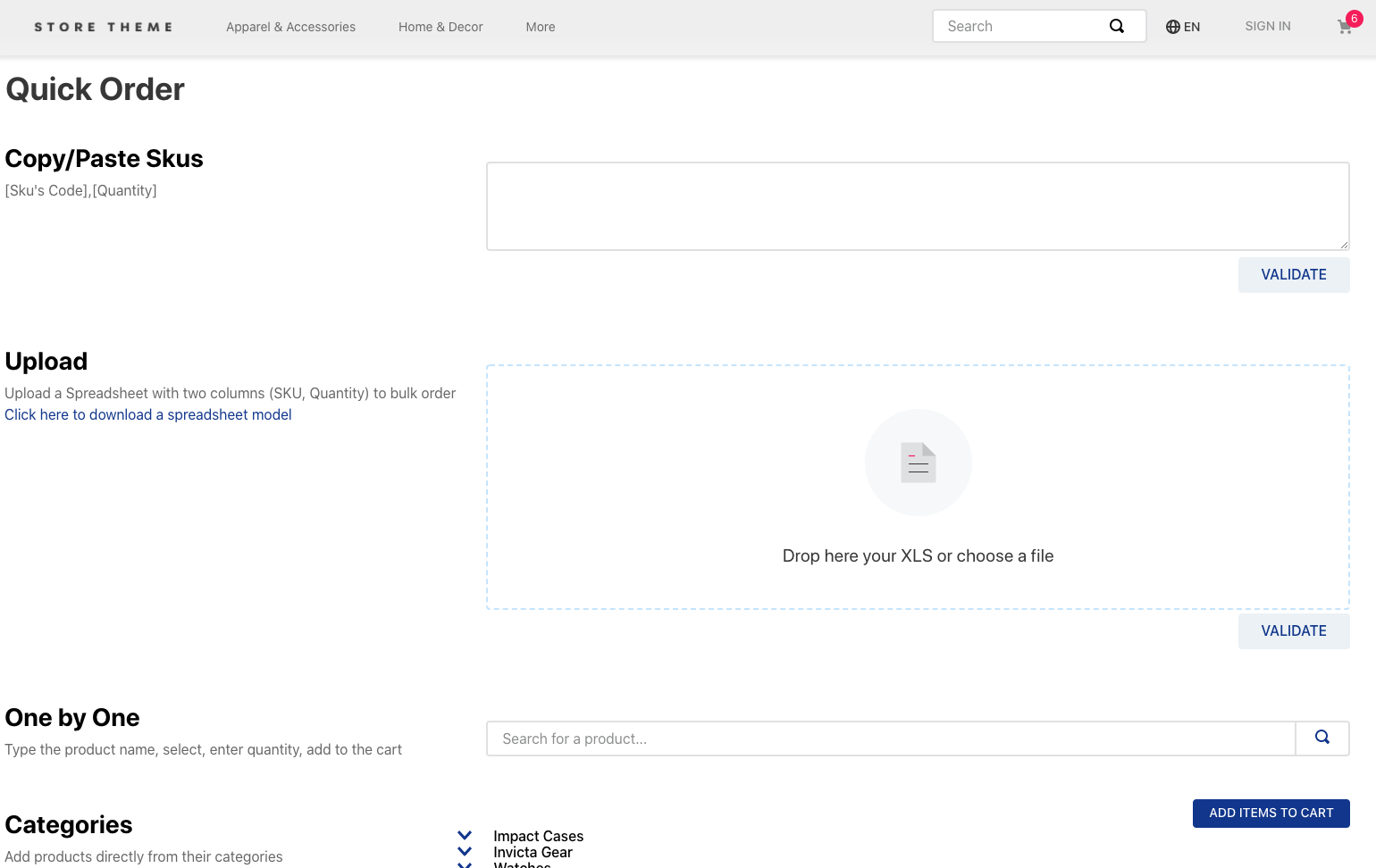 Example of a quick order page without customization
-
Install the Quickorder app by running
vtex install [email protected]in your terminal. -
Open your store's Store Theme app directory in your code editor.
-
Add the Quickorder app as a
peerDependencyin themanifest.jsonfile:"peerDependencies": { + "vtex.quickorder": "3.x" }
Once installed, the app will generate a new route called /quickorder for your store, creating the Quickorder custom page that allows bulk orders.
The new page already contains a default template with all blocks exported by the Quickorder app. This means the Quickorder page is ready to be rendered and no further actions are required.
However, you can customize it by overwriting the template and creating a brand new one tailored to your preferences. To do so, check the Advanced configurations section below.
In order to define the Quickorder custom page UI, you must use the blocks exported by the vtex.quickorder app:
| Block name | Description |
|---|---|
quickorder-textarea |
Renders a text box, allowing users to paste a list of desired SKUs following the structure [Sku's Code],[Quantity]. For more on this component, check out the How the app works section. |
quickorder-upload |
Renders an upload box, working as an option that replaces the Copy/Paste SKU component (quickorder-textarea block). It allows users to upload a spreadsheet containing the desired SKUs. For more on this component, check out the How the app works section. |
quickorder-autocomplete |
Renders a custom search bar, allowing users to look for SKUs and add them to the Minicart at once according to the desired quantity. For more on this component, check out the How the app works section. |
quickorder-categories |
Renders the store's category tree, allowing users to look for the desired SKUs and add them to the Minicart at once according to the desired quantity. |
To use these blocks, follow the instructions below.
-
In the
storefolder of your Store Theme app, create a new file calledquickorder.json. -
Then, create a new store template called
store.quickorder. -
In its
blocksarray, declare the blocks responsible for building your Quickorder custom page. For example:{ "store.quickorder": { "blocks": [ "flex-layout.row#title", "flex-layout.row#textarea", "flex-layout.row#upload", "flex-layout.row#autocomplete", "flex-layout.row#categories" ] }, -
Configure each one of the blocks previously declared using its props, as shown in the example below:
{ "store.quickorder": { "blocks": [ "flex-layout.row#title", "flex-layout.row#textarea", "flex-layout.row#upload", "flex-layout.row#autocomplete", "flex-layout.row#categories" ] }, "flex-layout.row#title": { "children": ["flex-layout.col#title"] }, "flex-layout.col#title": { "children": ["rich-text#title"], "props": { "blockClass": "titleQuickorder", "preventVerticalStretch": true } }, "rich-text#title": { "props": { "text": "## Quick Order" } }, "flex-layout.row#textarea": { "children": ["flex-layout.col#textarea"] }, "flex-layout.col#textarea": { "children": ["quickorder-textarea"] }, "quickorder-textarea": { "props": { "componentOnly": false, "text": "Copy/Paste Skus", "description": "[Sku's Code],[Quantity]" } }, "flex-layout.row#upload": { "children": ["flex-layout.col#upload"] }, "flex-layout.col#upload": { "children": ["quickorder-upload"] }, "quickorder-upload": { "props": { "componentOnly": false, "text": "Upload", "description": "Upload a Spreadsheet with two columns (SKU, Quantity) to bulk order", "downloadText": "Click here to download a spreadsheet model" } }, "flex-layout.row#autocomplete": { "children": ["flex-layout.col#autocomplete"] }, "flex-layout.col#autocomplete": { "children": ["quickorder-autocomplete"] }, "quickorder-autocomplete": { "props": { "componentOnly": false, "text": "One by One", "description": "Type the product name, select, enter quantity, add to the cart" } }, "flex-layout.row#categories": { "children": ["flex-layout.col#categories"] }, "flex-layout.col#categories": { "children": ["quickorder-categories"] }, "quickorder-categories": { "props": { "componentOnly": false, "text": "Categories", "description": "Add products directly from their categories" } } }
All blocks exported by the quickorder app share the same props:
| Prop name | Type | Description | Default value |
|---|---|---|---|
text |
string |
Component title. | undefined |
description |
string |
Component description. It should be used to explain users how to properly bulk order using the given component. | undefined |
componentOnly |
boolean |
If true, only the component will be loaded, removing the text and description column. |
false |
Especially, the quickorder-upload block also can use the following prop:
| Prop name | Type | Description | Default value |
|---|---|---|---|
downloadText |
string |
Defines a text for the spreadsheet download button. Use this prop to explain users how to properly download the spreadsheet model provided by the component. | undefined |
In addition, the quickorder-upload and the quickorder-textarea block can use the following prop:
| Prop name | Type | Description | Default value |
|---|---|---|---|
hiddenColumns |
array of strings (i.e. ["sku", "seller", "quantity"]) |
Defines which columns of the review block must be hidden, you might hide more than one column separating the values with comma | [] |
For more on each of the components and their respective functionalities, check out the How the app works section below.
The Quickorder custom page works just like any other store page, with a unique route and its own components.
This means that you can display a link to it in components from other pages, such as the homepage, so that your storefront users can access it faster.
When configuring the page itself, we recommend that you choose a maximum of 2 bulk order options (from the total of 4 available) to establish clear communication with users. Remember: the more options on the UI, the more complex the order process becomes.
Read the following sections to learn more about the available options.
The Copy/Paste SKU option allows user to paste a list of desired SKUs in a text box following the structure [Sku's Code],[Quantity], where:
SKU's code: SKU Reference ID (be aware that this is not the SKU ID displayed in your admin's Catalog).Quantity: SKU quantity you wish to add to the cart.
For example:
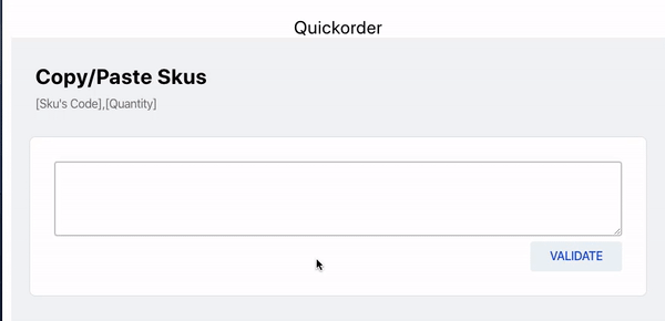
ℹ Remember that you need to validate the list after pasting it. Validating the Reference IDs will let you know if the selected SKUs are in fact available for purchase.
Another possible option that replaces the Copy/Paste SKU option is to upload a spreadsheet containing two columns (SKU and Quantity) to the Upload component (quickorder-upload block).
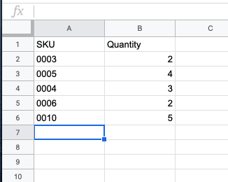
The spreadsheet will work in the same way as the list pasted using the Copy/Paste SKU option, as follows:
SKUcolumn: SKU Reference ID (be aware that this is not the SKU ID displayed in your admin's Catalog).Quantitycolumn: SKU quantity you wish to add to the cart.
ℹ Once uploaded, the spreadsheet is then validated. Based on the filled in SKU reference IDs, Quickorder will confirm whether the SKUs are in fact available for purchase.
The Custom Search Bar component works as a custom search bar. Simply add the name of the desired SKU, then select it and set the amount you wish to add to the cart.
Remember to add each selected item to the cart by clicking on Add.
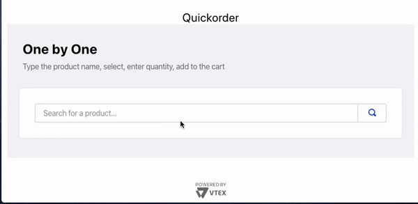
This option does not require any validation, since selecting the SKUs using a search bar already ensures that they are available to purchase.
The Categories component allows users to choose their desired SKUs and respective quantities using the store's categories tree, adding all the selected options to the cart at once.
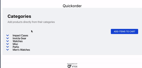
⚠ This option is only recommended if you have less than 50 SKUs for each category in your Catalog. Otherwise, the component will take too long to load and will negatively affect your store's user experience.
This scenario also does not require validating the SKUs that you've added to the cart, since selecting them directly from the store's categories tree ensures their availability.
In order to apply CSS customizations to this and other blocks, follow the instructions given in the recipe on Using CSS Handles for store customization.
| CSS Handles |
|---|
autocompleteBlock |
buttonAdd |
buttonClear |
buttonsBlock |
buttonValidate |
categoriesSubCategory |
categoriesProductContainer |
categoryButtonAdd |
categoryContainer |
categoryLoadingProducts |
categoryHelper |
categoryInputQuantity |
categoryProductLabel |
categoryProductTitle |
categoryProductThumb |
categoryProductReference |
categoryProductItem |
categoryTitle |
componentContainer |
container |
copyPasteBlock |
dropzoneContainer |
dropzoneLink |
dropzoneText |
downloadLink |
inputQuantity |
productLabel |
productTitle |
productSku |
productThumb |
reviewBlock |
skuSelection |
textContainer |
textContainerTitle |
textContainerDescription |
title |
customOptionButton |
Thanks goes to these wonderful people:
This project follows the all-contributors specification. Contributions of any kind are welcome!


 React
React
 Typescript
 Django
 Laravel
 Facebook
 Microsoft
 Google
 Alibaba
 D3
D3
 Tencent