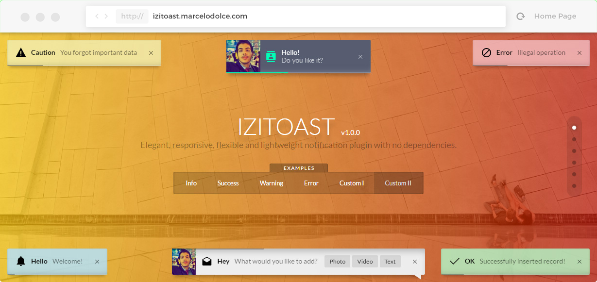
iziToast
Elegant, responsive, flexible and lightweight notification plugin with no dependencies.


| Fast | Responsive | Animated | Lightweight | Customizable | No dependencies | Retina |
|---|---|---|---|---|---|---|
 |
|
|
|
|
|
|
- All modern browsers are supported (Tested in Chrome, Firefox, Opera, Safari, IE9+ and Edge).
- Bugs? create an issue here.
Version Log
- v1.0.1
Internet Explorer support - Implemented.

Install
npm
npm install izitoast --save
bower
bower install izitoast
Default Options
iziToast.show({
    class: '',
    title: '',
    message: '',
    color: '', // blue, red, green, yellow
    icon: '',
    iconText: '',
    iconColor: '',
    image: '',
    imageWidth: 50,
    layout: 1,
    balloon: false,
    close: true,
    rtl: false,
    position: 'bottomRight', // bottomRight, bottomLeft, topRight, topLeft, topCenter, bottomCenter, center
    target: '',
    timeout: 5000,
    pauseOnHover: true,
    resetOnHover: false,
    progressBar: true,
    progressBarColor: '',
    animateInside: true,
    buttons: {},
    transitionIn: 'fadeInUp',
    transitionOut: 'fadeOut',
    transitionInMobile: 'fadeInUp',
    transitionOutMobile: 'fadeOutDown',
    onOpen: function () {},
    onClose: function () {}
});| Argument | Default Value | Description |
|---|---|---|
| class | '' | The class that will be applied to the toast. It may be used as a reference. |
| title | '' | Title of the toast. |
| message | '' | Message of notification. |
| color | '' | It can be #hexadecimal, pre-defined themes like blue, red, green and yellow or set another class. Create and use like this ".iziToast-color-name" |
| icon | '' | Icon class (font-icon of your choice, Icomoon, Fontawesome etc.). |
| iconText | '' | Icon text (font-icon using text, Material Icons, etc.). |
| iconColor | '' | Icon color. |
| image | '' | Cover image. |
| imageWidth | 50 | Width of cover image. |
| layout | 1 | It can be 1 or 2, or use another layout, creating the class like this: ".iziToast-layout3" |
| balloon | false | Applies a balloon like toast. |
| close | true | Show "x" close button |
| rtl | false | RTL option |
| position | 'bottomRight' | Where it will be shown. It can be bottomRight, bottomLeft, topRight, topLeft, topCenter, bottomCenter or center. |
| target | '' | Fixed place where you want to show the toasts. |
| timeout | 5000 | Amount in milliseconds to close the toast or false to disable. |
| pauseOnHover | true | Pause the toast timeout while the cursor is on it. |
| resetOnHover | false | Reset the toast timeout while the cursor is on it. |
| progressbar | true | Enable timeout progress bar. |
| progressbarColor | '' | Progress bar color. |
| animateInside | true | Enable animations of elements in the toast. |
| buttons | {} | You can specify an array of buttons. |
| transitionIn | 'fadeInUp' | Default toast open animation. It can be: bounceInLeft, bounceInRight, bounceInUp, bounceInDown, fadeIn, fadeInDown, fadeInUp, fadeInLeft, fadeInRight or flipInX. |
| transitionOut | 'fadeOut' | Default toast close animation. It can be: fadeOut, fadeOutUp, fadeOutDown, fadeOutLeft, fadeOutRight, flipOutX |
| transitionInMobile | 'fadeInUp' | Default toast opening mobile transition. |
| transitionInMobile | 'fadeOutDown' | Default toast closing mobile transition. |
| onOpen | function () {} | Callback function triggered when open the toast. |
| onClose | function () {} | Callback function triggered when close the toast. |
Methods
- Settings - is used to set default values.
iziToast.settings({
    timeout: 10000,
    resetOnHover: true,
    icon: 'material-icons',
    transitionIn: 'flipInX',
    transitionOut: 'flipOutX',
    onOpen: function(){
        console.log('callback abriu!');
    },
    onClose: function(){
        console.log("callback fechou!");
    }
});- Show - Opens the toast. (Example with buttons).
iziToast.show({
    color: 'dark',
    icon: 'icon-person',
    title: 'Hey',
    message: 'Welcome!',
    position: 'center', // bottomRight, bottomLeft, topRight, topLeft, topCenter, bottomCenter
    progressBarColor: 'rgb(0, 255, 184)',
    buttons: [
        ['<button>Ok</button>', function (instance, toast) {
            alert("Hello world!");
        }],
        ['<button>Close</button>', function (instance, toast) {
            instance.hide({ transitionOut: 'fadeOutUp' }, toast);
        }]
    ]
});- Hide - Closes the specific toast.
var toast = document.querySelector('.toast');

iziToast.hide({
    transitionOut: 'fadeOutUp'
}, toast);- Destroy - Destroy all toasts.
iziToast.destroy();- Info
iziToast.info({
    title: 'Hello',
    message: 'Welcome!',
});- Success
iziToast.success({
    title: 'OK',
    message: 'Successfully inserted record!',
});- Warning
iziToast.warning({
    title: 'Caution',
    message: 'You forgot important data',
});- Error
iziToast.error({
    title: 'Error',
    message: 'Illegal operation',
});
Events
- Open - Capture when the toast is opening.
document.addEventListener('iziToast-open', function(data){
    if(data.detail.class == 'test'){
        console.log('test open');
    }
});- Close - Capture when the toast is closing.
document.addEventListener('iziToast-close', function(data){
    if(data.detail.class == 'test'){
        console.log('test close');
    }
});


 React
React
 Typescript
 Django
 Laravel
 Facebook
 Microsoft
 Google
 Alibaba
 D3
D3
 Tencent