Giter VIP home page Giter VIP logo

react-draggable-tab's Introduction

React-draggable-tab Build Status npm version

Gyazo

Atom like draggable tab react component.

Demo

View Demo

Installation

npm install --save react-draggable-tab

React v0.14 is supported from react-draggable-tab v0.4.0. For React v0.13.x, please use react-draggable-tab v0.3.3.

API

Tab

Tab is just a case class to check props. props.children will rendered into content area.

Props

  • key: unique key in TabList. PropTypes.string.isRequired

  • beforeTitle: element to show in tab. eg icon. PropTypes.element

  • title: string or element to show in tab. PropTypes.oneOfType([PropTypes.string, PropTypes.element]).isRequired

  • afterTitle: element to show in tab. eg: notification badge PropTypes.element

  • uncloseable: If true, closeButton will not be appeared in tab. PropTypes.bool (Default false)

Style (for each tab)
  • tabClassNames: classNames which will be added to rendered elements.

  • tab: base li element of tab (defult: rdTab)

  • tabBefore: before element of li which emulate :Before selector (defult: rdTabBefore)

  • tabAfter: after element of li which emulate :After selector (defult: rdTabAfter)

  • tabTitle: span element of tab title (defult: rdTabTitle)

  • tabBeforeTitle: span element of tab before title (defult: tabBeforeTitle)

  • tabAfterTitle: span element of tab after title (defult: tabAfterTitle)

  • tabCloseIcon: base span element of close icon (defult: rdCloseIcon)

  • tabActive: selected tab's li, before, after (defult: rdTabActive)

  • tabHover: selected tab's li, before, after (defult: rdTabHover)

  • tabStyles: Inline styles which will be overwritten default and common-tabs inline styles.

  • tab: base li element of tab

  • tabBefore: before element of li which emulate :Before selector.

  • tabAfter: after element of li which emulate :After selector.

  • tabTitle: span element of tab title

  • tabActive: selected tab's li

  • tabBeforeActive: selected tab's li before

  • tabAfterActive: selected tab's li after

  • tabTitleActive: selected tab's title

  • tabOnHover: hovered tab's li

  • tabBeforeOnHover: hovered tab's li before

  • tabAfterOnHover: hovered tab's li after

  • tabTitleOnHover: hovered tab's title

  • tabCloseIcon: base span element of close icon

  • tabCloseIconOnHover: base span element of close icon when hover

  • containerStyle: style object which will be apply to container of rendered tab.

  • hiddenContainerStyle: style object which will be apply to container of hidden tab.

Events

All other props like onXX handler set to Tab will be passed to rendered element except onClick You can use any onXX for Supported events for tab element.

Tabs

Tabs is container for tab. it will render tabBar and content of selected element.

Props

  • tabs: Array of Tab elements. PropTypes.arrayOf(PropTypes.element)

  • selectedTab: key for selectedTab. PropTypes.string default to first tab.

  • disableDrag: disables the ability to drag the tabs. React.PropTypes.bool default is false.

  • tabAddButton: element for add button. PropTypes.element

  • keepSelectedTab: Prevent tab select on drag/move behind tab. PropTypes.bool default false.

  • unclosable: Disable tab to close. PropTypes.bool default false.

  • shouldTabClose(e, key): will be called before tab close event, return false if you want to stop tab close process, default true;

Shortcut key binding
  • shortCutKeys: Short cut key bindings as Mousetrap style.
  • close: key binding to close current tab (onTabClose will be called)
  • create: key binding to create tab (onTabAddButtonClick will be called)
  • moveRight: key binding to move right (onTabSelect will be called)
  • moveLeft: key binding to move left (onTabSelect will be called)
Style (All tabs will be apply these styles)
  • tabsClassNames: classNames which will be added to rendered elements.

  • tabWrapper: root wrapper div element (defult: rdTabWrapper)

  • tabBar: base ul element of tab bar (defult: rdTabBar)

  • tabBarAfter: after span element of tab bar which emulate :After selector (defult: rdTabBarAfter)

  • tab: base li element of tab (defult: rdTab)

  • tabBefore: before element of li which emulate :Before selector (defult: rdTabBefore)

  • tabAfter: after element of li which emulate :After selector (defult: rdTabAfter)

  • tabTitle: span element of tab title (defult: rdTabTitle)

  • tabBeforeTitle: span element of tab before title (defult: rdTabBeforeTitle)

  • tabBeforeTitle: span element of tab after title (defult: rdTabAfterTitle)

  • tabCloseIcon: base span element of close icon (defult: rdCloseIcon)

  • tabActive: selected tab's li, before, after (defult: rdTabActive)

  • tabsStyles: Inline styles which will be overwritten default inline styles.

  • tabWrapper: root wrapper div element

  • tabBar: base ul element of tab bar

  • tabBarAfter: after span element of tab bar which emulate :After selector

  • tab: base li element of tab

  • tabBefore: before element of li which emulate :Before selector.

  • tabAfter: after element of li which emulate :After selector.

  • tabTitle: span element of tab title

  • tabActive: selected tab's li

  • tabBeforeActive: selected tab's li before

  • tabAfterActive: selected tab's li after

  • tabTitleActive: selected tab's title

  • tabCloseIcon: base span element of close icon

  • tabCloseIconOnHover: base span element of close icon when hover

Events
  • onTabSelect(e, key, currentTabs): Called when tab of key was selected. currentTabs is array of tabs elements sorted with current order.

  • onTabClose(e, key, currentTabs): Called when tab of key was closed. currentTabs is array of tabs elements sorted with current order.

  • onTabPositionChange(e, key, currentTabs): Called when tab of key was moved. currentTabs is array of tabs elements sorted with current order.

  • onTabAddButtonClick(e, currentTabs): Called when tab add button was clicked. currentTabs is array of tabs elements sorted with current order. Basically you will concat currentTabs with new empty tab.

    let newTabs = currentTabs.concat([newTab]);

* onTabDoubleClick(e, key): Called when title was double clicked. Removed from v0.5.0

* onTabMouseEnter(e, key): Called when mouse enter to tab. Removed from v0.5.0

* onTabMouseLeave(e, key): Called when mouse leave from tab. Removed from v0.5.0

Usage example

class App extends React.Component {
  constructor(props) {
    super(props);
    let icon = (<image src='icon.png' style={{height:'13px'}}/>);
    let fonticon = (<icon className='icon-html5'/>);
    let badge = (<DynamicTabBadge />);

    this.state = {
      tabs:[
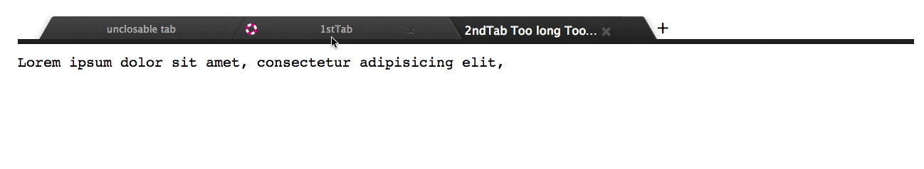
        (<Tab key={'tab0'} title={'unclosable tab'} unclosable={true} >
          <div>
            <h1>This tab cannot close</h1>
          </div>
        </Tab>),
        (<Tab key={'tab1'} title={'1stTab'} beforeTitle={icon} >
          <div>
            <h1>This is tab1</h1>
          </div>
        </Tab>),
        (<Tab key={'tab2'} title={'2ndTab Too long Toooooooooooooooooo long'} beforeTitle={fonticon} >
          <div>
            <pre>Lorem ipsum dolor sit amet, consectetur adipisicing elit,
            </pre>
          </div>
        </Tab>),
        (<Tab key={'tab3'} title={'Dynamic tab'} afterTitle={badge}>
          <DynamicTabContent/>
        </Tab>)
      ],
      badgeCount: 0
    };
  }

  handleTabSelect(e, key, currentTabs) {
    console.log('handleTabSelect key:', key);
    this.setState({selectedTab: key, tabs: currentTabs});
  }

  handleTabClose(e, key, currentTabs) {
    console.log('tabClosed key:', key);
    this.setState({tabs: currentTabs});
  }

  handleTabPositionChange(e, key, currentTabs) {
    console.log('tabPositionChanged key:', key);
    this.setState({tabs: currentTabs});
  }

  handleTabAddButtonClick(e, currentTabs) {
    // key must be unique
    const key = 'newTab_' + Date.now();
    let newTab = (<Tab key={key} title='untitled'>
                    <div>
                      <h1>New Empty Tab</h1>
                    </div>
                  </Tab>);
    let newTabs = currentTabs.concat([newTab]);

    this.setState({
      tabs: newTabs,
      selectedTab: key
    });
  }

  render() {

    return (
      <Tabs
        tabsClassNames={tabsClassNames}
        tabsStyles={tabsStyles}
        selectedTab={this.state.selectedTab ? this.state.selectedTab : "tab2"}
        onTabSelect={this.handleTabSelect.bind(this)}
        onTabClose={this.handleTabClose.bind(this)}
        onTabAddButtonClick={this.handleTabAddButtonClick.bind(this)}
        onTabPositionChange={this.handleTabPositionChange.bind(this)}
        tabs={this.state.tabs}
        shortCutKeys={
          {
            'close': ['alt+command+w', 'alt+ctrl+w'],
            'create': ['alt+command+t', 'alt+ctrl+t'],
            'moveRight': ['alt+command+tab', 'alt+ctrl+tab'],
            'moveLeft': ['shift+alt+command+tab', 'shift+alt+ctrl+tab']
          }
        }
      />
    )
  }
};

See also example

npm install
npm run start:example

Tests

npm test

Contributors

See list

Known Issue

  • Dynamic tab content.

Tabs do not care any change in Tab content. content needs update by your application side. See 3rdTab in example.

In application, class rdTabBar or your custom class of TabBar needs display: -webkit-flex in CSS like below.

.myTabBar {
  display: -webkit-flex;
}

react-draggable-tab's People

Contributors

dependabot[bot] avatar ehsankhfr avatar eran-gil avatar georgeosddev avatar handtrix avatar linhlc888 avatar maluen avatar mgsouth avatar shanejdonnelly avatar urikphytech avatar

Stargazers

 avatar  avatar  avatar  avatar  avatar  avatar  avatar  avatar  avatar  avatar  avatar  avatar  avatar  avatar  avatar  avatar  avatar  avatar  avatar  avatar  avatar  avatar  avatar  avatar  avatar  avatar  avatar  avatar  avatar  avatar  avatar  avatar  avatar  avatar  avatar  avatar  avatar  avatar  avatar  avatar  avatar  avatar  avatar  avatar  avatar  avatar  avatar  avatar  avatar  avatar  avatar  avatar  avatar  avatar  avatar  avatar  avatar  avatar  avatar  avatar  avatar  avatar  avatar  avatar  avatar  avatar  avatar  avatar  avatar  avatar  avatar  avatar  avatar  avatar  avatar  avatar  avatar  avatar  avatar  avatar  avatar  avatar  avatar  avatar  avatar  avatar  avatar  avatar  avatar  avatar  avatar  avatar  avatar  avatar  avatar  avatar  avatar  avatar  avatar  avatar

Watchers

 avatar  avatar  avatar  avatar  avatar  avatar  avatar  avatar  avatar  avatar

react-draggable-tab's Issues

How can I prevent tab selection?

Hi,
I've been using your library and loving it! One thing I can't seem to do:
I want to add a condition that prevents the user from switching tabs. I tried overriding the onTabSelect prop to use my own function to handle tab selection, but it seems that even though my method is called, the tab selection happens anyway.

Another thing I thought i'd try is event.preventDefault() on the event parameter to prevent the tab from being selected, but when I try that I get the error:

Warning: This synthetic event is reused for performance reasons. If you're seeing this, you're accessing the methodpreventDefaulton a released/nullified synthetic event. This is a no-op function. If you must keep the original synthetic event around, use event.persist(). See https://fb.me/react-event-pooling for more information.

I tried using event.persist() as suggested but that didn't work as well.

Any idea on how I can accomplish preventing tab selection with a condition?

P.S. I'm using React 15

Thanks!
Uri

Context menu on right click

Any plans on supporting right click mouse events on a tab? Also, any plans on supporting context menu on right click on a tab?
Fantastic work thus far btw, a huge thanks!!

New tab button hidden when too many tabs are open

When too many tabs are open, after they are resized to be narrower automatically by the application, a tab will hide the plus button, limiting the amount of tabs that can be opened at the same time. I think it would be a good idea if it could be changed so that the tab area behaves like in a real browser - with little arrow buttons on each side allowing you to scroll horizontally between different tabs. Also, that will virtually remove the limit on the tabs.

Unable to add styles or css classes to the tab content div

When adding child elements to a Tab element, there are no available props or styles or classNames which give you the ability to add to how the content div is rendered:
Example
what is output today:
<div style="width:100%;position:relative;text-align:initial;" data-reactid=".1.0.2.0.1:$tabTemplate#overview"><div data-reactid=".1.0.2.0.1:$tabTemplate#overview.$overview">...</div>

i have no way reliably to add to the style tag unless i create a css rule to traverse the DOM by x div children.

It would be nice to have a default class or style available on this div container to adjust it. In my case adding a height: 100% to support in components needing a scrollable container that can be dynamically set with css.

Is there any way already available that i am missing?

onDrag override?

In the documentation it is mentioned that

All other props like onXX handler set to Tab will be passed to rendered element except onClick You can use any onXX for Supported events for tab element.

I wanted a way to override onDrag to make the tabs undraggable and noticed that I was getting no response to that event. Is it supported? Is there another way you'd suggest to disable dragging?

Allow overriding TabStyles.wrapper using props

Hi,
Sorry for all the issues.. Promise I'll work on a PR or two once I have some time.
In the meantime, it would be great the library would expose all style props so they can be overridden.
In my case I need to override the TabStyles.wrapper object.

Another good alternative would be to add a class to the wrapper so it could be overriden in CSS
Thanks,
Uri

Missing "too many tabs" handler

When too many tabs are open, I do not see any way to scroll, or access the other tabs.

Perhaps a drop down menu could be shown that lists the other tabs?

Element ref was specified as a string (tab0) but no owner was set. You may have multiple copies of React loaded.

React 版本: 15.6.2
react-draggable-tab版本: 0.8.1

const tabs = [ (<Tab key="tab0" title="unclosable tab" disableClose > <div> <h1>This tab cannot close</h1> </div> </Tab>), (<Tab key="tab1" title="1stTab" > <div> <h1>This is tab1</h1> </div> </Tab>), (<Tab key="tab2" title="2ndTab Too long Toooooooooooooooooo long" > <div> <pre>Lorem ipsum dolor sit amet, consectetur adipisicing elit, </pre> </div> </Tab>), ]; return ( <Tab tabs = {tabs}> )

image

Reordering bugs

Awesome library, thanks.

I find very quickly in the online demo that reordering tabs is buggy.
Try your demo, reorder a few tabs, select them, reorder again, you should see the problem quickly, resize window etc.

Also for some reason it was becoming very slow at times like there is a tight code loop.

I can trigger this quite easily but can't tell you specific sequence to replicate it.

Update dependencies

> ncu

 react                    ^0.13.3  →   ^0.14.2
 react-draggable           ^0.8.0  →    ^1.0.1
 babel-eslint              ^3.1.9  →    ^4.1.3
 babelify                  ^6.1.2  →    ^7.2.0
 browserify               ^10.2.1  →   ^12.0.1
 chai                      ^2.3.0  →    ^3.4.0
 eslint                   ^0.21.2  →    ^1.8.0
 eslint-plugin-react       ^2.3.0  →    ^3.6.3
 karma                   ^0.12.35  →  ^0.13.15
 karma-chrome-launcher    ^0.1.12  →    ^0.2.1
 karma-cli                  0.0.4  →     0.1.1
 karma-mocha              ^0.1.10  →    ^0.2.0
 karma-spec-reporter       0.0.19  →    0.0.22
 react-tap-event-plugin    ^0.1.7  →    ^0.2.1
 material-ui               ^0.9.2  →   ^0.13.1

Run with -u to upgrade package.json

The following dependencies are satisfied by their declared version range, but the installed versions are behind. You can install the latest versions without modifying your package file by using npm update. If you want to update the dependencies in your package file anyway, use --upgradeAll.

 immutable                 ^3.7.3  →   ^3.7.5
 classnames                ^2.1.2  →   ^2.2.0
 lodash                    ^3.9.3  →  ^3.10.1
 browser-sync              ^2.7.6  →  ^2.9.11
 karma-browserify          ^4.2.1  →   ^4.4.0
 mocha                     ^2.2.5  →   ^2.3.3
 react-notification-badge  ^0.1.0  →   ^0.1.1
 watchify                  ^3.2.1  →   ^3.6.0

Warning: Failed propType: Invalid prop `0` supplied to `Tabs`, expected a ReactElement. Check the render method of `App`.

I get the warning:

Warning: Failed propType: Invalid prop0supplied toTabs, expected a ReactElement. Check the render method ofApp.

and then the error:

Uncaught Error: Invariant Violation: There should be unique key in each Tab

when trying to run this on Electron (Chrome-based desktop app).

I am using gulp-babel to compile the files in components before importing them into my React views.

Tab content only renders when tab is clicked

I'm trying to get this component to work in my app, which has a tree with a number of links. The tree and the tabs are two different objects. When I click on a link a tab is added, but I have to click on the tab to render the content of the new tab. What can I do to render automatically? THX

Remove 'ed' from event handler name

Breaking change

  • onTabSelected -> onTabSelect
  • onTabClosed -> onTabClose
  • onTabPositionChanged -> onTabPositionChanged
  • onTabAddButtonClicked -> onTabAddButtonClicked
  • onTabDoubleClicked -> onTabDoubleClicked

Tab Height Question

Nice job on this library, it is very feature rich!

I have a question. It seems like tabs are shown and hidden partially by using the "height" attribute on the div that holds the tab. In my situation, I am using a flex layout, and the tab container is taking up 100% of the vertical width of the page. I am putting a text editor component in the tabs, and the text editor will control the vertical scrolling of the content. Therefore, when the current tab is selected, I need it to take up the remaining space in the layout.

However, it seems like the tab will remove all height attributes when it is shown. This would mean the child component is what would determine the height of the tab. But I need the reverse. I need to tab to take up all extra space in the layout and then set the child to be 100% of the tab.

Is anything like this possible?

I was perhaps thinking that the visibility of the tabs could be controlled with the CSS visibility: hidden / visible attribute rather than setting the height to 0px with an overflow of hidden. I was looking at the containerStyle and hiddenStyle, but am still not sure how those work.

Renamable Tabs

Will there be any support for renamable tabs in the future? Thanks

Invariant Violation: addComponentAsRefTo(...): ...

bundle.js:9824 Uncaught Invariant Violation: addComponentAsRefTo(...): Only a ReactOwner can have refs. You might be adding a ref to a component that was not created inside a component's render method, or you have multiple copies of React loaded (details: https://fb.me/react-refs-must-have-owner).

Use case in simple react app:

..
getInitialState() {
    return {
      tabs:[
        (<Tab key={'tab0'} title={'Tab'}>
          <div>
            <h1>This tab cannot close</h1>
          </div>
        </Tab>)
      ]
    }
  },

  render() {
    return (
        <section>

          <Tabs
            tabs={this.state.tabs}
          />
...

Name a tab

A Feature request. Is it possible to add capability to name/rename a tab? may be ondblclick?

Support keyboard shortcut

Idea

Add alt for default chrome keybinding

  • move right alt + ctrl + tab
  • move left alt + shift ctrl + tab
  • close alt + command + w
  • create alt + command + t
  • context menu on right click

Tabs class copies all Tab props to li element, causes warning

When Tabs.js render() creates the

  • element for a tab, it copies all of the tab's props. One of them, "uncloseable" (renamed from "disableClose" in my PR) is a boolean. Copying this prop to
  • results in a react-dom warning that a "Received true for a non-boolean attribute uncloseable."

  • Inactive tabs very hard to read

    Hi-
    This is cool! Have not seen this implemented before. One issue with the demo-- the inactive tabs are super hard to read. This will make for a less compelling screenshot when I add to react.rocks. Could you have the text be lighter and easier to read please? Thanks.

    image

    How do I build this project?

    I'm trying to make the appropriate changes to the library to allow disabling dragging on a specific component, but I'm having trouble compiling the ES6 to ES5. I installed Babel 5.8.38, then ran babel src --out-dir lib but I get:

    C:\Projects\axiom-pro-3.0\Source\ServiceLayer\jspm_packages\github\JBHarris\[email protected]>babel src --out-dir lib
    ReferenceError: [BABEL] src\components\CloseIcon.js: Unknown option: C:\Projects\axiom-pro-3.0\Source\ServiceLayer\jspm_packages\github\JBHarris\[email protected]\.babelrc.presets
        at Logger.error (C:\Users\james\AppData\Roaming\npm\node_modules\babel\node_modules\babel-core\lib\transformation\file\logger.js:58:11)
        at OptionManager.mergeOptions (C:\Users\james\AppData\Roaming\npm\node_modules\babel\node_modules\babel-core\lib\transformation\file\options\option-manager.js:126:29)
        at OptionManager.addConfig (C:\Users\james\AppData\Roaming\npm\node_modules\babel\node_modules\babel-core\lib\transformation\file\options\option-manager.js:107:10)
        at OptionManager.findConfigs (C:\Users\james\AppData\Roaming\npm\node_modules\babel\node_modules\babel-core\lib\transformation\file\options\option-manager.js:168:35)
        at OptionManager.init (C:\Users\james\AppData\Roaming\npm\node_modules\babel\node_modules\babel-core\lib\transformation\file\options\option-manager.js:229:12)
        at File.initOptions (C:\Users\james\AppData\Roaming\npm\node_modules\babel\node_modules\babel-core\lib\transformation\file\index.js:147:75)
        at new File (C:\Users\james\AppData\Roaming\npm\node_modules\babel\node_modules\babel-core\lib\transformation\file\index.js:137:22)
        at Pipeline.transform (C:\Users\james\AppData\Roaming\npm\node_modules\babel\node_modules\babel-core\lib\transformation\pipeline.js:164:16)
        at Object.exports.transform (C:\Users\james\AppData\Roaming\npm\node_modules\babel\lib\babel\util.js:40:22)
        at Object.exports.compile (C:\Users\james\AppData\Roaming\npm\node_modules\babel\lib\babel\util.js:49:20)
    

    Any help you can offer is appreciated.

    Thanks,
    Brad

    Improve tab rendering perfomance

    react-draggable-tab hides a tab by setting its height: 0.
    This means, that the contents of each tab need to be resized every time the tab is selected.
    This may cause the view engine to render the selected tab very slowly.

    Solution 1:

    Switch to absolute hiding

    // Hide
    left: -9999999px;
    
    // Show
    left: 0;
    

    Solution 2:

    Let the user configure the hiding styles via props

    Confused about CSS support

    I'm a bit lost about CSS support and was wondering if you would help clear that up.

    I see that you mention

    tabClassNames: classNames which will be added to rendered elements.

    which makes me think that react classNames are supported but I don't see any css class references on any of the components and figured I was misunderstanding and wanted to double check.

    Thanks

    Get order of tab?

    Hi! How can order of tab be obtained? Are there any events fired on tabs reordering? I need to save order of tabs to restore it on the next application start.

    Add shouldTabClose prop

    hello, how can I add a confirm dialog(when YES tab closes and when NO do nothing).
    thanks for sharing this useful react component.

    Recommend Projects

    • React photo React

      A declarative, efficient, and flexible JavaScript library for building user interfaces.

    • Vue.js photo Vue.js

      🖖 Vue.js is a progressive, incrementally-adoptable JavaScript framework for building UI on the web.

    • Typescript photo Typescript

      TypeScript is a superset of JavaScript that compiles to clean JavaScript output.

    • TensorFlow photo TensorFlow

      An Open Source Machine Learning Framework for Everyone

    • Django photo Django

      The Web framework for perfectionists with deadlines.

    • D3 photo D3

      Bring data to life with SVG, Canvas and HTML. 📊📈🎉

    Recommend Topics

    • javascript

      JavaScript (JS) is a lightweight interpreted programming language with first-class functions.

    • web

      Some thing interesting about web. New door for the world.

    • server

      A server is a program made to process requests and deliver data to clients.

    • Machine learning

      Machine learning is a way of modeling and interpreting data that allows a piece of software to respond intelligently.

    • Game

      Some thing interesting about game, make everyone happy.

    Recommend Org

    • Facebook photo Facebook

      We are working to build community through open source technology. NB: members must have two-factor auth.

    • Microsoft photo Microsoft

      Open source projects and samples from Microsoft.

    • Google photo Google

      Google ❤️ Open Source for everyone.

    • D3 photo D3

      Data-Driven Documents codes.