guitong / blog Goto Github PK
View Code? Open in Web Editor NEWMy Blog.
License: MIT License
My Blog.
License: MIT License


要查看端口被哪个进程占用,可以这样:
sudo lsof -i tcp:port # such as 8080
然后可以获取到该进程的PID,结束该进程:
sudo kill -9 xxx
Fetch API 提供了一个用于获取资源的接口(包括跨网络)。如果您使用过XMLHttpRequest的话将会对此比较熟悉,但是新的API提供了更强大和灵活的功能集。
Fetch提供了关于请求和响应对象(以及与网络请求相关的其他事项)的通用定义。这将允许它们在未来任何需要的地方被使用,无论是service workers, Cache API和处理或修改请求和响应的其他类似的东西,还是任何可能要求您以编程方式生成你的响应的用例。
它还提供了对相关概念(例如:CORS and the HTTP origin header semantics)的定义,以取代它们在其他地方的独立定义。
若要创建请求并获取资源,使用GlobalFetch.fetch方法。它在多个接口中实现,特别是Window和WorkerGlobalScope。这使得它可以在几乎任何可能要获取资源的上下文中使用。
Fetch()方法有一个必需参数,就是你想获取的资源的路径。它返回一个Promise对象以解析该请求的响应,无论它是成功还是失败。您也可以传入一个init选项对象作为可选的第二参数(see Request)。
一旦检索到响应,就可以使用多种方法定义 body 内容和如何去处理它。(see Body)。
你可以使用Request()和Response()构造函数直接创建一个请求和响应,但是你不太可能直接这样做。相反,这些更可能被创建为其他API操作的结果(for example, FetchEvent.respondWith from service workers)。
Note: 查看更多Fetch API的用法见 Using Fetch,概念学习请查看 Fetch basic concepts。
GlobalFetch包含fetch()方法,用于获取资源。
Headers表示响应/请求头,允许您查询它们并根据结果执行不同操作。
Request表示资源请求。
Response表示一个请求的响应。
也被叫做“可取消fetch(cancellabel fetch)”, 下面的接口包含允许在生命周期中观察和控制fetch请求操作。
FetchController表示一个控制器对象,该对象允许你控制一个或多个fetch请求。
FetchSignal表示一个信号对象, 该对象允许你与一个fetch请求通信并通过FetchController控制它。
FetchObserver表示一个观察者对象,该对象允许你检索有关fetch请求状态的信息。
ObserverCallbackProvides a callback function that runs when the fetch request it is assocated with runs. 它提供了一个FetchObserver对象,可以用于检索有关fetch请求状态的信息。
Body提供与响应/请求体有关的方法,允许你声明其内容类型及处理方法。
| 规范 | 状态 | Comment |
|---|---|---|
| Fetch | Living Standard | Initial definition |

[1] This API is implemented behind a preference.
[2] Prior to Firefox 52, get() only returned the first value in the specified header, with getAll() returning all values. From 52 onwards, get() now returns all values and getAll() has been removed.
[3] Hidden behind a preference in 55+ Nightly. In about:config, you need to create two new boolean prefs — dom.fetchObserver.enabled and dom.fetchController.enabled — and set the values of both to true.
场景一:通过输入型绑定把数据从父组件传到子组件
使用@Input装饰器。
例如:
// 一个子组件 hero-child.component.ts
import { Component, Input } from '@angular/core';
import { Hero } from './hero';

@Component({
    selector: 'app-hero-child',
    template: `
    	<h3>{{hero.name}} says:</h3>
    	<p>I, {{hero.name}}, am at your service, {{masterName}}.</p>
    `
})
export class HeroChildCompoent {
    @Input() hero: Hero;
    @Input('master') masterName: string; // 指定别名
}
再看下父组件(部分省略):
import ...
@Component({
    ...
    template: `
    	<h2>{{master}} controls {{heroes.length}} heroes</h2>
    	<app-hero-child *ngFor="let hero of heroes"
    		[hero]="hero"
    		[master]="master"
    	</app-hero-child>
    `
})
效果如下:

场景二:通过setter截听输入属性值的变化
使用输入属性的setter,以拦截父组件中值的变化,并作出响应。
例如:
// 一个子组件,输入属性`name`的setter会trim掉名字中的空格,并把空格替换为默认字符串
import ...
@Component({
    selector: 'app-name-child',
    template: '<h3>"{{name}}"</h3>'
})
export class NameChildComponent {
    private _name = '';

    @Input()
    set name(name: string) {
        this._name = (name && name.trim()) || '<no name set>';
    }

    get name(): string { return this._name; }
}场景三:通过ngOnChanges()来截听输入属性值的变化
当需要监听多个、交互式输入属性的时候,此方法比setter更合适。
import ...
@Component({
    selector: 'app-version-child',
    template: `
        <h3>Version {{major}}.{{minor}}</h3>
    	<h4>Change log:</h4>
	    <ul>
			<li *ngFor="let change of changeLog">{{change}}</li>
	    </ul>
    `
})
export class VersionChildComponent implements OnChanges {
    @Input() major: number;
    @Input() minor: number;
    changeLog: string[] = [];

    ngOnChanges(changes: {[propKey: string]: SimpleChange}) {
        let log: string[] = [];
        for (let propName in changes) {
            let changedProp = changes[propName];
            let to = JSON.stirngify(changedProp.currentValue);
            if (changedProp.isFirstChange()) {
                log.push(`Initial value of ${propName} set to ${to}`);
            } else {
                let from = JSON.stringify(changedProp.previousValue);
                log.ush(`${propName}` change from ${from} to ${to});
            }
        }
        this.changeLog.push(log.join(', '));
    }
}
场景四:父组件监听子组件的事件
也就是子 -> 父传递数据。
需要子组件暴露一个EventEmitter属性,当事件发生时,子组件利用该属性emits(向上弹射)事件。父组件绑定这个事件属性,并在事件发生时作出响应。
NEW: 使用@Output装饰器。
import ...
@Component({
    selector: 'app-voter',
    template: `
    	<h4>{{name}}</h4>
    	<button (click)="vote(true)" [disabled]="voted">Agress</button>
		<button (click)="vote(false)" [disabled]="voted">Disagree</button>
    `
})
export class VoterComponent {
	@Input() name: string;
	@Output() onVoted = new EventEmitter<boolean>();

	voted = false;
	vote(agreed: boolean) {
        this.onVoted.emit(agreed);
        this.voted = true;
	}
}
父组件绑定一个事件处理器:
...
@Component({
    template: `
    	<app-voter
    		[name]="voter"
    		(onVoted)="onVoted($event)"
    	></app-voter>
    `
})
export class VotedTakerComponent {
    ...
    onVoted(agreed: boolean) {
        agreed ? this.agreed++ : this.disagreed++;
    }
}
场景五: 父子组件通过本地变量互动
父组件可以在模版里新建一个本地变量代表子组件,然后利用这个变量来读取子组件的属性和调用子组件的方法。
// parent
...
@Component({
    template: `
    	<h3>Countdown to Liftoff (via local variable)</h3>
    	<button (click)="timer.start()">Start</button>
    	<button (click)="timer.stop()">Stop</button>
    	<div> class="seconds">{{timer.seconds}}</div>
    	<app-countdown-timer #timer></app-countdown-timer>
    `
})
export class CountdownLocalVarParentComponent { }
本地变量 —> #timer
场景六: 父组件调用@ViewChild()
本地变量的方法有个局限性:父组件本身的代码对子组件没有访问权。
当父组件类需要访问子组件数据时,可以把子组件作为_ViewChild_,注入到父组件里面。
父组件:
import { CountdownTimerComponent } from '@angualr/core';

@Component({})
export class CountdownViewChildParentComponent implements AfterViewInit {
    @ViewChild(CountdownTimerComponent)
    private timerComponent: CountdownTimerComponent;

    seconds() { return 0; }

    ngAfterViewInit() {
        // Redefine `seconds()` to get from the `CountdownTimerComponent.seconds` ...
        // but wait a tick first to avoid one-time devMode
        // unidirectional-data-flow-violation error
        setTimeout(() => this.seconds = () => this.timerComponent.seconds, 0);
    }

    start() { this.timerComponent.start(); }
    stop() { this.timerComponent.stop(); }
}
注意:Angular的单向数据流规则会阻止在同一个周期内更新父组件视图。
场景七: 父子组件通过服务来通讯
// TODO
Short note on what CSS display properties do to table semantics
Posted on Sunday, 4 March 2018 by Steve Faulkner
CSS的display属性非常强大。你可以用它来改变元素的视觉展示以匹配期望的样式,但有时候这样做可能会在浏览器可访问性树(browser accessibility tree)中产生意想不到的影响,如传达给屏幕阅读软件的元素的语义。通常情况下,屏幕阅读器和其他辅助技术并不能直接访问HTML DOM,他们通过可访问性API(Accessibility APIs)获取HTML DOM的部分信息。有时候,一个元素在HTML DOM中和可访问性树中会有不同的表示(represents)。
如果在可访问性树中的表示并不符合开发人员预期,它可能是开发人员或浏览器的错误(有意或无意的)。但我们可以确定的是,它不是屏幕阅读器的错。
一个示例
the good
具有默认display属性的数据表格,其在浏览器可访问性树的表示正确传达了每个元素的语义。

每个元素在可访问性树中表示为适当的角色,例如:a table element has a role=table。

the bad
当设置table元素的display属性为block、grid或flex时,不好的事情发生了。table元素将不再表示为table(在可访问性树中),表格行元素/语义不以任何形式表示。

在可访问性树中,没有任何元素以数据表格语义表示,它们的角色都分配为role=Text frame。

可以使用ARIAtable/row/colunmheader/rowheader/cell角色(参见ARIA table design pattern )添加语义来解决这个问题,但这对开发者来说是本不应该需要的繁重工作。 在这种情况下,浏览器不该混淆表格语义。
If nothing else, a developer should be aware that it is not always the fault of the assistive technology when we can’t have nice things.
Centering in CSS: A Complete Guide
BY CHRIS COYIER ON SEPTEMBER 2, 2014
附:文中涉及到了flex的一些用法,如果没有接触过flex布局,建议看一下阮一峰老师的这篇指南:Flex 布局教程:语法篇
CSS居中是常被开发者抱怨的问题之一。Why dose it have to be so hard?? They jeer. 我认为问题不在于它实现起来有多难,而是有太多能够实现它的方法。在不同的情景下,如何去选择,才是真正困惑我们的地方。
所以现在,让我们来做一个决策树,使CSS居中问题更容易解决。
它是行内或类行内元素吗?(比如文本和链接)
你可以将行内元素置于块级父元素内,然后用下面的CSS代码来使其水平居中:
.center-children {
  text-align: center;
}
See the Pen Centering Inline Elements by Chris Coyier (@chriscoyier) on CodePen.
这种方法适用于inline,inline-block,inline-table,inline-flex等类型的元素。
它是一个块级元素吗?
为了居中一个块级元素,你可以设置它的margin-left和margin-right值为auto(它的width值已给定,否则将占满容器,也就不需要居中了)。通常简写如下:
.center-me {
  margin: 0 auto;
}
See the Pen Centering Single Block Level Element by Chris Coyier (@chriscoyier) on CodePen.
无论我们将要居中的块级元素或父元素的宽度如何,这都将起作用。
注意你不能将浮动元素居中。There is a trick though.
有多个块级元素吗?
如果你需要将多个块级元素水平居中于单行,一个好的办法是改变它们的dispaly类型。这里有两个例子,分别使用了inline-block和 flexbox 方法实现:
See the Pen Centering Row of Blocks by Chris Coyier (@chriscoyier) on CodePen.
除非你是想让它们堆叠在一起,那么刚才使用的设置自动外边距值将仍然有效。
See the Pen Centering Blocks on Top of Each Other by Chris Coyier (@chriscoyier) on CodePen.
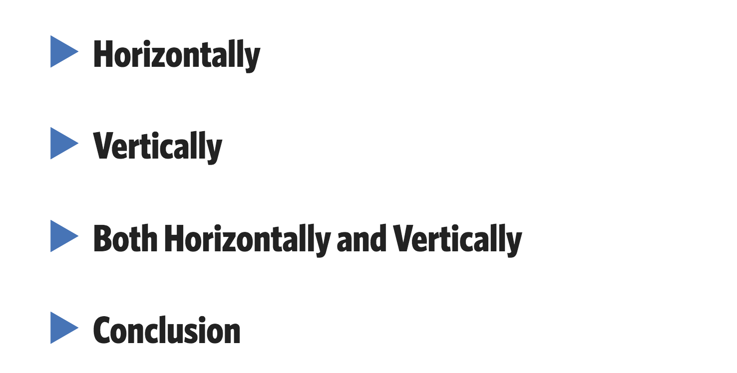
垂直居中在CSS中比较棘手。
它是行内或类行内元素吗?
是单行吗?
有时行内/文本元素能垂直居中显示,仅仅是因为它们有相等的上下padding值。
.link {
  padding-top: 30px;
  padding-bottom: 30px;
}
See the Pen Centering text (kinda) with Padding by Chris Coyier (@chriscoyier) on CodePen.
如果由于某些原因,设置padding的方法并不可选,而你需要居中已知不会换行的文本,有一个技巧是使其line-height值与其height值相等。
.center-text-trick {
  height: 100px;
  line-height: 100px;
  white-space: nowrap;
}
See the Pen Centering a line with line-height by Chris Coyier (@chriscoyier) on CodePen.
是多行吗?
对于多行文本的情况,依然可以使用上下padding相等的方法使其垂直居中,但是如果这种方法失效了,可能文本所在的元素是一个table cell,不管是通过字面量定义的还是通过CSS定义的。(红叶注:这里的意思就是该元素可以是直接使用<td>表格标签声明,也可以是为元素设置display:table-cell;属性而使其成为一个table cell,父元素设置display:table; )。如果是文本在<td>这样的元素内,该元素默认有CSS属性vertical-align:middle;,所以不需要我们显示地设置。然而,如果你是手动更改CSS使其成为table cell元素的,就需要显示地加入这个属性vertical-align:middle;。
下面的例子非常清晰地展示了这种方法:
See the Pen Centering text (kinda) with Padding by Chris Coyier (@chriscoyier) on CodePen.
如果你不喜欢或者这种方法也不好使,也许你可以用flexbox?单个子flex元素可以非常轻松地在父flex元素内垂直居中。
.flex-center-vertically {
  display: flex;
  justify-content: center;
  flex-direction: column;
  height: 400px;
}
See the Pen Vertical Center Multi Lines of Text with Flexbox by Chris Coyier (@chriscoyier) on CodePen.
但是要记住,上面的讨论都是基于元素父容器有一个固定的高度(px,%,etc)。
如果这些方法都无法实现,你可以采用“ghost element”技术,将一个全高度的伪元素将放置于容器中,文本将与其垂直对齐。
.ghost-center {
  position: relative;
}
.ghost-center::before {
  content: " ";
  display: inline-block;
  height: 100%;
  width: 1%;
  vertical-align: middle;
}
.ghost-center p {
  display: inline-block;
  vertical-align: middle;
}
See the Pen Ghost Centering Multi Line Text by Chris Coyier (@chriscoyier) on CodePen.
它是一个块级元素吗?
知道元素的高度吗?
不知道网页布局的高度是相当常见的,有很多原因:如果文本的宽度改变,那么重布局时高度就会改变;文本样式的改变会改变高度;文本数量改变会改变高度;具有固定纵横比的元素(如图像),会在尺寸改变时影响高度。Etc。
但是如果你明确地知道高度,可以像这样使其垂直居中:
.parent {
  position: relative;
}
.child {
  position: absolute;
  top: 50%;
  height: 100px;
  margin-top: -50px;/* account for padding and border if not using box-sizing: border-box; */
}
See the Pen Center Block with Fixed Height by Chris Coyier (@chriscoyier) on CodePen.
未知元素高度?
没关系。你仍然可以使用类似上面的方法使其居中。先将其绝对定位至父元素半高位置,再提升自身半高距离即可。
.parent {
  position: relative;
}
.child {
  position: absolute;
  top: 50%;
  transform: translateY(-50%);
}
See the Pen Center Block with Unknown Height by Chris Coyier (@chriscoyier) on CodePen.
~~> Can you use flexbox?
你可以使用flexbox吗?
如果可以,那就相当简单了。
.parent {
  display: flex;
  flex-direction: column;
  justify-content: center;
}
See the Pen Center Block with Unknown Height with Flexbox by Chris Coyier (@chriscoyier) on CodePen.
你可以将前面的方法任意组合起来,实现完美的居中效果。但是我发现通常可以将其分为三类:
元素有固定的宽度和高度吗?
先将元素绝对定位至50%/50%位置,然后加入负margin值,使该值等于高度和宽度的一半(注:元素如果有padding要记得计算进去,参考下例)。这样就可以使元素水平且垂直居中,并具有良好的浏览器兼容性。
.parent {
  position: relative;
}
.child {
  width: 300px;
  height: 100px;
  padding: 20px;

  position: absolute;
  top: 50%;
  left: 50%;

  margin: -70px 0 0 -170px;
}
See the Pen Center Block with Fixed Height and Width by Chris Coyier (@chriscoyier) on CodePen.
元素的宽度与高度未知?
如果你不知道该元素的宽高,可以将它的transform属性设置为translate(-50%, -50%)。也可以达到相同的效果。
.parent {
  position: relative;
}
.child {
  position: absolute;
  top: 50%;
  left: 50%;
  transform: translate(-50%, -50%);
}
See the Pen Center Block with Unknown Height and Width by Chris Coyier (@chriscoyier) on CodePen.
你可以使用flexbox吗?
在水平和垂直两个方向上居中元素,你需要用到flex的两个属性:
.parent {
  display: flex;
  justify-content: center;
  align-items: center;
}
See the Pen Center Block with Unknown Height and Width with Flexbox by Chris Coyier (@chriscoyier) on CodePen.
这是一个小技巧,对单个元素来说非常有效:
body, html {
  height: 100%;
  display: grid;
}
span { /* thing to center */
  margin: auto;
}
See the Pen Centering with Grid by Chris Coyier (@chriscoyier) on CodePen.
You can totally center things in CSS !!!
(完)
参考:
http://lisp-lang.org/learn/getting-started/
https://github.com/slime/slime
https://github.com/melpa/melpa
https://common-lisp.net/project/slime/doc/html/Installation.html
我采用的Lisp环境为SBCL + Quicklisp + Emacs + SLIME 。首先让我们来安装SBCL(Steel Bank Common Lisp),它是Common Lisp的一种实现,是一个高性能的Common Lisp编译器。
在OS X系统上,我们可以很方便的使用Homebrew来安装:
$ brew install sbcl接下来安装Quicklisp,它是包管理器。安装过程也同样简单:
$ curl -o /tmp/ql.lisp http://beta.quicklisp.org/quicklisp.lisp
$ sbcl --no-sysinit --no-userinit --load /tmp/ql.lisp \
       --eval '(quicklisp-quickstart:install :path ".quicklisp")' \
--quitQuicklisp将安装至~/.quicklisp/目录下。
首先确保你安装了 Emacs,如果没有同样可以使用Homebrew快速安装(推荐安装最新版本):
$ brew install emacs --with-cocoa
# or use MacPorts
# sudo port install emacs-app
SLIME 是基于Emacs构建的Common Lisp IDE。它的安装方式大概有两种:
这里我们采用第一种方式(*其他方式请参考:https://common-lisp.net/project/slime/doc/html/Installation.html)。
为了能够让 Emacs 从 MELPA 仓库获取安装包,我们需要添加一些配置到~/.emacs文件中(如果没有则创建一个):
(require 'package)
(let* ((no-ssl (and (memq system-type '(windows-nt ms-dos))
                    (not (gnutls-available-p))))
       (proto (if no-ssl "http" "https")))
  ;; Comment/uncomment these two lines to enable/disable MELPA and MELPA Stable as desired
  (add-to-list 'package-archives (cons "melpa" (concat proto "://melpa.org/packages/")) t)
  ;;(add-to-list 'package-archives (cons "melpa-stable" (concat proto "://stable.melpa.org/packages/")) t)
  (when (< emacs-major-version 24)
    ;; For important compatibility libraries like cl-lib
    (add-to-list 'package-archives '("gnu" . (concat proto "://elpa.gnu.org/packages/")))))
(package-initialize)
配置好MELPA之后,我们就可以开始安装 SLIME 了。使用如下指令:
M-x package-install RET slime RET
*注:对应到键盘就是 Alt + x package-install 回车 (等待完成)slime 回车 (等待完成)。
安装完成后,再添加一些配置到~/.emacs文件中。
;; Set your lisp system and, optionally, some contribs
(setq inferior-lisp-program "/usr/local/bin/sbcl")
(setq slime-contribs '(slime-fancy))
注意第二行的/usr/local/bin/sbcl,这里应该写你本机上 sbcl 二进制文件的路径,所以可能视个人情况不同修改。
现在所有的环境就配置完成,打开Emacs,输入M-x,然后在底部的buffer区输入 slime,SLIME将会启动并连接至你的Lisp编译器。
让我们先来演示一个Hello World吧~输入下面的代码:
(format t "Hello, world!")
你将会看到下图的效果。

开始你的Lisp之路吧!
(完)
一般情况下,当我们想在Github上为开源项目做贡献时,会首先将项目fork到自己的库中。那么应该如何同步这个库,使其与上游库保持最新呢?
其实非常简单,只要经过以下几步:
(这里我们以 webpack 的开源项目为例)
然后用你喜欢的方式将它克隆到本地。
当我们已经对自己fork的仓库做了一些修改,然而可能源仓库已经又有了其他的更新,我们想把这些更新同步到自己的fork仓库。这时,我们应该先配置自己fork仓库的远端仓库地址。
以命令行为例(windows可以使用git bash):
先查看目前的配置:
$ git remote -v
origin  https://github.com/my_name/webpack.git (fetch)
origin  https://github.com/my_name/webpack.git (push)
添加新的上游仓库:
$ git remote add upstream https://github.com/webpack/webpack.git确认添加成功:
$ git remote -v
origin  https://github.com/guitong/webpack.git (fetch)
origin  https://github.com/guitong/webpack.git (push)
upstream        https://github.com/webpack/webpack.git (fetch)
upstream https://github.com/webpack/webpack.git (push)现在让我们开始同步fork仓库。
首先从上游仓库拉取分支和各自的提交。
$ git fetch upstream
 * [new branch]        0.10                  -> upstream/0.10
 * [new branch]        0.11                  -> upstream/0.11
 * [new branch]        0.8                   -> upstream/0.8
 * [new branch]        0.9                   -> upstream/0.9
 * [new branch]        1.0                   -> upstream/1.0
 * [new branch]        IgnorePluginHotfix    -> upstream/IgnorePluginHotfix
 * [new branch]        bugfix/hash-watch-warnings-errors -> upstream/bugfix/hash-watch-warnings-errors
 * [new branch]        ci/travis             -> upstream/ci/travis
 * [new branch]        deprecation/webpack-3 -> upstream/deprecation/webpack-3
 * [new branch]        feature/emoji_presets_to_options -> upstream/feature/emoji_presets_to_options
 * [new branch]        feature/jsonp-to-push -> upstream/feature/jsonp-to-push
 * [new branch]        feature/pure-module   -> upstream/feature/pure-module
 * [new branch]        feature/webpack_options_apply_coverage_increase -> upstream/feature/webpack_options_apply_coverage_increase
 * [new branch]        inline                -> upstream/inline
 * [new branch]        master                -> upstream/master
 * [new branch]        performance/parser    -> upstream/performance/parser
 * [new branch]        refactor/cleanups     -> upstream/refactor/cleanups
 * [new branch]        test/dependency-upgrade -> upstream/test/dependency-upgrade
 * [new branch]        use-set-in-chunks     -> upstream/use-set-in-chunks
 * [new branch]        webpack-1             -> upstream/webpack-1
* [new branch] webpack-2 -> upstream/webpack-2现在upstream上所有的分支都已经拉取到本地了。master 上的提交保存在了本地分支,upstream/master。
如果我们想同步master分支,切换至本地master分支:
$ git checkout master
Switched to branch 'master'将upstream/master分支数据合并至本地master分支:
$ git merge upstream/master至此,我们的同步操作就完成了。
Tip: Syncing your fork only updates your local copy of the repository. To update your fork on GitHub, you must push your changes.
参考issue链接:lmk123/blog#28
我一般使用下面的命令:
SASS_BINARY_SITE=https://npm.taobao.org/mirrors/node-sass/ npm install node-sass还可以添加.npmrc文件,或者使用梯子。
npm install concurrently同时运行多个命令。
需要用引号包裹单独的命令:
concurrently "cmd1 arg" "cmd2 arg"在package.json中需要转义:
"start": "concurrently \"cmd1 arg\" \"cmd2 arg\""Parse, validate, manipulate, and display dates and times in JavaScript.
时间..日期..格式.. 这么麻烦的东西,还是交给库去做吧.. 🔨link
moment().format('MMMM Do YYYY, h:mm:ss a'); // February 26th 2018, 6:59:21 pm
moment().format('dddd');                    // Monday
moment().format("MMM Do YY");               // Feb 26th 18
moment().format('YYYY [escaped] YYYY');     // 2018 escaped 2018
moment().format();
Relative Time , Calendar Time , Multiple Locale Support ...
.box { display: flex; } /* container */
.inline-box { display: inline-flex; } /* inline */注意:
-webkit前缀。float、clear、vertical-align属性将失效
参考上图:
overview:
flex-direction
flex-wrap
flex-flow
justify-content
align-items
align-content
决定主轴方向。可能值:
item默认排在一条轴线上。该属性定义如果一条轴线排不下时如何换行。
可能值:
.box {
    flex-flow: <flex-direction> || <flex-wrap>;
}
default: row nowrap
定义item在main axis上的对齐方式。可能值:
定义item在cross axis上的对齐方式。可能值:
定义了多根轴线的对齐方式。可能值:
overview:
order
flex-grow
flex-shrink
flex-basis
flex
align-self
定义项目的排列顺序。数值越小,排列越靠前。default -> 0
定义item的放大比例。default -> 0,即如果存在剩余空间,也不放大。
定义item的缩小比例。default -> 1,即如果空间不足,该item将缩小。
定义在分配多余空间之前,item占据的主轴空间(main size)。default -> auto,即项目的本来大小。
.item {
    flex: none | [ <'flex-grow'> <'flex-shrink'>? || <'flex-basis'> ]
}
快捷值:auto(1 1 auto)和 none(0 0 auto)
允许单个项目与其他项目不一样的对齐方式,可覆盖align-items属性。default -> auto,表示继承父元素的align-item属性。(else -> stretch)
.item {
    align-self: auto | flex-start | flex-end | center | baseline | stretch;
}
Sharing Data Between Angular Components - Four Methods
Arp 30, 2017 by Jeff Delaney
在深入您的第一个Anguar项目前,需要理解一个重要的概念 — 数据共享。在这节课程里,我将提供四种用于Angular组件之间共享数据的方法。

我们Angular app的父-子-同胞结构。
Input()共享数据这可能是共享数据的方法中最常见和最直接的。它通过使用Input()装饰器(decorator)以使数据能够通过模版(template)传递。
# parent.component.ts
import { Component } from '@angular/core';

@Component({
    selector: 'app-parent',
    template: `
    	<app-child [childMessage]="parentMessage"></app-child>
    `,
    styleUrls: ['./parent.component.css']
})
export class ParentComponent {
    parentMessage = 'message from parent';
    constructor() {}
}
# child.component.ts
import { Component, Input } from '@angular/core';

@Component({
    selector: 'app-child',
    template: `
    	Say {{message}}
    `,
    StyleUrls: ['./child.component.css']
})
export class ChildComponent {
    @Input() childMessage: string;

    constructor() {}
}ViewChild()共享数据ViewChild允许一个组件注入到另外一个组件中,父组件可以访问子组件的属性和功能。但是需要注意AfterViewInit生命周期钩子以接收子组件的数据。
# parent.component.ts
import { Component, ViewChild, AfterViewInit } from '@angular/core';

@Component({
    selector: 'app-parent',
    template: `
    	Message: {{message}}
    	<app-child></app-child>
    `,
    styleUrls: ['./parent.component.css']
})
export class ParentComponent implements AfterViewInit {
    @ViewChild(ChildComponent) child;

    constructor() {}

    message: string;

    ngAfterViewInit() {
        this.message = this.child.message;
    }
}
# child.component.ts
import { Component } from '@angular/core';

@Component({

    message: string = 'Hola Mundo';

    constructor() {}
})Output()和EventEmitter共享数据另外一个共享数据的方法是从子组件发出(emit)数据,which can be listed to by the parent.当您想要分享如按钮点击、表单事件和其他用户事件等发生的数据更改时,此方法非常理想。
在父组件中,我们创建一个方法去接收信息并将其设置与message变量相等。
在子组件中,我们使用Output修饰符声明一个messageEvent变量并将其设置为一个新的事件发生器(event emitter)。然后我们创建一个名为sendMessage的函数,该函数调用在此事件上的emit方法发送我们想要传递的信息。最后,我们创建一个按钮用来触发这个函数。
此时父组件可以订阅这个由子组件发出的messageEvent事件,然后在该事件发生时运行消息接收函数。
# parent.component.ts
import { Component } from '@angular/core';

@Component({
    selector: 'app-parent',
    tempate: `
    	Message: {{message}}
    	<app-child (messageEvent)="receiveMessage($event)"></app-child>
    `,
    styleUrls: ['./parent.component.css']
})
export class ParentComponent {
    constructor() {}

    message: string;

    receiveMessage($event) {
        this.message = $event;
    }
}
# child.component.ts
import { Component, Output, EventEmitter } from '@angular/core';

@Component({
    selector: 'app-child',
    template: `
    	<button (click)="sendMessage()"Send Message</button>
    `,
    styleUrls: ['./child.component.css']
})
export class ChildComponent {
    message: string = 'Hola Mundo';

    @Output() messageEvent = new EventEmitter<string>();

    constructor() {}

    sendMessage() {
        this.messageEvent.emit(this.message);
    }
}当需要在两个没有直接联系的组件(如同胞组件,孙辈组件等)间传递数据时,您应该提供一个共享服务。当您的数据需要时刻保持同步时,我发现 RxJS BehaviorSubject 在这种场景非常好用。
你也可以使用一般的RxJS Subject提供服务共享数据,但我更倾向于使用BehaviorSubject的原因是:
onnextgetValue()方法用来提取最新值作为原始数据(raw data)在服务中,我们创建一个私有BehaviorSubject来保存消息的当前值。我们定义一个currentMessage变量来处理这个数据流,作为一个被组件使用的可观察对象。最后,我们在BehaviorSubject上创建一个函数调用next方法来改变它的值。
父组件、子组件和同胞组件都会有相同的接收。我们在constructor中注入DataService,然后订阅currentMessage可观察对象并将其值设置为与message变量相等。
现在,我们在这些组件中的任一组件中创建一个函数用来改变message的值,当这个函数执行时,新的数据会自动传播到其他所有的组件中。
# data.service.ts
import { Injectable } from '@angular/core';
import { BehaviorSubject } from 'rxjs/BehaviorSubject';

@Injectable()
export class DataService {

    private messageSource = new BehaviorSubject<string>('default message');
    currentMessage = this.messageSource.asObservable();

    constructor() {}

    changeMessage(message: string) {
        this.messageSource.next(message);
    }
}
# parent.component.ts
import { Component, OnInit } from '@angular/core';
import { DataService } from '../data.service';

@Component({
    selector: 'app-parent',
    tempate: `
		{{message}}
	`,
	styleUrls: ['./siblings.component.css']
})
export class ParentComponent implements OnInit {
    message: string;

    constructor(private data: DataService) {}

    ngOnInit() {
        this.data.currentMessage.subscribe(message => this.message = message);
    }
}
# sibling.component.ts
import { Component, OnInit } from '@angular/core';
import { DataService } from '../data.service';

@Component({
    selector: 'app-sibling',
    template: `
    	{{message}}
    	<button (click)="newMessage()">New Message</button>
    `,
    styleUrls: ['./sibling.component.css']
})
export class SiblingComponent implements OnInit {
	message: string;

	constructor(private data: DataService) {}

	ngOnInit() {
        this.data.currentMessage.subscribe(message => this.message = message);
	}

	newMessage() {
        this.data.changeMessage('Hello from Sibling');
	}
}越来越多的人推荐使用yarn,它有何优势呢?// TODO..
brew install yarn --without-node(我安装了nvm,所以要加上--without-node)
初始化新项目
yarn init添加依赖包
yarn add [package]
yarn add [package]@[version]
yarn add [package]@[tag]
按类别添加
yarn add [package] --dev
yarn add [package] --peer
yarn add [package] --optional分别添加到devDependencies、peerDependencies、optionalDependencies。
升级依赖包
yarn upgrade [package]
yarn upgrade [package]@[version]
yarn upgrade [package]@[tag]
移除依赖包
yarn remove [package]安装项目的全部依赖
yarn # or
yarn install
和npm的操作蛮像的。
Git hooks made easy
Husky 可用于避免 bad commit, push and more 🐶 woof!
yarn add husky --dev # or use npm// 修改 package.json
{
"scripts": {
"precommit": "npm test",
"prepush": "npm test",
"...": "..."
}
}git commit -m "Keep calm and commit"现有的钩子不会被替换,你可以使用任何Git钩子。
(如果你正在从ghooks迁移,只要运行npm uninstall ghooks --save-dev && npm install husky --save-dev,然后编辑package.json即可。Husky将自动迁移ghooks钩子。)
目前普遍使用的是Angular规范。如下图:

提交信息包括三个部分:Header, Body 和 Footer。
<type>(<scope>): <subject>
<BLANK LINE>
<body>
<BLANK LINE>
<footer>
其中,Header为必需项。任何一行不得超过72(或100)个字符。
Header部分包括三个字段:type(必需)、 scope(可选)、subject(必需)。
标明类别,只允许使用如下7个:
feat: 新功能(feature)
fix: 修补big
docs: 文档(documentation)
style: 格式(不影响代码运行的变动)
refactor: 重构(既不是新增功能,也不是修改bug的代码改动)
test: 增加测试
chore: maintain
用于说明commit影响的范围,比如数据层、控制层、视图层等。
是commit的简短描述,不超过50个字符。
暂略。详见参考。
Web应用在Chrome里调试时正常,但是在移动端测试时点击后退不会刷新页面数据。
查看了移动端输出信息后,发现确实是接口数据都走了缓存。
我的后退是通过History API实现的:
history.back();
// history.go(-1); 与上面代码起同样作用经过查找发现,桌面端与移动端浏览器在对后退按钮的处理是有区别的。桌面端在后退到上一页面时会刷新页面,包括表单数据等都会更新。然而在移动端则不会刷新,数据不会发生变化。这样的设计可能针对存在慢速连接的移动端,可以说,有其道理..
一个并不完美的替代方案是使用document.referrer。
它的定义是:
Returns the URI of the page taht linked to this page.
就是返回链接到此页面的页面的URI。
(注意:如果是用户直接导航到当前页面(没有通过一个链接,比如从书签)的情况,它的值是一个空字符串。)
我们可以这样写来达到假返回的效果:
location.href = document.referrer;之所以是假返回,因为这其实是一个前进操作。。如果使用hostory.back()方法,会返回到历史记录中的上一条记录,然而使用上面这种的话会在历史记录中再添加新的一条记录,这与我的初衷并不相符,所以说并不是完美的解决方案。
那么问题来了,应该如何完美解决呢?
才疏学浅,母鸡啦。
点击要插入字符的位置,按Control-Command-Space键。

按住某个按键,直到显示该按键对应的替代字符。

..
via: https://support.apple.com/zh-cn/HT201586
关于使用在链接上应用伪类的顺序。
见Gist: https://gist.github.com/guitong/ce26c7253d80e12e81b87d8ba9111f62
当你需要遍历一个非常庞大的数组时,你会发现这很有用:使用 while 循环而不是 for 循环。
例如,现在有如下的代码:
var myArray = new Array(10000);
for (var i=0; i<myArray.length; i++) {
  myArray[i] = i;
}你可以使用while循环让它运行的更快:
var myArray = new Array(10000);
var n = myArray.length;
while (n--) {
  myArray[n] = n;
}它的原理在于n--将会先返回n的值再去递减它。所以当它接近索引零时,它会计算1为true,然后在myArray[n]=n;这行之前递减n。
然而,你会发现这种循环是逆向的,所以如果你对循环的顺序有要求的话就不能用这种方法。不过你仍然可以优化第一个例子--通过先将myArray.length赋值给一个变量,然后再在for循环的退出条件语句中使用它。这将会使它运行的快一些(取决于你使用的浏览器),因为这样可以避免在每次循环中都进行属性查找。(即myArray.length)。代码如下:
var myArray = new Array(10000);
var n = myArray.length;
for (var i=0; i<n; i++) {
  myArray[i] = i;
}更新一个库的新版本并不容易。Semantic versioning screws things just enough, 所以手动修改package.json文件的方式要比尝试npm杂技更安全一些。这篇文章将介绍如何只使用npm从命令行更新依赖。
当你在一个新项目上运行npm install ,npm将安装满足package.json文件中语义版本控制定义的范围的最新版本。初始化安装后,再次运行npm install将不会更新已存在的包,这是因为npm已经在文件系统中找到了满足要求的版本。
你可以使用npm update来更新已安装的包,而不是npm install。当你运行npm update时,npm将检查是否有满足语义版本控制要求的更新版本(newer versions)并安装它们。
假设我们依赖lodash的版本为^3.9.3,且该版本安装在node_modules/lodash目录下。
"dependencies": {
    "lodash": "^3.9.2"
}然后运行npm update将会安装版本3.10.1至相同目录下,但是package.json并未修改(你可以通过传入 --save 选项来改变)。
$ npm update
└── [email protected]
要更新超出语义版本控制范围的版本需要两个部分。
第一,使用npm outdated要求npm列出有更新版本的包。
$ npm outdated
Package  Current  Wanted  Latest  Location
lodash    3.10.1  3.10.1  4.16.4  backend
第二,让npm安装最新版本的包。你可以使用@latest标记索取最新版本。你也应该使用--save标记更新package.json文件。
$ npm install lodash@latest --save
现在npm将安装4.16.4版本至node_modules/目录下。同时,package.json也被更新。
"dependencies": {
	"lodash": "^4.16.4"
}有时我们希望文本的内容不要太长,如果超出预期长度的话,则显示省略号标记。这种实现也比较常见。
简而言之,要实现这种效果,需要同时满足以下四个条件:
有宽度限制,即定义一个文本最长宽度
禁止折行。所有的文本只能在一行显示,下面的CSS代码可以实现:
white-space: nowrap;内容溢出则将其隐藏。
overflow: hidden;文本溢出时显示省略号标记。
text-overflow: ellipsis;下面是一个示例。
https://jsfiddle.net/redtree/zq97zatd/2/
(完)
LICENSE: MIT
How To Use Ampersands To Simplify Your Sass
Author: PHILIP ZASTROW
&(ampersand)是一个神奇的字符。它是一个古老的符号,是来源于拉丁语“Et”的一个连字符,可用于连接单词、短语和thoughts?。如今,&的使用变得更多样化,但是&仍然保持了它原始的含义 — and, as well as 或 this too。在Sass中,&引用声明块的父选择器,允许其在自己的内部被引用。这意味着,诸如伪类选择器(pseudo selectors)、同胞选择器(sibling selectors)等可以使用该选择器的其他声明来引用和分组。&是组织和扩展Sass的强大工具。
在我的Sass中,&最常见的用途之一是伪类选择器。These include the :hover, :active, and :focus found accompanying selectors like <a> and <input>.当在Sass中使用&时,可以为<a>声明单个块。然后在该声明块中,<a>可以使用&:hover、&:active和&:focus来引用。看下面的例子:
Sass
a {
  color: #0090B2;
  &:hover {
    color: #FF7A00;
  }
  &:active {
    color: #B25500;
  }
}
CSS
a {
  color: #0090B2;
}
a:hover {
  color: #FF7A00;
}
a:active {
  color: #B25500;
}
See this example on Sassmeister
这些伪类选择器只是开始,还有更多如:nth-child、:target、:checked等等。
由于&引用最顶端选择器,我们可以使用额外的类和/或id(就像伪类选择器一样)去扩展功能。让我们假设现在有一个.feature-class选择器,它有另外一个实例匹配选择器.style-class,添加这个类将会改变它的外观。在.feature-class声明块中,我们将声明一个以&.style-class开头的子块。Sass将使用.feature-class替代&,在生成的CSS中变成了.feature-class.style-class。让我们更新上面的例子,并将元素选择器<a>替换为类选择器.feature-class。
Sass
.feature-class {
    color: #0090b2;
    &:hover {
        color: #FF7A00;
    }
    &:active {
        color: #B25500;
    }
    &.style-class {
        color: #00CEFF;
        &:hover {
            color: #0090b2;
        }
        &:active {
            color: #FF7A00;
        }
    }
}
CSS
.feature-class {
  color: #0090B2;
}
.feature-class:hover {
  color: #FF7A00;
}
.feature-class:active {
  color: #B25500;
}
.feature-class.style-class {
  color: #00CEFF;
}
.feature-class.style-class:hover {
  color: #0090B2;
}
.feature-class.style-class:active {
  color: #FF7A00;
}
See this example on Sassmeister.
注意到,&.style-class声明块拥有自己的&:hover和&:active,它允许伪类选择器仅作用于特定组合类的实例。虽然可以进行更深层级的嵌套,但是超出四个层级后就会变得混乱并难以管理。
理解&的力量的关键在于它在选择器声明中的位置。上面两个例子中,&都是作为第一个字符,但是它也可以被声明在后面。在包含选择器的父项导致选择器样式发生变化的情况下,我们可以从选择器的声明块中引用父选择器。这可以通过在新的声明块中&的前方添加父选择器来实现。所以,当我们的类.feature-class需要在作为.parent-class的子类时改变的场景下,我们可以在.feature-class声明块中作出改变。比如下面这个例子:
Sass
.feature-class {
    color: #0090B2;
    .parent-class & {
        color: #00CEFF;
    }
}
CSS
.feature-class {
    color: #0090B2;
}
.parent-class .feature-class {
    color: #00CEFF;
}
See this example on Sassmeister.
当我们在<html>标签上有条件类时,这个特性将非常有用。比如对于IE浏览器,我们可以简单地在声明块中添加一个.lt-ie9 &,即可添加任何针对IE8或更低版本的样式。
我最喜欢的使用&的方式是相邻同胞选择器(adjacent sibling selectors)。只要当有一个选择器需要更改,且它相邻另一个选择器时,就会出现这种类型的选择器。通常,我使用相邻同胞选择器修改相同选择器在HTML中并列排布的布局,比如段落(paragraphs)或列表项目(list items)。下面的例子,我们将设置<p>没有外边距(margin),但是当其相邻一个<p>时则添加边距。
Sass
p {
    margin: 0;
    line-height: 1.5em;
    & + & {
        margin-top: 1em;
    }
}
CSS
p {
    margin: 0;
    line-height: 1.5em;
}
p + p {
    margin-top: 1em;
}
See this example on Sassmeister.
当然,这不局限于相同元素。或许你不想在一个<h1>后添加外边距,除非之后紧挨着<h2>。
Sass
h1, h2, h3 {
  margin: 0;
}

h1 {
  & + h2 {
    margin-top: 1em;
  }
}
CSS
h1, h2, h3 {
  margin: 0;
}

h1 + h2 {
  margin-top: 1em;
}
See this example on Sassmeister.
同样地,通用同胞和子组合选择器都可以通过用+、~和>分别替换+来为声明块编写适当的样式。
明确地,我们仅仅讨论了Sass中&的力量。混合使用上面讨论过的不同形式的组合,可以实现更多的效果。你可能会遇到这样的情况:你需要定位选择器的同胞,但仅当它有特定父元素时(e.g. .parent-class & + .sibling-class)。At that point, you can take & to the next level by using it with mixins and extend to make wonderfully usable code — sky's the limit.So dream big, but not too big.
 React
React
A declarative, efficient, and flexible JavaScript library for building user interfaces.
🖖 Vue.js is a progressive, incrementally-adoptable JavaScript framework for building UI on the web.
 Typescript
TypeScript is a superset of JavaScript that compiles to clean JavaScript output.
An Open Source Machine Learning Framework for Everyone
 Django
The Web framework for perfectionists with deadlines.
 Laravel
A PHP framework for web artisans
Bring data to life with SVG, Canvas and HTML. 📊📈🎉
JavaScript (JS) is a lightweight interpreted programming language with first-class functions.
Some thing interesting about web. New door for the world.
A server is a program made to process requests and deliver data to clients.
Machine learning is a way of modeling and interpreting data that allows a piece of software to respond intelligently.
Some thing interesting about visualization, use data art
Some thing interesting about game, make everyone happy.
 Facebook
We are working to build community through open source technology. NB: members must have two-factor auth.
 Microsoft
Open source projects and samples from Microsoft.
 Google
Google ❤️ Open Source for everyone.
 Alibaba
Alibaba Open Source for everyone
 D3
D3
Data-Driven Documents codes.
 Tencent
China tencent open source team.
