Soruce: Project details can be found in this link
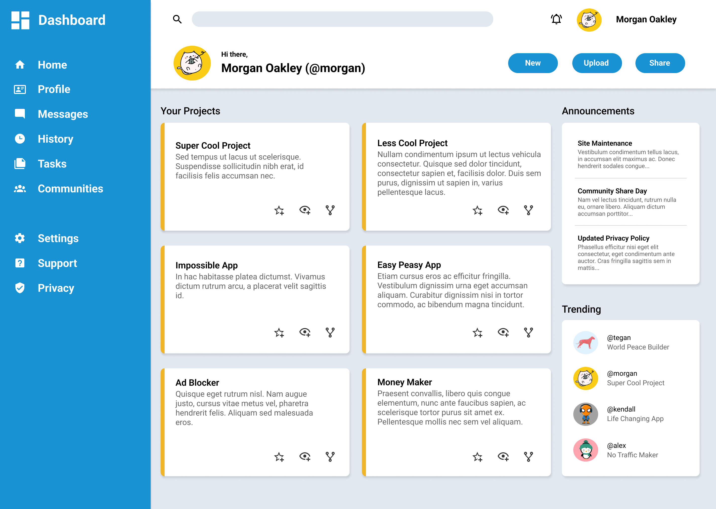
The purpose of this project is to help the user work on their CSS and HTML skills by replicating a sample page. The project doesn't need to be a pixel perfect match since it is for practice purposes. The main subject involved in this project is the CSS Grid. I decided to use a little bit of Flexbox inside my CSS Grid methods, but I also may go back over these methods and replace the Flexbox properties with Grid properties just to see if the page has an overall better responsive design to it. Removing the Flexbox will allow me to also use Grid Nesting more as I did in various sections throughout the CSS file.
Sample Page Source: sample page
A good example of using CSS Grid with flex-box items inside it is the header class section inside the main-container class section. The header section|link section is a little clunky when applying flex-wrap. This is a major section that I may go back over to use the nested CSS Grid method instead.
The CSS file has a @media tag for responsive design when the browser shrinks to a max-width of 1080px on a desktop layout/viewport. The sidebar will no longer be displayed once the browser shrinks to this value. JavaScript was added to allow the browser to have breakpoint and display a dropdown link with all the original links from the sidebar once the browser is resized. The class sections will also look different to fit the resized viewport.
Here is a list of the important class sections in the project. Each section contains a sub-section child that comes right after the bullet points. They are also labeled in the CSS file.
body
- main-container class
main-container section
- header class
- sidebar class
- main-content class
header section
- search bar class
- notifications class
- introduction class
- links class
sidebar section
- sidebar title class
- sidebar links class
main-content class
- h2 title id's (projects|annoucements|trending)
- project class
- announcement class
- trending class

 React
React
 Typescript
 Django
 Laravel
 Facebook
 Microsoft
 Google
 Alibaba
 D3
D3
 Tencent