


Tired of these menu buttons?

Why not try these:

Yes, this library is about a menu which can ... BOOM!
###Usage
- Easy to Use in 3 Steps
- Use in Action Bar
- Use in Floating Action Button
- Use in List
- Use in Share Style
- Use with Builder
- Hamburger Button and Circle Button
- Number of Sub Buttons
- Boom Types
- Place Types
- Ease Types
- Boom Animation Duration
- Animation Start Delay
- Rotation Degree
- Auto Dismiss
- Cancelable
- Show Order and Hide Order
- Sub Buttons Click Listener
- Animation Listener
- Click Effects
- Sub Button Texts Color
- Dim Types
- Shadow of Sub Buttons and Boom Button
- Get States and Dismiss
- Get Sub Views of Sub Button
Just add the "compile 'com.nightonke:BoomMenu:1.0.9'" in your build.gradle of your module.
dependencies {
    ...
    compile 'com.nightonke:boommenu:1.0.9'
    ...
}
Or maven:
<dependency>
  <groupId>com.nightonke</groupId>
  <artifactId>boommenu</artifactId>
  <version>1.0.9</version>
  <type>pom</type>
</dependency>
- I use the ShadowLayout from dmytrodanylyk-ShadowLayout to create the shadow effect of the buttons.
- Boom menu button can be used in list since version 1.0.4.
You can check most of the options that you can set when using boom menu button in this demo. When you read the code of the demo, don't be afraid of the length of the code in MainActivity.class. Most of codes are for the logic of the RadioGroups.

Or by link:
Boom V1.0.9 in Github
Boom V1.0.9 in Fir
Check the code in EaseUseActivity and you will found out all to do are 3 steps:
1.Add BoomMenuButton in xml file:
<com.nightonke.boommenu.BoomMenuButton
    android:id="@+id/boom"
    android:layout_width="wrap_content"
    android:layout_height="wrap_content"
    android:layout_alignParentBottom="true"
    android:layout_alignParentRight="true"
    android:layout_alignParentEnd="true"
    android:layout_margin="20dp"
    app:boom_inActionBar="false"
    app:boom_button_color="@color/colorPrimary"
    app:boom_button_pressed_color="@color/colorPrimary"
    />
**2.**Get the view in xml in onCreate() method:
boomMenuButton = (BoomMenuButton)findViewById(R.id.boom);**3.**Initialize the boom menu button in the onWindowFocusChanged() method in activity:
@Override
public void onWindowFocusChanged(boolean hasFocus) {
    super.onWindowFocusChanged(hasFocus);

    boomMenuButton.init(
            subButtonDrawables, // The drawables of images of sub buttons. Can not be null.
            subButtonTexts,     // The texts of sub buttons, ok to be null.
            subButtonColors,    // The colors of sub buttons, including pressed-state and normal-state.
            ButtonType.HAM,     // The button type.
            BoomType.PARABOLA,  // The boom type.
            PlaceType.HAM_3_1,  // The place type.
            null,               // Ease type to move the sub buttons when showing.
            null,               // Ease type to scale the sub buttons when showing.
            null,               // Ease type to rotate the sub buttons when showing.
            null,               // Ease type to move the sub buttons when dismissing.
            null,               // Ease type to scale the sub buttons when dismissing.
            null,               // Ease type to rotate the sub buttons when dismissing.
            null                // Rotation degree.
    );
}To add boom menu button in action bar just:
1.Create your own action bar layout, custom_actionbar.xml:
<?xml version="1.0" encoding="utf-8"?>
<RelativeLayout xmlns:android="http://schemas.android.com/apk/res/android"
    android:layout_width="match_parent"
    android:layout_height="match_parent"
    xmlns:app="http://schemas.android.com/apk/res-auto"
    android:background="@color/transparent">

    <com.nightonke.boommenu.BoomMenuButton
        android:id="@+id/boom"
        android:layout_width="56dp"
        android:layout_height="match_parent"
        android:layout_alignParentStart="true"
        android:layout_alignParentLeft="true"
        android:layout_centerVertical="true"
        android:background="?android:actionBarItemBackground"
        app:boom_inActionBar="true"
        />

    <TextView
        android:id="@+id/title_text"
        android:layout_width="wrap_content"
        android:layout_height="wrap_content"
        android:layout_centerVertical="true"
        android:textAllCaps="true"
        android:textAppearance="?android:attr/textAppearanceLarge"
        android:textColor="#fff"
        android:layout_toRightOf="@+id/boom"
        android:layout_toEndOf="@+id/boom"
        />

</RelativeLayout>2.Custom the default action bar in onCreate() method:
@Override
protected void onCreate(Bundle savedInstanceState) {
    super.onCreate(savedInstanceState);
    setContentView(R.layout.activity_main);

    ActionBar mActionBar = getSupportActionBar();
    mActionBar.setDisplayShowHomeEnabled(false);
    mActionBar.setDisplayShowTitleEnabled(false);
    LayoutInflater mInflater = LayoutInflater.from(this);

    mCustomView = mInflater.inflate(R.layout.custom_actionbar, null);
    TextView mTitleTextView = (TextView) mCustomView.findViewById(R.id.title_text);
    mTitleTextView.setText(R.string.app_name);

    boomMenuButtonInActionBar = (BoomMenuButton) mCustomView.findViewById(R.id.boom);
    boomMenuButtonInActionBar.setOnSubButtonClickListener(this);
    boomMenuButtonInActionBar.setAnimatorListener(this);

    mActionBar.setCustomView(mCustomView);
    mActionBar.setDisplayShowCustomEnabled(true);

    ((Toolbar) mCustomView.getParent()).setContentInsetsAbsolute(0,0);
}3.Initialize the boom menu button in the onWindowFocusChanged() method in activity. Just like what we do in the step3 in Easy to Use in 3 Steps
###Use in Floating Action Button
Similar with above. But just add some params in xml:
<com.nightonke.boommenu.BoomMenuButton
    android:id="@+id/boom"
    android:layout_width="wrap_content"
    android:layout_height="wrap_content"
    app:boom_inActionBar="false"
    app:boom_button_color="@color/colorPrimary"
    app:boom_button_pressed_color="@color/colorPrimary"
/>| Param | Type | What It Does |
|---|---|---|
| app:boom_inActionBar | boolean | true for boom menu button in action bar |
| app:boom_inList | boolean | true for boom menu button in list |
| app:boom_button_color | color | the color of the boom menu button, only work in floating action button |
| app:boom_button_pressed_color | color | the color when pressing the boom menu button, only work when the ClickEffect is normal |
To add boom menu button in list just:
1.Create your list-item layout, notice that the app:boom_inList value should be true:
<?xml version="1.0" encoding="utf-8"?>
<LinearLayout xmlns:android="http://schemas.android.com/apk/res/android"
    xmlns:app="http://schemas.android.com/apk/res-auto"
    android:orientation="horizontal"
    android:layout_width="match_parent"
    android:layout_height="match_parent">

    <TextView
        android:id="@+id/text_view"
        android:layout_width="0dp"
        android:layout_height="56dp"
        android:layout_weight="1"
        android:layout_marginStart="15dp"
        android:layout_marginLeft="15dp"
        android:gravity="center_vertical"
        />

    <com.nightonke.boommenu.BoomMenuButton
        android:id="@+id/boom_circle"
        android:layout_width="56dp"
        android:layout_height="match_parent"
        app:boom_inList="true"
        />

    <com.nightonke.boommenu.BoomMenuButton
        android:id="@+id/boom_ham"
        android:layout_width="56dp"
        android:layout_height="match_parent"
        app:boom_inList="true"
        />

</LinearLayout>2.Init the boom menu button with delays in adapter:
@Override
public View getView(int position, View convertView, final ViewGroup parent) {

    ...

    viewHolder.circleBoomMenuButton.postDelayed(new Runnable() {
        @Override
        public void run() {
            viewHolder.circleBoomMenuButton.init(
                    circleSubButtonDrawables, // The drawables of images of sub buttons. Can not be null.
                    circleSubButtonTexts,     // The texts of sub buttons, ok to be null.
                    subButtonColors,          // The colors of sub buttons, including pressed-state and normal-state.
                    ButtonType.CIRCLE,        // The button type.
                    BoomType.PARABOLA,        // The boom type.
                    PlaceType.CIRCLE_3_1,     // The place type.
                    null,                     // Ease type to move the sub buttons when showing.
                    null,                     // Ease type to scale the sub buttons when showing.
                    null,                     // Ease type to rotate the sub buttons when showing.
                    null,                     // Ease type to move the sub buttons when dismissing.
                    null,                     // Ease type to scale the sub buttons when dismissing.
                    null,                     // Ease type to rotate the sub buttons when dismissing.
                    null                      // Rotation degree.
            );
            viewHolder.hamBoomMenuButton.setSubButtonShadowOffset(
                    Util.getInstance().dp2px(2), Util.getInstance().dp2px(2));
            viewHolder.circleBoomMenuButton.setSubButtonShadowOffset(
                    Util.getInstance().dp2px(2), Util.getInstance().dp2px(2));
        }
    }, 1);

    ...

}
For more information, please check ListViewActivity.class
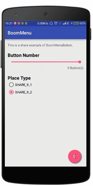
Share style is the new place type of BMB in version 1.0.6. You can see the effect in the gifs. To use this, just change the place type as PlaceType.SHARE_X_X. Just try it in the demo.
You can set the width of lines in share icon with setShareLineWidth(float width) and change the lines colors with setShareLine1Color(int color) and setShareLine2Color(int color).
For more information, please check ShareActivity.class
Thanks @demolot to remind me of using Builder. Now you can use Builder to initialize the BMB more convenient.
@Override
public void onWindowFocusChanged(boolean hasFocus) {
    super.onWindowFocusChanged(hasFocus);

    // this is an example to show how to use the builder
    new BoomMenuButton.Builder()
            // set all sub buttons with subButtons method
            //.subButtons(subButtonDrawables, subButtonColors, subButtonTexts)
            // or add each sub button with addSubButton method
            .addSubButton(this, R.drawable.boom, subButtonColors[0], "BoomMenuButton")
            .addSubButton(this, R.drawable.java, subButtonColors[1], "View source code")
            .addSubButton(this, R.drawable.github, subButtonColors[2], "Follow me")
            .frames(80)
            .duration(800)
            .delay(100)
            .showOrder(OrderType.RANDOM)
            .hideOrder(OrderType.RANDOM)
            .button(ButtonType.HAM)
            .boom(BoomType.PARABOLA_2)
            .place(PlaceType.HAM_3_1)
            .showMoveEase(EaseType.EaseOutBack)
            .hideMoveEase(EaseType.EaseOutCirc)
            .showScaleEase(EaseType.EaseOutBack)
            .hideScaleType(EaseType.EaseOutCirc)
            .rotateDegree(720)
            .showRotateEase(EaseType.EaseOutBack)
            .hideRotateType(EaseType.Linear)
            .autoDismiss(true)
            .cancelable(true)
            .dim(DimType.DIM_6)
            .clickEffect(ClickEffectType.RIPPLE)
            .boomButtonShadow(Util.getInstance().dp2px(2), Util.getInstance().dp2px(2))
            .subButtonsShadow(Util.getInstance().dp2px(2), Util.getInstance().dp2px(2))
            .subButtonTextColor(Color.BLACK)
            .onBoomButtonBlick(null)
            .animator(null)
            .onSubButtonClick(null)
            // this only work when the place type is SHARE_X_X
            .shareStyle(0, 0, 0)
            .init(boomMenuButton);
}
For more information, please check BuilderActivity.class
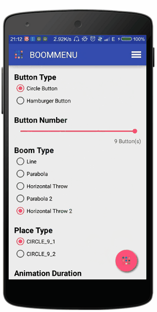
There are 2 types of sub buttons in BMB(boom menu button). Hamburger and circle. You can use ButtonType.HAM and ButtonType.CIRCLE to initialize the BMB.
For hamberger type, there are [1, 4] sub buttons. For circle type, there are [1, 9] sub buttons.
There are 5 boom types provided in this version. They are BoomType.LINE, BoomType.PARABOLA_2 , BoomType.HORIZONTAL_THROW, BoomType.PARABOLA_2 and BoomType.HORIZONTAL_THROW_2. Just try them for fun in the demo. You can choose your favorite BoomType when initializing the BMB, or set it:
setBoomType(newBoomType);There are 32 types for placing the sub buttons in BMB or in the screen. You can use PlaceType.CIRCLE_X_X and PlaceType.HAM_X_X (the former X is the number of sub buttons and the latter X is type number) to initialize BMB.


For more information for Place type, please check PlaceType.class
You can set 30 ease types for 6 part of animations when the BMB is showing or hiding. You can set the moving, scaling and rotating or showing and hiding animation when initializing the BMB, or set them to null to use the default ease types. And also, you can set 6 types by the setters:
setShowMoveEaseType(showMoveEaseType);

setShowScaleEaseType(showScaleEaseType);

setShowRotateEaseType(showRotateEaseType);

setHideMoveEaseType(hideMoveEaseType);

setHideScaleEaseType(hideScaleEaseType);

setHideRotateEaseType(hideRotateEaseType);
For more ease types, you can check Ease Type Package. Or check the library that I made(This part is the same).
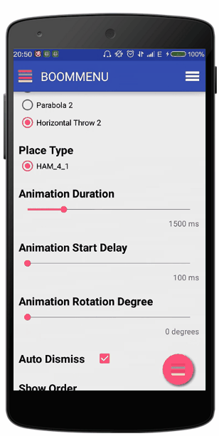
Set the duration of the boom animation by setDuration(duration) (in ms). The default duration is 800ms.
Use setDelay(delay) to set the delay between each 2 sub buttons(in ms). For instance, if the delay is 0, then all the sub buttons will boom out at the same time. The default delay is 100ms.
You can set the degree to rotate the sub button. But only for circle types, I forbade applying rotation animation to hamburger types button because the shadow or a rolling rectangle is hard to display. The default rotation degree is 720. Set the degree when initializing BMB or use setRotateDegree(rotateDegree);
When you click a sub button, the BMB will automatically hide all the sub buttons. If you want to stop this, just use setAutoDismiss(autoDismiss) to set autoDismiss to false.
When click other place except the sub buttons, the BMB will hide all the sub buttons. You can use setCancelable(cancelable) to set the value to false. But remember to set one button to perform the cancelable job, otherwise the BMB will be uncancelable.
Set the order of showing or hiding sub buttons with OrderType.DEFAULT, OrderType.REVERSE and OrderType.RANDOM. Use setShowOrderType(showOrderType) and setHideOrderType(hideOrderType) to set these values.
boomMenuButton.setOnSubButtonClickListener(new BoomMenuButton.OnSubButtonClickListener() {
    @Override
    public void onClick(int buttonIndex) {
        // return the index of the sub button clicked
    }
});boomInfo.setAnimatorListener(new BoomMenuButton.AnimatorListener() {
@Override
public void toShow() {
// the moment when the BMB is clicked and the showing animation is about to start
}
@Override
public void showing(float fraction) {
// the showing animation is playing, the fraction is the process of animation
}
@Override
public void showed() {
// the showing animation is just played
}
@Override
public void toHide() {
// the BMB is about to play the hiding animation
}
@Override
public void hiding(float fraction) {
// the hiding animation is playing
}
@Override
public void hided() {
// the hiding animation is just played
}
});Use setClickEffectType(clickEffectType) set click effect of all the buttons of BMB(including itself). Use ClickEffectType.RIPPLE to set the ripple effect(only work at or after Android 5.0) or ClickEffectType.NORMAL to set the normal effect of buttons.
Use setTextViewColor(int color) to set the color of all the textviews of sub buttons. Or use setTextViewColor(int[] colors) to set different color of textviews of sub buttons.
You can use DimType to control the dim degree when showing the sub buttons. You may notice that in the demo, when you click the floating action button, the background would not be dim. But, when you click the BMB in the action bar, the background would be dim. There are 10 values of dim degree:
public enum DimType {
    DIM_0(Color.parseColor("#00000000")),
    DIM_1(Color.parseColor("#11000000")),
    DIM_2(Color.parseColor("#22000000")),
    DIM_3(Color.parseColor("#33000000")),
    DIM_4(Color.parseColor("#44000000")),
    DIM_5(Color.parseColor("#55000000")),
    DIM_6(Color.parseColor("#66000000")),
    DIM_7(Color.parseColor("#77000000")),
    DIM_8(Color.parseColor("#88000000")),
    DIM_9(Color.parseColor("#99000000"));

    public int value;

    DimType(int value) {
        this.value = value;
    }
}
Use setDimType(DimType dimType) to set the dim degree of BMB. For instance, you can use boomMenuButton.setDimType(DimType.DIM_0); to keep the background light when showing sub buttons.
You can set the offset of the shadow of sub buttons and the BMB. Use setSubButtonShadowOffset(float xOffset, float yOffset) (in pixel)to set the offset of sub buttons and setBoomButtonShadowOffset(float xOffset, float yOffset) to the BMB's.
You can get the current state of BMB with:
boolean isClosed();

boolean isClosing();

boolean isOpen();

boolean isOpening();
And use boolean dismiss() to force the BMB to play hiding animation. Returns true if the BMB is going to hide, returns false if the BMB cannot hide right now(because it is showing, hiding or hided).
If you wanna modify the sub views in the sub button. There are several methods to do that:
ImageView[] getImageViews();

TextView[] getTextViews();First version.
Fix a bug that now BMB should be able to used in version below lollipop.
Fix the bug that's in Android 4.0, the image of the circle button is black.
Now the BMB can be used in list.
Share style.
Setters for share style.
Thanks @hisham2007 to remind me of the RTL bug. Now BMB is able to support RTL mode.
Thanks @demolot to remind me use the Builder to init the BMB. For more information, please check Use with BMB.
Try to fix the memory optimization issue, but I'm not sure whether it works.
Try to fix the null-pointer exception.
- Particle effects are coming soon.
Make BMB ready for using in listview.- Blur background.
Copyright 2016 Nightonke

Licensed under the Apache License, Version 2.0 (the "License");
you may not use this file except in compliance with the License.
You may obtain a copy of the License at

   http://www.apache.org/licenses/LICENSE-2.0

Unless required by applicable law or agreed to in writing, software
distributed under the License is distributed on an "AS IS" BASIS,
WITHOUT WARRANTIES OR CONDITIONS OF ANY KIND, either express or implied.
See the License for the specific language governing permissions and
limitations under the License.


 React
React
 Typescript
 Django
 Laravel
 Facebook
 Microsoft
 Google
 Alibaba
 D3
D3
 Tencent