#JHChart(最新版本1.0.3)


Well, I admit that there are a lot of other graphics libraries on the GitHub. But, because of my project needs, most of the library can not fully meet my needs. So I took out a little free time, I wrote a chart library. Initial plan to write only a few lines (my project needs), did not expect the release to GitHub after a number of friends told me that they need more styles.I don't want to tell them I just intend to do it here, so it's a bit of a development to the present 0.1.1 version, basically meet the needs of users before. Of course, the follow-up will continue to update, add more features.
A simple, feature rich and customizable iOS development chart library. Click here if you want to see the usage of the Chinese description.
##Requirement
- Xcode 7.0+
- iOS 7.0+
##Import library
There are two ways to use the JHChart library. * Download the current Demo directly, and then add the JHChart folder to your project * Use CocoaPod import, only need to add the following statement in your Podfile: pod 'JHChart','~>1.0.3'
(If you don't know about cocoapods, click here to go to the official website.)
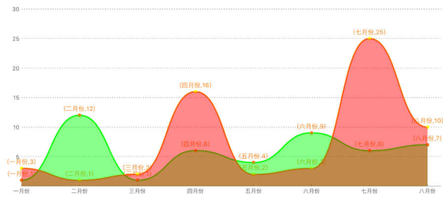
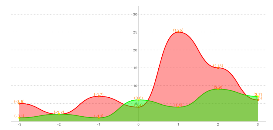
Description: JHLineChart can create a variety of data sources linear charts, including broken lines and curves, can be based on the data source to determine whether the multiple linear table. And, according to the needs of the interval fill color. At the same time the table supports the different needs of different quadrant, here is just set the first quadrant of the sample, the other quadrant of the use of the same method.
/*     Create object        */
JHLineChart *lineChart = [[JHLineChart alloc] initWithFrame:CGRectMake(10, 100, k_MainBoundsWidth-20, 300) andLineChartType:JHChartLineValueNotForEveryX];

/* The scale value of the X axis can be passed into the NSString or NSNumber type and the data structure changes with the change of the line chart type. The details look at the document or other quadrant X axis data source sample.*/

lineChart.xLineDataArr = @[@"0",@"1",@"2",@3,@4,@5,@6,@7];

/* The different types of the broken line chart, according to the quadrant division, different quadrant correspond to different X axis scale data source and different value data source. */

lineChart.lineChartQuadrantType = JHLineChartQuadrantTypeFirstQuardrant;

lineChart.valueArr = @[@[@"1",@"12",@"1",@6,@4,@9,@6,@7],@[@"3",@"1",@"2",@16,@2,@3,@5,@10]];

/* Line Chart colors */
lineChart.valueLineColorArr =@[ [UIColor purpleColor], [UIColor brownColor]];
/* Colors for every line chart*/
lineChart.pointColorArr = @[[UIColor orangeColor],[UIColor yellowColor]];
/* color for XY axis */
lineChart.xAndYLineColor = [UIColor blackColor];
/* XY axis scale color */
lineChart.xAndYNumberColor = [UIColor blueColor];
/* Dotted line color of the coordinate point */
lineChart.positionLineColorArr = @[[UIColor blueColor],[UIColor greenColor]];
/*        Set whether to fill the content, the default is False         */
lineChart.contentFill = YES;
/*        Set whether the curve path         */
lineChart.pathCurve = YES;
/*        Set fill color array         */
lineChart.contentFillColorArr = @[[UIColor colorWithRed:0.500 green:0.000 blue:0.500 alpha:0.468],[UIColor colorWithRed:0.500 green:0.214 blue:0.098 alpha:0.468]];
[self.view addSubview:lineChart];
/*       Start animation        */
[lineChart showAnimation];
Actual effect chart:
- first quardrant.
- first and second quardrant.
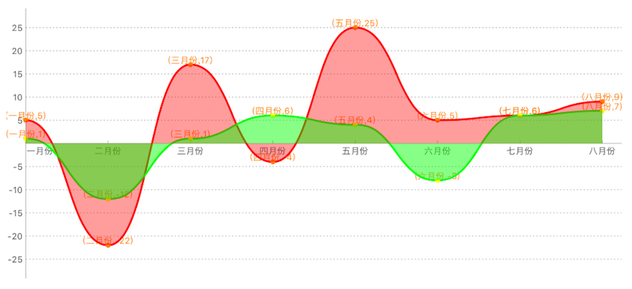
- first and fouth quardrant.
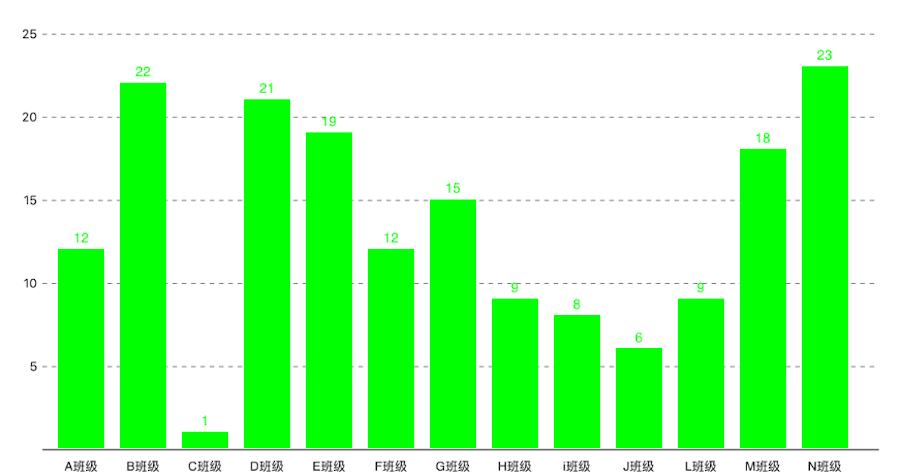
Description: JHColumnChart is a rolling column, you can set the data source you need to draw an array of flexible style, it not only set the column of different color, can also provide you a number of descriptive attributes used to mark different styles
JHColumnChart *column = [[JHColumnChart alloc] initWithFrame:CGRectMake(0, 100, k_MainBoundsWidth, k_MainBoundsWidth)];
/*        Create an array of data sources, each array is a module data. For example, the first array can represent the average score of a class of different subjects, the next array represents the average score of different subjects in another class        */
column.valueArr = @[
@[@12,@15,@20],
@[@22,@15,@20],
@[@12,@5,@40],
@[@2,@15,@20],
@[@20,@15,@26]
];
/*       This point represents the distance from the lower left corner of the origin.         */
column.originSize = CGPointMake(30, 30);
/*    The first column of the distance from the starting point     */
column.drawFromOriginX = 10;
/*        Column width         */
column.columnWidth = 40;
/*        X, Y axis font color         */
column.drawTextColorForX_Y = [UIColor whiteColor];
/*        X, Y axis line color         */
column.colorForXYLine = [UIColor blackColor];
/*    Each module of the color array, such as the A class of the language performance of the color is red, the color of the math achievement is green     */
column.columnBGcolorsArr = @[[UIColor redColor],[UIColor greenColor],[UIColor orangeColor]];
/*        Module prompt         */
column.xShowInfoText = @[@"A班级",@"B班级",@"C班级",@"D班级",@"E班级"];
/*       Start animation        */
[column showAnimation];
[self.view addSubview:column];
Actual effect chart:
- ColumnChart for group
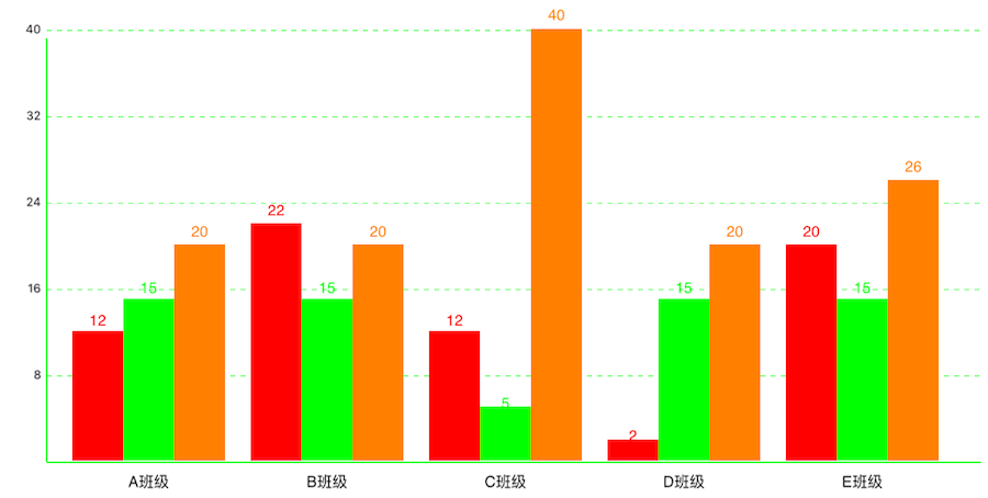
- Nomal ColumnChart
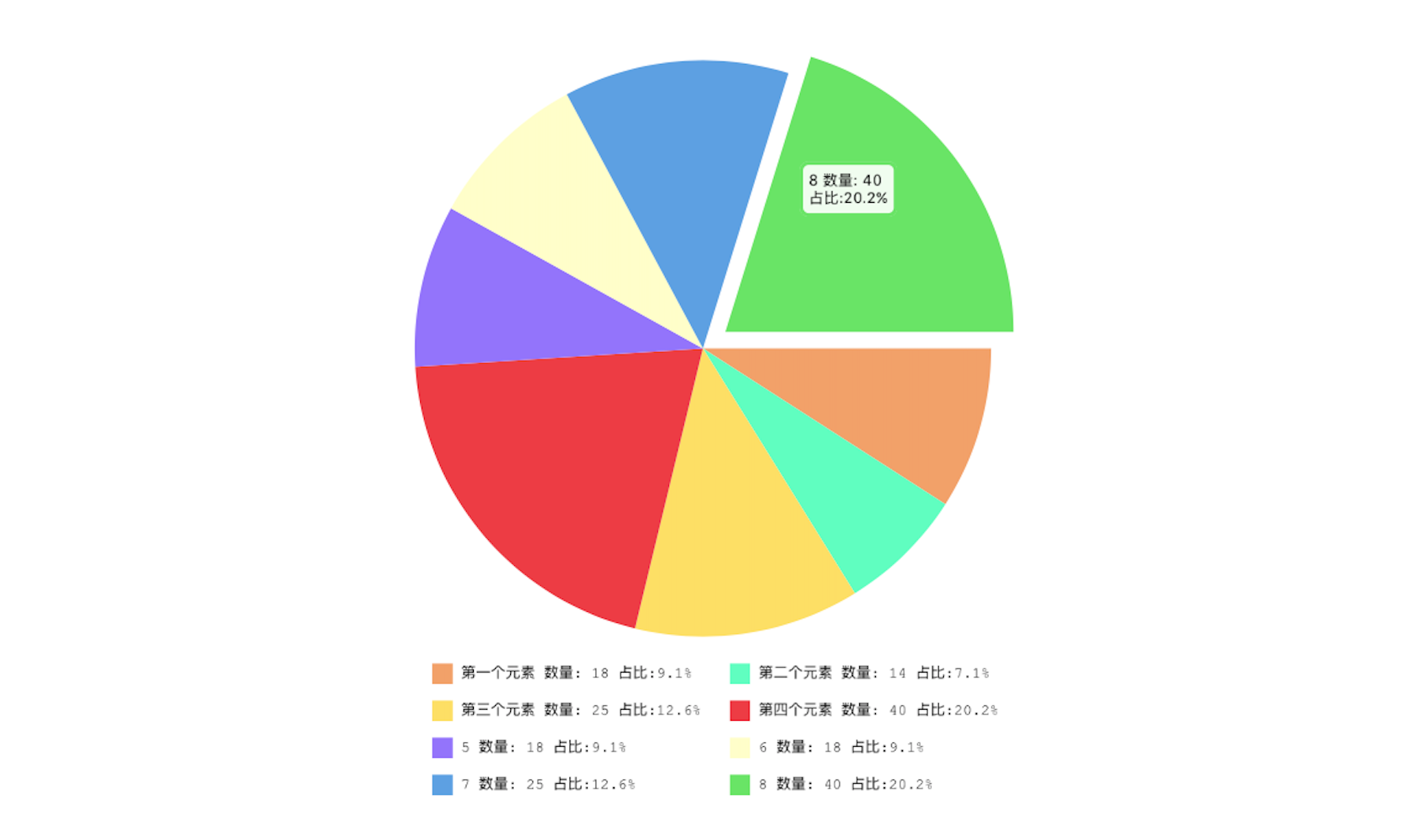
Description: JHPieChart can be based on your data source and view size settings, automatically generate the appropriate size, and there is a hint of animation pie chart. When you click on a piece of pie chart, the animation shows the current cake block information.
JHPieChart *pie = [[JHPieChart alloc] initWithFrame:CGRectMake(100, 100, 321, 421)];
pie.center = CGPointMake(CGRectGetMaxX(self.view.frame)/2, CGRectGetMaxY(self.view.frame)/2);
/* Pie chart value, will automatically according to the percentage of numerical calculation */
pie.valueArr = @[@18,@10,@25,@40,@18,@10,@25,@40,@18,@10,@15,@12,@30,@18];
/* The description of each sector must be filled, and the number must be the same as the pie chart. */
pie.descArr = @[@"第一个元素",@"第二个元素",@"第三个元素",@"第四个元素",@"5",@"6",@"7",@"8",@"9",@"10",@"23",@"12",@"21",@"30"];
pie.backgroundColor = [UIColor whiteColor];
[self.view addSubview:pie];
/*    When touching a pie chart, the animation offset value     */
pie.positionChangeLengthWhenClick = 15;
/*        Start animation         */
[pie showAnimation];
Actual effect chart:
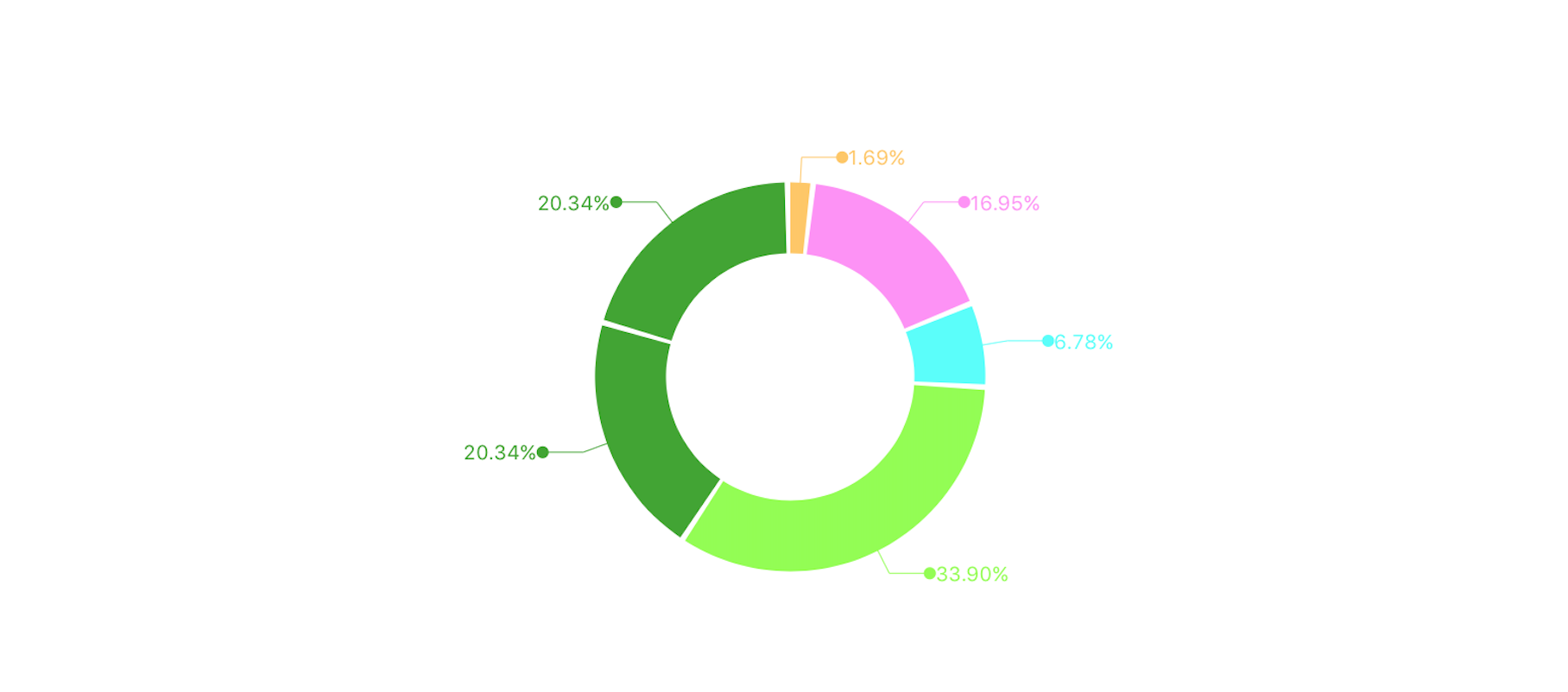
Description: JHRingChart according to your data source, automatically calculate the proportion of relevant data, the animation shows a ring graph, and from each loop to elicit relevant information tips
JHRingChart *ring = [[JHRingChart alloc] initWithFrame:CGRectMake(0, 100, k_MainBoundsWidth, k_MainBoundsWidth)];
/*        background color         */
ring.backgroundColor = [UIColor whiteColor];
/*        Data source array, only the incoming value, the corresponding ratio will be automatically calculated         */
ring.valueDataArr = @[@"0.5",@"5",@"2",@"10",@"6"];
/*         Width of ring graph        */
ring.ringWidth = 35.0;
/*        Fill color for each section of the ring diagram         */
ring.fillColorArray = @[[UIColor colorWithRed:1.000 green:0.783 blue:0.371 alpha:1.000], [UIColor colorWithRed:1.000 green:0.562 blue:0.968 alpha:1.000],[UIColor colorWithRed:0.313 green:1.000 blue:0.983 alpha:1.000],[UIColor colorWithRed:0.560 green:1.000 blue:0.276 alpha:1.000],[UIColor colorWithRed:0.239 green:0.651 blue:0.170 alpha:1.000]];
/*        Start animation             */
[ring showAnimation];
[self.view addSubview:ring];
Actual effect chart:
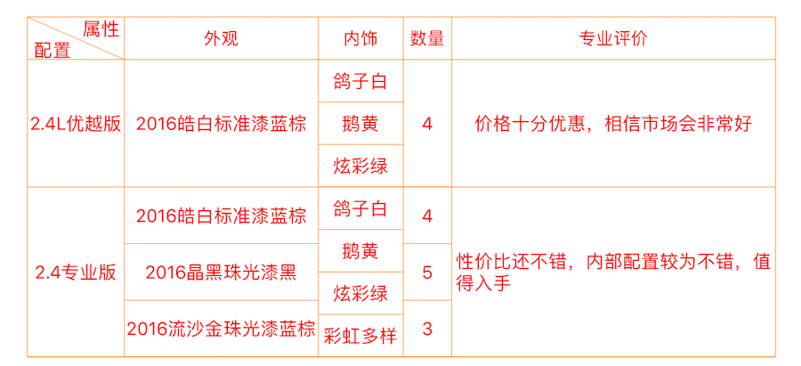
Description: JHTableChart for static drawing style changing table view, all the cell display style depends on the data source, do not need a special treatment of a cell, is very flexible and easy to use
JHTableChart *table = [[JHTableChart alloc] initWithFrame:CGRectMake(10, 64, k_MainBoundsWidth-20, k_MainBoundsHeight)];
/*       Table name         */
table.tableTitleString = @"全选jeep自由光";
/*        Each column of the statement, one of the first to show if the rows and columns that can use the vertical segmentation of rows and columns         */
table.colTitleArr = @[@"属性|配置",@"外观",@"内饰",@"数量"];
/*        The width of the column array, starting with the first column         */
table.colWidthArr = @[@100.0,@120.0,@70,@100];
/*        Text color of the table body         */
table.bodyTextColor = [UIColor redColor];
/*        Minimum grid height         */
table.minHeightItems = 35;
/*        Table line color         */
table.lineColor = [UIColor orangeColor];

table.backgroundColor = [UIColor whiteColor];
/*       Data source array, in accordance with the data from top to bottom that each line of data, if one of the rows of a column in a number of cells, can be stored in an array of         */
table.dataArr = @[
@[@"2.4L优越版",@"2016皓白标准漆蓝棕",@[@"鸽子白",@"鹅黄",@"炫彩绿"],@[@"4"]],
@[@"2.4专业版",@[@"2016皓白标准漆蓝棕",@"2016晶黑珠光漆黑",@"2016流沙金珠光漆蓝棕"],@[@"鸽子白",@"鹅黄",@"炫彩绿",@"彩虹多样色"],@[@"4",@"5",@"3"]]
];
/*        show                            */
[table showAnimation];
[self.view addSubview:table];
/*        Automatic calculation table height        */
table.frame = CGRectMake(10, 64, k_MainBoundsWidth-20, [table heightFromThisDataSource]);
Actual effect chart:
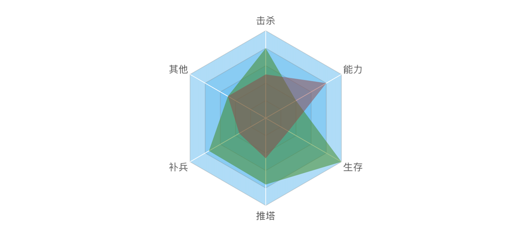
Description: JHRadarChart can according to your incoming data description and calculation of drawing data, and pruning, the advantages and disadvantages of each attribute can reflect the image of the
JHRadarChart *radarChart = [[JHRadarChart alloc] initWithFrame:CGRectMake(10, 74, k_MainBoundsWidth - 20, k_MainBoundsWidth - 20)];
radarChart.backgroundColor = [UIColor whiteColor];
/*       Each point of the description text, according to the number of the array to determine the number of basic modules         */
radarChart.valueDescArray = @[@"击杀",@"能力",@"生存",@"推塔",@"补兵",@"其他"];

/*         Number of basic module layers        */
radarChart.layerCount = 5;

/*        Array of data sources, the need to add an array of arrays         */
radarChart.valueDataArray = @[@[@"80",@"40",@"100",@"76",@"75",@"50"],@[@"50",@"80",@"30",@"46",@"35",@"50"]];

/*        Color of each basic module layer         */
radarChart.layerFillColor = [UIColor colorWithRed:94/ 256.0 green:187/256.0 blue:242 / 256.0 alpha:0.5];

/*        The fill color of the value module is required to specify the color for each value module         */
radarChart.valueDrawFillColorArray = @[[UIColor colorWithRed:57/ 256.0 green:137/256.0 blue:21 / 256.0 alpha:0.5],[UIColor colorWithRed:149/ 256.0 green:68/256.0 blue:68 / 256.0 alpha:0.5]];

/*       show        */
[radarChart showAnimation];

[self.view addSubview:radarChart];
Actual effect chart:
- 邮箱:[email protected]
- 简书:不睡觉的鸟
- 博客:Silktree


