提供了对amcharts插件的简单封装,把更多精力放在准备相应格式的数据上
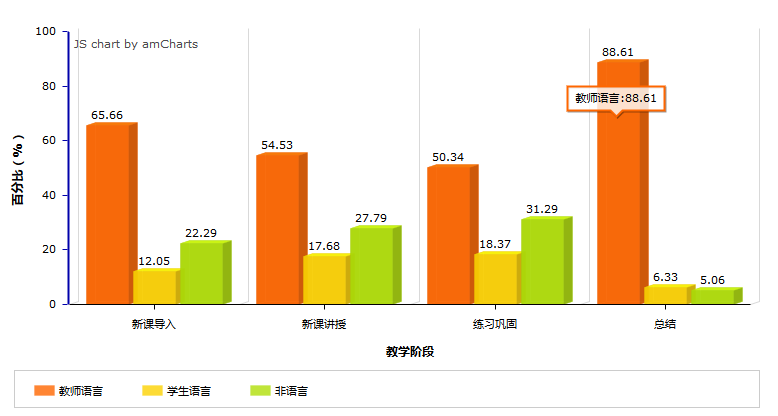
  var data = [
    {
        "type2": 22.29,
        "type1": 12.05,
        "type0": 65.66,
        "name": "新课导入"
    },
    {
        "type2": 27.79,
        "type1": 17.68,
        "type0": 54.53,
        "name": "新课讲授"
    },
    {
        "type2": 31.29,
        "type1": 18.37,
        "type0": 50.34,
        "name": "练习巩固"
    },
    {
        "type2": 5.06,
        "type1": 6.33,
        "type0": 88.61,
        "name": "总结"
    }
];var graphList = [
{
"balloonText": "[[title]]:[[value]]",
"id": "graphs-0",
"title": "教师语言",
"valueField": "type0"
},
{
"balloonText": "[[title]]:[[value]]",
"id": "graphs-1",
"title": "学生语言",
"valueField": "type1"
},
{
"balloonText": "[[title]]:[[value]]",
"id": "graphs-2",
"title": "非语言",
"valueField": "type2"
}
];initClusteredBarChart: function(){
var self = this, dom = self.element, chartId = 'report4_chart1';
$('#' + chartId).clusteredBarChart({
chartId: chartId,
categoryField: 'name',
columnGraphs: graphList,
chartDataProvider: data,
valueAxes: [
{
id: 'v1',
maximum: 100,//设置最大值
title: '百分比(%)'
}
],
categoryAxis: {
title: '教学阶段'
}
});
}
var data = [
  {"percent":"5","minute":1},
  {"percent":"0","minute":2},
  {"percent":"15","minute":3},
  {"percent":"5","minute":4},
  {"percent":"0","minute":5},
  {"percent":"10","minute":6},
  {"percent":"5","minute":7},
  {"percent":"10","minute":8},
  {"percent":"0","minute":9},
  {"percent":"0","minute":10},
  {"percent":"5","minute":11},
  {"percent":"0","minute":12},
  {"percent":"5","minute":13},
  {"percent":"0","minute":14},
  {"percent":"15","minute":15},
  {"percent":"10","minute":16},
  {"percent":"5","minute":17},
  {"percent":"10","minute":18},
  {"percent":"0","minute":19},
  {"percent":"0","minute":20},
  {"percent":"10","minute":21},
  {"percent":"0","minute":22},
  {"percent":"5","minute":23},
  {"percent":"0","minute":24},
  {"percent":"5","minute":25},
  {"percent":"5","minute":26},
  {"percent":"0","minute":27},
  {"percent":"0","minute":28},
  {"percent":"5","minute":29},
  {"percent":"30","minute":30},
  {"percent":"5","minute":31},
  {"percent":"20","minute":32},
  {"percent":"0","minute":33},
  {"percent":"0","minute":34},
  {"percent":"0","minute":35},
  {"percent":"0","minute":36},
  {"percent":"0","minute":37},
  {"percent":"0","minute":38},
  {"percent":"5","minute":39},
  {"percent":"20","minute":40},
  {"percent":"15","minute":41},
  {"percent":"0","minute":42},
  {"percent":"5","minute":43},
  {"percent":"0","minute":44}
];initMultipleValueAxesChart: function(data){
var self = this, dom = self.element;
var chartId = 'chart_div';
$('#' + chartId).multipleValueAxesChart({
chartId: chartId,
chartDataProvider: data,
categoryField: 'minute',
valueAxes:[
{
id: 'v1',
maximum: 100,//设置最大值
title: '百分比(%)'
}
],
'lineGraphs': [
{
'valueAxis': 'v1',
'title': 'xxxx折线图',
'type': 'line',
'lineThickness': 1,
'valueField': 'percent'
}
],
categoryAxis: {
parseDates: false,
title: '时间(分钟)'
},
chartCreditsPosition: 'top-left'
});
},var data = [
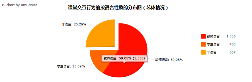
{
"duration":1536,
"count":512,
"title":"教师语言"
},
{
"duration":408,
"count":136,
"title":"学生语言"
},
{
"duration":657,
"count":219,
"title":"非语言"
}
];initPieChart: function(data){
var self = this, dom = self.element;
var chartId = 'report1_chart1';
$('#' + chartId).pieChart({
chartId: chartId,
chartDataProvider: data,
titleField: 'title',
valueField: 'duration',
innerRadius: '0%',
titles: [{
text: '课堂交互行为的按语言性质的分布图(总体情况)',
size: 16
}],
minRadius: 100
});
}