Repo constructed by tutors in the School of AMME and ACFR at the University of Sydney with tips and tricks for formatting of formal engineering reports and assignments.
Communication of ideas, results, and technical content clearly and effectively is integral to engineering. Getting into good habits before starting your undergraduate thesis or entering industry will help you explain your work to not only to those skilled in your field, but also those outside of it. Many of the semantics required for good formatting and communication can be "set-and-forget." For example, you can standardise your figures, tables, and presentation with nice formatting so that you can focus on getting the words right on the page.
Our intention for this repo is to give you an idea of best practice with regards to formatting so you can appreciate how the presentation of a document affects the clarity on the readers end.
We've added two supplementary guides to expand to less of the semantics, and more to the mechanics of various sorts of communication.
- Engineering report writing: these are tips directly for the writing of an engineering report - how to phrase, what to include, how to be clear, precise etc.
- Presentations - slides/content, practice and presenting: these tips are intended to help you create flexible, engaging and audience appropriate presentations.
- Literature reviews: do not write regurgitative literature reviews.
- LaTeX
- Font & Typeface
- Report Content
- Citations and Cross-Referencing
- Figures
- Tables
- Mathematics
- Calculations
- Code
From about second year, your coursework will have some rigorous maths and will therefore require proper typesetting for clarity. For this reason you are strongly encouraged to use LaTeX for every document you produce. It is easier to manage large and long documents, takes the pain out of formatting pages of maths and ensures your document is formatted how you define it rather than how another program thinks it should be.
Why the asterisk? For quick things - Google Docs or a text file will do fine. If you're writing an essay and there is no maths and pictures, and it's less than 20 pages - traditional document software will do. For presentations, you can do your slides in LaTeX using the Beamer class but it's finicky as you have too many images and isn't as dynamic as say PowerPoint. Everything else (particularly your thesis!): LaTeX - you'll thank us later.
As far as we're concerned: if NASA uses it, and book publishers use it, and good academics use it, you should use it too.
We'll assume for the rest of this document that you've made the decision to use LaTeX, as there's a lot of tricks to save you time which we will cover.
- Overleaf: the Google Docs of LaTeX. You also have a free Pro+ account with your USyd login waiting for you. If you don't need to have an offline LaTeX compiler, this is the best way to get started.
- USYD Report Template for LaTeX: passed around since 2018. A good template for reports, assignments, problem sets etc. Customise it as you see fit. Only use if the report does not specify a template.
- An Intro to LaTeX: a brief intro to LaTeX showing what it can do, and why it's worthwhile learning along with how to get started. You can find the slides here.
- TeXnique: a nice game to familiarise/challenge yourself with typing maths in LaTeX and learning the symbols.
We've added a guide on design report writing, commonly applicable to undergraduate engineering assignments.
A lot of people struggle to write content that is professional, and audience appropriate. You should be clear, concise and purposeful in your writing. This means that you actually need to plan what will be written, use language that is able to be understood by the audience and be lean in your language: do not write for the sake of writing. Use active voice where appropriate, and make it clear who and what throughout. Do not change tense, or voice partway through.
A good piece of text should be direct, but smooth and flowing.
- Australian Government Style Guide: Mostly targeted for writing Government reports, but some great tips on language, punctuation, structure and purpose. Well worth a read, use it as a secondary resource for some of these basic language tips.
Make it legible. Make it easy on the eyes (basic serif/sans serif fonts only). Choose your colours carefully. And please, we beg you: no comic sans.
- NASA Flightdeck Documentation: Not all fonts and colours are easy to read. This is a really interesting resource to read in full about how engineering design interacts with human psychology. If you just want the crux of it, their list of recommendations at the end is what is really necessary.
The age old question - and it depends on what you're writing for.
Most of your engineering reports should be fine with numbered references in IEEE format (i.e. boxes in text like this [4]). For some things like essays, you may need to change to a more appropriate style. Here, Harvard may be more acceptable - but it depends on your discipline.
If no referencing style is specified, and it's an engineering course - you're safe with IEEE.
Most citation styles have a guide for how they're used. For example - IEEE publishes a comprehensive guide. These are long and arduous, but well worth a skim just to make sure you're doing it correctly.
Luckily - many citation styles publish a BibTeX style which automates a process, provided you format your bib file correctly.
If you are working through a solution, and you wish to use a result from earlier or talk specifically about a prior equation or figure or section you will need to let the reader know exactly what you are referring to. Re-writing it or writing a reminder for the reader is inefficient - so you should be telling the reader where they can find the info again if they need a refresher.
Imagine you type out in your thesis "In Eq. 1.2 we provide the result for the Schwarzschild radius of a black hole" during the first draft. Six months later, you submit and celebrate and have your thesis printed because of how proud you are. Reading through with your family you re-read that line and flick back 26 pages to Eq 1.2... only now it is the equation for the heat flux needed to bake a cake! Oh no, you added an equation and now your text no longer lines up - how silly you look!
This could have been avoided if you had added \label{eq:schwarzschild} and then used "In Eq.~\ref{eq:schwarzschild}..." within the equation block. This is known as cross-referencing and LaTeX allows you to programmatically reference sections which update as you change the content of your document.
Where you have figures or equations or sections you refer to, you should be cross referencing to let the reader know exactly what you are talking about, without duplicating. Doing this programmatically is critical for clarity.
- IEEEtran bib style: Link to the BibTeX website for access to the IEEEtran style. Another reason why you should use LaTeX!
- hyperref: LaTeX package which adds hyperlinks to your references, allowing someone to check links from your document - nice and handy to have!
- cleveref: LaTeX package which enables you to cleverly cross reference equations, images, sections, chapters etc.
They say a picture speaks a thousand words, but they often forget the caveat: only if it's nicely formatted! Presenting your figures in a neat and concise manner is often the difference between someone understanding what you've done, and quickly zoning out. You can imagine how important this is if you are trying to explain some results to your boss or supervisor in a short meeting. A quality figure never subtracts from a report.
In the matlab/ directory of this repository, you will find default plotting functions to help make your figures nice. At the start of every MATLAB session, we suggest you run startup_plotting.m to change the default color scheme and set label fonts to LaTeX. After creating a plot, you can run the formatNice() function to automatically change the font size and linewidth of all objects in the figure to a value of your choosing. This function will also set the plot background style. Alternatively, the standalone file and function FormatFigure() can be used after plotting to achieve a similar result.

In the python/ folder you will find a format_figures.py module with a startup_plotting function to achieve similar defaults. Note here that in order to do LaTeX formatting, you will need an installed LaTeX distribution (TeXlive for those on Linux is a great option!).
As per the title - don't do it.
For inclusion in documents you should use a vector format like Encapsulated Post-Script (EPS) or PDF which will scale and not degrade with compression. Failing that, a .png at a high enough DPI is acceptable, though it can increase the size of your documents. MATLAB and Python both have these options natively.
Generally a no-go, unless asked for or there's an expectation that the assignment will be handwritten.
If you are hand-drawing a diagram: make it neat, use a ruler, make it large enough to be legible. You should use pen and do it in a proper pictorial fashion regularly used by your field.
If your assignment is typed, there is an expectation that any diagrams will be printed and in the format of the document provided. These are not hard to do and there are many online ways of achieving these (e.g. draw.io is widely used to represent things pictorially for publications, and you can typeset maths). Below is an example of one of these diagrams, showing the ambiguity distance for a 2-frequency time of flight camera.

Remember that an image in a report can only show a projection of 3D space. The same way that cameras work, we lose an indication of scale and knowledge of unseen regions in this way. An example of this is shown in the image below. You therefore need to consider the 3D data you have carefully and the way it is best presented.

Trajectories in 3D should have some 2D representation. As in the image above, producing a shadow plot on one or more planes (and the MATLAB equivalent) works well. You can also draw projections by adding new plots and multiplying each coordinate by 0 in succession, which works better for lines and points.
Another way you could do this is by parameterising the whole curve between 0 and 1, and giving the x, y and z trajectories as a function of the parameter t along the length of the curve.
For some things like a point cloud or a mesh, maneuvring the camera so it sees as much of the 3D information as possible is a good start. This is best for data like meshes where the shape gives most of the information.
One way you can help a reader to understand the 3D data more is by providing more representations of it: for example, colouring points or a mesh by normals, providing coloured and uncoloured geometry and providing the same landscape from multiple different views. The last point here is probably the most important - for complex geometry, it is often necessary to see it from a few perspectives to appreciate its shape. Similar to engineering drawings, a top, front, side and isometric view can do a good job of helping the reader to understand if you're struggling at picking your own perspectives.
For complex functions in 3D, sometimes presenting them in 3D is not the best choice at all! Presenting a 2D plot which a colourmap corresponding to the value of the 3rd axis is often just as good if not better. This is often preferred for visualising optimisation landscapes, or depth maps.
Some 3D data is volumetric, like hyperspectal cubes, visualising parameter space for bifurcations in dynamic systems, or configuration spaces for robotic arms. Here you need to be careful in how you present these. Presenting slices of the 3D data in the form of an image is a good way of helping people to understand what is going on inside a volume. Another good approach here is changing the opacity of data - this is especially useful when you have surfaces in 3D that are curved and have unique shapes. This means that denser data is visually more opaque, while sparser data is visually lighter.
Sometimes, figures need to show small changes or features within a larger context. For example, showing crowds of people in a satellite photo which is at low resolution. Not all of the original image is useful, but it helps to give context. Unfortunately, small changes are really difficult to see - and so it is your job to make these as easy as possible to find.
Take for example this image taken from NASA's Ingenuity Helicopter:
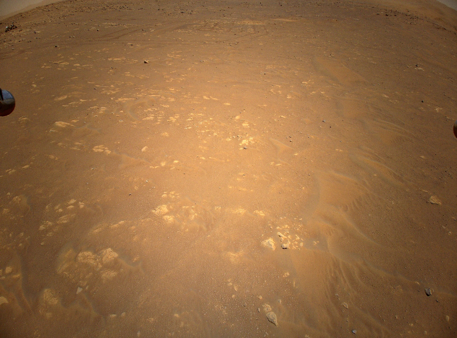
If I just say this contains a photo of Perserverence from the air, you'd need to take a few moments to find him in there. What you can do as a neat trick is add an inset to the image, directing the readers eyes by immediately magnifying the region you want them to look at. Is it easier to find Percy in this image?

This is easy to do - copy the image, crop the region you want, put a box around the region in the original image and blow up the crop to a larger size.
An important thing to note: never cover important parts of an image/plot. Take the inset outside the axis bounds if needs be, but don't cover data or interesting things.
If you have an image it should have a caption which gives the reader some interpretation of what is presented to them. You should have selected the figure for a purpose, and therefore will have an understanding of what you think it adds to the main body of text. It doesn't have to (and shouldn't!) be paragraphs long, but a sentence or two of clear and direct description with a link to the main body is necessary.
Take the below for example:

vs.
Every graph should have a title and an axis. The only case where you can omit a title is if you have a descriptive caption, and ideally as you progress towards the senior years of engineering, you will have a caption and no title. Some images and results containing images should similarly have titles/labels when comparing different methods or axes when referring to specific parts of an image, or when the image has a scale/known dimension.
The title and axes should be in keeping with the rest of your document: especially with font size and ideally with font type also. This means: small images, should still have appropriately sized titles/labels. Which of the below would you rather see in a book?


Ensure your axes are scaled appropriately: for example, if there are large changes in magnitude, you may wish to use a logarithmic axis. Ensure that scaling of axes makes sense - if you have changes between measurements on the scale of centimeters, an axes measured in metres with a strange power multiplier is not appropriate. Your axes should be labelled and have a scale.
If you opt for no title, your figure should be accompanied with a descriptive caption that fully explains what is presented, what this means and how it relates to the rest of the text. Every figure should be described in the caption, but discussed in the text. The follow on for this: if you have a figure which is not referenced in the text, you're either missing some text or you have one extra figure. All your images should serve a purpose in the main body of your text, it is not sufficient to just have an image on its own.
Any graph should have gridlines presented - whether it be 2D or 3D. The shape of functions and the location of key points such as minima and maxima is critical to fields like optimisation, dynamical systems and machine learning. For this reason, make it easy on your reader by providing gridlines that their eyes can follow and use to immediately locate key points of interest.
Ensure that these grid lines are fine and not too dark, else they can confuse when you have several trends of data on the one plot. This is particularly important when trends end horizontal or vertical.
All graphs should have a legend if they display more than one trend line, or type of data. As with insets, do not let this cover data from your plot: take it outside the axis bounds if needs be.
- Matplotlib: this is one you're likely very familiar with. We direct you to the cheatsheets and tutorials to achieve some of what we've spoken about above.
- Seaborn: an alternative to Matplotlib which gives more statistic-like plots. More granular display over appearance.
- Matplot++: nice library for C++ users to get results without having to switch to a new language.
- ggplot2: do you remember that one course where they told you to use R and you decided it was a rubbish language? Well it is, except for the fact it has ggplot2 under the hood which is very nice. ggplot stands for the "grammar of graphics" which is a kind of language for making data clear and pleasant. There's versions of this for both Python and MATLAB that are worth looking into.
- draw.io: free online diagram maker. You can render mathematics and have 3D blocks. Able to produce publication quality diagrams.
- Scientific Visualisation with Python: Great free book all about customising Python + Matplotlib to be visually appealing, and give you really strong visual results. Well worth a flick through.
- Repeatable plotting with Pylustrator: If you're making a plot, it's often hard to configure in terms of code, and hard to reconfigure if you don't save it. Pylustrator is a handy package where you can use a GUI to configure subplots and then write a script to reproduce that plot exactly.
Some tables can be gross. Disgustingly gross. Some can be boring and very difficult to interpret. A good rule of thumb here is: less is more. The gif below gives the best example of this that I've seen, and better than a static example I can come up with.
This comes with a caveat: for most purposes I would follow this minimalist style as much as possible, except for when you a required to use a specific template or style of document (e.g. an IEEE Journal template). These will have examples for how the template should use a table. In this case - you must follow how the template has set it out. Everything else: make it pleasant, please.
- Excel2LaTeX: Format tables in Excel in terms of colours, bolding, alignment and then convert directly to LaTeX.
As your notation gets more complex, you increasingly find yourself needing to use new variables. Someone reading your work therefore needs to quickly understand what the variables in each equation are. Functions are often denoted by several letters, and it can get very confusing which variables are variables and which are functions if you're lazy and don't distinguish them. Take the example below:
It is clear here what we mean - but it could be confusing if you use the letters "s", "i" and a function "n(x)" elsewhere in your manuscript. For this reason, any user defined functions (sign, heaviside, trigonometric functions, argmin/argmax etc.) or common functions (sin, cos, tan) should be positioned upright. This is as simple as adding a backslash before the command if the functions are found in a package. If not, you can define your own or use the \mathrm{name} command to remove the italics from the block.
This should only be done for functions whose names are more than one letter long, for example it is perfectly fine to denote the below:
Some operators don't mean what you think they mean. For example:
If you're still early in your studies, these look to be equivalent. In actuality, the first expression is often used to denote a convolution between A and b, the second a cross product, then a dot product and finally a matrix multiplication between A and b. It is very important that you make your notation clear and correct: choose your operators precisely and carefully, making note of what is standard in the field you're working in.
A good rule is to not use any operator for a multiplication (matrix or scalar). Ensure you check your notation thoroughly playing a mathematical Devil's Advocate with each line of working.
- Matrix Cookbook: A great resource by the University of Waterloo. Format matrix expressions as in this book.
physicsLaTeX Package: This wraps some common matrix expressions, derivatives etc. up in commands. Well worth using.- "What's wrong with these equations?": A great resource by David Mermin which is included with a lot of journal/conference template how-to's. Treat your maths as prose, number everything and refer to everything by a phrase - not just a number.
Units should be included for any quantity that has a physical meaning. The units should only be included on the last line of working with a final answer and not throughout. Similar to the discussion on functions above, it is a good idea to distinguish units from variables. You can do this by adding a space, and then using upright text after a final calculation (\,\mathrm{units} works okay).
A package highly recommended for this is the siunitx package where you can use pre-defined units (or units you've defined) to standardise the formatting. It also forces you to double check the dimensions of the final value by inputting the unit name.
Pretend for a moment you are doing calculations on the size of a slit in a sheet of paper needed for form a diffraction pattern using a laser. This is very small! You get that the size of the slit needs to be on the order of
Hopefully, you think not. It would be much more elgant to say:
For SI units there are standard multiples of thousands which we are interested in. Ideally, you actually say this:
I think intermediate answers of consequence should be presented in scientific notation, and final key results should be in engineering notation (either powers of
How many decimal points should you leave? A good question - you should be consistent however you choose. You could be consistent in number of significant figures (4 would be a good number). Or you could be consistent in number of decimals (3 or 4 are generally a good number). You don't want to select something with too few decimals, else small changes in data cannot be compared easily, but you also don't want to give so many decimal points that are magnitudes smaller than the data we are interested in.
This should go without saying but - only substitute at the last step. Working through a calculation with a mix of values and variables gets messy, particularly when you cancel things out.
You should not have any numbers (except coefficients) until the last 2 lines of working. The second last line can be one of 2 things: a calculator readout prior to rounding or a value substitution. Often, this is unnecessary: it merely shows where you calculation may have gone wrong. The final line should be the numeric answer with any units.
Sometimes it is important to calculate some value to evaluate how good something is. Do not invent new metrics if you do not need to - many things are well established in statistics, physics, engineering and have ways to compare between values. Use metrics which are well known, recognisable and meaningful, and always explain why you are using them.
Where can you find these metrics? Textbooks and papers in the field usually - it is rare for a new metric to be invented, but when it is there is often good reason. Metrics can be field specific - try not to crosspollinate if you can, they might have the same metric with a different name!
- OECD AI Policy Observatory Metrics: The OECD AI Policy Observatory maintains an excellent resource explaining common metrics used in AI, and their interpretation.
There is no one way to write good code and we do not claim that the below section covers all topics. However, we hope that the points listed below are informative and are useful in creating good coding habits.
A no-go unless specifically asked for. This can cause issues because text is not machine readable and cannot go through plagiarism checking software. To someone reading it, there is little to no benefit as we don't know whether the code runs or how it fits into the broader picture. Instead, if you want to explain how you implemented some code you should do so mathematically or use a pseudocode listing.
If it is specifically asked for - screenshots are still not recommended! Use a code block with indicative output formatted like a terminal: much easier to follow and highlightable within a document. Use Google's command-line syntax as best practice.
If you find yourself writing the same code more than once, or copying large chunks of it - you are doing something wrong. If it's used more than once, you should have it as a function in your code. Good code design here checks that the input is sensible: for example, you don't want complex numbers when functions should be in the real domain. You might find MATLAB's argument validation functionality worthwhile in helping to pick this up. This helps you catch bugs early, numerically speaking, and cleans up your code significantly.
While want to write sections of code that are as general as you can possibly make them, however you should NOT use generalization as a repalcement for specificity. For example, in languages like C++ where typing is enforced, use this to your advantage by using function overloading to avoid implicit type conversions.
void process(double data);
void process(int data);
In languages like C where function overloading is not available write functions for each specific type.
void process_double(double data);
void process_int(int data);
Avoid using templating to achieve this (unless you really know what you're doing). In most situations where you need to process data you want to know exactly what data type you are dealing with.
Any code you submit alongside a report should be included in an appendix, and should be formatted in a way which is easily readable. This means ensuring that the code is coloured corresponding to whether a line is comments or code, similar to how VSCode, MATLAB and other programming IDEs work (unless you're a maniac who writes Assembly/FORTRAN/C/C++ code in VIM).
This means you should spend some time tidying up your code for the appendix. Ideally - you shouldn't have to at all and your code is well formatted. Imagine you are working professionally and need to pass code to someone else: this is how you should document your code in the appendix of your report. The more informative your comments, variables etc. the easier it is to read.
The good news is: including your code in a report is not difficult and you can customise its display so it is neat, tidy and clear. More details can be found here.
If code is uncommented or undocumented it is largely useless. If no one knows why it works, then they're not sure why it doesn't work. Comments need not be exhaustive, however they should be clear and point towards rationale and resources; why it was written, what it does and where it comes from. Obscure equation factorisations which allow code to be executed in
If you're not sure how exhaustive your comments should be, lean on the side of clarity: write as much as you think someone needs to just rewrite the function from scratch if the code went missing.
Sometimes computers don't operate with the same instructions given the same code. A good example of this is if you use really old programs (poorly) designed for high performance and compile them from scratch on a Linux system sometimes they will say there are "invalid instructions" and exit with an error. The code has not changed - but the hardware has, and optimisations designed to run on old processors may not exist anymore. More commonly open source packages will be updated and have tiny bugs fixed which can change performance and accuracy of code written on top of them.
With academic code - differences between what is published and results you get on your machine happens more than you might think. For this reason, tools like conda are very useful in allowing you to export exactly what configuration of packages existed in an environment. This is a habit you should get into early on, particularly for major projects involving code. It is in essence a different sort of documentation - documenting exactly what environment the code worked on, so no one can yell at you if it doesn't work on Ubuntu 12.04 using Python 1.7 and GCC 2.0.1.
An aside: if you do come across old code which no longer works (or code for a different OS) - a Docker environment can be configured to recreate operating systems inside of a host machine.
Developing your own code workflow or pipeline (how you write code) is important to help you become a better coder, as well as prdocuding code and results faster. Equally as important is developing code that is easy to read and understand as this is more likely to result in better marks. Some good workflow tips include
- Many IDE’s have plugins to aid with commenting and formatting. For example VSCode has a plugin to generate appropriately formatted function and class comments. Use this.
def my_amazing_function(*args):
    """_summary_

    Returns:
        _type_: _description_
    """
return None/**
* @brief
*
* @param input const std::string&
*/
void myAmazingFunction(const std::string& input);- Use black or clang-format to automatically format your code according to a specification. There should be no reason to submit poorly formatted code. See resources for an example
.clang-formatfile. - Use git. Seriously, please use it.
- As part of using git, consider using pre-commit hooks - these allow hooks to be run automatically as part of a local git commit action. Among other things, formatting via black or clang can be added to these hooks so your code is automatically formatted prior to pushing your code. See resources for an bare-bones example of a
.pre-commit-config.yamlthat runs a number of file checks as as well running clang and black formatting. - If you use python are are not familar with the Typing module, we highly suggest you become so. This module provides runtime support for type hints and can be used by IDE's and linters, as well as making your python code significantly more readable.
We do not expect students to follow one style guide in particular, but code should be formatted consistently across submissions.
- Google's Styleguides: You should aim to follow this as closely as possible in terms of the amount of comments you need and the quality of coding style.
- The Good Research Code Book: You should also use this to help guide how you document your code and split it up. Research/academic code can be atrocious to read through - it's written by people who think things are easy/logical which are not. Format by this guide.
- Cookiecutter for Project Templates: If you don't have your own project templates for C++/Python/C etc. this is a good way to get some existing templates which are more modern. Some of the old Google project templates for C++ are good too: projects and libraries.
- Robostack - Reproducability for Robotics: If you're writing major projects, you may wish to consider the reproducability of your environment across platforms and development environments.
- Extra documentation in documents: To document how someone might use what you've built you usually put together a kind a manual. This is a good reference for how to put this together for code and to show in a document how one might use your program.
- The Machine Learning Reproducibility Checklist: Whilst intended for academic papers, this should also be something you consider when discussing results related to machine/deep learning.
- Releasing Research Code (Papers With Code): Also intended for academic papers, but provides good general guidelines for ensuring the code you are releasing (in this case for marking) is usable, worthwhile and has everything attached.


