Giter VIP home page Giter VIP logo

material-components-web-react's Introduction

Build Status codecov Chat

Material Components for React (MDC React)

NOTE: MDC-React is no longer under active development

We created MDC-React in 2018 to implement the updated Material Design guidelines. Since then, the open-source React community has embraced the new guidelines and created a number of excellent unofficial implementations. See Material Design Components - Web Framework Wrappers for a partial list.

In order to increase our focus on implementing our core, framework-independent libraries (MDC-Web and MWC), we’re passing the Material+React baton back to the community. That means Material Design will no longer be updating and maintaining this repo. We recommend that you switch to another implementation and keep building beautiful, usable apps based on Material Design. Thanks for being part of the project!

MDC React was an official implementation of Google's Material Design components for React. It is a wrapper library for MDC Web. Please refer to our MDC Web Catalog to play and interact with the Components.

mpmgq9h6b9x

Components

The following is a list of the components that are ready to be used, with corresponding links to the material.io design spec and MDC Web code.

Component Spec MDC Web
Button Button Design Page MDC Button
Card Card Design Page MDC Card
Checkbox Checkbox Design Page MDC Checkbox
Chips Chips Design Page MDC Chips
Dialog Dialog Design Page MDC Dialog
Drawer Drawer Design Page MDC Drawer
Fab Fab Design Page MDC Fab
Floating Label Text Field Design Page MDC Floating Label
Icon Button Icon Button Design Page MDC Icon Button
Layout Grid Layout Grid Design Page MDC Layout Grid
Line Ripple Text Field Design Page MDC Line Ripple
Linear Progress Linear Progress Design Page MDC Linear Progress
List List Design Page MDC List
Material Icon Material Icon Design Page Material Icon Tool
Menu Surface Menu Surface Design Page MDC Menu Surface
Menu Menu Design Page MDC Menu
Notched Outline Text Field Design Page MDC Notched Outline
Radio Radio Design Page MDC Radio
Ripple Ripple Design Page MDC Ripple
Select Select Design Page MDC Select
Snackbar Snackbar Design Page MDC Snackbar
Switch Switch Design Page MDC Switch
Tab Tabs Design Page MDC Tab
Tab Bar Tabs Design Page MDC Tab Bar
Tab Indicator Tabs Design Page MDC Tab Indicator
Tab Scroller Tabs Design Page MDC Tab Scroller
Text Field Text Field Design Page MDC Text Field
Top App Bar Top App Bar Design Page MDC Top App Bar
Typography Typography Design Page MDC Typography

Getting Started

With StackBlitz

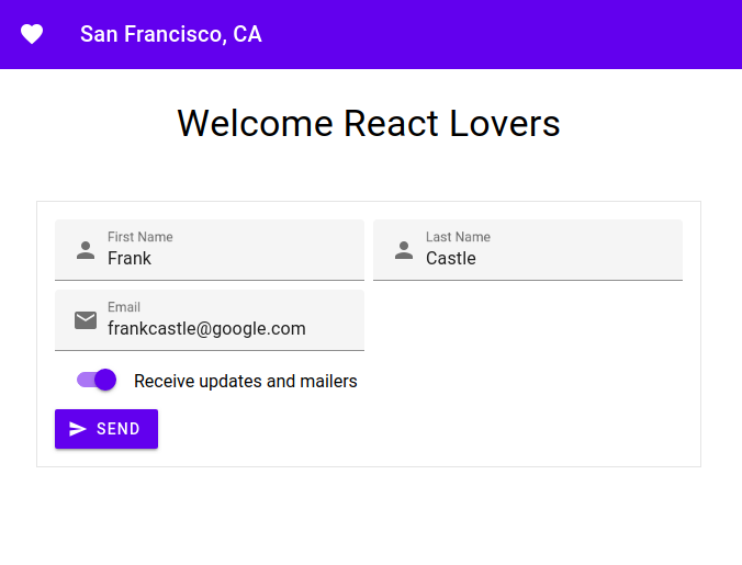
If you're looking to see how it looks without having to install a bunch of npm modules in your environment, please have a look at this Starter Stackblitz.

With create-react-app

create-react-app is a popular CLI tool to getting started with React. If you're new to React or Webpack, you might be starting out here. This section will walk you through configuring create-react-app to install and use our components.

If you're using an older version (v1) of create-react-app, please refer to our create-react-app-v1 doc.

Recommended things to know

  1. node/npm
  2. JavaScript
  3. HTML/CSS
  4. ES6

NOTE: If you haven't used create-react-app before, you may want to read the Overview Guide.

Step 1: Install create-react-app

NOTE: all npm commands can be replaced with yarn

Install create-react-app:

npx create-react-app my-app
cd my-app
npm start
Use with Typescript

It is recommended to use Typescript with our components. You will need to add a few more modules for this to work"

npm i @types/react @types/react-dom @types/classnames @types/node typescript
npm start

Step 2: Install Components

Install Button:

npm install @material/react-button

Step 3: Using Sass

If you want to use the compiled CSS and not customize any colors, text, etc. you can skip to Step 3a.

Most likely you'll want to start using the Sass mixins to customize your app. MDC Sass files are not supported out of the box, since we do not prepend ~ to our module imports. See this Github issue explaining the issue in detail. There is a workaround, but requires some work on your end (we promise it is not too difficult).

Add environment variable

To get MDC React Components to work with create-react-app you need to set a SASS_PATH environment variable that points to your node_modules directory. To quickly do this on OS X or Linux enter the following in your command line:

export SASS_PATH=./node_modules

If you're on Windows use the following:

SET SASS_PATH=.\node_modules

Rename your src/App.css file to src/App.scss. You will also need to install node-sass:

npm install node-sass

If you permanently want to add this to your environment, read adding environment variables. You're now ready to start using MDC React Sass modules in your create-react-app.

NOTE: this assumes that you will run npm start (or yarn start) from the root directory. By default this is how create-react-app is setup.

// ./src/App.scss

@import "@material/react-button/index.scss";
@import "./react-button-overrides";

...
// ./react-button-overrides.scss

@import "@material/button/mixins";

.button-alternate {
  @include mdc-button-container-fill-color(lightblue);
}

Step 3a: Use Compiled CSS

If you performed Step 3, then you can skip to Step 4.

If you don't need to customize your app, then using the CSS is a quicker way to get started with MDC React Components. Each package comes with a /dist directory, which includes the CSS files compiled from our Sass files. create-react-app is ready to import CSS files. To import the Button CSS copy the following line into ./src/App.js imports:

import '@material/react-button/dist/button.css';

If you want to use the minified version, the import instead looks like:

import '@material/react-button/dist/button.min.css';

Step 4: Use MDC React Button

Open ./src/App.js. Then replace the boilerplate App code (entire file) with the barebones MDC React Button:

import React, {Component} from 'react';
import Button from '@material/react-button';

import './App.scss';
// add the appropriate line(s) in Step 3a if you are using compiled CSS instead.

class App extends Component {
  render() {
    return (
      <div>
        <Button
          raised
          className='button-alternate'
          onClick={() => console.log('clicked!')}
        >
          Click Me!
        </Button>
      </div>
    );
  }
}

export default App;

You can also use these same configurations for your own Webpack build pipeline without create-react-app. But this is the quickest way to getting started with MDC React Components. Button is one of our simpler components, but you should be able to apply these same principles you learn here to any the components. Thanks for trying out MDC React Components, and remember to tell a friend! Enjoy!

Need help

We're constantly trying to improve our components. If Github Issues don't fit your needs, then please visit us on our Discord Channel.

material-components-web-react's People

Contributors

4cm4k1 avatar aarnadlr avatar abhiomkar avatar aluminick avatar bmihelac avatar bonniezhou avatar dan-kwiat avatar gugu avatar hvolschenk avatar jsuraj avatar julien1619 avatar kittle31 avatar liamcmitchell-sc avatar lstamour avatar lucasecdb avatar luisalbertovasquezvargas avatar lynnmercier avatar markus-schwer avatar maxim-mazurok avatar mgr34 avatar nicklasisraelsson avatar nickmccurdy avatar nworden avatar patrick91 avatar patrickrodee avatar ranguna avatar simsim0709 avatar thdk avatar williamernest avatar zej0hn avatar

Stargazers

 avatar  avatar  avatar  avatar  avatar  avatar  avatar  avatar  avatar  avatar  avatar  avatar  avatar  avatar  avatar  avatar  avatar  avatar  avatar  avatar  avatar  avatar  avatar  avatar  avatar  avatar  avatar  avatar  avatar  avatar  avatar  avatar  avatar  avatar  avatar  avatar  avatar  avatar  avatar  avatar  avatar  avatar  avatar  avatar  avatar  avatar  avatar  avatar  avatar  avatar  avatar  avatar  avatar  avatar  avatar  avatar  avatar  avatar  avatar  avatar  avatar  avatar  avatar  avatar  avatar  avatar  avatar  avatar  avatar  avatar  avatar  avatar  avatar  avatar  avatar  avatar  avatar  avatar  avatar  avatar  avatar  avatar  avatar  avatar  avatar  avatar  avatar  avatar  avatar  avatar  avatar  avatar  avatar  avatar  avatar  avatar  avatar  avatar  avatar  avatar

Watchers

 avatar  avatar  avatar  avatar  avatar  avatar  avatar  avatar  avatar  avatar  avatar  avatar  avatar  avatar  avatar  avatar  avatar  avatar  avatar  avatar  avatar  avatar  avatar  avatar  avatar  avatar  avatar  avatar  avatar  avatar  avatar  avatar  avatar  avatar  avatar  avatar  avatar  avatar  avatar  avatar  avatar  avatar  avatar  avatar  avatar  avatar  avatar  avatar  avatar  avatar  avatar  avatar  avatar  avatar  avatar  avatar  avatar  avatar  avatar  avatar  avatar  avatar  avatar  avatar  avatar

material-components-web-react's Issues

MDC Web is based on Sass, yet Sass is not well supported in React tools

Material-components-web is being ported to different libraries, including Vue, and it seems any library or framework other than React has been happily integrated with Sass.

It is known that the state of styles in React is a mess. This mess is two fold: First whether to write css in javascript. Seconds whether to process css by tools like Sass.

Another problem is starting a new project with React is hard. Hence, many of us opt to use CRA so that we can delegate dealing with nightmares like Webpack to other developers, which leads us to another problem: Weak or nonexisting support of Sass in CRA.

There are half baked approach for how to have Sass processing in CRA 1.x. None of them, including the one suggested in material-components-web-react guide, are ideal.

Sass is supposed to be supported in CRA 2.x, but it only works properly for the application code, and not for the npm packages that import sass files from other npm packages, which is the case of material-components-web-react components. Specifically see facebook/create-react-app#4651, facebook/create-react-app#4195 and facebook/create-react-app#4195 (comment).

Unfortunately, CRA authors are highly opinionated, inflexible and not very responsive when it comes to these Sass issues. At the moment, using material-components-web-react with CRA 1.x is possible with some hacks, and completely broken in CRA 2.x. Even Google project material-components-web-catalog uses an ejected version of CRA 1.x.

Given these high barriers, and given that Sass is a hard dependency of developing production quality with Material-components-web, the question is what can be done to stay away from Sass mess in React tools? Specifically, is it possible to change sass imports in material-components-web-react so that it can work with CRA 2.x, without CRA code being changes?

Centralised documentation

It's great that each component has documentation but it's a bit annoying to jump between each folder in GitHub. Maybe creating a hub page as part of the README would be a good idea. I'm willing to give it a shot if there are no objections?

Please don’t publish experimental syntax on npm

Hi, I help maintain React and some other projects like Create React App. 👋

I recently saw in this issue (facebook/create-react-app#4648 (comment)) that this project uses experimental syntax (such as class properties) as part of the npm entry point.

I strongly encourage you to reconsider this decision. If the class properties transform ends up changing (which is very likely) or abandoned (not as likely, but could happen), having uncompiled packages on npm using it will create a huge amount of churn for everyone (including maintainers of this project). Not to mention this makes the project unusable in any environment that respects the spec (such as Node.js).

Please compile any experimental syntax away before publishing. If you’re convinced that keeping import uncompiled is worth it (which is a whole separate can of worms as you can see in graphql/graphql-js#1248), please compile at least the non-standard syntax away when publishing. That includes JSX too.

I understand this might seem like an inconvenience now. But it will be much better to do now than deal with pain for months when build tools and the spec changes. Thanks.

Packages should be transpiled to ES5

Currently we don't have a build step for the packages, which requires npm users to transpile the packages themselves. The packages should be ES5 for everyone to consume.

Plans for implementing more Components?!

material-components-web-react currently implements only the very basic components (Button, Checkbox) - is there a roadmap, when the other components will be implemented? Or is there a contribution-guide, that explains how adding a new component is supposed to work?

Ripple doesn't trigger on key down event

Steps to reproduce:

  1. Start screenshot tests
  2. Go to button screenshots
  3. Bring to focus a button using the keyboard
  4. While focused on a button, press space bar or enter key

Actual Results:
No Ripple is activated

Expected Results:
Ripple should activate, similar to MDC Web

Why '.../dist/' ?

Dear maintainers,

I find it a bit off-putting that to use a component one has to import the compiled version from @material/react-button/dist (as opposed to simply @material/react-button). Is there a reason why you decided to make it so?

Apart from the packages in this repo I have never had to reference /dist - it is not obvious for me as a component consumer. What's more, in the docs to every component, the imports in demo look as one would expect :import Button from '@material/react-button'. Yet this won't work without having to transpile imported modules or in create-react-app context.

Please, let me if there is a good reason behind this decision I may not understand.

RippledComponent warning: Can't call setState (or forceUpdate) on an unmounted component

When Button is unmounted, React will produce warning as bellow:

Warning: Can't call setState (or forceUpdate) on an unmounted component. This is a no-op, but it indicates a memory leak in your application. To fix, cancel all subscriptions and asynchronous tasks in the componentWillUnmount method.
    in RippledComponent (created by App)

Here is minimal test case that would produce warning when button is clicked:
https://codesandbox.io/s/9zw5v67kn4

MDC element classname shortening with CSS modules (easily) possible?

Hello,
With the BEM naming for base MDC elements, class names can become long very quickly, mdc-list-item__secondary-text for instance. I was thinking about using CSS modules to shorten such names, but according to rmwc/rmwc#113, it looks like it is not (easily) possible to do so without breaking some components which have event listeners attached (elements with a ripple effect for instance or menus).
Could someone please confirm or deny this?

Trouble to understand how to use only 1 class generator

Hi there,

I have some kind of flickering when I do ssr with my app and I think it is due to the fact that the generated class are different from the server and the client side. (The content from the view source and the one from document.documentElement.innerHTML are different, but I don't have any react warnings)

As I can see in your documentation, a possible action to take would be to use the same generator: The whole page needs to be rendered with a single generator.

However, i do not understand how I should do that..

Here is the how I render server side:

const sheetsRegistry = new SheetsRegistry();
const generateClassName = createGenerateClassName();
renderToString(
          <Loadable.Capture report={m => modules.push(m)}>
            <Provider store={store}>
              <StaticRouter location={req.url} context={context}>
                <Frontload isServer>
                  <JssProvider registry={sheetsRegistry}
                               generateClassName={generateClassName}>
                    <MuiThemeProvider theme={overidedTheme}
                                      sheetsManager={new Map()}>
                      <CssBaseline/>
                      <App />
                    </MuiThemeProvider>
                  </JssProvider>
                </Frontload>
              </StaticRouter>
            </Provider>
          </Loadable.Capture>
        )

And Client side

const Application = (<Provider store={store}>
  <ConnectedRouter history={history}>
    <Frontload noServerRender>
      <MuiThemeProvider theme={overidedTheme}>
        <CssBaseline/>
        <Main />
      </MuiThemeProvider>
    </Frontload>
  </ConnectedRouter>
</Provider>);
Loadable.preloadReady().then(() => {
    hydrate(Application, root);
  });

When I compare the outputs, the difference are coming from the class names and the positions of the style tags (client side has multiple style tag inside the head while the server side has only one big style tag at the end before the body)

I would love to understand what could be the cause of this problem and how I can solve it!

Thanks :)

I figured out how to reuse the component class implementations from MDC directly in React

@lynnjepsen, I know I've been blowing you up on discord a bit, but I had to share this.

This is currently hacked together, but the fact that it works is crazy. I found a way to import the actual component class from MDC web and directly use it in React.

  • I import the class
  • Pass it to an HOC
  • I create a new React Component
  • I copy the MWC component class descriptors over to the new class
  • I handle the DOM refs in a way that reflects the way the MDC component expects them
  • The only things I need to specify at this point are things that work a bit different in react like setting classes and a syncWithProps function which can handle the react render cycle.
  • It is currently hacky as hell, but I thought about this an hour ago and I'm still in shock it actually works.

Check it out

  • Don't mind all the code in the commit just look at base/MDCFoundation and IconToggle/index.
  • npm run storybook, navigate to IconToggle

rmwc/rmwc@17cdee6

What does this mean?
I don't have to reimplement a single foundation adapter! I can use all of the ones already written in MWC web with minimal tweaks. I need to work through this more to find the edge cases and do a real implementation, but I'm pretty stoked right now.

Add typography components

Would be nice to have components for the typography styles, we can create a base one that can be reused for titles, paragraphs and more:

<Typography type="XXX">
  Text
</Typography>

Where type can be one of the following:

  • headline1
  • headline2
  • headline3
  • headline4
  • headline5
  • headline6
  • subtitle1
  • subtitle2
  • body1
  • body2
  • caption
  • button
  • overline

We can also add components like:

<Title level={1}>Hey</Title>
<Subtitle level={1}>Hey</Subtitle>

and so on :) What do you think? Can I make a PR for this?

MaterialIcon component should not load the material icon font (blocks page load)

Hello, I'm using the code in an app and totally enjoying the library:

about app

  • Static site
  • Hosted on firebase
  • Bundled/transpiled with webpack/babel-loader
  • Bundled using webpack rules to import SCSS directly from node_modules/@material/*

issue: slow rendering (fonts)

I noticed this when I ran Lighthouse (with emoji commentary)
😑 Opportunities

image


🤔 ok cool, go find in devtools…

image

🤔 ok, go to bundle…

found this CSS import in https://github.com/material-components/material-components-web-react/tree/master/packages/material-icon: @import url(https://fonts.googleapis.com/icon?family=Material+Icons);

🤔 ok, go get that resource in chrome…

@font-face {
  font-family: 'Material Icons';
  font-style: normal;
  font-weight: 400;
  src: url(https://fonts.gstatic.com/s/materialicons/v38/flUhRq6tzZclQEJ-Vdg-IuiaDsNa.woff) format('woff');
}

.material-icons {
  font-family: 'Material Icons';
  font-weight: normal;
  font-style: normal;
  font-size: 24px;
  line-height: 1;
  letter-spacing: normal;
  text-transform: none;
  display: inline-block;
  white-space: nowrap;
  word-wrap: normal;
  direction: ltr;
}

💪 ok cool, MaterialIcon has sass with this fonts.gstatic.com URL.

Basically any of these fonts in css files that are in HEAD will block rendering on the network if the user puts a link to the css file in head or in a style tag.

So I pre-loaded https://fonts.googleapis.com/icon?family=Material+Icons in the head of my HTML, and could preload the woff file also, but that is not really a stable way to go about it since any of the packages in the chain could break without warning.

try to fix issue

I was able to configure webpack to consume the @ material sass directly, but because of this URL I don't know how to make this code lighthouse-friendly without putting it after the body. I may be doing something wrong at a higher level.

solution?

TL;DR: Could we come up with a way to bundle in the font resources? Or SVGs? Maybe that takes the form of documentation or an example.

My sense is that some users are going to write this off as being slow rather than tear in to the details, so if we could make stuff 'just work' as they say, it'd be great. Surely for places like the Top Navbar in-line SVGs would be more performant than an icon font. (I think it's ~62kb) Maybe I don't know about a bundler that would let me resolve this, the closest thing I found was
https://www.npmjs.com/package/google-fonts-plugin, but I don't know how I'd connect it to this code as a user.

Where'd I go wrong here? Is there something on the roadmap that I'd want to know about?

Can't run tests successfully on Windows

When running npm test, an error occurs in the stop script:

> ./test/screenshot/stop.sh

'.' is not recognized as an internal or external command, operable program or batch file.

This might be because ps aux has different output format in MinGW on Windows. (I assume it wouldn't work at all from a standard command prompt.)

No focus/blur visual feedback for buttons

Steps to reproduce:

  1. Start screenshot tests
  2. Go to button screenshots
  3. Bring to focus a button using the keyboard

Actual Results:
Background color of the button should change

Expected Results:
Background color of the button doesn't change

How to make application layout with material-components-web-react?

Is the application layout:

  1. available now in material-components-web-react?
  2. something left to material-components-web, even when building apps with material-components-web-react?
  3. going to be implemented later in material-components-web-react?

If it's 3, what is a good way of building the layout when starting with material-components-web-react now?

Curious about the status of this project?

Hey, I came across this repo snooping for new material design components for react (the alternative being material-ui). Looks like this is under active development but there's no readme. Will this be an official react library for material components web?

Thanks,

Mike

Upgrade MDC Web to ^0.35.0

Currently all packages are on 0.34.1, but should be using latest (v0.35.0).

Known issues:
Ripple is broken, and needs to wrap the foundation.activate() call in a requestAnimationFrame. Not sure why this is the case, so further investigation is needed.

You may need an appropriate loader to handle this file type.

When I try import like example:

import LineRipple from '@material/react-line-ripple';

And try use:

class Foo extends Components {
    render() {
        return(
            <div>
                <LineRipple />
                ...
            </div>
        )
    }
}

Then throw:

ERROR in ./node_modules/@material/react-line-ripple/index.js
Module parse failed: Unexpected token (8:14)
You may need an appropriate loader to handle this file type.
| export default class LineRipple extends Component {
|
|   foundation_ = null;
|
|   state = {
...

Someone has a proposal solution for that?
Thank's guys ;)

Create new Top App Bar component, using @material/top-app-bar

  • New React.Component which returns the HTML structure for top app bar
  • Include the Sass files from @material/top-app-bar
  • Props on the component should map to the variants of top-app-bar (short, short-collapsed)
  • Include the foundation file from @material/top-app-bar
  • Wire together all synthetic React events top app bar needs to listen to
  • Update the components state, and trigger a React re-render, as necessary
  • Screenshot test to cover all properties
  • JS test to cover all React code

Server takes too long to start

Currently our screenshot tests take 200s on Travis to startup. We can decrease this time by decreasing the number of webpack configs we need to build.

Related PR: #6

Proposed solution:
Use react-router to build a SPA of each page, which will result in one webpack config.

Known issues:

  1. CBT requires a statically served site. Solution: use react-router's hash router, similar to the catalog pages. By doing this, we can host the demo pages from GCP without having an app server like nGinx.
  2. CSS Name collisions. Solution: use css modules to obfuscate css classnames. When using css-loader from webpack, its a 1 line change to turn this feature on/off. Collisions will be near impossible, especially given we only have a few pages. If a naming collision does occur, we can increase the size of the hash (decreasing statistical chance of collision).

Add TypeScript support

This issue will inevitably come up at some point: the community will need type definitions to reliably utilize the components in TypeScript projects.

Since this project is still at an early stage - maybe instead of creating and maintaining a separate package with definitions, it would make more sense to transition the project to TypeScript? This will provide a guarantee that the code, including changes and new features, are always in sync.

Create Changelog.md

Need a changelog.md to account for changes from each version. This will be similar to how the change log is generated in MDC-Web.

Recommend Projects

  • React photo React

    A declarative, efficient, and flexible JavaScript library for building user interfaces.

  • Vue.js photo Vue.js

    🖖 Vue.js is a progressive, incrementally-adoptable JavaScript framework for building UI on the web.

  • Typescript photo Typescript

    TypeScript is a superset of JavaScript that compiles to clean JavaScript output.

  • TensorFlow photo TensorFlow

    An Open Source Machine Learning Framework for Everyone

  • Django photo Django

    The Web framework for perfectionists with deadlines.

  • D3 photo D3

    Bring data to life with SVG, Canvas and HTML. 📊📈🎉

Recommend Topics

  • javascript

    JavaScript (JS) is a lightweight interpreted programming language with first-class functions.

  • web

    Some thing interesting about web. New door for the world.

  • server

    A server is a program made to process requests and deliver data to clients.

  • Machine learning

    Machine learning is a way of modeling and interpreting data that allows a piece of software to respond intelligently.

  • Game

    Some thing interesting about game, make everyone happy.

Recommend Org

  • Facebook photo Facebook

    We are working to build community through open source technology. NB: members must have two-factor auth.

  • Microsoft photo Microsoft

    Open source projects and samples from Microsoft.

  • Google photo Google

    Google ❤️ Open Source for everyone.

  • D3 photo D3

    Data-Driven Documents codes.