Giter VIP home page Giter VIP logo

coloris's Introduction

Coloris

Coloris in light, dark and polaroid themes

A lightweight and elegant JavaScript color picker written in vanilla ES6.
Convert any text input field into a color field.

View demo

Features

  • Zero dependencies
  • Very easy to use
  • Customizable
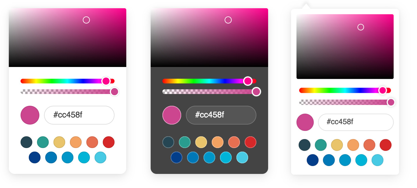
  • Themes and dark mode
  • Opacity support
  • Color swatches
  • Multiple color formats
  • Touch support
  • Fully accessible
  • Works on all modern browsers (no IE support)

Getting Started

Basic usage

Download the latest version, and add the script and style to your page:

<link rel="stylesheet" href="coloris.min.css"/>
<script src="coloris.min.js"></script>

Or include from a CDN (not recommended in production):

<link rel="stylesheet" href="https://cdn.jsdelivr.net/gh/mdbassit/Coloris@latest/dist/coloris.min.css"/>
<script src="https://cdn.jsdelivr.net/gh/mdbassit/Coloris@latest/dist/coloris.min.js"></script>

Then just add the data-coloris attribute to your input fields:

<input type="text" data-coloris>

That's it. All done!

What about NPM and TypeScript?

Thanks to @melloware, NPM and TypeScript support is available in a fork of this project. Head over to @melloware's fork or to their NPM repo for more information.

Customizing the color picker

The color picker can be configured by calling Coloris() and passing an options object to it. For example, to activate dark mode and disable alpha support:

Coloris({
  themeMode: 'dark',
  alpha: false
});

The new options are applied at runtime and can be updated at any time and as often as needed. For instance, to re-enable alpha support when clicking on a button:

document.querySelector('#mybutton').addEventListener('click', e => {
  Coloris({
    alpha: true
  });
});

Here is a list of all the available options:

Coloris({
  // The default behavior is to append the color picker's dialog to the end of the document's
  // body. but it is possible to append it to a custom parent instead. This is especially useful
  // when the color fields are in a scrollable container and you want the color picker's dialog
  // to remain anchored to them. You will need to set the CSS position of the desired container
  // to "relative" or "absolute".
  // The value of this option can be either a CSS selector or an HTMLElement/Element/Node.
  // Note: This should be a scrollable container with enough space to display the picker.
  parent: '.container',

  // A custom selector to bind the color picker to. This must point to HTML input fields.
  // This can also accept an HTMLElement or an array of HTMLElements instead of a CSS selector.
  el: '.color-field',

  // The bound input fields are wrapped in a div that adds a thumbnail showing the current color
  // and a button to open the color picker (for accessibility only). If you wish to keep your
  // fields unaltered, set this to false, in which case you will lose the color thumbnail and
  // the accessible button (not recommended).
  // Note: This only works if you specify a custom selector to bind the picker (option above),
  // it doesn't work on the default [data-coloris] attribute selector.
  wrap: true,

  // Set to true to activate basic right-to-left support.
  rtl: false,

  // Available themes: default, large, polaroid, pill (horizontal).
  // More themes might be added in the future.
  theme: 'default',

  // Set the theme to light or dark mode:
  // * light: light mode (default).
  // * dark: dark mode.
  // * auto: automatically enables dark mode when the user prefers a dark color scheme.
  themeMode: 'light',

  // The margin in pixels between the input fields and the color picker's dialog.
  margin: 2,

  // Set the preferred color string format:
  // * hex: outputs #RRGGBB or #RRGGBBAA (default).
  // * rgb: outputs rgb(R, G, B) or rgba(R, G, B, A).
  // * hsl: outputs hsl(H, S, L) or hsla(H, S, L, A).
  // * auto: guesses the format from the active input field. Defaults to hex if it fails.
  // * mixed: outputs #RRGGBB when alpha is 1; otherwise rgba(R, G, B, A).
  format: 'hex',

  // Set to true to enable format toggle buttons in the color picker dialog.
  // This will also force the format option (above) to auto.
  formatToggle: false,

  // Enable or disable alpha support.
  // When disabled, it will strip the alpha value from the existing color string in all formats.
  alpha: true,

  // Set to true to always include the alpha value in the color value even if the opacity is 100%.
  forceAlpha: false,

  // Set to true to hide all the color picker widgets (spectrum, hue, ...) except the swatches.
  swatchesOnly: false,

  // Focus the color value input when the color picker dialog is opened.
  focusInput: true,

  // Select and focus the color value input when the color picker dialog is opened.
  selectInput: false,

  // Show an optional clear button
  clearButton: false,

  // Set the label of the clear button
  clearLabel: 'Clear',

  // Show an optional close button
  closeButton: false,

  // Set the label of the close button
  closeLabel: 'Close',

  // An array of the desired color swatches to display. If omitted or the array is empty,
  // the color swatches will be disabled.
  swatches: [
    '#264653',
    '#2a9d8f',
    '#e9c46a',
    'rgb(244,162,97)',
    '#e76f51',
    '#d62828',
    'navy',
    '#07b',
    '#0096c7',
    '#00b4d880',
    'rgba(0,119,182,0.8)'
  ],

  // Set to true to use the color picker as an inline widget. In this mode the color picker is
  // always visible and positioned statically within its container, which is by default the body
  // of the document. Use the "parent" option to set a custom container.
  // Note: In this mode, the best way to get the picked color, is listening to the "coloris:pick"
  // event and reading the value from the event detail (See example in the Events section). The
  // other way is to read the value of the input field with the id "clr-color-value".
  inline: false,

  // In inline mode, this is the default color that is set when the picker is initialized.
  defaultColor: '#000000',

  // A function that is called whenever a new color is picked. This defaults to an empty function,
  // but can be set to a custom one. The selected color and the current input field are passed to
  // the function as arguments.
  // Use in instances (described below) to perform a custom action for each instance. 
  onChange: (color, input) => undefined
});

Accessibility and internationalization

Several labels are used to describe the various widgets of the color picker, which can be read aloud by a screen reader for people with low vision. If you wish to customize or translate those labels, you need to add an "a11y" option to the global Coloris object:

Coloris({
  a11y: {
    open: 'Open color picker',
    close: 'Close color picker',
    clear: 'Clear the selected color',
    marker: 'Saturation: {s}. Brightness: {v}.',
    hueSlider: 'Hue slider',
    alphaSlider: 'Opacity slider',
    input: 'Color value field',
    format: 'Color format',
    swatch: 'Color swatch',
    instruction: 'Saturation and brightness selector. Use up, down, left and right arrow keys to select.'
  }
});

Simulating multiple instances

Although there is only one physical instance of the color picker in the document, it is possible to simulate multiple instances, each with its own appearance and behavior, by updating the configuration at runtime. Here is an example of how to do it by manually setting configuration options in response to click events:

// Regular color fields use the default light theme
document.querySelectorAll('.color-fields').forEach(input => {
  input.addEventListener('click', e => {
    Coloris({
      theme: 'default',
      themeMode: 'light',
    });
  });
});

// But the special color fields use the polaroid dark theme
document.querySelectorAll('.special-color-fields').forEach(input => {
  input.addEventListener('click', e => {
    Coloris({
      theme: 'polaroid',
      themeMode: 'dark',
    });
  });
});

This works well and is quite versatile, but it can get a little hard to keep track of each change every "instance" makes and revert them to the default values.

So as of version 0.15.0, there is a new way to automatically manage virtual instances. This works by assigning configuration overrides to a CSS selector representing one or more color fields. Here is an example:

// Color fields that have the class "instance1" have a format toggle,
// no alpha slider, a dark theme and custom swatches
Coloris.setInstance('.instance1', {
  theme: 'polaroid',
  themeMode: 'dark',
  alpha: false,
  formatToggle: true,
  swatches: [
    '#264653',
    '#2a9d8f',
    '#e9c46a'
  ]
});

// Fields matching the class "instance2" show color swatches only
Coloris.setInstance('.instance2', {
  swatchesOnly: true,
  swatches: [
    '#264653',
    '#2a9d8f',
    '#e9c46a'
  ]
});

Any options that haven't been explicitly set by an instance will inherit the global values. So any common options should be set globally using the method described in the "Customizing the color picker" section above.

Please note that the options el, wrap, rtl, inline, defaultColor and a11y can only be set globally and not per instance.

N.B: There is only one true instance of the color picker, so it is not possible to show multiple instances at same time.

Events

All events are triggered on the last active input field that is bound to the color picker.

Event Description
open The color picker is opened
close The color picker is closed
input A new color is selected
change The color picker is closed and the selected color has changed

In addition to the events above, a coloris:pick event is triggered on the document whenever a new color is picked. Example:

document.addEventListener('coloris:pick', event => {
  console.log('New color', event.detail.color);
});

Manually updating the thumbnail

The color thumbnail is updated when an input event is triggered on the adjacent input field. If you programmatically update the value of the input field, you may need to trigger the event manually using the following code:

document.querySelector('#color-field').dispatchEvent(new Event('input', { bubbles: true }));

Closing the color picker

The color picker dialog can be closed by clicking anywhere on the page or by pressing the ESC on the keyboard. The later will also revert the color to its original value.

If you would like to close the dialog programmatically, you can do so by calling the close() method:

// Close the dialog
Coloris.close();

// Close the dialog and revert the color to its original value
Coloris.close(true);

Building from source

Clone the git repo:

git clone [email protected]:mdbassit/Coloris.git

Enter the Coloris directory and install the development dependencies:

cd Coloris && npm install

Run the build script:

npm run build

The built version will be in the dist directory in both minified and full copies.

Alternatively, you can start a gulp watch task to automatically build when the source files are modified:

npm run start

Contributing

If you find a bug or would like to implement a missing feature, please create an issue first before submitting a pull request (PR).

When submitting a PR, please do not include the changes to the dist directory in your commits.

License

Copyright (c) 2021 Momo Bassit.
Coloris is licensed under the MIT license.

coloris's People

Contributors

jepsar avatar mdbassit avatar melloware avatar raflermitte avatar royeden avatar savissimo avatar thijskh avatar

Stargazers

 avatar  avatar  avatar  avatar  avatar  avatar  avatar  avatar  avatar  avatar  avatar  avatar  avatar  avatar  avatar  avatar  avatar  avatar  avatar  avatar  avatar  avatar  avatar  avatar  avatar  avatar  avatar  avatar  avatar  avatar  avatar  avatar  avatar  avatar  avatar  avatar  avatar  avatar  avatar  avatar  avatar  avatar  avatar  avatar  avatar  avatar  avatar  avatar  avatar  avatar  avatar  avatar  avatar  avatar  avatar  avatar  avatar  avatar  avatar  avatar  avatar  avatar  avatar  avatar  avatar  avatar  avatar  avatar  avatar  avatar  avatar  avatar  avatar  avatar  avatar  avatar  avatar  avatar  avatar  avatar  avatar  avatar  avatar  avatar  avatar  avatar  avatar  avatar  avatar  avatar  avatar  avatar  avatar  avatar  avatar  avatar  avatar  avatar  avatar  avatar

Watchers

 avatar  avatar  avatar  avatar  avatar

coloris's Issues

Always include alpha in hex output?

I am developing an OctoPrint plugin that controls NeoPixels connected to a Raspberry Pi, and I am using this library as the color picker. Thank you so much for creating it.

The NeoPixels I use have a white channel, which is nearly perfectly controlled with the alpha slider. The exception is that when the slider is at 100% the hex value output is not appended with "ff". This can be seen with the screen shots included. Is there a way to keep the alpha value attached to the hex output?

Screen Shot 2022-05-31 at 2 27 15 PM

Screen Shot 2022-05-31 at 2 27 30 PM

How to make Coloris compatible with Skeleton CSS

Firefox 105.x, if I render a simple page like this:

<!DOCTYPE html>
<html lang="en" xmlns:YYYY-MM-DDTHH="http://www.w3.org/1999/xhtml">

<head>
    <meta charset="UTF-8">
    <meta name="viewport" content="width=device-width, initial-scale=1">
    <link rel="stylesheet" type="text/css" href="css/coloris.min.css">
</head>

<body>
    <div class="container">
        <input type="text" name="color1" class="coloris" value="#ff0000">
    </div>

    <script type="text/javascript" src="js/coloris.min.js"></script>
    <script>
        Coloris({
            el: '.coloris',
            theme: 'pill',
            themeMode: 'light',
            format: 'auto',
            formatToggle: true,
            alpha: 'false',
            swatches: [
                '#ff0000',
                '#ffa500',
                '#ffff00',
                '#008000',
                '#0000ff',
                '#4b0082',
                '#ee82ee',
                '#ffffff'
            ]
        });

    </script>
</body>

</html>

Coloris is rendered as expected:

immagine

But if I include the Skeleton CSS:

<link rel="stylesheet" type="text/css" href="css/skeleton.min.css">

it becomes a mess:

immagine

immagine

Is there a way to force the compatibility with Skeleton CSS (or any other CSS) ?

By the way, the alpha setting is not honored.

Color picker not working while changing location

I put input in a center aligned flex division but clr-picker is out of my div.
when removing it's top and left style, it's in correct position but color picker not working fine and should use it's previous position to select color.

Update: I want color picker to be always visible.

Simple request :)

It would be useful if with a double click on a color (both of the palette or the custom colors) of the color picker, trigger the event that close the popup

Add option to use picker inline

In case of inline I don't want an input field to be visible, instead it should act as an input. Values can either be bound to a hidden input, or you simply have to listen for color picks and deal with values in the listener.

Reset or set specified color

I don't understand how it's possible to set a specified color at runtime, the only way i've found is by setting the input value, but when i open the colorpicker it show me the set value into the input box, but the previous color into the preview box, i'm italian sorry for ma bad english :)

Import through NPM

Will the package be available through NPM?

I would like to import it instead of loading it through a script

How to refresh color after

image

Hello, how can i refresh the clr-open-label ?
I use the same field and i need to update him (the only thing who dont refresh is the label).

Thanks !

Change event not triggering

Thanks for making such a great color picker - it both looks amazing and is easy to customize.

However, the event doesn't trigger in this situation: 1) Change the color value, for example from '#66ff45' to #66ff86', then 2) click outside the color picker so it closes.

I've now solved this thanks to the open and close events, but if the change event worked correctly it would be a more elegant soultion.

The `button` element submits the form when clicked

Thank you for this component! It's so easy to setup and get working, it's really great!

But there's a problem: I made Coloris pickers out of my <input type="text" /> elements inside a form. When I closed the picker, the form got submitted. After inspecting, I've noticed that a button element is created, but since it has no type attribute it is assumed to be type="submit".

Can you set a default type="button" attribute, please?

too many decimals when setting a RGBa value

When setting a RGBa value with for example $("#colorpicker").val("rgba(47, 47, 47, 0.36)")
the value in the color picker is rgba(47, 47, 47, 0.36078431372549)
image

is there some bug that set the alpha value with 14 decimal places or is it an issue with jquery?

Thanks

Add option to show 'clear' button

Would it be possible to add an optional clear button (or a 'x' or something) that will clear the input field? Currently when you set a color you can not remove it anymore (unless you manually tab to the original input field and delete it that way).

Multiple color pickers swatches problem

Hi

First of all, awesome color picker. I love the simplicity of it. We have multiple color pickers on one page with different configurations. That works almost perfect, but we found a tiny little bug. If we select a color picker that uses swatches and then switch to another color picker without swatches, then the swatches from the previously added are displayed. I digged into the code and found the error:

On line 103 (coloris.js) theres a condition that only replaces the html if there are swatches defined (if (swatches.length)). You should add an else statement that sets the innerHTML to an empty string or something like this.

Request for event "open" and "close"

Sorry for my english.

Thank you for your work and it's a wonderful project.

If you can i need more events for example "open" and "close"

change event not trigger on close if there's no change color.
In local i add currentEl.dispatchEvent(new Event('close', { bubbles: true })); on line 290
and currentEl.dispatchEvent(new Event('open', { bubbles: true })); on line 184

Thank you so much , Marco

Build Instructions

@mdbassit can you add a small section to the README.MD on build instructions? I was able to do npm install but I don't see how to actually build the /dist directory with the minified script etc?

Inline colorpicker not calculating the right area dimensions #62

I want to display the colorpicker in a custom popup without any input. I used the following options:

Coloris({
  el: null,
  inline: true,
  parent: '#' + anchorId,
  autoClose: false,
  focusInput: false,
  alpha: false,
})

coloris

I reproduced the bug in this Codepen

The colorpicker opens as expected but when using the colorArea the color marker is locked to the right of the area because the x / y dimensions getting calculated are a bit off in the updatePickerPosition() function. I fixed it by using getBoundingClientRect() for the dimensions. I can provide the fix as a PR but it probably needs some testing with other use cases.

Use of CSS variables `var(--*)` on swatches

Hi @mdbassit :)

Is there a way to allow us using css var function as swatches colors?

I don't use the input[type="color"] and I built the swatches through an other way. Here is the result:

Coloris({
    // some other options
    swatches: [
        'var(--poseidon-color-1)',
        'var(--poseidon-color-2)',
        'var(--poseidon-color-3)',
        'var(--poseidon-color-4)',
        'var(--poseidon-color-5)',
        'var(--poseidon-color-6)',
        'var(--poseidon-color-7)',
        'var(--poseidon-color-8, "#ffffff")',
    ],
});

It's possible to get the var's color simply thanks to: getComputedStyle(document.documentElement).getPropertyValue('--poseidon-color-1')

Do you think there is a way to hook the setColorFromStr function?

If I select on a swatch instead of picking a color, I need the input to get the variable name (var(--poseidon-color-1)) as a result.

Thanks for your feedback.
Achraf

Turbo load raise error // Cannot set properties of null (setting 'innerHTML')

Look like when turbo render a page, Coloris raise an error

Uncaught TypeError: Cannot set properties of null (setting 'innerHTML')

I use CDN and init with turbo:load event

document.addEventListener("turbo:load", function() {
    Coloris({alpha: false})
});

I've tried to add a condition init

document.addEventListener("turbo:load", function() {
     if (document.querySelectorAll('[data-coloris]').length > 0) {
        Coloris({alpha: false})
     }
});

If the page is loaded with turbo I have the error, if i manually reload the page, it works

Anyone know where it could come from ?
Thanks

Parent element positioning is incorrect

Description of the issue

When I specify the option parent, the picker is always display on top even if there is not enough space on top.

Example

<div id="test-me" class="c-color-input">
  <input type="text" data-coloris/>
</div>

if I put "test-me" in parent the positionning is not correct

Non-passive event listener [Google Chrome]

Hello guys,

Thanks for the library.

I just started using the library and as soon I opened in Google Chrome I got this warning message:

coloris.js:928 [Violation] Added non-passive event listener to a scroll-blocking 'touchstart' event. Consider marking event handler as 'passive' to make the page more responsive. See https://www.chromestatus.com/feature/5745543795965952

Any idea to remove the warning?

Not working with bootstrap Modal

Coloris picker not working with latest bootstrap 5 Modal.
And not able to focus or edit color input in bootstrap 5 Modal popup.

I tried to fix it with z-index but not able to edit input hex text.

Please help me out Sir.

Scrolling when specifying the parent breaks the picker

Description of the issue

When I specify the option parent, and scroll the picker follow the parent but when I then click to choose a color it's most of the time black. It's due to the fact that it register the click like if the picker was positionned when first displayed (not after the scroll). It works fine when not specifying the parent option but then the scroll doesn't work ๐Ÿ˜…

More detailed instructions on how to use the color picker?

Maybe you can clarify more about where's the output value, and stuffs like that. It took me quite a while to find out everything i need to know in order to use it properly.
Btw i don't know why but my themeMode isn't working, i changed themeMode to dark but it doesn't do anything.

Thumbnail Not Showing

Hi, this widget is fantastic. Thanks for making this. I just added this to my project and I can't seem to get the thumbnail to appear. I don't have any CSS styling my inputs and I'm just using the default settings. Also I don't see anything in the readme on how to select between the various thumbnail styles in your examples e.g. rounded, circular, fullsize etc.

[Edit] I also just noticed it's not letting me change the defaultColor setting, however I am able to set custom swatches. I'm using this within a Vue3 app and wondering if that's creating a conflict somewhere, although I'm not seeing any JS errors anywhere.

Select value option

Thanks so much for developing this tool. It's super useful, easy, and attractive. Really nice work.

An enhancement idea... A setting 'selectInput' for selecting the color value text when the popup opens. This would save extra clicks to type or paste in a color value.

In the bindFields method:

if (settings.selectInput){
    colorValue.select();
}

Bug: Color picker sometimes goes off top of screen

Summary

The color picker goes off the top of the screen when there isn't enough space for it below the input.

For example, with the configuration

Coloris({
	el: '.coloris_input',
	format: 'hex',
	selectInput: false,
	focusInput: false,
	themeMode: this.editor.lightMode ? 'light' : 'dark',
	
	swatches: [
		Color4.red.toHexString(),
		Color4.purple.toHexString(),
		Color4.blue.toHexString(),
		Color4.yellow.toHexString(),
		Color4.green.toHexString(),
		Color4.clay.toHexString(),
		Color4.black.toHexString(),
		Color4.white.toHexString(),
	],
});

I get,
Screenshot of the color picker overflowing the top of the screen
and
screenshot of phone in landscape mode, color picker not overflowing

Expected Behavior

The color picker should go below the input.

Option to NOT focus on color value input by default

Option to NOT focus on color value input by default because the focus automatically activates keyboard on mobiles, etc.

Also, maybe it's just me, but Option wrap=false is not working for me; result and swatch are still showing.

Thank you for your work- it's (almost) perfect!

Thumbnails do not work in dynamic created content.

In static part of the page example code transforms from:
A:

<div class="example full">
  <p>Full size thumbnail</p>
  <input type="text" class="coloris" value="#ffcc00">
</div>

To:
B:

<div class="example full">
        <p>Full size thumbnail</p>
        <div class="clr-field" style="color: rgb(255, 204, 0);">
              <button aria-labelledby="clr-open-label"></button>
              <input type="text" class="coloris" value="#ffcc00">
        </div>
</div>

In dynamic created content thumbnail stays A, but color picking tool works in both cases.

"Identifier 'makeErrorCause' has already been declared" error when building

I tried to build Coloris from source, but after doing yarn install and yarn build I got this syntax error:

SyntaxError: D:\ss\varisw\Coloris\.yarn\cache\make-error-cause-npm-1.2.2-a8184cb0ea-04c3534363.zip\node_modules\make-error-cause\dist\index.js: Identifier 'makeErrorCause' has already been declared. (12:4)

  10 |     return makeError(value, _super);
  11 | }
> 12 | var makeErrorCause;
     |     ^
  13 | (function (makeErrorCause) {
  14 |     var BaseError = (function (_super) {
  15 |         __extends(BaseError, _super);
    at instantiate (D:\ss\varisw\Coloris\.yarn\cache\@babel-parser-npm-7.18.0-77a18bef7b-253b5828bf.zip\node_modules\@babel\parser\src\parse-error\credentials.js:61:22)
    at toParseError (D:\ss\varisw\Coloris\.yarn\cache\@babel-parser-npm-7.18.0-77a18bef7b-253b5828bf.zip\node_modules\@babel\parser\src\parse-error.js:58:12)
    at Parser.raise (D:\ss\varisw\Coloris\.yarn\cache\@babel-parser-npm-7.18.0-77a18bef7b-253b5828bf.zip\node_modules\@babel\parser\src\tokenizer\index.js:1736:19)
    at ScopeHandler.checkRedeclarationInScope (D:\ss\varisw\Coloris\.yarn\cache\@babel-parser-npm-7.18.0-77a18bef7b-253b5828bf.zip\node_modules\@babel\parser\src\util\scope.js:153:19)
    at ScopeHandler.declareName (D:\ss\varisw\Coloris\.yarn\cache\@babel-parser-npm-7.18.0-77a18bef7b-253b5828bf.zip\node_modules\@babel\parser\src\util\scope.js:128:14)
    at Parser.declareNameFromIdentifier (D:\ss\varisw\Coloris\.yarn\cache\@babel-parser-npm-7.18.0-77a18bef7b-253b5828bf.zip\node_modules\@babel\parser\src\parser\lval.js:707:16)
    at Parser.checkIdentifier (D:\ss\varisw\Coloris\.yarn\cache\@babel-parser-npm-7.18.0-77a18bef7b-253b5828bf.zip\node_modules\@babel\parser\src\parser\lval.js:702:12)
    at Parser.checkLVal (D:\ss\varisw\Coloris\.yarn\cache\@babel-parser-npm-7.18.0-77a18bef7b-253b5828bf.zip\node_modules\@babel\parser\src\parser\lval.js:605:12)
    at Parser.parseVarId (D:\ss\varisw\Coloris\.yarn\cache\@babel-parser-npm-7.18.0-77a18bef7b-253b5828bf.zip\node_modules\@babel\parser\src\parser\statement.js:1254:10)
    at Parser.parseVar (D:\ss\varisw\Coloris\.yarn\cache\@babel-parser-npm-7.18.0-77a18bef7b-253b5828bf.zip\node_modules\@babel\parser\src\parser\statement.js:1220:12) {
  code: 'BABEL_PARSE_ERROR',
  reasonCode: 'VarRedeclaration',
  loc: Position { line: 12, column: 4, index: 461 },
  pos: [Getter/Setter]
}

Any clues?

Hide alpha option

Hi,
Thanks for your work, picker looks great, as the subject, would it be possible to add an option to hide the alpha slider ? I guess it would be possible to override the css, but an option is more elegant.

Manual update of preview thumbnail

Loving Coloris. It is small, easy to implement and works great.

There is one problem I haven't been able to solve. I update the input field with a hex value programmatically, for example:
$("#colour").val("#FFFFFF");
But the Coloris thumbnail remains the transparent chequerboard pattern. Is there a way to force the thumbnail to update its colour when I programmatically change the value in the input field? I have tried calling Coloris.close() as there is mention in the source code that it might force an update of the thumbnail but this doesn't work for me.

Thanks.

Per instance configuration

Not sure if this is a question or a feature request. Currently it seems that configuration can only be done globally. Is it possible to have different instances with a different configuration?

Inline Mode - Change event not triggering and can't set specified color

Hello,

Thank you for share your picker.

When i use Coloris in inline mode the input text (#clr-color-value) don't trigger the change event and don't select the color entered. When the picker isn't in inline mode the change event is triggered.

An other problem, always in inline mode, i can't change the select color by code. Can you add a function to update the current color ? Like Coloris.update('#C4C4C4') ou Coloris.set({color:'#C4C4C4'}). I see in source the setColorFromStr() function but it not a public function...

@+

Recommend Projects

  • React photo React

    A declarative, efficient, and flexible JavaScript library for building user interfaces.

  • Vue.js photo Vue.js

    ๐Ÿ–– Vue.js is a progressive, incrementally-adoptable JavaScript framework for building UI on the web.

  • Typescript photo Typescript

    TypeScript is a superset of JavaScript that compiles to clean JavaScript output.

  • TensorFlow photo TensorFlow

    An Open Source Machine Learning Framework for Everyone

  • Django photo Django

    The Web framework for perfectionists with deadlines.

  • D3 photo D3

    Bring data to life with SVG, Canvas and HTML. ๐Ÿ“Š๐Ÿ“ˆ๐ŸŽ‰

Recommend Topics

  • javascript

    JavaScript (JS) is a lightweight interpreted programming language with first-class functions.

  • web

    Some thing interesting about web. New door for the world.

  • server

    A server is a program made to process requests and deliver data to clients.

  • Machine learning

    Machine learning is a way of modeling and interpreting data that allows a piece of software to respond intelligently.

  • Game

    Some thing interesting about game, make everyone happy.

Recommend Org

  • Facebook photo Facebook

    We are working to build community through open source technology. NB: members must have two-factor auth.

  • Microsoft photo Microsoft

    Open source projects and samples from Microsoft.

  • Google photo Google

    Google โค๏ธ Open Source for everyone.

  • D3 photo D3

    Data-Driven Documents codes.