PostCSS plugin to solve the popular problem when 100vh doesn’t fit the mobile browser screen.
yarn add postcss-viewport-height-correction
# --- OR ----
npm install --save postcss-viewport-height-correction
And then add this javascript to public/index.html (for React), or add to template.html (for Preact).
function setViewportProperty(doc) {
  var prevClientHeight;
  function handleResize() {
    var clientHeight = doc.clientHeight
    if (clientHeight === prevClientHeight) return;
    requestAnimationFrame(function updateViewportHeight(){
      doc.style.setProperty('--vh', (clientHeight * 0.01) + 'px');
      prevClientHeight = clientHeight;
    });
  }
  handleResize();
  return handleResize;
}

window.addEventListener('resize', setViewportProperty(document.documentElement));
Check you project for existed PostCSS config: postcss.config.js
in the project root, "postcss" section in package.json
or postcss in bundle config.
If you already use PostCSS, add the plugin to plugins list:
module.exports = {
  plugins: [
+   require('postcss-viewport-height-correction'),
    require('autoprefixer')
  ]
}
If you do not use PostCSS, add it according to official docs and set this plugin in settings.
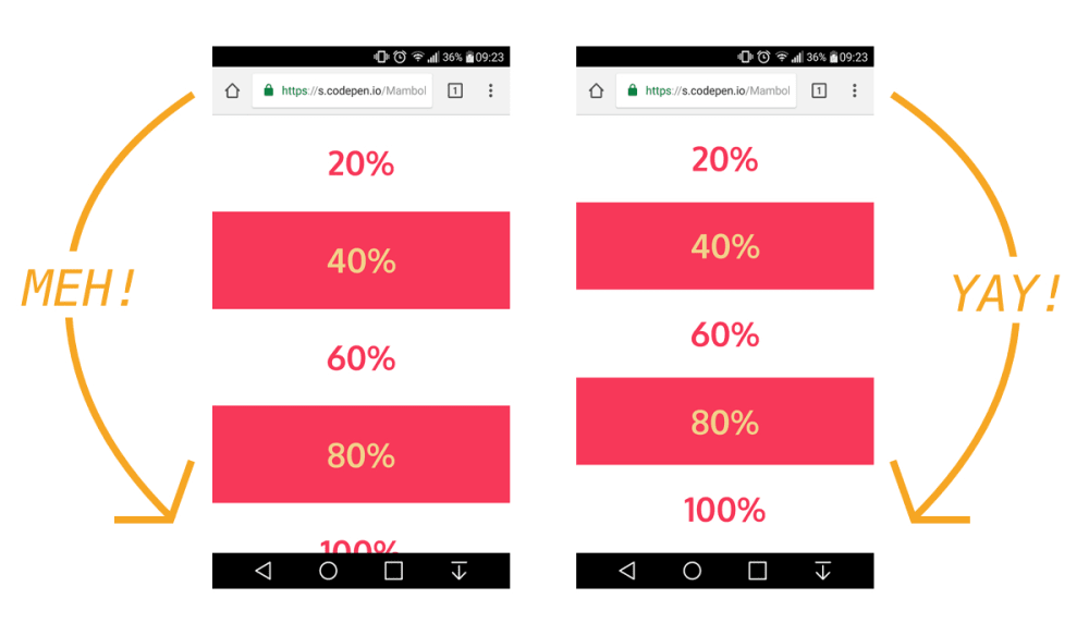
The viewport height which we use as "vh" unit in css does not give the actual viewport height but gives the height of the browser window. This plugin is an implememtation of CSS Tricks article on this issue.
.foo {
    /* Input example */
    height: 100vh;
}.foo {
/* Output example */
height: 100vh;
height: calc(var(--vh, 1vh) * 100); /* corrected viewport height using css custom variables */
} React
React
 Typescript
 Django
 Laravel
 Facebook
 Microsoft
 Google
 Alibaba
 D3
D3
 Tencent