
react-awesome-component-carousel is a library that allows you to easily add a viewer for your components that transition between one another. The two available transition modes are fade and slide.
npm install --save react-awesome-component-carousel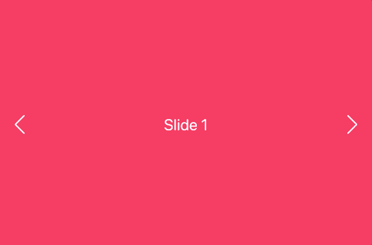

import React from 'react';
import ComponentCarousel from 'react-awesome-component-carousel';

const component1 = () => (
  <div style={{backgroundColor: '#fd3164', height:  '100vh', width: '100vw'}}>
    <h1>Slide 1</h1>
  </div>
);
const component2 = () => (
  <div style={{backgroundColor: '#80a5fd', height:  '100vh', width: '100vw'}}>
    <h1>Slide 2</h1>
  </div>
);
const component3 = () => (
  <div style={{backgroundColor: '#1ccb9e', height:  '100vh', width: '100vw'}}>
    <h1>Slide 3</h1>
  </div>
);

const components = [component1, component2, component3];

export default class App extends React.Component {
  render() {
    return (
      <div style={{ width: '100vw', height: '100vh', position: 'relative', overflow: 'hidden' }}>
        <ComponentCarousel
          transition={'slide'}
          transitionDuration={0.3}
          auto
          autoDuration={3}
          coolOff={6}
          components={components}
        />
      </div>
    );
  }
}
auto: false, autoDuration: 3, disableButtons: false, components: [], coolOff: 6, transition: slide, transitionDuration: 0.3,
| Name | Type | Description | Default value |
|---|---|---|---|
| auto | boolean | This determines whether or not the images transition automatically | false |
| autoDuration | number (seconds) | This sets the duration of when to automatically transition to the next image | 3 |
| components | array | This should be an array of components | [] |
| coolOff | number (seconds) | This is the duration for how long an image pauses before resuming the auto image transition when the next or previous buttons are clicked | 6 |
| disableButtons | boolean | This will remove the previous and next buttons | false |
| dots | boolean | This will add click-able dots to the bottom of the slider to allow the user to navigate the slides | false |
| customPrevButton | component | This will remove the default left button and use a your custom component, an onClick prop will be passed in | undefined |
| customNextButton | component | This will remove the default right button and use a your custom component, an onClick prop will be passed in | undefined |
| transition | string | This can either be set to 'fade' or 'slide' which will set the transition type of the images | 'slide' |
| transitionDuration | number (seconds) | This is the duration of the transition | 0.3 |
 React
React
 Typescript
 Django
 Laravel
 Facebook
 Microsoft
 Google
 Alibaba
 D3
D3
 Tencent