A collection of utilities to use with Google App Maker. Support outside of Google App Maker might be available for some utilities but the primary focus is compatibility with Google App Maker.
Guaranteed support for Google Chrome v60+. Compatibility with other browsers has not been tested yet but most of it should work.
You can download the demo app from here: GAMUT Demo
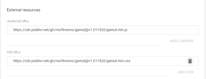
Make sure you add the required external resources in the app settings.
- JavaScript URL — https://cdn.jsdelivr.net/gh/morfinismo/[email protected]/gamut.min.js
- CSS URL — https://cdn.jsdelivr.net/gh/morfinismo/[email protected]/gamut.min.css
Then, put the following code in the app startup script:
loader.suspendLoad();
gamut.init(app);
loader.resumeLoad();
<script src="gamut.min.js" onload="gamut.init()"></script>
- Time Setter
- Format Text Box (GOOGLE APP MAKER ONLY)
- Format Switch (GOOGLE APP MAKER ONLY)
- Time Picker
A utility that helps you set a certain amount of time in hours, minutes and seconds. Its usage is primarily focused on systems that require to keep track of time for certain activities.
Config:
- leadingZeros (boolean) - Whether to show the time value with no leading zeros, e.g. 0:3:5; or to show it with leading zeros, e.g. 00:03:05. The default is true.
- initialValue (string) - A formatted string using the pattern H:M:S or HH:MM:SS. This is the value that will be shown when the time setter initializes.
- zIndex (number) - Used to set up the z-index value of the time setter widget when it becomes visible.
- valueChange (function) - A callback function to execute each time the value changes. This function receives the new value as the only parameter.
This can only be used with a TextBox widget. Depending on your need, add the following code to either the onAttach event handler or the onDataLoad event handler of the widget:
var config = {
    leadingZeros: true,
    initialValue: "00:45:09",
    zIndex: 9,
    valueChange: function(newValue){
        console.log(newValue);
    }
};
gamut.timeSetter(widget, config);
This can only be used with an input HTML element. Preferably, use it after the DOM content is loaded:
var config = {
    leadingZeros: true,
    initialValue: "00:45:09",
    zIndex: 9,
    valueChange: function(newValue){
        console.log(newValue);
    }
};
document.addEventListener("DOMContentLoaded", ()=>{
    gamut.timeSetter(document.querySelector["#setTime"], config);
});
A utility that helps you change the type of a TextBox widget.
Config:
- type (string) - The type of input that it should be. (Currently, the only supported ones are text, password and number.)- The default is text.
- readonly (boolean) - Specifies if the widget should not be editable without having to apply the "disabled" option in appmaker which causes the widget to be grayed out. The default is false.
- min (number) - Applies to number type only. Specifies the minimum value allowed. The default is 0.
- max (number) - Applies to number type only. Specifies the maximum value allowed. The default is 999999999.
- step (number) - Applies to number type only. Specifies the granularity that the value must adhere to. The default is 1.
- initialValue (any) - The value the widget should have upon initialization. The default for text is null and for numbers is the min.
Depending on your need, add the following code to either the onAttach event handler or the onDataLoad event handler of the widget:
var config = {
    type: "password"
};
gamut.formatTextBox(widget, config);
A utility that helps you apply preset and custom colors to the Checkbox widget Switch variant. Several presets are already included, but you can use custom colors. The color style can be applied at four levels: Global, Page, Single Switch Preset, Single Switch Custom.
If by any chance you are in need of using the four levels at the same time, take into account the following order of precedence: Single Switch Custom takes precedence overall. Single Switch Preset takes precedence over Page Level and Global; And Page Level takes precedence over Global.
You must pass a config object as a second parameter when initializing the app. The config object can either contain a preset string or an object with the custom color you want.
//using a string with a preset
var config = {
    defaultSwitch: "gamutSwitch--Teal900"
}

//initiate gamut
gamut.init(app, config);
OR
//using an object with custom colors
var config = {
    checked: "blue",
    checkedBtn: "lightblue",
    unchecked: "#333333",
    uncheckedBtn: "#efefef"
}

//initiate gamut
gamut.init(app, config);
When applying it to the page level, you need to include the following code inside the onAttach event handler of the page:
//using a string with a preset
var defaultSwitch = "gamutSwitch--Amber500";
gamut.formatSwitch(widget, defaultSwitch);
OR
//using an object with custom colors
var defaultSwitch = {
    checked: "blue",
    checkedBtn: "lightblue",
    unchecked: "#333333",
    uncheckedBtn: "#efefef"
}
gamut.formatSwitch(widget, defaultSwitch);
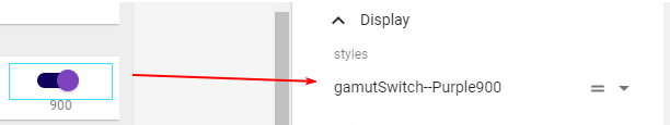
In order to apply a preset, select the widget inside app maker and add it as a style in the property editor, under the Display properties.
You need to include the following code inside the onAttach event handler of the widget:
var customColors = {
    checked: "blue",
    checkedBtn: "lightblue",
    unchecked: "#333333",
    uncheckedBtn: "#efefef"
}
gamut.formatSwitch(widget, defaultSwitch);
A utility that helps you select a time using an analog clock.
Config:
- initialValue (string) - A formatted string using the pattern H:M or HH:MM. This is the value that will be shown when the time picker initializes. Accepted values range from 00:00 - 23:59. The default is 8:00.
- zIndex (number) - Used to set up the z-index value of the time picker widget when it becomes visible.
- onClose (function) - A callback function to execute each time the time picker closes. This function receives the new value as the only parameter. When using it in App Maker, the parameter provided to this callback is a date object. Outside of App Maker, the parameter provided to this callback is a string.
This can only be used with a DateBox widget. Depending on your need, add the following code to either the onAttach event handler or the onDataLoad event handler of the widget:
var config = {
    initialValue: "13:45",
    zIndex: 9,
    onClose: function(newValue){
        console.log(newValue);
    }
};
gamut.timePicker(widget, config);
This can only be used with an input HTML element. Preferably, use it after the DOM content is loaded:
var config = {
    initialValue: "09:27",
    zIndex: 9,
    onClose: function(newValue){
        console.log(newValue);
    }
};
document.addEventListener("DOMContentLoaded", ()=>{
    gamut.timePicker(document.querySelector["#timePicker"], config);
});

![dependabot[bot] avatar](https://avatars.githubusercontent.com/in/29110?v=4 "dependabot[bot]")


 React
React
 Typescript
 Django
 Laravel
 Facebook
 Microsoft
 Google
 Alibaba
 D3
D3
 Tencent