The Infinite Scroll widget implements the design pattern also known as Dynamic Scroll or Endless Scroll for the Alloy MVC framework for Titanium by Appcelerator. A Titanium Classic implementation can be found in the KitchenSink.
Also take a look at my Pull to Refresh widget.
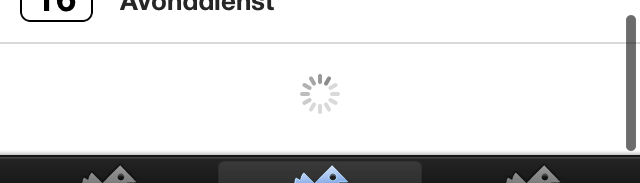
The widget automatically shows an ActivityIndicator in a TableView's FooterView when the user reached the end of the table. An event is triggered so that the implementing controller can load more rows.
- Add the widget to your TableView using just one line of code.
- Override all styling via your app's
app.tss. - Manually trigger the widget from your controller.
- Full Android, Mobile Web, Tizen and BlackBerry compatibility and testing.
- Support for ListViews.
-
Download the latest release.
-
Unzip the file to
app/widgets/nl.fokkezb.infiniteScroll. -
Add the widget as a dependency to your
app/config.jsonfile:"dependencies": { "nl.fokkezb.infiniteScroll":"1.2" }
-
Add the widget to your TableView:
 <TableView>
   <Widget id="is" src="nl.fokkezb.infiniteScroll" onEnd="myLoader" />
 </TableView>
-
In the callback set via
myLoaderyou call eithere.success(),e.error()ore.done()optionally passing a custom message:function myLoader(e) { // Length before var ln = myCollection.length; myCollection.fetch({ // Some data for the sync adapter to retrieve next "page" data: { offset: myCollection.length }, // Don't reset the collection, but add to it add: true, // Don't trigger an "add" event for every model, but just one "fetch" silent: true, success: function (col) { // Call "done" if we didn't add anymore models (col.length === ln) ? e.done() : e.success(); }, error: e.error }); }
The widget can be fully styled without touching the widget source. Use the following ID's in your app's app.tss to override the default style:
| ID | Description |
|---|---|
#is |
The view to be added as FooterView |
#isIndicator |
The ActivityIndicator showing during load |
#isText |
The message shown when not loading |
There are no required options to pass via TSS properties or XML attributes, apart from the onEnd attribute to bind your callback to the end-event. You can change the displayed messages by using the following options:
| Parameter | Type | Default |
|---|---|---|
| msgTap | string |
Tap to load more... |
| msgDone | string |
No more to load... |
| msgError | string |
Tap to try again... |
You can also manually trigger the loading state of the widget. You could use this for the first load when your window opens.
| Function | Parameters | Usage |
|---|---|---|
| setOptions | object |
Set any of the options |
| load | Manually trigger the end event and loading state |
|
| state | state, string |
Manually set the state. The first argument should be one of the exported SUCCESS, DONE and ERROR constants. The second optional argument is a custom message to display instead of the message belonging to the state. |
| dettach | Manually set the DONE state and remove the scroll listener |
- 1.2:
- Now compatible with Android (and other OS)
- View will now always show since Android doesn't support removing it :(
- 1.1:
- From now on declared in the XML view instead of the controller!
- Splitted
initintosetOptionsandattach - Renamed
removetodettach - Renamed
triggertoloadto not interfere with BackBone
- 1.0.1:
- Fixed for Alloy 1.0GA
- 1.0: Initial version itial version
Copyright 2013 Fokke Zandbergen

Licensed under the Apache License, Version 2.0 (the "License");
you may not use this file except in compliance with the License.
You may obtain a copy of the License at

   http://www.apache.org/licenses/LICENSE-2.0

Unless required by applicable law or agreed to in writing, software
distributed under the License is distributed on an "AS IS" BASIS,
WITHOUT WARRANTIES OR CONDITIONS OF ANY KIND, either express or implied.
See the License for the specific language governing permissions and
limitations under the License.


 React
React
 Typescript
 Django
 Laravel
 Facebook
 Microsoft
 Google
 Alibaba
 D3
D3
 Tencent