Autocomplete / Select / Typeahead component made with Svelte
- no dependencies
- use plain lists or array of objects
- option to define a label field or function
- option to define more fields used for search
- support for async load of items
- can hold one or several values
npm i -D simple-svelte-autocompleteImport the component and define items:
import AutoComplete from "simple-svelte-autocomplete"
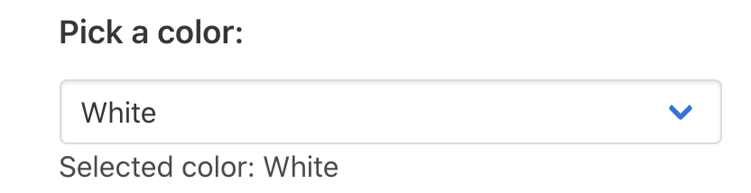
const colors = ["White", "Red", "Yellow", "Green", "Blue", "Black"]
let selectedColorAnd use it like this:
<AutoComplete items="{colors}" bind:selectedItem="{selectedColor}" />You can also use it with array of objects:
const colorList = [
  { id: 1, name: "White", code: "#FFFFFF" },
  { id: 2, name: "Red", code: "#FF0000" },
  { id: 3, name: "Yellow", code: "#FF00FF" },
  { id: 4, name: "Green", code: "#00FF00" },
  { id: 5, name: "Blue", code: "#0000FF" },
  { id: 6, name: "Black", code: "#000000" },
]

let selectedColorObject
Just define which field should be used as label:
<AutoComplete items="{colorList}" bind:selectedItem="{selectedColorObject}" labelFieldName="name" />Specifying function for label instead of field name is also supported:
<AutoComplete items={colorList} bind:selectedItem={selectedColorObject} labelFunction={color =>
color.id + '. ' + color.name} />
By default the component searches by the item label, but it can also search by custom fields by specifying keywords function. For example to enable searching by color name and color HEX code:
<AutoComplete items={colorList} bind:selectedItem={selectedColorObject} labelFieldName="name"
keywordsFunction={color => color.name + ' ' + color.code} />Define a searchFunction which will be called with keyword and maxItemsToShowInList parameters.
If you have searchFunction defined you don't need to specify items since the function will be used for loading.
The delay parameter specifies the time to wait between user input and calling the searchFunction.
It is recommend that delay > 200ms is set when using a remote search function to avoid sending too many requests.
The localFiltering parameter can be set to false if the search function already returns filtered items according to the user input.
<AutoComplete
  searchFunction="{getItems}"
  delay="200"
  localFiltering={false}
  labelFieldName="name"
  valueFieldName="id"
  bind:selectedItem="{myValue}"
/>
async function getItems(keyword) {
const url = "/api/my-items/?format=json&name=" + encodeURIComponent(keyword)
const response = await fetch(url)
const json = await response.json()
return json.results
}{
"results": [
{
"id": 1,
"name": "Sample One",
"date": "2020-09-25"
},
{
"id": 2,
"name": "Sample Two",
"date": "2020-09-26"
}
]
}-
items- array of items the user can select from (optional, usesearchFunctionfor async loading of items) -
searchFunction- optional function to load items asynchronously from HTTP call for example, the searchFunction can also return all items and additional local search will still be performed -
delay- delay in milliseconds to wait after user input to do the local searching or callsearchFunctionif provided, defaults to 0 -
localFiltering- boolean specifying ifsearchFunctionis used, to still perform local filtering of the items to only ones that match the user input, defaults to true -
localSorting- boolean specifying if result items should be sorted locally byitemSortFunctionorsortByMatchedKeywords. If set to false, no local sorting will be done -
cleanUserText- by default the component removes special characters and spaces from the user entered text, setcleanUserText=falseto prevent this -
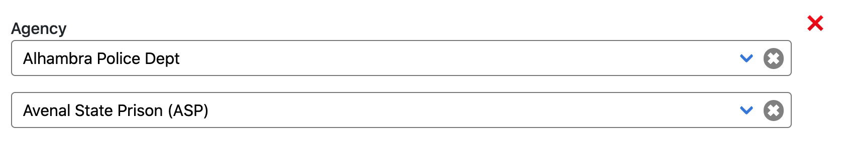
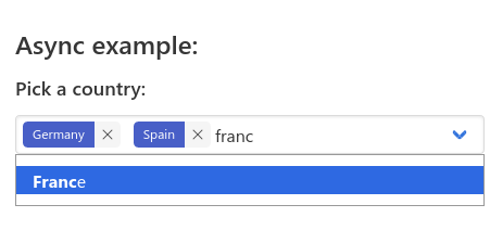
multiple- enable multiple selection (false by default) -
orderableSelection- enable selection reordering with drag and drop. needs multiple = true -
selectedItem- the current item that is selected (object if the array of items contains objects) -
highlightedItem- the current item that is highlighted in the dropdown menu -
labelFieldName- the name of the field to be used for showing the items as text in the dropdown -
keywordsFieldName- the name of the field to search by, if not specified the label will be used -
value- derived value from theselectedItem, equals toselectedItemifvalueFieldNameis not specified -
valueFieldName- field to use to derive the value from the selected item -
labelFunction- optional function that creates label from the item. If usedlabelFieldNameis ignored -
keywordsFunction- optional function that creates text to search from the item. If usedkeywordsFieldNameis ignored -
valueFunction- optional function that derives the value from the selected item. If usedvalueFieldNameis ignored -
keywordsCleanFunction- optional function to additionally process the derived keywords from the item -
lowercaseKeywords- set to false to not lowercase the keywords extracted from the items -
textCleanFunction- optional function to additionally process the user entered text. Ignored ifcleanUserText=false -
selectFirstIfEmpty- set to true to select the first item if the user clears the text and closes the dropdown, defaults to false -
minCharactersToSearch- minimum length of search text to perform search, defaults to 1 -
maxItemsToShowInList- maximum number of items to show in the dropdown list, defaults 0 (no limit) -
ignoreAccents- ignores the accents/umlauts (è,ü,ö etc) to match items, defaults to true -
matchAllKeywords- defaults to true, if false, any item will be suggested if it shares at least one common keyword with the input. Ignored if sorting function is given withitemSortFunction -
sortByMatchedKeywords- defaults to false, if true, items are sorted by the number of matched keywords, only useful ifmatchAllKeywordsis false. Ignored if sorting function is given withitemSortFunction -
itemSortFunction- Optional custom function to order items. Parameters are two list items to compare and the cleaned up search query. Returns an integer indicating wether the first item comes before the seconde one. Only used ifsortByMatchedKeywordsis true. -
itemFilterFunction- Optional custom function to filter items. Parameters are a list item and the cleaned up search query. Returns a boolean indicated wether to keep the item. If this is used, thekeywordsFieldNameandkeywordsFunctionare ignored -
disabled- disable the control completely -
readonly- make the input readonly, no user entered text (simulates combobox), item from the list can still be selected -
lock- defaults to false, locks the input for user entered text when an item has been selected -
create- true to enable accepting of unlisted values -
closeOnBlur- true to close the dropdown when the component loses focus -
debug- flag to enable detailed log statements from the component
beforeChange- function called before a new value is selectedonChange- function called after new value is selectedonFocus- function called on focus of the input controlonBlur- function called on blur of the input controlonCreate- function called whencreateis true and the user presses enter, the function must return add the created item to theitemsarray and return it
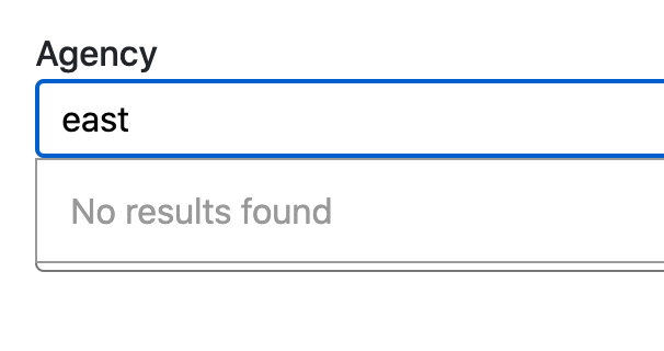
placeholder- change the text displayed when no option is selectednoResultsText- text to show in the dropdown when the search text does not match any item. Defaults to "No results found". Can be set to "" to not show anything.moreItemsText- text displayed when the user text matches a lot of items and we can display only up tomaxItemsToShowInListitemscreateText- text to show whencreateis true, and the user text doesn't match any of the itemshideArrow- set to true to not show the blue dropdown arrowshowClear- set to true to show X button that can be used to deselect the selected itemshowLoadingIndicator- defaults to false, set to true to show loading spinner when the asyncsearchFunctionis executed, bulma class 'is-loading' is added to the input control
className- apply a className to the controlinputClassName- apply a className to the input controlnoInputStyles- set to true to disable theinput autocomplete-inputclasses which are added to the input by defaultinputId- apply an id attribute to the the input controldropdownClassName- apply a className to the dropdown div showing the list of itemsname- generate an HTML input with this name, containing the current valuehtml5autocomplete- value to enable or disable the HTML5 autocomplete attribute.autocompleteOffValue- the value whenhtml5autocomplete=false, defaults tooffbut can be set tononefor ChromeselectName- apply a name attribute to the tag that holds the selected value selectId - apply an id attribute to the tag that holds the selected valuerequired- adds therequiredattribute to the inputtabIndex- adds thetabIndexattribute https://developer.mozilla.org/en-US/docs/Web/HTML/Global_attributes/tabindex
item- change the apearance of items in the dropdown list:
<div slot="item" let:item let:label>
  {@html label}
  <!-- to render the default higliglighted item label -->
  <!-- render anything else -->
  <span style="color:{item.propertyX}">{item.propertyY}</span>
</div>no-results- customize the div that shows the "no results" text:
<div slot="no-results" let:noResultsText>
    <span>{noResultsText}</span>
</div>
The noResultsText variable is optional and can be ommited.
loading- customize the div that shows the "loading" text:
<div slot="loading" let:loadingText>
    <span>{loadingText}</strong>
</div>tag- customize the tag blocks displayed when multiple selection is enabled:
<div slot="tag">
  <span class="tag">{label}</span>
  <span class="delete-tag" on:click|preventDefault="{unselectItem(item)}"></span>
</slot>dropdown-header- customize what is displayed before the item list in the dropdown. By default there is nothing displayed.
<div slot="menu-header" let:nbItems let:maxItemsToShowInList>
  <div class="dropdown-item">Choose between those {nbItems} items</div>
  <hr class="dropdown-divider">
</div>dropdown-footer- customize what is displayed after the item list in the dropdown. By default this is where themoreItemsTextis displayed if there are too many items to be displayed.
<div slot="dropdown-footer" let:nbItems  let:maxItemsToShowInList>
    ...
</div>autocompletethe class applied to the main controlautocomplete-inputthe class applied to the input listautocomplete-listthe class applied to the dropdown listautocomplete-list-itemthe class applied to items in the dropdown list
Note: Setting noInputStyles=true will disable the use of the autocomplete-input class above.
Use global to apply styles, example:
  .parent :global(.childClass) {
    color: red;
  }
The component is inteded to use with Bulma but it can be adapted to use Boostrap or anything else.


![dependabot[bot] avatar](https://avatars.githubusercontent.com/in/29110?v=4 "dependabot[bot]")


 React
React
 Typescript
 Django
 Laravel
 Facebook
 Microsoft
 Google
 Alibaba
 D3
D3
 Tencent