
The Salesforce Lightning Design System (SLDS) UI Kit is a collection of resources to support designing and prototyping using Lightning Design System components, tokens, and design patterns. There are also useful resources to help make design workflows more efficient with artifacts like page templates, wireframes, key product screens, and components for writing specifications.
» To install, copy/paste the URLs below in any browser address bar « Required libraries- SLDS Icons
sketch://add-library?url=https://www.lightningdesignsystem.com/sketch-library-icon-rss.xml - SLDS Components for Web
sketch://add-library?url=https://www.lightningdesignsystem.com/sketch-library-rss.xml
- Builder Patterns
sketch://add-library?url=https://www.lightningdesignsystem.com/sketch-library-builder-rss.xml - Chart Patterns
sketch://add-library?url=https://www.lightningdesignsystem.com/sketch-library-chart-rss.xml - Rules, Filters, and Logic Patterns
sketch://add-library?url=https://www.lightningdesignsystem.com/sketch-library-rfl-rss.xml - User Engagement Patterns
sketch://add-library?url=https://www.lightningdesignsystem.com/sketch-library-user-engagement-rss.xml
- Artboard Templates
sketch://add-library?url=https://www.lightningdesignsystem.com/sketch-library-artboard-rss.xml - Specification Library
sketch://add-library?url=https://www.lightningdesignsystem.com/sketch-library-spec-rss.xml - Key Mobile Product Screens
sketch://add-library?url=https://www.lightningdesignsystem.com/sketch-library-key-screens-rss.xml - Wireframe Library
sketch://add-library?url=https://www.lightningdesignsystem.com/sketch-library-wireframe-rss.xml
Download the most recent version of Sketch.
If you do not have Sketch, you can use the Framer SLDS UI Kit or Figma SLDS Components for Web and Figma SLDS Icons libraries, however, they may not be as up-to-date as the Sketch files.
- Download the Salesforce Sans fonts from the Design System repository
- Install the Salesforce Sans fonts on your system
Welcome to the Salesforce Lightning Design System (SLDS) Sketch UI Kit
The Salesforce Design Systems team has made optimizations with this Sketch Library so you can more efficiently create Salesforce Lightning interfaces. In the instructions below, we’ll cover the basics and some tips for you to get started.
Sketch Libraries allow you to have SLDS components and patterns available from Sketch’s symbols menu in any file you open. Sketch Libraries will automatically update your designs when the library is updated. Your designs will never be out of date if they’re linked to this Sketch Library document.
How to use the SLDS Sketch UI Kits as Sketch Libraries
Copy and paste the following links to each of the required libraries below in any browser. This will subscribe your Sketch application to automatically download and install the SLDS Sketch UI Kits and will automatically update when new versions are released. All other libraries in this UI kit are optional.
SLDS Icons
sketch://add-library?url=https://www.lightningdesignsystem.com/sketch-library-rss.xml
SLDS Components for Web
sketch://add-library?url=https://www.lightningdesignsystem.com/sketch-library-icons-rss.xml
Alternatively, download the Sketch Libraries in this repository you'd like to install. Open Sketch > Preferences > Libraries and click Add Library.... Select the library you'd like to install. If you do this method, you'll have to frequently come back to this repository, download the new version, and repeat this installation. This method is not recommended because it's such a hassle.
Verify that you've successfully installed the Sketch Libraries by opening Sketch > Preferences > Libraries. You should see all of the libraries you installed above.

That's it! Now you can supercharge your design workflow for building on the Salesforce platform.
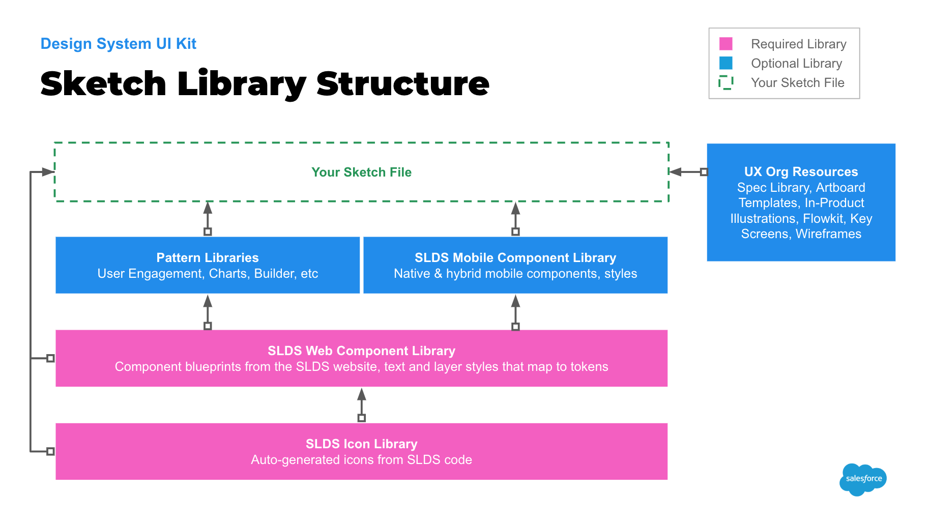
The SLDS UI Kit is optimized to mimic the code structure of a design system but within the bounds of Sketch. The two main, and required, resources are the SLDS Icon Library and the SLDS Web Component Library. The SLDS Icon Library is, well, each icon in SLDS. The SLDS Web Component Library file is a replica of SLDS web components and tokens.
Also in the kit are multiple pattern files. These files inherit the symbols from the icon and generic-styled components from the required libraries above, then are composed to create accurate examples for each pattern as you'd find it in the product today.
To structure your Sketch project, create a file for your designs like you normally would do. Hopefully you've verified that the libraries are installed if you followed the instructions in the previous section. If you have, then in Sketch you can click Insert > Symbols > SLDS Icon Library or Insert > Symbols > SLDS Components for Web, select the symbol you would like to use, then drop it onto your Sketch file's artboard.
Design System Tokens are represented as Layer Styles and Text Styles in Sketch
Salesforce Lightning Design System uses tokens to store visual design attributes. The SLDS Web Component Library uses Sketch Layer Styles and Sketch Text Styles to mimic tokens. This allows Sketch designs to use the equivalent of a token; saving you time spec'ing your designs for development and making sure your designs use accurate platform specifications.
In symbols that contain solid color backgrounds, like icons, you’ll find the background is a layer style. This allows us to easily make file-wide changes to colors when new visual styles are introduced in SLDS. Instead of changing fill colors individually in hundreds of shapes in this document, we can just update a color symbol or point the shape to another color symbol.
SLDS Components for Web
Sketch equivalents of component blueprints and tokens as seen on the SLDS website
SLDS Components for Mobile (coming soon)
Sketch collection of native mobile patterns and mobile web coded components
SLDS Icon Library
A file of design system icons which is automatically generated from design system code
Pattern: Builder
Builder design guideline customized component symbols
Pattern: User Engagement
User engagement design guideline customized component symbols
Pattern: Chart
Chart design guideline customized component symbols
Pattern: Rules, Filters, and Logic
RFL design guideline customized component symbols
Standard Artboards
Based on user data, Sketch artboards are sized to the common viewport dimensions used
Spec Library
A collection of symbols to use when documenting dimensions and details of designs for engineers
Wireframes
Grey box stencils of common Lightning interfaces
Key Screens
A collection of the most common product screens on mobile (and desktop coming soon)
The SLDS team welcomes your feedback to help maintain these design resources. Please add any bugs or feature requests under the Issues tab of this repository.
External contributions are currently closed
Throughout a release, Salesforce's design team contributes to these Sketch files through an application called Abstract. Public contributions become unmanagable to review and merge since GitHub doesn't have the capability to view binary files.
All icons and images are licensed under Creative Commons Attribution-NoDerivatives 4.0


 React
React
 Typescript
 Django
 Laravel
 Facebook
 Microsoft
 Google
 Alibaba
 D3
D3
 Tencent