This is a website about the American 'minimalist' composer Philip Glass. It is intended to be a simple, user-friendly introduction to the composer, focusing on a clean design, rather than overloading on details. The user is first presented with a video of one of his compositions being performed, and then is offered some information on him, some samples of his work, tickets to upcoming concerts, and a contact form.
My main focus for the structure of the website was to prioritise important information and the avoid the unnecessary. As the website is supposed to be an introduction, I wanted to ensure that the user doesn't close the site from being bogged down by auxiliary information.
Before starting work on the code, I created a rough mock-up using Figma: https://www.figma.com/file/Beefa8u9WIDZTnt3W2wKaim0/Glass?node-id=1%3A2 Through the process of creating the website I changed some elements from the mock-up either to make them look better, or because they proved awkward to code.
When considering the visual user experience, I had 2 conflicting ideas that I wanted to reconcile. Firstly, I wanted an aesthetic that I felt matched his music. I flet that something geometric would represent his sound well. Since I am not a graphic designer, I searched the internet until I found a public domain image that I thought would work (A large image of a geometric glass building).
The second consideration was for a clean, uncluttered presentation of information. As the image that I found for the background was pretty visually striking, with a high contrast, I had to come up with a way to make the content of the website to stand out from it. I used a semi-transparent colour on the main div of the website, which was an improvement but didn't fix it so I edited the colour of the image from it's original light blue to a dark grey (less contrast), which I felt brought it a a satisfactory level. The image was also cropped and mirrored as to display seemlessly.
I wanted the first the user sees to be a video to captivate their interest and give them an impression of the composer and consequently the rest of the website. I made sure to find a video that visually fit the aesthetic of the website.
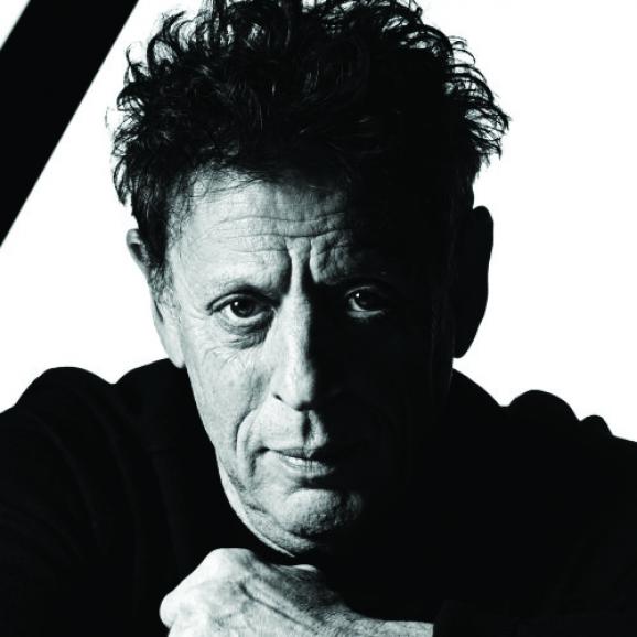
The bio was to provide a brief description of the life, style, and ackomplishments of the composer. Admittedly, it grew a bit longer than I would have liked, espescially when viewed on mobile, but I felt that it couldn't be abridged without sacrificing important information.
Here I added spotify links to 4 pieces by the composer, which I feel best represent him, as well as a short description of each. Displays as 2 per row on small screen sizes and up, and 1 per row on mobile, in order to display correctly.
For the tour dates I opted for a clean design, restyling the default bootstrap buttons to make them cleaner and more visually striking. I also added a pseudo-element effect to change the colour of the button when hovered over, to indicate that it can be clicked. I greyed out the 'sold out' buttons and disabled the hover effect to show that they can't be clicked. On mobile, the content of each div changes to a vertical format to save screen space. At the moment clicking the buttons doesn't lead anywhere because the backend hasn't been implemented yet.
A simple contact form, with the styling changed to match the rest of the website. As with the tour dates section, clicking the send button doesn't do anything because the backend hasn't been implemented yet.
The name of the website in teal, as well as links to the various sections. These links shrink to a dropdown on mobile.
Copyright Information and links to the composers various social media. These display inline on screens wide enough, and on top of each other on mobile.
I am considering adding a live gallery linked to the composer's instagram account, after I have aquired Javascript knowledge.
HTML: Used for the structure of the website. CSS: Used for styling the website Bootstrap: Used primarily for the Grid in the 'Sample Works' section and for the navbar. - https://getbootstrap.com/ Font Awesome: Used for the social links icons in the footer. - https://fontawesome.com/ Navbar Snippet - "Bootstrap 4 navbar example, navigation top menu bootstrap" - Bootstrap 4.1.1 Snippet by vosidiy - https://bootsnipp.com/snippets/nNWr8
As I proceeded with the project, I tested the site on multiple screen sizes to ensure that the different elements displayed properly. One common problem was elements becoming too cramped on mobile. In order to fix these issues, I made most of the elements that displayed inline or inline-block, display as a block instead. In the case of the footer, I lowered the font size of the copyright information on mobile devices so it would remain on one line. A lot of tweaking was need for the margins and borders of divs, to find a balance between looking stylish on bigger displays, and not looking too cramped on smaller ones.
While working on the project, I have been incrementally commiting changes to a GitHub repository using the ubuntu console. This can be accessed at https://github.com/ShaneT1708/philip_glass
A live version of the site can be found at https://shanet1708.github.io/philip_glass/
Portions of text paraphrased from https://philipglass.com
Background Image - Joel Filipe - psychedelic glass wall - https://unsplash.com/photos/Wc8k-KryEPM BIO Image - Watershed - https://www.watershed.co.uk/sites/default/files/styles/main-500/public/post/key_image/2013-05-21/glass.jpg?itok=-s-8XxoC×tamp=1369135585 Video - Víkingur Ólafsson - Philip Glass, Étude No. 5 - https://www.youtube.com/watch?v=3y4pIYV6yh0
Inspiration for the website from - https://www.ramindjawadi.com/ - and - https://www.metallica.com/
