A look at the flow, duration and cross-talk from the two debates
View the online version here: https://sspboyd.ca/US-Presidential-Debates/.
On September 29, 2020, the US held their first presidential debate between the encumbent President Trump and former Vice President Biden. The debate immediately became known not for what was said or policies debated but for the interruptions and complete lack of decorum. One anchor called it a "shitshow" and to quote an anchor from CNN:
"That was a hot mess inside a dumpster fire inside a train wreck... And it's primarily because of President Trump, who spent the entire time interrupting not abiding by the rules he agreed to."
The second debate took place on October 22, 2020 and it garnered a lot of interest to see if it would be the same style (disaster) as the first debate.
So what is our "why" here? What is the goal of the visualization? What are we trying to figure out? Can a visualization help understand these debates?
For me, the question I am trying to ask the data is:
Are candidates and moderators able or not able to engage in a traditional flow of moderator questions, candidate answers, rebuttals and exchanges between candidates?
Can we use a visualization to help us see the flow, interuptions and cross-talk? Are all of the interruptions from the first debate evident? Is it possible to tell who is interrupting the most?
The next decision to consider is what type of graphic representation best fits the aim of the visualization? Before we look at that, let's do a quick detour and examine the data and tools used.
The data source for this project are transcripts from Rev Transcription Services.
I have converted their data to JSON and along the way added in data to include the times when each person speaks. You can find the ways I adjusted the data in the data_munging.js and date_munging_2nd_Debate.js file for the second debate. There is an accompanying blog post about using Regex for parsing this data as well.
The visualization is built using (the fantastic) P5.js. I will try not to be overly effusive in my love of P5.js so I'll just say that it is a great tool for doing quick prototypes of ideas and should be considered for the final product tooling too.
So what type of graphic representation will work best given the primary goal of the visualization: "Are candidates and moderators able or not able to engage in a traditional flow of moderator questions, candidate answers and exchanges between candidates?".
To decide on the style of visualization we need to think about what kind of information we want to convey through the visualization. For example, are we looking for a single quantified answer or number? No, not really in this case. Or is it a ranking question? Again, no. This is more a question of the overall quality of exchanges between participants.
We want to be able to look at the visualization and say things like, "all the exchanges are short and coming right after each other" or "you can see how each participant had their uninterupted time mixed with brief back-and-forths".
So this tells us we're looking for more of an overarching view as opposed to specific quantities and metrics.
In the visualization development process, every project goes through a phase of ideation and 'getting to know the data'. This step will ideally produce a wide variety of different variants on how the data can be visualized.
Sometimes it is even helpful to generate our own test data first so that we can get to know what characteristics of the real data could be of greater use.
Here are some examples below.
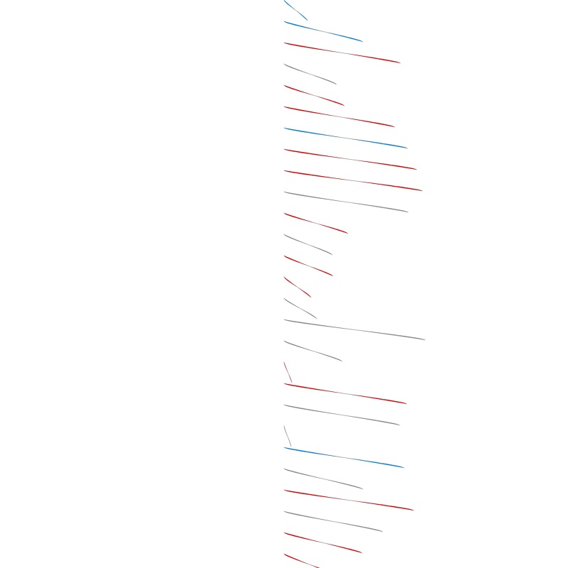
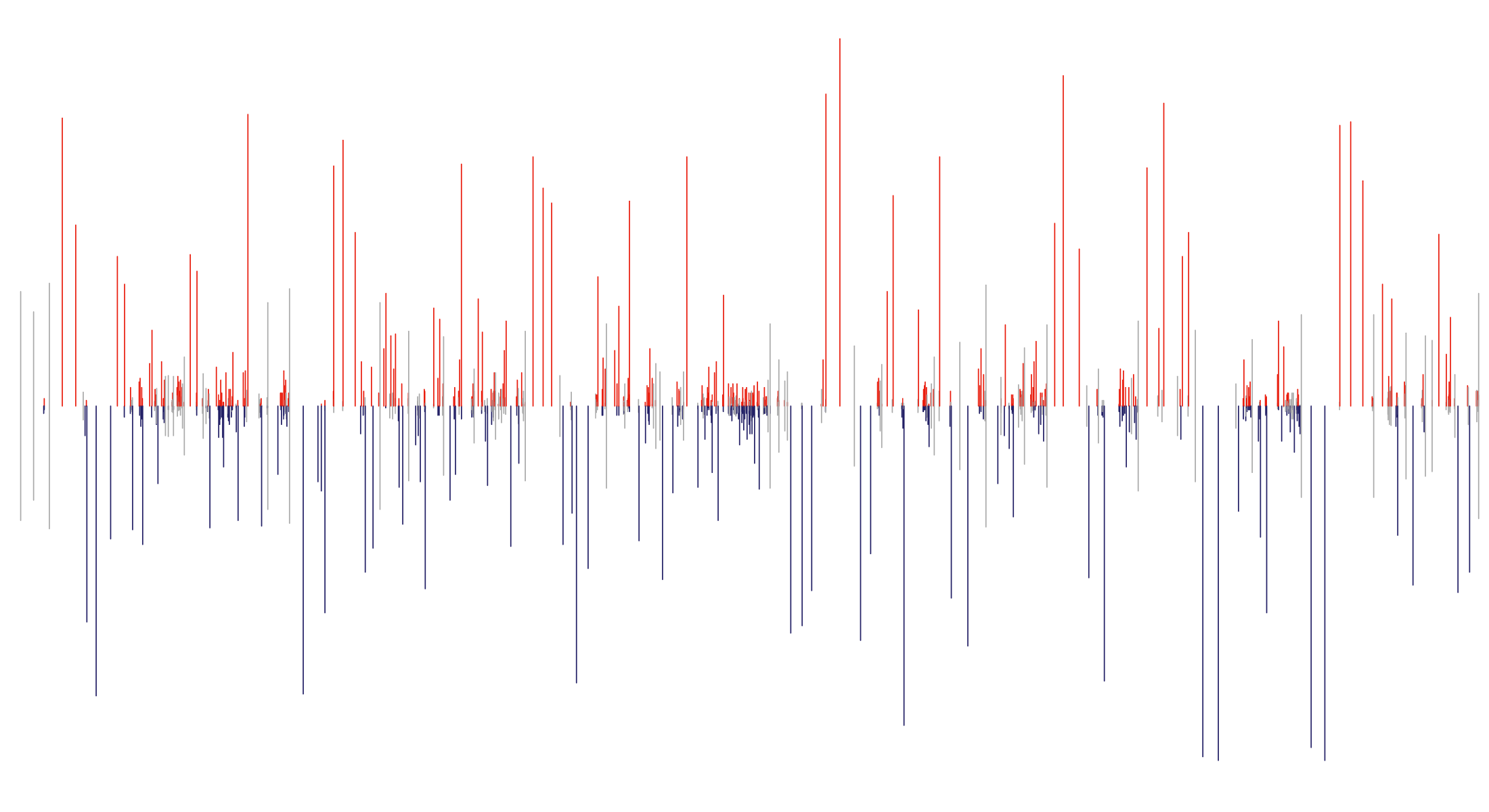
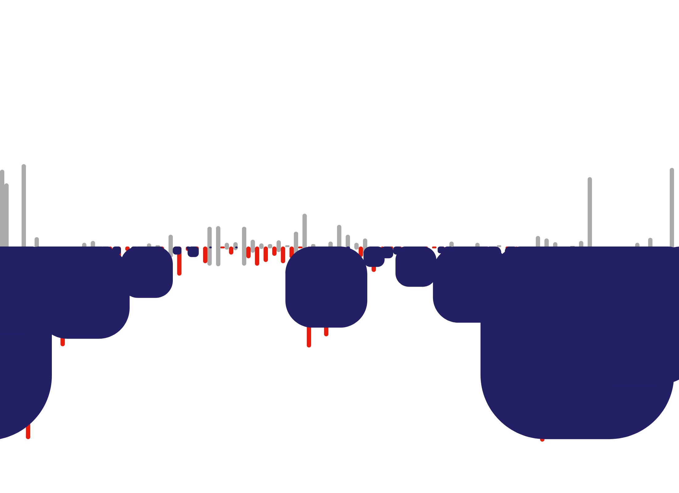
In general each of these tests are showing the democratic candidate as blue, republican as red and moderator as grey.


These are always some of my favourites. You can't beat the random strangeness of code not quite working the way you intended.


The layout chosen from all of this experimentation is the circle based horizontal layout. It allows for seeing the entire debate on one screen and the circles' locations and areas help convey the amount of uninterupted or interupted talking time.
I have left in the abilty to inspect each circle and see the text spoken, and also the collisions and occlusions that happen. I feel this provides a good 'retelling' of the experience of trying to listen to the debate where longer stretches of speech are easier to follow and understand whereas the shorter interuptions get in each others way and nothing is really understood except the cocaphony.
Let me know what you think!
- Implement explorable text interface. Rollover states for each bar such that you can scrub the timeline and see what is being said at each moment.
- Add debate transcripts from previous elections. Or what about Lincoln Douglas Debates?
- Try using something other than lines for rendering for each transcript entry. Look at using squares where the area is proportional to the number of words spoken. Maybe cirles?
- Try out adjusting vertical location of axis based on end point of person who last spoke? Might be a way to see the interruption patterns move up and down? Hard to tell how this would work or look.
- Add annotations
- Length of line matches number of words spoken.
- Red is Trump, Blue is Biden, Grey is Wallace.
- Add 15 min time markers
- Maybe add in where the moderators attempted to have candidates address specific questions, eg Supreme Court, Covid, etc...
- Create landing page
Stephen Boyd
- Twitter, Instagram, GitHub are all @sspboyd
I'd like to build a quick sketch looking at the flow of conversation for the first 2020 Presidential Debate. The term 'debate' should be used lightly here to describe what that was.
I think it would be really interesting to look at how long each of the three participants talked for. How long did they talk. How much did they talk over each other.
- Look at past presidential debates to compare what their visual fingerprint looks like in comparison. I hope this would show just how beyond the norm the first Trump / Biden debate was.
This connects to an old (like 2004 old) data print I built for one of the Bush / Kerry debates where I used screen capture composites of the debate video to create an image of two vertical structures with gradients from blue to red.
I've started asking online to find a good source of timestamped data for this project.
- NBC YouTube Subtitles Transcript - https://youtu.be/5cathmZFeXs?t=3823
- Otter.ai -
- The Commission on Presidential Debates - https://www.debates.org/voter-education/debate-transcripts/
- Opal Transcription Services - https://www.opaltranscriptionservices.com/debate-transcripts/
- Concord Monitor - https://www.concordmonitor.com/First-presidential-debate-Trump-Biden-full-transcript-36532544
- Rev Transcription Services - https://www.rev.com/blog/transcripts/donald-trump-joe-biden-1st-presidential-debate-transcript-2020
- post links to Kerry Bush debate project and images
- Post link to the Otter.ai service I've tried
- add link to the YouTube video I grabbed the initial transcription from
- visually sketch out some ideas for how this could look
- decide what tool(s) to use
- Python/Pandas, Processing, P5.js, D3.js
- define minimum viable first version and use dummy data
- add example of data format to data sources section above.
- What is the data model here? What is the representation model?
- Speaker class and subclasses for each speaker and then instances for each time someone speaks? Seems overwrought. Simpler the better at first.
- Lets keep it to each speaker having a text area, colour and width of text dependent on how much each person speaks. Simple left/right/centre layout with red/blue/grey for each person.

