Giter VIP home page Giter VIP logo

startbootstrap-grayscale's Introduction

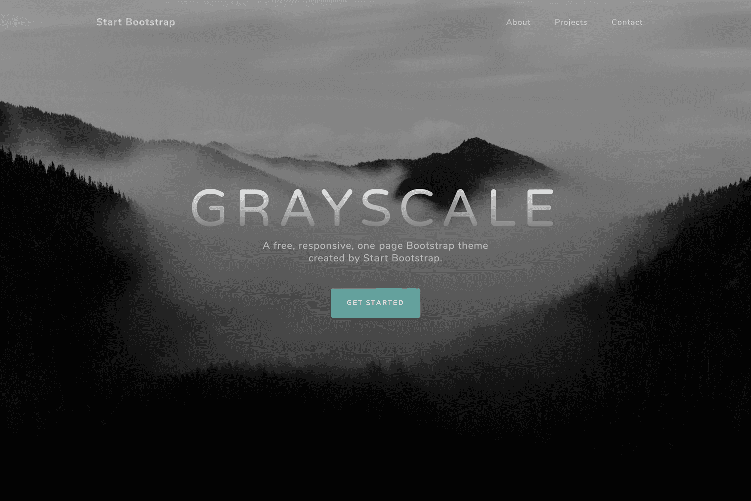
Grayscale is a multipurpose, one page HTML theme for Bootstrap created by Start Bootstrap.

Preview

Grayscale Preview

View Live Preview

Status

GitHub license npm version

Download and Installation

To begin using this template, choose one of the following options to get started:

Usage

Basic Usage

After downloading, simply edit the HTML and CSS files included with dist directory. These are the only files you need to worry about, you can ignore everything else! To preview the changes you make to the code, you can open the index.html file in your web browser.

Advanced Usage

Clone the source files of the theme and navigate into the theme's root directory. Run npm install and then run npm start which will open up a preview of the template in your default browser, watch for changes to core template files, and live reload the browser when changes are saved. You can view the package.json file to see which scripts are included.

npm Scripts

  • npm run build builds the project - this builds assets, HTML, JS, and CSS into dist
  • npm run build:assets copies the files in the src/assets/ directory into dist
  • npm run build:pug compiles the Pug located in the src/pug/ directory into dist
  • npm run build:scripts brings the src/js/scripts.js file into dist
  • npm run build:scss compiles the SCSS files located in the src/scss/ directory into dist
  • npm run clean deletes the dist directory to prepare for rebuilding the project
  • npm run start:debug runs the project in debug mode
  • npm start or npm run start runs the project, launches a live preview in your default browser, and watches for changes made to files in src

You must have npm installed in order to use this build environment.

Bugs and Issues

Have a bug or an issue with this template? Open a new issue here on GitHub or leave a comment on the theme overview page at Start Bootstrap.

About

Start Bootstrap is an open source library of free Bootstrap themes and templates. All of the free themes and templates on Start Bootstrap are released under the MIT license, which means you can use them for any purpose, even for commercial projects.

Start Bootstrap was created by and is maintained by David Miller.

Start Bootstrap is based on the Bootstrap framework created by Mark Otto and Jacob Thorton.

Copyright and License

Copyright 2013-2023 Start Bootstrap LLC. Code released under the MIT license.

startbootstrap-grayscale's People

Contributors

davidtmiller avatar dmz006 avatar erinni avatar jamlamberti avatar joariasl avatar luigiellebalotta avatar vitalibr avatar zlargon avatar

Stargazers

 avatar  avatar  avatar  avatar  avatar  avatar  avatar  avatar  avatar  avatar  avatar  avatar  avatar  avatar  avatar  avatar  avatar  avatar  avatar  avatar  avatar  avatar  avatar  avatar  avatar  avatar  avatar  avatar  avatar  avatar  avatar  avatar  avatar  avatar  avatar  avatar  avatar  avatar  avatar  avatar  avatar  avatar  avatar  avatar  avatar  avatar  avatar  avatar  avatar  avatar  avatar  avatar  avatar  avatar  avatar  avatar  avatar  avatar  avatar  avatar  avatar  avatar  avatar  avatar  avatar  avatar  avatar  avatar  avatar  avatar  avatar  avatar  avatar  avatar  avatar  avatar  avatar  avatar  avatar  avatar  avatar  avatar  avatar  avatar  avatar  avatar  avatar  avatar  avatar  avatar  avatar  avatar  avatar  avatar  avatar  avatar  avatar  avatar  avatar  avatar

Watchers

 avatar  avatar  avatar  avatar  avatar  avatar  avatar  avatar  avatar  avatar  avatar  avatar  avatar  avatar  avatar  avatar  avatar  avatar  avatar  avatar  avatar  avatar  avatar  avatar  avatar  avatar  avatar  avatar  avatar  avatar  avatar  avatar  avatar  avatar  avatar  avatar  avatar  avatar  avatar  avatar  avatar  avatar  avatar  avatar  avatar  avatar  avatar  avatar  avatar  avatar  avatar

startbootstrap-grayscale's Issues

Help with Less and Bootstrap Theme

Hi,

I am fairly new to web development and have never used LESS or existing Bootstrap themes before. I like the grayscale theme, but I am having trouble combining my website with your theme.

On my homepage, I've changed the image within the intro-header class from your water and cliffs image to an image of a soccer player on an ipad. I added this image to the grayscale.less file. I know that this less file is working, because the soccer image does appear when I view it in the browser.

However, the image is smaller and is not styled in the same way as it should be with the grayscale theme. I've changed the image back to the theme's water image, but I have the same problem, so I know this is not because of the image size. I think this problem may be because of the CSS file that LESS is generating, but I don't know how to access this css file. The grayscale.css file remains the same even when I change the LESS file, so I'm assuming that this is not the compiled css file generated from the grayscale.less.

I tried to host this project on gitHub with gh-branches, so that you could see it but for some reason, it still has the original image of the water and cliffs and is styled in the appropriate fashion. I am very confused. Here is the link to my github repository for this project: https://github.com/KelseySteele/vazzt-video-on-the-move-website

Thank you!!

Having problem with dropdown menus in the navbar

When I'm trying to add a button with dropdown menu in the navbar, I found it not working when the navbar is collapsed.

Here are my codes I added between <ul class="navbar-nav"> and </ul>:

<li class="dropdown">
  <a class="dropdown-toggle" data-toggle="dropdown" href="#"><i class="glyphicon glyphicon-globe"></i> Language<span class="caret"></span></a>
  <ul class="dropdown-menu">
    <li><a href="../en/">English</a></li>
    <li><a href="../jp/">日本語</a></li>
  </ul>
</li>

For complete document, please click here.

favicon.ico

hello david. I like so much your template, goshencoin project will use it like home page for our portal. We would like to send you a goshencoin bounty and to ask you how I can change the favicon. thanks again

Files I cannot seem to find

I'm using the ordinary version of the theme (didn't use npm), and I cannot find certain folders that are supposed to be inside the vendor folder according to chrome's inspect element, namely the scss folder. What am I doing wrong?

Background image in HEADER is not responsive

The other images behave gentle, but the header image not. IMO it should dynamically resize to always fit on screen, without being cropped, repeated, or anything else disturbing the layout.

Trouble with animate.css and wow.js

Hi we have some trouble with wow integration. he doesnt work properly.
when i add some wow slideInLeft" data-wow-duration="2s" data-wow-delay="5s"
the text stay on the page and i try to change the offset but nothing append
Thanks
screen shot 2015-03-08 at 10 58 04 am
screen shot 2015-03-08 at 10 58 11 am

and my main.js

//jQuery to collapse the navbar on scroll
$(window).scroll(function() {'use strict';
if ($('.navbar').offset().top > 50) {
$('.navbar-fixed-top').addClass('top-nav-collapse');
} else {
$('.navbar-fixed-top').removeClass('top-nav-collapse');
}
});

//jQuery for page scrolling feature - requires jQuery Easing plugin
$(function() {'use strict';
$('a.page-scroll').bind('click', function(event) {
var $anchor = $(this);
$('html, body').stop().animate({
scrollTop: $($anchor.attr('href')).offset().top
}, 1500, 'easeInOutExpo');
event.preventDefault();
});
});
// Closes the Responsive Menu on Menu Item Click
$('.navbar-collapse ul li a').click(function() {'use strict';
$('.navbar-toggle:visible').click();
});
var wow = new WOW(
{
boxClass: 'wow', // animated element css class (default is wow)
animateClass: 'animated', // animation css class (default is animated)
offset: 200, // distance to the element when triggering the animation (default is 0)
mobile: true, // trigger animations on mobile devices (default is true)
live: true, // act on asynchronously loaded content (default is true)
callback: function(box) {
// the callback is fired every time an animation is started
// the argument that is passed in is the DOM node being animated
}
}
);
wow.init();

Syntax errors in css and less files

Line 193 of greyscale.css "0" is invalid syntax and should be "0%"

Line 207 of greyscale.css "0" is invalid syntax and should be "0%"

line 202 of greyscale.less "0" is invalid syntax and should be "0%"

line 219 of greyscale.less "0" is invalid syntax and should be "0%"

same errors exist in minified css

Horizontal rules not shown in projects section

Startbootstrap-greyscale Version v7.0.5

In this release the <hr> tags:
<hr class="d-none d-lg-block mb-0 ms-0"/>
and
<hr class="d-none d-lg-block mb-0 me-0"/>
are not visible.

Screenshot from Your-Preview

hr_not_displayed

Tested with

  1. Chrome 108.0.5359.124
  2. Safari 16.0
  3. Firefox 108.0.2

Missing CSS classes in use

Startbootstrap-greyscale Version v7.0.5

In this release the CSS classes text-lg-left and text-lg-right are used in the projects section, but not available in bootstrap v5.1.3 anymore.

Fixing this issue

They both must be replaced with text-lg-start respectively text-lg-end

Screenshot from Your-Preview

Here you see the current faulty state:
missing_css_classes

And here you see the fix with the correct CSS classes applied:
fixed_missing_css_classes

Inquiries on making it into a fix cover page

What should i change onto jquery file, css and etc to make it as a cover page with background gradient image carousel and also the footer with copyright. It should a not have a scroll bar at the right side.

No textfields for grayscale

When I use input type="text" it brings me the default text field and when checkingI couldn't find a custom textfield for grayscale. Does one exist that I'm missing or has a textfield not been created for this?

Template Size Not Loading Properly on Mobile

EDIT: This seems to be a server issue on my end, but I haven't found the solution.

When loading the template in a mobile browser, the full size header is loaded and the entire page is not visible.

When loaded in a desktop browser the responsiveness works properly.

Unable to insert an image <img scr="">

Hi

I have a problem, i can't insert images in sections.

For exemple : a part of my index :
<!-- Photoshop section --> <section id="photoshop" class="photoshop-section content2-section text-center"> <div class="container"> <div class="col-lg-8 mx-auto"> <h2>My photoshop creations</h2> <br> <p><img scr="img/beimpressive.jpg" alt="Image1"/></p> </div> </div> <a href="#exit" class="btn btn-circle js-scroll-trigger"> <i class="fa fa-angle-double-down animated"></i> </a> </section>

Css sections involved :
.photoshop-section { color: white; background-color: grey; -webkit-background-size: cover; -moz-background-size: cover; -o-background-size: cover; background-size: cover; }
.content2-section { padding-top: 75px; padding-bottom: 500px; }

No matter which sections are involved, no picture appears.
What to do ?
Thank you

Navbar collapse on iOS not working correctly

I did see Issue #32 marked as closed a few years back, but I've just come across your theme and I'm experiencing the same problems on iOS - basically you need to scroll all the way to the top/bottom of the page and then scroll up/down again (kind of like a double-scroll) for the "navbar-shrink" class to be added/removed.

FYI - In my brief testing I've found that by removing this js -

  // Collapse Navbar
  var navbarCollapse = function() {
    if ($("#mainNav").offset().top > 100) {
      $("#mainNav").addClass("navbar-shrink");
    } else {
      $("#mainNav").removeClass("navbar-shrink");
    }
  };
  // Collapse now if page is not at top
  navbarCollapse();
  // Collapse the navbar when page is scrolled
  $(window).scroll(navbarCollapse);

and replacing it with something like this, works much better -

  $(document).scroll(function() {
   if($(window).scrollTop() !== 0) {
       $("#mainNav").addClass("navbar-shrink");
   } else {
       $("#mainNav").removeClass("navbar-shrink");
   }
  });

It's far from perfect (i.e. it does 'shrink' earlier than previously and if you scroll up when at the top of the page, it will (briefly) apply the class and the navbar shrinks/changes color until the page falls back down to the top again), and I'm not sure exactly what Crapple's problem is, but this is much better on iOS and still works as you'd expect on Desktop/Android.

I hope that helps - anyways, use it as you please!

Tested On -
iOS - v9.3.5 Safari, Firefox v8.3, Chrome v63.3239.73
Grayscale v5.0.2 & 5.0.3

PS: Great looking theme BTW! :-)

Typo in file "css/grayscale.css"

Incorrect property name on line 96
outline: nonte;

possible correction
outline: none;

Full block

.navbar-custom .nav li.active {
    outline: none;
    background-color: rgba(255,255,255,.3);
}

How do you turn off BrowserSync?

I don't want browsersync on the web I'm making, but when I change the code, it failed (SIGTERM error)

Here's the code (start.js),

const concurrently = require('concurrently');
const upath = require('upath');

const browserSyncPath = upath.resolve(upath.dirname(__filename), '../node_modules/.bin/browser-sync');

concurrently([
{ command: 'node scripts/sb-watch.js', name: 'SB_WATCH', prefixColor: 'bgBlue.bold' },
{
command: echo 'BrowserSync is disabled', // Instead of running BrowserSync command, echo a message indicating that it's disabled
name: 'SB_BROWSER_SYNC',
prefixColor: 'bgGreen.bold',
}
], {
prefix: 'name',
killOthers: ['failure', 'success'],
}).then(success, failure);

function success() {
console.log('Success');
}

function failure() {
console.log('Failure');
}


Also, I changed the sb-watch.js Here's the code,

'use strict';

const _ = require('lodash');
const chokidar = require('chokidar');
const upath = require('upath');
const renderAssets = require('./render-assets');
const renderPug = require('./render-pug');
const renderScripts = require('./render-scripts');
const renderSCSS = require('./render-scss');

const watcher = chokidar.watch('src', {
persistent: true,
});

let READY = false;

process.title = 'pug-watch';
process.stdout.write('Loading');
let allPugFiles = {};

watcher.on('add', filePath => _processFile(upath.normalize(filePath), 'add'));
watcher.on('change', filePath => _processFile(upath.normalize(filePath), 'change'));
watcher.on('ready', () => {
READY = true;
console.log(' READY TO ROLL!');
});

_handleSCSS();

function _processFile(filePath, watchEvent) {

if (!READY) {
    if (filePath.match(/\.pug$/)) {
        if (!filePath.match(/includes/) && !filePath.match(/mixins/) && !filePath.match(/\/pug\/layouts\//)) {
            allPugFiles[filePath] = true;
        }
    }
    process.stdout.write('.');
    return;
}

console.log(`### INFO: File event: ${watchEvent}: ${filePath}`);

if (filePath.match(/\.pug$/)) {
    return _handlePug(filePath, watchEvent);
}

if (filePath.match(/\.scss$/)) {
    if (watchEvent === 'change') {
        return _handleSCSS(filePath, watchEvent);
    }
    return;
}

if (filePath.match(/src\/js\//)) {
    return renderScripts();
}

if (filePath.match(/src\/assets\//)) {
    return renderAssets();
}

}

function _handlePug(filePath, watchEvent) {
if (watchEvent === 'change') {
if (filePath.match(/includes/) || filePath.match(/mixins/) || filePath.match(//pug/layouts//)) {
return _renderAllPug();
}
return renderPug(filePath);
}
if (!filePath.match(/includes/) && !filePath.match(/mixins/) && !filePath.match(//pug/layouts//)) {
return renderPug(filePath);
}
}

function _renderAllPug() {
console.log('### INFO: Rendering All');
_.each(allPugFiles, (value, filePath) => {
renderPug(filePath);
});
}

function _handleSCSS() {
renderSCSS();
}


What am I doing wrong?

Dropdown menus don't work when using collapsed (mobile) layout

When using a dropdown the grayscale.js .navbar-collapse visible toggle has problems.

When using a dropdown I had to modify the javascript to close the responsive menu as follows:

// Closes the Responsive Menu on Menu Item Click
$('.navbar-collapse ul li a').click(function() {
  if ($(this).attr('class') != 'dropdown-toggle active') {
    $('.navbar-toggle:visible').click();
  }
});

What I have done here is add the if class is not dropdown-toggle active then toggle the visibility of the menu; otherwise keep it open.

Click on nav unsync scrolling

I've noticed that when you click on <li> on nav menu and scroll to another section the navbar unsync (it shows two selected sections) until you click anywhere again.

Would like to remove Background Gradient

Hi I really love this template but the background gradient over the background image messes up with my image - i would like to remove the background gradient entirely or make it less darker pls assist

Fix navbar responsiveness

The navbar responsiveness is acting a bit weird in the v4 dev version compared to what it should be doing as represented in the v4 alpha docs.

nav-item dropdown not working on mobile devices

I added a nav-item dropdown item on the navbar (exactly as specified in the Bootstrap 5 documentation: https://getbootstrap.com/docs/5.0/components/navbar/). It works fine on wider viewports. But once the viewport is small enough that the navbar is collapsed (such as on mobile devices), the dropdown no longer works. Clicking the nav-link dropdown-toggle item doesn't display the dropdown-item elements, but instead closes the navbar menu.

I can only assume that the issue is specific to this theme, since I have another website using vanilla Bootstrap 5 that has no issue with nav-item dropdown elements, and I'm not doing anything differently.

NPM Start

Hi There,

Every time I try to review changes I made after I stop the server the project isn't saved- I've forked and cloned the repo but It reverts back to the original settings.. Am I missing a step?

hoek 2.x alerts vulnerability issue

Hello, thanks for this template. Helped a lot to understand bootstrap properly. One thing is package-lock.json has a very old dependency of hoek. Which gives a vulnerability issue. 4.2 version has resolved the issue. Should we update it?
hapijs/hoek#247

Preview of theme

Would be great if a preview of the theme could be in the readme

Nav issue

Hi,

Os X 10.10.2
Chrome 40.0.2214.94 (64-bit)

Load the index.html page ;
Start scrolling ;
Leave the intro section ;
Enter about section ;
Keep scrolling ;
Leave the about section ;
Enter Download section ;
...

When you enter a new section the nav menu auto-update and the section name is highlighted.
When you leave a section the nav menu auto-update and the section is not highlighted (the next/previous section is)
This is the normal behaviour.

The issue:

Load the index.html page ;
Click Download item within the nav menu ;
Scroll back to come back to About section ;
Scroll back to come back to intro section ;

When you first click on Download item within the menu, the item is highlighted and the auto-scroll brings the Download section.
When we scroll back to About section both Download and About are highlighted.
When we continue scrolling back to intro section, About item is not highlighted anymore (good) but the Download item is still highlighted (bad).

Can you help me to fix it please?

Regards and thank you for your great template!

dropdown menu

I used the grayscale template for our RV park. I now wanted to expand the menu by adding a dropdown menu. I based the dropdown off the modern-business template. On desktop sized screen the menu works great, but on narrow screens clicking the dropdown menu item closes the menu. I added a dropdown to the stock grayscale template as below to demonstrate the issue:

            <!-- Collect the nav links, forms, and other content for toggling -->
            <div class="collapse navbar-collapse navbar-right navbar-main-collapse">
                <ul class="nav navbar-nav">
                    <!-- Hidden li included to remove active class from about link when scrolled up past about section -->
                    <li class="hidden">
                        <a href="#page-top"></a>
                    </li>
                    <li>
                        <a class="page-scroll" href="#about">About</a>
                    </li>
                    <li>
                        <a class="page-scroll" href="#download">Download</a>
                    </li>
                    <li>
                        <a class="page-scroll" href="#contact">Contact</a>
                    </li>
                    <li class="dropdown">
                        <a href="#" class="dropdown-toggle" data-toggle="dropdown">More...<b class="caret"></b></a>
                        <ul class="dropdown-menu">
                            <li>
                                <a class="page-scroll" href="#about">About</a>
                            </li>
                            <li>
                                <a class="page-scroll" href="#download">Download</a>
                            </li>
                            <li>
                                <a class="page-scroll" href="#contact">Contact</a>
                            </li> 
                        </ul>
                      </li>
                </ul>
            </div>
            <!-- /.navbar-collapse -->

Gulpfile no sass

Not a biggie, but I think the gulpfile is missing the sass compiler? Or was this left out for a reason?

jquery problem

grayscale.js (line 21)
use scrollTop: $($anchor.attr('href')).offset().top - $(".navbar").height()
instead of: $($anchor.attr('href')).offset().top

use this, so this function is more precise when the navbar is expanded
problem: how to fix the doubled active entry (/ no selected entry) in navbar when using this?

How do I enable GitHub pages ?

I made a copy of master branch and put the branch address in GitHub pages but it's not showing the real site but rathee a different site. How do I enable GitHub pages as you have done ?

index.html missing

I'm relatively new to these stuffs, so please don't laugh. I can't find the index.html. Am I missing something or is this a bug?

Navbar collapse not smooth with iPad

Hello,

I have tried opening my website on an iPad, and the collapsing of the navbar doesn't happen smoothly as it does on a computer. Basically I have to scroll down twice to see the collapsing happen. And I have to scroll to the top twice to see the navbar expand.
I have checked with the original grayscale preview and the same problem happens.

Any ideas?

Florent

page scroll issue

How do I get the page to scroll down further when I click the menu buttons. It only scrolls part way down, and I have to manually scroll down to read the information. Thanks!

Recommend Projects

  • React photo React

    A declarative, efficient, and flexible JavaScript library for building user interfaces.

  • Vue.js photo Vue.js

    🖖 Vue.js is a progressive, incrementally-adoptable JavaScript framework for building UI on the web.

  • Typescript photo Typescript

    TypeScript is a superset of JavaScript that compiles to clean JavaScript output.

  • TensorFlow photo TensorFlow

    An Open Source Machine Learning Framework for Everyone

  • Django photo Django

    The Web framework for perfectionists with deadlines.

  • D3 photo D3

    Bring data to life with SVG, Canvas and HTML. 📊📈🎉

Recommend Topics

  • javascript

    JavaScript (JS) is a lightweight interpreted programming language with first-class functions.

  • web

    Some thing interesting about web. New door for the world.

  • server

    A server is a program made to process requests and deliver data to clients.

  • Machine learning

    Machine learning is a way of modeling and interpreting data that allows a piece of software to respond intelligently.

  • Game

    Some thing interesting about game, make everyone happy.

Recommend Org

  • Facebook photo Facebook

    We are working to build community through open source technology. NB: members must have two-factor auth.

  • Microsoft photo Microsoft

    Open source projects and samples from Microsoft.

  • Google photo Google

    Google ❤️ Open Source for everyone.

  • D3 photo D3

    Data-Driven Documents codes.