Giter VIP home page Giter VIP logo

streetcommunityprogrammer / metaphore Goto Github PK

View Code? Open in Web Editor NEW
26.0 3.0 5.0 1.49 MB

Story as Code. Public Collections of Metaphore our Freestyler accross the world. Gain knowledge with unusual perspective from our Punk members.

Home Page: https://metaphore.vercel.app

License: GNU General Public License v3.0

JavaScript 97.78% CSS 2.22%
blogging freestyle metaphors programmers-solutions sharing

metaphore's Introduction

Metaphore

Public Collections of Metaphore our Freestylers accross the world. Gain knowledge with unusual perspective from our Punk members.

Every Punk can make contributions to share their styles and unusual code snippet that are believed to be different from traditional theory or usual business, but they work! That's our Punk Freestyle Engineer. Welcome to the Street Community Programmer.

See it in action!


﹌﹌﹌﹌﹌﹌﹌﹌﹌﹌﹌﹌﹌﹌﹌﹌﹌﹌﹌﹌﹌﹌﹌﹌﹌﹌﹌﹌﹌﹌﹌﹌﹌﹌﹌﹌﹌﹌﹌﹌﹌﹌﹌﹌﹌﹌﹌﹌﹌


How it's work?

⍿ We use GitHub issues templates to create a new metaphore.

⍿ Once the metaphore is accepted, we use GitHub Action to generate a markdown file that contains the metaphore.

⍿ The website vercel build is triggered and updated automatically.

⍿ Your metaphore is now live online!

[ I have a story to list ]


Metaphor Story - Structure

Our Metaphor Story has several components that aim to provide context and explanation for the submitted metaphor.

Story Title (Required)

The first component is the Story Title, which is a concise and descriptive title that summarizes the main idea or concept behind the metaphor. This component is required, as it helps readers quickly understand what the metaphor is about.

The Back Story about your Metaphor (Required)

The second component is the Back Story about your Metaphor, which is a brief explanation of the inspiration or motivation behind the metaphor. This component is also required, as it helps readers understand the context in which the metaphor was created and why it might be relevant or useful.

The Story (Required)

The third component is the Story itself, which is a detailed description of the metaphor and how it works. This component is also required and should be written in a clear and easy-to-understand manner, so that readers can follow along and potentially use the metaphor in their own projects.

Demo/Link (Optional but recommended)

The fourth component is the Demo/Link, which is an optional component that can be used to provide additional information or examples of the metaphor in action. This could be a link to a live demo, a GitHub repository, or any other relevant resource.

Donation Link (Optional)

The fifth component is the Donation Link, which is also optional and can be used to provide a way for readers to support the creator of the metaphor. This could be a link to a Patreon page, a PayPal account, or any other relevant donation platform.

Overall, the structure of Our Metaphor Story is designed to provide a comprehensive and easy-to-understand format for sharing unconventional coding solutions or freestyle metaphors that could be useful for other freestylers.


Create & Share Your Metaphor Story

Don't ask how to contribute, just share what you want to share!

[ Let Me In ]

Notes

Every metaphor in this repository is public and everyone can used for free.

metaphore's People

Contributors

darkterminal avatar github-actions[bot] avatar mkubdev avatar panquesito7 avatar semantic-release-bot avatar

Stargazers

 avatar  avatar  avatar  avatar  avatar  avatar  avatar  avatar  avatar  avatar  avatar  avatar  avatar  avatar  avatar  avatar  avatar  avatar  avatar  avatar  avatar  avatar  avatar  avatar  avatar  avatar

Watchers

 avatar  avatar  avatar

metaphore's Issues

Transforming Coordinates into Human-Readable Addresses with useReverseGeocoding

The Back Story about your Javascript Metaphor

As a software freestyle engineer, you know that location-based features are becoming more and more common in web and mobile applications. However, sometimes it's not enough to simply display a set of coordinates to the user. To provide a better user experience, it's important to translate those coordinates into a human-readable address that users can easily understand. This is where reverse geocoding comes in.

The javascript Story!

Requirements

In order to achieve the functionality I needed, I started by importing two useful tools: useState and useEffect from the React library, and the react-geocode package. I also imported a utility function called toObjectCoordinate which converts a comma-separated string into an object with lat and lng keys. With these tools, I was able to create a custom hook called useReverseGeocoding, which accepts two optional parameters for latitude and longitude and returns an address string and two state setters for latitude and longitude.

The Utils

export default function toObjectCoordinate(latLong) {
    const index = latLong.split(',')
    return {
        lat: index[0],
        lng: index[1]
    }
}

The above function takes a string parameter latLong, which is a comma-separated string of latitude and longitude values. The function splits the string using the comma as a separator and returns an object with two properties - lat and lng.

The Hook

import { useState, useEffect } from "react";
import Geocode from "react-geocode";
import { maps } from '../constants/maps';

Geocode.setApiKey(maps.key);

const useReverseGeocoding = (lat = null, lng = null) => {
    const [address, setAddress] = useState("");
    const [latitude, setLatitide] = useState(lat);
    const [longitude, setLongitude] = useState(lng);

    useEffect(() => {
        if (latitude !== null || longitude !== null) {
            Geocode.fromLatLng(latitude, longitude).then(
                (response) => {
                    const address = response.results[0].formatted_address;
                    setAddress(address);
                },
                (error) => {
                    console.error(error);
                }
            );
        }
    }, [latitude, longitude]);

    return { address, setLatitide, setLongitude };
};

export default useReverseGeocoding;

The code then defines a custom hook called useReverseGeocoding. The hook takes two parameters - lat and lng - which are set to null by default. Inside the hook, three state variables are defined using the useState hook - address, latitude, and longitude. The hook also defines an effect that runs whenever latitude or longitude changes. The effect calls the fromLatLng method of the Geocode object to get the address from the geographic coordinates. If the call is successful, the address is stored in the address state variable. If there is an error, it is logged to the console.

The hook returns an object with three properties - address, setLatitude, and setLongitude. The address property contains the human-readable address obtained from the geographic coordinates. The setLatitude and setLongitude functions can be used to set the latitude and longitude state variables, respectively.

The Component

import { Form, Formik, useFormikContext } from 'formik'
import ValidationMessage from '../../../forms/ValidationMessage'
import useReverseGeocoding from '../../../hooks/useReverseGeocoding'
import toObjectCoordinate from '../../../Utils/toObjectCoordinate'
import React, { useState, useEffect, useCallback } from 'react'
import { Helmet } from 'react-helmet'
import { NewCustomer } from '../../../forms/states/NewCustomer'
import { customerValidation } from '../../../forms/validations/customerValidation'

const AddressReceiver = ({ address }) => {
    const { setFieldValue } = useFormikContext()

    useEffect(() => {
        setFieldValue('customerAddress', address)
    }, [address])
    return null
}


function FormCustomer() {
    const { address, setLatitide, setLongitude } = useReverseGeocoding()
    return (
        <>
            <Helmet>
                <title>Add New Customer</title>
            </Helmet>
            <section className='w-9/12 my-3 mx-auto'>
                <Formik
                    initialValues={NewCustomer}
                    validationSchema={customerValidation}
                    enableReinitialize={true}
                    onSubmit={handleSubmit}
                >
                    {({ values, errors, touched, handleChange, setFieldValue }) => (
                        <Form autoComplete='off'>
                            {/* All form field... */}
                            <div className="form-control w-full">
                                            <label className="label">
                                                <span className="label-text">Coordinate <sup className="text-error">*</sup></span>
                                            </label>
                                            <input type="text" name='customerCoordinate' value={values.customerCoordinate} onChange={(e) => {
                                                const value = e.target.value
                                                const { lat, lng } = toObjectCoordinate(value)
                                                setLatitide(lat)
                                                setLongitude(lng)
                                                setFieldValue('customerCoordinate', value)
                                            }} placeholder="Type here" className="input input-md input-bordered w-full" />
                                            <ValidationMessage name='customerCoordinate' errors={errors} touched={touched} />
                                        </div>
                            <div className="form-control w-full col-span-3">
                                    <label className="label">
                                        <span className="label-text">Address <sup className="text-error">*</sup></span>
                                    </label>
                                    <input type="text" name='customerAddress' value={values.customerAddress} onChange={handleChange} placeholder="Type here" className="input input-md input-bordered w-full" />
                                    <ValidationMessage name='customerAddress' errors={errors} touched={touched} />
                                </div>
                            <AddressReceiver address={address} />
                        </Form>
                    )}
                </Formik>
            </section>
        </>
    )
}

The FormCustomer component is a form that allows the user to input customer details, including their coordinate and address. The component utilizes the useReverseGeocoding hook to simplify the process of inputting the customer's address. When the user inputs the customer's coordinate, the toObjectCoordinate function is used to extract the latitude and longitude values and pass them to the setLatitude and setLongitude functions. This triggers the useEffect hook in the useReverseGeocoding function, which performs the reverse geocoding and updates the address variable. The AddressReceiver component is used to update the customerAddress field in the form with the retrieved address.

The Result

Peek 2023-04-04 08-48

The Conclusion

Reverse geocoding is an important feature for location-based applications that allows coordinates to be translated into human-readable addresses. The useReverseGeocoding hook and toObjectCoordinate utility function provided in the code snippet make it easy to implement reverse geocoding in a React application. By using these tools, developers can provide a better user experience by displaying easily understandable addresses to their users.

A Javascript demo/repos link

None

PayPal Link for Donation (Javascript Storyteller)

https://www.paypal.me/lazarusalhambra

Getting Started with TinyML: Unlocking the Potential of Smart Embedded Devices

The Backstory about your Python Metaphor

This comprehensive guide provides an introduction and step-by-step tutorial on how to start with Tiny Machine Learning (TinyML), a groundbreaking technology that combines machine learning and embedded systems. The guide introduces TinyML and explains its significance and potential, with practical examples like voice assistants. The guide also highlights potential uses of TinyML in different sectors like industrial predictive maintenance, healthcare, and wildlife conservation.

The Python Story!

In this story, I'll provide detailed instructions to help you start with TinyML. By the time you finish reading, you'll have the knowledge and skills to create a simple project using an embedded ML platform. It's an exciting opportunity to dive into the world of TinyML and witness firsthand the incredible things you can achieve with this cutting-edge technology. So, let's dive right in and unlock the power of TinyML together. Get ready to embark on an adventure that will expand your horizons and open up a world of possibilities in embedded machine learning. Let's get started!

What is TinyML?

Tiny Machine Learning is an exciting convergence of two cutting-edge fields: machine learning and embedded systems. It involves equipping small computing devices with the remarkable capability of machine learning. What sets TinyML apart is its excellent power efficiency, operating at deficient power levels, typically in the range of milliwatts. This efficiency enables always-on machine learning on battery-powered devices, opening up a world of possibilities.

To truly grasp the potential of TinyML, let's explore some familiar examples. Take a moment to think about popular voice assistants like "OK, Google," "Hey, Siri," or "Alexa." These intelligent voice assistants showcase the practical application of TinyML, particularly in keyword spotting and hot word detection. However, it's worth noting that these devices typically rely on a continuous power source or frequent charging. The future of TinyML, on the other hand, is poised to go beyond these limitations by deploying machine learning models directly on small, battery-powered devices. This advancement allows for self-contained and highly efficient computing, revolutionizing our interactions with technology.

Where does TinyML is used?

TinyML shows excellent promise in industrial predictive maintenance, enabling proactive issue prediction and maintenance in machinery. Ping Services has developed an IoT device that autonomously inspects wind turbines, identifying and alerting potential problems in real-time. This approach leads to cost savings, reduced downtime, improved reliability, and better service quality.

Healthcare benefits from TinyML through the Solar Scare Mosquito project. Small IoT robotic platforms disrupt mosquito breeding cycles, combating Malaria, Dengue, and Zika. These solar-powered devices communicate through low-power protocols, providing smart statistics and alerts for widespread mosquito prevention.

TinyML contributes to wildlife conservation by enabling environmental monitoring. Innovative acoustic and thermal sensor systems powered by solar energy prevent collisions between trains and elephants in India. Similar systems prevent whale strikes in busy waterways.

These examples demonstrate the vast potential of TinyML, with current deployments and future opportunities for developers to create their applications.

Empowering Edge Devices: Exploring the Potential of TinyML with Edge Impulse

Tiny Machine learning refers to running machine learning models directly on edge devices, such as microcontrollers and IoT devices, rather than relying on cloud-based processing. This approach brings the power of machine learning algorithms closer to the data source, enabling real-time and low-latency inference on resource-constrained devices. 'Edge Impulse,' an embedded ML medium, enables the implementation of these strategies.

To achieve these feats, developers can rely on a unique embedded ML platform called "Edge Impulse." This open-source solution empowers developers by streamlining the collection and processing of sensor data, training machine learning models, and deploying them seamlessly onto microcontrollers. With support for a wide range of sensors and a rich library of pre-built signal processing blocks and machine learning algorithms, Edge Impulse accelerates the prototyping and iteration of models, unlocking new realms of possibilities for developers in the TinyML domain.

Embarking on the Edge Impulse studio

Learning through examples enhances our understanding and simplifies complex concepts. To grasp the fundamentals of EI Studio, let's delve into a real-time project developed using this platform.

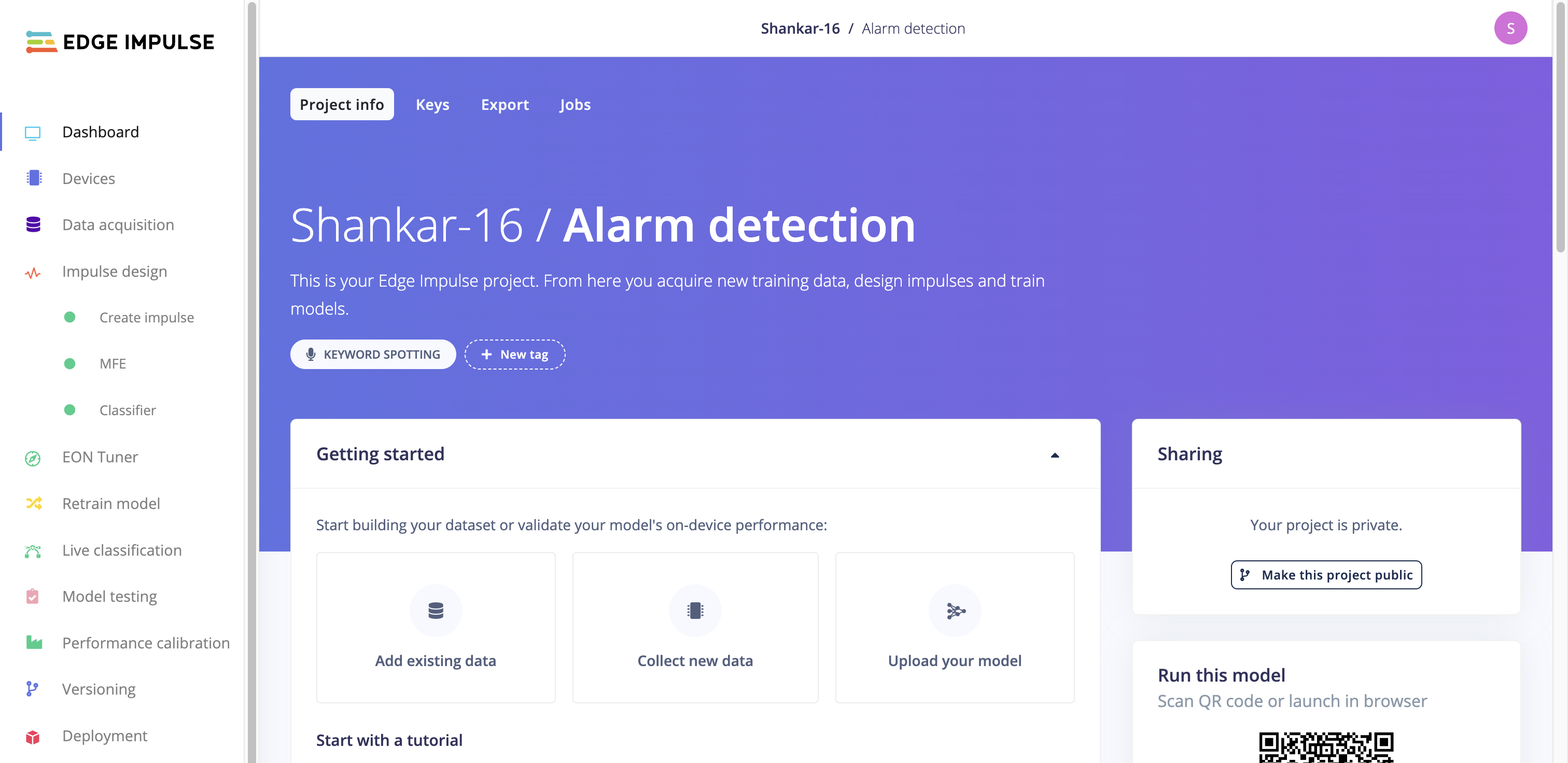
We here aim to classify fire alarm sounds based on their audio characteristics. This project will serve as our guide to exploring the capabilities of EI Studio.

To kickstart our journey with EI Studio, we require a TinyML-supported device. The studio officially supports a variety of MCUs, ensuring compatibility with popular development boards. However, don't fret if you lack a development board; a mobile phone can suffice for data acquisition and model testing. In the upcoming section, we will delve into the process of data acquisition and impulse design, unraveling the potential of EI Studio.

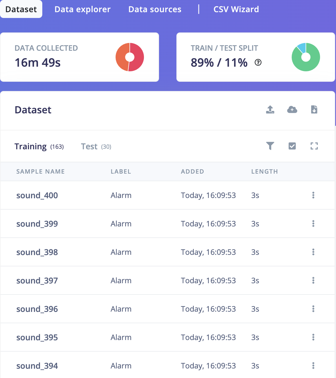
To construct this model, the initial step involves collecting audio data for training the machine learning model. The primary objective is to train the model to distinguish the distinct sound of a Fire Alarm from ambient noise. Alarm and Noise audio samples are gathered in the Data Acquisition tab. The dataset follows a 90:10 ratio, with 90% allocated for training and 10% for testing. Once the setup is completed, we can design the impulse, which will be discussed in detail below.

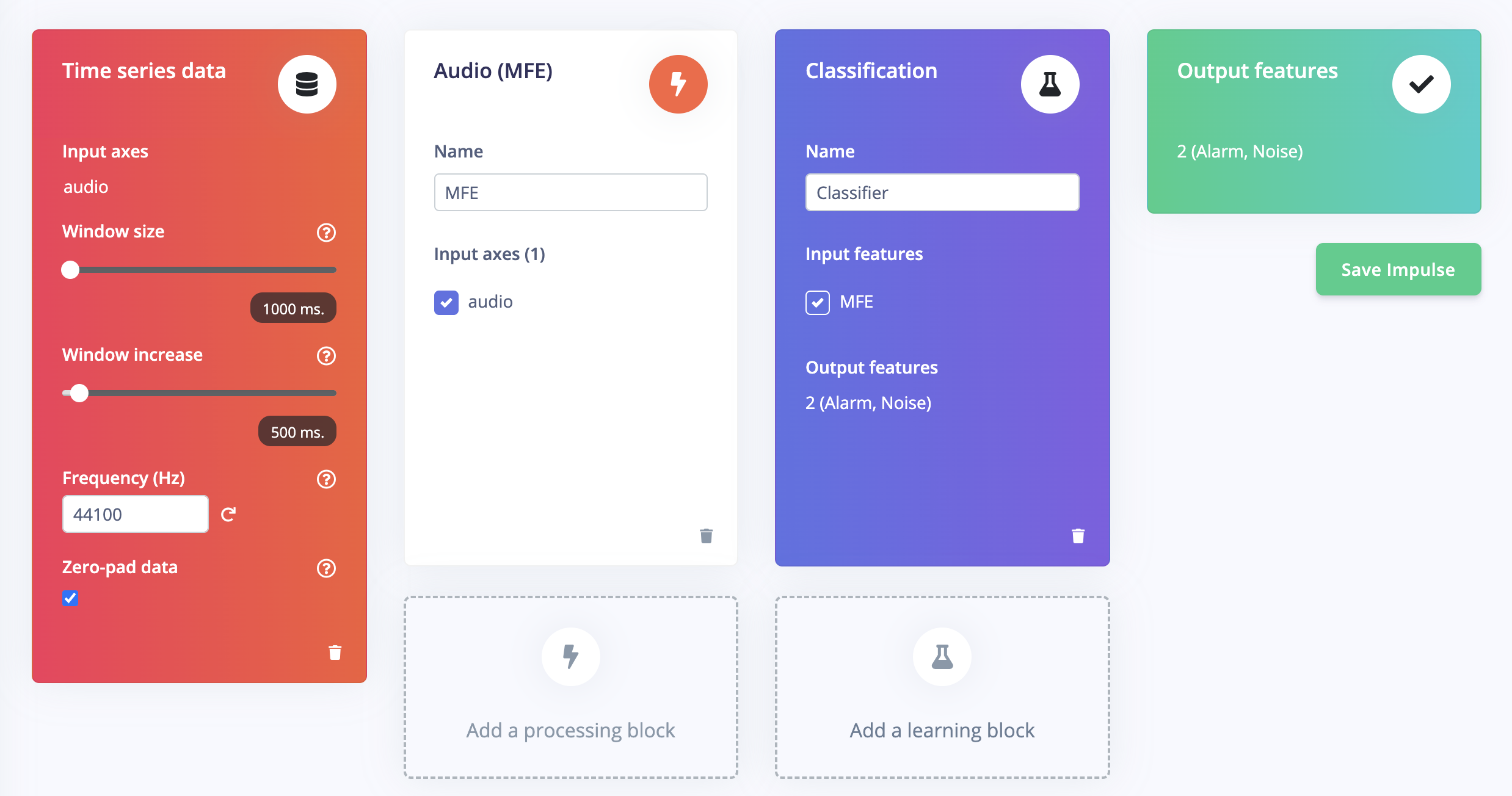
Once you have prepared the training set, the next step is to create an impulse. An impulse takes the raw data and divides it into smaller windows. In each window, signal processing blocks are applied to extract relevant features. In this case, we can include processing and learning blocks.

For the processing block, we have opted for MFE (Mel-filterbank energy), which is highly effective in extracting spectrograms from audio signals. It utilizes Mel-filterbank energy features, making it particularly useful for non-voice audio. This processing block enables us to capture essential characteristics of the audio data.

On the other hand, for the learning block, we have chosen Classifier. This learning block can learn patterns from the training data and apply this knowledge to recognize audio in new data accurately. It plays a crucial role in the classification process, ensuring that our model can make precise predictions based on the learned patterns.

By combining the MFE processing block and the Classifier learning block, we create a powerful impulse that can effectively process and classify audio data.

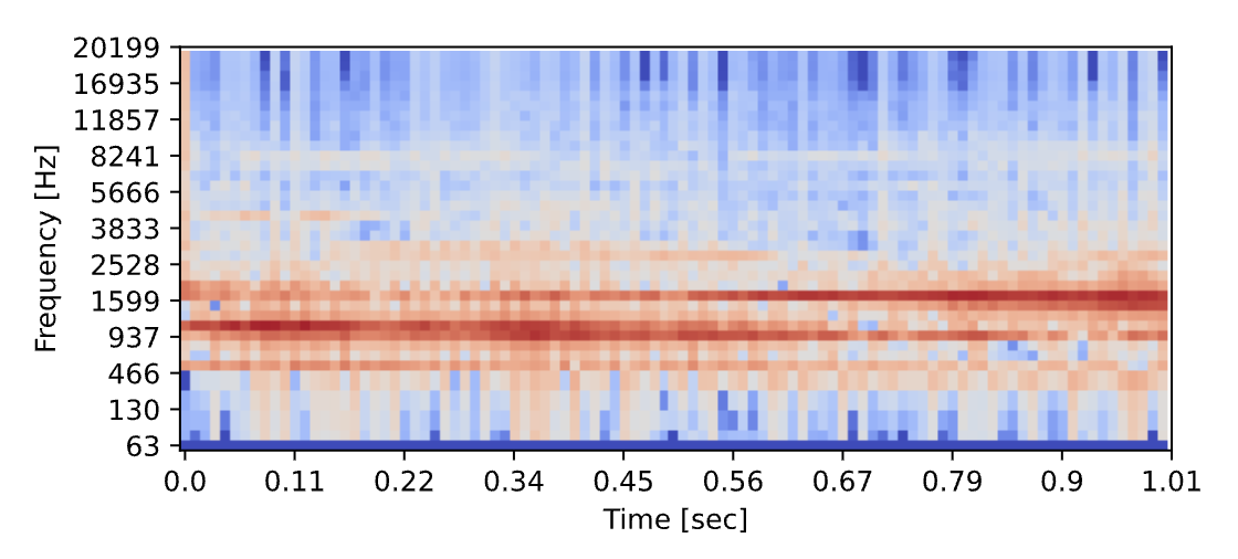
In this feature, you can configure the MFE (Mel-filterbank energy) block and preview the resulting data transformation. The purpose of the MFE block is to convert a window of audio into a tabular format, where each row corresponds to a different frequency range, and each column represents a specific time interval. Within this table, each cell represents a specific frequency range during a particular period and contains the corresponding amplitude value.

The spectrogram is generated to provide a visual representation of this tabular data. The spectrogram uses colored blocks to represent the amplitude values within the table. The intensity of each colored block corresponds to the amplitude value it represents. By observing the spectrogram, you can gain insights into the frequency distribution and power of the audio signal.

The spectrograms of the alarm and noise samples derived from the MFE feature are shown below for reference and better understanding. These visual representations provide a helpful visual reference to analyze the characteristics of the audio signals and their corresponding amplitude values.

The spectrograms generated by the MFE block play a crucial role in training a robust neural network architecture that excels at recognizing patterns in tabular data. Before preparing the neural network, generating MFE blocks for all the audio windows is essential, which may take some time due to the processing involved.

Neural networks are advanced algorithms inspired by the intricate workings of the human brain. They possess the remarkable ability to learn and identify patterns within their training data. In our case, the specific neural network we are training takes the MFE spectrogram as input and aims to classify it into one of two classes: Noise or Alarm.

As the MFE spectrogram is fed into the neural network, it enters the first layer of neurons. Each neuron in this layer processes and modifies the information based on its internal state. The output from the first layer is then passed to the subsequent layers, where further transformations occur. This sequential process continues until the final layers of the neural network, resulting in a highly refined and distinctive output.

Python is the programming language to develop and customize the NN classifier. Python offers many libraries and tools specifically designed for neural network development, making it a flexible and powerful platform.

import tensorflow as tf
from tensorflow.keras.models import Sequential
from tensorflow.keras.layers import Dense, InputLayer, Dropout, Conv1D, Conv2D, Flatten, Reshape, MaxPooling1D, MaxPooling2D, AveragePooling2D, BatchNormalization, TimeDistributed, Permute, ReLU, Softmax
from tensorflow.keras.optimizers import Adam
EPOCHS = args.epochs or 100
LEARNING_RATE = args.learning_rate or 0.005

# this controls the batch size, or you can manipulate the tf.data.Dataset objects yourself
BATCH_SIZE = 32
train_dataset = train_dataset.batch(BATCH_SIZE, drop_remainder=False)
validation_dataset = validation_dataset.batch(BATCH_SIZE, drop_remainder=False)

# model architecture
model = Sequential()
model.add(Reshape((int(input_length / 40), 40), input_shape=(input_length, )))
model.add(Conv1D(8, kernel_size=3, padding='same', activation='relu'))
model.add(MaxPooling1D(pool_size=2, strides=2, padding='same'))
model.add(Dropout(0.25))
model.add(Conv1D(16, kernel_size=3, padding='same', activation='relu'))
model.add(MaxPooling1D(pool_size=2, strides=2, padding='same'))
model.add(Dropout(0.25))
model.add(Flatten())
model.add(Dense(classes, name='y_pred', activation='softmax'))

# this controls the learning rate
opt = Adam(learning_rate=LEARNING_RATE, beta_1=0.9, beta_2=0.999)
callbacks.append(BatchLoggerCallback(BATCH_SIZE, train_sample_count, epochs=EPOCHS))

# train the neural network
model.compile(loss='categorical_crossentropy', optimizer=opt, metrics=['accuracy'])
model.fit(train_dataset, epochs=EPOCHS, validation_data=validation_dataset, verbose=2, callbacks=callbacks)

# Use this flag to disable per-channel quantization for a model.
# This can reduce RAM usage for convolutional models, but may have
# an impact on accuracy.
disable_per_channel_quantization = False

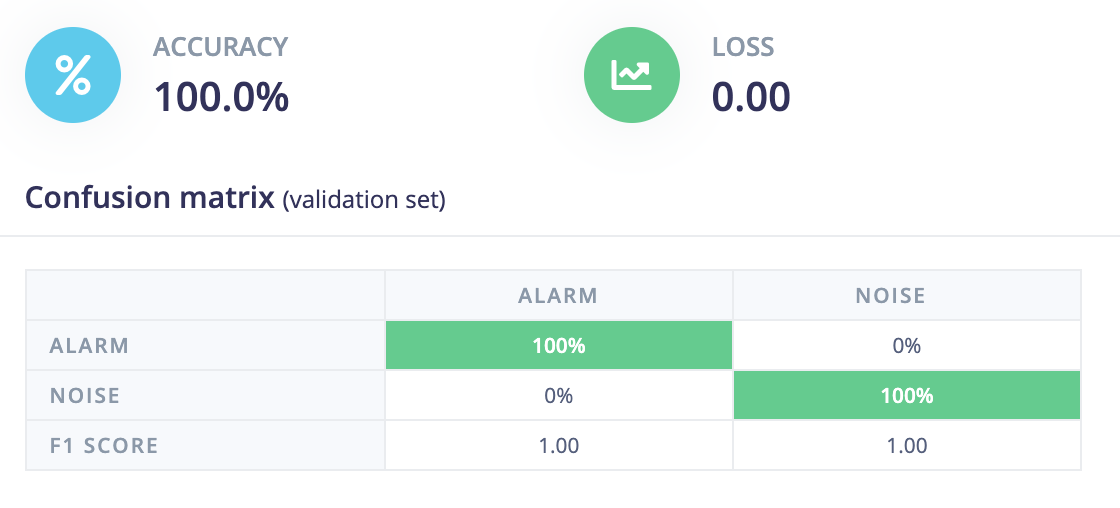
The Confusion matrix provides a comprehensive visual representation of the accuracy and distribution of classified windows. It offers valuable insights into the balance between correctly and incorrectly classified instances. The accompanying screenshot shows that all the alarm and noise audio windows have been accurately classified without misclassifying. This outcome showcases the model's impressive performance and indicates a favorable result.

Accuracy of the Model

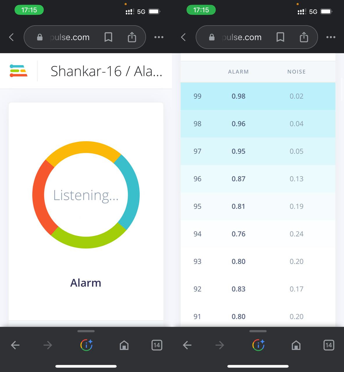
Edge Impulse provides valuable tools for evaluating and testing our model, ensuring its accuracy and effectiveness. One handy feature is capturing real-time data directly from our device and promptly classifying it. This feature allows us to connect our mobile phones to gather accurate data for testing purposes. This ensures that our model is evaluated with real-world data, enhancing its reliability and performance.

The testing phase results, specifically for the Alarm class, are presented below. These results provide valuable insights into the model's classification performance, highlighting its ability to distinguish and classify instances of the Alarm sound accurately.

We can assess the model's ability to effectively recognize and classify real-time data through the testing process, ensuring its reliability and suitability for practical applications. By leveraging Edge Impulse's robust testing capabilities, we can fine-tune our model and improve its overall performance based on the results.

After designing, training, and validating the impulse, We can deploy the model back to my device. This enables the model to run offline, reducing latency and minimizing power consumption. Edge Impulse provides a convenient solution by packaging the complete impulse, including the MFE algorithm, neural network weights, and classification code, into a single C++ library. We can easily include this library in any embedded software for seamless integration.

Alright!, You now know to acquire data, design Impulse and utilize Edge Impulse to train a neural network model that can recognize a specific sound. The applications for such a model are limitless, ranging from monitoring industrial machinery to identifying voice commands. Once you have completed the model training process, you can seamlessly integrate your Impulse into the firmware of your own embedded device.

Conclusion

To summarize, Tiny Machine Learning (TinyML) represents an exciting intersection of machine learning and embedded systems, enabling small computing devices to possess powerful machine learning capabilities. We also discussed the essential steps in creating a TinyML project using Edge Impulse. From gathering and preparing the training data to designing the impulse and configuring the necessary blocks, we explored the intricacies of the process. The ability to generate spectrograms using the MFE block and train a neural network for accurate audio recognition showcased the power of TinyML in practical applications.

So, why wait? Start exploring the world of TinyML today and witness the transformative impact it can have on smart embedded devices. Let's unlock the potential of this exciting technology and shape the future of intelligence.

References

TinyML foundation

Edge Impulse documentation

Edge Impulse Github

A Python demo/repos link

No response

PayPal Link for Donation (Python Storyteller)

No response

Punk Idea: Story Share & Donation Button

Is your mind blowing punk idea is something that wrong different then other.

discord: darkterminal

Tell me what you want to suggest

As we know about street culture, we doing freestyle and people clapping their hand and give feedback for us. What they can do for us? They can leave a comments, share our story, and make donation about our story. It's that good?

Unleashing the Power of Google Maps API in Your React App

The Back Story about your Javascript Metaphor

Hello punk, location-based apps have become increasingly popular, and the Google Maps API is a fundamental tool for developers to build apps that require location services. However, integrating Google Maps API with a React application can be a challenge. In this metaphor story, I will explore how to use the Google Maps API in a React app to create a MapLine component that displays a line between two points on the map. We will also discuss a utility function called toObjectCoordinate that converts a latitude and longitude string into an object with lat and lng properties.

The javascript Story!

The Brief

Google Maps API is a powerful tool that provides developers with a range of location-based services to integrate into their applications. The MapLine component I will write in in this metaphor story uses the Google Maps API to display a line between two points on the map. I will use the useEffect hook in React to load the API and create the map, and the useRef hook to get a reference to the HTML element that will display the map.

The MapLine Component

The MapLine component takes several props, including an:

  • API key
  • the center point of the map
  • the zoom level
  • and an array of points that define the line.

In my example, I use the toObjectCoordinate utility function to convert two latitude and longitude strings into objects with lat and lng properties.

<MapLine
    apiKey={maps.key}
    center={toObjectCoordinate(currentLocation, true)}
    points={[
      toObjectCoordinate(currentLocation, true),
      toObjectCoordinate(modalData.customerCoordinate, true),
    ]} 
    zoom={10}
/>

The Utility

The toObjectCoordinate function takes a latitude and longitude string as an argument and returns an object with lat and lng properties. The second argument is a boolean that indicates whether the function should convert the string values to numbers or return them as strings. The function splits the string by comma and returns an object with lat and lng properties.

export default function toObjectCoordinate(latLong, toNumber = false) {
    const index = latLong.split(',')
    return {
        lat: toNumber ? Number(index[0]) : index[0],
        lng: toNumber ? Number(index[1]) : index[1],
    }
}

Implementation

The useEffect hook in the MapLine component loads the Google Maps API using the Loader object provided by the @googlemaps/js-api-loader package. Once the API is loaded, we create a new instance of the google.maps.Map object, set the center and zoom level, and add a new google.maps.Polyline object that represents the line between the two points. I also create a new google.maps.Marker object for each point on the line and add them to the map.

import React, { useEffect, useRef } from 'react';
import { Loader } from '@googlemaps/js-api-loader';

const MapLine = ({ apiKey, center, zoom, points, twStyle = 'w-full h-52' }) => {
    const mapRef = useRef(null);

    useEffect(() => {
        const loader = new Loader({
            apiKey: apiKey,
            version: 'weekly',
        });

        loader.load().then(() => {
            if (mapRef.current instanceof Element) {
                const map = new google.maps.Map(mapRef.current, {
                    center: center,
                    zoom: zoom,
                });

                // Create a new line from point A to point B
                const line = new google.maps.Polyline({
                    path: points,
                    geodesic: true,
                    strokeColor: '#FF0000',
                    strokeOpacity: 1.0,
                    strokeWeight: 2,
                });

                // Set the line on the map
                line.setMap(map);

                const bounds = new google.maps.LatLngBounds();
                points.forEach((point) => bounds.extend(point));
                map.fitBounds(bounds);

                // Add a marker to each point on the line
                points.forEach((point) => {
                    new google.maps.Marker({
                        position: point,
                        map: map,
                    });
                });

                // Hide the map control
                map.setOptions({ disableDefaultUI: true });
            }
        });
    }, [apiKey, center, zoom]);

    return <div ref={mapRef} className={twStyle} />;
};

export default MapLine;

The Conclusion

In conclusion, Google Maps API is a powerful tool for developers to create location-based applications. Integrating Google Maps API with a React application can be challenging, but using the useEffect and useRef hooks in combination with the @googlemaps/js-api-loader package can make the process smoother. The MapLine component discussed in this metaphor story uses the Google Maps API to display a line between two points on the map and utilizes a toObjectCoordinate utility function that converts a latitude and longitude string into an object with lat and lng properties. With this knowledge, developers can unlock the power of Google Maps API in their React applications.

image

A Javascript demo/repos link

No response

PayPal Link for Donation (Javascript Storyteller)

https://www.paypal.me/lazarusalhambra

Migrate CRA to Vite Without Changing Any Old Files

The Back Story about this Metaphor

Migrate CRA to Vite Without Changing Any Old Files

Metaphore story

When I need more speed in development phase, I choose Vite to boost my development workflow. But I have old (slow) CRA before.

Here my old CRA Directory Structure

whats-my-app/
  README.md
  .env
  node_modules/
  package.json
  public/
    index.html
    favicon.ico
  src/
    assets/
    components/
    utils/
    App.js
    index.css
    index.js

But wait... Vite work out of the book using .tsx and .jsx when first initial create vite app. But my old metaphor have .js extension and I don't want to rename and changing my old metaphor base.

So, here the step to chill and migrate...

  1. Create file vite.config.js in the root directory
import { defineConfig, loadEnv } from 'vite'
import react from '@vitejs/plugin-react'
import fs from 'fs/promises'

// https://vitejs.dev/config/
export default ({ mode }) => {
  process.env = Object.assign(process.env, loadEnv(mode, process.cwd(), ''))

  return defineConfig({
    build: {
      outDir: 'build'
    },
    server: {
      port: process.env.VITE_PORT
    },
    esbuild: {
      loader: "jsx",
      include: /src\/.*\.jsx?$/,
      exclude: [],
    },
    optimizeDeps: {
      esbuildOptions: {
        plugins: [
          {
            name: "load-js-files-as-jsx",
            setup(build) {
              build.onLoad({ filter: /src\/.*\.js$/ }, async (args) => ({
                loader: "jsx",
                contents: await fs.readFile(args.path, "utf8"),
              }));
            },
          },
        ],
      },
    },
    plugins: [
      react()
    ],
  })
}
  1. Remove all react-scripts command and package in package.json
{
    // ...other mataphor
   "scripts": {
        "dev": "vite",
        "build": "vite build",
        "preview": "vite preview"
     }
    // ...other mataphor
]
  1. Move index.html from public directory to root of project, and also make sure:
<!DOCTYPE html>
<html lang="en">
  <head>
    <meta charset="UTF-8" />
    <link rel="icon" type="image/svg+xml" href="/logo/logo.png" />
    <meta name="viewport" content="width=device-width, initial-scale=1.0" />
    <title>Vite + React</title>
  </head>
  <body>
    <div id="root"></div>
    <!--- include your src/index.js file here --->
    <script type="module" src="/src/index.js"></script>
  </body>
</html>
  1. Change env variable prefix REACT_APP_ with VITE_
  2. Install vite as dev dependencies npm i --save-dev @types/react @types/react-dom @vitejs/plugin-react vite

Here my new directory structure

whats-my-app/
  README.md
  .env
  node_modules/
  package.json
  public/
    favicon.ico
  src/
    assets/
    components/
    utils/
    App.js
    index.css
    index.js
  vite.config.js
  index.html

That's it! Enjoy your speed....

A demo/repos link

No response

A Central Sidebar Menu Configuration

The Backstory about your JavaScript Metaphor

As I embarked upon the realm of crafting a Next.js project infused with TypeScript, I encountered a profound necessity—a central sidebar menu configuration that would bestow upon us a realm of consistency and scalability. Our noble objective was to fashion a malleable menu system, one that could gracefully accommodate updates and bespoke alterations across an array of pages and components. With TypeScript as our steadfast companion, we sought to harness its formidable power of static typing, thereby fortifying our code with unwavering reliability and unwaning maintainability. Armed with meticulous planning and ingenious design, we embarked upon a grand odyssey—a quest to forge a central sidebar menu configuration, an embodiment of harmonized navigation, and a guarantee of a sublime user experience throughout our illustrious endeavor.

The JavaScript Story!

As we are well aware, when treading the realms of TypeScript, it is incumbent upon us to fashion meticulous definitions. These exquisite artifacts bestow upon us the power to discern errors swiftly during the development process and promptly rectify them.

I am embarking on a project utilizing Next.js App Router and Shadcn-UI. This endeavor marks a new and momentous chapter in my career as a Software Freestyle Engineer.

The Abstract Definition

In the vein of crafting a research journal, I am compelled to fashion an abstract that shall subsequently unfold into a captivating phenomenon of eloquent prose, adorned with a hint of narcissistic flair.

// Filename: types/sidebar.ts
export interface SubmenuItems {
    label: string;
    link: string;
}

export interface NavItems {
    label: string;
    icon: React.ReactElement | undefined;
    link: string;
    isParent: boolean;
    subMenu?: SubmenuItems[];
}

export interface SidebarProps extends React.HTMLAttributes<HTMLDivElement> {
    menus: NavItems[];
}

The following code presents a comprehensive definition of TypeScript interfaces and React component prop types for a sidebar component.

  • The SubmenuItems interface delineates the composition of submenu items within the sidebar. It encompasses two properties: label, denoting the label for the submenu item, and link, representing the associated URL link.

  • The NavItems interface outlines the structure of navigation items within the sidebar. It encompasses properties such as label for the navigation item label, icon for the corresponding React element depicting the item's icon, link for the associated URL link, isParent to indicate the presence of submenus, and an optional subMenu property of type SubmenuItems[], which facilitates the definition of an array of submenu items.

  • The SidebarProps interface extends the HTML attributes of a div element and introduces a menus property of type NavItems[]. This property allows for the definition of an array of navigation items to be passed as props to the sidebar component.

In essence, this code provides a structured approach to defining types and props required for a sidebar component, promoting seamless utilization and type-checking within a React application.

A Central Sidebar Configuration

A well-designed sidebar menu like this one is a testament to the power of intuitive UI/UX, providing users with a clear and structured path to navigate through various sections of an application

// Filename: config/sideMenu.tsx
import { NavItems } from "@/types/sidebar";
import { Icons } from "@/components/icons";

export const sideMenu: NavItems[] = [
  {
    label: "Master Data",
    icon: undefined,
    link: "javascript:;",
    isParent: false,
  },
  {
    label: "Master Korcam",
    icon: <Icons.userSquare className="w-4 h-4" />,
    link: "/dashboard/master-korcam",
    isParent: false,
  },
  {
    label: "Master Kordes",
    icon: <Icons.userSquare className="w-4 h-4" />,
    link: "/dashboard/master-kordes",
    isParent: false,
  },
  {
    label: "Master Korlap",
    icon: <Icons.userSquare className="w-4 h-4" />,
    link: "/dashboard/master-korlap",
    isParent: false,
  },
  {
    label: "Master Pemilih",
    icon: <Icons.userSquare className="w-4 h-4" />,
    link: "/dashboard/master-pemilih",
    isParent: false,
  },
  {
    label: "Settings",
    icon: <Icons.settings className="w-4 h-4" />,
    link: "/settings",
    isParent: true,
    subMenu: [
      {
        label: "Profile",
        link: "/settings/profile",
      },
      {
        label: "Preferences",
        link: "/settings/preferences",
      },
    ],
  },
]

The provided code establishes an arrangement for the sidebar navigation menu within a dashboard or application through the definition of an array named sideMenu, having a type of NavItems[].

Each element within the sideMenu array represents a distinct menu item within the sidebar. These elements possess properties such as label for the menu item's label, icon for associating an icon with the menu item (utilizing the Icons component), link for the corresponding URL link, and isParent to signify whether the menu item contains submenus.

The code initializes the sideMenu array with various menu items. For instance, "Master Data" serves as a top-level item without an icon. Additionally, other items such as "Master Korcam," "Master Kordes," and so forth, are equipped with icons sourced from the Icons component, along with their respective links.

Furthermore, there exists a "Settings" menu item adorned with the "settings" icon, and isParent is set to true, indicating the presence of submenus. The submenus themselves are defined within the subMenu property as an array of objects comprising label and link properties.

All in all, this code establishes the configuration for a sidebar menu, encompassing an array of menu items complete with labels, icons, links, and submenus. This configuration can be employed to render the sidebar navigation within a React application.

The Sidebar Component

Once we have abstracted our imagination and begun unraveling it into a journey towards the dream we desire—an exquisite center of command for the sidebar menu in our application—it is now time to execute our intentions and bring forth the creation of the sidebar menu component.

// Filename: components/sidebar.tsx
"use client"

import Link from "next/link"
import { usePathname } from "next/navigation"

import {
  Accordion,
  AccordionContent,
  AccordionItem,
  AccordionTrigger,
} from "@/components/ui/accordion"
import { Button, buttonVariants } from "@/components/ui/button"
import { ScrollArea } from "@/components/ui/scroll-area"
import { cn } from "@/lib/utils"
import { SidebarProps } from "@/types/sidebar"

import { Icons } from "./icons"

export function Sidebar({ className, menus }: SidebarProps) {
  const pathname = usePathname()
  return (
    <div className={cn("pb-12", className)}>
      <div className="space-y-4 pb-2">
        <div className="py-2">
          <ScrollArea className="min-h-[300px] max-h-screen px-2">
            <div className="space-y-1 p-2">
              <Link
                className={`${buttonVariants({
                  size: "sm",
                  variant: pathname === "/dashboard" ? "default" : "ghost",
                  align: "flexLeft",
                })}`}
                href={"/dashboard"}
              >
                <span className="inline-flex items-center justify-center gap-1">
                  <Icons.home className="w-4 h-4" /> Dashboard
                </span>
              </Link>
              {menus?.map((menu, i) => {
                if (menu.isParent === false && menu.link === "javascript:;" && menu.icon === undefined) {
                  return <strong key={`${menu}-${i}`} className="font-bold inline-flex items-start justify-start text-xs text-gray-700 dark:text-gray-400">{menu.label}</strong>
                } else if (menu.isParent && menu.link !== "javascript::" && menu.icon !== undefined) {
                  return (
                    <Accordion
                      key={`${menu}-${i}`}
                      type="single"
                      collapsible
                      className="w-full"
                    >
                      <AccordionItem value={`item-${i}`} className="border-b-0">
                        <AccordionTrigger
                          className={buttonVariants({
                            size: "sm",
                            variant:
                              pathname === menu.link ? "default" : "ghost",
                            align: "flexBetween",
                            className: "hover:no-underline",
                          })}
                        >
                          <span className="inline-flex items-center justify-center gap-1">
                            {menu.icon} {menu.label}
                          </span>
                        </AccordionTrigger>
                        <AccordionContent>
                          {menu.subMenu?.map((subItem, subIndex) => (
                            <Button
                              key={`${subIndex}-${i}`}
                              variant="ghost"
                              size="sm"
                              className="w-full justify-start font-normal"
                            >
                              &mdash; {subItem.label}
                            </Button>
                          ))}
                        </AccordionContent>
                      </AccordionItem>
                    </Accordion>
                  )
                } else {
                  return (
                    <Link
                      key={`${menu}-${i}`}
                      className={`${buttonVariants({
                        size: "sm",
                        variant: pathname === menu.link ? "default" : "ghost",
                        align: "flexLeft",
                      })}`}
                      href={menu.link}
                    >
                      <span className="inline-flex items-center justify-center gap-1">
                        {menu.icon} {menu.label}
                      </span>
                    </Link>
                  )
                }
              })}
            </div>
          </ScrollArea>
        </div>
      </div>
    </div>
  )
}

The sidebar menu component will dynamically process and categorize the menus defined in config/sideMenu.tsx. Isn't this truly impressive? We simply need to define the menus we wish to display on the sidebar within a single configuration file.

Here is an illustration showcasing the transformation from the realm of imagination to the realization of our previous endeavors.

[Imagine -> Plan -> Create -> Achieve]

  1. Imagination: Visualizing the concept of a dynamic sidebar menu configuration.
  2. Planning: Mapping out the structure and properties of the menu items.
  3. Creation: Implementing the code to define the menu items and their characteristics.
  4. Achievement: Witnessing the manifestation of our vision as the dynamic sidebar menu comes to life.

This journey exemplifies the power of imagination and execution in bringing ideas to fruition.

[The Graph - 001] - Sidebar Menu Title & Sidebar Menu Items

Graph - 001

[The Graph - 002] - Nested Menu in Sidebar Navigation

Graph - 002

The Live Version of Our Imagination

Peek 2023-05-27 17-52

The Last Freestyle Improvisation

As is my custom, I always strive to innovate upon existing foundations while staying true to my own character as a Software Freestyle Engineer.

The default button component provided by Shadcn-UI may not fully satisfy the imaginative requirements we envision. However, with a few modifications, we can transform it into something truly remarkable.

// Filename: components/ui/button.tsx
import * as React from "react"
import { VariantProps, cva } from "class-variance-authority"

import { cn } from "@/lib/utils"

const buttonVariants = cva(
  "rounded-md text-sm font-medium transition-colors focus-visible:outline-none focus-visible:ring-2 focus-visible:ring-ring focus-visible:ring-offset-2 disabled:opacity-50 disabled:pointer-events-none ring-offset-background",
  {
    variants: {
      variant: {
        default: "bg-primary text-primary-foreground hover:bg-primary/90",
        destructive:
          "bg-destructive text-destructive-foreground hover:bg-destructive/90",
        outline:
          "border border-input hover:bg-accent hover:text-accent-foreground",
        secondary:
          "bg-secondary text-secondary-foreground hover:bg-secondary/80",
        ghost: "hover:bg-accent hover:text-accent-foreground",
        link: "underline-offset-4 hover:underline text-primary",
      },
      size: {
        default: "h-10 py-2 px-4",
        sm: "h-9 py-1.5 px-3 rounded-md",
        lg: "h-11 px-8 rounded-md",
      },
      align: {
        flexLeft: 'flex items-start justify-start',
        flexCenter: 'flex items-center justify-center',
        flexRight: 'flex items-end justify-end',
        flexBetween: 'flex items-center justify-between',
        inlineLeft: 'inline-flex items-start justify-start',
        inlineCenter: 'inline-flex items-center justify-center',
        inlineRight: 'inline-flex items-end justify-end',
        inlineBetween: 'inline-flex items-center justify-between'
      },
    },
    defaultVariants: {
      variant: "default",
      size: "default",
      align: 'flexCenter'
    },
  }
)

export interface ButtonProps
  extends React.ButtonHTMLAttributes<HTMLButtonElement>,
    VariantProps<typeof buttonVariants> {}

const Button = React.forwardRef<HTMLButtonElement, ButtonProps>(
  ({ className, variant, size, ...props }, ref) => {
    return (
      <button
        className={cn(buttonVariants({ variant, size, className }))}
        ref={ref}
        {...props}
      />
    )
  }
)
Button.displayName = "Button"

export { Button, buttonVariants }

And I awoke from a profoundly beautiful dream, only to discover that the dream had indeed become a reality.

A JavaScript demo/repos link

No response

PayPal Link for Donation (JavaScript Storyteller)

No response

Add [React Table Trigger Changed Without SWR]

The Back Story about this Metaphor

React Table Trigger Changed Without SWR

Metaphore story

I'm into the world of javascript and reactjs is absolutely nil! And I found react-table from TanStack and it's really cool! That agnostic (What The Buff!)

And I'm trying to simplify my old way of working with jQuery when I was almost sinking to the bottom of the ocean (Hypertext Preprocessor) and didn't find the light of JavaScript as a complete combat tool more promising.

In jQuery I need to create a function to repeat the request and I trigger it from the targeted event and it's easy.

My question is how can I do the same thing but in react-table by not using any other library.

And here's what happened:

// file: components/TablePagination.js
function TablePagination({
    columns,
    data,
    fetchData,
    loading,
    pageCount: controlledPageCount,
    totalRow,
    actions: Actions
}) {
    const {
        getTableProps,
        getTableBodyProps,
        headerGroups,
        prepareRow,
        page,
        canPreviousPage,
        canNextPage,
        pageOptions,
        pageCount,
        gotoPage,
        nextPage,
        previousPage,
        setPageSize,
        state: { pageIndex, pageSize, globalFilter, sortBy },
        preGlobalFilteredRows,
        setGlobalFilter
    } = useTable(
        {
            columns,
            data,
            manualPagination: true,
            manualGlobalFilter: true,
            manualSortBy: true,
            initialState: {
                pageIndex: 0,
                pageSize: 10
            }, // Pass our hoisted table state
            pageCount: controlledPageCount,
            autoResetSortBy: false,
            autoResetExpanded: false,
            autoResetPage: false
        },
        useGlobalFilter,
        useSortBy,
        usePagination
    );

    const GlobalFilter = ({ preGlobalFilteredRows, globalFilter, setGlobalFilter }) => {
        const count = preGlobalFilteredRows
        const [value, setValue] = React.useState(globalFilter)
        const onChange = useAsyncDebounce(value => {
            setGlobalFilter(value || undefined)
        }, 700)

        return (
            <div className={Actions !== undefined ? 'flex flex-row justify-between' : 'flex flex-col'}>
                {Actions !== undefined ? (<Actions />) : null}
                <input
                    value={value || ""}
                    onChange={e => {
                        setValue(e.target.value);
                        onChange(e.target.value);
                    }}
                    placeholder={`${count} records...`}
                    type="search"
                    className={`input input-bordered input-sm w-full max-w-xs focus:outline-0 mb-2 ${Actions !== undefined ? '' : 'self-end'}`}
                />
            </div>
        )
    }

    React.useEffect(() => {
        let search = globalFilter === undefined ? '' : globalFilter
        fetchData(pageSize, pageIndex, search);
    }, [fetchData, pageIndex, pageSize, globalFilter, sortBy]);

    return (
        <>
            <GlobalFilter
                preGlobalFilteredRows={totalRow}
                globalFilter={globalFilter}
                setGlobalFilter={setGlobalFilter}
            />
            <div className="overflow-x-auto">
                <table {...getTableProps()} className='table table-compact table-zebra w-full'>
                    <thead>
                        {headerGroups.map(headerGroup => (
                            <tr {...headerGroup.getHeaderGroupProps()}>
                                {headerGroup.headers.map(column => (
                                    <th {...column.getHeaderProps(column.getSortByToggleProps())}>
                                        <span>
                                            {column.isSorted ? column.isSortedDesc ? <ArrowLongDownIcon className='h-4 w-4 inline mr-1' /> : <ArrowLongUpIcon className='h-4 w-4 inline mr-1' /> : <FunnelIcon className='h-4 w-4 inline mr-1' />}
                                        </span>
                                        {column.render('Header')}
                                    </th>
                                ))}
                            </tr>
                        ))}
                    </thead>
                    <tbody {...getTableBodyProps()}>
                        {page.length > 0 ? page.map((row, i) => {
                            prepareRow(row)
                            return (
                                <tr {...row.getRowProps()} className='hover'>
                                    {row.cells.map(cell => {
                                        return <td {...cell.getCellProps()}>{cell.render('Cell')}</td>
                                    })}
                                </tr>
                            )
                        }) : (<tr className='hover'>
                            <td colSpan={10000} className='text-center'>Data not found!</td>
                        </tr>)}
                        {loading ? (
                            <tr>
                                <td colSpan="10000">Loading...</td>
                            </tr>
                        ) : null}
                    </tbody>
                </table>
            </div>
            <div className="flex flex-row justify-between">
                <div className='mt-2'>
                    <span>
                        Halaman{' '}
                        <strong>
                            {pageIndex + 1} dari {pageOptions.length}
                        </strong>{' '}
                        Total <strong>{preGlobalFilteredRows.length}</strong>{' '}
                    </span>
                    <span>
                        | Lompat ke halaman:{' '}
                        <input
                            type="number"
                            defaultValue={pageIndex + 1}
                            onChange={e => {
                                const page = e.target.value ? Number(e.target.value) - 1 : 0
                                gotoPage(page)
                            }}
                            className="input input-bordered input-sm w-20 max-w-xs focus:outline-0"
                        />
                    </span>{' '}
                    <select
                        value={pageSize}
                        onChange={e => {
                            setPageSize(Number(e.target.value))
                        }}
                        className="select select-bordered select-sm w-30 max-w-xs focus:outline-0"
                    >
                        {[10, 20, 30, 40, 50].map(pageSize => (
                            <option key={pageSize} value={pageSize}>
                                Tampilkan {pageSize} baris
                            </option>
                        ))}
                    </select>
                </div>
                <div className='mt-2'>
                    <button className='btn btn-xs' onClick={() => gotoPage(0)} disabled={!canPreviousPage}>
                        {'<<'}
                    </button>{' '}
                    <button className='btn btn-xs' onClick={() => previousPage()} disabled={!canPreviousPage}>
                        {'<'}
                    </button>{' '}
                    <button className='btn btn-xs' onClick={() => nextPage()} disabled={!canNextPage}>
                        {'>'}
                    </button>{' '}
                    <button className='btn btn-xs' onClick={() => gotoPage(pageCount - 1)} disabled={!canNextPage}>
                        {'>>'}
                    </button>{' '}
                </div>
            </div>
        </>
    );
}

export default TablePagination

What I really want is that when I update data from a modal component (child), I can trigger the previous component (parent) I have to refresh the data in the table after a data change.

// file: pages/Example.js (parent)
function Example() {

    const [data, setData] = useState([]);
    const [loading, setLoading] = useState(false)
    const [pageCount, setPageCount] = useState(0)
    const [totalRow, setTotalRow] = useState(0)
    const [refresh, setRefresh] = useState(false)

    const fetchData = useCallback(async (pageSize, pageIndex, search) => {
        setLoading(true)
        const queryOptions = {
            page: pageIndex,
            limit: pageSize,
            search: search
        }
        const customers = await customerDatatable(queryOptions)

        setData(customers.data)
        setPageCount(customers.pagination.totalPage)
        setTotalRow(customers.pagination.totalRow)
        setLoading(false)
        setRefresh(false)
    }, [refresh]);

    const columns = useMemo(
        () => [
            ....,
            {
                Header: 'Actions',
                accessor: (row) => {
                    return (
                        <div className='flex flex-row w-38'>
                            <ReuseableModal modalId={`modalEdit-${row.customer_uuid}`} btnClassName={`btn-xs btn-info mr-2`} btnContent={<PencilSquareIcon className='h-3 w-3' />} width='w-11/12 max-w-5xl'>
                                // here the child
                                <FormEdit data={row} setRefresh={setRefresh} modalTarget={row.customer_uuid} />
                            </ReuseableModal>
                        </div>
                    )
                },
                disableSortBy: true
            }
        ],
        []
    );

    return (
        <Fragment>
            <Helmet>
                <title>Example</title>
            </Helmet>
            <section className='p-3'>
                <div className="bg-base-300 p-3 rounded">
                    <TablePagination
                        columns={columns}
                        data={data}
                        fetchData={fetchData}
                        loading={loading}
                        pageCount={pageCount}
                        totalRow={totalRow}
                    />
                </div>
            </section>
        </Fragment>
    )
}

export default PelangganAktif
}

And here the modal popup

// file: components/modal/FormEdit.js (child)
function FormEdit({ data, setRefresh, modalTarget }) {

    const { addToast } = useToast()
    const initValues = data

    const formSubmit = async (values) => {
        const updated = await customerUpdate(values)
        if (updated.type === 'success') {
            addToast('success', 'top-right', 'Data updated!', `${data.profiles.fullname} detail updated`, 5000)
            document.getElementById(`modalEdit-${modalTarget}`).click()
            setRefresh(true)
            resetForm()
        } else {
            addToast('error', 'top-right', 'Data failed to update!', `${data.profiles.fullname} defail failed to update`, 5000)
        }
    }

    const { values, errors, touched, handleChange, handleSubmit, resetForm } = useFormik({
        initialValues: initValues,
        onSubmit: formSubmit,
        enableReinitialize: true
    })
    
    return // your form here
}

export default FormEdit

That's it!

A demo/repos link

No response

React Table - Sever Side Pagination, Search, Sort/Order

Metaphore Name

React Table - Sever Side Pagination, Search, Sort/Order

Share your metaphore story!

React-Table-Sever-Side-Pagination-Search-Sort-Order

TLDR

This is a complete guide how I manage datatable in React JS project using react-table and prisma ORM. Let's start!

Client Side

// Component Filename: TablePagination.js

import {
    ArrowLongDownIcon,
    ArrowLongUpIcon,
    FunnelIcon,
} from "@heroicons/react/24/outline"
import { ClockIcon } from "@heroicons/react/24/solid"
import React from "react"
import {
    useAsyncDebounce,
    useGlobalFilter,
    usePagination,
    useSortBy,
    useTable,
} from "react-table"

function TablePagination({
    columns,
    data,
    fetchData,
    loading,
    pageCount: controlledPageCount,
    totalRow,
    actions: Actions,
}) {
    const {
        getTableProps,
        getTableBodyProps,
        headerGroups,
        prepareRow,
        page,
        canPreviousPage,
        canNextPage,
        pageOptions,
        pageCount,
        gotoPage,
        nextPage,
        previousPage,
        setPageSize,
        state: { pageIndex, pageSize, globalFilter, sortBy },
        preGlobalFilteredRows,
        setGlobalFilter,
    } = useTable(
        {
            columns,
            data,
            manualPagination: true,
            manualGlobalFilter: true,
            manualSortBy: true,
            initialState: {
                pageIndex: 0,
                pageSize: 10,
            }, // Pass our hoisted table state
            pageCount: controlledPageCount,
            autoResetSortBy: false,
            autoResetExpanded: false,
            autoResetPage: false,
        },
        useGlobalFilter,
        useSortBy,
        usePagination
    )

    const GlobalFilter = ({
        preGlobalFilteredRows,
        globalFilter,
        setGlobalFilter,
    }) => {
        const count = preGlobalFilteredRows
        const [value, setValue] = React.useState(globalFilter)
        const onChange = useAsyncDebounce((value) => {
            setGlobalFilter(value || undefined)
        }, 700)

        return (
            <div
                className={
                    Actions !== undefined
                        ? "flex flex-row justify-between"
                        : "flex flex-col"
                }
            >
                {Actions !== undefined ? <Actions /> : null}
                <input
                    value={value || ""}
                    onChange={(e) => {
                        setValue(e.target.value)
                        onChange(e.target.value)
                    }}
                    placeholder={`${count} records...`}
                    type="search"
                    className={`input input-bordered input-sm w-full max-w-xs focus:outline-0 mb-2 ${
                        Actions !== undefined ? "" : "self-end"
                    }`}
                />
            </div>
        )
    }

    React.useEffect(() => {
        let search = globalFilter === undefined ? "" : globalFilter
        fetchData(pageSize, pageIndex, search, sortBy)
    }, [fetchData, pageIndex, pageSize, globalFilter, sortBy])

    return (
        <>
            <GlobalFilter
                preGlobalFilteredRows={totalRow}
                globalFilter={globalFilter}
                setGlobalFilter={setGlobalFilter}
            />
            <div className="overflow-x-auto relative">
                <table
                    {...getTableProps()}
                    className="table table-compact table-zebra w-full"
                >
                    <thead>
                        {headerGroups.map((headerGroup) => (
                            <tr {...headerGroup.getHeaderGroupProps()}>
                                {headerGroup.headers.map((column) => (
                                    <th
                                        {...column.getHeaderProps(
                                            column.getSortByToggleProps()
                                        )}
                                    >
                                        <span>
                                            {column.isSorted ? (
                                                column.isSortedDesc ? (
                                                    <ArrowLongDownIcon className="h-4 w-4 inline mr-1" />
                                                ) : (
                                                    <ArrowLongUpIcon className="h-4 w-4 inline mr-1" />
                                                )
                                            ) : (
                                                <FunnelIcon className="h-4 w-4 inline mr-1" />
                                            )}
                                        </span>
                                        {column.render("Header")}
                                    </th>
                                ))}
                            </tr>
                        ))}
                    </thead>
                    <tbody {...getTableBodyProps()}>
                        {page.length > 0 ? (
                            page.map((row, i) => {
                                prepareRow(row)
                                return (
                                    <tr
                                        {...row.getRowProps()}
                                        className="hover"
                                    >
                                        {row.cells.map((cell) => {
                                            return (
                                                <td {...cell.getCellProps()}>
                                                    {cell.render("Cell")}
                                                </td>
                                            )
                                        })}
                                    </tr>
                                )
                            })
                        ) : (
                            <tr className="hover">
                                <td colSpan={10000} className="text-center">
                                    Data not found!
                                </td>
                            </tr>
                        )}
                    </tbody>
                </table>
                {loading ? (
                    <div className="absolute top-0 bottom-0 left-0 right-0 bg-black bg-opacity-5 rounded-md z-20 flex items-center justify-center">
                        <div className="absolute p-3 bg-white w-36 shadow-md rounded-md text-center">
                            <div className="flex animate-pulse">
                                <ClockIcon className="w-6 h-6 mr-1" />{" "}
                                <span>Loading...</span>
                            </div>
                        </div>
                    </div>
                ) : null}
            </div>
            <div className="flex flex-row justify-between">
                <div className="mt-2">
                    <span>
                        Halaman{" "}
                        <strong>
                            {pageIndex + 1} dari {pageOptions.length}
                        </strong>{" "}
                        Total <strong>{preGlobalFilteredRows.length}</strong>{" "}
                    </span>
                    <span>
                        | Lompat ke halaman:{" "}
                        <input
                            type="number"
                            defaultValue={pageIndex + 1}
                            onChange={(e) => {
                                const page = e.target.value
                                    ? Number(e.target.value) - 1
                                    : 0
                                gotoPage(page)
                            }}
                            className="input input-bordered input-sm w-20 max-w-xs focus:outline-0"
                        />
                    </span>{" "}
                    <select
                        value={pageSize}
                        onChange={(e) => {
                            setPageSize(Number(e.target.value))
                        }}
                        className="select select-bordered select-sm w-30 max-w-xs focus:outline-0"
                    >
                        {[10, 20, 30, 40, 50].map((pageSize) => (
                            <option key={pageSize} value={pageSize}>
                                Tampilkan {pageSize} baris
                            </option>
                        ))}
                    </select>
                </div>
                <div className="mt-2">
                    <button
                        className="btn btn-xs"
                        onClick={() => gotoPage(0)}
                        disabled={!canPreviousPage}
                    >
                        {"<<"}
                    </button>{" "}
                    <button
                        className="btn btn-xs"
                        onClick={() => previousPage()}
                        disabled={!canPreviousPage}
                    >
                        {"<"}
                    </button>{" "}
                    <button
                        className="btn btn-xs"
                        onClick={() => nextPage()}
                        disabled={!canNextPage}
                    >
                        {">"}
                    </button>{" "}
                    <button
                        className="btn btn-xs"
                        onClick={() => gotoPage(pageCount - 1)}
                        disabled={!canNextPage}
                    >
                        {">>"}
                    </button>{" "}
                </div>
            </div>
        </>
    )
}

export default TablePagination

Dependencies

The component above generates a table with global filtering, pagination, sorting, and loading features. It uses the following dependencies: @heroicons/react for icons, react for the base library, and react-table for generating the table.

Table Instance

TablePagination is a function that receives props that are used to display the table. The props are columns for the table columns, data for the data to be displayed, fetchData for fetching data when pagination is changed, loading to display the loading icon, pageCount for the number of pages, totalRow for the total row count, and actions for extra action buttons on the filter row.

The function creates a table instance using useTable from react-table and initializes the state of the table to the first page and ten rows per page. It also sets manualPagination, manualGlobalFilter, and manualSortBy to true so that the component has control over those features.

Global Filtering

The GlobalFilter component displays the input search box used for filtering the table data. It also receives the pre-filtered row count and uses useAsyncDebounce to delay the search filter until the user stops typing. This helps reduce unnecessary calls to the server when searching.

Table Body

The table body and header are then created using the getTableProps and getTableBodyProps methods from the react-table library. The headerGroups and page are used to map over the header columns and table data, respectively, using the map function. The prepareRow method is called on each row to enable the use of the getRowProps and getCellProps methods to style the row and cell.

Sorting

The sorting feature is enabled by adding the getHeaderProps method to the column header and using the column.getSortByToggleProps() method. This method updates the sortBy object in the table state and adds the appropriate class and icon to the sorted column.

Pagination

The pagination feature is enabled using usePagination and the pageCount, canPreviousPage, canNextPage, pageOptions, gotoPage, nextPage, previousPage, and setPageSize methods. These methods are used to generate the pagination controls and update the table state when the user interacts with them.

Loading

Finally, the loading feature is enabled by checking if loading is true and displaying a loading icon in the table while data is being fetched from the server.

Helpers

When we use API for pagination we also need a helper to serialized endpoint url before sending to server.

// Filename: uriSerialized.js
const Util = {
    isArray: function (val) {
        return Object.prototype.toString.call(val) === "[object Array]"
    },
    isNil: function (val) {
        return val === null || Util.typeOf(val)
    },
    typeOf: function (val, type) {
        return (type || "undefined") === typeof val
    },
    funEach: function (obj, fun) {
        if (Util.isNil(obj)) return // empty value

        if (!Util.typeOf(obj, "object")) obj = [obj] // Convert to array

        if (Util.isArray(obj)) {
            // Iterate over array
            for (var i = 0, l = obj.length; i < l; i++)
                fun.call(null, obj[i], i, obj)
        } else {
            // Iterate over object
            for (var key in obj)
                Object.prototype.hasOwnProperty.call(obj, key) &&
                    fun.call(null, obj[key], key, obj)
        }
    },
}

export const uriSerialized = (params) => {
    let pair = []

    const encodeValue = (v) => {
        if (Util.typeOf(v, "object")) v = JSON.stringify(v)

        return encodeURIComponent(v)
    }

    Util.funEach(params, (val, key) => {
        let isNil = Util.isNil(val)

        if (!isNil && Util.isArray(val)) key = `${key}[]`
        else val = [val]

        Util.funEach(val, (v) => {
            pair.push(`${key}=${isNil ? "" : encodeValue(v)}`)
        })
    })

    return pair.join("&")
}

This code defines an object named Util, which contains several utility functions:

  1. isArray checks whether a given value is an array or not. It does this by using the Object.prototype.toString.call method, which returns a string representing the object's type. If the string matches the expected value "[object Array]", then the value is considered an array.
  2. isNil checks whether a given value is null or undefined. It does this by using the typeOf method to check if the type of the value is "undefined".
  3. typeOf checks whether the given value is of a certain type. It does this by comparing the type of the value to the type provided as an argument. If the types match, it returns true.
  4. funEach is a utility function that can iterate over an array or an object and execute a given function for each element. If the given value is null or undefined, the function simply returns. If the value is not an object, it converts it to an array. If the value is an array, it iterates over each element and calls the given function with the element, index, and array as arguments. If the value is an object, it iterates over each key-value pair and calls the given function with the value, key, and object as arguments.

The code then exports a function named uriSerialized. This function takes an object params as input and returns a string representing the object as a URI-encoded string.

The function uses Util.funEach to iterate over the object and create an array of key-value pairs, where each value is URI-encoded. If the value is an array, the key is modified by appending "[]" to the end. The key-value pairs are then concatenated into a string with "&" as the separator, and returned.

Services

For example when we need to create datatable for roles designation on a system.

import axios from "axios"
import { uriSerialized } from "../Utils/uriSerialized"

export const getRoleDatatable = async (queryOptions = null) => {
    try {
        const query = queryOptions ? "?" + uriSerialized(queryOptions) : ""
        const request = await axios({
            method: "GET",
            url: `/roles/datatable${query}`,
        })
        const response = request.data
        return response
    } catch (error) {
        console.log(`getRoleDatatable error: ${error}`)
        return false
    }
}

This function makes a GET request to an API endpoint for a role datatable using the Axios HTTP client library.

The function accepts an optional parameter queryOptions which can be used to pass in query parameters to the API endpoint. If queryOptions is not null, it will be converted to a serialized URI string using the uriSerialized function imported from "../Utils/uriSerialized". The serialized URI string is then appended to the API endpoint URL.

The function then sends the HTTP request to the API endpoint using axios, and awaits for the response data. If the request is successful, the response data is returned. If the request fails, the error message is logged to the console and the function returns false.

The Role Datatable

Woooooooooooooooooooooooooo.... implementing in RoleDatatable component

import React, { useState, useCallback, useMemo } from "react"
import { getRoleDatatable } from "../../../services/roles"
import TablePagination from "../../TablePagination"
import { PencilSquareIcon, TrashIcon } from "@heroicons/react/24/solid"

function RoleDatatable() {
    const [data, setData] = useState([])
    const [loading, setLoading] = useState(false)
    const [pageCount, setPageCount] = useState(0)
    const [totalRow, setTotalRow] = useState(0)

    const fetchData = useCallback(
        async (pageSize, pageIndex, search, order) => {
            setLoading(true)
            const queryOptions = {
                page: pageIndex,
                limit: pageSize,
                search: search,
                order: order,
            }
            const items = await getRoleDatatable(queryOptions)

            setData(items.data)
            setPageCount(items.pagination.totalPage)
            setTotalRow(items.pagination.totalRow)
            setLoading(false)
        },
        []
    )

    const columns = useMemo(
        () => [
            {
                Header: "#",
                accessor: "roleId",
                Cell: ({ row }) => `R#${row.original.roleId}`,
                disableSortBy: true,
            },
            {
                Header: "Role Name",
                accessor: "roleName",
            },
            {
                Header: "Role Key",
                accessor: "roleKey",
                Cell: ({ row }) => row.original.roleKey,
            },
            {
                Header: "Action",
                accessor: ({ row }) => {
                    return (
                        <div className="flex gap-2">
                            <button className="btn btn-xs btn-info">
                                <PencilSquareIcon className="w-4 h-4" />
                            </button>
                            <button className="btn btn-xs btn-error">
                                <TrashIcon className="w-4 h-4" />
                            </button>
                        </div>
                    )
                },
            },
        ],
        []
    )

    return (
        <section>
            <TablePagination
                columns={columns}
                data={data}
                fetchData={fetchData}
                loading={loading}
                pageCount={pageCount}
                totalRow={totalRow}
            />
        </section>
    )
}

export default RoleDatatable

This is a functional React component that fetches data from the server, displays it in a paginated table, and provides the user with some action buttons for each item.

The component uses the useState hook to maintain its internal state, which includes data, loading, pageCount, and totalRow. The fetchData function is a useCallback hook, which makes an API call to the server with some query parameters to fetch the data, updates the state variables, and sets the loading flag.

The component also uses the useMemo hook to memoize the columns object that contains an array of objects, which define the headers of the table columns, their accessor functions, and a Cell function that returns the corresponding value for each row. The last column of the table has two buttons, PencilSquareIcon and TrashIcon, to allow the user to edit or delete an item.

The TablePagination component is a custom component that receives columns, data, fetchData, loading, pageCount, and totalRow as its props. This component is responsible for rendering the table, paginating it, and displaying the loading spinner while the data is being fetched. When the user clicks on the pagination links, fetchData is called with the new page index and page size, which triggers a new API call to the server with the updated query parameters.

Finally, the component is exported as the default export, which can be imported and used in other parts of the application.

That's the client side things!!! Terrace done!

Server Side

Now move on the server side, we will use prisma as ORM in Express API.

Dependencies:

  • lodash
  • prisma
  • a cup of coffee

Role Datatable Model

// Filename: Roles.js
const { PrismaClient } = require('@prisma/client')
const db = new PrismaClient()
const _ = require('lodash')

exports.roleDatatable = async (
    page = 0,
    limit = 10,
    search = '',
    order = []
) => {
    try {
        var paginate = limit * page - 1
        var offset = paginate < 0 ? 0 : paginate
        const sort = _.isEmpty(order) ? [] : JSON.parse(_.first(order))
        const orderKey = _.isEmpty(sort) ? 'roleName' : sort.id
        const orderDirection = _.isEmpty(sort)
            ? 'desc'
            : sort.desc
            ? 'desc'
            : 'asc'

        const roles = await db.roles.findMany({
            where: {
                OR: [
                    {
                        roleName: {
                            contains: search,
                        },
                    },
                ],
                isDeleted: false,
            },
            skip: Number(offset),
            take: Number(limit),
            orderBy: {
                [orderKey]: orderDirection,
            },
        })

        const countTotal = await db.roles.count({
            where: {
                OR: [
                    {
                        roleName: {
                            contains: search,
                        },
                    },
                ],
                isDeleted: false,
            },
        })

        return {
            data: roles,
            totalRow: countTotal,
            totalPage: Math.ceil(countTotal / limit),
        }
    } catch (error) {
        console.log(`Error on roleDatatable: ${error}`)
        return false
    }
}

function called roleDatatable that queries a database to retrieve a paginated list of roles based on the given search criteria, sorting and pagination.

The function takes four optional parameters: page, limit, search and order. page and limit are used to determine the page size and the number of records to return, while search is used to filter the records based on a text string. order is an array that specifies the order in which the records should be sorted.

Inside the function, the paginate and offset variables are used to calculate the number of records to skip and take. The sort, orderKey, and orderDirection variables are used to specify the order by which the records should be sorted.

The function then queries the database using db.roles.findMany(), passing in the search criteria, pagination and sorting options. It also queries the total count of roles that match the search criteria, which is used to calculate the total number of pages.

The function returns an object that contains the paginated roles, the total number of rows, and the total number of pages. If an error occurs, it logs the error and returns false.

Helpers

I need to format server response that sent to client using formatResponse helper

// Filename: helpers/formatResponse.js
module.exports = (
    type,
    message = 'No desription',
    data = [],
    pagination = null
) => {
    const ALLOWED_TYPES = [
        'VALID',
        'INVALID',
        'FOUND',
        'NOT_FOUND',
        'INTERNAL_ERROR',
        'CREATED',
        'NOT_MODIFIED',
        'NOT_AUTHORIZED',
        'FORBIDDEN',
    ]
    if (!ALLOWED_TYPES.includes(type)) {
        throw `${type} is not allowed. Available type is ${ALLOWED_TYPES.join(
            ', '
        )}`
    }
    return pagination === null
        ? { type, message, data }
        : { type, message, data, pagination }
}

The function takes in four parameters: type (a string), message (a string with a default value of "No description"), data (an array with a default value of an empty array), and pagination (an optional object).

The function returns an object with the properties type, message, and data, and, if pagination is not null, includes the pagination object as well.

Before returning the object, the function checks if the type parameter is one of the allowed types by comparing it to an array of allowed types. If the type is not allowed, an error is thrown indicating which types are allowed.

Router

Let's create API route for Role Datatable

// Filename: routes/roles.js
const express = require('express')
const formatResponse = require('../../helpers/formatResponse')
const { roleDatatable } = require('../../models/Roles')

const router = express.Router()

router.get('/datatable', async (req, res) => {
    const { page, limit, search, order } = req.query
    const roles = await roleDatatable(page, limit, search, order)
    if (roles) {
        res.status(200).json(
            formatResponse('FOUND', 'Roles datatable', roles.data, {
                totalRow: roles.totalRow,
                totalPage: roles.totalPage,
            })
        )
    } else {
        res.status(404).json(formatResponse('NOT_FOUND', 'No data roles'))
    }
})

module.exports = router

his code sets up a router for an endpoint that returns a datatable of roles. The endpoint listens for GET requests to the '/datatable' path. When a request is received, it extracts the query parameters (page, limit, search, and order) from the request. It then calls the roleDatatable function from the Roles model with the query parameters. If roleDatatable returns data, the endpoint sends a response with a 200 status code and a JSON object containing the datatable data and pagination information. If roleDatatable returns no data, the endpoint sends a response with a 404 status code and a JSON object containing an error message.

The formatResponse function is used to format the response into a standard structure. It takes four parameters: type (a string that indicates the type of response), message (a string that provides additional details about the response), data (the data to be included in the response), and pagination (an optional object that contains pagination information). It returns an object that includes the four parameters.

Fiuh!!!! that's it... no puncline...

A demo/repos link

No response

Fixing the Sticky Footer Issue with Next.js and TailwindCSS

The Back Story about your CSS Metaphor

As a software freestyle engineer, I'm always on the lookout for new and innovative ways to solve web design issues. One issue that has been bothering me lately is the sticky footer problem when using Next.js with TailwindCSS. When a website has a sticky footer, it stays at the bottom of the page, even if the content on the page is shorter than the screen height. However, when using Next.js with TailwindCSS, the sticky footer doesn't work as expected. So, I set out to find a solution that would fix this issue and make the sticky footer work seamlessly with Next.js and TailwindCSS.

The CSS Story!

The Formula

This formula live on Metaphore Website and this is second formula form the begin experiment How to Fix the Next.js TailwindCSS Sticky Footer

{/* Main Element */}
<div className="min-h-screen flex flex-col relative pb-20">
  {/* Content here */}
  <div className="mt-auto">
    <div className="footer absolute bottom-0 w-full">
      {/* Footer content here */}
    </div>
  </div>
</div>

The metaphor above is a JSX element that can be used to fix the sticky footer issue when using Next.js with TailwindCSS. Let's take a closer look at how it works.

Place The First Stone

Add this class name in body element that use as your whole app layout.

min-h-screen flex flex-col relative pb-20

image

This sets the minimum height of the element to the full screen height (min-h-screen), and creates a flex container with flex direction set to column (flex-col) so that the content inside is stacked vertically. The relative position is used to allow the child elements to be positioned relative to this parent container. Finally, the pb-20 class adds a padding bottom of 80 pixels to the container.

The Solution

image

Next, we have the content of the page, which is contained within the div element with the className mt-auto. The mt-auto class is used to push the content to the top of the container, while leaving the remaining space at the bottom for the footer.

Finally, we have the footer element, which is contained within the div element with the className footer absolute bottom-0 w-full. The footer class is used to apply any styles specific to the footer, such as font size, color, and background color. The absolute position is used to position the element at the bottom of its parent container, and the bottom-0 class is used to ensure it is flush with the bottom of the container. The w-full class is used to ensure the element spans the full width of its parent container.

By using these classes in the right combination, we can create a sticky footer that works seamlessly with Next.js and TailwindCSS. This solution ensures that the footer stays at the bottom of the page, even if the content on the page is shorter than the screen height.

In conclusion, the sticky footer issue can be a frustrating problem to deal with, but by using the right combination of classes in our JSX element, we can solve this problem and create a seamless user experience for our website visitors.

A CSS demo/repos link

https://metaphore.vercel.app/stories/css

PayPal Link for Donation (CSS Storyteller)

https://paypal.me/larazusalhambra

Spice Up Your Website with These Color-Related Functions

The Back Story about your Javascript Metaphor

Colors are a crucial aspect of web design, and they play a significant role in attracting visitors and conveying emotions. In this article, we will introduce you to a set of color-related functions that can help you add more personality to your website.

The javascript Story!

Are you looking to add some more color to your website? Do you want to create a more visually appealing site that captures your audience's attention? Look no further than these five color-related functions. Btw, i use this function for labeling data in my Metaphor Story - React Table

image

Converting Hex Color Codes to RGB Values

/**
 * Converts a hex color code to an object containing its RGB values.
 *
 * @param {string} hex - The hex color code to convert.
 * @returns {Object} An object containing the red, green, and blue values of the hex color code.
 */
function hexToRgb(hex) {
    const r = parseInt(hex.slice(1, 3), 16);
    const g = parseInt(hex.slice(3, 5), 16);
    const b = parseInt(hex.slice(5, 7), 16);
    return { r, g, b };
}

If you're not familiar with the concept, a hex color code is a six-digit code that represents a color in hexadecimal format. However, sometimes you may need to convert this code to RGB values to achieve a specific effect or use in some calculations. With our hexToRgb function, you can do just that. Simply input your hex color code, and the function will return an object with the red, green, and blue values of that color.

Converting RGB Color Values to Hex Color Codes

/**
 * Converts RGB color values to hex color code.
 *
 * @param {number} r - The red color value (0-255).
 * @param {number} g - The green color value (0-255).
 * @param {number} b - The blue color value (0-255).
 * @returns {string} The hex color code.
 */
function rgbToHex(r, g, b) {
    const hexR = r.toString(16).padStart(2, '0');
    const hexG = g.toString(16).padStart(2, '0');
    const hexB = b.toString(16).padStart(2, '0');
    return `#${hexR}${hexG}${hexB}`;
}

On the flip side, if you have an RGB color value, you may need to convert it to a hex color code. This is where our rgbToHex function comes in handy. Input the red, green, and blue values, and the function will return the hex color code for that color.

Generating Shades of a Color

/**
 * Generate color shades
 * @param {string} hex color string
 * @param {number} numShades the number of color shades
 * @param {null|number} onlyShade the number is accourding from numShades with index start from 0
 * @returns {array|string} colors array or string
 */
export function generateShades(hex, numShades, onlyShade = null) {
    // Convert the hex color to RGB
    const rgb = hexToRgb(hex);
    // Initialize the shades array
    const shades = [];
    // Determine the color step
    const step = Math.round(255 / (numShades - 1));
    // Generate the shades of the color
    for (let i = 0; i < numShades; i++) {
        const r = Math.max(Math.min(rgb.r + i * step, 255), 0);
        const g = Math.max(Math.min(rgb.g + i * step, 255), 0);
        const b = Math.max(Math.min(rgb.b + i * step, 255), 0);
        // Convert the RGB color back to hex
        const shade = rgbToHex(r, g, b);
        shades.push(shade);
    }
    return onlyShade !== null ? shades[onlyShade] : shades;
}

Looking to add more depth to your website by creating a gradient effect? Our generateShades function can help you create multiple shades of a color, giving your site a more dynamic appearance. Simply input the hex code of the color you want to use, and the number of shades you want to create. You can even generate only one specific shade by inputting the index of the shade you want.

Generating Hex Color Codes from Strings

/**
 * Generates a hex color code from a string using a simple hash function.
 * @param {string} anyString - The input string to generate the hex color code from.
 * @returns {string} The generated hex color code.
 */
export function generateHexColor(anyString) {
    // Use a simple hash function to generate a number from the anyString
    let hash = 0;
    for (let i = 0; i < anyString.length; i++) {
        hash = anyString.charCodeAt(i) + ((hash << 5) - hash);
    }

    // Generate a 24-bit color from the hash
    let color = (hash & 0x00FFFFFF).toString(16).toUpperCase();

    // Pad the color code with zeros if necessary
    while (color.length < 6) {
        color = "0" + color;
    }

    // Prepend a hash symbol to the color code
    return "#" + color;
}

Sometimes you may want to generate a color based on a specific string, such as a user's name or username. With our generateHexColor function, you can do just that. Simply input any string, and the function will use a simple hash function to generate a 24-bit color from that string. The result is a unique hex color code that you can use to add more personality to your website.

Calculating the Opposite Color of a Hexadecimal Color

/**
 * Calculates the opposite color of the given hexadecimal color.
 *
 * @param {string} hexColor - The hexadecimal color to calculate the opposite of.
 * @returns {string} The opposite color in hexadecimal format.
 */
export function getOppositeColor(hexColor) {
    // Remove the "#" character if present
    hexColor = hexColor.replace("#", "");

    // Convert the hex color to RGB
    const red = parseInt(hexColor.substr(0, 2), 16);
    const green = parseInt(hexColor.substr(2, 2), 16);
    const blue = parseInt(hexColor.substr(4, 2), 16);

    // Calculate the opposite color
    const oppositeRed = 255 - red;
    const oppositeGreen = 255 - green;
    const oppositeBlue = 255 - blue;

    // Convert the opposite color to hex
    const oppositeHex = "#" +
        oppositeRed.toString(16).padStart(2, "0") +
        oppositeGreen.toString(16).padStart(2, "0") +
        oppositeBlue.toString(16).padStart(2, "0");

    return oppositeHex;
}

Finally, if you're looking to create more contrast on your website, our getOppositeColor function can help you achieve just that. Input a hex color code, and the function will return the opposite color in hexadecimal format. This can help you create a more visually appealing site that stands out to your visitors.

In conclusion, adding more color to your website doesn't have to be difficult or time-consuming. With these five functions, you can easily create unique colors and gradients that give your site more personality and appeal.

That's it! Thank for reading my Metaphor Story...

A Javascript demo/repos link

None

PayPal Link for Donation (Javascript Storyteller)

https://www.paypal.me/lazarusalhambra

Add [Easy fetching on Next.js]

Metaphore Name

Easy fetching on Next.js

Share your metaphore story!

Sometimes, we face fetching issue between development and production NODE_ENV.. Next.js need a canonical URL once you use SSR strategy, but it's not required on local development.

A quick utility could be:

  • Create a config/index.tsx at the root of the project
  • Add:
const dev = process.env.NODE_ENV !== "production";

export const server = dev
  ? "http://localhost:3000"
  : "https://your_deployment.server.com";
  • And use this metaphore this way on SSR strategy pages:
// src/pages/index.tsx
import type { NextPage } from "next";
import Head from "next/head";
import React, { forwardRef, useEffect, useRef } from "react";

// Import the config
import { server } from "config";

const Homepage: NextPage = ({ data }) => {
  return (
    <>
      <Head>
        <title>Homepage</title>
        <meta name="description" content="Homepage" />
        <link rel="icon" href="/favicon.ico" />
      </Head>
      <div>
         {data}
      </div>
    </>
  );
};

Homepage.displayName = "Homepage";
export default Homepage;

export async function getServerSideProps(context) {
  const res = await fetch(`${server}/your/endpoint/1`); // use server export here!!
  const data = await res.json();
  
  return {
    props: {
      data, // will be passed to the page component as props
    }, 
  };
}
  • Once you ship the app in production server, just update config/index.tsx accordingly

A demo/repos link

No response

The internet connection problem in linux

The Backstory about your Linux Metaphor

Internet Connection Problem related to DNS After Dual Booting

As depicted in the image provided, the ping test with an IP address shows successful packet transmission, but when attempting to ping a website name, a name resolution error is encountered. This indicates that there is an internet connection, but there seems to be an issue with the Domain Name System (DNS).

Screenshot from 2023-08-01 22-24-09

The Linux Story!

To Solve the Internet Connection Problem:

  1. Open the resolv.conf file in a text editor like nano or any other of your choice with superuser privileges using the following command:
sudo nano /run/NetworkManager/resolv.conf
  1. Add the following lines to the resolv.conf file and save it:
nameserver 8.8.8.8
nameserver 8.8.4.4
  1. After making the changes, you need to restart the systemd-resolved.service to apply the new DNS settings. Execute the following command:
sudo systemctl restart systemd-resolved.service

Now, the DNS servers 8.8.8.8 and 8.8.4.4 (Google's Public DNS servers) have been added to your DNS resolution configuration. This should resolve the DNS issues, and you should be able to access websites using their names, and enjoy a working internet connection.

Screenshot from 2023-08-01 22-31-56

A Linux demo/repos link

No response

PayPal Link for Donation (Linux Storyteller)

No response

Redirect to Mobile Pages with useDetectMobile in React

The Back Story about your Javascript Metaphor

Imagine that you're building a website or application, and you want to make sure that users are accessing it on the right device. For example, you might have certain pages or features that are optimized for mobile devices, and you don't want users on desktop devices to access them. To accomplish this, you can use the useDetectMobile metaphor in React.

The javascript Story!

The useDetectMobile metaphor is a custom React hook that uses the useEffect and useNavigate hooks from react-router-dom to detect whether the user is on a mobile device and redirect them to a "Not Found" page if they are not.

Here's how it works

First, import the necessary hooks from React and react-router-dom:

import { useEffect } from "react";
import { useNavigate } from "react-router-dom";

Next, create the useDetectMobile function, which will be the custom metaphor:

function useDetectMobile() {
  const navigate = useNavigate();

  useEffect(() => {
    const userAgent = navigator.userAgent;
    const isMobile = /Mobile|iPhone|iPad|iPod|Android/i.test(userAgent);
    
    if (!isMobile) {
      navigate("/not-found");
    }
  }, [navigate]);
}

Inside the useDetectMobile function, we're using the useEffect hook to run some story when the component using the useDetectMobile metaphor is mounted. The useEffect hook takes two arguments: a function that contains the story to run, and an array of dependencies. In this story, our only dependency is the navigate function from the useNavigate metaphor.

Inside the useEffect function, we're using the navigator.userAgent property to get information about the user's device. We then check whether the device is a mobile device by using a regular expression that matches common mobile device keywords like "Mobile", "iPhone", "iPad", "iPod", and "Android".

If the user is not on a mobile device, we use the navigate function to redirect the user to the "Not Found" page. This will prevent the user from accessing parts of the site that are not optimized for desktop use.

Finally, we export the useDetectMobile metaphor:

import { useEffect } from "react";
import { useNavigate } from "react-router-dom";

function useDetectMobile() {
  const navigate = useNavigate();

  useEffect(() => {
    const userAgent = navigator.userAgent;
    const isMobile = /Mobile|iPhone|iPad|iPod|Android/i.test(userAgent);
    
    if (!isMobile) {
      navigate("/not-found");
    }
  }, [navigate]);
}

export default useDetectMobile;

Or you have any conditions?

You might find that in some cases, you want to redirect the user to a different page than the "Not Found" page if they are not on a mobile device. For example, you might want to redirect them to a page that explains why they need to access the site on a mobile device. To accomplish this, you can modify the useDetectMobile metaphor to accept an optional parameter for the redirect route.

To make the useDetectMobile metaphor accept an optional parameter for the redirect route, we can modify the useDetectMobile function to accept an optional redirectRoute parameter. Here's the modified useDetectMobile metaphor:

import { useEffect } from "react";
import { useNavigate } from "react-router-dom";

function useDetectMobile(redirectRoute = "/not-found") {
  const navigate = useNavigate();

  useEffect(() => {
    const userAgent = navigator.userAgent;
    const isMobile = /Mobile|iPhone|iPad|iPod|Android/i.test(userAgent);
    
    if (!isMobile) {
      navigate(redirectRoute);
    }
  }, [navigate, redirectRoute]);
}

export default useDetectMobile;

In this example, we're passing in "/mobile-only-page" as the redirectRoute parameter. If the user is not on a mobile device, they will be redirected to the "/mobile-only-page" route instead of the default "/not-found" route.

That's it! You can now import the useDetectMobile metaphor and use it in your components to ensure that users are accessing your site on the right device.

Don't forget to share and comment if you found this story helpful!

A Javascript demo/repos link

No response

PayPal Link for Donation (Javascript Storyteller)

https://www.paypal.me/lazarusalhambra

Next.js - Reusable Confirm Dialog

Metaphore Name

Next.js - Reusable Confirm Dialog

Share your metaphore story!

TODO: Add gif here!

TLDR

This is a complete guide on how to create a reusable confirm dialog component for next.js. Here we go!

Prerequisites

Before you begin, ensure that you have node and npm or Yarn installed on your machine. Here is a run-down of the core technologies we will be using.

  • Next.js — A framework for building server-side rendered(SSR) React applications with ease. It handles most of the challenges that come with building SSR React apps.
  • React — A very popular JavaScript DOM rendering framework for building scalable web applications using a component-based architecture.
  • TailwindCSS — A utility-first CSS framework packed with classes like flex, pt-4, text-center and rotate-90 that can be composed to build any design, directly in your markup.

Setup

Create a next.js application with tailwind pre-configured:

npx create-next-app@latest --ts -e with-tailwindcss my_app
# or
yarn create next-app --typescript --example with-tailwindcss my_app
npm install @headlessui/react -s
# or
yarn add @headlessui/react

Components

ConfirmDialog

import { Dialog, Transition } from '@headlessui/react';
import { Fragment, useState } from 'react';

import ButtonCancel from '@/components/ButtonCancel';
import ButtonConfirm from '@/components/ButtonConfirm';

interface Props {
  title: string;
  children: React.ReactNode;
  open: boolean;
  onClose: Function;
  onConfirm: Function;
}
export default function ConfirmDialog(props: Props) {
  const { open, onClose, title, children, onConfirm } = props;
  if (!open) {
    return <></>;
  }

  return (
    <Transition appear show={open} as={Fragment}>
      <Dialog as="div" className="relative z-10" onClose={onClose}>
        <Transition.Child
          as={Fragment}
          enter="ease-out duration-300"
          enterFrom="opacity-0"
          enterTo="opacity-100"
          leave="ease-in duration-200"
          leaveFrom="opacity-100"
          leaveTo="opacity-0"
        >
          <div className="fixed inset-0 bg-black bg-opacity-25" />
        </Transition.Child>

        <div className="fixed inset-0 overflow-y-auto">
          <div className="flex items-center justify-center min-h-full p-4 text-center">
            <Transition.Child
              as={Fragment}
              enter="ease-out duration-300"
              enterFrom="opacity-0 scale-95"
              enterTo="opacity-100 scale-100"
              leave="ease-in duration-200"
              leaveFrom="opacity-100 scale-100"
              leaveTo="opacity-0 scale-95"
            >
              <Dialog.Panel className="w-full max-w-md p-6 overflow-hidden text-left align-middle transition-all transform bg-white shadow-xl rounded-2xl">
                <Dialog.Title
                  as="h3"
                  className="text-lg font-medium leading-6 text-gray-900"
                >
                  {title}
                </Dialog.Title>
                <div className="mt-2">
                  <p className="text-sm text-gray-500">{children}</p>
                </div>

                <div className="flex justify-between mt-4">
                  <Button
                    onClick={() => onClose()}
                    className="bg-secondary hover:bg-secondary-light"
                  >
                    No
                  </Button>
                  <ButtonConfirm
                    onClick={() => {
                      onClose();
                      onConfirm();
                    }}
                  >
                    Yes
                  </ButtonConfirm>
                </div>
              </Dialog.Panel>
            </Transition.Child>
          </div>
        </div>
      </Dialog>
    </Transition>
  );
}

ButtonCancel

interface Props {
  children: React.ReactNode;
  type?: 'submit' | 'button' | 'reset';
  onClick?: (event: React.MouseEvent<HTMLButtonElement, MouseEvent>) => void;
  className?: string;
}
export default function ButtonCancel(props: Props) {
  const { type = 'button', children, onClick, className = '' } = props;
  return (
    <button
      className={`bg-red-400 hover:bg-red-700 text-white font-bold py-2 px-4 rounded focus:outline-none focus:shadow-outline ${className}`}
      type={type}
      onClick={onClick}
    >
      {children}
    </button>
  );
}

ButtonConfirm

interface Props {
  children: React.ReactNode;
  type?: 'submit' | 'button' | 'reset';
  onClick?: (event: React.MouseEvent<HTMLButtonElement, MouseEvent>) => void;
  className?: string;
}
export default function ButtonConfirm(props: Props) {
  const { type = 'button', children, onClick, className = '' } = props;
  return (
    <button
      className={`bg-green-400 hover:bg-green-700 text-white font-bold py-2 px-4 rounded focus:outline-none focus:shadow-outline ${className}`}
      type={type}
      onClick={onClick}
    >
      {children}
    </button>
  );
}

How to use the component?

In order to use the <ConfirmDialog /> component, you need to use a boolean state to display it:

import { useState, useCallback } from 'react';

import ConfirmDialog from './ConfirmDialog';

export default function Home() {
  const [confirmOpen, setConfirmOpen] = useState(false);

  // ...

  const handleConfirm = useCallback(() => {
    console.log('confirmed!');
  }, []);

  return (
    <>
      <button
        className="px-4 py-2 font-bold text-white rounded bg-cyan-400 hover:bg-red-700 focus:outline-none focus:shadow-outline"
        onClick={() => setConfirmOpen(true)}
      >
        Open
      </button>
      <ConfirmDialog
        title="Modal title: Put a modal title!"
        open={confirmOpen}
        onClose={() => setConfirmOpen(false)}
        onConfirm={(e) => handleConfirm(e)}
      >
        Are you sure you have completed all answer?
      </ConfirmDialog>
    </>
  );
}

A demo/repos link

No response

Verification Request - DnyaneshwariKolapkar

Fill information about you

{start userdata}
{
"github_username": "DnyaneshwariKolapkar",
"public_email": "[email protected]",
"donation_link": "N/A",
"social_media": {
"devto": "https://dev.to/dnyaneshwarikolapkar",
"twitter": "https://twitter.com/dnyank_",
"reddit": "change-to-your-reddit-link-optional",
"hashnode": "change-to-your-hashnode-link-optional",
"mastodon": "change-to-your-mastodon-link-optional",
"facebook": "change-to-your-facebook-link-optional",
}
}
{end userdata}

useIsomorphicLayoutEffect React hook

The Back Story about your Javascript Metaphor

Check this gnarly snippet, dudes and dudettes! We've got ourselves a rad custom hook called useIsomorphicLayoutEffect that's ready to shred. This bad boy is like an isomorphic version of useLayoutEffect and can rock out in both server-side rendering and client-side rendering jams. 🎸

The javascript Story!

The hook

export const useIsomorphicLayoutEffect =
  typeof window !== 'undefined' ? useLayoutEffect : useEffect;

Usage

This snipp defines athe hook useIsomorphicLayoutEffect. The purpose of this hook is to provide an isomorphic version of the useLayoutEffect hook, which can be used in both server-side rendering and client-side rendering environments.

To understand why this is useful, let's first take a look at the difference between useLayoutEffect and useEffect.

useEffect is a hook provided by React that allows you to perform side-effects in a functional component after the component has rendered. This can include fetching data from an API, updating the DOM, or subscribing to events.

useLayoutEffect is a similar hook to useEffect, but it runs synchronously immediately after React has performed all DOM updates. This means that any updates to the DOM made by useLayoutEffect will be visible to the user before the browser has a chance to paint the screen. This can result in a smoother and more responsive user experience, but it can also cause performance issues if the updates are too heavy.

Now, let's say you are building a React app that needs to support both server-side rendering and client-side rendering. In a server-side rendering environment, there is no browser DOM available, so running useLayoutEffect would cause an error. However, you still need to perform some kind of side-effect to ensure that the component renders correctly on the server.

This is where useIsomorphicLayoutEffect comes in. By using typeof window !== 'undefined' to check if the code is running in a browser environment, useIsomorphicLayoutEffect can switch between useLayoutEffect and useEffect depending on the environment. This means that your code can be written once and used in both server-side and client-side rendering without any issues.

Example

For example, let's say you have a component that needs to fetch data from an API and render it to the DOM. You can use useIsomorphicLayoutEffect to perform the fetch on the client side using useLayoutEffect for a smoother user experience, while using useEffect on the server side to ensure that the component renders correctly:

// /components/MyComponent.jsx

function MyComponent() {
  const [data, setData] = useState(null);

  useIsomorphicLayoutEffect(() => {
    fetchData().then((response) => setData(response));
  }, []);

  if (!data) {
    return <div>Loading...</div>;
  }

  return <div>{data}</div>;
}
  • Explanation:
    fetchData is a function that returns a Promise that resolves to the data we want to render. useIsomorphicLayoutEffect is used to perform the fetch on the client side using useLayoutEffect, while using useEffect on the server side. The if (!data) check ensures that the component displays a "Loading..." message until the data has been fetched and rendered to the DOM.

This snippet can be usefull for library like GSAP 😁

A Javascript demo/repos link

No response

PayPal Link for Donation (Javascript Storyteller)

No response

Easy fetching on Next.js | SCP Metaphor

Easy fetching on Next.js | SCP Metaphor

Metaphore Name Easy fetching on Next.js Share your metaphore story! Sometimes, we face fetching issue between development and production NODE_ENV.. Next.js need a canonical URL once you use SSR strategy, but it’s not required on local development. A quick utility could be: Create a config/index.tsx at the root of the project Add: const dev = process.env.NODE_ENV !== "production"; export const server = dev ? "http://localhost:3000" : "https://your_deployment.server.com"; And use this metaphore this way on SSR strategy pages: // src/pages/index.tsx import type { NextPage } from "next"; import Head from "next/head"; import React, { forwardRef, useEffect, useRef

https://streetcommunityprogrammer.github.io/metaphore/metaphore/stories/javascript/easy-fetching-on-nextjs/

FIX: add responsiveness

Is your mind blowing punk idea is something that wrong different then other.

[email protected]

Tell me what you want to suggest

We need to implement the responsive class of tailwind.
I’ll self assign this task.

After triple boot 3 OS options not showing on the grub

The Backstory about your Linux Metaphor

As a Linux enthusiast, I have a dual-booted system comprising Windows and Ubuntu. Recently, I made the decision to triple boot and added Endeavour OS as a third operating system. However, upon booting the system, the GRUB menu failed to display the option for Endeavour OS. we will see a solution to this problem in this story.

The Linux Story!

Triple Boot Setup: Windows, Ubuntu, and Endeavour OS

Introduction

As a Linux enthusiast, I decided to venture into a triple boot setup, integrating Windows, Ubuntu, and Endeavour OS into my system. However, after installing Endeavour OS, I encountered an issue where it didn't appear in the GRUB menu alongside Windows and Ubuntu. This README documents the troubleshooting journey and the ultimate solution.

Initial Verification

To verify if Endeavour OS was successfully installed and functional, I accessed the BIOS and temporarily changed the boot sequence to set Endeavour OS as the first option. This confirmed that Endeavour OS was installed correctly and could boot up when selected directly from the BIOS boot menu.

The Challenge

The primary goal was to display all three operating systems in the GRUB menu without having to modify the boot sequence every time I started the computer. I attempted a couple of solutions, but they didn't yield the desired results.

Attempted Solutions

  1. Using Ubuntu Commands:
    While booted into Ubuntu, I tried running the following commands in the terminal:
    -sudo os-prober
    -sudo update-grub
    Unfortunately, this method didn't add Endeavour OS to the GRUB menu.

  2. Manual Configuration:
    Next, I attempted to manually add an entry for Endeavour OS to the GRUB configuration file. Despite being cautious with the process, it still didn't show up in the GRUB menu as expected.

The Solution

After exploring different options, I decided to take a different approach, which ultimately worked.

Solution:
Booting into Endeavour OS, I ran the following command in the terminal:
-sudo update-grub
Magically, this time, it worked! The GRUB menu was updated, and now it displayed all three operating systems - Windows, Ubuntu, and Endeavour OS - allowing me to choose between them seamlessly during boot.

Conclusion

With this successful solution, I no longer needed to modify the boot sequence in the BIOS every time I wanted to access Endeavour OS. Now, for every boot-up, the GRUB menu presented me with the full array of options, making my triple-boot setup a convenient reality. My journey as a Linux enthusiast continued, and I reveled in the versatility of my system, ready to explore new frontiers with Endeavour OS.

A Linux demo/repos link

No response

PayPal Link for Donation (Linux Storyteller)

No response

Shadcn UI - Sidebar Navigation

The Back Story about your Javascript Metaphor

I was super thrilled when I found out about Shadcn-UI, and guess what? It's NOT just another component library. It's a collection of reusable components that you can simply copy and paste into your app.

OhMyPunk! It's going to be so much fun creating a user interface with tools made by fellow Punks.

Punk is all about capitalism and freedom for those who believe in big things in the future for themselves.

Peek 2023-05-24 03-07

The javascript Story!

I don't want to beat around the bush too much this time because this is an extraordinary story for me.

To create a sidebar and collapsible menu using Shadcn UI, we need to define a type (yeah, let's use TypeScript, whatever you say!)

The Sidebar Definition

// Filename: types/sidebar.ts
export interface SubmenuItems {
    label: string;
    link: string;
}

export interface NavItems {
    label: string;
    icon: React.ElementType;
    link: string;
    isParent: boolean;
    subMenu?: SubmenuItems[];
}

export interface SidebarProps extends React.HTMLAttributes<HTMLDivElement> {
    menus: NavItems[];
}

With the above definition, we will achieve something unforgettable about the experience of creating sidebar navigation along with a collapsible menu using just an Array of Object.

Get The Accordion

After writing the sidebar definition, we need to copy & paste the accordion component from Shadcn UI using the following command:

npx shadcn-ui add accordion

The Sidebar Component

OhMyPunk! Let me tell you a little story about this magical thing called the Sidebar! So, imagine this: I stumbled upon a whimsical place called Shadcn UI - Examples - Music, and it was like stepping into a sweet bakery full of delicious treats. Now, with a sprinkle of imagination and a dash of creativity, I took that Sidebar component and transformed it into something truly scrumptious, just like kneading dough for a delightful cake. It was like giving it a life of its own, ready to add a pinch of charm to any project. Oh, the wonders we can create with a little bit of inspiration and a touch of magic!

// Filename: components/sidebar.tsx
import { cn } from "@/lib/utils";
import { Button, buttonVariants } from "@/components/ui/button";
import { ScrollArea } from "@/components/ui/scroll-area";
import { SidebarProps } from "@/types/sidebar";
import {
  Accordion,
  AccordionContent,
  AccordionItem,
  AccordionTrigger,
} from "@/components/ui/accordion"
import Link from "next/link";

export function Sidebar({ className, menus }: SidebarProps) {
  return (
    <div className={cn("pb-12", className)}>
      <div className="space-y-4 py-4">
        <div className="py-2">
          <ScrollArea className="h-[300px] px-2">
            <div className="space-y-1 p-2">
              {menus?.map((menu, i) => {
                if (menu.isParent) {
                  return (
                    <Accordion key={`${menu}-${i}`} type="single" collapsible className="w-full">
                      <AccordionItem value="item-1" className="border-b-0">
                        <AccordionTrigger className={buttonVariants({ size: 'sm', variant: 'ghost', align: 'flexBetween', className: 'hover:no-underline' })}>{menu.label}</AccordionTrigger>
                        <AccordionContent>
                          {menu.subMenu?.map((subItem, subIndex) => (
                            <Button
                              key={`${subIndex}-${i}`}
                              variant="ghost"
                              size="sm"
                              className="w-full justify-start font-normal"
                            >
                              &mdash; {subItem.label}
                            </Button>
                          ))}
                        </AccordionContent>
                      </AccordionItem>
                    </Accordion>
                  );
                } else {
                  return (
                    <Link
                      key={`${menu}-${i}`}
                      className={buttonVariants({ size: 'sm', variant: 'ghost', align: 'flexLeft' })}
                      href={menu.link}
                    >
                      {menu.label}
                    </Link>
                  );
                }
              })}
            </div>
          </ScrollArea>
        </div>
      </div>
    </div>
  );
}

The Little Secret Sauce

But hey, here's a little secret sauce! While we're on the topic, let me spill the beans about a little tweak I made. I couldn't resist giving some love to the button.tsx file nestled snugly in the cozy folder of components/ui. It was like giving it a fashionable makeover, adding a sprinkle of pizzazz and a dash of flair. Trust me, it's the kind of modification that makes you want to do a little happy dance. So, keep your eyes peeled for that delightful surprise when you delve into the magical world of code!

// Filename: components/ui/button.tsx
import * as React from "react"
import { VariantProps, cva } from "class-variance-authority"

import { cn } from "@/lib/utils"

const buttonVariants = cva(
  "rounded-md text-sm font-medium transition-colors focus-visible:outline-none focus-visible:ring-2 focus-visible:ring-ring focus-visible:ring-offset-2 disabled:opacity-50 disabled:pointer-events-none ring-offset-background",
  {
    variants: {
      variant: {
        default: "bg-primary text-primary-foreground hover:bg-primary/90",
        destructive:
          "bg-destructive text-destructive-foreground hover:bg-destructive/90",
        outline:
          "border border-input hover:bg-accent hover:text-accent-foreground",
        secondary:
          "bg-secondary text-secondary-foreground hover:bg-secondary/80",
        ghost: "hover:bg-accent hover:text-accent-foreground",
        link: "underline-offset-4 hover:underline text-primary",
      },
      size: {
        default: "h-10 py-2 px-4",
        sm: "h-9 py-1.5 px-3 rounded-md",
        lg: "h-11 px-8 rounded-md",
      },
      align: {
        flexLeft: 'flex items-start justify-start',
        flexCenter: 'flex items-center justify-center',
        flexRight: 'flex items-end justify-end',
        flexBetween: 'flex items-center justify-between',
        inlineLeft: 'inline-flex items-start justify-start',
        inlineCenter: 'inline-flex items-center justify-center',
        inlineRight: 'inline-flex items-end justify-end',
        inlineBetween: 'inline-flex items-center justify-between'
      },
      
    },
    defaultVariants: {
      variant: "default",
      size: "default",
      align: 'flexCenter'
    },
  }
)

export interface ButtonProps
  extends React.ButtonHTMLAttributes<HTMLButtonElement>,
    VariantProps<typeof buttonVariants> {}

const Button = React.forwardRef<HTMLButtonElement, ButtonProps>(
  ({ className, variant, size, ...props }, ref) => {
    return (
      <button
        className={cn(buttonVariants({ variant, size, className }))}
        ref={ref}
        {...props}
      />
    )
  }
)
Button.displayName = "Button"

export { Button, buttonVariants }

Usage

Time to put our creation to the test and bring it to life! After following those steps above, it's now time to unleash our masterpiece into the wild. Get ready to work your magic story and implement what we've cooked up so far, just like following a scrumptious recipe. Remember, you're the master chef here, so trust your instincts and let your creativity shine. Brace yourself for the excitement as you witness your creation come alive in all its glory.

// Filename: app/page.tsx
import { Sidebar } from "@/components/sidebar"
import { NavItems } from "@/types/sidebar"
import { Home, Info, Settings } from "lucide-react"

const menus: NavItems[] = [
  {
    label: "Home",
    icon: Home,
    link: "/home",
    isParent: false,
  },
  {
    label: "About",
    icon: Info,
    link: "/about",
    isParent: false,
  },
  {
    label: "Settings",
    icon: Settings,
    link: "/settings",
    isParent: true,
    subMenu: [
      {
        label: "Profile",
        link: "/settings/profile",
      },
      {
        label: "Preferences",
        link: "/settings/preferences",
      },
    ],
  },
]

export default function IndexPage() {
  return (
    <div className="grid lg:grid-cols-5">
      <Sidebar menus={menus} className="hidden lg:block" />
      <div className="col-span-3 lg:col-span-4 lg:border-l">
        <h1>Hello</h1>
      </div>
    </div>
  )
}

A Javascript demo/repos link

No response

PayPal Link for Donation (Javascript Storyteller)

No response

A Dynamic Heroicons component for next.js

The Back Story about your Javascript Metaphor

Hi there, I'm a software engineer who's obsessed with finding ways to write less code. I've always been drawn to elegant, efficient solutions that achieve maximum results with minimal effort. I believe that the best code is the code you don't have to write, and I'm always looking for ways to streamline my workflows and eliminate unnecessary complexity. I love nothing more than finding a simple, elegant solution to a complex problem, and I'm always on the lookout for new tools and techniques that can help me write less code while still delivering top-notch results. To me, writing less code isn't just about being lazy or cutting corners - it's about being efficient, effective, and creative.

The javascript Story!

The Formula

I've created a new component called DynamicHeroicons that allows for dynamic rendering of Heroicons based on a prop value. The component imports all the Solid icons from the '@heroicons/react/24/solid' package and selects the appropriate icon based on the value of the 'icon' prop.

  • src/components/DynamicHeroicons.js
import * as HIconsSolid from '@heroicons/react/24/solid'

const DynamicHeroicons = (props) => {
  const {...icons} = HIconsSolid
  const TheIcon = icons[props.icon]

  return (
    <>
      <TheIcon className="h-6 w-6 text-white" aria-hidden="true" />
    </>
  )
}

export default DynamicHeroicons;

Here's how to use it in your code:

import DynamicHeroicons from '@/components/DynamicHeroicons';

 // ....

<DynamicHeroicons icon="MagnifyingGlass" />

Let me know if you have any questions or feedback.

A Javascript demo/repos link

None

PayPal Link for Donation (Javascript Storyteller)

None (yet)

Punk Idea: Create a GitHub workflow to generate .md when we add a label to metaphore issue

Is your mind blowing punk idea is something that wrong different then other.

@mkubdev

Tell me what you want to suggest

The action should look like this:

jobs:
  build:
    runs-on: ubuntu-latest
    steps:
      # Check out the repository
      - uses: actions/checkout@v2
      # Install dependencies
      - name: Install dependencies
        run: |
          npm install @octokit/rest
      # Set up the GitHub API client
      - name: Set up the GitHub API client
        env:
          GITHUB_TOKEN: ${{ secrets.GITHUB_TOKEN }}
        run: |
          const Octokit = require('@octokit/rest')
          const octokit = new Octokit({ auth: process.env.GITHUB_TOKEN })
      # Fetch the content of the issue
      - name: Fetch the content of the issue
        run: |
          const issueNumber = github.context.issue.number
          const { data: issue } = await octokit.issues.get({ owner: github.context.repo.owner, repo: github.context.repo.repo, issue_number: issueNumber })
          const content = issue.body
      # Generate the Markdown file
      - name: Generate the Markdown file
        run: |
          const fs = require('fs')
          fs.writeFileSync(`issue-${issueNumber}.md`, content)

Missing stuff is trigger this action when we put a specific label to accepted issue.

Punk Idea: Add C/C++ stories

Is your mind blowing punk idea is something that wrong different then other.

Panquesito7#3723

Tell me what you want to suggest

It'd be great if we could add C/C++ stories to the list of stories.
I have a few (and plan to make more in the future) that I'd like to add. 🙂

Punk Idea: create linux stories

Is your mind blowing punk idea is something that wrong different then other.

Tell me what you want to suggest

Instead of just stories for programming languages, users should also be able to add Linux-related stories. After dual booting sometimes users face problems and many of us come up with different solutions which we can put it here.

E: Package ________ has no installation candidate in Kali Linux

The Backstory about your Linux Metaphor

Screenshot from 2023-08-07 15-53-49
If your machine is connected to the internet, but you are experiencing errors while attempting to install packages or running an apt-get update, as shown in the image, there could be several reasons for this issue. You can try the following solution for this issue.

The Linux Story!

How to Solve the Issue by Editing sources.list?

To resolve the problem of encountering errors while installing packages or running apt-get update, you can try editing the sources.list file on your system. Follow the steps below to do so:

  1. Open sources.list File: Open the sources.list file using a text editor like nano or any other of your choice. You can use the following command to open it with nano:

    sudo nano /etc/apt/sources.list
    

Screenshot from 2023-08-07 15-56-09

  1. It will look something like this, just uncomment the second line and save the
    changes. Now you will be able to install packages.

A Linux demo/repos link

No response

PayPal Link for Donation (Linux Storyteller)

No response

How to Fix the Next.js TailwindCSS Sticky Footer

The Back Story about your CSS Metaphor

The issue we are trying to solve is when using TailwindCSS with Next.js, the sticky footer doesn't work as expected.

The CSS Story!

How to fix the Next.js TailwindCSS sticky footer that is not fixed? A sticky footer is a web design feature where the footer stays at the bottom of the page, even if the content on the page is shorter than the screen height. The issue we are trying to solve is when using TailwindCSS with Next.js, the sticky footer doesn't work as expected.

To solve this issue, we need to create a custom document in the _document.js file located in the src/pages folder. This file allows us to modify the default HTML document rendered by Next.js.

import { Html, Head, Main, NextScript } from 'next/document';

export default function Document() {
  return (
    <Html lang="en" data-theme="winter">
      <Head />
      <body className="flex flex-col min-h-screen">
        <Main />
        <NextScript />
      </body>
    </Html>
  );
}

Adding the flex flex-col min-h-screen classes. This will make the body element a flex container with a vertical layout and set its minimum height to the height of the viewport. This is necessary to make the sticky footer work properly.

After creating the custom document, we need to create a Layout component inside the src/components folder. The Layout component will be responsible for rendering our app's main content, including the navbar, the main content section, and the footer.

export default function Layout({ children }) {
  return (
    <>
      <Navbar />
      <main className='flex-1'>{children}</main>
      <Footer />
    </>
  );
}

The Layout component will take in children as props and render them inside the main tag. We can also include the Navbar and Footer components inside the Layout component.

Finally, we need to create the Footer component that will render the footer content. We can use the self-end class to position the footer at the bottom of the page. We can also add any additional styling or content to the Footer component.

function Footer() {
  return (
    <footer className="footer self-end dark:bg-white bg-zinc-900 px-4 py-2 border-t-2">
      {/* Your footer content here */}
    </footer>
  );
}

By following these steps, we can fix the Next.js TailwindCSS sticky footer issue and create a custom layout for our Next.js app.

A CSS demo/repos link

No response

PayPal Link for Donation (CSS Storyteller)

https://paypal.me/lazarusalhambra

Add [Translate Requests Between Stores with Different Selling Units]

Metaphore Name

Translate Requests Between Stores with Different Selling Units

Share your metaphore story!

This JavaScript code provides a solution for translating requests between two stores, storeABC and storeDEF, that sell the same item ABC KOPI MILK, but with different units of measurement and amounts.

The stores are defined as objects with the properties name and items. The items property is an array of objects, where each object represents a different item and contains the properties name, unit, and amount.

const storeABC = {
  name: "ABC Shop",
  items: [
    {
      name: "ABC KOPI MILK",
      unit: "Box",
      amount: 12
    }
  ]
};

const storeDEF = {
  name: "DEF Shop",
  items: [
    {
      name: "ABC KOPI MILK",
      unit: "Jointly",
      amount: 1
    }
  ]
};

In this example, storeABC has one item ABC KOPI MILK that is sold in the unit of Jointly with an amount of 12 Jointly per Box. On the other hand, storeDEF has the same item ABC KOPI MILK that is sold in the unit of Jointly with an amount of 1 Jointly per Jointly.

The function convertUnits takes in two stores, fromStore and toStore, as well as the itemName of the item to be transferred, and returns the conversion factor necessary to convert the units from one store to the other.

function convertUnits(fromStore, toStore, itemName) {
  let fromItem;
  let toItem;
  
  for (const item of fromStore.items) {
    if (item.name === itemName) {
      fromItem = item;
      break;
    }
  }

  for (const item of toStore.items) {
    if (item.name === itemName) {
      toItem = item;
      break;
    }
  }

  if (!fromItem || !toItem) {
    console.error(`Item not found in either store: ${itemName}`);
    return;
  }

  if (fromItem.unit === toItem.unit) {
    console.error(`The units for the item are the same in both stores: ${fromItem.unit}`);
    return;
  }

  let conversionFactor = toItem.amount / fromItem.amount;

  return Math.ceil(conversionFactor);
}

Finding the items in both stores

First, the function uses a for...of loop to find the item in both stores, and saves the item objects as the variables fromItem and toItem. If either of these items is not found in the respective store, the function returns an error message using console.error.

Checking if units are the same

Next, the function checks if the units for the item are the same in both stores. If so, it returns another error message using console.error.

Calculating the conversion factor

Finally, the function calculates the conversion factor by dividing the amount of toItem by the amount of fromItem. The conversion factor is then returned from the function and saved in the variable conversionFactor. The conversion factor represents the number of units of the toStore that can be obtained for each unit of the fromStore.

Logging the conversion factor

Finally, the code logs the conversion factor using console.log. The returned value will represent the number of units of toStore that can be obtained for each unit of fromStore. In this example, the returned value would be 1 since 1 Jointly is equal to 12 Renteng.

Note that the code uses Math.ceil to round the conversion factor up to the nearest whole number. This ensures that the returned conversion factor is an integer, even if the calculation results in a fractional value.

A demo/repos link

No response
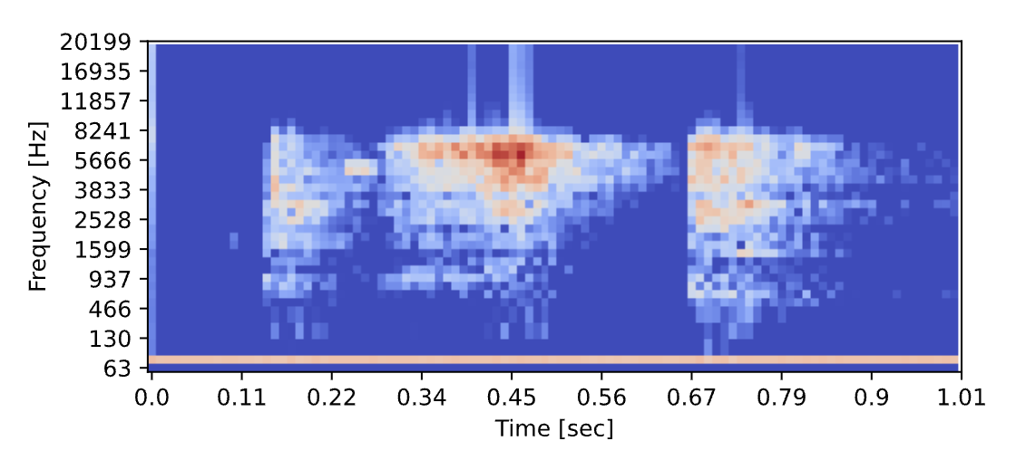
Check a String is a Valid Date or DateTime format in PHP

The Back Story about your PHP Metaphor

I writing a story helper (little helper) to validate schema using PHP in my open-source project called SleekwareDB a Flat File database and RESTfull API using SleekDB. I know we have many libraries out there, never mind. It's just freestyled in my old language.

The PHP Story!

You can check if a string is a valid date or datetime format in PHP using the DateTime::createFromFormat() method. This method returns a DateTime object if the input string is a valid date/datetime in the specified format, or false if it is not valid.

Here's an example function that checks whether a string is a valid date or datetime in the given format:

function isDateTime($dateString, $format) {
    $dateObj = DateTime::createFromFormat($format, $dateString);
    return $dateObj !== false && !array_sum($dateObj->getLastErrors());
}

You can use this function like this:

$dateString1 = '2022-05-01';
$dateString2 = '2022-05-01 10:30:00';
$format1 = 'Y-m-d';
$format2 = 'Y-m-d H:i:s';

if (isDateTime($dateString1, $format1)) {
    echo "$dateString1 is a valid date format.";
} else {
    echo "$dateString1 is not a valid date format.";
}

if (isDateTime($dateString2, $format2)) {
    echo "$dateString2 is a valid datetime format.";
} else {
    echo "$dateString2 is not a valid datetime format.";
}

This code will output:

2022-05-01 is a valid date format.
2022-05-01 10:30:00 is a valid datetime format.

That's it! Small and cringe... 😄

A PHP demo/repos link

No response

PayPal Link for Donation (PHP Storyteller)

No response

Automated GitHub Repository Backup

The Backstory about your Linux Metaphor

I'm used to host my code on GitHub. I like GitHub a lot. I have a also a self-hosted gitlab for private work. But ensuring safety and integrity of our codebases can be scarry (imagine GitHub being offline...). One effective way to safeguard your GitHub repositories is through regular backups, and what better way to automate this process than with a scheduled cronjob on your Linux machine?

💡 3-2-1 Backup Strategy:

The 3-2-1 backup strategy, a golden rule in data backup, emphasizes redundancy and versatility. It advocates for maintaining:

  1. Three Copies of Your Data:

The original data on your local machine.
A secondary copy on another storage device.
A tertiary copy stored remotely, off-site, offering protection against catastrophic events like hardware failures or disasters.

  1. Two Different Media:

Utilize diverse storage mediums, such as local drives and cloud repositories, to mitigate risks associated with a specific type of storage failure.

  1. One Copy Off-Site:

Ensure at least one backup is stored off-site to guard against location-specific risks like theft, fire, or natural disasters.

The Linux Story!

A simple guide /w GitHub CLI and Cron Jobs.

Prerequisite

You'll need this before starting to build the backup script.

  1. Install GitHub CLI

Start by installing GitHub CLI on your machine. You can find installation instructions on the official GitHub CLI repository.

  1. Authenticate locally with GitHub CLI

Type gh auth login. You'll be redirected to your browser to validate the authentication.

Make the script!

Go somewhere on your machine, and create a file backup_repos.sh :

#!/bin/bash

# Set the path where you want to clone the repositories
BACKUP_PATH="/path/to/your/backup/location"

# Set your GitHub organization name
GH_ORG="your-organization"

# List all repositories for the authenticated user
repos=$(gh repo list $GH_ORG --json=name --limit=1000 | jq -r '.[].name')

# Go to the clone path
cd $BACKUP_PATH

# Clone each repository
for repo in $repos
do
  gh repo clone $GH_ORG/$repo
done

Important

Make sure to replace your-organization with your GitHub organization's name. Also, adjust the BACKUP_PATH to the desired directory where you want to clone all the repositories.

Save the script, and make it executable:

$> chmod +x backup_repos.sh

Setup the Cronjob:

Open the crontab file for editing it:

$> crontab -e

Add a line to schedule the backup script to run weekly. For example, to run the backup every Sunday at 8 AM:

0 8 * * 0 /path/to/backup_repos.sh

Save and exit.

Tada!

A Linux demo/repos link

No response

PayPal Link for Donation (Linux Storyteller)

No response

Recommend Projects

  • React photo React

    A declarative, efficient, and flexible JavaScript library for building user interfaces.

  • Vue.js photo Vue.js

    🖖 Vue.js is a progressive, incrementally-adoptable JavaScript framework for building UI on the web.

  • Typescript photo Typescript

    TypeScript is a superset of JavaScript that compiles to clean JavaScript output.

  • TensorFlow photo TensorFlow

    An Open Source Machine Learning Framework for Everyone

  • Django photo Django

    The Web framework for perfectionists with deadlines.

  • D3 photo D3

    Bring data to life with SVG, Canvas and HTML. 📊📈🎉

Recommend Topics

  • javascript

    JavaScript (JS) is a lightweight interpreted programming language with first-class functions.

  • web

    Some thing interesting about web. New door for the world.

  • server

    A server is a program made to process requests and deliver data to clients.

  • Machine learning

    Machine learning is a way of modeling and interpreting data that allows a piece of software to respond intelligently.

  • Game

    Some thing interesting about game, make everyone happy.

Recommend Org

  • Facebook photo Facebook

    We are working to build community through open source technology. NB: members must have two-factor auth.

  • Microsoft photo Microsoft

    Open source projects and samples from Microsoft.

  • Google photo Google

    Google ❤️ Open Source for everyone.

  • D3 photo D3

    Data-Driven Documents codes.