MagicMirror module for calendar view.
My previous module, MMM-CalendarExt2, was always notorious for its difficulty to use. I need a more easy and light one. So I rewrite this from scratch newly.
- Only focusing on how it shows; Parsing is delegated to original MagicMirror module
calendar. (It means thecalendarmodule is REQUIRED to use this module.) - Only
weekandmonthviews. I found that people are rarely interested in other views onCX2. So I drop out different views. - Respect to original MM's hide/show mechanism. Now you can hide/show this module easily with other scheduler or control modules. (By the way, Look at this module also. - MMM-Scenes)
- No dependency on the 3rd party modules (e.g. momentJS or Luxon, etc.). This is built with pure JS and CSS only.
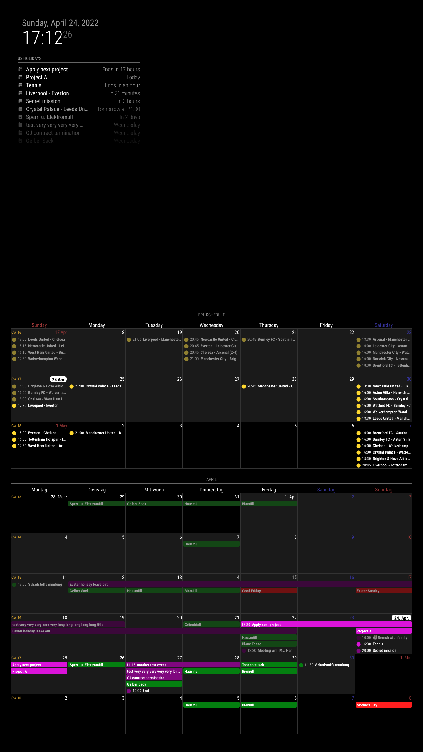
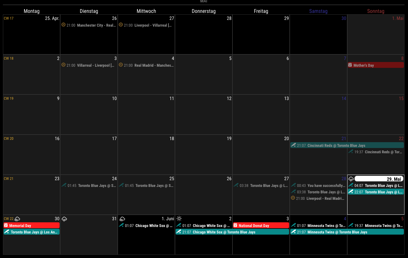
weekview ormonthview- locale-aware calendar
- customizing events: filtering, sorting, transforming
- multi-instance available. You don't need to copy and rename the module. Just add one more configuration in your
config.js.
cd ~/MagicMirror/modules
git clone https://github.com/MMRIZE/MMM-CalendarExt3Anyway, even this simplest will work.
{
  module: "MMM-CalendarExt3",
  position: "bottom_center",
},
More conventional;
{
  module: "MMM-CalendarExt3",
  position: "bottom_center",
  title: "",
  config: {
    mode: "month",
    instanceId: "basicCalendar",
    locale: 'de-DE',
    maxEventLines: 5,
    firstDayOfWeek: 1,
    calendarSet: ['us_holiday', 'abfall', 'mytest'],
    ...
  }
},
You need setup default calendar configuration also.
/* default/calendar module configuration */
{
  module: "calendar",
  position: "top_left",
  config: {
    broadcastPastEvents: true, // <= IMPORTANT to see past events
    calendars: [
      {
        url: "webcal://www.calendarlabs.com/ical-calendar/ics/76/US_Holidays.ics",
        name: "us_holiday", // <= RECOMMENDED to assign name
        color: "red" // <= RECOMMENDED to assign color
      },
...All the properties are omittable, and if omitted, a default value will be applied.
| property | default | description |
|---|---|---|
mode |
'week' | Calendar view type. You can choose between 'week' and 'month' |
weekIndex |
-1 | Which week starts in a view. -1 is the previous week of the current focusing moment. 0 is the focusing week of the moment. 1 will be the next week, and so on.Ignored on mode:'month' |
weeksInView |
3 | How many weeks from the index. weekIndex:-1, weeksInView:3 means 3 weeks view from the last week. Ignored on mode:'month' |
instanceId |
(auto-generated) | When you want more than 1 instance of this module, each instance would need this value to distinguish each other. If you don't assign this property, the identifier of the module instance will be assigned automatically but not recommended to use it. (Hard to guess the auto-assigned value.) |
firstDayOfWeek |
1 | Monday is the first day of the week according to the international standard ISO 8601, but in the US, Canada, Japan and some cultures, it's counted as the second day of the week. If you want to start the week from Monday, set this property to 1. If you want Sunday, set 0. Sunday:0, Monday:1, Tuesday:2, ..., Saturday:6 |
minimalDaysOfNewYear |
4 | ISO 8601 also says each week's year is the Gregorian year in which the Thursday falls. The first week of the year, hence, always contains 4 January. However, the US (Yes, it is.) system differs from standards. In the US, containing 1 January defines the first week. In that case, set this value to 1. And under some other culture, you might need to modify this. |
locale |
(language of MM config) |
de or ko-KR or ja-Jpan-JP-u-ca-japanese-hc-h12. It defines how to handle and display your date-time values by the locale. When omitted, the default language config value of MM. |
calendarSet |
[] | When you want to display only selected calendars, fulfil this array with the targeted calendar name(of the default calendar module). e.g) calendarSet: ['us_holiday', 'office'],[] or null will allow all the calendars. |
maxEventLines |
5 | How many events will be displayed in 1-day cell. The overflowed events will be hidden. |
fontSize |
'18px' | Default font size of this module. |
eventHeight |
'22px' | The height of each event. |
cellDateOptions |
{month: 'short', day: 'numeric'} |
The format of day cell date. It varies by the locale and this option. locale:'en-US', the default displaying will be Jun 1 or 1. See options |
eventTimeOptions |
{timeStyle: 'short'} | The format of event time. It varies by the locale and this option. locale:'en-US', the default displaying will be 3:45 pm.See options |
headerWeekDayOptions |
{weekday: 'long'} | The format of weekday header. It varies by the locale and this option. locale:'en-US', the default displaying will be Tuesday.See options |
headerTitleOptions |
{month: 'long'} | The format of module header of the month view. It varies by the locale and this option. locale:'en-US', the default displaying will be December. In mode:'week', this will be ignored.See options |
eventFitler |
callback function | See the Filtering part. |
eventSorter |
callback function | See the Sorting part. |
eventTransformer |
callback function | See the Transforming part. |
waitFetch |
5000 | (ms) waiting the fetching of last calendar to prevent flickering view by too frequent fetching. |
refreshInterval |
1800000 | (ms) refresh view by force if you need it. |
glanceTime |
60000 | (ms) Return to original view when you move to other moment by notificatioon. |
animationSpeed |
1000 | (ms) Refreshing the view smoothly. |
useSymbol |
true | Whether to show font-awesome symbold instead of simple dot icon. |
displayLegend |
false | If you set as true, legend will be displayed. (Only the clanear which has name assigned) |
useWeather |
true | Whether to show forecasted weather information of default weather module. |
weatherLocationName |
null | When you have multi forecasting instances of several locations, you can describe specific weather location to show. |
Jump calendar view to another moment. It will return after glanceTime from last notification command.
instanceId: If you have more than 1 instance of this module, you can specify the instance to manipulate. If omitted ornull, all instances would obey this notification order.step: How many leaps of the current view. Inmode:'week'1 step will be a week. Inmode:'month'1 step will be a month. Negative value is allowed.
Set the date of specific view.
instanceId: See the abovedate: Specific date to move. e.g) Inmode:'month',date: "2022-12-25"would display calendar view of2022 Decemeber. Be aware ofweekIndexofmode:'week'. The view range will be calculated withweekIndex,weeksInViewand this value.
Any module which can emit this notification could become the source of this module. Generally, the default calendar module would be.
Any module which can emit this notification could become the source of weather forecasting. Generally, the default weather module would be.
Nothing yet. (Does it need?)
You can handle almost all of the visual things with CSS. See the module.css and override your needs into your custom.css.
CX3,CX3_{instanceId},mode_weekormode_month: The root selector. Each instance of this module will haveCX3_{instanceId}as another root selector. With this CSS selector, you can assign individual look to each instance.
.CX3 {
  /* you CAN modify these values; but SHOULD NOT to remove */
  --celllinecolor: #333;
  --cellbgcolor: rgba(0, 0, 0, 0.2);
  --cellheaderheight: 25px;
  --cellfooterheight: 2px;
  --defaultcolor: #FFF;
  --eventheight: calc(var(--fontsize) + 4px);
  --totalheight: calc(var(--eventheight) * var(--maxeventlines));
  font-size: var(--fontsize);
  color: var(--defaultcolor);
  line-height: calc(var(--eventheight))
}
Most commonly used values would be defined in .CX3 selector as variables.
--fontsize, --maxeventlines, --eventheight would be imported from configuration for your setup convenience.
-
.cell: Every day cell has this selector. Each cell could have these class name together by its condition..today,.thisMonth,.thisYear.year_2022,.month_12,.date_25,.weekday_0
-
.cellHeader,.cellFooter: Parts of day cell..cellHeaderwould have.cw(count of week) and.cellDateas children..cellHeader .cellDate: Displaying date of the cell. The date would have many parts of date/hour information fromcellDateOptionsof config.
-
.event: Every event has this selector. Each event could have these class name together by its condition..continueFromPreviousWeek,.continueToNextWeek.calendar_{calendarName},{class}: Orginalcalendar.passed,.future,.current,.multiday,.singleday,.fullday
And event also has dataSet (data-*) as its attributes. (e.g. data-title="...", data-start-date="...") You can use these attributes also.
.weekGrid,.weekGridRow: Definition of calendar grid. You can adjust the grid itself. (e.g. Shrink the width of weekends cells)
Each event object has this structure.
{
  "title": "Leeds United - Chelsea",
  "startDate": 1650193200000,
  "endDate": 1650199500000,
  "fullDayEvent": false,
  "class": "PUBLIC",
  "location": false,
  "geo": false,
  "description": "...",
  "today": false,
  "symbol": ["calendar-alt"],
  "calendarName": "tottenham",
  "color": "gold",
  "calendarSeq": 1, // This would be the order from `calendarSet` of configuration
  "isPassed": true,
  "isCurrent": false,
  "isFuture": false,
  "isFullday": false,
  "isMultiday": false
}
You can use these values to handle events.
You can filter each event by its condition.
eventFilter: (ev) => {
  if (ev.isFullday) return false
  return true
}
This example shows how you can filter out 'fullday' events.
You can sort each event by its condition. However, this module arranges events masonry with density. So displaying would not fit with your sorting intention. Anyway, try if you need it.
eventSorter: (a, b) => {
  return a.calendarSeq - b.calendarSeq
}
This example tries to sort events by calendar order in calendarSet.
You can manipulate or change the properties of the event.
eventTransformer: (ev) => {
  if (ev.title.search('John') > -1) ev.color = 'blue'
  return ev
}
This example shows how you can transform the color of events when the event title has specific text.
When you are using MM's default weather forecasting, weather icon will be displayed on the day cell.
useWeather: true,
weatherLocationName: 'New York',
// Original weather module might have its location name with more details. (e.g. 'New York City, US'), but the partial text included would be acceptable for this attribute.
// When the location name would not match, warning messgage will be shown on dev console. Check it.You can set brands icons like this; (However, default calendar module cannot accept FA brands icons AFAIK.)
/* In your default calendar config */
symbol: ['fa-brands fa-canadian-maple-leaf'],
/* or */
symbol: ['brands canadian-maple-leaf'],
/* of course below are also allowed */
symbol: 'brands canadian-maple-leaf',
/* But if you want multi-icons, use array */
symbol: ['brands google-drive', 'solid calendar'],eventTransformer: (e) => {
e.startDate = new Date(e.start?.date || e.start?.dateTime).valueOf()
e.endDate = new Date(e.end?.date || e.end?.dateTime).valueOf()
e.title = e.summary
e.fulldayEvent = (e.start?.date) ? true : false
return e
}- The default
calendarmodule cannot emit the exact starting time ofmultidays-fullday-event which is passing current moment. Always it starts from today despite of original event starting time. So this module displays these kinds of multidays-fullday-event weirdly. - I am not considering 5-weekdays-view at this moment. Only-Weekdays-view might be useful, but in some cultures/locales, Locale-aware
Weekdaysare not easy to normalize. Friday and Sunday are weekends in Brunei. Iran adopts Friday only. I cannot calculate any convenient way to normalize this kind of grid view. - I'll add
TimeLineandTimeTableviews/extended modules in future.
- Added
useWeatheroption. (true/false) - Added
weatherLocationNameoption (some partial text to distinguish location)
- Added Display legend of the calendar (
displayLegend: trueand when you set the calendar name oncalendarmodule) - Fixed Some CSS fixture
- Fixed Urgent fix for
useSymbolissue since #1.2.2 - Fixed
symbol:nullissue resolved
- Fixed Move
eventFormatterto prior to get compatibility with other calendar module (e.g GoogleCalendar module)
- Added Multi icons
- Added Font-awesome 'brands' icons
- Added Magic opposite color for the full-day event (This feature could solve the issue of no-color assigned.)
- Fixed CSS file renamed (module.css => MMM-CalendarExt3.css)
- Support multi notifications from multi-calendar providers. (It will prevent events reset.)
- Released.
- Seongnoh Yi ([email protected])


 React
React
 Typescript
 Django
 Laravel
 Facebook
 Microsoft
 Google
 Alibaba
 D3
D3
 Tencent