Welcome to the repository! Here are collected plots for analysis of country's socio-economic status. It is aimed primarily for academia of Social Science, such as Economists, Sociologists and Political Scientists, but also can be applied in other places (for example, Marketing).
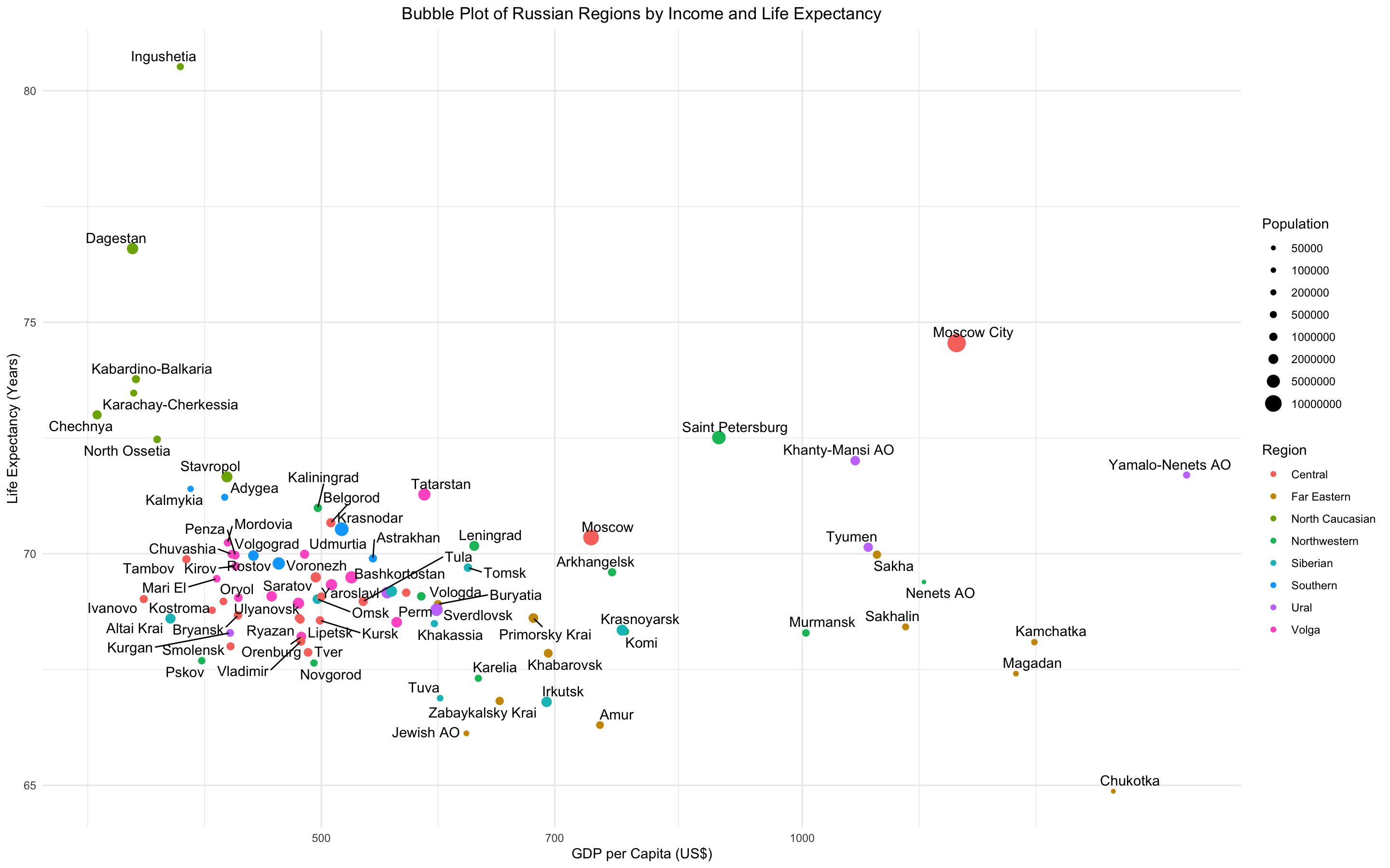
Bubble Plot of Income and Life Expectancy by Regions
Looking at this bubble plot, you may notice that there is no linear relationship between income and life expectancy in Russia. The reason is due to some regions: for example, Causasian regions show high life expectancy at lower incomes whereas Siberian, Ural and Far Eastern regions experience opposite situation with higher incomes and lower life expectancies. When reducing these regions from our data set, we will see ordinary linear relationship where the more regions earn the longer they live.
Population
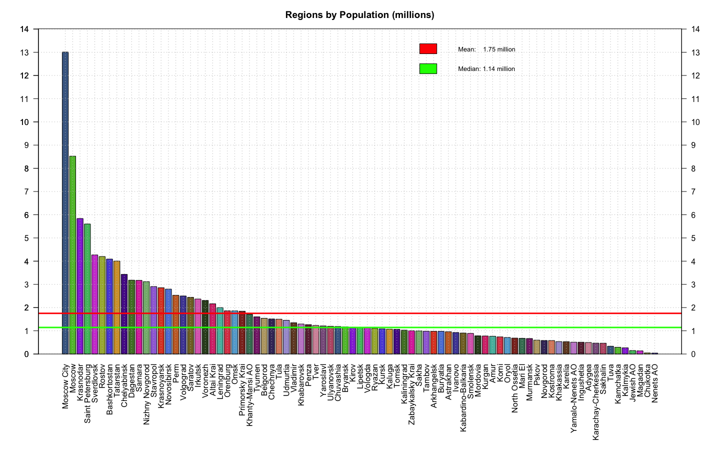
Fig. 2. Bar Plot of Population by Regions
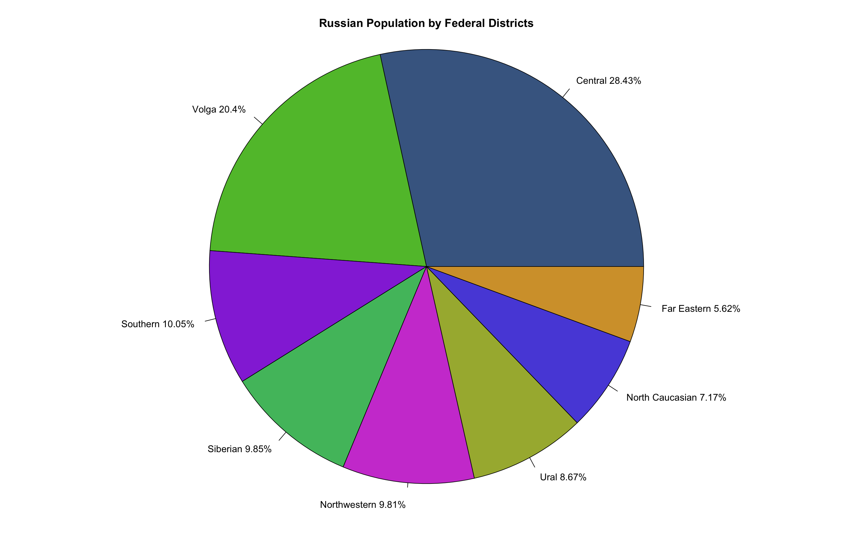
Fig. 3. Pie Plot of Population by Federal Districts
Fig. 4. Pie Plot of Portion of Regions in Total Population
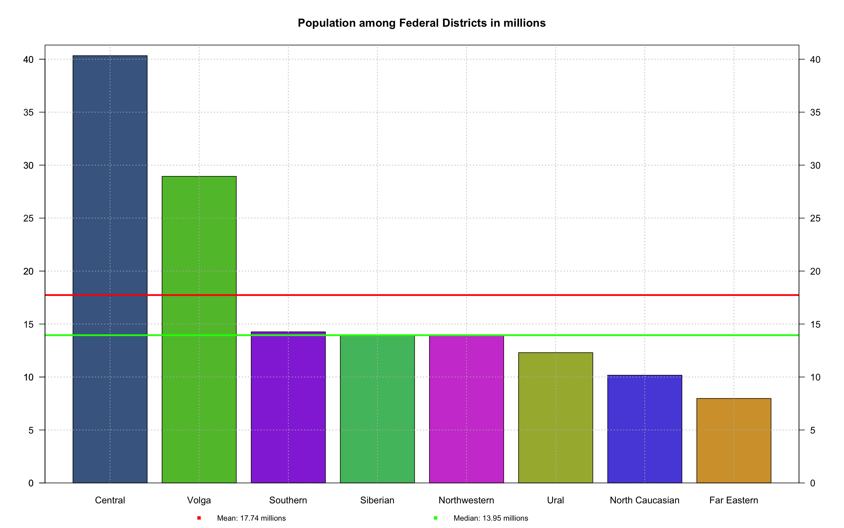
Fig. 5. Bar Plot of Population by Federal Districts
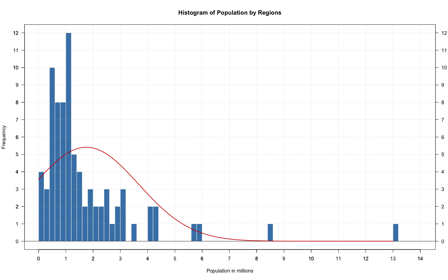
Fig. 6. Histogram of Population by Regions
Income (GDP per Capita in $US)
Fig. 7. Bar Plot of Monthly Income by Regions
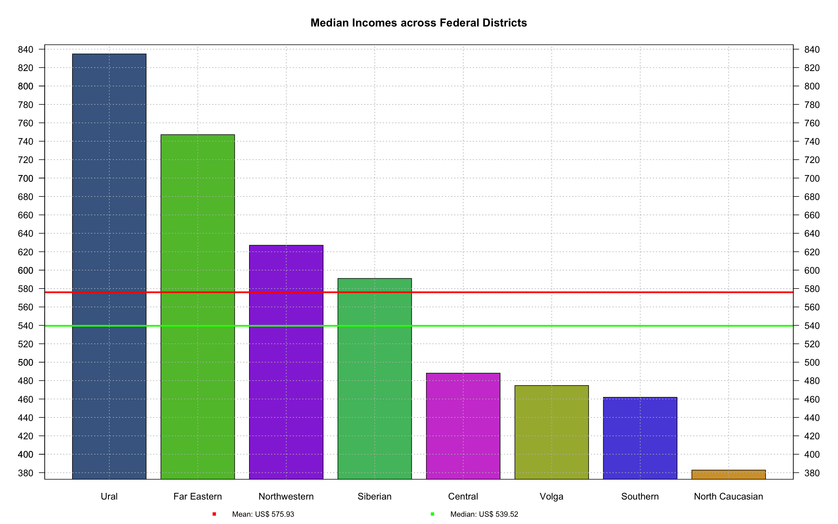
Fig. 8. Bar Plot of Monthly Median Income by Districts
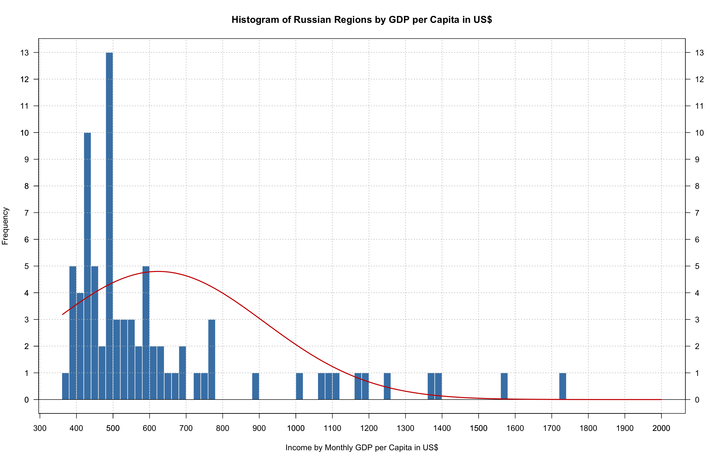
Fig. 9. Histogram of Monthly Incomes by Regions
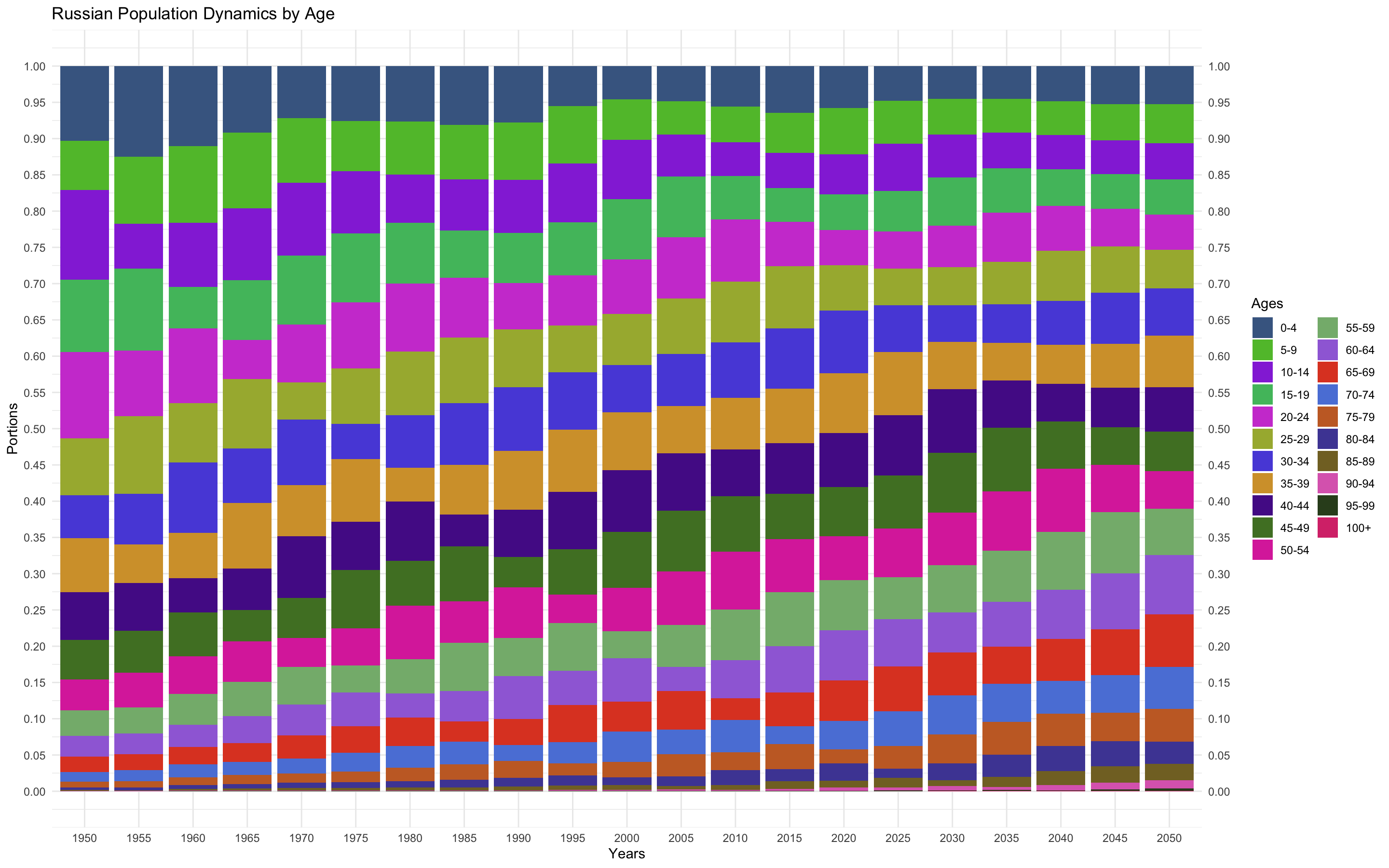
Fig. 10. Stacked Bar Plot of Age Group by Years
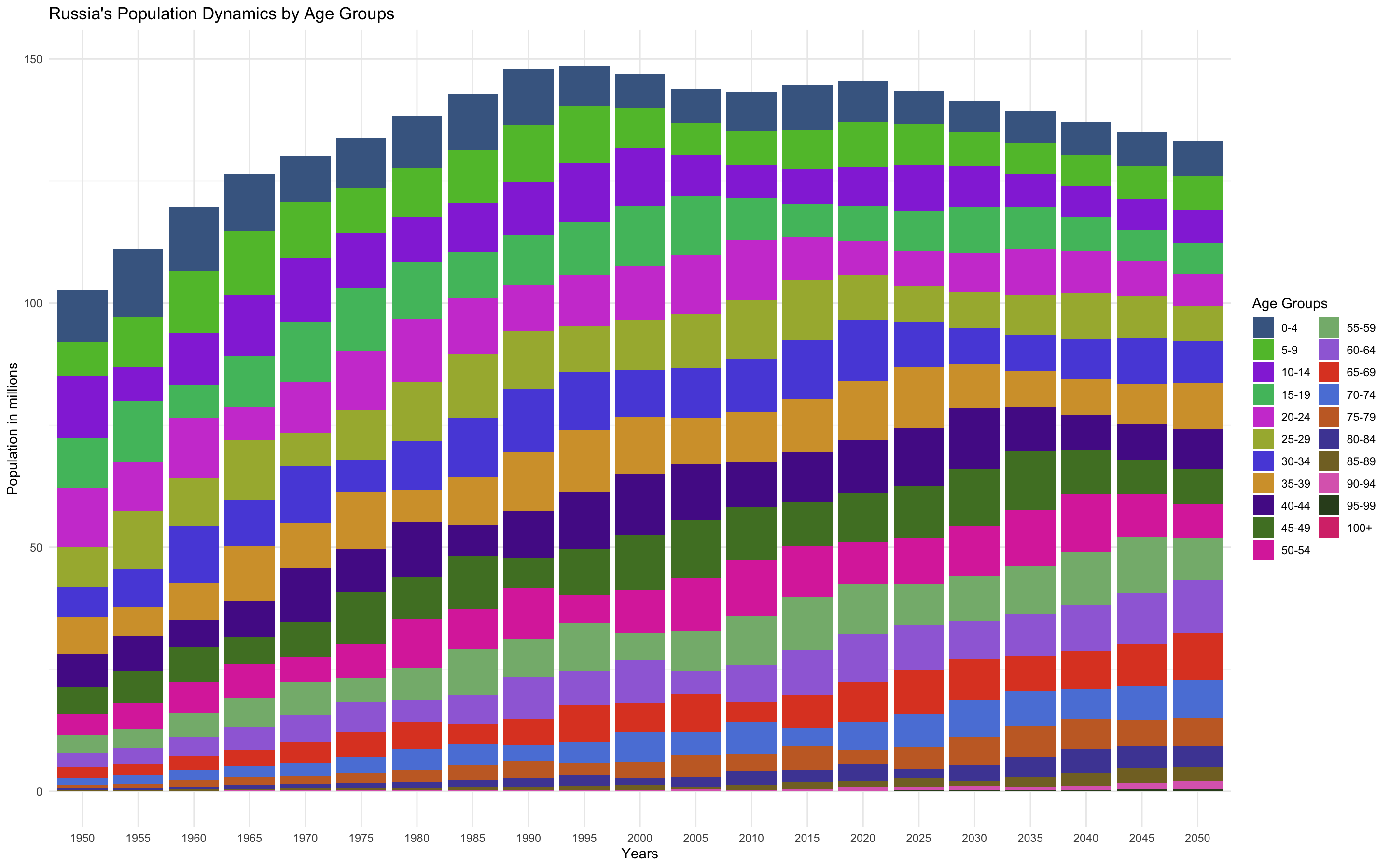
Fig. 11. Stacked Bar Plot of Age Group by Years in nominal values
Life Expectancy
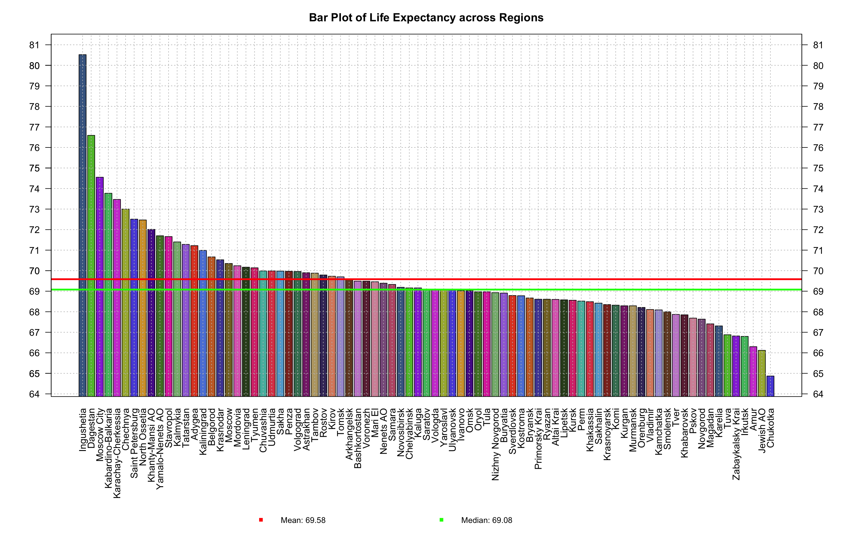
Fig. 12. Bar Plot of Life Expectancy across Regions
Fig. 13. Bar Plot of Life Expectancy across Federal Districts
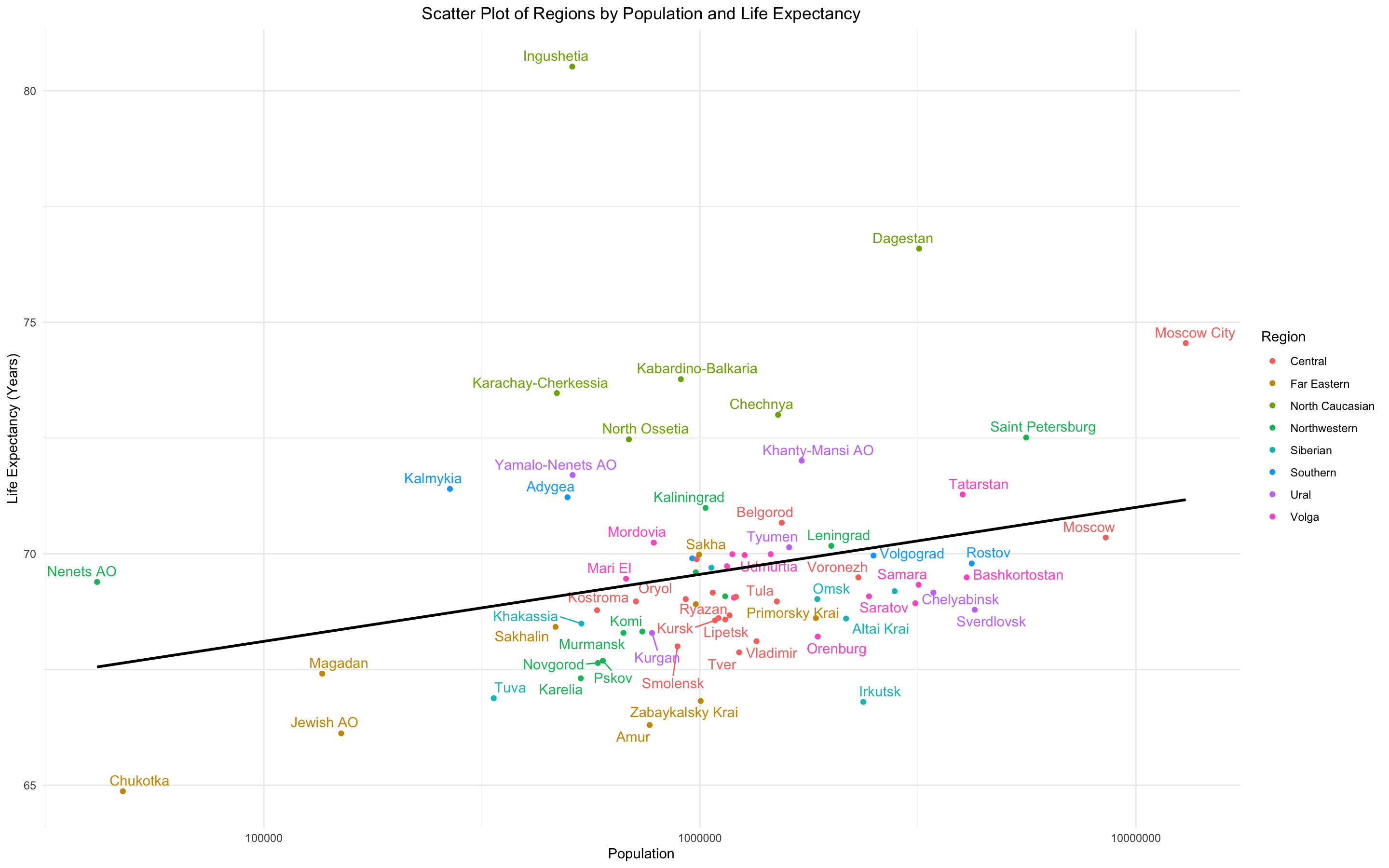
Fig. 14. Scatter Plot of Regions by Population and Life Expectancy
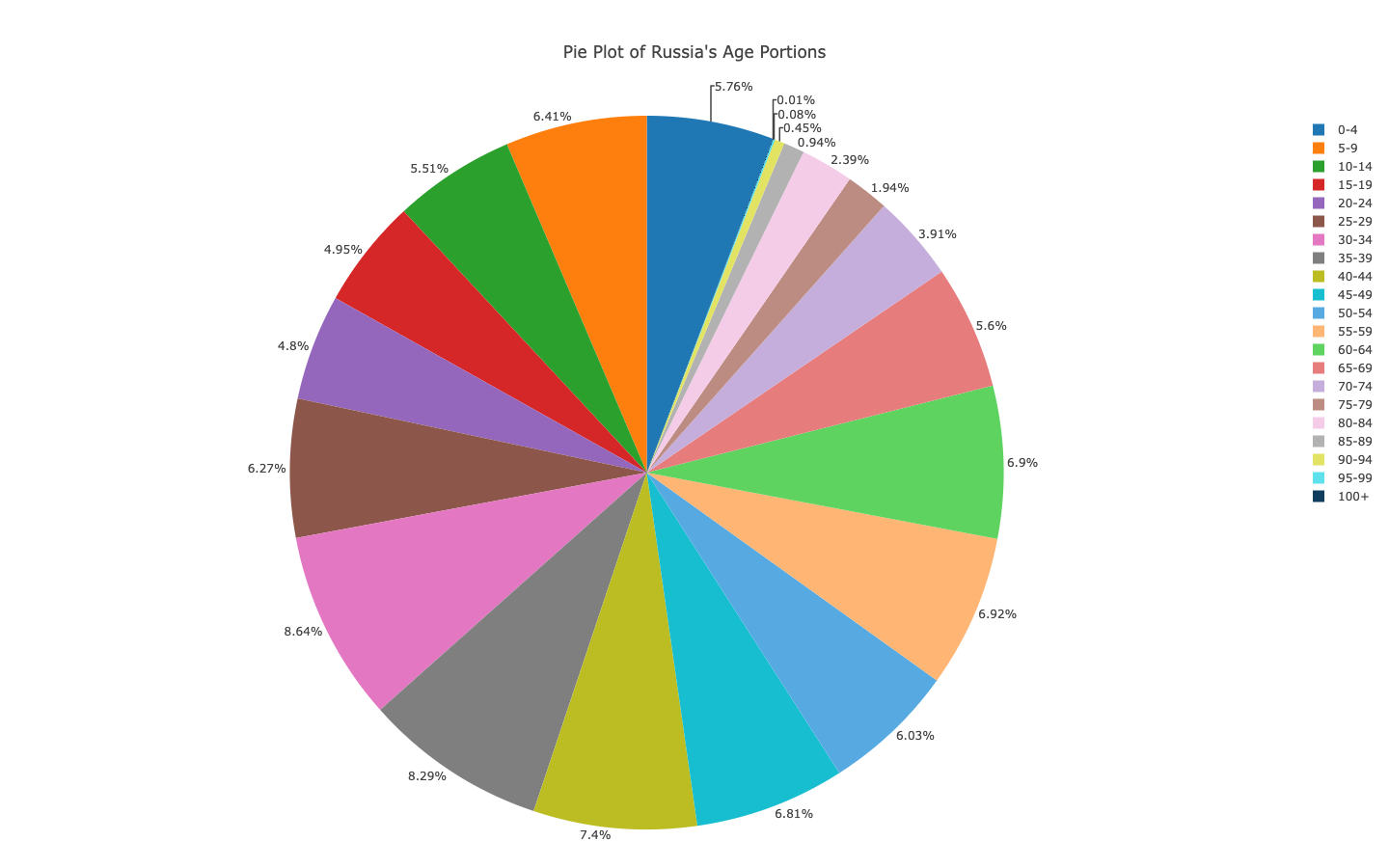
Fig. 15. Pie Plot of Russia's Age Portions
Fig. 16. Histogram of Life Expectancy by Regions
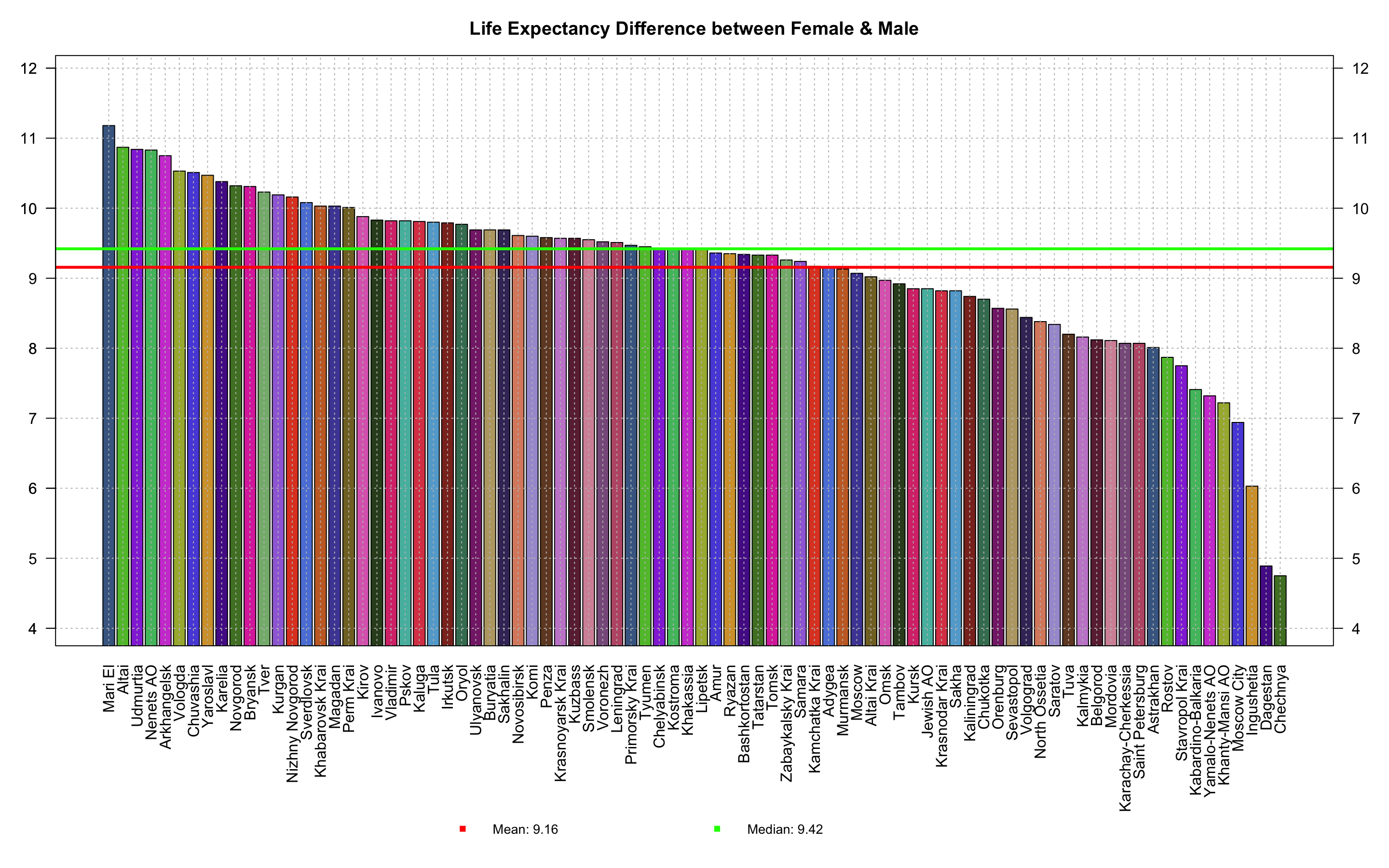
Fig. 17. Bar Plot of Life Expectancy Difference between Females and Males
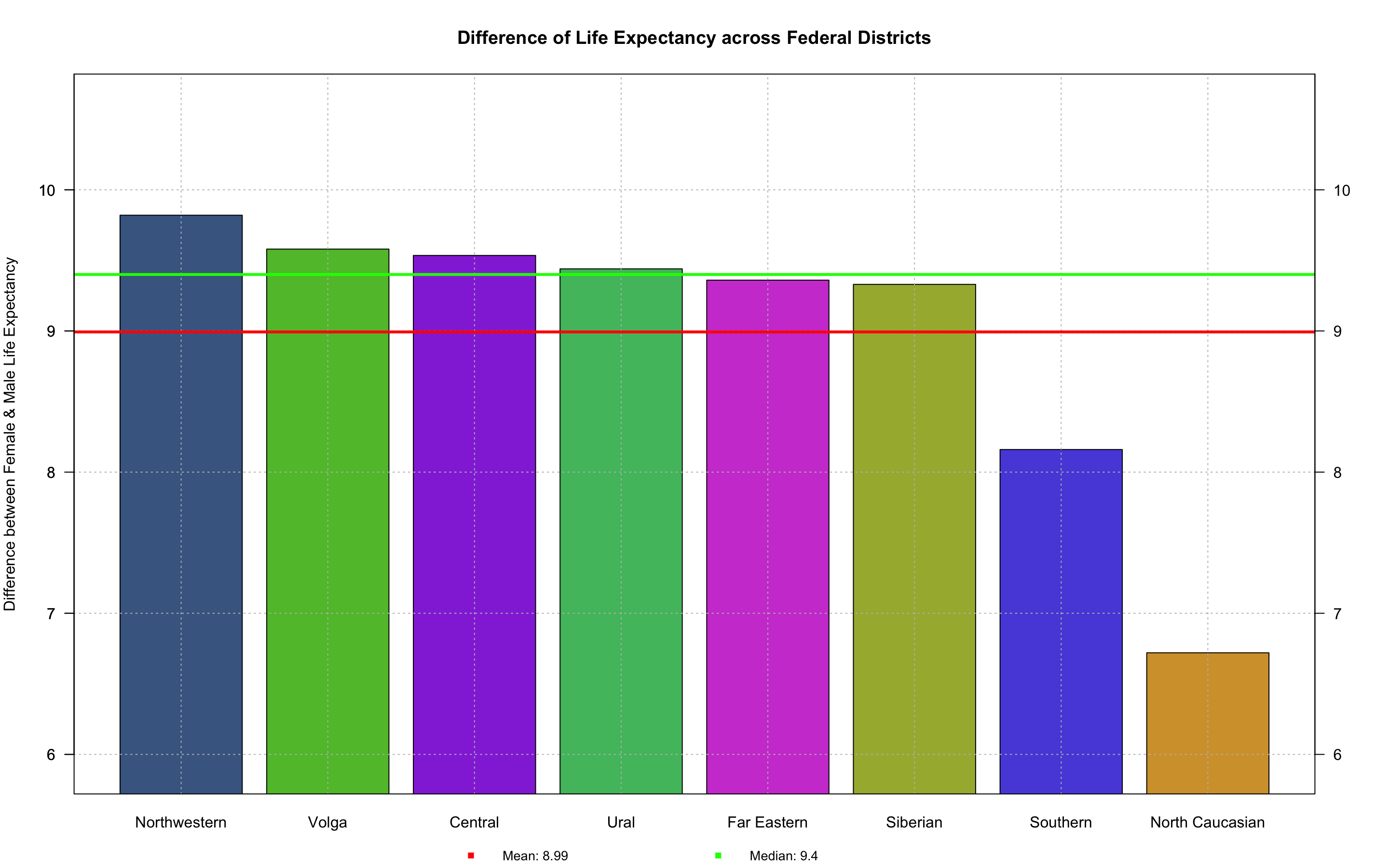
Fig. 18. Bar Plot of Life Expectancy Difference between Females and Males by Federal Districts
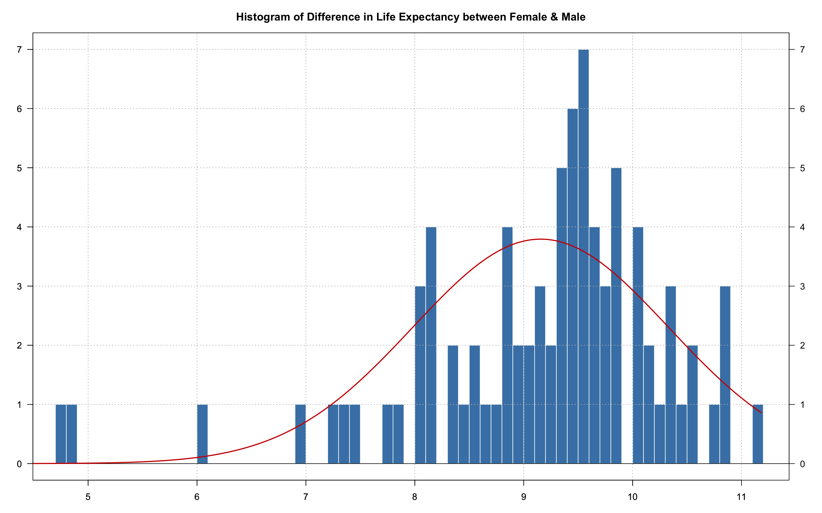
Fig. 19. Histogram of Life Expectancy Difference between Females and Males
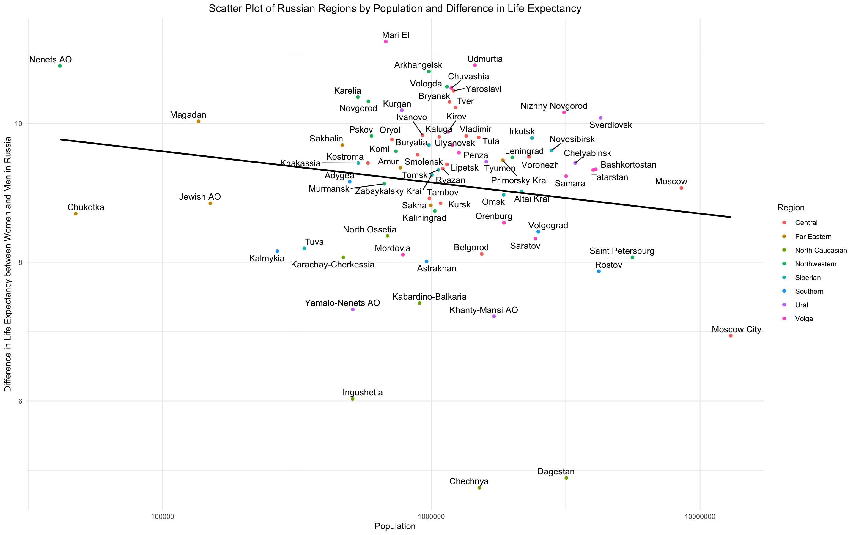
Fig. 20. Scatter Plot of Population and Life Expectancy Difference between Females and Males
Fertility
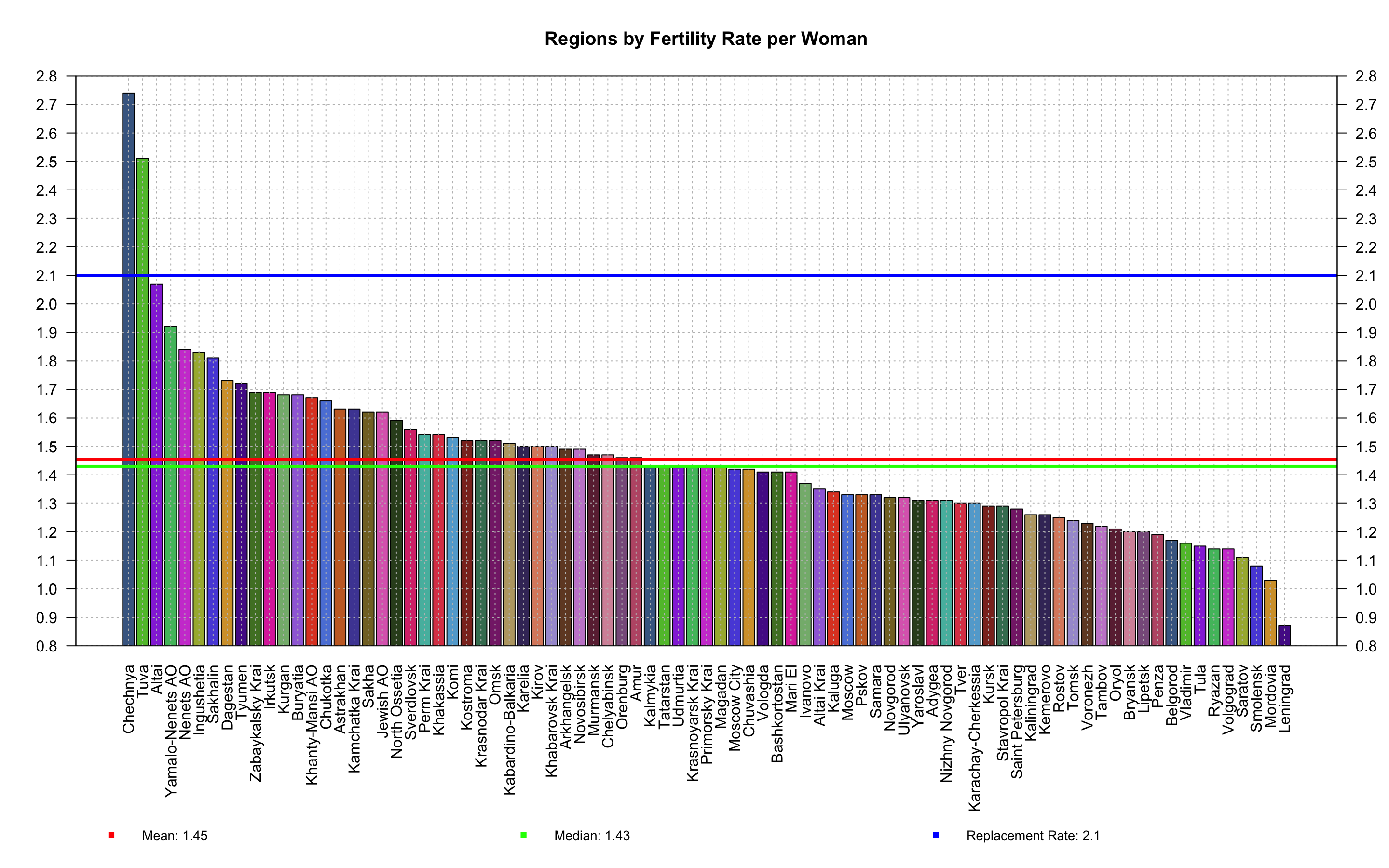
Fig. 21. Bar Plot of Fertility Rate
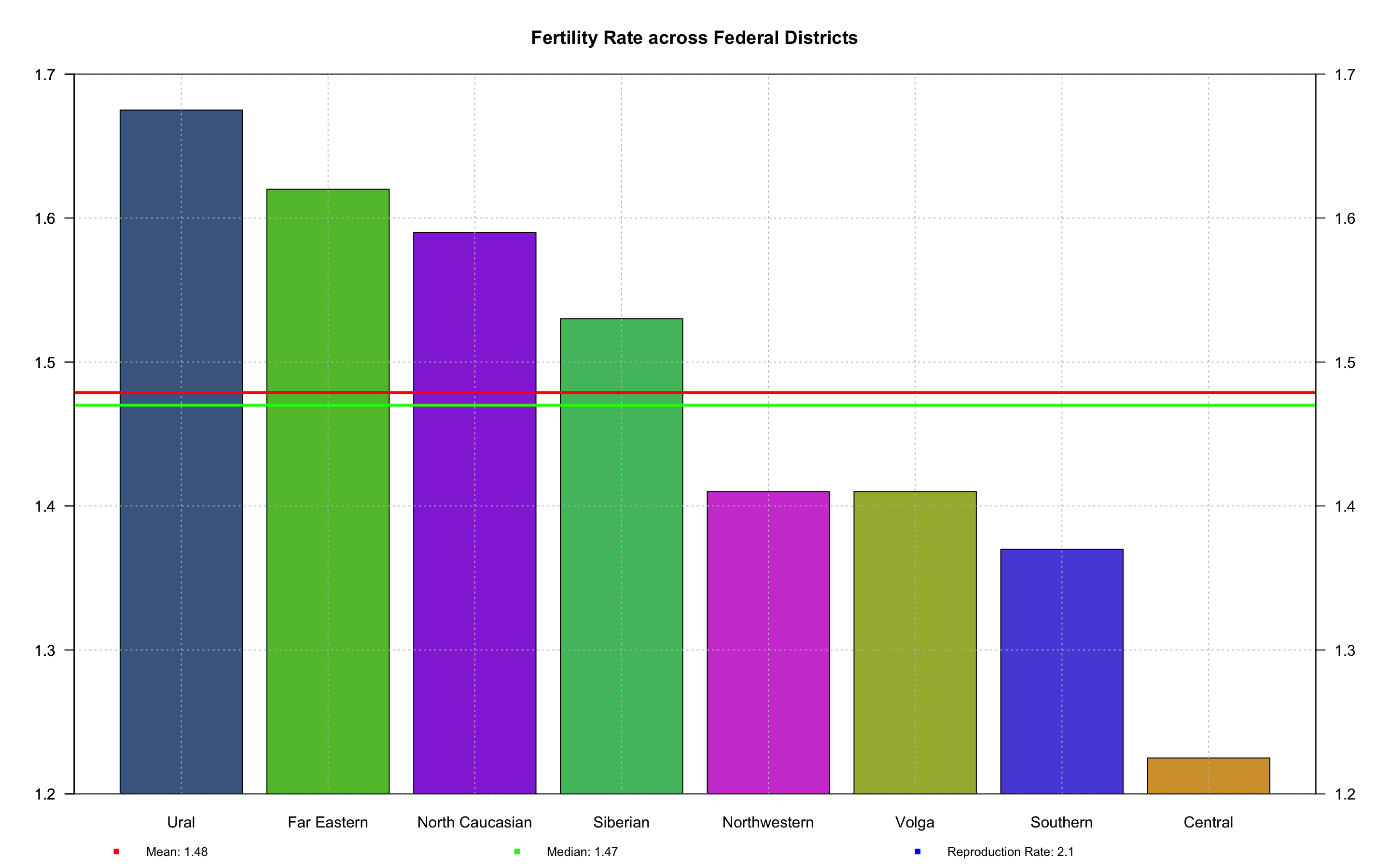
Fig. 22. Bar Plot of Fertility Rate by Districts
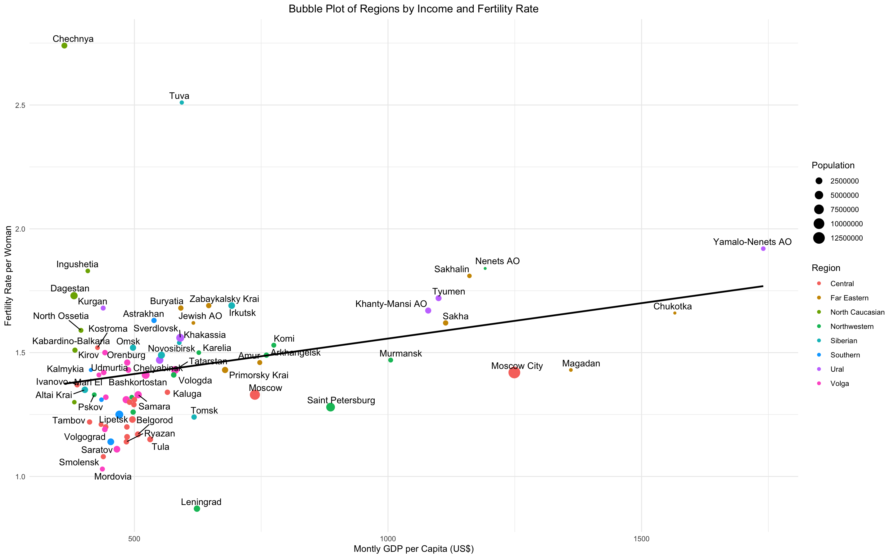
Fig. 23. Bubble Plot of Regions by Income and Fertility Rate
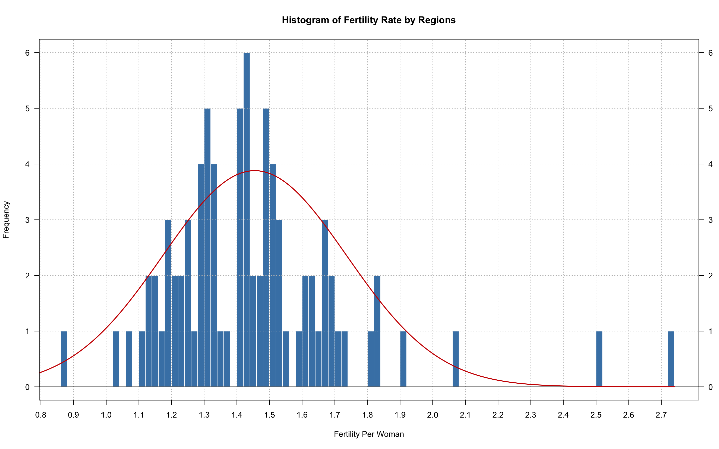
Fig. 24. Histogram of Fertility Rate
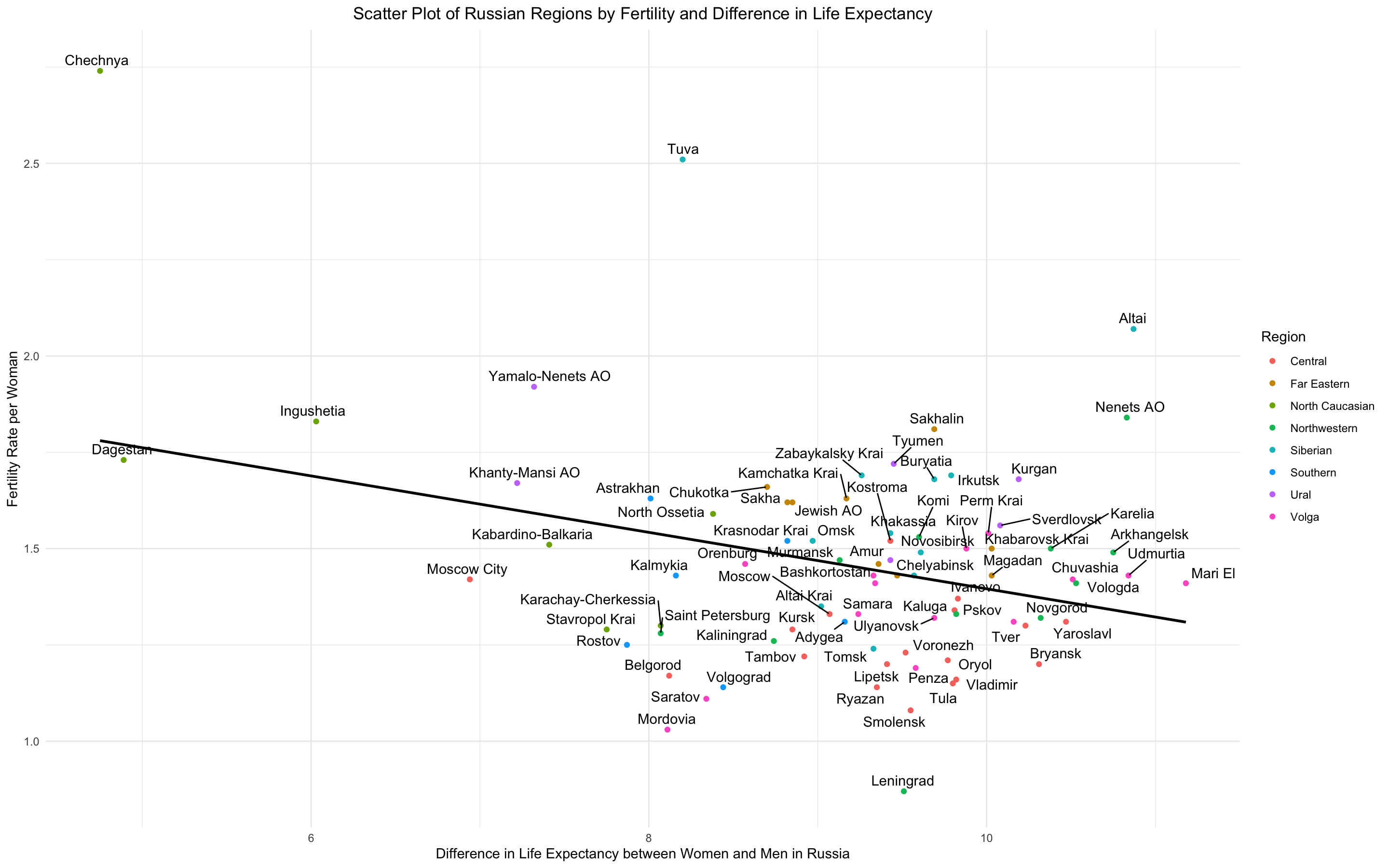
Fig. 25. Scatter Plot of Life Expectnacy Difference between Females and Males and Fertility Rate
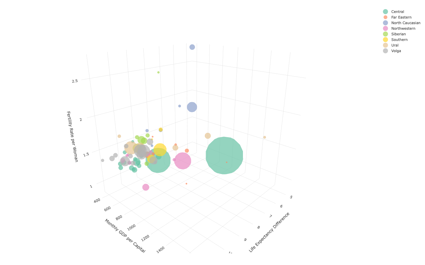
Fig. 26. 3D Bubble Plot of Life Expectnacy Difference between Females, Income and Males and Fertility Rate
Gender
Fig. 27. Stacked Bar Plot of Russia's Population by Gender
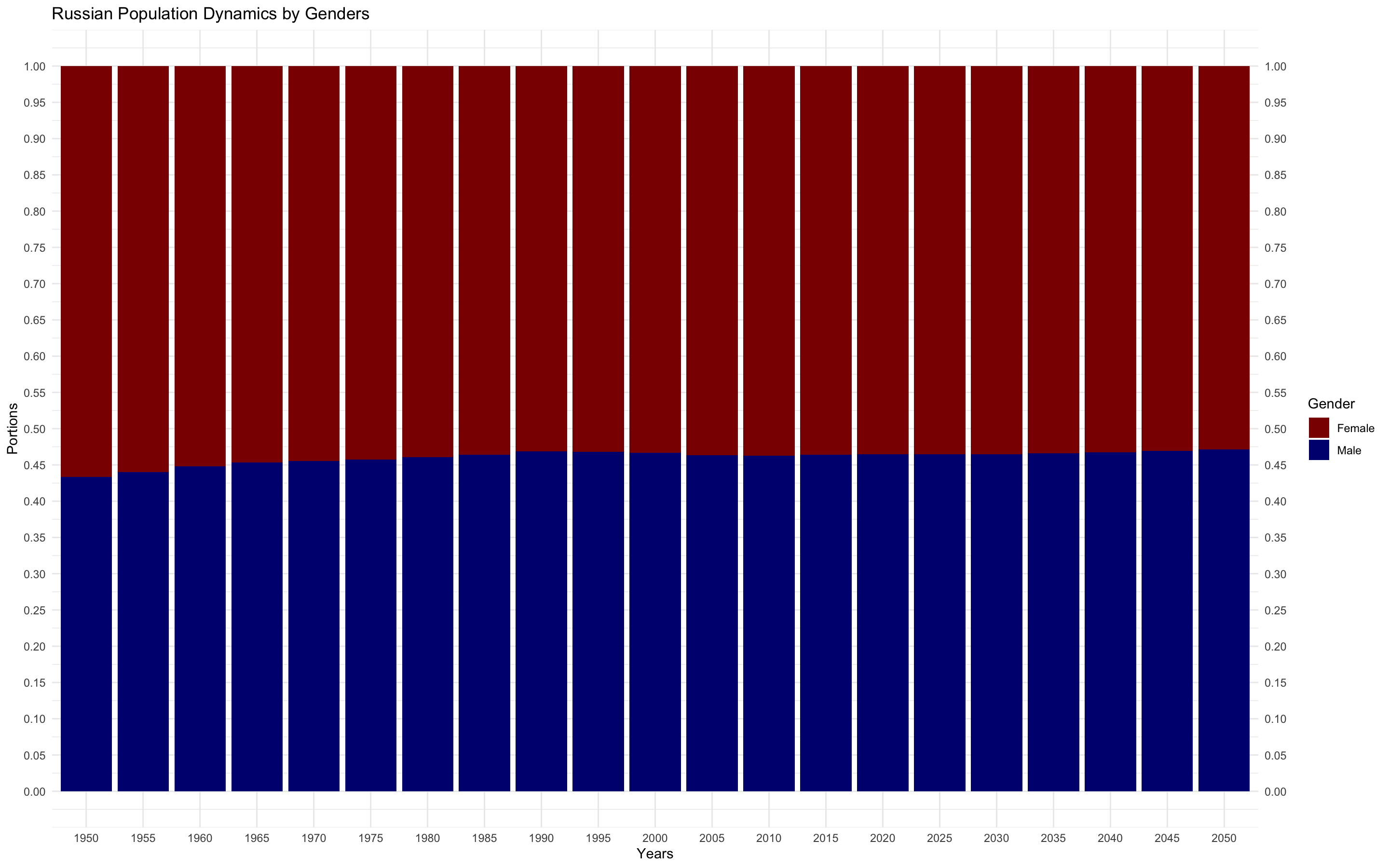
Fig. 28. Stacked Bar Plot of Russia's Population by Gender in Portions
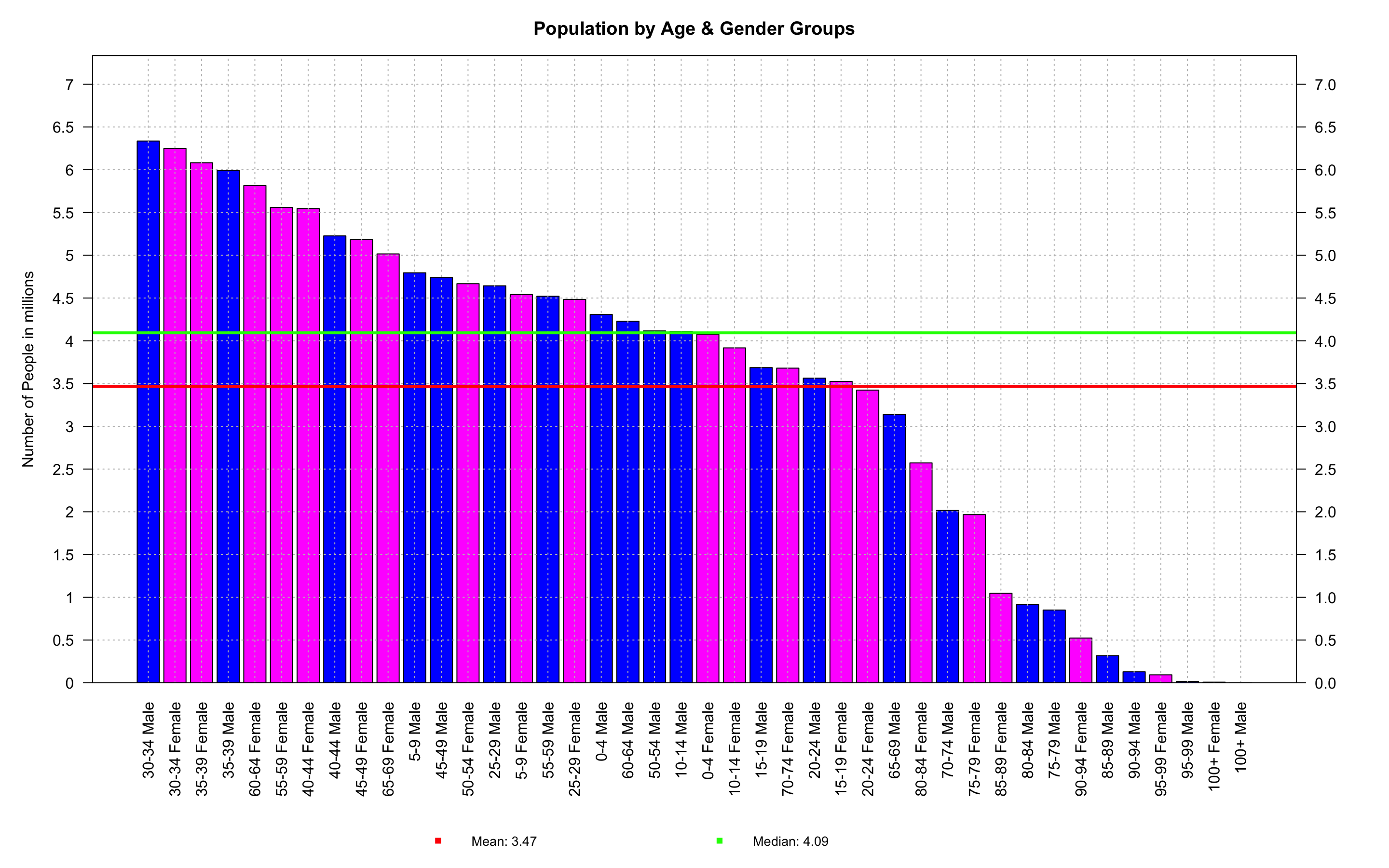
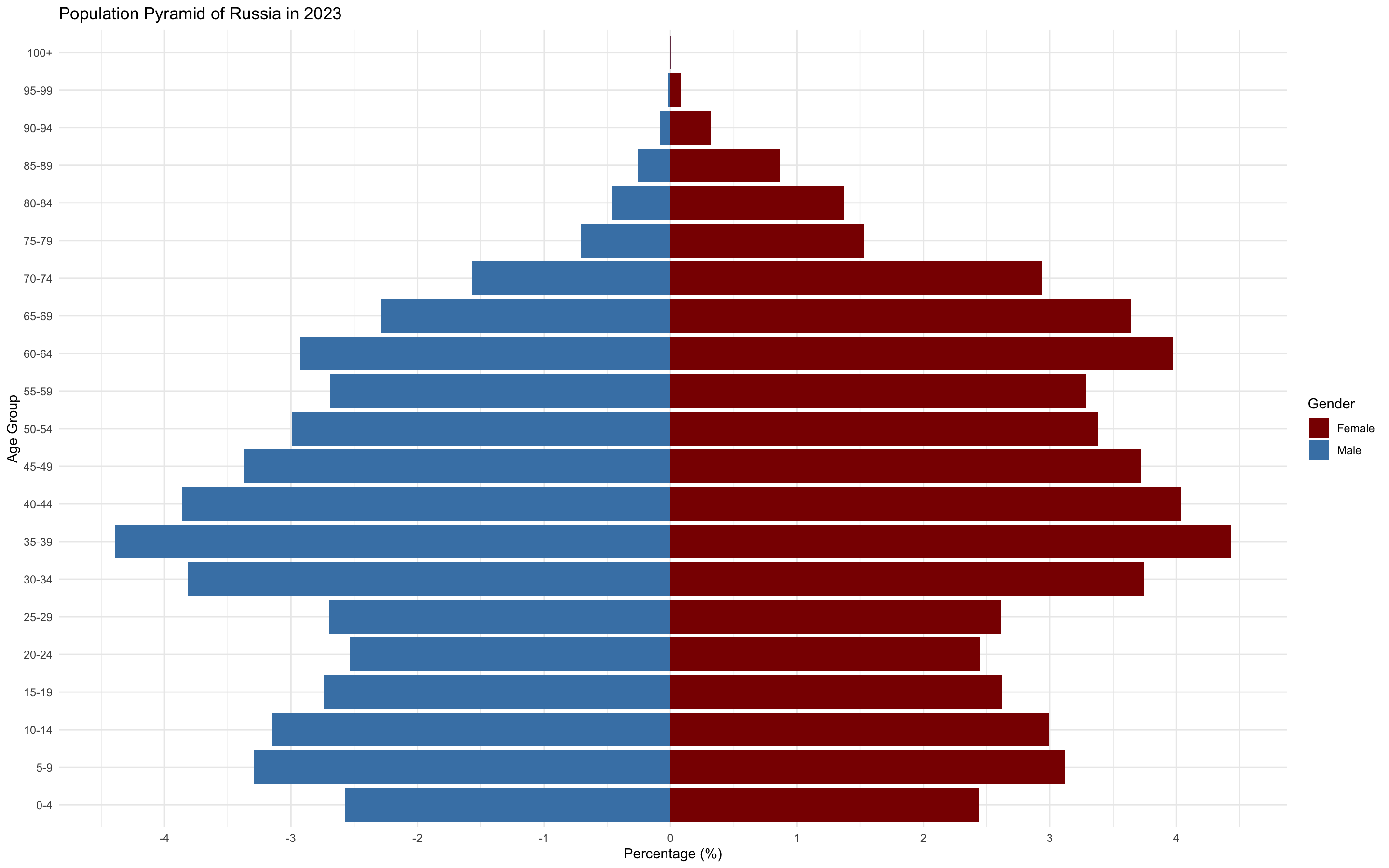
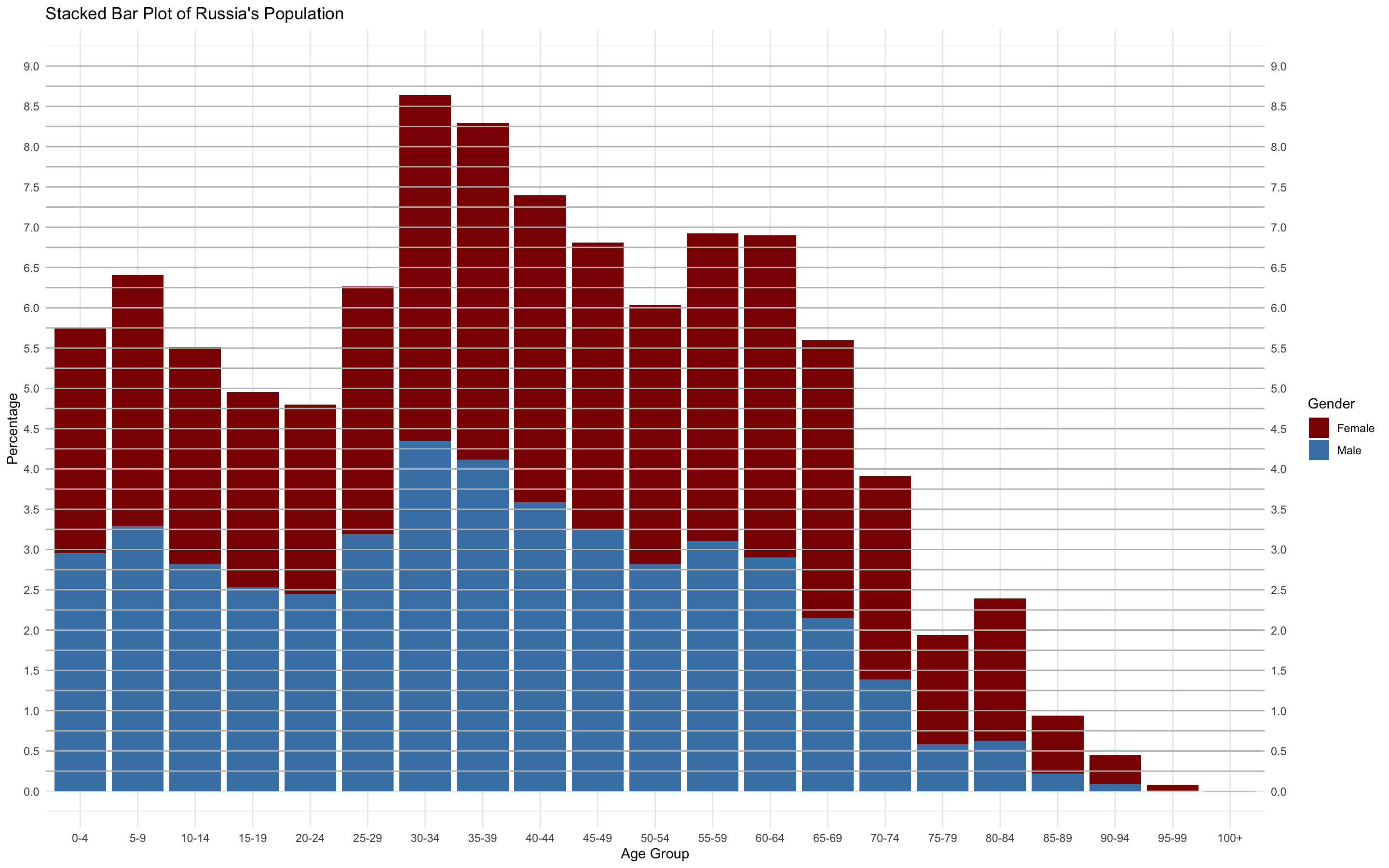
Fig. 29. Bar Plot of Russia's Population by Gender and Age
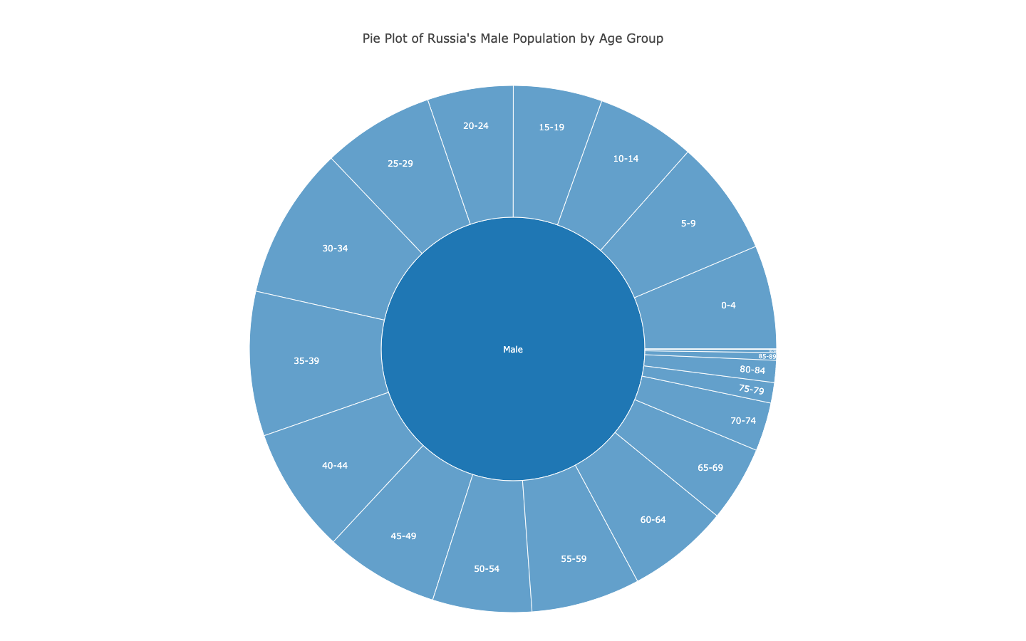
Fig. 30. Pie Plot of Russia's Male Population by Gender in Portions
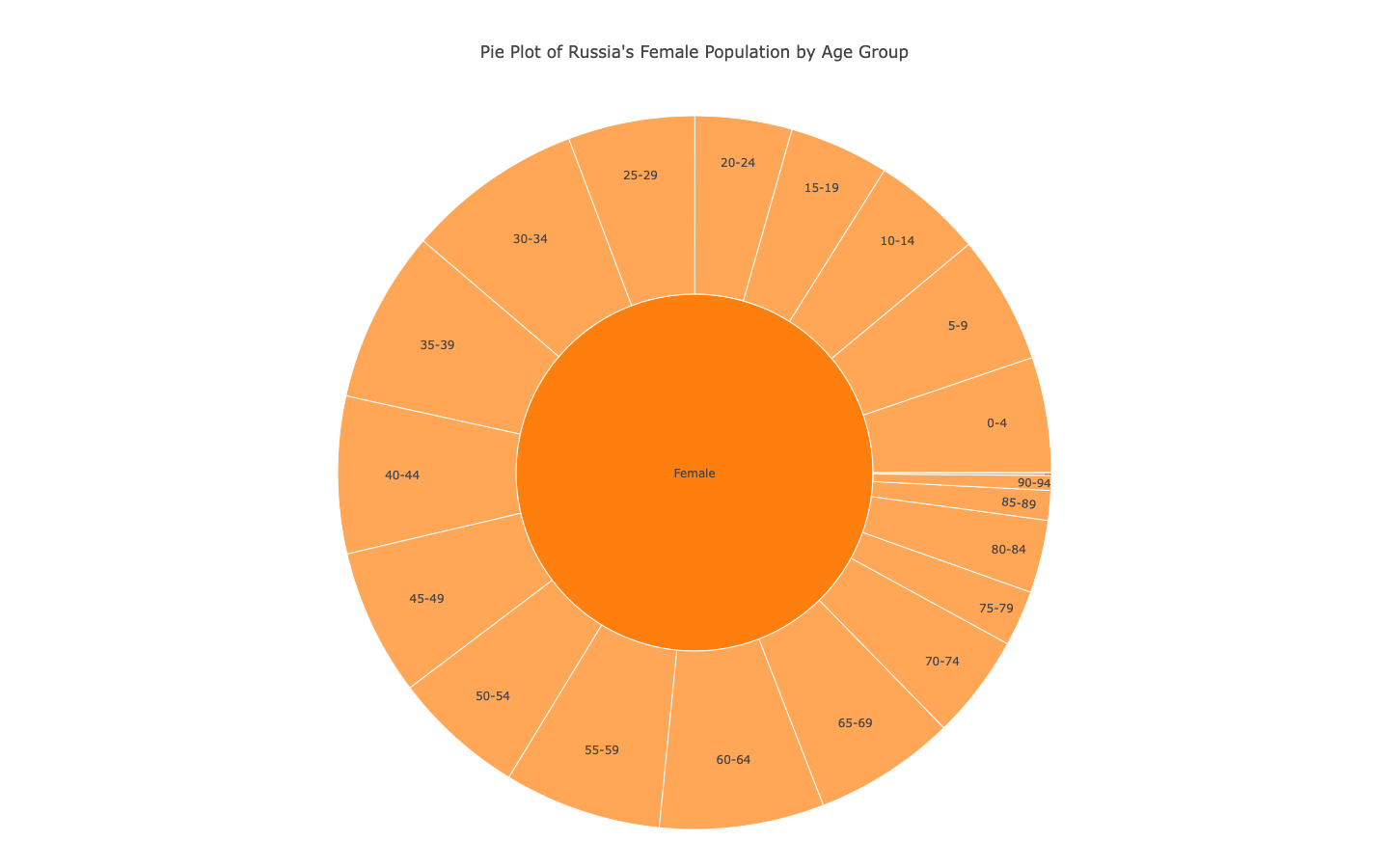
Fig. 31. Pie Plot of Russia's Female Population by Gender in Portions
Fig. 32. Nested Pie Plot of Russia's Population by Age and Gender in Portions
Fig. 33. Stacked Bar Plot of Population by Gender Portions
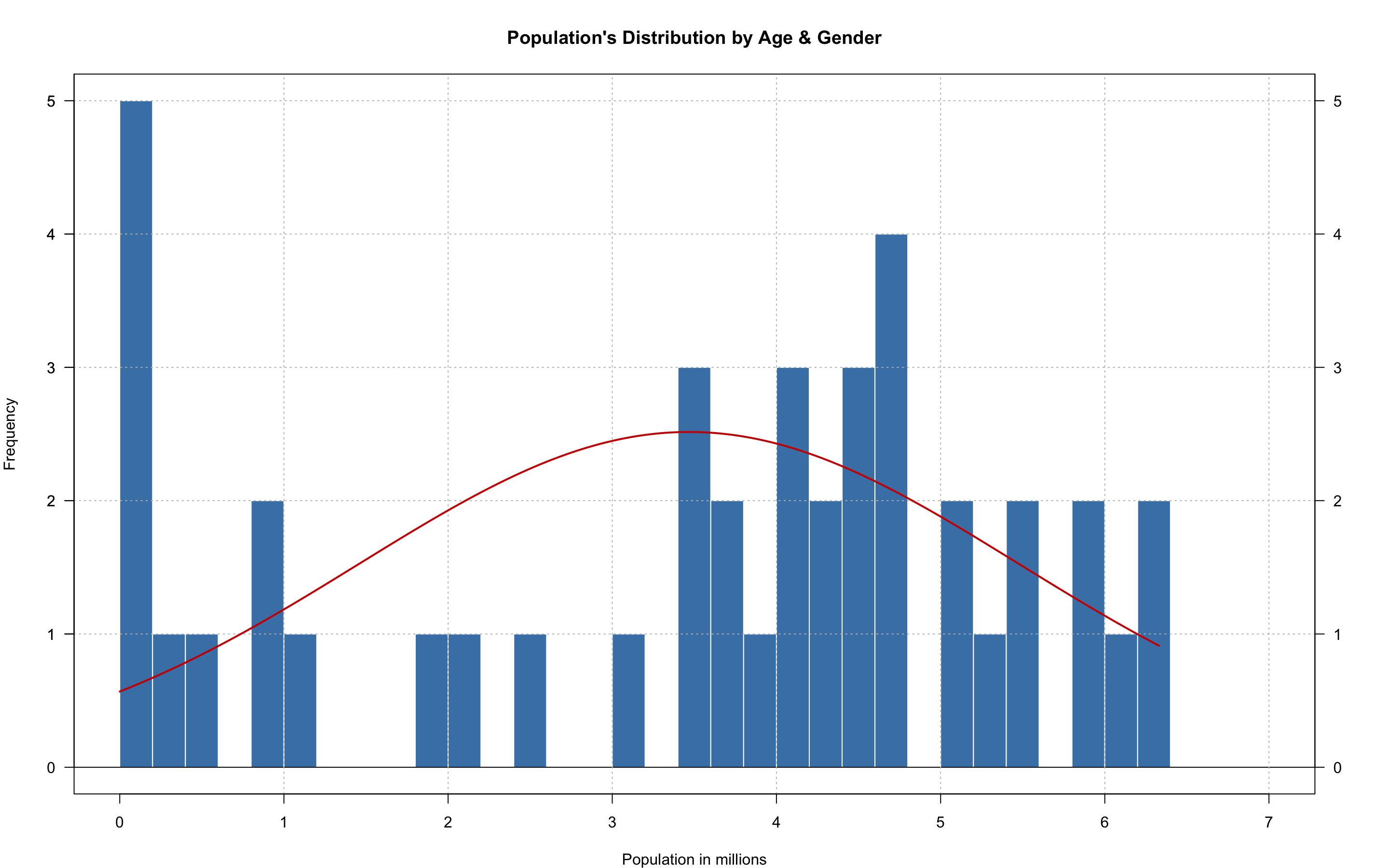
Fig. 34. Histogram of Russia's Population by Age and Gender
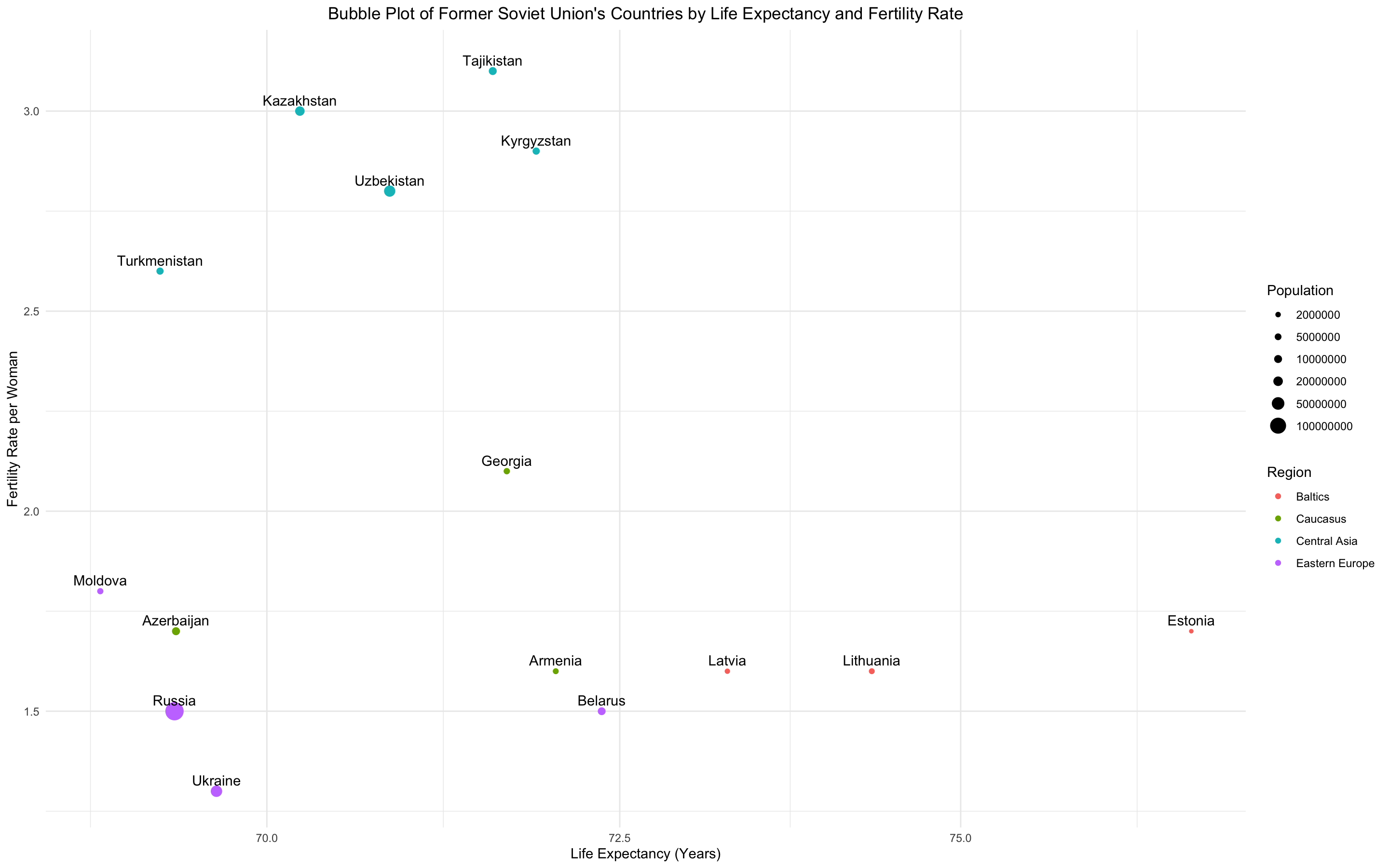
Comparison with Post Soviet Countries
Fig. 35. Bubble Plot of Post Soviet Union's Countries by Life Expectancy and Fertility Rate


.png?raw=true)