Giter VIP home page Giter VIP logo

okaynav's Introduction

#okayNav jQuery Plugin

Join the chat at https://gitter.im/VPenkov/okayNav

You know how navigations have only a desktop and a mobile state, right? I thought, "this might cost people money because it requires additional click for users to reach even the most important pages."

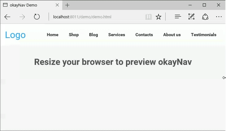
This navigation aims at progressively collapsing navigation links into an off-screen navigation instead of doing it for all the links at the same time. Check out this example:

okayNav Demo

Or play with it on CodePen.

How to Use

This is the code used in the example:

<header id="header">
    <a class="site-logo" href="#">
       Logo
    </a>
    
    <nav role="navigation" id="nav-main" class="okayNav">
        <ul>
            <li><a href="#">Home</a></li>
            <li><a href="#">Shop</a></li>
            <li><a href="#">Blog</a></li>
            <li><a href="#">Services</a></li>
            <li><a href="#">Contacts</a></li>
            <li><a href="#">About us</a></li>
            <li><a href="#">Testimonials</a></li>
        </ul>
    </nav>
</header><!-- /header -->

Include the CSS:

<link rel="stylesheet" href="css/okayNav.css" media="screen">

Include the library:

<script src="js/jquery.okayNav.min.js"></script>

And here's the JS to initialize it:

var navigation = $('#nav-main').okayNav();

Dependencies

okayNav depends on jQuery. Tested with jQuery 1.10+ but should work with lower versions. The stylization of okayNav comes in a commented LESS and CSS.

Browser Support

okayNav supports IE9+, Firefox, Chrome. Transitions work in IE10+.

Default options

var navigation = $('#nav-main').okayNav({
	parent : '', // will call nav's parent() by default
    toggle_icon_class : 'okayNav__menu-toggle',
    toggle_icon_content: '<span /><span /><span />',
    align_right: true, // If false, the menu and the kebab icon will be on the left
    swipe_enabled: true, // If true, you'll be able to swipe left/right to open the navigation
    threshold: 50, // Nav will auto open/close if swiped >= this many percent
    beforeOpen : function() {}, // Will trigger before the nav gets opened
    afterOpen : function() {}, // Will trigger after the nav gets opened
    beforeClose : function() {}, // Will trigger before the nav gets closed
    afterClose : function() {}, // Will trigger after the nav gets closed
    itemHidden: function() {}, // Will trigger after an item moves to the hidden navigation
    itemDisplayed: function() {} // Will trigger after an item moves to the visible navigation
});

Methods

Open the off-screen part: navigation.okayNav('openInvisibleNav');

Close the off-screen partnavigation.okayNav('closeInvisibleNav');

Toggle the off-screen partnavigation.okayNav('toggleInvisibleNav');

Recalculate what should be visible and what shouldn't: navigation.okayNav('recalcNav');

Get the nav's parent element: navigation.okayNav('getParent');

Get the nav's visible part: navigation.okayNav('getVisibleNav');

Get the nav's off-screen part: navigation.okayNav('getInvisibleNav');

Get the nav's toggle icon: navigation.okayNav('getNavToggleIcon');

Get the nav children's total width: navigation.okayNav('getChildrenWidth');

Destroy the nav, make everything visible, disable all events: navigation.okayNav('destroy');

Roadmap

The following features will be implemented at the next versions:

  • AMD/CommonJS support
  • Multi-level navigation
  • Option to prioritize certain nav items
  • Option to hide or show all nav items instead of doing it progressively

Pull requests are appreciated.

License

Licensed under the MIT License.

Support

Please use the GitHub issues for support requests. If you need someone to implement okayNav for you, hit me up at [email protected].

Changelog

2.0.2
Reintroduced throttling on window resize.

2.0.1

  • Flexbox is now optional; nav will work with floats too;
  • Resolved a bug when maximizing the browser.

2.0.0

  • Swipe actions are now available;
  • Swipe can be enabled or disabled;
  • You can adjust the threshold after which the swipe action will trigger;
  • Added extra callbacks;
  • Callbacks are now camelCased;
  • The beforeOpen/beforeClose callbacks now only trigger if swipe is disabled (for obvious reasons).

Scroll up to see the defaults for more information!

1.0.2
Resize events are now a lot more efficient

1.0.1
First public version

Tell me what you've created

Ping me on Facebook or Twitter. I'd definitely love to see what you've done with okayNav!

Contributors

Many thanks to @Bloodb0ne for the enormous help with swipe actions!

Buy me a beer

I appreciate good beer and good coffee. If you find this plugin useful and want to say thanks, there's no better way to do it. My PayPal is available below.

Donate! :3

okaynav's People

Contributors

djtb avatar gitter-badger avatar kwiatkk1 avatar marcobiedermann avatar splattne avatar vpenkov avatar vshushkov avatar

Stargazers

 avatar  avatar  avatar  avatar  avatar  avatar  avatar  avatar  avatar  avatar  avatar  avatar  avatar  avatar  avatar  avatar  avatar  avatar  avatar  avatar  avatar  avatar  avatar  avatar  avatar  avatar  avatar  avatar  avatar  avatar  avatar  avatar  avatar  avatar  avatar  avatar  avatar  avatar  avatar  avatar  avatar  avatar  avatar  avatar  avatar  avatar  avatar  avatar  avatar  avatar  avatar  avatar  avatar  avatar  avatar  avatar  avatar  avatar  avatar  avatar  avatar  avatar  avatar  avatar  avatar  avatar  avatar  avatar  avatar  avatar  avatar  avatar  avatar  avatar  avatar  avatar  avatar  avatar  avatar  avatar  avatar  avatar  avatar  avatar  avatar  avatar  avatar  avatar  avatar  avatar  avatar  avatar  avatar  avatar  avatar  avatar  avatar  avatar  avatar  avatar

Watchers

 avatar  avatar  avatar  avatar  avatar  avatar  avatar  avatar  avatar  avatar  avatar  avatar  avatar  avatar  avatar  avatar  avatar  avatar  avatar  avatar  avatar  avatar  avatar  avatar  avatar  avatar  avatar  avatar  avatar  avatar  avatar  avatar  avatar  avatar  avatar  avatar  avatar  avatar  avatar  avatar  avatar  avatar  avatar  avatar  avatar  avatar  avatar  avatar  avatar  avatar  avatar  avatar  avatar  avatar  avatar  avatar  avatar  avatar  avatar  avatar  avatar  avatar  avatar  avatar  avatar  avatar  avatar  avatar  avatar  avatar  avatar  avatar  avatar  avatar  avatar  avatar  avatar  avatar  avatar  avatar  avatar  avatar  avatar  avatar  avatar  avatar  avatar  avatar  avatar  avatar  avatar  avatar  avatar  avatar  avatar  avatar  avatar  avatar  avatar  avatar

okaynav's Issues

Requires flexbox

I noticed that the plugin is dependant on the flexbox properties you have for the

in style.css of your demo. Without it, the menu links don't return to their visible state when resizing the browser.

Is it possible to remove the flexbox dependencies?

Example: http://codepen.io/anon/pen/obrKEE

Menu icon getting misaligned on iOS Safari

I've run into an issue where the menu icon gets pushed down onto a new line on Safari on iOS (tested on an iPhone 5S running iOS 10.2). The issue popped up during bugtesting on a project but can be seen on the Codepen found in the readme.

Here's a screenshot

Adjusting any of the CSS in the developer tools instantly fixes this, so appears to occur on the initial render.

Cheers,
Matthew Simpson

multiple instances

This is fixed in the source but not the most recent dist (2.0.4)
So we could do with a new dist.

The future of this repository

Hey guys,

For a while now okayNav's development has been next to none.

I'd like to let you know that I'm working on a fully rewritten version that eliminates the jQuery dependency (but will support jQuery, and will be backwards-compatible).

The most important planned stuff going on is:

  • Custom priorities (so it wouldn't hide the last item but the least important item instead);
  • Support for multi-level (nested) menus;
  • Extensive unit testing;
  • Very well-commented source code;
  • Eliminating the need for jQuery from the equation but still supporting jQuery;
  • Support for vertical navigations
  • Switching to SCSS from LESS
  • Better theming
  • Bootstrap theme
  • Unstyled theme (barebones styling necessary for the plugin to work)

You can have a look here. Keep in mind that a small part of it is actually working as of yet but it felt like a good time to announce it and maybe gather early feedback.

Upon releasing it, all existing issues will be closed, hopefully because they will stop being relevant.

If anyone's interested in helping and/or porting existing functionality, do let me know!

not work on iOS < 9.0

Plugin does not turn off the menu.
53d90d2f5623a0da09ad98595ad7737c9402b92a0cc78374f6 pimgpsh_fullsize_distr
Iphone 6, ios 8.4. I don't know how to fix it... On ios > 9.0 work good.
Thx advance.

Mobile close menu

Cannot close menu by clicking on three dots (menu button) on mobile devices (tested in chrome mobile tool)

Add a link to live demo please

People want to play with it before using. GIF is fine, but please add a link to live demo, as you already have a demo folder, adding "gh-pages" won't be hard.

Minimalist Version?

This looks awesome, but it's a bit more full featured than I'd like. What I'd really like is if it could just move elements in and out of the container, without any styles, click events, or animations built in. Any chance you'll put out okayNav Light any time soon?

No dev tools

There doesn't seem to be any dev tools, like gulp or grunt, in the repo, not any mention which tool to use to convert less to css and to minify js&css

Throttle / debounce nav recalc requests ?

$(window).on('load.okayNav resize.okayNav', function(event) {
_okayNav.recalcNav();
console.log('resized');
});
I logged this part here to see what was happening when the browser was resizing (and the nav was changing/ recalculating ) , it seems maybe little excessive and could be throttled or reduced a little?

I'm not 100% sure how badly this would affect real world performance (it seems pretty good at the moment) or if it would add unnecessary weight to the js.

Side note: I'm not a developer at all, more a curious designer..

Receiving support?

Hi there!
This isn't a issue but I didn't know where to ask!
Are you accepting donations or supports? Because you can get some support to okayNav.
I don't trying to spam you, but I want to invite you to beerpay.io, a simple platform to monetize open source projects, like okayNav.
I know that the open source is free, but it's okay if someone want to contribute in other way.

Thanks for this work!

Not working with BrowserSync

When loading okayNav, I get the following error in the DevTools:

GET https://localhost:3000/browser-sync/socket.io/?EIO=3&transport=polling&t=1457110443945-27 net::ERR_CONNECTION_CLOSED

Option to ignore specified items

Great plugin, we've been looking for something like this at work. Would it be possible to add an option where you could specify menu items that are excluded from being moved into the collapsed navigation e.g. I want to have the "Contacts" link in your demo to always remain visible.

Item Priority

Love the library! Would love to see it support a priority value on each nav item so that lower priority items are hidden/moved before higher ones. Many times the last item in a menu is the primary call-to-action or contact link and shouldn't be hidden until there's really no other option.

Thanks again for writing the library!

Multi Menu compatible

How to use multiple menu? I get only the last menu (same class selector) working. Thanks

Expandable UL does not close when touching out of it on iPad Safari

Hi,

Device: iPad
Model: Unsure
Browser: Safari

Issue: ".okayNav__nav--invisible .nav-open" does not collapse when touching elsewhere on the screen. You have to click on the menu-toggle.

Compliments: Great plugin and thanks for reshaping the way menu's break down :)

CSS: split styling / positioning

Styling stuff like colors, margins, paddings should not go into the same .css-file as postioning, dislay-properties, etc.

Currently you have to override a lot of stuff okaynav does. Not everyone has a white background header, this should go into somekind of theme.css-File.

Workflow could then be:
Demo it using

  • dist/okaynav.css
  • dist/okaynav-defaulttheme.css

Use it in production using only style/okaynav.css + myprojectsstyle.css.

Mobile on resize won't restore menus and flash of unstyled content

I have put the okayNav() inside a function, so that I can call it on resize like this

function navigation(){
    $('#nav-main').okayNav({
        swipe_enabled : false,
    });
}

navigation();

$(window).on('resize', function(){
    navigation();
});

The problem is that the resizing seems to only work when you go from fullscreen navigation (desktop) towards the mobile (smaller resolutions), but not the other way around.

The only way I made it work if I made my browser full screen. On mobile devices this is not the case. And this is an issue when I'm in portrait mode and go to landscape mode.

So far I've tested this on Android Galaxy S6, and on a windows tablet, but I recon the same will happen on ipads and iphones.

Also is there any way, on mobile devices, to prevent the flash of unstyled content? Because I can see all of my menu which collapses once the page loads. Or do I need to manually implement something like setTimeout()?

Thanks

How to use with Bootstrap?

Thanks VPenkov for your amazing plugins. I added okayNav to my exists project that use bootstrap navigation bar. However, It's not working. How can I solve this problem. Code spinet is include bellow. Thanks.

<nav class="navbar navbar-inverse navbar-fixed-top okayNav" id="nav-main"  role="navigation">
  <div class="container-fluid">
    <div class="navbar-header">
      <div style="padding-top:3px;" class="pull-left">
        <a class="project-title" href="/"><img src="/assets/images/logo2.png" alt="" width="32" height="32" style="margin-left: 15px;"> Project </a>
      </div>
    </div>
    <ul class="nav navbar-nav navbar-right nav-right-icons nav-main-btns">
      <li>
        <a href="/register" class="btn btn-sm nav-reg-btn">Free Register</a>
      </li>
      <li>
        <a href="/login" class="btn btn-sm nav-signin-btn">Login</a>
      </li>
    </ul>
  </div>
</nav>

Always Show Active Menu

This is really a great plugin and I'll be using this in my next project ๐Ÿ‘

I have one request though, that is, an option to always show the active/selected menu. So if I have:

<ul id="navigation">
    <li><a href="#">Menu A</a></li>
    <li class="selected"><a href="#">Menu B</a></li>
    <li><a href="#">Menu C</a></li>
    <li><a href="#">Menu D</a></li>
    <li><a href="#">Menu E</a></li>
</ul>

then Menu B will never disappear. A live example is at https://xenforo.com/community/

This might be related to #6 but this one is based on class or even ID.

Add Priority

Is there any way to set priority for items (Except item order)? Then we can hide unimportant items earlier than others.

Keyboard accessibility

As someone that does accessibility testing quite often, I found the module to have a few issues:

  1. A user can tab to the hidden items with their keyboard, even if they're not visible. A user should not be able to tab to an item that is not visible.
  2. Tabbing to the ellipsis should occur before the navigation items to expand collapse.
  3. Missing keyboard functions (and ARIA attributes) for the Menubar role.

The first issue can be fixed by applying a tabindex="-1" to hidden links, and change them to tabindex="0" when they are exposed.

The second issue is simply an issue with reordering the item.

The third issue can be fixed by following the rules defined in this example: http://oaa-accessibility.org/example/25/

Global _options variable avoids using multi okayNav instance in one page

Hi, very nice plugin!

My problem :
_options variable is declared globally and can cause problems if I use several okayNav instances in one page. Do you think it could become a instance property?

Same problem for the $navigation,$nav_visible,$nav_invisible variables. Do you think they could also become instance properties?

does not collapse on initial page load

If my window is sized so that the nav should appear collapsed, upon initial page load it does not collapse it. once I resize the browser it does though. any quick thoughts what could cause this issue?

Having okaynav in a container

Hi,

i'm trying to have a full width header and the h1 and nav to be 80% within side of it.

I'm using WordPress and Timber.

            <header id="header">
                <section>
                    <h1><a href="{{ site.url }}">Logo</a></h1>

                    <nav role="navigation" id="nav-main" class="okayNav">
                        <ul>
                            {% for item in menu.get_items %}
                                    <li class="nav__item {{item.classes | join(' ')}}"><a class="nav__link" href="{{item.get_link}}">{{item.title}}</a>
                                        <!-- {% if item.get_children %}
                                            <ul class="nav-drop">
                                              {% for child in item.get_children %}
                                                <li class="nav-drop-item"><a href="{{child.get_link}}">{{child.title}}</a></li>
                                              {% endfor %}
                                            </ul>
                                         {% endif %} -->
                                    </li>
                            {% endfor %}
                        </ul>
                    </nav>
                </section>
            </header><!-- /header -->

i've tried adding in a section but the functionality seems to disappear, the kebab menu dosent show.

Thanks Jake.

Demo not working

Hi,

I download the zip from GitHub and open in a browser the file dist/index.html and it does not show the header menu correctly. Items are one above the other and thus I cannot even make the demo work.

Can you please fix it ?
Thank you

Option to defined which items should always show

Is there a way to define items which should always be visible/not hidden?

If I have a login link which like so:

link1 link2 link3 link4 link5 login

I would like the other links to be hidden but the login link to be visible

Clash with revolution slider on wordpress

I'm implementing this for client on his wordpress site, and he has revolution slider included in page, and when I enable okayNav, I get these errors:

Uncaught TypeError: Cannot read property 'href' of undefined        jquery.themepunch.revolution.min.js=ver=5.1.6:8
common.js:206 Uncaught TypeError: Cannot read property 'x' of undefined      common.js:206

Both revolution slider js file, and common are minified, so I'm not sure where this could clash with your script.

Any idea what could be the issue?

Error if nav is between two blocks

I, I try to set my navbar expandable and responsive with okaynav but i have a big problem.

I Have My List Like this :

+------------+----------------------------------+-------------------+
|            |                                  |                   |
|   Logo     |      OkayNav                     |     Other Button  |
|            |                                  |                   |
+------------+----------------------------------+-------------------+

But after try this, The result is :

+------------+------------------------------------------------------+
|            |                                                      |
|   Logo     |      OkayNav                         Other Button    |
|            |                                                      |
+------------+------------------------------------------------------+

The Okaynav part don't care about the other block in the right. How to fix this ?

Recommend Projects

  • React photo React

    A declarative, efficient, and flexible JavaScript library for building user interfaces.

  • Vue.js photo Vue.js

    ๐Ÿ–– Vue.js is a progressive, incrementally-adoptable JavaScript framework for building UI on the web.

  • Typescript photo Typescript

    TypeScript is a superset of JavaScript that compiles to clean JavaScript output.

  • TensorFlow photo TensorFlow

    An Open Source Machine Learning Framework for Everyone

  • Django photo Django

    The Web framework for perfectionists with deadlines.

  • D3 photo D3

    Bring data to life with SVG, Canvas and HTML. ๐Ÿ“Š๐Ÿ“ˆ๐ŸŽ‰

Recommend Topics

  • javascript

    JavaScript (JS) is a lightweight interpreted programming language with first-class functions.

  • web

    Some thing interesting about web. New door for the world.

  • server

    A server is a program made to process requests and deliver data to clients.

  • Machine learning

    Machine learning is a way of modeling and interpreting data that allows a piece of software to respond intelligently.

  • Game

    Some thing interesting about game, make everyone happy.

Recommend Org

  • Facebook photo Facebook

    We are working to build community through open source technology. NB: members must have two-factor auth.

  • Microsoft photo Microsoft

    Open source projects and samples from Microsoft.

  • Google photo Google

    Google โค๏ธ Open Source for everyone.

  • D3 photo D3

    Data-Driven Documents codes.