Giter VIP home page Giter VIP logo

photon's Introduction

Build Status

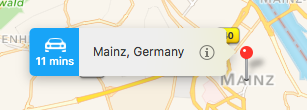
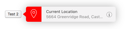
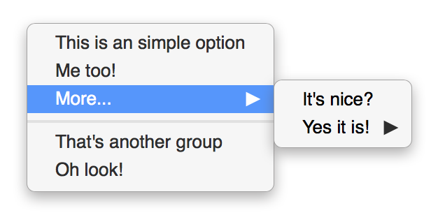
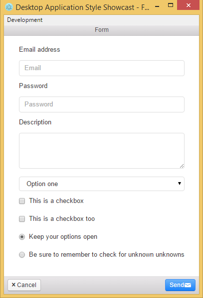
UI toolkit for building desktop apps with Electron.

Getting started

  • Clone the repo with git clone https://github.com/connors/photon.git
  • Read the docs to learn about the components and how to get your new application started

Take note that our master branch is our active, unstable development branch and that if you're looking to download a stable copy of the repo, check the tagged downloads.

What's included

Within the download you'll find the following directories and files, logically grouping common assets. You'll see something like this:

photon/
├── css/
│   ├── photon.css
├── fonts/
│   ├── photon-entypo.eot
│   ├── photon-entypo.svg
│   ├── photon-entypo.ttf
│   └── photon-entypo.woff
└── template-app/
    ├── js/
    │   └── menu.js
    ├── app.js
    ├── index.html
    └── package.json

We provide compiled CSS (photon.*). We also include the Entypo fonts and a template Electron application for you to quickly get started.

Documentation

Photon's documentation is built with Jekyll and publicly hosted on GitHub Pages at http://photonkit.com. The docs may also be run locally.

Running documentation locally

  1. If necessary, install Jekyll (requires v2.5.x).
  1. Install the Ruby-based syntax highlighter, Rouge, with gem install rouge.
  2. From the root /photon directory, run jekyll serve in the command line.
  3. Open http://localhost:4000 in your browser, and boom!

Learn more about using Jekyll by reading its documentation.

Contributing

Please file a GitHub issue to report a bug. When reporting a bug, be sure to follow the contributor guidelines.

Development

  1. Install node dependencies: npm install.
  2. Open the example app: npm start.

Modifying source Sass files? Open a second Terminal tab and run npm run build to kick off a build of the compiled photon.css.

Versioning

For transparency into our release cycle and in striving to maintain backward compatibility, Photon is maintained under the Semantic Versioning guidelines. Sometimes we screw up, but we'll adhere to these rules whenever possible.

Releases will be numbered with the following format:

<major>.<minor>.<patch>

And constructed with the following guidelines:

  • Breaking backward compatibility bumps the major while resetting minor and patch
  • New additions without breaking backward compatibility bumps the minor while resetting the patch
  • Bug fixes and misc changes bumps only the patch

For more information on SemVer, please visit http://semver.org/.

Maintainers

Connor Sears

License

Copyright @connors. Released under MIT.

photon's People

Contributors

connors avatar danieldiekmeier avatar developit avatar ducky427 avatar follower avatar ggamel avatar hustlion avatar kevinsawicki avatar kostasx avatar mdo avatar samuelyeshua avatar zeke avatar

Stargazers

 avatar  avatar  avatar  avatar  avatar  avatar  avatar  avatar  avatar  avatar  avatar  avatar  avatar  avatar  avatar  avatar  avatar  avatar  avatar  avatar  avatar  avatar  avatar  avatar  avatar  avatar  avatar  avatar  avatar  avatar  avatar  avatar  avatar  avatar  avatar  avatar  avatar  avatar  avatar  avatar  avatar  avatar  avatar  avatar  avatar  avatar  avatar  avatar  avatar  avatar  avatar  avatar  avatar  avatar  avatar  avatar  avatar  avatar  avatar  avatar  avatar  avatar  avatar  avatar  avatar  avatar  avatar  avatar  avatar  avatar  avatar  avatar  avatar  avatar  avatar  avatar  avatar  avatar  avatar  avatar  avatar  avatar  avatar  avatar  avatar  avatar  avatar  avatar  avatar  avatar  avatar  avatar  avatar  avatar  avatar  avatar  avatar  avatar  avatar  avatar

Watchers

 avatar  avatar  avatar  avatar  avatar  avatar  avatar  avatar  avatar  avatar  avatar  avatar  avatar  avatar  avatar  avatar  avatar  avatar  avatar  avatar  avatar  avatar  avatar  avatar  avatar  avatar  avatar  avatar  avatar  avatar  avatar  avatar  avatar  avatar  avatar  avatar  avatar  avatar  avatar  avatar  avatar  avatar  avatar  avatar  avatar  avatar  avatar  avatar  avatar  avatar  avatar  avatar  avatar  avatar  avatar  avatar  avatar  avatar  avatar  avatar  avatar  avatar  avatar  avatar  avatar  avatar  avatar  avatar  avatar  avatar  avatar  avatar  avatar  avatar  avatar  avatar  avatar  avatar  avatar  avatar  avatar  avatar  avatar  avatar  avatar  avatar  avatar  avatar  avatar  avatar  avatar  avatar  avatar  avatar  avatar  avatar  avatar  avatar  avatar  avatar

photon's Issues

Native window button (Contribution enquiries)

Didnt find add close, minimize, maximize buttons in the title bar in photon. That's why this issue aims to discuss about.

Their are 2 aspects abouts this:

  1. Theme integration (css, styling)
  2. action automation (js)

1. Theme integration

Theme integration would allow offer way to create these buttons. E.g (view top right buttons):

photon_002

That raises a problem: each desktop/OS has it's one button layout, colors, styles...
That's why buttons should be themable through custom classes e.g action-close but they should remain customable if he developer wants to do some weird button implementations (for instance the google chrome button that allows to login google account from the title bar).

2. Javscript integration

The second question. I'm only contributing, I have no precise idea of your goal with photon. Do you want to provide a feature rich javascript environment ?

In this case we could offer some shortcut to make a button closing the window (show bellow for example).

Implementation example

I provided an example of implementation:
gsouf@0313ccc

The buttons are defined in the header next to the title: gsouf@0313ccc#diff-434fc7c230c4addfe39300dedd6074edR21

Buttons can be bind automatically from markup: gsouf@0313ccc#diff-441d9fb1b9d314b7b48820c2890acc76R20

Please note that the implementation I provided is only a draft that was developed fastly in order to provide a concret example.

toolbar-header is not draggable by default

When using a frameless-window, only
toolbar-footer is draggable, I think we have to add

.toolbar-header {
   -webkit-app-region: drag;
}

By the way, photon is really awesome!

Shouldn't be able to highlight two items in list-group

Hi,

If you look at native UI components in OSX, you can't highlight two list items at the same time. The experience feels really weird when I have a selected item and I click on another one and both get highlighted.

I see two solutions here:

  1. Don't highlight on .list-group-item:active (Finder.app behaves like this in sidebar)
  2. Remove highlight on .list-group:active .list-group-item.selected:not(:active) (Finder.app behaves like this with folder content)

fixed-width tabs

Thank you for the photon! I've spent several hours to implement my own tab styles until I find this awesome library.

Would you like to add a fixed-width tab-item which can be found in many native apps (e.g. Terminal & Xcode):

image
image

I can submit a pr for this.

Have a windows (metro) style too ?

Using photon makes creating GUI a breeze, BUT, it looks really out of place when running such an app on Windows/Linux.

Any plans to support Windows themed UI elements ?

not emit 'maximize' event when click 'maximize' button

I create a 'browser-window'; it not emit 'maximize' event when I click 'maximize' button; To my surprised, these events('closed', 'minimize' etc) are ok.

this's my test code on max os x:

var main_window = new BrowserWindow({'accept-first-mouse': true, 'min-width': 500, 'min-height': 200, icon: tray_icon_path, 'title-bar-style': 'hidden', 'fullscreen': 'true'});
main_window.loadUrl(`file://${__dirname}/index.html`);

main_window.on('maximize', function() {
    console.log('maximize');
    main_window.maximize();
});

Menu Bar Component

I think a very common component in Desktop applications is Menu Bars and frankly, the one that Electron provides is kinda ugly.

I've been using angular-material lately and something like this would be nice, but much more compact. What I like most of photon is that is very compact in comparison to other css libraries/frameworks

Angular Material menu bar
MenuBar

Component - Collapsable Table Rows

In the "Finder" app in Mac OS, users can expand and collapse rows when viewing directories. This would be a very valuable addition to Photon.

menu.js error (missing: .js-context-menu)

I'm noticing dist/template-app/menu.js is trying to attach a click event to .js-context-menu but there's no element in dist/template-app/index.html that matches that. I looked around in each of the releases and wasn't able to find it there either.

Uncaught TypeError: Cannot read property 'addEventListener' of null
  (anonymous function) @ menu.js:24

https://github.com/connors/photon/blob/master/dist/template-app/js/menu.js#L24

Really cool project btw. Looks fantastic.

Component - alert & confirm dialog

In OS X, the modal dialog shows below the title bar:
image
image

Electron does a good job that shows alert and confirm dialog (by invoke alert() and confirm()) following the native style. However when using the custom title bar component of photon, the native dialog will become very strange:

image

I think it would be of great help if photon can offer a dialog component 😆

fyi - website page photon/components broken on safari 8

The majority of mac users that browse via safari are likely still on safari 8. Doing away with the -webkit- prefix for flex related styles breaks the layout. You're not alone in this, I've seen several other recently launched sites with the same issue. Just thought I'd mention it.

It's all the more irritating - especially since, for whatever reason, the recently announced Yosemite Safari 9 update is not listed in the app store at the moment.

Input, Button etc. cursor-type

If i hover a button, input, textarea or something else, the cursor remains default. If not already added: Please add the cursor: pointer to those relevant elements! 😸 Thanks!!

Context-Menu

Native looking context-menu

https://github.com/MauriceConrad/context-menu
(JSFiddle: https://jsfiddle.net/3rvxy92k/)

I've created a native looking context-menu CSS component.
There's no controller, just plain CSS:
This Context-Menu

minimal-example

  <body>
    <div class="context-menu" style="left: 100px; top: 100px">
      <ul>
        <li>
          <h1>Option 1</h1>
        </li>
        <li>
          <h1>Option 2</h1>
        </li>
      </ul>
    </div>
  </body>

sub-context-menu example

  <body>
    <div class="context-menu" style="left: 100px; top: 100px">
      <ul>
        <li class="has-sub-context-menu">
          <h1>I have a subcontext</h1>
          <ul>
            <li><h1>Item</h1></li>
            <li><h1>Another</h1></li>
          </ul>
        </li>
        <li>
          <h1>I'm normal</h1>
        </li>
      </ul>
    </div>
  </body>

How to use it?

It's really simple. Already study the JSFiddle or the example.html should explain everything.
But of course in the README.md everything is explained.

Documentation

https://github.com/MauriceConrad/context-menu/blob/master/README.md

Error building

First of all, this looks awesome. Cannot wait to use it.

I've followed the example, but I'm getting an error:

$ npm install
-
> [email protected] postinstall /Users/Steve/Downloads/photon-0.1-alpha/node_modules/electron-prebuilt
> node install.js

Downloading electron-v0.33.7-darwin-x64.zip
[============================================>] 100.0% of 37.93 MB (1.38 MB/s)
[email protected] node_modules/grunt-contrib-clean
└── [email protected]

[email protected] node_modules/grunt-contrib-copy
├── [email protected]
└── [email protected] ([email protected], [email protected], [email protected], [email protected], [email protected])

[email protected] node_modules/grunt-banner
└── [email protected] ([email protected], [email protected], [email protected], [email protected], [email protected])

[email protected] node_modules/grunt-contrib-sass
├── [email protected]
├── [email protected] ([email protected])
├── [email protected] ([email protected], [email protected], [email protected], [email protected], [email protected])
└── [email protected] ([email protected])

[email protected] node_modules/grunt-jekyll
└── [email protected] ([email protected])

[email protected] node_modules/grunt-contrib-concat
├── [email protected] ([email protected], [email protected], [email protected], [email protected], [email protected])
└── [email protected] ([email protected])

[email protected] node_modules/load-grunt-tasks
├── [email protected] ([email protected], [email protected], [email protected])
└── [email protected] ([email protected])

[email protected] node_modules/grunt-contrib-watch
├── [email protected]
├── [email protected] ([email protected])
└── [email protected] ([email protected], [email protected], [email protected], [email protected])

[email protected] node_modules/time-grunt
├── [email protected]
├── [email protected] ([email protected], [email protected], [email protected], [email protected], [email protected])
└── [email protected] ([email protected], [email protected], [email protected], [email protected], [email protected])

[email protected] node_modules/grunt-contrib-cssmin
├── [email protected] ([email protected], [email protected], [email protected], [email protected], [email protected])
├── [email protected] ([email protected], [email protected])
└── [email protected] ([email protected], [email protected], [email protected])

[email protected] node_modules/grunt
├── [email protected]
├── [email protected] ([email protected])
├── [email protected]
├── [email protected] ([email protected], [email protected])
├── [email protected]
├── [email protected] ([email protected], [email protected])
├── [email protected] ([email protected], [email protected], [email protected])
├── [email protected] ([email protected], [email protected])
└── [email protected] ([email protected], [email protected])

[email protected] node_modules/grunt-contrib-connect
├── [email protected]
├── [email protected] ([email protected])
├── [email protected] ([email protected], [email protected], [email protected], [email protected], [email protected])
├── [email protected] ([email protected], [email protected], [email protected], [email protected])
├── [email protected] ([email protected], [email protected], [email protected])
└── [email protected] ([email protected], [email protected], [email protected], [email protected], [email protected], [email protected], [email protected])

[email protected] node_modules/grunt-html
├── [email protected]
└── [email protected] ([email protected], [email protected], [email protected], [email protected], [email protected])

[email protected] node_modules/grunt-sed
├── [email protected] ([email protected], [email protected], [email protected])
└── [email protected]

[email protected] node_modules/grunt-contrib-compress
├── [email protected]
├── [email protected] ([email protected], [email protected], [email protected], [email protected], [email protected])
└── [email protected] ([email protected], [email protected], [email protected], [email protected], [email protected], [email protected], [email protected], [email protected])

[email protected] node_modules/electron-prebuilt
├── [email protected] ([email protected], [email protected], [email protected], [email protected], [email protected])
└── [email protected] ([email protected], [email protected], [email protected], [email protected], [email protected], [email protected], [email protected])


$ npm start

> [email protected] start /Users/Steve/Downloads/photon-0.1-alpha
> electron example-components


npm ERR! Darwin 15.0.0
npm ERR! argv "/usr/local/bin/node" "/usr/local/bin/npm" "start"
npm ERR! node v4.1.1
npm ERR! npm  v2.14.4
npm ERR! code ELIFECYCLE
npm ERR! [email protected] start: `electron example-components`
npm ERR! Exit status 1
npm ERR!
npm ERR! Failed at the [email protected] start script 'electron example-components'.
npm ERR! This is most likely a problem with the photon package,
npm ERR! not with npm itself.
npm ERR! Tell the author that this fails on your system:
npm ERR!     electron example-components
npm ERR! You can get their info via:
npm ERR!     npm owner ls photon
npm ERR! There is likely additional logging output above.

npm ERR! Please include the following file with any support request:
npm ERR!     /Users/Steve/Downloads/photon-0.1-alpha/npm-debug.log

Along with an electron pop up saying:

The app provided is not a valid electron app, please read the docs on how to write one:
https://github.com/atom/electron/tree/master/docs

Error: Cannot find module '/Users/Steve/Downloads/photon-0.1-alpha/example-components'

I realise it might just be because I haven't set anything up yet, I just presumed a basic boilerplate would work from the start.

CSS: Issues with one-third-width pane

In photon.css, the following doesn't work (takes up 50% of the container instead of 33.3%):

.pane-one-third {
  width: 33.3%;
}

Unless flex:none; is added to it:

.pane-one-third {
  width: 33.3%;
  flex: none;
}

Project name confusion

Hey @connors,

This project looks awesome and super useful - we've built an application with Electron and I can see how helpful this framework will be. That said, I'm wondering if I could convince you to change the name.

Backstory - I run a company called Particle; we make open source hardware development kits for IoT (used to be called Spark). Our latest development kit is called the Photon, and it's pretty popular; if you google 'Photon' we're the first result after the Wikipedia page on Photons. Our IDE, Particle Dev, is on Github's list of projects built with Electron: http://electron.atom.io/

I worry that the name you've selected for this project will create confusion; although the projects do different things, they're both development tools. I'm wondering if I can convince you to change the name while the project is still young?

Thanks for considering!

Unable to round corners in a table

Hello,

I have a table defined like this:


<div style="padding:1rem;">
  <p>
    A description of the contents of the table goes here. 
    This paragraph takes up a couple of lines of space.
  </p>
  <br />
  <table class="table-striped" >
    <thead>
      <tr>
        <th>First Name</th>
        <th>Last Name</th>
      </tr>
    </thead>

    <tbody>
      <tr>
        <td>Bill</td>
        <td>Jones</td>
      </tr>

      <tr>
        <td>Alex</td>
        <td>Johnson</td>
      </tr>

      <tr>
        <td>Jill</td>
        <td>Rodriguez</td>
      </tr>
    </tbody>
  </table>
</div>

The documentation shows two different table layouts:

  1. A version that does not have rounded corners as shown on the home page.
  2. A version that has rounded corners as shown in the "Tables" section of the components page.

The code above displays the version of a table without rounded corners. However, I want to display a table in my page that has rounded corners. As the code above shows, I have a 1rem padding. That's why I want the table border with rounded corners. Its unclear how to do this. I'm not sure if the rounded corners come from the window or the pane. If its the window, its not currently possible to nest a table with rounded corners in the middle of a page.

How can I display the table with the border and rounded corners shown in the "Tables" section of the components page?

`dist` includes files you don't need

In Electron, there's no reason to minify files since you're shipping them in-box, or to include a bunch of different web-compatible fonts since you know you're operating against Chrome 45, you can strip these

Modal component

There should be a simple modal component. This would be used in the current window instead of popping a new window.

Publish on npm?

Would be handy just to npm i photon.
photon is already taken, but photonkit is available.

For now I just do:

{
   "dependencies": {
    "photon": "connors/photon"
  }
}

Any plans to publish it as package on npm registry?

[Feature requests] In-button Icon

This feature sees in bootstrap or jquery ui (the style):

https://gyazo.com/1309644b527e99169301e27485c757ee

I did the above prototype by adding (changing?) these lines:

  .btn .icon {
    float: inherit;
    color: inherit;
  }

Toolbar:

      <footer class="toolbar toolbar-footer">
        <div class="toolbar-actions">
          <button class="btn btn-default">
            <span class="icon icon-cancel"></span> Cancel
          </button>

          <button class="btn btn-primary pull-right">
            Send <span class="icon icon-mail"></span>
          </button>
        </div>
      </footer>

(Currently, this is a quick prototype.)

Implement native OS X window handling for close/quit

Is there interest in implementing native OS X window handling for close/quit? If so, a personal project of mine has this functionality working 100% and it's 👌🏻👌🏻👌🏻. Improves the app experience (for me at least) by making the app feel far more native.

Pressing Cmd+Q and Cmd+W under OS X are common actions taken by OS X users:

  • Pressing Cmd+W results in the active app window being closed/hidden, but still active and not terminated in the background
  • Pressing Cmd+Q results in the active app window being quit/terminated.
  • Pressing the red X traffic light results in the active app window being closed/hidden, but still active and not terminated in the background.
  • Clicking the OS X dock icon for an app activates/reveals/unhides the closed/hidden app window

Thoughts? It shouldn't be a big deal for me to implement for photon, but figured I would test the waters to see if the interest is there.

Official NW.js support

Hey, I'm the creator of UGUI a framework for NW.js. I just tested your project and with a one line change it works fine in NW.js.

Do you have plans to officially support NW.js, or be willing to accept pull requests regarding it. It would take very little effort to set this project up proper for NW.js. And maintenance would require a small amount of changes to your current automated grunt system.

If you've not used it before, they're very similar (except NW.js beats out Electron by a little bit in almost every category). You should try it out, of course you'll need to change your "Electron is the easiest way to build cross-platform desktop applications" line on the website after wards though... since ya know, it's not um... factual.

I'll go now.

Table headers active

When you click on the thead cell, instead of just highlighting the clicked cell, it highlights the whole row

Popovers

It'd be nice to have a nice css and js component for popovers like:

screen shot 2015-10-11 at 5 37 57 pm

Component - Split Buttons

In the "App Store" app in Mac OS, users can choose to "Download" or "Get" an app. Alternatively, a user can click the "v" button beside the word "Download" and "Get" to see more options. Options like: "Copy Link", "Tell a Friend", and "Share on Twitter".

It would be really nice if Photon supported split buttons.

dropdown icon broken when css unminified

When using photon.css (unminified):

screen shot 2015-10-21 at 1 06 36 am

When using photon.min.css (minified):

screen shot 2015-10-21 at 1 06 56 am

Not sure why this is happening, but it is!

Working on Mac OS X Yosemite if that's at all relevant.

Copy: 'AirPlay' should be 'AirDrop'

If I understand correctly, the demo web app is supposed to represent a file browser - Finder in particular. One of the sidebar items is 'AirPlay' which is Apple's streaming protocol. Location of 'AirPlay' is nonsensical as when you use a file browser, you usually browse directories and locate files rather than... play music/stream videos to network devices. ¯_(ツ)_/¯

I recommend the 'AirPlay' is changed to 'AirDrop' as this may be what author intended it to be and made a typo AND it also makes more sense as 'AirDrop' is Apple's file sharing protocol.

Disabled State

Hello,

In Photon, buttons have an active class available to them. It would be valuable if a disabled class was also available. An example of a disabled button can be seen in the Finder in OS X.

  1. Open the Finder.
  2. Click "Documents"
  3. In the toolbar, you'll probably notice that the "Edit Tags" and "Share the selected items" buttons are disabled until you select one or more files.

Neutral theme

OS X is cool and all but it should be a theme on top of the neutral base layer. Electron is cross platform, so should we.

Bower

Hi! could be added in the project a bower.json to facilitate the maintenance of "front-end" dependencies. =)

tks,

More accurate input focus ring

I'd like to suggest a more accurate (at least in terms of OS X) input focus outline/border including the nice little animation Apple added in Yosemite.

Preview:

preview

JSFiddle Demo:

http://jsfiddle.net/developit/2xpnn03s/

SCSS:

.form-control {
    box-shadow: 0 0 0 7px rgba(109,179,253,0);

    &:focus {
        box-shadow: 0 0 0 1px rgba(109,179,253,0.8);
        transition: box-shadow 250ms ease-out;
        cursor: text;
    }
}

... thoughts?

Toolbar Layout

Hello,

I am building an app with Photon (which is awesome!). I'm having problems aligning items in the toolbar. In the toolbar, I'm basically trying to have three "sections". One section above the sidebar, one above the main content/pane and one floating to the right. Currently, I have this setup like the following:

<div class="window">
  <header class="toolbar toolbar-header">
    <!-- Left aligned above the sidebar. This works. -->
    <button class="btn btn-default"><span class="icon icon-plus"></span></button>

    <!-- Should be left-aligned above the "pane". This does not work -->
    <div class="btn-group">
      <button class="btn btn-default active"><span class="icon icon-menu"></span></button>
      <button class="btn btn-default"><span class="icon icon-layout"></span></button>
      <button class="btn btn-default"><span class="icon icon-cloud"></span></button>
    </div>

    <!-- Should be right-aligned -->
    <button class="btn btn-default pull-right"><span class="icon icon-help"></span></button>
  </header>

  <div class="window-content">
    <div class="pane-group">
      <div class="pane pane-sm sidebar">
        [navigation]
      </div>

      <div class="pane>
        [main content]
      </div>
    </div>
  </div>
</div>

Unfortunately, I cannot seem to figure out how to get the btn-group to be in the same line as the others, while at the same time, providing enough padding so that it is not above the sidebar. Is there a clean way of doing this?

Can't edit in form fields (inputs) in Safari or WKWebView

I just noticed that in Safari or an embedded WKWebView that I can't edit in form fields.

Just load up the sample page in Safari, and try and put data in the inputs in the "forms" sample.

http://photonkit.com/components/

I found this was being stopped by "-webkit-user-select: none;", and switching it to "-webkit-user-select: text;" made it work. I'm actually using this with the React version of your lib:

http://react-photonkit.github.io/#/components

so I edited the file there, and will mention this there as well. Thanks for the great lib!

Docs: thoughts on adding titles to icons?

Just wondering if there'd be interest in adding title attributes to the icon examples in the docs? I'm finding the current layout makes locating the right class name a bit tricky.

Something like:

<span class="icon icon-check" title="icon-check"></span>

for

screen shot 2015-10-14 at 10 08 29 am

I'd be happy to submit a PR!

Getting Started

Hello,

PhotonKit looks great. However, it is unclear how to actually start an app. I followed the "Getting "Started" information. I downloaded the "Precompiled Photon" I can see the css, fonts, and template-app directories. However, I can't figure out what to do now. How do I run the thing?

Recommend Projects

  • React photo React

    A declarative, efficient, and flexible JavaScript library for building user interfaces.

  • Vue.js photo Vue.js

    🖖 Vue.js is a progressive, incrementally-adoptable JavaScript framework for building UI on the web.

  • Typescript photo Typescript

    TypeScript is a superset of JavaScript that compiles to clean JavaScript output.

  • TensorFlow photo TensorFlow

    An Open Source Machine Learning Framework for Everyone

  • Django photo Django

    The Web framework for perfectionists with deadlines.

  • D3 photo D3

    Bring data to life with SVG, Canvas and HTML. 📊📈🎉

Recommend Topics

  • javascript

    JavaScript (JS) is a lightweight interpreted programming language with first-class functions.

  • web

    Some thing interesting about web. New door for the world.

  • server

    A server is a program made to process requests and deliver data to clients.

  • Machine learning

    Machine learning is a way of modeling and interpreting data that allows a piece of software to respond intelligently.

  • Game

    Some thing interesting about game, make everyone happy.

Recommend Org

  • Facebook photo Facebook

    We are working to build community through open source technology. NB: members must have two-factor auth.

  • Microsoft photo Microsoft

    Open source projects and samples from Microsoft.

  • Google photo Google

    Google ❤️ Open Source for everyone.

  • D3 photo D3

    Data-Driven Documents codes.