Giter VIP home page Giter VIP logo

lovelace-mushroom-themes's Introduction

🍄 Mushroom Themes

hacs

Warning Mushroom theme is not needed anymore if you have Home Assistant 2022.11 version! You only need it if you want Square, Shadow or Square Shadow theme.

Warning It's only a theme! You need to install Mushroom if you want to use Mushroom cards!

Description

Mushroom themes allow you to customize your Mushroom dashboard using Home Assistant themes.

Overview

Usage

Just select your theme in your Home Assistant profile settings.

4 themes are available :

  • Mushroom (default) : If you use this one, just simply uninstall Mushroom Themes as it's now part of Home Assistant default theme.
  • Mushroom Square
  • Mushroom Shadow
  • Mushroom Square Shadow

Build your own

You can build your own theme by using the mushroom variables.

em unit is relative to container height.

Mushroom:
    # HA variables
    ha-card-box-shadow: 0px 2px 4px 0px rgba(0,0,0,0.16)
    ha-card-border-radius: 12px
    # Mushroom layout
    mush-spacing: 12px
    # Title
    mush-title-padding: 24px 12px 8px
    mush-title-spacing: 8px
    mush-title-font-size: 24px
    mush-title-font-weight: normal
    mush-title-line-height: 32px
    mush-title-color: var(--primary-text-color)
    mush-title-letter-spacing: -0.288px
    # Subtitle
    mush-subtitle-font-size: 16px
    mush-subtitle-font-weight: normal
    mush-subtitle-line-height: 24px
    mush-subtitle-color: var(--secondary-text-color);
    mush-subtitle-letter-spacing: 0px

    # Card
    mush-card-primary-font-size: 14px
    mush-card-secondary-font-size: 12px
    mush-card-primary-font-weight: 500
    mush-card-secondary-font-weight: 400
    mush-card-primary-line-height: 20px
    mush-card-secondary-line-height: 16px
    mush-card-primary-color: var(--primary-text-color)
    mush-card-secondary-color: var(--primary-text-color)
    mush-card-primary-letter-spacing: 0.1px
    mush-card-secondary-letter-spacing: 0.4px

    # Chip
    mush-chip-spacing: 8px
    mush-chip-padding: 0 0.25em
    mush-chip-height: 36px
    mush-chip-border-radius: 18px
    mush-chip-font-size: 0.3em
    mush-chip-font-weight: bold
    mush-chip-icon-size: 0.5em
    mush-chip-avatar-padding: 0.1em
    mush-chip-avatar-border-radius: 50%
    mush-chip-background: var(--ha-card-background)
    # Control
    mush-control-border-radius: 12px
    mush-control-height: 42px
    mush-control-button-ratio: 1
    mush-control-icon-size: 0.5em
    # Slider
    mush-slider-threshold: 10
    # Badge
    mush-badge-size: 16px
    mush-badge-icon-size: 0.75em
    mush-badge-border-radius: 50%
    # Icon
    mush-icon-border-radius: 50%
    mush-icon-size: 40px
    mush-icon-symbol-size: 0.6em
    # Colors
    mush-rgb-red: 244, 67, 54
    mush-rgb-pink: 233, 30, 99
    mush-rgb-purple: 106, 107, 201
    mush-rgb-deep-purple: 111, 66, 193
    mush-rgb-indigo: 63, 81, 181
    mush-rgb-blue: 33, 150, 243
    mush-rgb-light-blue: 3, 169, 244
    mush-rgb-cyan: 0, 188, 212
    mush-rgb-teal: 0, 150, 136
    mush-rgb-green: 76, 175, 80
    mush-rgb-light-green: 139, 195, 74
    mush-rgb-lime: 205, 220, 57
    mush-rgb-yellow: 255, 235, 59
    mush-rgb-amber: 255, 193, 7
    mush-rgb-orange: 255, 152, 0
    mush-rgb-deep-orange: 255, 111, 0
    mush-rgb-brown: 121, 85, 72
    mush-rgb-light-grey: 189, 189, 189;
    mush-rgb-grey: 158, 158, 158
    mush-rgb-dark-grey: 96, 96, 96;
    mush-rgb-blue-grey: 96, 125, 139
    mush-rgb-black: 0, 0, 0
    mush-rgb-white: 255, 255, 255

    mush-rgb-info: var(--mush-rgb-blue)
    mush-rgb-success: var(--mush-rgb-green)
    mush-rgb-warning: var(--mush-rgb-orange)
    mush-rgb-danger: var(--mush-rgb-red)

    mush-rgb-state-fan: var(--mush-rgb-green)
    mush-rgb-state-light: var(--mush-rgb-orange)
    mush-rgb-state-entity: var(--mush-rgb-blue)
    mush-rgb-state-switch: var(--mush-rgb-blue)

    mush-rgb-state-alarm-disarmed: var(--mush-rgb-info)
    mush-rgb-state-alarm-armed: var(--mush-rgb-success)
    mush-rgb-state-alarm-triggered: var(--mush-rgb-danger)

    mush-rgb-state-person-home: var(--mush-rgb-success)
    mush-rgb-state-person-not-home: var(--mush-rgb-danger)
    mush-rgb-state-person-zone: var(--mush-rgb-info)
    mush-rgb-state-person-unknown: var(--mush-rgb-grey)

    mush-rgb-state-cover-open: var(--mush-rgb-blue)
    mush-rgb-state-cover-closed: var(--mush-rgb-disabled)

    mush-rgb-state-climate-auto: var(--mush-rgb-green);
    mush-rgb-state-climate-cool: var(--mush-rgb-blue);
    mush-rgb-state-climate-dry: var(--mush-rgb-orange);
    mush-rgb-state-climate-fan-only: var(--mush-rgb-blue-grey);
    mush-rgb-state-climate-heat: var(--mush-rgb-deep-orange);
    mush-rgb-state-climate-heat-cool: var(--mush-rgb-green);
    mush-rgb-state-climate-idle: var(--mush-rgb-grey);
    mush-rgb-state-climate-off: var(--mush-rgb-disabled);

    # You must keep this to support light/dark theme
    modes:
        light:
            mush-rgb-disabled: 189, 189, 189
        dark:
            mush-rgb-disabled: 111, 111, 111

Installation

Add the following code to your configuration.yaml file (restart required).

frontend:
  ... # your configuration.
  themes: !include_dir_merge_named themes
  ... # your configuration.

HACS

Mushroom Themes is available in HACS (Home Assistant Community Store).

  1. Open HACS
  2. Go to "Frontend" section
  3. Click button with "+" icon
  4. Search for "Mushroom Themes"

Manual

Clone this repository in your existing (or create it) themes/ folder.

cd themes/
git clone https://github.com/piitaya/lovelace-mushroom-themes

lovelace-mushroom-themes's People

Contributors

cumpsd avatar piitaya avatar

Stargazers

 avatar  avatar  avatar  avatar  avatar  avatar  avatar  avatar  avatar  avatar  avatar  avatar  avatar  avatar  avatar  avatar  avatar  avatar  avatar  avatar  avatar  avatar  avatar  avatar  avatar  avatar  avatar  avatar  avatar  avatar  avatar  avatar  avatar  avatar  avatar  avatar  avatar  avatar  avatar  avatar  avatar  avatar  avatar  avatar  avatar  avatar  avatar  avatar  avatar  avatar  avatar  avatar  avatar  avatar  avatar  avatar  avatar  avatar  avatar  avatar  avatar  avatar  avatar  avatar  avatar  avatar  avatar  avatar  avatar  avatar  avatar  avatar  avatar  avatar  avatar  avatar  avatar  avatar  avatar  avatar  avatar  avatar  avatar  avatar  avatar  avatar  avatar  avatar  avatar  avatar  avatar  avatar  avatar  avatar  avatar  avatar  avatar  avatar  avatar  avatar

Watchers

 avatar  avatar  avatar  avatar  avatar  avatar  avatar  avatar  avatar

lovelace-mushroom-themes's Issues

Unable to change mushroom card text color in dark mode

I'm using a few mushroom theme variables in a separate theme (iOS) that has a light and dark mode. In light mode, the primary-text-color and secondary-text-color variables seem to change the color of the text as expected, but in dark mode, my mushroom cards don't seem to respond to changes in those variables within the dark mode group. Are there different mushroom card specific text variables I should be using or is this a bug?

Make icon sizable in template card

First of all: Thank you for your outstanding work on mushroom-cards.

I would love to use them but encountered a small problem. I would like to be able to enlarge the icon size of (at least) the template card. Right now it seems to be fixed at 20px which for my eyes (I am 60 years young) on my phone is a bit small. I even tried to edit it in the mushroom.js (--mdc-icon-size in .shape ha-icon class) - but I can´t get it to work. So it would be much appreciated if you could make this size adjustable via a themes variable.

Thanks again!

Matthias

Feature Request: Expandable Card

I would like to have a Card that can be expanded. By default, it would be collapsed to save space and if you click on it, it would expand to show an additional card.

Sudden appearance of chip border after update 2.2.0

After updating to Mushroom v2.2.0 chips shows with a border. Used to be without. How can this be solved? Tried to play around with styles but no change.

image

This used to work

card_mod:
style: |
ha-card {
--chip-box-shadow: none;
--chip-background: none;
--chip-spacing: 0;
}

Fan and Light Card Colors not working

When trying to use the mush-rgb-state-light & mush-rgb-state-fan variable, the changes are not applied. Only changing colors and other options like font size and padding are working.

For example, I would like to change the color of the fans to be light blue from green, and lights to be amber.

This does not work:

mush-rgb-state-light: var(--rgb-amber)
mush-rgb-state-fan: var(--rgb-light-blue)

This works, but also changes anything else that is green.

mush-rgb-green: 3, 169, 244

Change background color for number card

card_mod:
  style: |-
    ha-card {
      --control-border-radius: 12px;
      --control-height: 36px;
      --control-button-ratio: 10;
      --control-icon-size: 0.5em;
      --bg-color: blue; #not work
    }
entity: input_number.shopping_item_number
name: none
layout: horizontal
fill_container: true
icon_type: none
display_mode: buttons
primary_info: none
secondary_info: none
tap_action:
  action: none
hold_action:
  action: none
double_tap_action:
  action: none

hacs upgrade from v0.0.1 -> v0.0.2 fails silently

Have tried several times to update the mushroom theme from v0.0.1 -> v0.0.2 but it fails silently with no error message at all. Is there a log somewhere that may give some clues to the problem?

Home Assistant 2022.4.7 running on a pi under docker (not supervised).

Theme doesnt seem to be applying

I have installed both mushroom and mushroom themes through HACS. I copied the basic default values into the mushroom.yaml in the themes folder and changed the mush-rgb-state-light to blue.
image
Set my theme to Mushroom:
image
All my lights still appear amber:
image
Here is the code for the frontend part I'm showing you:
- type: grid square: false columns: 3 cards: - type: custom:mushroom-light-card entity: light.downstairs_lamp name: Downstairs fill_container: false collapsible_controls: false show_brightness_control: true layout: vertical use_light_color: false color: light-blue style: word-wrap: normal - type: custom:mushroom-light-card entity: light.kitchen_lights name: Kitchen fill_container: false use_light_color: false show_brightness_control: true show_color_control: false layout: vertical - type: custom:mushroom-light-card entity: light.main_hallway name: Hallway layout: vertical show_brightness_control: true use_light_color: false
Also, If you could let me know how to enable word wrapping that would be awesome

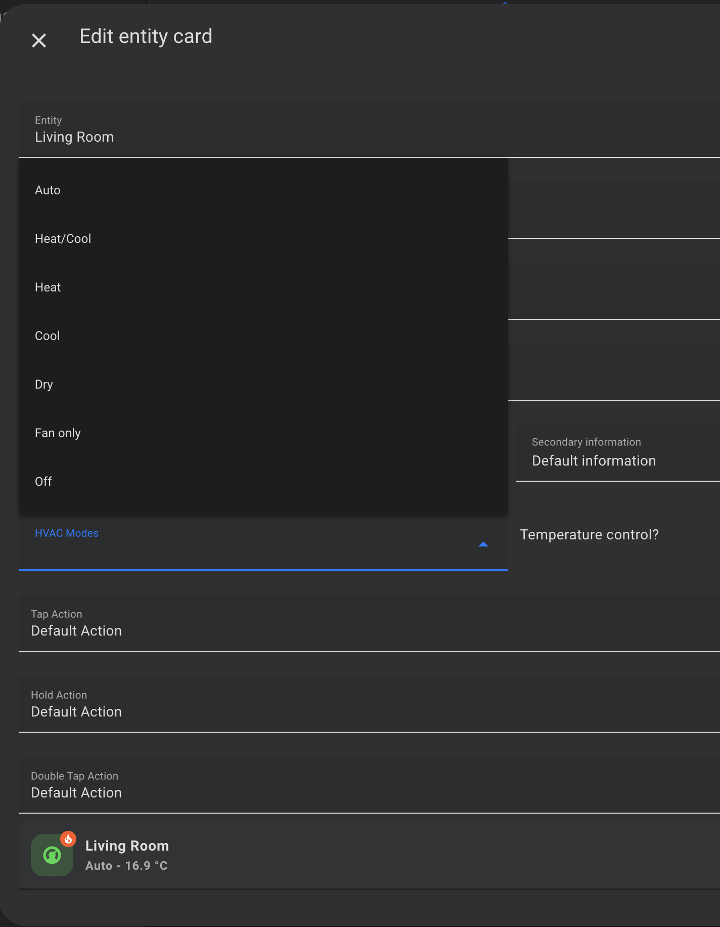
2022.12.0 - Climate Card

Guys.

I have noticed that running version 2022.11.5 i am able to see the HVAC modes. However running version 2022.12.0 the HVAC modes do not show up and can not be selected at all.

Screenshot 2022-12-08 at 12 02 14

Colors in theme like Minimalist ui

Can you use the same colors in your theme, so it is more integrated with Lovelace Minimalist UI?

  # Journal
  state-icon-color: "rgb(var(--color-theme))"
  border-radius: "20px"
  error-color: "var(--google-red)"
  warning-color: "var(--google-yellow)"
  success-color: "var(--google-green)"
  info-color: "var(--google-blue)"
  divider-color: "rgba(var(--color-theme),.12)"
  accent-color: "var(--google-yellow)"
  card-mod-theme: "minimalist-mobile"
  card-mod-root: |
    app-toolbar {
      display: none;
    }
  card-mod-view-yaml: |
    "*:first-child$": |
      #columns .column > * {
        padding-left: 5px;
        padding-right: 5px;
        padding-bottom: 5px;
      }
  modes:
    light:
      # text
      primary-text-color: "#212121"
      # main interface colors
      primary-color: "#434343"
      google-red: "#F54436"
      google-green: "#01C852"
      google-yellow: "#FF9101"
      google-blue: "#3D5AFE"
      google-violet: "#661FFF"
      google-grey: "#BBBBBB"
      color-red: "245, 68, 54"
      color-green: "1, 200, 82"
      color-yellow: "255, 145, 1"
      color-blue: "61, 90, 254"
      color-purple: "102, 31, 255"
      color-grey: "187, 187, 187"
      color-pink: "233, 30, 99"
      color-theme: "51,51,51"
      color-background-yellow: "250, 250, 250"
      color-background-blue: "250, 250, 250"
      color-background-green: "250, 250, 250"
      color-background-red: "250, 250, 250"
      color-background-pink: "250, 250, 250"
      color-background-purple: "250, 250, 250"
      color-yellow-text: "var(--primary-text-color)"
      color-blue-text: "var(--primary-text-color)"
      color-green-text: "var(--primary-text-color)"
      color-red-text: "var(--primary-text-color)"
      color-pink-text: "var(--primary-text-color)"
      color-purple-text: "var(--primary-text-color)"
      opacity-bg: "1"
      # background and sidebar
      card-background-color: "#FAFAFA"
      primary-background-color: "#EFEFEF"
      secondary-background-color: "#EFEFEF"
      # header
      app-header-text-color: "var(--primary-text-color)"
      app-header-background-color: "var(--primary-background-color)"
      # paper-tabs-selection-bar-color: "var(--primary-text-color)"
      # slider
      slider-color: "rgb(var(--color-blue))"
      slider-bar-color: "rgba(var(--color-blue),0.38)"
      # cards
      box-shadow: "0px 2px 4px 0px rgba(0,0,0,0.16)"
      ha-card-box-shadow: "var(--box-shadow)"
      # sidebar
      sidebar-selected-text-color: "var(--google-red)"
      sidebar-selected-icon-color: "var(--google-red)"
      sidebar-text-color: "#80868b"
      # switch
      switch-checked-color: "var(--google-blue)"
      # media player
      mini-media-player-accent-color: "var(--google-blue)"
    dark:
      # text
      primary-text-color: "#DDDDDD"
      # main interface colors
      primary-color: "#89B3F8"
      google-red: "#F18B82"
      google-green: "#80C994"
      google-yellow: "#FCD663"
      google-blue: "#89B3F8"
      google-violet: "#BB86FC"
      google-grey: "#BBBBBB"
      color-red: "241, 139, 130"
      color-green: "128, 201, 148"
      color-yellow: "252, 214, 99"
      color-blue: "137, 179, 248"
      color-theme: "221,221,221"
      color-purple: "102, 31, 255"
      color-grey: "187, 187, 187"
      color-pink: "233, 30, 99"
      color-background-yellow: "var(--color-yellow)"
      color-background-blue: "var(--color-blue)"
      color-background-green: "var(--color-green)"
      color-background-red: "var(--color-red)"
      color-background-pink: "var(--color-pink)"
      color-background-purple: "var(--color-purple)"
      color-yellow-text: "var(--color-yellow)"
      color-blue-text: "var(--color-blue)"
      color-green-text: "var(--color-green)"
      color-red-text: "var(--color-red)"
      color-pink-text: "var(--color-pink)"
      color-purple-text: "var(--color-purple)"
      opacity-bg: "0.1"
      # floating button text color
      mdc-theme-on-secondary: "var(--card-background-color)"
      # background and sidebar
      card-background-color: "#1D1D1D"
      primary-background-color: "#121212"
      secondary-background-color: "#121212"
      # header
      app-header-text-color: "var(--primary-text-color)"
      app-header-background-color: "var(--primary-background-color)"
      paper-tabs-selection-bar-color: "var(--primary-text-color)"
      # Sidebar
      sidebar-selected-text-color: "rgb(var(--color-blue))"
      sidebar-selected-icon-color: "rgb(var(--color-blue))"
      # Slider
      slider-color: "rgb(var(--color-blue))"
      slider-bar-color: "rgba(var(--color-blue),0.38)"
      # card
      box-shadow: "none"
      # media player
      mini-media-player-accent-color: "var(--google-blue)"
      # Journal
      state-icon-color: "rgb(var(--color-theme))"

Formatting for each card type

Is it possible to adjust card height and width for each card type? When I change card size on yaml file all cards changes. I want small person card but big light card or medium size climate card.

Do you have any plans for that?

Btw, this is a great work! Big thanks!

[Bug]: Using my own color variable from frontend theme

Current Behavior

So, we have specific mushroom-card palette in theme.yaml, it looks like: white: 255, 255, 255
while all whole cards (and HA GUI) uses white: rgb(255,255,255)

We need a way to use variables like: color: var(--white), but now we cant do it.
I tried set "white" in theme.yaml as rgb(), rgba(), #hex. No way to use "var" in mushroom-cards for all of them,
card waiting for "255,255,255" format only (for var), or hexa color #ffffff directly in card config.

I have my own list of colors in theme.yaml wich I using everywhere, and rly I dont want to copy-paste one more list in specific mushroom format.

Expected Behavior

No response

Steps To Reproduce

No response

Environment

- OS:
- Node:
- Version:
- Hassio:

Anything else?

No response

Climate Card Increment Area Font Size Question

Does anyone know how to change the font size of the area highlighted below? I'm using the below to customize the size, but can't figure out the highlighted area. Any help greatly appreciated.

            card_mod:
              style: |
                ha-card {
                  --icon-size: 100px;
                  --icon-symbol-size: 80px;
                } 
                :host {
                  --mush-card-secondary-font-size: 25px;
                }   

image

Theme not applied on HASS cards

Describe the bug
The mushroom theme is not applicate on all mushroom cards when we set theme on the page.
We have to set theme directly on some cards

To Reproduce
Steps to reproduce the behavior:

  1. Create a page
  2. Set theme page as mushroom
  3. Create a vertical stack
  4. First row, horizontal stack with 3 columns with 3 persons cards
  5. Second row, mushroom entity card with graphic footer
  6. See the entity card not take the theme

Screenshots
image

Shape Icon Colors

Looking at the CSS it appears the template card has shape-color rgba(r,g,b,0.2) whereas the person card assigns rgba(r,g,b,0.05). The only other place I was able to find transparency of 0.05 was in the Alarmo card.

image

custom element doesn't exist: mushroom-chip-card

Hello,

I updated to mushrooms last version today and all my mushroom cards (so, all my cards) disappeared.

All the cards are shown like that :
Screenshot_20231224_074408_Home Assistant

And I cannot add any new mushroom card.

Was there breaking changes? I didn't see such mention in the changelogs..
Please, could you tell me how to fix that issue?
do I need to manually edit every single card or can I update them all at once? (I have more than 50, its impossible to do from my mobile device)

Thank you,
Regards

HA 10.11 Borders

Since Home assistant 10.11 the default borders have appeared on the mushroom themes and they look far worse than the old look pre 10.11
Themes

New Theme (Mix of themes) Square theme with round Icons

Hello,

could you please make a theme where is everything square like in the theme "Mushroom Square" or "Mushroom Square Shadow" with the exception of the Icon. The Icon should be a circle like in the Theme "Mushroom" or "Mushroom Shadow"

With best regards

Johann

Recent change with chip card?

I've had a custom theme based on the example here with a slight size increase for the chip card however a recent release seems to have changed the config of the card? my theme previously increased the chip card by a few pixels however now it's very large as can be seen from the screenshot below:
image
here is my theme:

Mushroom-test:
  # HA variables
  ha-card-box-shadow: 0px 2px 4px 0px rgba(0,0,0,0.16)
  ha-card-border-radius: 12px
  # Mushroom layout
  mush-spacing: 12px
  # Title
  mush-title-padding: 24px 12px 16px
  mush-title-spacing: 12px
  mush-title-font-size: 28px
  mush-title-font-weight: normal
  mush-title-line-height: 1.2
  mush-subtitle-font-size: 16px
  mush-subtitle-font-weight: normal
  mush-subtitle-line-height: 1.2
  # Card
  mush-icon-border-radius: 50%
  mush-control-border-radius: 12px
  mush-card-primary-font-size: 14px
  mush-card-secondary-font-size: 12px
  mush-card-primary-font-weight: bold
  mush-card-secondary-font-weight: bolder
  #card-background-color: rgba(2, 58, 162, 0.2)
  # Chips
  mush-chip-spacing: 8px
  mush-chip-padding: 0 12px
  mush-chip-height: 38px
  mush-chip-border-radius: 18px
  mush-chip-font-size: 1em # relative to chip height
  mush-chip-font-weight: bold
  mush-chip-icon-size: 1.5em # relative to chip height
  # Slider
  mush-slider-threshold: 10
  # Colors
  mush-rgb-red: 244, 67, 54
  mush-rgb-pink: 233, 30, 99
  mush-rgb-purple: 156, 39, 176
  mush-rgb-deep-purple: 103, 58, 183
  mush-rgb-indigo: 63, 81, 181
  mush-rgb-blue: 33, 150, 243
  mush-rgb-light-blue: 3, 169, 244
  mush-rgb-cyan: 0, 188, 212
  mush-rgb-teal: 0, 150, 136
  mush-rgb-green: 76, 175, 80
  mush-rgb-light-green: 139, 195, 74
  mush-rgb-lime: 205, 220, 57
  mush-rgb-yellow: 255, 235, 59
  mush-rgb-amber: 255, 193, 7
  mush-rgb-orange: 255, 152, 0
  mush-rgb-deep-orange: 255, 87, 34
  mush-rgb-brown: 121, 85, 72
  mush-rgb-grey: 158, 158, 158
  mush-rgb-blue-grey: 96, 125, 139
  mush-rgb-black: 0, 0, 0
  mush-rgb-white: 255, 255, 255

  mush-rgb-info: var(--rgb-blue)
  mush-rgb-success: var(--rgb-green)
  mush-rgb-warning: var(--rgb-orange)
  mush-rgb-danger: var(--rgb-red)

  mush-rgb-state-cover: var(--rgb-blue)
  mush-rgb-state-fan: var(--rgb-green)
  mush-rgb-state-light: var(--rgb-orange)
  mush-rgb-state-entity: var(--rgb-blue)
  mush-rgb-state-switch: var(--rgb-blue)

  mush-rgb-state-alarm-disarmed: var(--rgb-info)
  mush-rgb-state-alarm-armed: var(--rgb-success)
  mush-rgb-state-alarm-triggered: var(--rgb-danger)

  mush-rgb-state-person-home: var(--rgb-success)
  mush-rgb-state-person-not-home: var(--rgb-danger)
  mush-rgb-state-person-zone: var(--rgb-info)
  mush-rgb-state-person-unknown: var(--rgb-grey)

  # You must keep this to support light/dark theme
  modes:
    light: {}
    dark: {}

Mushroom dark

Would you create a dark theme preferably with mushroom square
Thanks

Spacing when using entity picture in Chips Card

When using a chips card, if you use an entity picture I've noticed the spacing between the picture and text is quite large.

When using the browser inspect element tool - it looks like mush-chip-padding is being applied to the text as well as the picture, rather than to both as one object. I hope that makes sense.

Overriding the mush-rgb-state-* doesn't work

Great stuff! I tried overriding in my own theme the default color of lights, using mush-rgb-state-light: var(--rgb-amber), but this had no effect. The other kinds of overrides do work though, so I can't tell why these ones don't.

Feature Request: A Popup Card

Hello,

First, I would like to thank you for your magnificent work.

It would be cool if you would create a button/entity type card that opens a pop up with a card in it. A card in where you can define one card that is shown if you click on this button/entity.

Latest update crashed all cards on Samsung Fridge

Hi,
Until last update I was able to display all cards in Samsung’s Family Hub display.
After the update all my cards display error:
Custom element doesn’t exist: mushroom-chips-card
(Same for all cards)

it still works fine on mobile and PC but for me the new upgrade is unusable if it used some new libraries or whatnot :(

Unable to install

When trying to install the themes, error msg:
image

If i try to 'download' anyways, it just spins and goes no where.

Home Assistant 2022.10.5 Supervisor 2022.10.0 Operating System 9.3 Frontend 20221010.0 - latest

Mushroom Entity Card: Default color differs

It's stated that since 2022.11 Mushroom theme is not needed anymore. But without using it, the Mushroom Entity Card's default color doesn't respect HA's default state colors.

Example (2022.12.8):

AAD3682B-BBD4-41AF-83C7-CA0AB899BC12


      - type: custom:mushroom-entity-card
        entity: group.weihnachtsbeleuchtung
        name: mushroom-entity-card

      - type: tile
        entity: group.weihnachtsbeleuchtung
        name: tile

      - type: entities
        entities:
          - entity: group.weihnachtsbeleuchtung
            name: entities
        state_color: true

Color Icon when state is off on Mushroom entity card

Hi

I tried to add a color template to change the color on the entity card. But seems like it is not possible to add color to an icon when state is off.

I have a few magnet sensors on my windows, and it would be great if I could set the color of the icon to green when they are closed (State is off but set to closed since entity has device class "opening" which sets state off to closed (https://www.home-assistant.io/integrations/binary_sensor/))

Is it possible to add the opportunity for color template like it is for the icon template?

Ability to change font size of Chip text

I am probably just missing something in Inspector and the stylesheet, but is there currently a term e.g., how there is mush-chip-height, or mush-title-font-size?

I am trying to increase their size so they are easier to use on a touch display. I love these lovelace addons - thank you for all the great work!

Ability to keep changes after update

Loving the mushroom Themes

I use 2 backgrounds for light and dark mode, when updating the config for these are wiped.
Would it be possible to make a custom section where these are changed, and will be called even when updated.

Keep up the great work!

Problem with Lovelace category during HACS install

Just installed the theme using hacs. The README.md states that I should choose Lovelace as the category for the custom repo. The installation failed because of a not compatible folder layout. Instead of Lovelace select Theme and everything will work fine.

Map background to dark

I really like the SQUARE theme, but for on problem. The map background should be light, as is, it is hardly possible to recognize anything. Can I change this myself? Fooled around a bit in the theme, but got nowhere.... See the attached example...

IdAW – Home Assistant 2023-10-21 13-57-37

Mushroom Theme recommendation

After many tests I’ve found a very nice theme for Mushroom:

Mushroom 2:
    # Home Assistant override
    ha-card-box-shadow: rgba(50, 50, 105, 0.1) 0px 1px 2px 0px, rgba(0, 0, 0, 0.05) 0px 1px 1px 0px
    ha-card-border-radius: 6px
    # Layout
    mush-spacing: 8px
    mush-chip-height: 36px
    # Elements
    mush-icon-border-radius: 50%
    mush-control-border-radius: 6px
    # Chips
    mush-chip-border-radius: 6px
    modes:
        light:
            border-color: "#E8E8E8"
            primary-background-color: rgba(0,0,0,0.03)
        dark:
            border-color: "#1F1B24"
            primary-background-color: rgba(0,0,0,0.3)

Chip Outline

I used to have no outline for the chip cards. After the recent updates, I can not get rid of them. I don't know what I am missing? I have tried removing every border option I can see.
Screenshot 2022-11-18 170049
Does anyone know how to remove the chip card outline?

stretch icon

Is it possible to stretch icons by width?
to fill the line from edge to edge, for beauty.
image
to get it like this
image

Cannot read properties of undefined (reading 'attributes')

Uncaught (in promise) TypeError: Cannot read properties of undefined (reading 'attributes')
at ns (mushroom.js?hacstag=444350375213:1340:3113)
at sl.render (mushroom.js?hacstag=444350375213:2175:991)
at sl.update (mushroom.js?hacstag=444350375213:37:410)
at sl.performUpdate (mushroom.js?hacstag=444350375213:25:5057)
at sl.scheduleUpdate (mushroom.js?hacstag=444350375213:25:4704)
at sl.$E (mushroom.js?hacstag=444350375213:25:4612)

Split "mush-control-border-radius" into two attributes

Hello,

is it possible to split the "mush-control-border-radius: " attribute into two, to control the buttons and the color/brightness bar separately?

I would like to have circular buttons but a more rectangular color/brightness bar.

[Bug]: 0.0.5 dont apply on hass 2022.10.5

I don't have much to say, the borders are not being applied and it seems to me that the whole theme is not working. I'm installing it for the first time today so I don't know if any other issues are happening, but version 0.0.2 seems to be working fine.

Environment

VMware
Brower: Chrome
Mushroom: 2.2.0
Mushroom Themes: 0.0.5
Home Assistant 2022.10.5
Supervisor 2022.10.0
Operating System 9.3
Frontend: 20221010.0 - latest

Recommend Projects

  • React photo React

    A declarative, efficient, and flexible JavaScript library for building user interfaces.

  • Vue.js photo Vue.js

    🖖 Vue.js is a progressive, incrementally-adoptable JavaScript framework for building UI on the web.

  • Typescript photo Typescript

    TypeScript is a superset of JavaScript that compiles to clean JavaScript output.

  • TensorFlow photo TensorFlow

    An Open Source Machine Learning Framework for Everyone

  • Django photo Django

    The Web framework for perfectionists with deadlines.

  • D3 photo D3

    Bring data to life with SVG, Canvas and HTML. 📊📈🎉

Recommend Topics

  • javascript

    JavaScript (JS) is a lightweight interpreted programming language with first-class functions.

  • web

    Some thing interesting about web. New door for the world.

  • server

    A server is a program made to process requests and deliver data to clients.

  • Machine learning

    Machine learning is a way of modeling and interpreting data that allows a piece of software to respond intelligently.

  • Game

    Some thing interesting about game, make everyone happy.

Recommend Org

  • Facebook photo Facebook

    We are working to build community through open source technology. NB: members must have two-factor auth.

  • Microsoft photo Microsoft

    Open source projects and samples from Microsoft.

  • Google photo Google

    Google ❤️ Open Source for everyone.

  • D3 photo D3

    Data-Driven Documents codes.