Giter VIP home page Giter VIP logo

react-native-slider's Introduction

react-native-slider

npm version npm downloads npm licence Platform

A pure JavaScript <Slider> component for react-native. This is still very much a work in progress, ideas and contributions are very welcome.

It is a drop-in replacement for Slider.

Install

npm i --save react-native-slider

Note: I try to maintain backward compatibility of this component with previous versions of React Native, but due to the nature of the platform, and the existence of breaking changes between releases, it is possible that you need to use a specific version of this component to support the exact version of React Native you are using. See the following table:

React Native version(s) Supporting react-native-slider version(s)
<0.25.0 <0.7.0
v0.25.x v0.7.x
v0.26.0+ v0.8.x
v0.43.0+ v0.10.x
v0.44.0+ v0.11.x

Usage

import React from "react";
import Slider from "react-native-slider";
import { AppRegistry, StyleSheet, View, Text } from "react-native";

class SliderExample extends React.Component {
  state = {
    value: 0.2
  };

  render() {
    return (
      <View style={styles.container}>
        <Slider
          value={this.state.value}
          onValueChange={value => this.setState({ value })}
        />
        <Text>
          Value: {this.state.value}
        </Text>
      </View>
    );
  }
}

const styles = StyleSheet.create({
  container: {
    flex: 1,
    marginLeft: 10,
    marginRight: 10,
    alignItems: "stretch",
    justifyContent: "center"
  }
});

AppRegistry.registerComponent("SliderExample", () => SliderExample);

Try this example live on Expo Snack.

Props

Prop Type Optional Default Description
value number Yes 0 Initial value of the slider
disabled bool Yes false If true the user won't be able to move the slider
minimumValue number Yes 0 Initial minimum value of the slider
maximumValue number Yes 1 Initial maximum value of the slider
step number Yes 0 Step value of the slider. The value should be between 0 and maximumValue - minimumValue)
minimumTrackTintColor string Yes '#3f3f3f' The color used for the track to the left of the button
maximumTrackTintColor string Yes '#b3b3b3' The color used for the track to the right of the button
thumbTintColor string Yes '#343434' The color used for the thumb
thumbTouchSize object Yes {width: 40, height: 40} The size of the touch area that allows moving the thumb. The touch area has the same center as the visible thumb. This allows to have a visually small thumb while still allowing the user to move it easily.
onValueChange function Yes Callback continuously called while the user is dragging the slider
onSlidingStart function Yes Callback called when the user starts changing the value (e.g. when the slider is pressed)
onSlidingComplete function Yes Callback called when the user finishes changing the value (e.g. when the slider is released)
style style Yes The style applied to the slider container
trackStyle style Yes The style applied to the track
thumbStyle style Yes The style applied to the thumb
thumbImage source Yes Sets an image for the thumb.
debugTouchArea bool Yes false Set this to true to visually see the thumb touch rect in green.
animateTransitions bool Yes false Set to true if you want to use the default 'spring' animation
animationType string Yes 'timing' Set to 'spring' or 'timing' to use one of those two types of animations with the default animation properties.
animationConfig object Yes undefined Used to configure the animation parameters. These are the same parameters in the Animated library.

MIT Licensed

react-native-slider's People

Contributors

brentvatne avatar brunolemos avatar cridenour avatar jamesreggio avatar janmarsicek avatar jaygarcia avatar jeanregisser avatar kapv89 avatar manask88 avatar msand avatar philippkrone avatar rreusser avatar skevy avatar

Stargazers

 avatar  avatar  avatar  avatar  avatar  avatar  avatar  avatar  avatar  avatar  avatar  avatar  avatar  avatar  avatar  avatar  avatar  avatar  avatar  avatar  avatar  avatar  avatar  avatar  avatar  avatar  avatar  avatar  avatar  avatar  avatar  avatar  avatar  avatar  avatar  avatar  avatar  avatar  avatar  avatar  avatar  avatar  avatar  avatar  avatar  avatar  avatar  avatar  avatar  avatar  avatar  avatar  avatar  avatar  avatar  avatar  avatar  avatar  avatar  avatar  avatar  avatar  avatar  avatar  avatar  avatar  avatar  avatar  avatar  avatar  avatar  avatar  avatar  avatar  avatar  avatar  avatar  avatar  avatar  avatar  avatar  avatar  avatar  avatar  avatar  avatar  avatar  avatar  avatar  avatar  avatar  avatar  avatar  avatar  avatar  avatar  avatar  avatar  avatar  avatar

Watchers

 avatar  avatar  avatar  avatar  avatar  avatar  avatar  avatar  avatar  avatar  avatar  avatar  avatar  avatar  avatar  avatar  avatar

react-native-slider's Issues

Merge + publish small fixes/tweaks

Thanks so much for this module! I'm not aware of a different native drop-in for android yet, so I did my best to clean up a couple small issues, pull things together, and document the changes. You can see the result at: https://github.com/rreusser/react-native-slider

I know how much work it is to maintain open source stuff like this, but I really appreciate you putting this together and would be glad to merge and publish #9, #10, #24, and #25 (I had trouble getting #17 working ๐Ÿ˜ž) if you think those changes are the right move and if given permission.

Otherwise anyone is welcome to use my fork if these tweaks seem like the right move. ๐Ÿ‘

Thanks!

Cannot position the slider

I can't seem to do much with this component...

Tried setting all sorts of styles on the style.container object to try to position the slider...position: 'absolute', width, top, left, etc all have no effect...the slider seems to always be the width of the screen and fixed to the top.

transformError causing build to fail

After installing this package and refreshing my view, I recieved the red error screen saying transformError, unexpected token ... I'm using react-native 0.18 and react-native-cli 0.2.0. Just wondering if anyone else had experienced this isue

RTL support for Slider

When RTL is active, Slider's view automatically positioned in RTL and the thumb positioned in the right side which is the correct behaviour.
Nevertheless the thumb and the touch gestures are not inverted and will only respond to LTR touch.
This is too bad, cause this package cannot be used at all for RTL apps.

Validation function warning

I am currently facing the issue, that I am getting around 10 warnings pushed to the same topic:

Warning: You are manually calling a React.PropTypes validation function for the value prop on Slider. This is deprecated and will not work in production with the next major version. You may be seeing this warning due to a third-party PropTypes library. See https://fb.me/react-warning-dont-call-proptypes for details.reactConsoleError @ ExceptionsManager.js:76
ExceptionsManager.js:76Warning: You are manually calling a React.PropTypes validation function for the disabled prop on Slider. This is deprecated and will not work in production with the next major version. You may be seeing this warning due to a third-party PropTypes library. See https://fb.me/react-warning-dont-call-proptypes for details.reactConsoleError @ ExceptionsManager.js:76

The slider is working but I can't turn off those warnings. Any suggestions?

New release for npm

Hi,
I saw previous commits removed peerDependencies but I still have the issue when I try to install your package through npm (npm i --save react-native-slider).
Could you please update npm ? I think you just have to make a new release.

Slider motion delay

There is a significant delay from when I slide the toggle to when it actually moves. What could be the reason for this? I have a number of sliders on one view if that makes any difference.

Thanks,
Daniel

Is there a way to lock the slider?

I have a use case where I want to show the slider, but i dont want the user to be able to move the slider. Is there any way that I can implement my use case with the current compoment as it is?. If not, is there any plan to support this feature?

Track doesn't align in RN0.39

Hi, I've noticed the track doesn't align properly in React Native 0.39.

<Slider
  style={{width: 300}}
  value={this.state.value}
  minimumTrackTintColor='#FF0000'
  maximumTrackTintColor='#00FF00'
  thumbTintColor='#0000FF'
  minimumValue={0}
  maximumValue={10}
  onValueChange={(value) => this.setState({value})} />

As a short term fix, I've found that providing trackStyle={{marginTop: -4}} fixes the issue, but I suspect changing defaultStyles to include the fix would be a better solution.

Here's a screenshot of the bug...
screen shot 2016-12-05 at 15 46 06

track issue.

maxTrack and minTrack are in wrong position.
like this:
==========( )---------------------
both tracks on left side are visible.

Support vertical orientation

This would be perfect for my project if it supported vertical orientation. How much would it take to support other orientations?

Consider transpiling npm package to ES5

I found that it's impractical to use this package for web apps because it uses ES6/7 features and doesn't transpile to ES5 before publishing to npm. It's common for web apps to skip transpiling their node_modules dependencies.

Support using images

On iOS, you can set a thumb image, and you can set the left side and right side image, where you would for example create a slider image that includes the left and right caps, then in the middle, you would have two 1 pixel wide by __ pixel high pictures that would tile the left and right side of the thumb as you move. Don't know how feasible this would be?

Getting custom Animations to work

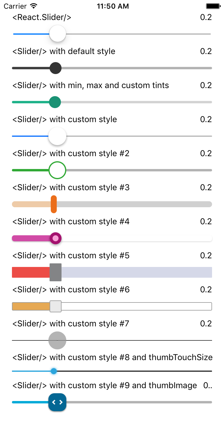
I have a very heavily edited version of react-native-slider that i am using to create a slider with custom images. So far i have a background image with two images acting as the thumb of the slider however i want to apply an animation 'onSlidingComplete' to one of the images.

Please note that i have edited the slider.js file within node_modules to get my desired effects and i have managed to get everything working up until now but i cannot for the life of me make any animations work.

slider declaration:

             <Slider

                style={styles.slider}

                trackStyle={styles.trackStyle}

                maximumValue={this.props.max}

                minimumValue={this.props.min}

                step={this.props.step}

                value={this.state.value}

                thumbTouchSize={this.props.thumbTouchSize}

                sliderBg={require('../../images/tank_bg.png')}

                thumbImage={require('../../images/thumb_slider.png')}

                thumbImageBg={require('../../images/thumb_slider_whitebg_line.png')}

                onSlidingComplete={(value) => this.onSlidingComplete(value)}

                onValueChange={(value) => this.onValueChange(value)}

                orientation={'horizontal'}

                sliderAnim={this.state.sliderAnim}

            />

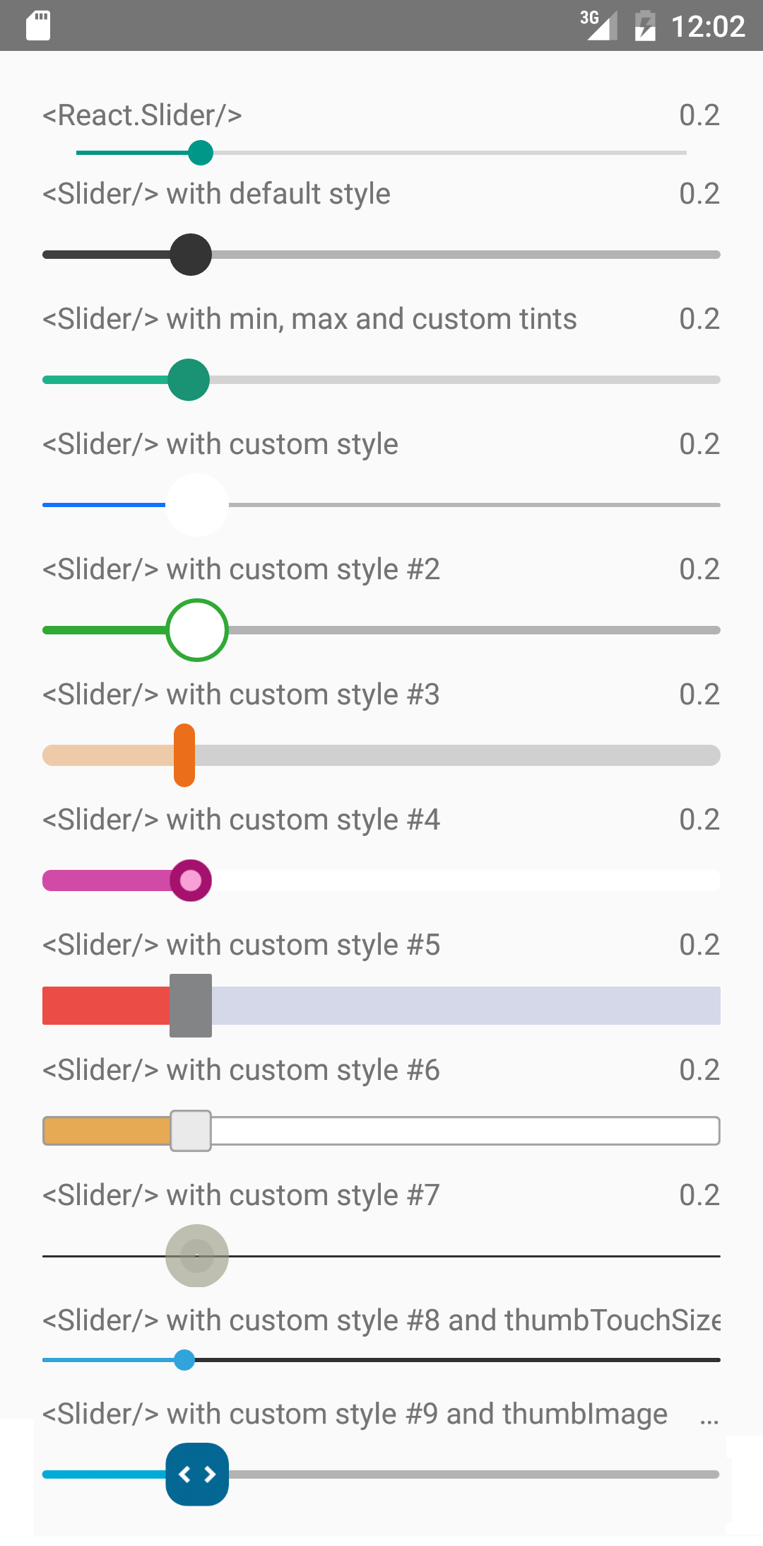
This is how i have my slider.js set up.

the places to note that i have already tried to implement animations are the _setCurrentValueAnimated function on line 577 and the _animateSlider function on line 240.

What i am looking to do is pass a boolean into the slider through its declaration as a this.state.sliderAnim: proptypes.bool and then have the code execute a scripted animation.

All i am trying to do is make the thumbImageBg animate its height from 0 to 100% once each time onSlidingComplete is called.

Any help is appreciated a lot

                    `
        import React, {
          Component,
        } from "react";
        import {
          Animated,
          StyleSheet,
          Image,
          PanResponder,
          View,
          Easing,
          Dimensions,
          LayoutAnimation,
          TouchableWithoutFeedback,
          TouchableOpacity,
          Platform,
          UIManager
        } from "react-native";

        import PropTypes from 'prop-types';

        if (Platform.OS === 'android') {
          UIManager.setLayoutAnimationEnabledExperimental(true);
        };

        const shallowCompare = require('react-addons-shallow-compare'),
              styleEqual = require('style-equal');

        const DIM = Dimensions.get('window');

        var TRACK_SIZE = 4;
        var THUMB_SIZE = 20;

        Image.getSize('../../images/tank_bg.png', (width, height) => {this._setWH({width, height})});

        function _setWH(width, height) {
            this.IMPwidth = width;
            this.IMPheight = height;
        };

        function Rect(x, y, width, height) {
          this.x = x; // This is a huge edit x = y
          this.y = y; // This is a huge edit y = x
          this.width = width;
          this.height = height;
        }

        Rect.prototype.containsPoint = function(x, y) {
          return (x >= this.x
                  && y >= this.y
                  && x <= this.x + this.width
                  && y <= this.y + this.height);
        };

        var DEFAULT_ANIMATION_CONFIGS = {
          spring : {
            friction : 7,
            tension  : 100
          },
          timing : {
            duration : 150,
            easing   : Easing.inOut(Easing.ease),
            delay    : 0
          },
          // decay : { // This has a serious bug
          //   velocity     : 1,
          //   deceleration : 0.997
          // }
        };

        export default class Slider extends Component {
          static propTypes = {
            /**
             * Initial value of the slider. The value should be between minimumValue
             * and maximumValue, which default to 0 and 1 respectively.
             * Default value is 0.
             *
             * *This is not a controlled component*, e.g. if you don't update
             * the value, the component won't be reset to its inital value.
             */
            value: PropTypes.number,

            /**
             * If true the user won't be able to move the slider.
             * Default value is false.
             */
            disabled: PropTypes.bool,

            /**
             * Initial minimum value of the slider. Default value is 0.
             */
            minimumValue: PropTypes.number,

            /**
             * Initial maximum value of the slider. Default value is 1.
             */
            maximumValue: PropTypes.number,

            /**
             * Step value of the slider. The value should be between 0 and
             * (maximumValue - minimumValue). Default value is 0.
             */
            step: PropTypes.number,

            /**
             * The color used for the track to the left of the button. Overrides the
             * default blue gradient image.
             */
            minimumTrackTintColor: PropTypes.string,

            /**
             * The color used for the track to the right of the button. Overrides the
             * default blue gradient image.
             */
            maximumTrackTintColor: PropTypes.string,

            /**
             * The color used for the thumb.
             */
            thumbTintColor: PropTypes.string,

            /**
             * The size of the touch area that allows moving the thumb.
             * The touch area has the same center has the visible thumb.
             * This allows to have a visually small thumb while still allowing the user
             * to move it easily.
             * The default is {width: 40, height: 40}.
             */
            thumbTouchSize: PropTypes.shape(
              {width: PropTypes.number, height: PropTypes.number}
            ),

            /**
             * Callback continuously called while the user is dragging the slider.
             */
            onValueChange: PropTypes.func,

            /**
             * Callback called when the user starts changing the value (e.g. when
             * the slider is pressed).
             */
            onSlidingStart: PropTypes.func,

            /**
             * Callback called when the user finishes changing the value (e.g. when
             * the slider is released).
             */
            onSlidingComplete: PropTypes.func,

            /**
             * The style applied to the slider container.
             */
            style: View.propTypes.style,

            /**
             * The style applied to the track.
             */
            trackStyle: View.propTypes.style,

            /**
             * The style applied to the thumb.
             */
            thumbStyle: View.propTypes.style,

            /**
             * Sets an image for the thumb.
             */
            thumbImage: Image.propTypes.source,

            /**
             * Set this to true to visually see the thumb touch rect in green.
             */
            debugTouchArea: PropTypes.bool,

            /**
            * Set to true to animate values with default 'timing' animation type
            */
            animateTransitions : PropTypes.bool,

            /**
            * Custom Animation type. 'spring' or 'timing'.
            */
            animationType : PropTypes.oneOf(['spring', 'timing']),

            /**
            * Used to configure the animation parameters.  These are the same parameters in the Animated library.
            */
            animationConfig : PropTypes.object,

            /**
            * Used to change the slider orientation between horizontal and vertical
            */
            orientation : PropTypes.oneOf(['horizontal', 'vertical']),

            /**
             * Sets an image for the background of the slider.
             */
            sliderBg: Image.propTypes.source,

            /**
             * Sets an image for the thumb background used for animation. @@@@ CUSTOM
             */
            thumbImageBg: Image.propTypes.source,

            /**
             * Starts the animation for the slider bar.
             */
            sliderAnim: PropTypes.bool,
          };


          state = {
            containerSize: {width: 0, height: 0},
            trackSize: {width: 0, height: 0},
            thumbSize: {width: 0, height: 0},
            allMeasured: false,
            value: new Animated.Value(this.props.value),
            imageBGStyle: {
              height: this.props.thumbImageBg.height,
            }
          };

          static defaultProps = {
            value: 0,
            minimumValue: 0,
            maximumValue: 1,
            step: 0,
            minimumTrackTintColor: '#3f3f3f',
            maximumTrackTintColor: '#b3b3b3',
            thumbTintColor: '#343434',
            thumbTouchSize: {width: 80, height: 80},
            debugTouchArea: true,
            animationType: 'timing',
            orientation: 'horizontal',
            sliderAnim: true,
          };

          _animateSlider() { // #################################################################
            // I USED THIS METHOD TO TRY CREATE AN ANIMATION USING LAYOUTANIMATION
            LayoutAnimation.configureNext(LayoutAnimation.Presets.spring);
            this.setState({
              imageBGStyle: {
                height: '100%',
              }
            })
            LayoutAnimation.configureNext(LayoutAnimation.Presets.spring);
            setInterval(function() {this.setState({
              imageBGStyle: {
                height: '0%',
              }
            })}.bind(this),5000)
          }

          componentWillMount() {
            this._panResponder = PanResponder.create({
              onStartShouldSetPanResponder: this._handleStartShouldSetPanResponder,
              onMoveShouldSetPanResponder: this._handleMoveShouldSetPanResponder,
              onPanResponderGrant: this._handlePanResponderGrant,
              onPanResponderMove: this._handlePanResponderMove,
              onPanResponderRelease: this._handlePanResponderEnd,
              onPanResponderTerminationRequest: this._handlePanResponderRequestEnd,
              onPanResponderTerminate: this._handlePanResponderEnd,
            });

            if(this.sliderAnim == true)
            {
              this.animatedValue = new Animated.Value(100);
              alert('sliderAnim is true and runs');
              console.log('sliderAnim is true and runs');
            }
          };

          componentWillReceiveProps(nextProps) {
            var newValue = nextProps.value;

            if (this.props.value !== newValue) {
              if (this.props.animateTransitions) {
                this._setCurrentValueAnimated(newValue);
              }
              else {
                this._setCurrentValue(newValue);
              }
            }
          };

          render() {
            var {
              minimumValue,
              maximumValue,
              minimumTrackTintColor,
              maximumTrackTintColor,
              thumbTintColor,
              thumbImage,
              styles,
              style,
              trackStyle,
              thumbStyle,
              debugTouchArea,
              orientation,
              sliderBg,
              thumbImageBg,
              sliderAnim,
              ...other
            } = this.props;
            var {value, containerSize, trackSize, thumbSize, allMeasured} = this.state;
            var mainStyles = styles || defaultStyles;
            var outputRange;
            if (orientation === 'horizontal') {
              outputRange = [0, containerSize.width - thumbSize.width];
            } else {
              outputRange = [containerSize.height - thumbSize.height, 0];
            }
            var thumbStart = value.interpolate({
                inputRange: [minimumValue, maximumValue],
                outputRange: outputRange,
                //extrapolate: 'clamp',
              });
            var valueVisibleStyle = {};
            if (!allMeasured) {
              valueVisibleStyle.opacity = 0;
            }

            var minimumTrackStyle = {
              position: 'absolute',
              // width: Animated.add(thumbStart, thumbSize.width/2),
              backgroundColor: minimumTrackTintColor,
              ...valueVisibleStyle
            };

            if (orientation === 'horizontal') {
              minimumTrackStyle.width = Animated.add(thumbStart, thumbSize.width / 2);
              minimumTrackStyle.marginTop = -trackSize.height;
            } else {
              minimumTrackStyle.marginLeft = -trackSize.width;
              minimumTrackStyle.top = thumbStart;
              minimumTrackStyle.height = Animated.add(thumbStart, -trackSize.height);
              minimumTrackStyle.height = Animated.multiply(minimumTrackStyle.height, -1);
            }

            var touchOverflowStyle = this._getTouchOverflowStyle();

            let imageBGStyle = [defaultStyles.thumbImgStyleBg, this.state.imageBGStyle];

            return (
              <View {...other} style={[mainStyles.container, style]} onLayout={this._measureContainer}>
                <Image style={defaultStyles.trackImgStyle} source={this.props.sliderBg}>
                  <View
                    style={[{backgroundColor: maximumTrackTintColor,}, mainStyles.track, trackStyle]}
                    renderToHardwareTextureAndroid={true}
                    onLayout={this._measureTrack} />
                    
                    {/*LayoutAnimation.configureNext(LayoutAnimation.Presets.spring);*/}

                  {/*<Animated.View
                    renderToHardwareTextureAndroid={true}
                    style={[mainStyles.track, trackStyle, minimumTrackStyle]} >
                    </Animated.View>*/}

                    {/*<TouchableOpacity
                      style={[defaultStyles.touchArea, {zIndex: 100}]}
                      onPress={this.animateSlider.bind(this)}>*/}

                  <Animated.View
                    onLayout={this._measureThumb}
                    renderToHardwareTextureAndroid={true}
                    style={[

                      mainStyles.thumb, thumbStyle,
                      {
                        transform: [
                          { translateX: thumbStart },
                          { translateY: 0 }
                        ],
                        ...valueVisibleStyle
                      }
                    ]} 
                  >

                  
                      <Animated.Image 
                      style={imageBGStyle} 
                      source={this.props.thumbImageBg} >
                        <Animated.Image 
                        style={defaultStyles.thumbImgStyle} 
                        source={this.props.thumbImage}/>
                      </Animated.Image>
                  </Animated.View>
                    {/*</TouchableOpacity>*/}

                  
                  <View
                    renderToHardwareTextureAndroid={true}
                    style={[defaultStyles.touchArea, touchOverflowStyle]}
                    {...this._panResponder.panHandlers}>
                    {debugTouchArea == true && this._renderDebugThumbTouchRect(thumbStart)}
                  </View>
                </Image>
              </View>
            );
          };

          _animate() { 
            Animated.timing(this.animatedValue,
            {
              toValue: 50,
              duration: 5000,
              easing: Easing.bounce
            }).start()
          };

          _getPropsForComponentUpdate(props) {
            var {
              value,
              onValueChange,
              onSlidingStart,
              onSlidingComplete,
              style,
              trackStyle,
              thumbStyle,
              ...otherProps,
            } = props;

            return otherProps;
          };

          _handleStartShouldSetPanResponder = (e: Object, /*gestureState: Object*/): boolean => {
            // Should we become active when the user presses down on the thumb?
            return this._thumbHitTest(e);
          };

          _handleMoveShouldSetPanResponder(/*e: Object, gestureState: Object*/): boolean {
            // Should we become active when the user moves a touch over the thumb?
            return false;
          };

          _handlePanResponderGrant = (/*e: Object, gestureState: Object*/) => {
            this._previousStart = this._getThumbStart(this._getCurrentValue());
            this._fireChangeEvent('onSlidingStart');
          };
          _handlePanResponderMove = (e: Object, gestureState: Object) => {
            if (this.props.disabled) {
              return;
            }

            this._setCurrentValue(this._getValue(gestureState));
            this._fireChangeEvent('onValueChange');
          };
          _handlePanResponderRequestEnd(e: Object, gestureState: Object) {
            // Should we allow another component to take over this pan?
            return false;
          };
          _handlePanResponderEnd = (e: Object, gestureState: Object) => {
            if (this.props.disabled) {
              return;
            }


            console.log("holy fuck");

            this._setCurrentValue(this._getValue(gestureState));
            this._fireChangeEvent('onSlidingComplete');
            if(this.sliderAnim === true)
            {
              this._animateSlider();
            }
          };

          onSlidingComplete() {
            alert("nah this works!");
          }

          _measureContainer = (x: Object) => {
            this._handleMeasure('containerSize', x);
          };

          _measureTrack = (x: Object) => {
            this._handleMeasure('trackSize', x);
          };

          _measureThumb = (x: Object) => {
            this._handleMeasure('thumbSize', x);
          };

          _handleMeasure = (name: string, x: Object) => {
            var {width, height} = x.nativeEvent.layout;
            var size = {width: width, height: height};

            var storeName = `_${name}`;
            var currentSize = this[storeName];
            if (currentSize && width === currentSize.width && height === currentSize.height) {
              return;
            }
            this[storeName] = size;

            if (this._containerSize && this._trackSize && this._thumbSize) {
              this.setState({
                containerSize: this._containerSize,
                trackSize: this._trackSize,
                thumbSize: this._thumbSize,
                allMeasured: true,
              })
            }
          };

          _getRatio = (value: number) => {
            return (value - this.props.minimumValue) / (this.props.maximumValue - this.props.minimumValue);
          };

          _getThumbStart = (value: number) => {
            var ratio = this._getRatio(value);

            var start = 0;

            if (this.props.orientation === 'horizontal') {
              var length = this.state.containerSize.width - this.state.thumbSize.width;
              start = ratio * length;
            } else {
              var length = this.state.containerSize.height - this.state.thumbSize.height;
              start = length - (ratio * length);
            }

            return start;
          };

          _getValue = (gestureState: Object) => {
            var length = 0;

            if (this.props.orientation === 'horizontal') {
              length = this.state.containerSize.width - this.state.thumbSize.width;
            } else {
              length = this.state.containerSize.height - this.state.thumbSize.height;
            }

            var thumbStart = this._previousStart;

            var ratio;
            /*
              ~~~~~~~~~~~~~~~~~~~~~~~~~~~~~~~~~~~~~~~~~~~~~~~~~~~~~~~~~~~~~~~~~~~~~~~~~
              
                THE NEXT STATEMENT IS EDITED TO AUTOMATICALLY TAKE ROTATED INPUTS FROM THE USER. EDIT IF "ORIENTATION" WORKS!
              
              ~~~~~~~~~~~~~~~~~~~~~~~~~~~~~~~~~~~~~~~~~~~~~~~~~~~~~~~~~~~~~~~~~~~~~~~~~
            */
            if (this.props.orientation === 'horizontal') {
              thumbStart += -gestureState.dy;
              ratio = (thumbStart / length);
            } else {
              thumbStart += gestureState.dy;
              ratio = 1 - (thumbStart / length);
            }

            if (this.props.step) {
              return Math.max(this.props.minimumValue,
                Math.min(this.props.maximumValue,
                  this.props.minimumValue + Math.round(ratio * (this.props.maximumValue - this.props.minimumValue) / this.props.step) * this.props.step
                )
              );
            } else {
              return Math.max(this.props.minimumValue,
                Math.min(this.props.maximumValue,
                  ratio * (this.props.maximumValue - this.props.minimumValue) + this.props.minimumValue
                )
              );
            }
          };

          _getCurrentValue = () => {
            return this.state.value.__getValue();
          };

          _setCurrentValue = (value: Number) => {
            this.state.value.setValue(value);
          };

          _setCurrentValueAnimated = (value: Number) => {
            var animationType   = this.props.animationType;
            var animationConfig = Object.assign(
                  {},
                  DEFAULT_ANIMATION_CONFIGS[animationType],
                  this.props.animationConfig,
                  {toValue : value}
                );
                // #######################################################################################################################
                // I CHANGED THIS THIS.STATE IN THE NEXT LINE SO THAT IT WOULD CHANGE THE HEIGHT OF MY IMAGES STYLE IN AN ANIMATION BUT IT DID NOT WORK
            Animated[animationType](this.state.imageBGStyle.height, animationConfig).start();
          };

          _fireChangeEvent = (event) => {
            if (this.props[event]) {
              this.props[event](this._getCurrentValue());
            }
          };

          _getTouchOverflowSize = () => {
            var state = this.state;
            var props = this.props;

            var size = {};
            if (state.allMeasured === true) {

              if (props.orientation === 'horizontal') {
                size.width = Math.max(0, props.thumbTouchSize.width - state.thumbSize.width);
                size.height = Math.max(0, props.thumbTouchSize.height - state.containerSize.height);
              } else {
                size.width = Math.max(0, props.thumbTouchSize.width - state.containerSize.width);
                size.height = Math.max(0, props.thumbTouchSize.height - state.thumbSize.height);
              }
            }

            return size;
          };

          _getTouchOverflowStyle = () => {
            var {width, height} = this._getTouchOverflowSize();

            var touchOverflowStyle = {};
            if (width !== undefined && height !== undefined) {
              var verticalMargin = -height / 2;
              touchOverflowStyle.marginTop = verticalMargin;
              touchOverflowStyle.marginBottom = verticalMargin;

              var horizontalMargin = -width / 2;
              touchOverflowStyle.marginLeft = horizontalMargin;
              touchOverflowStyle.marginRight = horizontalMargin;
            }

            if (this.props.debugTouchArea === true) {
              touchOverflowStyle.backgroundColor = 'orange';
              touchOverflowStyle.opacity = 0.5;
            }

            return touchOverflowStyle;
          };

          _thumbHitTest = (e: Object) => {
            var nativeEvent = e.nativeEvent;
            var thumbTouchRect = this._getThumbTouchRect();

            return thumbTouchRect.containsPoint(nativeEvent.locationX, nativeEvent.locationY);
          };

          _getThumbTouchRect = () => {
            var state = this.state;
            var props = this.props;
            var touchOverflowSize = this._getTouchOverflowSize();

            var rect = new Rect(
              0,
              0,
              props.thumbTouchSize.width,
              state.containerSize.height
            );

            if (this.props.orientation === 'horizontal') {
              rect.x = touchOverflowSize.width / 2 + this._getThumbStart(this._getCurrentValue()) + (state.thumbSize.width - props.thumbTouchSize.width) / 2;
              rect.y = touchOverflowSize.height / 2 + (state.containerSize.height - props.thumbTouchSize.height) / 2;
            } else {
              rect.x = touchOverflowSize.width / 2 + (state.containerSize.width - props.thumbTouchSize.width) / 2;
              rect.y = touchOverflowSize.height / 2 + this._getThumbStart(this._getCurrentValue()) + (state.thumbSize.height - props.thumbTouchSize.height) / 2;
            }

            return rect;
          };

          _renderDebugThumbTouchRect = (thumbStart) => {
            var thumbTouchRect = this._getThumbTouchRect();

            var positionStyle = {
              left: thumbTouchRect.x,
              top: thumbTouchRect.y,
              width: thumbTouchRect.width,
              height: thumbTouchRect.height,
              flex: 1,
              flexDirection: 'column',
              justifyContent: 'center'
            };

            if (this.props.orientation === 'horizontal') {
              positionStyle.left = thumbStart;
            } else {
              positionStyle.top = thumbStart;
            }
            return (
              <Animated.View
                style={[defaultStyles.debugThumbTouchArea, positionStyle]}
                pointerEvents='none'
              />
            );
          };

          _renderThumbImage = () => {
            var {thumbImage} = this.props;

            if (!thumbImage) return; 


            return {thumbImage};
          };
        };


        var defaultStyles = StyleSheet.create({
          container: {
            // height: 440,
            justifyContent: 'center',
            
          },
          track: {
            height: TRACK_SIZE,
            borderRadius: TRACK_SIZE / 2,
            
          },
          thumb: {
            position: 'absolute',
            width: THUMB_SIZE,
            height: '100%',
            borderRadius: THUMB_SIZE / 2,
            
          },
          thumbImgStyle: {
            resizeMode: 'contain',
            width: '100%',
            height: '100%',
            backgroundColor:'transparent'
          },
          thumbImgStyleBg: {
            resizeMode: 'contain',
            width: '100%',
            height: '100%',
            backgroundColor:'transparent'
          },
          trackImgStyle: {
            resizeMode: 'contain',
            flex: 1,
            width: '100%',
            height: '100%',
          },
          touchArea: {
            position: 'absolute',
            backgroundColor: 'transparent',
            top: '-40%',
            left: 0,
            right: 0,
            bottom: '-40%',
          },
          debugThumbTouchArea: {
            position: 'absolute',
            backgroundColor: 'green',
            opacity: 0.5,
            
          }
        });`

Slider only works in regular view. If its a nested navigation view it doesnt

I have a project thats using react-native-tabbar for navigation.
If I render the Slider in any one of the subviews. It works just fine.

The problem arises when I "pop" out of the tabbar navigator into either a modal window, or another page outside of the tabbar navigator context.

If I try to render a Slider on any of these pages, it doesnt seem to work.

It appears its the _measureContainer method that is making it dissapear.
Because if I remove that from the View tag, it displays, but its static and doesnt allow interaction.

Any idea why this is?

Add icons to thumb instead of only image

Right now it's possible to add an image to thumb, but what about icons?

Is there a reason we can only define source for image instead of letting the user add the image as they like, enabling one to insert <Icon>, <Svg>, <Image>, etc?

Events don't fire with onPanResponderTerminationRequest: () => false

Hi.

I have the problem: slider stops work if I add these lines

 componentWillMount() {
        this._panResponder = PanResponder.create({
            onPanResponderTerminationRequest: () => false,
            onStartShouldSetPanResponderCapture: () => true,
        });

If I correctly understand it's because PanResponder is used inside slider and code above will prevent events form bubbling.
But I need this code for my parent component (it's a panel with some other components inside and you can drag it up or down) because I don't want to make drag event work on slider component.

Here is my code:

class Filter extends Component {
    state = {
        value: 1,
    }

    componentWillMount() {
        this._panResponder = PanResponder.create({
            // prevent drag event from parent component
            onPanResponderTerminationRequest: () => false,
            onStartShouldSetPanResponderCapture: () => true,
        });
    }

    render() {
        return (
            <View style={styles.filterWrap} {...this._panResponder.panHandlers} >
                <Slider
                    step={1}
                    trackStyle={styles.track}
                    thumbStyle={styles.thumb}
                    minimumValue={0}
                    maximumValue={2}
                    minimumTrackTintColor='rgba(0,0,0,0)'
                    maximumTrackTintColor='rgba(0,0,0,0)'
                    thumbTintColor='#fff'
                    style={styles.slider}
                    value={this.state.value}
                    onValueChange={(value) => this.setState({value})} />
            </View>
        );
    }
}

Is there any way to prevent events from my parent component on Slider component and enable events in slider PanResponder?

Not working on Android

Hi @jeanregisser

on Android, react-native-slider is currently not working for me (the slider is just not moving when dragging). After debugging, it seems to be due to _thumbHitTest returning "false" all the time. Could this be connected to facebook/react-native#3426? My only idea is to have an "if Platform.OS === android return true" until this PR is merged - do you have a better idea? :)

Regards
Philipp

Position thumb on top of above screen

Trying to do something like this:

screen shot 2016-06-02 at 1 33 04 pm

I would like the progress bar to be in line with the bottom of the NavigationBar (using NavigationExperimental), but if I decrease the height of the bar I lose the thumb

Any suggestions?

Tick marks and "snap to" functionality?

Is anyone working on either tick marks or "snap to" functionality?

Specifically:

  1. adding tick marks at given values, possibly with custom labels, either to indicate spacial awareness, allowed or suggested values, et al.
  2. "snapping" to those values, i.e. when the user slides near one of those values, snap to the closest one.

They aren't necessarily tied together, but they are related enough that I thought they'd be worth mentioning.

If nobody is working on this and it's functionality that would be accepted, I can start to work on it.

Thanks!

Slider only works on 'debug in chrome mode'

Hello,
When i try to run, app is crashing. I think its about JSON Serialization err. Does anyone can help with that ?

Terminating app due to uncaught exception 'NSInvalidArgumentException', reason: 'Invalid number value (NaN) in JSON write'

I'm using react-native 0.14.2
Thanks

Cannot Set Value from Parent

I have a "Send Transaction" scene where we want the user to drag a slider (to the left) in order to confirm that they would like to send the transaction.

Unfortunately, from what I can tell it seems that it is not possible to set the state from the parent component. Once someone slides left to confirm, the slider should move back to the right side (like a 'reset').

Here is my parent component:

<ScrollView>
         <View style={[styles.pendingSymbolArea]}>
            {this.props.sendConfirmation.pending && 
              <ActivityIndicator style={[{ flex: 1, alignSelf: 'center' }, b()]} size={'small'}/>
            }
          </View>
          <ABSlider setValue={this.setValue} onSlidingComplete={this.signBroadcastAndSave} sliderDisabled={false} onValueChange={this.onSlidingValueChange} value={this.state.sliderValue} />
        </ScrollView>
    )
  }

  onSlidingValueChange = value => {
    this.props.dispatch(updateSliderValue(value))
  }

  setValue = (val) => {
    this.setState({sliderValue: val})
  }

  signBroadcastAndSave = () => {
    // this.setState({sliderValue: 10})
    this.props.dispatch(updateSliderValue(10))
    const { transaction } = this.props
    this.props.dispatch(updateSpendPending(true))
    this.props.signBroadcastAndSave(transaction)
  }

And here is my child component:

import { Container, Content } from 'native-base'
var Slider = require('react-native-slider')

class ABSlider extends Component {
  constructor (props) {
    super(props)
    console.log('inside ABSlider, this.props is: ', this.props)
    this.state = {
      sliderDisabled: this.props.sliderDisabled,
      onSlidingComplete: this.props.onSlidingComplete,
      value: this.props.value
    }
  }

  onSlidingComplete = (value) => {
    console.log('onSlidingComplete')
    if(value <= 1) {
      this.props.onSlidingComplete()
    } else {
      this.setState({ value: 10 })
    }
  };

  onValueChange = value => {
    console.log('inside abSlider->onValueChange, value is: ', value)
    this.setState({value})
  }

  setValue = value => {
    console.log('inside abSlider->setValue, value is: ', value)    
    this.setState({value: value})    
  }

  render() {
    console.log('rendering slider, this.props is: ', this.props, ' , and this.state is: ', this.state)
    return (
      <View style={styles.container}>
        <Slider
          disabled={this.props.sliderDisabled}
          onValueChange={this.onValueChange}
          onSlidingComplete={this.onSlidingComplete}
          minimumValue={0}
          maximumValue={10}
          style={styles.slider}
          trackStyle={styles.track}
          thumbStyle={styles.thumb}
          minimumTrackTintColor='transparent'
          maximumTrackTintColor='transparent'
          thumbTouchSize={{width: 160, height: 160}}
          value={this.state.value}
        />
        <Text style={styles.textOverlay}>Slide To Confirm</Text>
      </View>
    )
  }
}

export default connect(state => ({
  
}))(ABSlider)

Any help would be appreciated. And this is just for using state... it becomes even more of an issue when I try to hook the reset into a Redux action (ASYNC success or failure of transaction send). Thanks a bunch!

Thumb is above the track?

Am I the only one having this kind of issue?

screen shot 2017-03-08 at 6 30 51 pm

Also note that the back track is gone.

Here is my code: (Footer comes from native-base)

<Footer style={{
    backgroundColor: '#7DC265',
}}>
            <Slider
                style={{ flex: 1, alignSelf: 'stretch', margin: 10, alignItems: 'baseline' }}
                minimumValue={0} maximumValue={100}
                value={volume}
                trackStyle={{
                    height: 4,
                    borderRadius: 2,
                }}
                thumbStyle={{
                    width: 15,
                    height: 15,
                    backgroundColor: 'white',
                    borderColor: '#30a935',
                    borderWidth: 2
                }}
                minimumTrackTintColor='#30a935'
                onValueChange={value => debounce(volumeChange(value), 150)}
            />
</Footer>

I'm using:

    "native-base": "^2.0.12",
    "react-native": "0.42.0",
    "react-native-elements": "^0.9.7",
    "react-native-vector-icons": "^4.0.0",

Perhaps should not receive value update via props

Thanks for the component! It's soooo close to exactly what I need.

One small thing: The docs for SliderIOS state:

Initial value of the slider. โ€ฆ
This is not a controlled component, e.g. if you don't update the value, the component won't be reset to its initial value.

However, this component receives prop updates that affect the value. Should that simply be removed so that the component gets an initial value but not further updates?

Move thumb directly where the user taps

Only way to move the thumb is by sliding it. But if the user taps directly in a section of the slider, it won't move directly to that position.

I've seen that behaviour in the youtube app, for example

so far, what a great library!

Android not able to set Thumb height to more than 40

Hi,

Ive noticed I am not able to set the thumb height to more than 40 on Android (see screenshot attached). Somehow there is a max height of 40 set somewhere. Any idea how to fix?

screen shot 2017-01-18 at 12 06 33 pm

<Slider
              trackStyle={customStyles7.track}
              thumbStyle={customStyles7.thumb}
              value={this.state.value}
              onValueChange={(value) => this.setState({value})} />
var customStyles7 = StyleSheet.create({
  track: {
    height: 1,
    backgroundColor: 'gray',
  },
  thumb: {
    width: 58,
    height: 58,
    backgroundColor: 'rgba(255, 255, 255, 0.1)',
    borderColor: 'rgba(255, 255, 255, 0.9)',
    borderWidth: 4,
    borderRadius: 30,
  }
});

Help with animation

Hello,
Someone could help me set up the slider animation?
When I open the page, i want it to fill according to the value.

Thanks!

thumbImage not displaying

Hi, I am trying to use a png as the thumbImage o the slider, but I cant seem to get it to work. I am using example 9 and just replaced the image path with my own:

        <Slider
          minimumTrackTintColor='#13a9d6'
          thumbImage={require('./slider_thumbnail.png')}
          thumbStyle={customStyles9.thumb}
          thumbTintColor='#0c6692'
          value={this.state.value}
          onValueChange={(value) => this.handleValueChange(value)}
        />

All i get is the styling from example#9 but my png is not displayed anywhere
Any ideas or how to debug?

Jumps to start of slider

When I try to slide the button it jumps to the start of the slider and only moves back to the position I slid it to when I release the mouse (in Simulator, iOS 9.1). I'm using version 0.4.0 of this element. Have you seen this issue before?

Getting 2 sliders

Hi,

Iยดm getting 2 instances when adding a slider:

render () {
    return (<View style={_styles.sliderContainer}>
        <Slider
          value={this.state.sliderValue}
          onValueChange={(value) => this.setState({sliderValue: value})} />
        <Text>Value: {Math.round(this.state.sliderValue)}</Text>
        </View>)
}

Have no idea why, pls advice :)

Use Animated instead of setState

Right now using setState is fairly inefficient as you need to reconcile the entire component again on each frame of the touch -- if you were to use Animated the performance would much much smoother. Noticed this on a Nexus 5.

[Feature Request] Dual Slider

Is it possible that we can have a slider component with two pins? This is needed for use-cases where you have to select a specific range as value.

Thanks a'lot.

Slider passes events to parent

If trying to embed react-native-slider in react-native-swiper, the dragging events are leaked through to react-native-swiper, thus moving the page at the same time with the thumb

Compatibility issues.

Hello author,

At the beginning,

RN-version = 0.41.2 and react-version = 15.4.2, the slider on version 0.9.1 works well;

RN-version = 0.46.0 and react-version = 16.0.0-alpha.12, the slider on version 0.9.1 works bad, like this:

image

Then,

RN-version = 0.46.0 and react-version = 16.0.0-alpha.12, the slider on version 0.10.0 doesn't work,
with the error message:

Element type is invalid: expected a string (for built-in components) or a class/function (for composite components) but got: object.

Last, my slider code here:

         <Slider
          style={{ width: width - 60, marginTop: 10, justifyContent:'center', height:50}}
          value={func.curtain_percent / 100}
          onSlidingComplete={(value) => this._onSlidingComplete(value)}
          thumbTouchSize={{width:60, height:60}}
          thumbStyle={{justifyContent:'center', alignItems:'center'}}
          trackStyle={{backgroundColor:'#eeeeee'}}
          thumbTintColor="#4790ff"
          minimumTrackTintColor='#4790ff'
          maximumTrackTintColor='#494949'
          onValueChanged={()=>{}}/>

Last, can you help me on this issue? Thanks.

Multislide support

Hi guys,

thanks a lot for great job.
Just a question here: How can I add another slider to have a range?

Thanks a lot.

Make thumb size 50% size of Track

Is there an easy way to make the thumb size 50% the width of the track? Flex doesn't seem to adjust the width. You can do a hard width number, but I need it to be fluid for different phone sizes.

Recommend Projects

  • React photo React

    A declarative, efficient, and flexible JavaScript library for building user interfaces.

  • Vue.js photo Vue.js

    ๐Ÿ–– Vue.js is a progressive, incrementally-adoptable JavaScript framework for building UI on the web.

  • Typescript photo Typescript

    TypeScript is a superset of JavaScript that compiles to clean JavaScript output.

  • TensorFlow photo TensorFlow

    An Open Source Machine Learning Framework for Everyone

  • Django photo Django

    The Web framework for perfectionists with deadlines.

  • D3 photo D3

    Bring data to life with SVG, Canvas and HTML. ๐Ÿ“Š๐Ÿ“ˆ๐ŸŽ‰

Recommend Topics

  • javascript

    JavaScript (JS) is a lightweight interpreted programming language with first-class functions.

  • web

    Some thing interesting about web. New door for the world.

  • server

    A server is a program made to process requests and deliver data to clients.

  • Machine learning

    Machine learning is a way of modeling and interpreting data that allows a piece of software to respond intelligently.

  • Game

    Some thing interesting about game, make everyone happy.

Recommend Org

  • Facebook photo Facebook

    We are working to build community through open source technology. NB: members must have two-factor auth.

  • Microsoft photo Microsoft

    Open source projects and samples from Microsoft.

  • Google photo Google

    Google โค๏ธ Open Source for everyone.

  • D3 photo D3

    Data-Driven Documents codes.